Search the Community
Showing results for tags 'stroke'.
-
 Right now, we can only apply a fill to a text box in the character/ text styles. Or a fill + stroke in the text frame studio in Publisher (this should also be available in Designer and Photo for text graphics!). I would love to see additional features to control the text box styling. Changing the size of the textbox dynamically with a top/bottom/left/right offset, a top/bottom/left/right stroke (or multiple strokes for double lines) rounding the frame that is used for artistic text, etc. It is very handy if you have more granular control, so you can create more sophisticated styles that are applied dynamically. Saves a lot of manual editing work.
 -
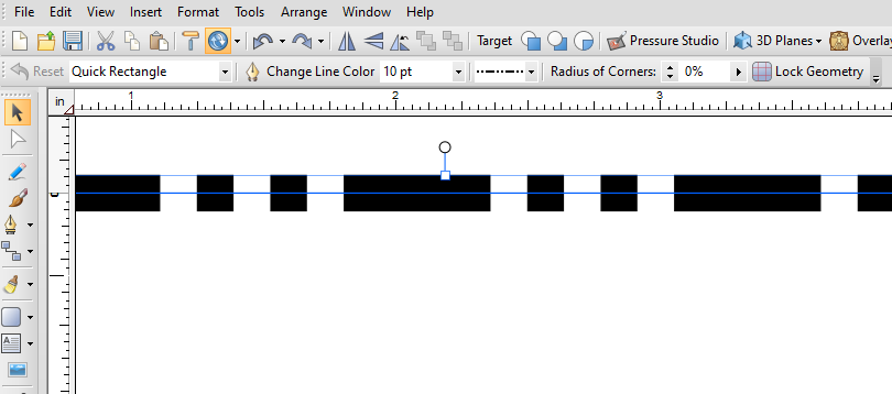
Expanding strokes of smaller size does not keep the same shape as the stroke.
-
I’ve created a thread here. Not sure where else to report bugs other than maybe this forum section, so I’m posting this here in hopes the Affinity team will see this and fix the issues.
-
Hasn't it been implemented yet that was available in DrawPlus?

-
 Hey Serif! First of all, loving the new 1.9 update! Tons of feature improvements and they're all awesome. There is a bug that I'm seeing in the select same tool. When I use "Select Object > Unstroked Objects" , it works the same as "Select Object > Stroked Objects". It selects only stroked objects and not the unstroked ones. Here is a reference video. A1LXRiNPvj.mp4
 -
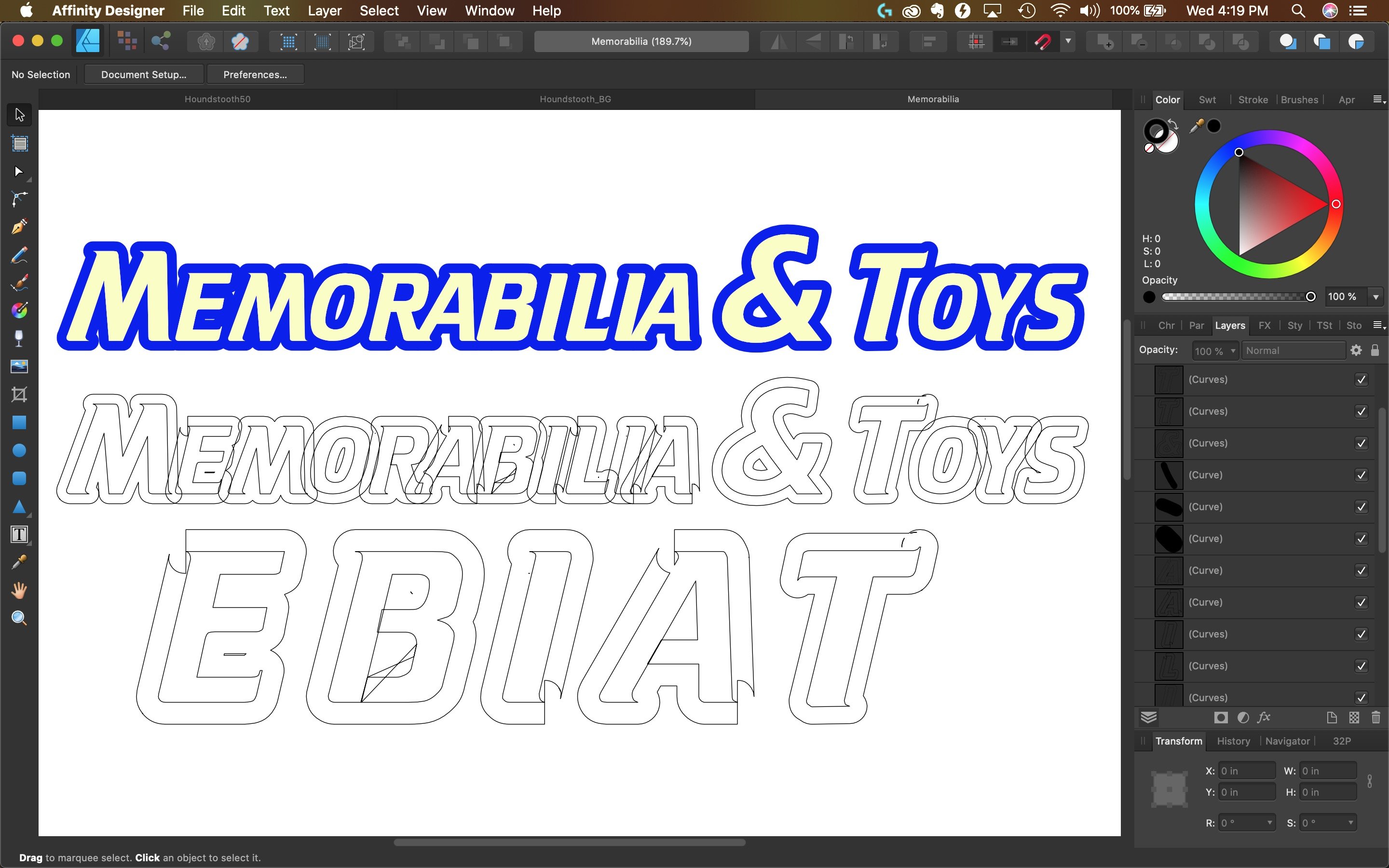
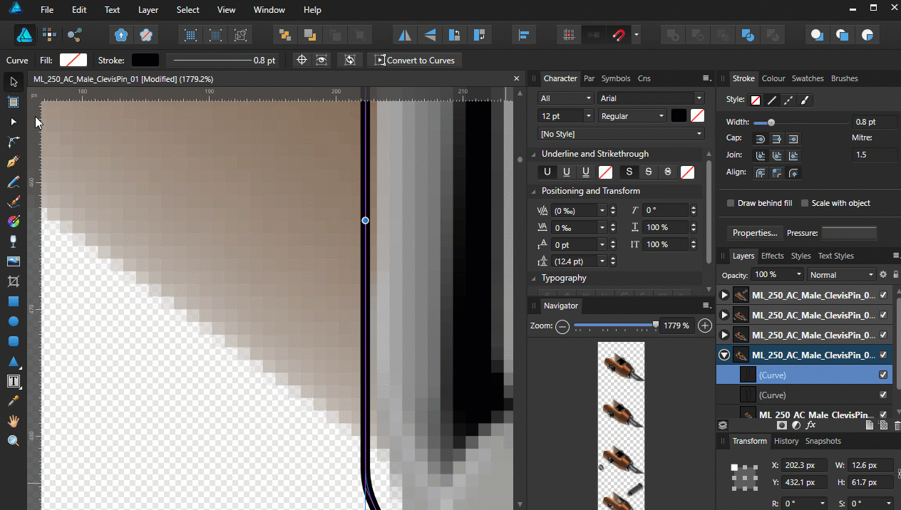
BUG REPORT - What happens when I Expand the Stroke. Everything I tried doesn't work on this particular font and rasterizing is not an option for me due to professional publishing needs. The only workaround for me on this one was taking it into another software to make the paths. I wish there was a fix for this in Affinity. This issue really needs to be fixed or at least some way to have a viable workaround. Font is Krupper Additionally, I first noticed the font was breaking from Publisher when exporting to PDF. So I tried to convert to curves in Desginer which causes the font to break. Running MacOS 10.15.5 & Affinity 1.8.4 Steps to repeat this: Download Krupper Font Add Stroke set to 3.5 Convert to Curves Expand Stroke New Document file attached as well as a photo. Memorabilia.afdesign
-
 Hi, Designer 1.5.4 on Mac OS X 10.8.5. I drew a simple pen shape (in Draw Persona), and made the stroke a vector brush (ie, Stroke Style button 'Texture Line Style'). How do I now cancel the vector brush and revert the stroke to a plain line stroke? I would've thought: Stroke Palette—>Style—>Click 'Solid Line Style'. But the vector brush stroke stays. Same when I click the Dash Line Style. Same when I adjust the stroke width slider. However: Clicking 'No Line Style' _does_ work, and removes all stroke. But when I then click Solid Line Style (or Dash Style), the vector brush stroke comes back. What am I missing?? thanks in advance, - pbass
 -
 If I want a thick stroke to be on the inside or outside edge of the logical paragraph box I currently need to do the maths and set the offset appropriately as the painted stroke is always centred. It would be useful if the inside/outside/centre alignment worked for decorations to avoid this.
 -
The select same command does not select the same strokes for me: 2023-01-11 18-41-25.mp4 The colours of the pink and purple are completely different when selecting the same fill and stroke colour. This is also the case when selecting by stroke colour: 2023-01-11 18-43-25.mp4 Now I finally understand why this selection method wasn't working the way I wanted too, it's just completely broken in 2.0.3. Windows 22H2. Although it's a known issue (by design) that Designer also selects hidden and locked layers, see: I know I also filed a bug report for this in the past in the past, but cannot find it through the forum search. But please, restrict selections with select > same to only visible, unlocked layers. Please.
-
 I think it would be nice and quite useful to have the option to set the Start and/or End of a stroke to have a different colour to the actual stroke. For example, you could have a black line stroke with a green circle at the Start and End to illustrate the start and finish of something, all done with just one stroke rather than putting in the circles manually. Thanks and keep up the great work!
 -
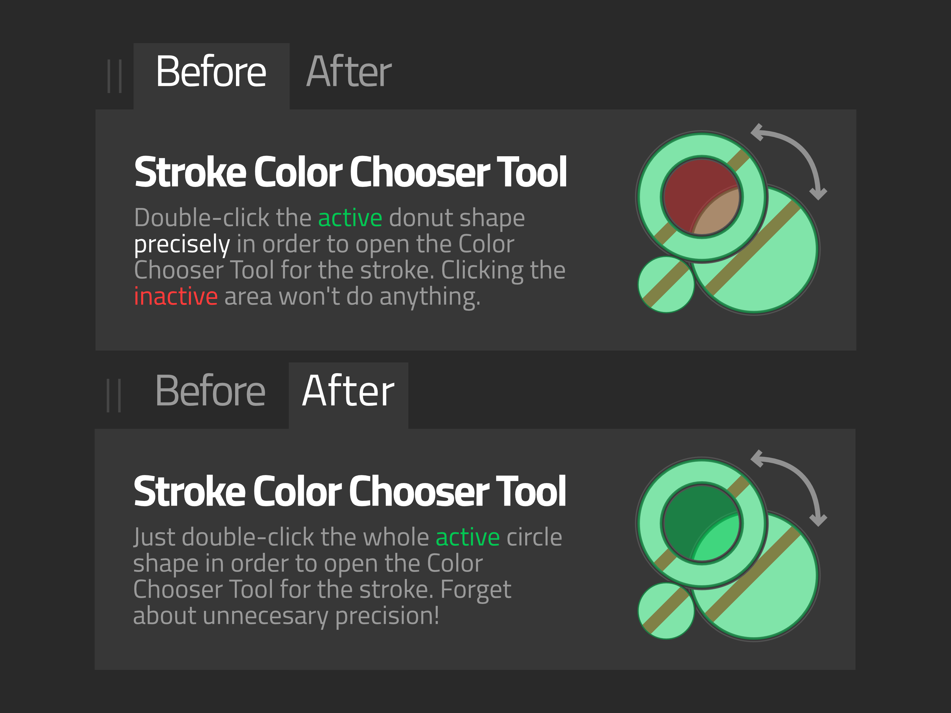
 Thank you for reading. Problem! Tiny Active Donut Shape Target: Over the years with the apps, I've always felt unnecessary having to precisely double-click the very tiny donut shape in order to open the Color Chooser Tool when editing the stroke color. You'll sometimes find yourself clicking many times to change the stroke color because you may have missed the target (like clicking the hole in the center). Solution! Make it work like the fill: So, I would suggest the Affinity Team to make the whole circle functional, that way we just have to double-click the circle to open the Color Chooser Tool to edit the stroke color, like how the fill already works. That's the way most programs do it (Illustrator, Figma, etc.). Please guys! It's easier. And it seems like veeeery tiny fix. Additional Notes Retain the donut the shape but with solid active area: Because I imagine and understand that the donut shape is for easy recognition, what I want is having the same shape but with a solid active area. There are some design apps that have the exact design but don't make you precisely click the donut itself. That's why the design below retains the donut shape.
- 5 replies
-
- 1
-

-
- stroke
- suggestion
- (and 1 more)
-
I started a simple design in Affinity Designer 2.0.0 (only and latest version) on Windows 11 Pro (latest updates, version 22H2) that does not allow the border of the item named “Main Panel” to be edited. I was forced to export the file to SVG to open it in Affinity Designer 1 to continue. The program hung for a bit while editing, and on relaunch asked for permission to submit crash reports that I approved. The problem file is attached. Thank you for your attention. TChapterSlider.afdesign
-
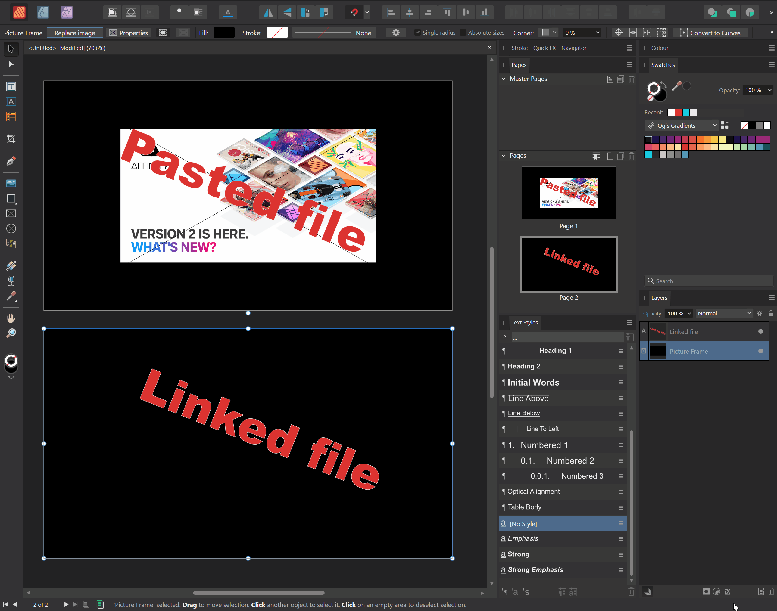
When placing an image, the fill colour of my image frames disappears in Publisher when the file is linked. The first file is copied from the web and pasted into the image frame. The second image is saved to disk and then brought into the frame with the replace image button (I had to actually replace images earlier to retain scale and position). 2022-11-17 17-48-02.mp4 Notice that when the image is deleted, it leaves a white mark where the fill is supposed to be. Removing the stroke of the object gets rid of this, despite not having applied a stroke, nor a stroke colour. Steps to reproduce: 1. Create an image frame that spans the entire page 2. Select the image frame and apply a fill to it 3. Click the replace image button and place an image 4. Notice how the fill colour of the image frame disappears. Image placing policy is set to embedded. This is on Windows 10 19044.2251 (21H2).
-
2022-11-17 18-05-33.mp4 I have my shortcuts setup to increase or decrease the stroke weight with the bracket keys. However, this does not apply to text. This is on Windows 19044.2251 (21H2).
-
 Hi. I'd like to make a black or colorless word logo with a rainbow stroke. Every time I try it fills in my letters and I do not see how to make a rainbow stroke. Is this possible please? Thanks!
 -
Locked layers can still be manipulated in terms of fill and stroke colour and other stroke properties. I would expect everything to be locked when locking a layer, so I won't accidentally make changes to the object/ layer, which is the whole reason locking layers exists. Steps to reproduce 1. Create a bunch of objects 2. Group them (and promote the group to layers) 3. Lock both the layer and the object 4. Change the fill colour 5. Notice how appearance changes are permitted 2022-11-21 14-27-00.mp4 2022-11-21 14-33-33.mp4 E: You can also continue drawing/ adding objects to locked layers. So there's no real way to actually make sure a layer remains unchanged.
-
 I can't seem to get the Stroke Align to change.
-
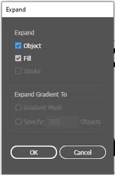
Would be nice if I cloud use the equivalent command to the Expand/Expand Appearance in Illustrator that will separate the stroke and the fill to individual objects. The Expand Stroke command leaves the "bleed" of the fill under the stroke. The Geometry or the Shape Builder needs many steps if it's a complicated object or a group of multiple objects.
-
In this demo you can see that I increase the stroke width, but that the object has no stroke colour assigned. Therefore, I don't see any effect of increasing the stroke width with the new keyboard shortcuts [ and ]. 2022-11-10 21-29-11.mp4 Worse, it can lead to extremely large and buggy strokes when I do apply a stroke colour. 2022-11-10 21-29-11.mp4 Therefore, I would like to see that a default stroke colour is applied when increasing the stroke width while there is no colour assigned. You generally tend to hold the key until you are really sure it is not working. By then, the stroke value is probably so large that you get what I showed in the second video.
-
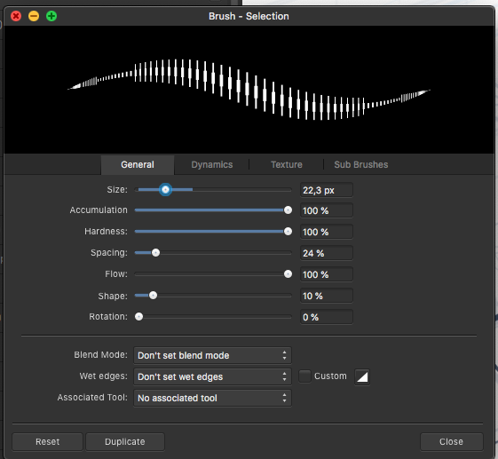
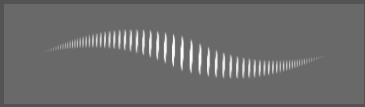
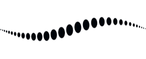
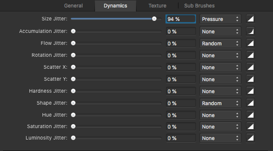
 I've had a hard time adjusting the brush to act in a natural way for drawing. I've compared with mainly photoshop and sketchbook pro and posted numerous reports about this. There are a few issues like jagged lines on low zoom levels and general inconsistent behaviour of hardness and size. Things you only notice when drawing or writing by hand on a tablet or Cintiq. Now I think I found what causes the latter! I was able to isolate what is going on by setting the shape to a narrow ellipse and the stroke to large spacing. Look what the preview shows. There are 2 things going on here: 1 Inconsistent size toward the beginning/ending of the stroke, causing a sort of 'arrow head' effect 2 The increase of the amount of dots towards the ending is too steep. Meaning the spacing between the dots in the end is near zero and in the middle pretty large. Some decay in spacing is useful since the relative spacing between dots should stay the same. But it seems that AP does not take the dot size into account and at certain settings the decay is much to steep, causing too many dots to overlap. I noticed that in photoshop and sketchbook pro this decay is far less and generally in better balance with the shape size. This presumably results in their smoother line behaviour. One result of this steep decay in AP is that soft lines are much harder in the endings than in the middle and pressure sensitivity feels a bit 'off'. All in all this explains the strange behaviour I was experiencing. This arrowhead effect is nearly invisible in the preview when the shapes are rounder, but in practice I always notice the inconsistent line behaviour because of this. Affinity photo: A drawn line to show it's not just the preview: photoshop: sketchbook lastly look at this soft line and how hard it gets near the endings. The steep decrease of dot spacing is what causes this. In all examples these are the dynamics settings: In my opinion two things need to change: 1 The arrow head behaviour is just off and needs to be fixed. 2 The spacing between the dots needs to be rebalanced in order to have a consistent line behaviour throughout different settings of spacing, dynamics, hardness etc. Generally speaking the dot SPACING needs to be in balance with the dot SIZE and SHAPE. E.g. the thinner part of a pressure sensitive line should be equally soft as the broader part of the line. Also when pressure sensitivity is set to linear, the line thickness change should also be linear. This is currently not the case and my guess is the inconsistent dot spacing causes this. I hope this helps refine the brush behaviour for AP!
- 18 replies
-
- 14
-

-
-
 There is an aliasing issue that occurs with shapes created with the Star, Double Star, Square Star, Cog, or Cloud tool in Designer 1.10.5 for macOS. There are various ways to reproduce this bug, but here is a reliable method that makes it quite easy to see. Create a small document (~100x100px, 144dpi). Enable retina pixel view mode, and zoom to fit. Select the Star Tool. Create a 50x50px star. Give it a 10pt black stroke, aligned to the outside of the shape. Decrease “Inner radius” and “Outer circle” to 0%. From 50->1%, the outer edge changes slightly, but the moment you reach 0%, suddenly the border is much harsher and more jagged. This same bug occurs with the other radial shape tools: Star — inner radius and outer circle to 0% Double Star — inner radius to 0% Square Star — cutout to 100% Cog — tooth size to 0% and notch size to 100%, or vice versa Cloud — inner radius to 0% This is a literal edge case, but there are circumstances in which any of these settings would be useful. For example, I encountered this bug when attempting to make a five-pointed asterisk character, which has spokes with no width besides the stroke. Affinity Designer 1.10.5 macOS 12.4 2019 MacBook Pro occurs with or without hardware acceleration no external hardware Star with 0% internal radius (left) vs. 1% internal radius (right): (for better comparison, please download the images and toggle between them) bug.afdesign
-
I would like there to be an option in the colour picker to apply sampled colours of filled objects to the selected object's fill colours. Similarly, sampled strokes should be applied to the selected object's stroke colour. This is how it works in Illustrator and bypasses to have to check whether fill or stroke colours are active to determine to where your colour ends up going. For any non-vector objects that were sampled, the colour should still be applied to whether the stroke or fill is currently active. This saves quite a lot of time if you need to apply colours to newly created objects it helps if you can sample them from objects that were already created. This proposal does not cover stroke widths (or appearances in general, which the tool currently does not sample). For that, see:
-
 Picking a color for Gradient strokes and fills, only works from the gradient menu. In the gradient menu there is the option for color. However from this color panel I do not have access to my swatches. Further more, if I navigate to my swatches and select a color, that color overrides the gradient on the object as one solid color. Same goes for the color panel. Note -- For fills I can work around this by using the Fill tool to create the adjustable line for gradients, selecting the nodes on the adjustable gradient line and then selecting colors from my swatches or the color panel with out the swatches overriding the gradient to a solid fill. I should be able to select a color for gradients from swatches and the color panel while I have the gradient panel open with nodes selected. I should not be limited to the single "color selector" button that is within the gradient panel. I feel like it could almost be done away with, as I'm sure most people have their color panel or swatch panel located somewhere on their screen. Edit : I have found that within the gradient color selection there is a drop down which allows me to access my swatch colors. This provides me with a useable work around for coloring stroke gradients. However my point still remains that this color selection button could be done away with. I already have my color panel, and swatch panel, open in my work space, I use them very frequently and habitually. It is very frustrating to have these extra steps/clicks to navigate to and color gradients. When the color and swatch panel are used so frequently, it is very anti intuitive that they both do not work for gradients.
 -
 First off, Affinity is a stellar piece of kit. I am a very satisfied customer. However there is a small oversight that is really strange and I think should be fixed. So, I checked the help section, which was incredibly useful and very well designed, lovely experience. and I couldn't find any way to add strokes to selections. This seems like a really weird oversight. Krita and Medibang can do this, photoshop can, and so can gimp, but Affinity can't and that does sour the experience in an otherwise fantastic piece of software. I hope this feature is added to affinity photo in the near future. the selection tools available are nothing short of spectacular, so it seems strange that there is no option to add a stroke with a pixel line or a current brush when everything else is really good. I am doing this on 2 fold: 1 I wanna help affinity as much as I am able, especially since its a reasonably priced 1 off payment. 2 I don't want myself or those who have similar opposition to adobe as i do, come crawling back to photoshop. I will continue to explore this app and report my findings and thoughts here to help the devs keep this tool awesome for everyone who uses it. Will also be down in the future to keep buying software from you guys should you continue to take a stab at adobe. I'll be happy to give money and feedback. Photo is such an incredible piece of kit, and I want to help make sure that everyone who needs it doesn't have to crawl back to adobe over some silly trifles. I will gladly give some of my time to the devs of photo if they want me to test the implementation of this. Have a nice day everyone.
 -
I prefer using the 1 column width toolbar, but it comes at the cost of not having a fill & stroke colour widget there. I prefer to have it there, because it gives me a clear indication on first glance. And it stays there regardless of the studios I have opened. It is also the closest to the canvas and since you already glance the tools to know the active tools, it would be the ideal place to add this. Hopefully this will be reconsidered! Also, see the discussion here: