Search the Community
Showing results for tags 'settings'.
-
 I am posting this feedback in this section of the forum, I hope this help to improve the software Not going to talk about the bugs, I hope all of them get fixed I am going to compare my experience with other softares, such as Adobe Illustrator, Inkscape (the ones I use the most) For the few time I have used the software I can tell is very minimalistic, (I really hope this is not because the Ipad version limitations, as PC can do much more than a Ipad, so I hope PC version is not being limited to keep in the same quality of the Ipad version) Or maybe is the way the software is going to be, as it could be a minimalistic software not planned to have advanced features, I would like to know which kind of software Affinity Designer aim to be, minimalistic or advanced? Developer team care for both personas this mean less time to focus to improve designer persona and possibly priorize pixel persona over vector persona (The software is meant to be a vector graphic software, rather than a raster graphic software) The exporting persona is not intuitive and does not have much more to offer than the traditional exporting in the user menu The software have very few settings and some of them are not compatible with SVG format (The standard file format for vector graphics) The software have very few tools and some of them are not compatible with SVG format (The standard file format for vector graphics) There are very few tools for vector graphics, and the customization for them are very tricky and not intuitive & limited _ What I suggest is to focus on introducing new tools&features&settings to work with vector graphics and improve the ones that the software already have Currently I don`t use this software because of the limitations exposed, as other vector graphic software have to offer much more optimized tools&features for vector format (SVG), I really hope it get more complexity eventually as for now it is not a stand alone software for its limitations & few features for vector graphics.
- 14 replies
-
- 3
-

-

-
- improvement
- bug
- (and 8 more)
-
I am doing the graphic design of a game using SVG files I was using Adobe Illustrator CC, but exporting SVG files in AI ruins the gradient, shapes, so I switched to affinity designer The problem is that when I open any SVG file, the color of the vectors looks wrong, pale, without saturation I think it could be because the color settings, and display settings When I export the file as SVG, the colors display correctly in other software, such as inkscape/illustrator (as should be) but not in affinity designer, so yeah, the problem is about displaying the colors in the software correctly _______ These are two examples of the same file open in different softwares - (Affinity open the Affinity file.PNG - SVG screenshot) __ - (Adobe Illustrator or Inkscape or other software or browser open the SVG file.PNG - SVG screenshot)

-
As it is for color, it would be useful to have a quick live preview gradient settings in the studio
-
I am doing the graphic design of a game using SVG filesI was using Adobe Illustrator CC, but exporting SVG files in AI ruins the gradient, shapes, so I switched to affinity designerThe problem is that when I open any SVG file, the color of the vectors looks wrong, pale, without saturationI think it could be because the color settings, and display settingsWhen I export the file as SVG, the colors display correctly in other software, such as inkscape/illustrator (as should be) but not in affinity designer, so yeah, the problem is about displaying the colors in the software correctly. _______ These are two examples of the same file open in different softwares - (Affinity open the Affinity file.PNG - SVG screenshot) __ - (Adobe Illustrator or Inkscape or other software or browser open the SVG file.PNG - SVG screenshot)
-
 I am using Affinity to create card games or other cards, and with the way a number of programs and game websites handle file names I was wanting to find a way to force Publisher to add leading zeros so that the files would be listed in the same order regardless of which site or program is looking at them. I couldn't see any settings to let me do that. Current Setup: FileName_1.png, FileName_2.png, FileName_20.png, FileName_21.png, etc What I'd like: FileName_001.png, FileName_002.png,..., FileName_197.png, etc
 -
 I'm freelance photographer and recently bought affinity photo for editing my pictures on the go but what i found that there is no any copy paste option for develop and adjustment setting from one picture to another like photoshop raw camera and lightroom have. I'm really disappointed with that coz i cant able to make similar look on my pictures. So is there any solution for this ? Or affinity team working on this issue soon they can provide that option in update or something. Coz of that i cant able to use affinity i have to stick on lightroom only.
 -
 An olg bug or lack of feature is that we can't see which brush is selected. But I was able to look at its name when modifying it before. But with the last Bêta (AD and AP), I can only read: "Pinceau - selection / Brush - selection) when I modify a brush (or open its settings to look at its name)! The name of the brush, and why not the category should be display on the brush' settings panel (Category - name). An option to keep the same brush, same size, etc. with the different Brush Tools would be nice too, since it's when I needed to know which brushes I was using with the other Tools. (And spend time selecting and resizing other brushes). Improvements to the Brushes would be: Displaying the name of the selected brush when modifying it Highlight of the selected brush in the brushes panel An option in the context toolbar to keep the same brush with same setting (size, opacity, flow…) when switching brush tools If those options were available, I would have spend less time selecting and adjusting brushes in my last works!
-
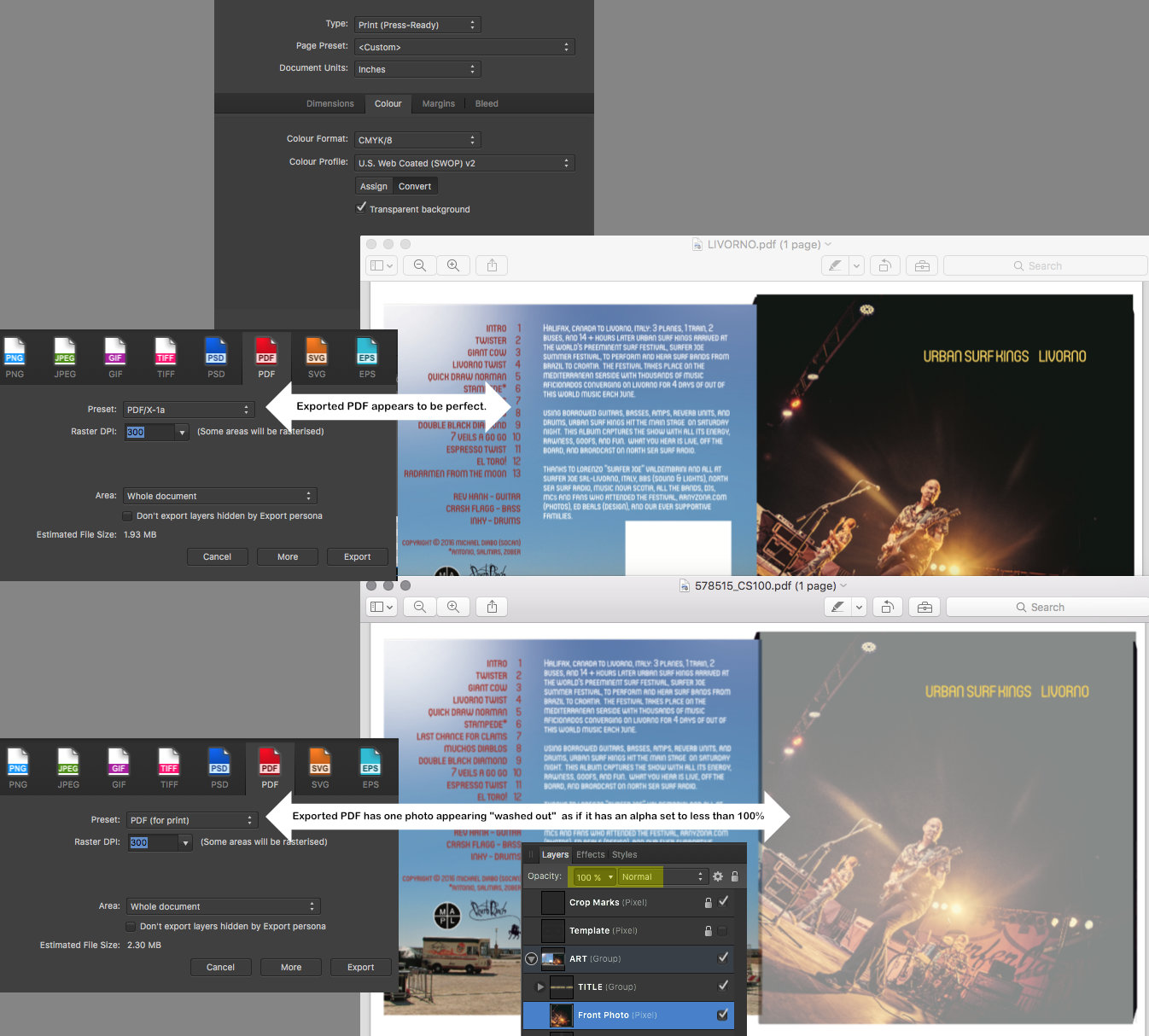
 The print service has requested CMYK exported as "High Quality PDF". The design has 2 photos, lots of text (converted to curves) and a few vector elements. When I use the "PDF (for print)" export option, the resulting PDF has the strange result you see attached. When I use the "PDF/X-1a" option, the resulting PDF appears to be as expected. I'm going to send this version to the print service. I am, however, curious about what is causing this issue with the "PDF (for print)" option. Id it possible that this is a problem only with the display, and that it would still print correctly? At any rate I did not want to test that theory on 1000 CD sleeves. This is not an emergency unless the manufacturers says they have an issue with the PDF version I am sending. Thanks in advance.
-
 I'm wondering if there is a way to keep this box open like the others (exposure, saturation, vibrance etc.) are always open? I use the feature often and would prefer to have it always open already as opposed to having to check the box AND scroll down first. Thanks in advance for advice.
 -
When starting a new document in DESIGNER and PHOTO, if for example you start of with letter size ( 8.5x11 ) but change it to 5x5. The setting doesn't change to custom like it used to. When you then start another new document, it say PRINT/ Letter , but the size is still the old custom size you typed in. You then have to click on a new preset and back to get your original numbers. It not a huge deal , but a bug non the less. Gary
-
 Affinity Photo 7 - Upgraded to 7 in Mojave. Now how do I transfer all my styles and cropping setting. It's a shame that this isn't considered when upgrading the Photo software.
 -
 I'm currently converting some photohsop brushes to affinity format. For brushes with dynamics I have to select each brush manually and change the parameters to the desired values. It would be much easier if I could: Right Click a Brush >> Copy Settings Select Multiple Brushes using Ctrl+Click and/or Shift+Click Past the copied settings. This would also be really useful when affinity users are creating brushes and want to do changes to all brushes very fast.
 -
 It is an inadmissible waste of time that when exporting a file, for example tif, always appears 8 bit, when I always export 16bit and have to display the list and change it each and every time. How can I make my default file format appear first in the list? Thank you
 -
 Hi there I find it quite useful using a recolour layer and a really bright colour (like lime) to highlight specific selected areas using the Blend Options interface. My thinking is if I use the recolour layer to show my selection is there a way to copy that across to say a Curves or Levels layer so I know exactly what I'm adjusting? Look forward to any reply. Many thanks Andrew Busst
 -
 Hi, I'm trying to find out the right settings on the Apply Image filter to set up manual frequency separation both for 8 and 16bits if they are any different. My point is to use FS with Median blur instead of Gaussian. Thanks, Vagelis
 -
 Hello dear Forum, I tried to draw with my Wacom Intuos 4 in Affinity Designer unsing the pencil tool in the software. The problem is that it is always drawing a staight line, even if I draw curved lines, using my pencil from my Wacom tablet. If I draw with my mouse/cursor, everything works fine. I also have Affinity Photo. There is no problem neither with my tablet nor with my mouse. Everything works nicely. I think it must be a setting issue but I can't find out what I have to click on. Would be awesome to get some fast answers, so I can start working today
-
 So there's a setting in Photoshop called transfer that I use religiously. Is there a setting in Affinity (or is a setting being planned in a future update) that I can use that would produce something similar?? I found another thread about this but I'm looking for more recent answers.... I tried setting "flow" to be affected by pen pressure, but the result is too different from what I'm looking for. I'd also be okay with a Photoshop plugin of... some sort, that might allow me to do something similar... I'm just so desperate for Affinity Photo to replace Photoshop for me. I refuse to pay monthly for something I wouldn't use monthly! Anything helps
 -
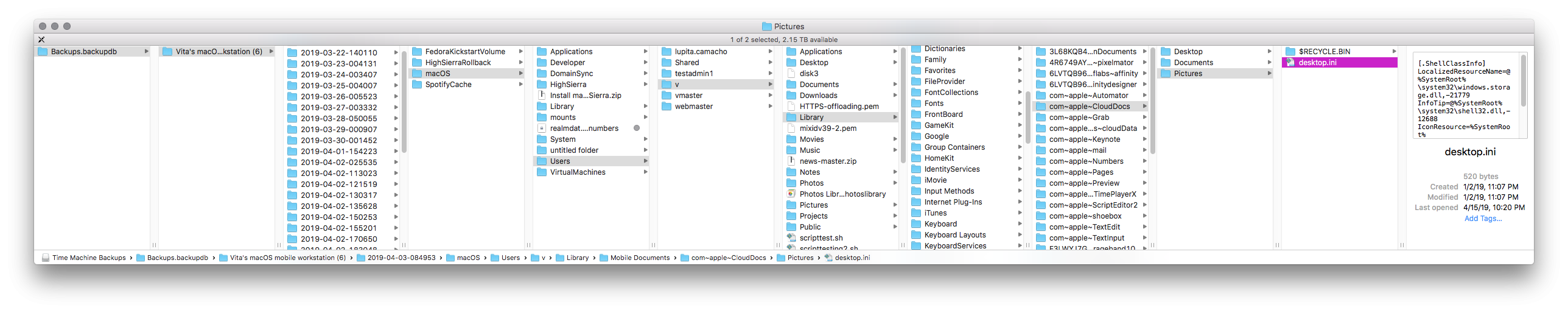
 I couldn't stand the downgrade to Mojave one more day and went back to High Sierra. Most of the apps I use aren't personalized or are synced through the Documents folder and Syncthing/Nextcloud, it completely escaped my mind to look for stuff to back up on the Library folder. I have 10day-old Time Machine backups on a server recent enough to recover my swatches, which is the only thing I need. Since I can't restore them on an older system anyway, I snooped around and found all the file system there, I just have to pick the right file. I found nothing under the Application Support Library but I did find a file under the Preferences Library for my old user which has a pointer to the iCloud local storage for the user. I went for the latest and it has nothing maybe because there weren't modifications to backup, I think, without the Time Machine UI I have to do this: Those are eight levels down a backup! Am I at least on the right place? Could you confirm? If I'm not, could you point me to the right folder? Thanks!
-
Please, unify the color settings in Colour palette. For example in Sliders mode each slider has its own box for direct value entry, but there is no cursor (circle) in the color field with the selected color (even though you can adjust the color by dragging). While in Boxes mode, the cursor (circle) is, but you cannot enter a value (direct value entry is often useful). Tint mode direct value entry has, but again it has no color field. Personally, I think that instead of specific Tint mode, it would be preferable to give Tint as one item in Boxes mode, or/and in Sliders mode.
-
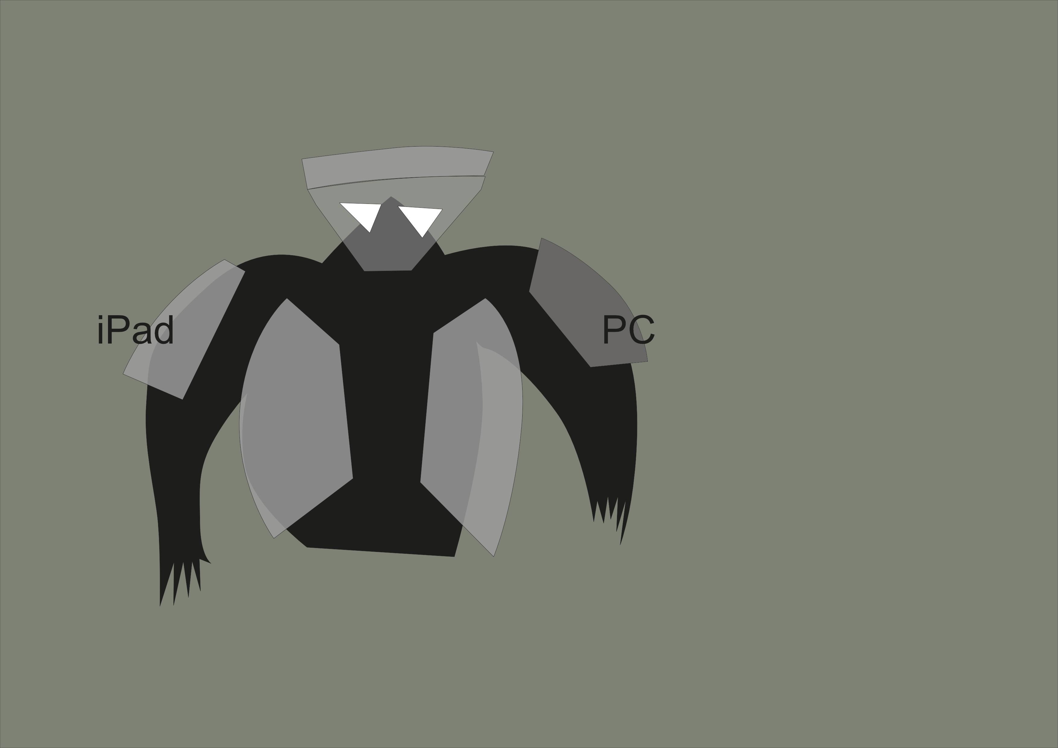
 I solved the problem below. For some reason, changing CMYK 0,0,0,100 to 0,0,0,50 changed opacity in HSL to 50%. Once I put it back to 100% it works OK. I think it may be a bug as it does with every newly created document on iPad, but works OK on desktop. — original question: Hi, I've got a document made in Affinity Designer on iPad Pro 2018. The document is in CMYK. I started to create shapes on different layers using black, and when I make grey fill CMYK 0,0,0,50 it seems to be transparent 50%. When I use exactly same colour from the same palette in the same document on PC, then it's opaque. How can I knock-out colours on iPad so they behave as they do on PC? I must have some settings wrong on iPad, but can't find what. I attach: 1. screenshot of how right arm cover is semi-transparent on iPad and left is opaque 2. screenshot of my colour settings on iPad Your help will be much appreciated! mr_1.afdesign
-
 I am having a terrible time solving what seems to be a color discrepancy between what I am seeing on my monitors within the Affinity Designer & Photo applications and what I am printing out via my office printer as well as outside print services. While Affinity Designer & Photo display bright, crips images within the monitor itself, my print jobs from any file format appear very dark and dull, even when printed through third party print shops. I have had no issues in the past with other programs and their settings. I am wondering if there might be a color setting that I need to change internally to help your program accurately display on screen what my (and outside) printers will produce. If you have any other suggestions, they would be much appreciated.
 -
 I have Affinity and when I try to send it to a plugin it becomes all washed out or the colors are wildly weird.. is there a certain color setting to fix this, I have uninstalled and no change..it does it in Topaz.. nik and all others.. except smartphoto editor.
 -
 I am using a 27" display 1920 x 1080 full screen. The Publisher displays well except for content entered into the text frames. The text is not anti-aliased and is barely readable. Is there a registry entry that needs to be made to correct?
 -
 I am well aware that I can set Margins when I created a new document and then change Margins after the fact by digging down into the Master page "Spread Properties." But is there a good reason why there is no conveniently accessible "Margins" command in the Document menu? That menu would be the most logical and intuitive place to find it. InDesign has "Margins and Columns..." in their Layout men, so anyone can easily find it without brainstorming or reading a manual, and I would argue a menu command is faster to access than (1) finding the Master, (2) right-clicking on the Master, (3) and then Choosing "Spread Properties." Thanks.
 -

Margins reset to default settings
stjack posted a topic in [ARCHIVE] Publisher beta on macOS threads
Hi, The publisher is an amazing program. I just made the first project. Working on tables is a fairy tale. So far, I've noticed one problem. The margins on the master page set in the whole document, after reopening, reset to the default settings. Only on pages, the Master page remains unchanged.