Search the Community
Showing results for tags 'redesign'.
Found 6 results
-
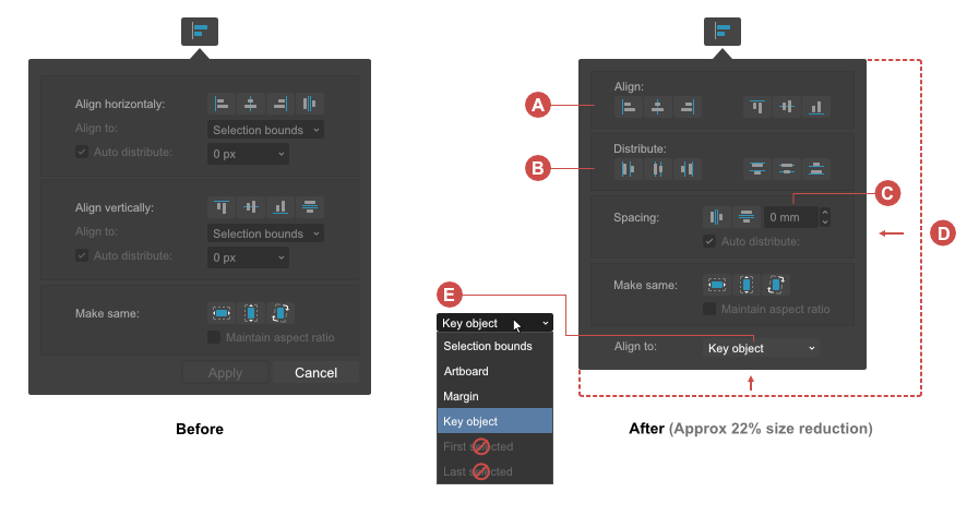
 I did a quick redesign of the "Alignment" drop-down panel because I'm disappointed with the current implementation. Perhaps one of you (devs) will come across this post and think that it is an interesting proposition worth considering. Current Alignment panel UI/UX shortcomings: • Dialog box to big for its content (space not used effectively) • Not all distribute options are included • Lack of "Key object" option in the "Align to" dropdown list • Alignment operations require to many moves / clicks from the user • Unnecessary command buttons (Apply, Cancel) • Poor combination of text field + drop-down list with slider is used as input field for numeric data: – an additional click is required to display the slider – problems with the precision of value changes caused by rapid mouse movements • User is not alowed to choose the "Align to:" option before performing an alignment operation This casues a negative effect, that objects are leaping before the user can go and chose the right "Align to" option Changes in the UI/UX and UX propositions: • Horizontal and vertical alignment controls combined into one section labeled as "Align" (A) • Included the missing distibute options (B) • For more precission, usability, less space a combination of text field + increment / decrement controls for numeric data input is used • Reduced the dialog box to make it more compact (D) • Option "Key object" should be added in the "Align to" dropdown list (E) • After implementing "Key object" alignment,"First selected" and "Last Selected" completely lose their reason for existence and could be removed without compromising usability. • Amount of dropdowns is limited to the only necessary dropdown for "Align to" option to avoid unnecessary clicks ⚠ The user should have the ability to set the "Align to:" preference before performing the alignment action. • Removed command buttons (Apply, Cancel) The alignment is a live on canvas operation so the "Apply" button is not mandatory. Every operation should be registered in history panel immediately after it is succesfully performed on the canvas. Edit → Undo command from the "Edit" menu can with succes replace the "Cancel" command button. To toggle the panel user should use the "Alignment" button in the toolbar or simply click outside the panel. Here also a PDF version (cheat sheet) for download↓ Aligment_panel_UI_redesign_cheat_sheet.pdf
-
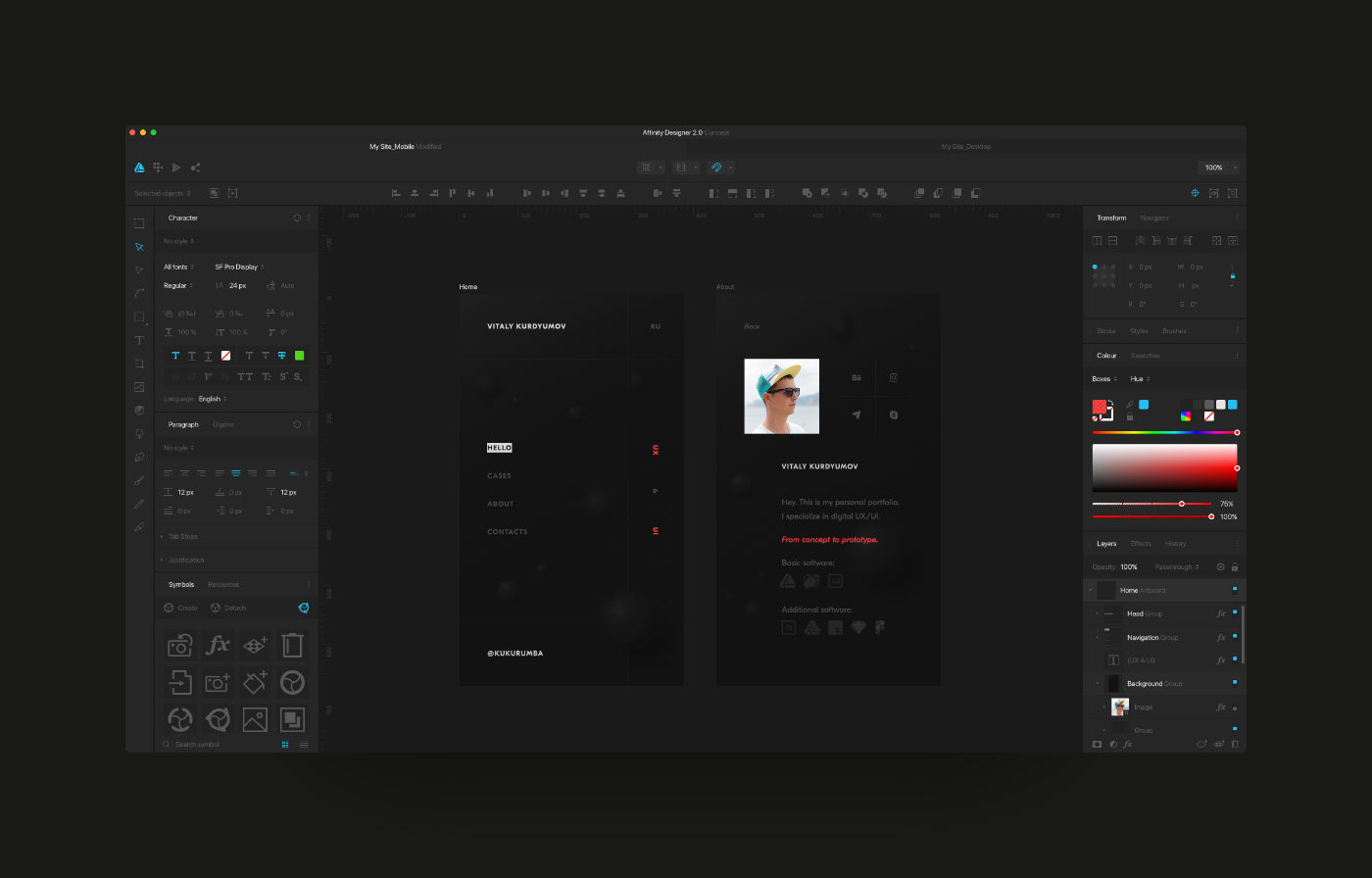
Hello. My name is Vitaly, I am UX/UI designer from Russia. In my free time I decided to redesign my beloved Affinity Designer. What I did can be viewed at the link below. What do you say, colleagues? View on Behance
-
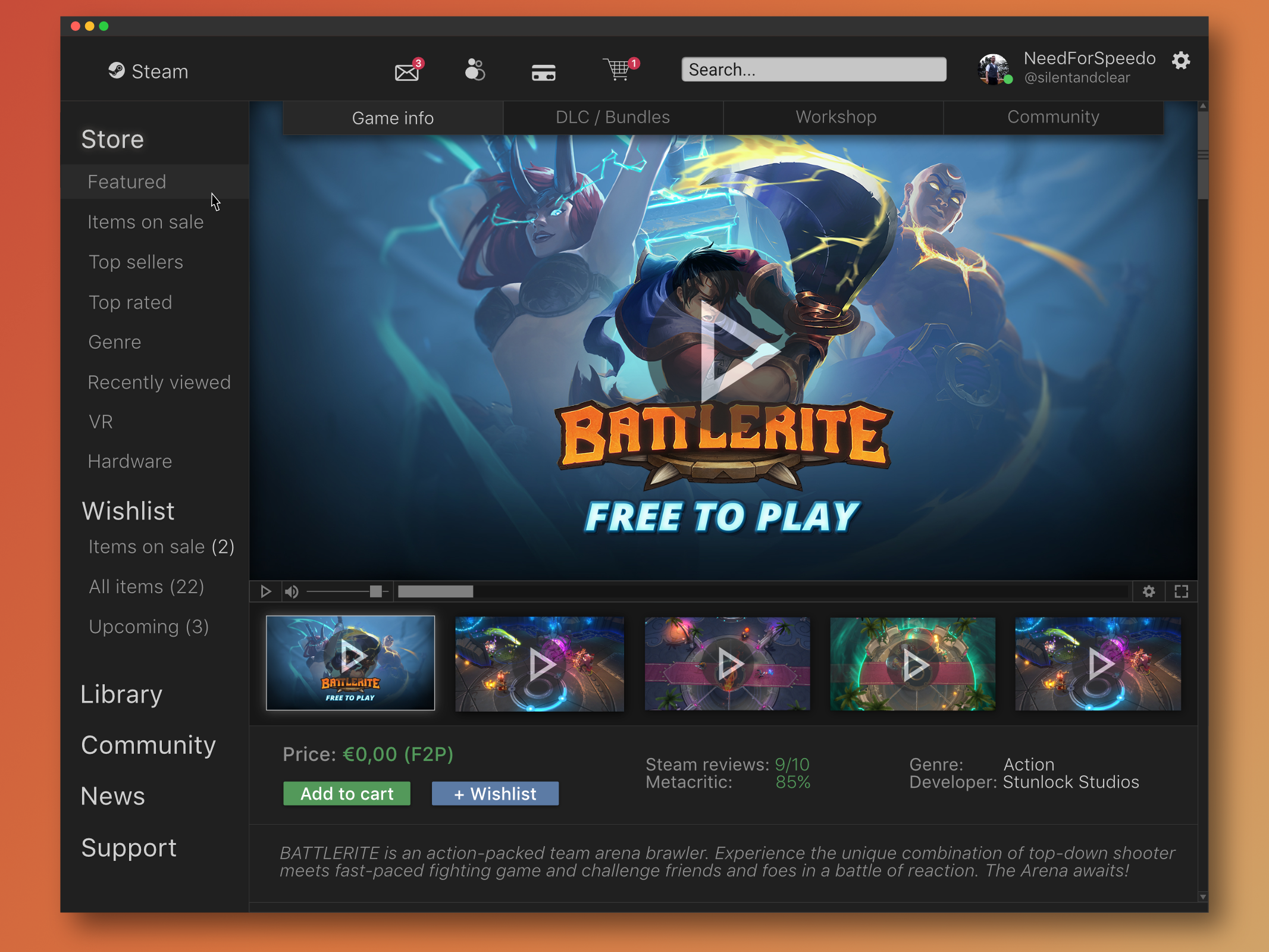
Redesign concept of the Steam client. This concept aims to make the navigation of the app more intuitive and giving it a clean, smooth, more visual appealing design overall. More screens will follow in the future. What do you guys think? Feel free to follow me on: Dribbble Behance Twitter silentandclear.com (revised version of Original project)
-
Hello, I have been waiting with excitement for the Affinity BETA to come out on windows. After opening Affinity, i was not convinced. I really got this "not bad" feeling.. This is because of 1 main issue; i don't like the user interface. Functionally speaking, its great. It beats photoshop in my opinion. But its not even close to what i had hoped for.. I am a big fan of "minimalism" and "flat" design, not just for its looks, but for the overall experience. I came accross a photoshop redisign made by Aurélien Salomon on Behance: https://www.behance.net/gallery/19600227/Photoshop-redesign This is how a modern and new photo editor app/program, in my opinion, should look like. Design is contantly evolving, so the tools that are used to create design should be designed with this in mind. My suggestion: create an user interface that works with templates. Give the user control of how Affinity looks like. What would be better then an editor that by itself gives inspiration to create more beautifull & smart designs?
-
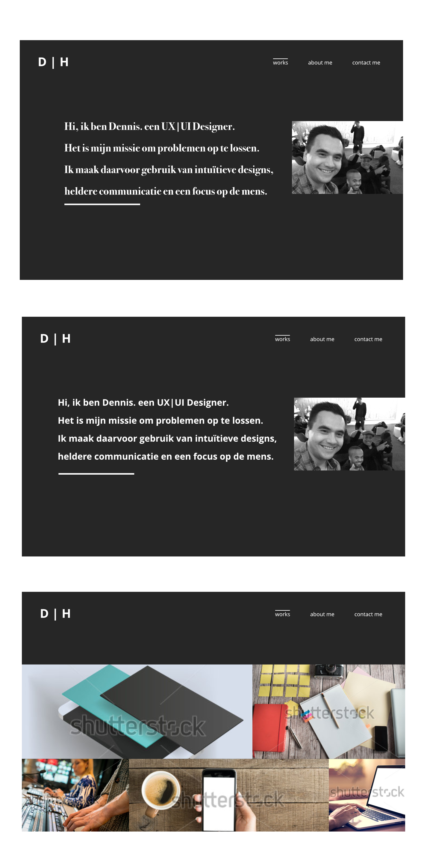
Hi, Last month I finished my course as UX Designer. At the same time I launched my portfolio website using Semplice (some sort of WordPress tool). After two or three weeks I needed my website to be more professional with UX in mind, so I stripped most of its elements. But now it's too empty, bland, ugly. You can find my website here. So, while that ugly piece of crap is up and running I'm redesigning its looks. But now I'm running in circles and I need some feedback on the sketches that I made last week. Could you guys/girls gimme some? Obviously it needs more content, better photos and the text is just some copy/paste stuff. You are appreciated.
-
 A while ago I went to a portfolio show to get advice from some leading graphic designers in the area. When I showed one designer this logo that I did for a women’s group he said to me that at first didn’t realize that they were people due to their heads not being very visible in front of their arms. He also thought that the curves of the dress made it appear like they were rubber gloves. He suggested that I move the arms further apart so the head would be more visible and to straighten the dress out more. The image on the left is the redesign I did after listening to his advice. There many other type choices I have been experimenting with that I might try as well. I would love to hear what other people think!