Search the Community
Showing results for tags 'realistic'.
Found 15 results
-
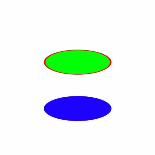
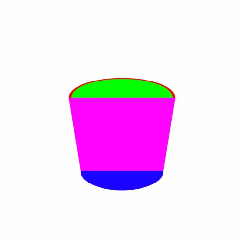
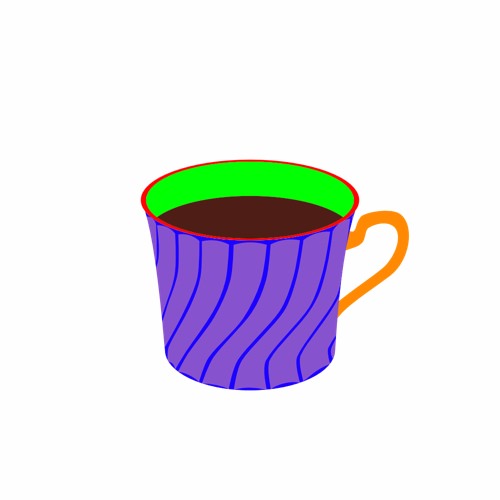
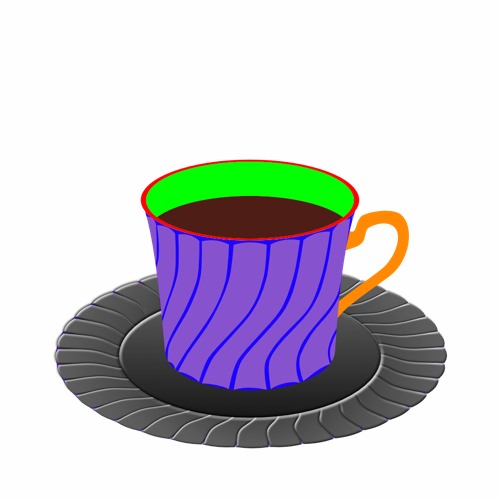
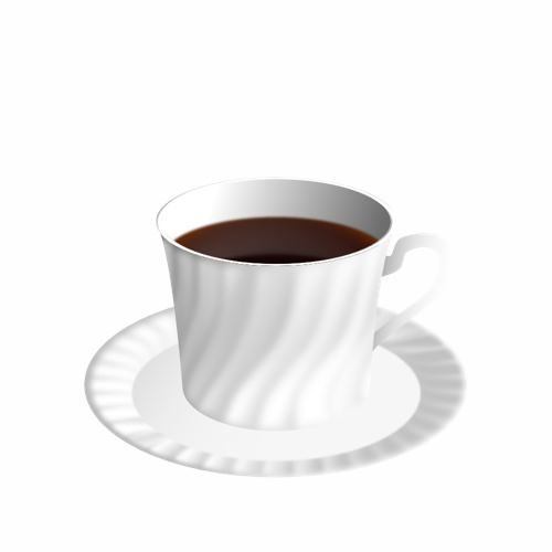
“Coffee Time” I’m really not very good with hand drawing (stick figures only!) so I really like the concept of vector drawing in which I can make changes after the fact and tweak to my hearts content. To learn how to use Affinity Designer (I have played with some vector stuff before in Inkscape but nothing much at all), I decided to make something look as real as I could that wouldn’t need too much raw drawing skill and I came up with “Coffee Time” : 100% created from scratch vector drawing (no brushes or pixel layers except for the use of the fx “Layer effects"). I did use a photo for reference but I didn’t do any tracing or anything. I’m really, really happy how it turned out. I tried out all sorts of things and learned a lot but it was a lot of fun :) As this is a "Learn and Share” forum, I thought I’d share exactly what I did (see the other other attached pictures). It’s not perfect and I’m a beginner, but hopefully others might be able to learn something, too Enjoy! :) My Process: 01 Create 2 sets of circle shapes to represent the top and bottom of the cup. Squish the top and the bottom with the move tool. The top circle has a smaller one on top to remove later to make a lip for the cup. I deliberately used bright colours to make the shapes easy to distinguish from each other. 02 Join the circles with the corners of a rectangle shape to form the side of the cup. 03 Shape the rectangle with the node tool. Add a handle. Clone the top circle and move it down to make the surface of the coffee. 04 Create a set of “shading shapes” to put on top of the side of the cup. These will then be given a gradient colour and transparency to give the illusion of a bumpy surface. 05 Create some circles and overlay some shading shapes . I used the the smart duplicate function to repeatedly rotate duplicates of the shading shape easily. 06 Squish the saucer with the move tool and move into place under the saucer 07 Change the colours to something closer to the final version and play with gradients and transparencies. I also blurred it to make it blend more naturally. Once I got something that looked good, I made a style of it and then applied it to the others and then hand tweaked each one. 08 Do the same to the saucer. Also added some detail (reflection of the inside of the cup and blurred it) to the coffee. 09 Add a background with a gradient. I used the noise slider to give it some texture. I also added some steam with just a hand drawn shape. 10 Add a shadow. I just duplicated the cup and saucer, blacked them out and then put them in place underneath everything and used the shear tool to project it out. I also added some fine detail on the edge of the side of the cup to add to the bumpiness illusion. Made the lip a nice shiny gold with a slightly tweaked version of the built in “metal” style. Added some self shadowing to the saucer and further deformed the circle shape it to give a more 3D look to it. 11 Added reflections and spectral highlights to the cup and saucer. Now it looks nice and shiny. For the final version, I also added some bubbles to the coffee (lots of circle shapes) and the text, converted to curves and then given a steam like style (actually the same one I used for the shading shapes!) and then each character rotated and scaled to make it look like steam from the coffee.

- 10 replies
-
- 13
-

-
- coffee cup
- vector
- (and 3 more)
-
 Hello all, if you want to learn how to create an isometric cylinder, then check out my tutorial
 -
Hi guys, here's a video of me drawing banana in Affinity Photo. I hope you enjoy it. Thank you!
-
 Very excited to finally being able to present this class: “REALISTIC VECTOR ART PRINCIPLES“. In this class you'll learn all the techniques, methods, tips and mindset to achieve professional results like you see in these samples of my own work. HOW to observe, HOW to think, WHAT to do and WHY. Watch the video to get all the information about this class. See you there! Thanks. https://www.youtube.com/watch?v=ZgYN2MRcl2w -- 10 FREE Udemy coupons for this class will be raffled among anyone asking for them with a comment on the Youtube video. I will reply commenting back with instructions for winners on Friday 13th - Good luck y'all
-

affinity designer Realistic drawing with Affinity Designer
Francky posted a topic in Share your work
Hello to You all, This is my last vectorial drawing. Realistic vectorial drawing, done using Affinity Designer. I'm really excited with the results, see below. How to draw realistic objects (this case a headphones) with Affinity Designer. Step by step the full project here on behance Best regards Francky
- 16 replies
-
- 19
-
-
- realistic drawing
- vectorial
- (and 6 more)
-
Hi peeps, I leave here a tut on how to create an skeuomorphic volume knob. I'd say this kind of simple pieces is how I started learning how to "read objects" in order to reproduce them in a realistic way. It is pretty simple to follow through even for newbies and results are quite nice. Hope you enjoy it, and if so, comment, like and subscribe for more. Thank you all. Isabel.
- 4 replies
-
- 5
-
-
- affinity designer
- tutorial
- (and 6 more)
-
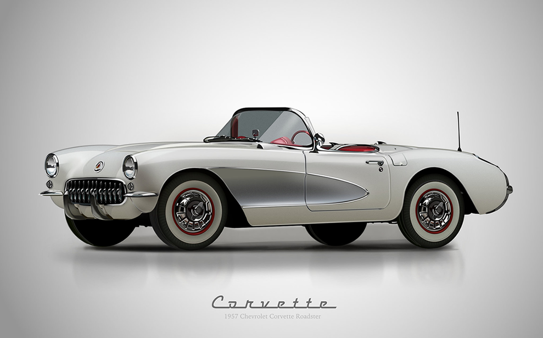
Another illustration trying the latest beta. More details and thoughts on it in my Behance portfolio. https://www.behance.net/gallery/31578563/1957-Chevy-Corvette-Roadster-Affinity-D-Vectors
- 72 replies
-
- 58
-
-
- 1957 chevy corvette roadster
- realistic
- (and 4 more)
-
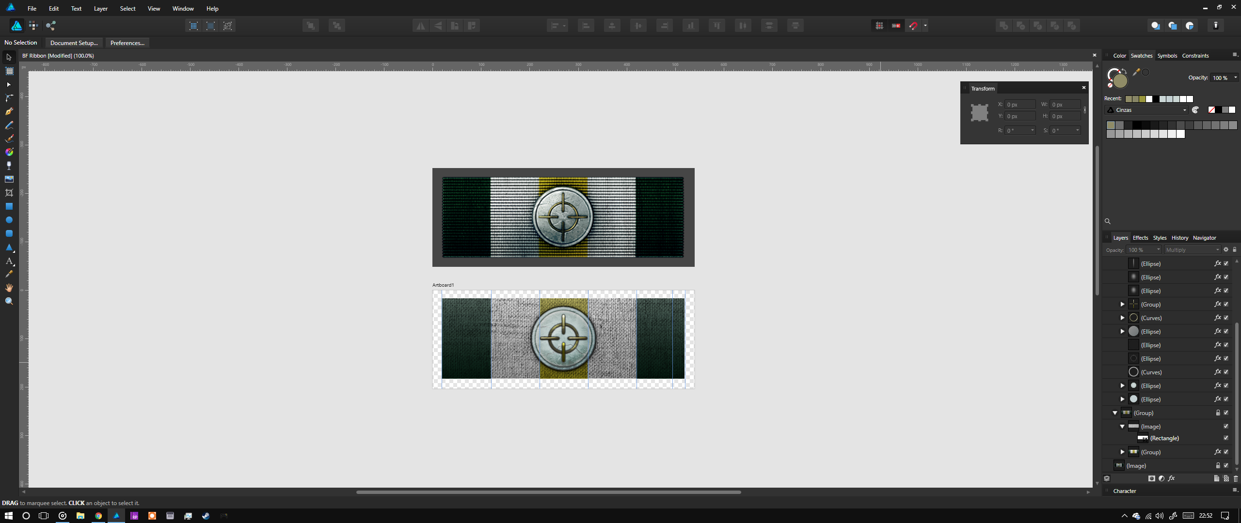
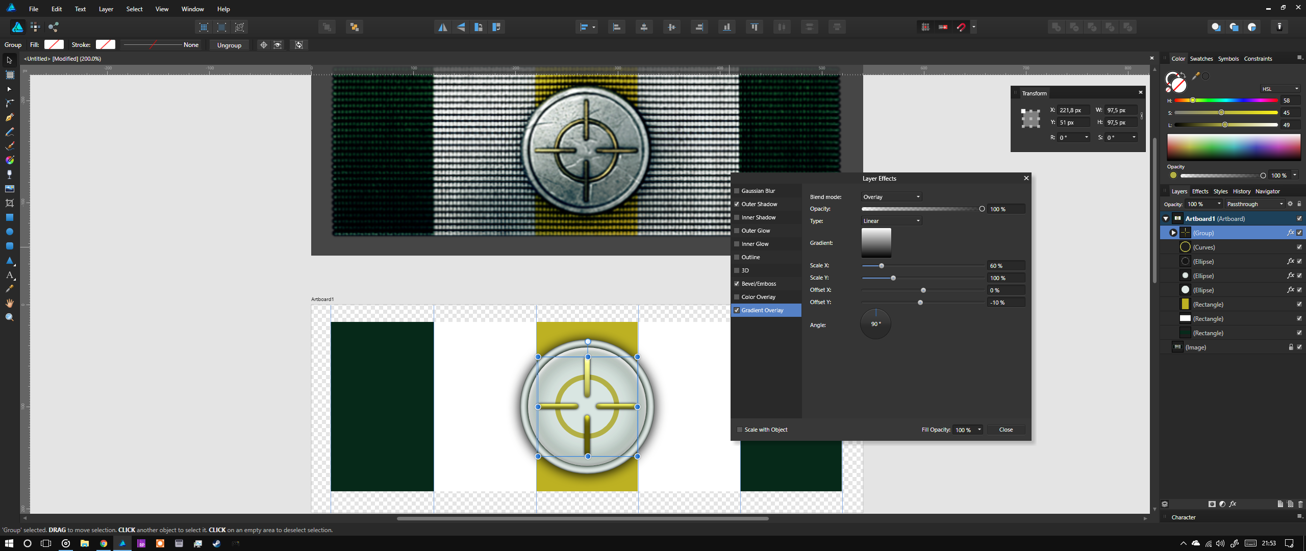
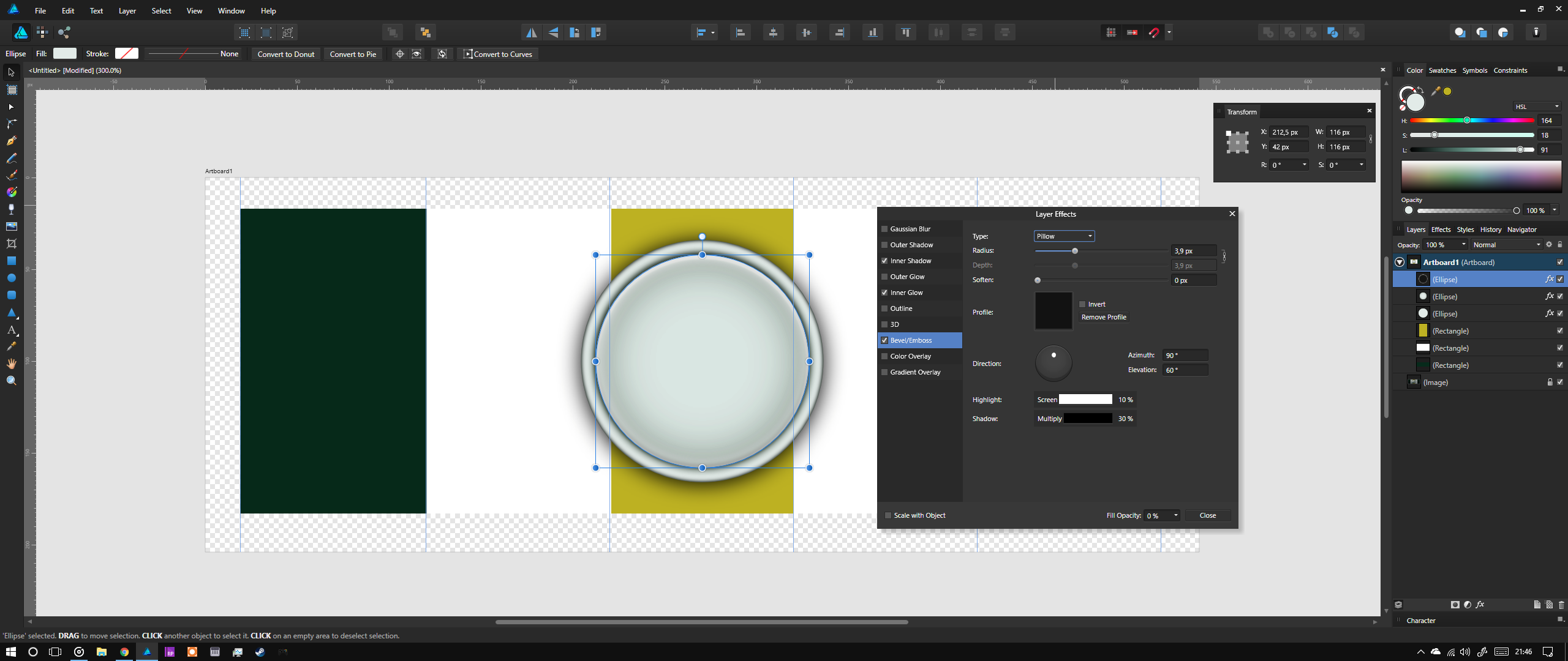
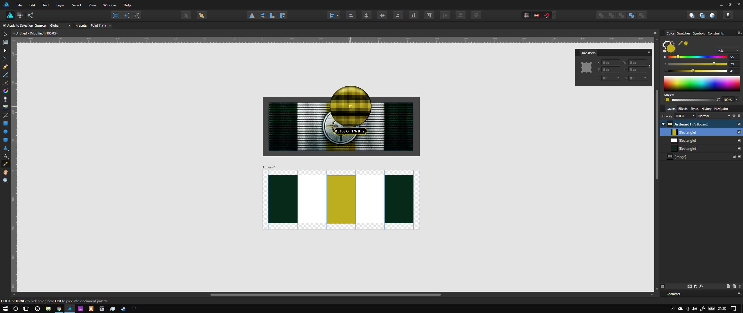
 Hello, I wanted to create something quite simple for the community, so I thought I'd go back to my realistic icon design days and apply some of my methods in AD. For this I digged out the Battlefield 3 "Accuracy ribbon" design. This was originaly made with 3D software but it's not too hard to replicate in 2D. http://battlefield.wikia.com/wiki/Ribbons/Battlefield_3?file=Accuracy_Ribbon.png The basics are: Import the ribbon image into AD and create a new artboard below it Add guidelines for the sizes of objects and where the background color bands meet Start by recreating the shapes over the original image - the background colors, then the golden circle and the rounded, long squares of the aim Try to select colors similar to what you see on the top image Play around with Outer Shadows, Inner Shadows, Bevel and layering different effects until you have the same feeling of volume Add shadows and other lighting details to the illustrationRemember that 100% black shadows on most objects feel unreal. Try to base the color of the shadows off of the object itself or off where the shadow "lands" Finally use images in Color Burn and Multiply mode inside masks to add the gritty feel to the metals and the fabric texture to the background Play around with the saturation of the colors you chose to find the right spot for added realism. Metals that have been "through war" are not polished therefore they shouldn't shine, they should be dull. Please find the final file attached. The texture images in it are for demonstration purposes only and I do not have rights over them. BF Ribbon.afdesign
-
100% vector + some dust texture
- 10 replies
-
- 18
-
-
100% vector
- 4 replies
-
- 6
-
-
- illustration
- realistic
- (and 2 more)
-
100% vector
- 16 replies
-
- 15
-
-
100% Vector + some textures
-
 A realistic grunge banner with a stylized eagle insignia 2, on Flickr Started in Designer, mostly used Photo. 3800x5578 Here is a link to the .afdesign file for this. It includes history and is about 9GB. Copyright Alex Poulsen 2016, copyright includes everything contained with the exception of the fabric texture. Includes the three vector designs. You are free to use the linked .afdesign as a tutorial for creating your own version, however similar the final product may be.
 -
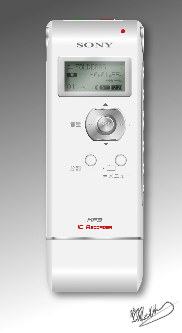
Hi all Its been a while since I posted any work and I was wanting to make another custom icon for a device I plug into my computer again: this time my "Sony IC Recorder" voice recorder. I wasn't able to match the fonts exactly, but it looks good enough for me (especially when its resized really small when used as an icon!). I did find the advanced font adjustments useful at getting "close" to the originals. I was also quite happy with how easy it was to give the rounded effect on the top and the bottom of the device by simple adding more points to a gradient and moving them around until I got a convincing shading. I also took the opportunity to make a custom style for the LCD display, so now if I want one, I just click once and all the works already done! :) Hope you like it :)
- 11 replies
-
- 5
-
-
- sony ic recorder
- realistic
- (and 2 more)
-
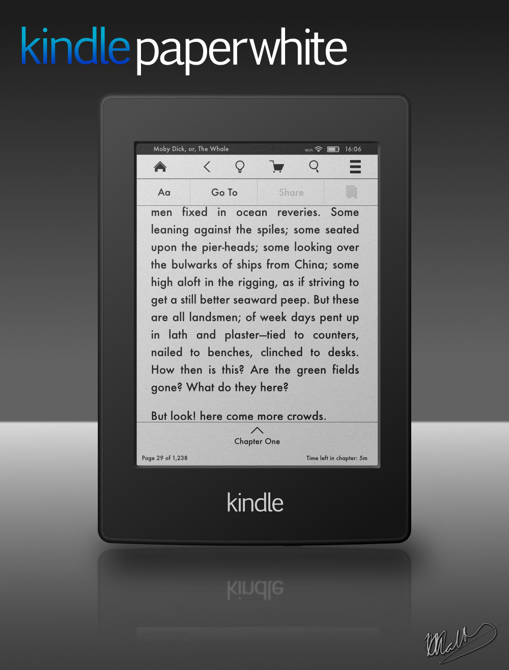
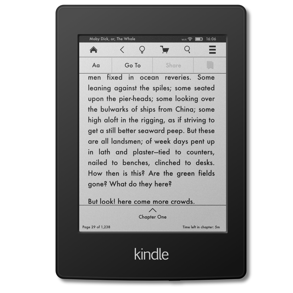
I was making a icon to use as a replacement for the one automatically displayed on the desktop when I plug in my kindle paperwhite and it turned out quite well. So, I thought I'd make it even more accurate and make a marketing-type poster. All vector and all done in Affinity Designer, including all the text, lines and icons on the display. It really wasn't as hard as I thought it would be, mainly because its really a lot of rounded rectangle shapes, but that's what makes vector art (and AD) great :) I'm hoping to make a more 3D-ish one that appears to be rotated around 20~30 degrees around the y-axis sometime, but I'm happy with this "straight on" one, too. I've also include the icon as a png if anyone would like to use it. Hope you like it! edit: re-uploaded the png with a few minor fixes for some strokes getting too big after resizing the layer