Search the Community
Showing results for tags 'publisher 2'.
Found 23 results
-
 Hello everyone, I'm currently facing a peculiar issue with Affinity Publisher 2 regarding the exported PDFs. Although the Table of Contents (TOC) works perfectly within Affinity Publisher, it behaves oddly in the exported PDF. Many headings in the PDF's TOC are not hierarchically structured as expected, though a few are correctly aligned. The first chapter has an TOC in PDF as expected. Any other does no hierarchy at all. Every chapter has it's own styled Heading. So that I have H1a, H2a, H3a for chapter 1, H1b, H2b, H3b for chapter 2 and so on. It seems like this is the issue. But I don't understand why Affinity Publisher 2 reads all headings correctly but PDF does not. Steps Taken: I've made sure that all headings are assigned correctly in Affinity Publisher and have tried updating the TOC before exporting. I've also experimented with different PDF export settings to maintain the structure but to no avail. Has anyone encountered this issue before? Any advice on export settings or other adjustments to ensure the TOC hierarchy is preserved in the PDF would be greatly appreciated! Thank you!
-
 Setup: 1) Hyphenation is enabled (checked) in the Style that I am using for body text and the language is set to Auto (US English). 2) I have studied the help file on hyphenation and have kept the default settings since, if I understand correctly, they provide the most aggressive (so to speak) hyphenation. But it's not working well. I often get loose lines; see the screen shot. In each place where I have inserted a red line, if I type a hyphen followed by a space, the preceding letters and the hyphen jump up to the previous line. So there is certainly space available, but no automatic hyphenation happens. Adding a soft hyphen at these points has no effect. I would appreciate any advice!
-
 I was working on a project and I saved and closed it and then reopened it, changed something and while saving it crashed and from there on every time I change something and try to save, it crashes. I attached the crash report. Hope you can help! 189e5f35-6d6f-4fe8-ad36-5d111f8fba79.dmp
 -
 Does anyone know if you can convert an RGB image within Publisher to a CMYk image? I quite often get PDF artwork from clients that I import into Publisher2, but the photos within these are usually RGB and I need them to be CMYK. Is there an easy way to convert these images all within Publisher2? I thought maybe I could maybe use the Photo persona, but I can only find how to convert the whole document to CMYK, and that doesn't work - the images all remain as RGB. Be good if you could select the image and somewhere select to change it to CMYK. Anyone know if this is possible or do I have to extract the image and convert them through Photo? This can be time consuming, so I am hoping there is an option to stay within Publisher2.
 -
 Is it possible to view two pages (facing pages) without checking Facing Pages in the Document Setup? I don't need two-page masters, and I'm hoping that single-page masters will avoid this problem which Affinity has not explained. But I would still like to see facing pages on my monitor for convenience.
 -
 Hi folks, I have created a flyer, a third of A4, which I have filled with content, backgrounds and a graphic. The .afpub is 1.4 MB in size. When I want to open this document, it takes forever (! - about 4 minutes) until it is open and can be edited. Does this happen often? What can I do about it? Thank you very much, Hooray
 -
Guides are not working in Publisher 2.2.1. I can't drag them from the ruler. They're simply not there. Of course, View>Show Guides is enabled. I can create and delete them in the View>Guides panel, but they don't respond to mouse actions. Is this my issue, or has anyone encountered something similar?
-
 I'm rearranging a-lot of text for garment print. I first started making all the text with the Artistic text tool, but then I found out if I had to resize the text box I should convert the text to "Frame text". Now I have the layout I want however I need to decrease the size of all my text artwork, but when I resize my grouped text frames only the text frame changes size but no the size of the text. Is there a way to resize the text inside the text-frames by dragging?
 -
 Hello everyone! Happy holidays and happy new year. Thank you for reading my post. Am I the only one experiencing this oddity? As in even in version 1 of Publisher, it annoys me that the software doesn't remember the window size and position for say: File >> New or when opening up the Guides Panel to manually add in (type in) guide pixel values. It always centers. Is this a "feature" or is this a bug? In other words, Publisher does not remember window position and size in version 1 and still the same behavior in 2.0.3. Next, how can we can Serif to consider fixing this so that we the end users have absolute control as to where we place and size our tool panels. I am not referring to the Studio Panels, where we can add tool panels and customization. I am talking about the tool panel that pops up when doing File >> New or View >> Guides. Do you see that? No matter where you position and/or resize, the application doesn't remember. It always defaults to center-of-screen.
 -
 In Publisher 2.0.x, it was possible to copy or cut an inline image together with a paragraph and then paste them elsewhere. Unfortunately, this stopped working in version 2.1. If you try doing the same now, the application only copies the text to the clipboard, not the inline image. It doesn’t matter if you use paragraph styles or not. Workaround Cut or copy the image without the text. Paste the image elsewhere. Go back and do the same, but now with the text. Steps to reproduce: Create a new document in Publisher 2.1 Add a text frame. Place the cursor in this frame to import an inline image. Import the image (File > Place…). I used a vector graphic from Designer 2.0.x. Type some text under the image. Select both the image and the text. Press cmd-c to copy (or cmd-x to cut) both items. You can’t paste both because the image is not on the clipboard. I’m using macOS 12.6.5 and the latest Affinity Publisher (2.1).
 -
 affinity publisher 2, show grid doesn't work properly. Show grids has not been working consistently. Currently not at all. A search of the forum shows nothing . . . any ideas?
 -
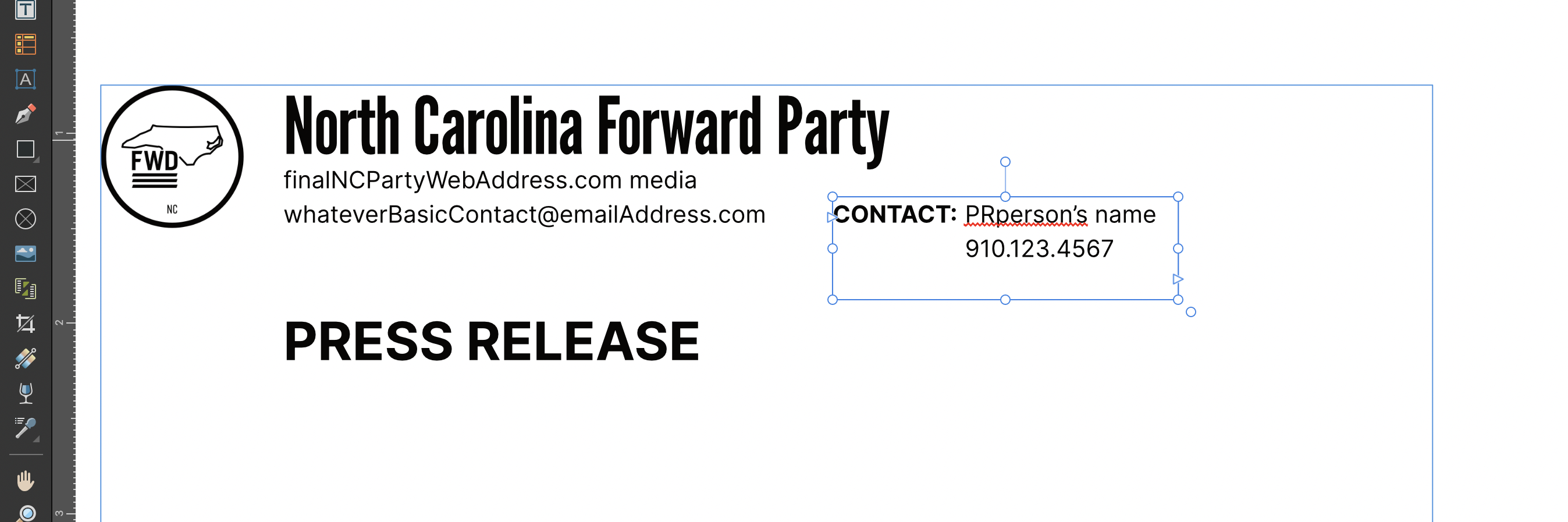
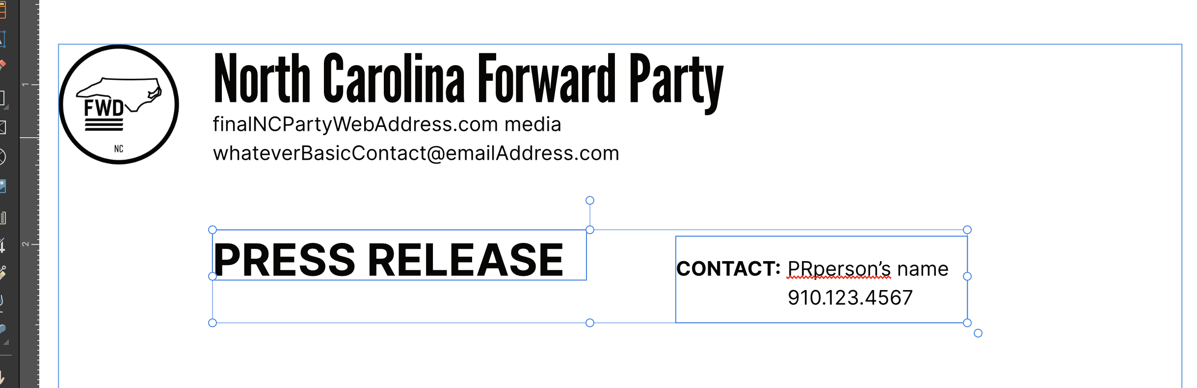
The text is shifting in relation to the position of the text frame. There are no text styles or wraps on any text Pic 1 - the text is at the top of the text frame Pic 2 - when I try to align the <Contact block> with the <press release block> the contact info shifts down I cannot align these text frames
-
.thumb.jpg.a29ef32a92c9b769eea70410dd872021.jpg) Pretty much what it says... is there an easy way, like a keyboard shortcut, to quickly jump between the text entry and its endnote and vice versa? I know in Word you can just double-click the number to switch between positions. Is there as similar shortcut in Publisher? **edit - never mind, I just found it!🤐**
Pretty much what it says... is there an easy way, like a keyboard shortcut, to quickly jump between the text entry and its endnote and vice versa? I know in Word you can just double-click the number to switch between positions. Is there as similar shortcut in Publisher? **edit - never mind, I just found it!🤐**- 3 replies
-
- 1
-

-
- publisher 2
- footnotes/endnotes
- (and 1 more)
-
 My table of contents/index is putting an item which is mid-way down page 12 above the title of page 12. Thus making the item come up under Objective 1 rather than Objective 2. I'm guessing this is about layers. I can't see that the item is linked to a previous page. What am I doing wrong? Thank you.
-
When I try to drag and drop a PDF into publisher, so that I can access it easily and gut out some stuff out of it, Publisher freezes and crashes. Win 11, fresh install. Very annoying. Given that there is not that much new in Publisher (and one is forced to buy it because even basic Publisher files are not backwards compatible), I would expect at least a smooth deployment.
-
Hello! I have two questions about things that I'm pretty sure I didn't have an issue with in Publisher v1. However, I'm a newbie, so it's very possible I'm just doing something wrong... I'm laying out a print book, and both questions can can be demonstrated from one screenshot. 1. This is a minor point, but all new documents seem to be created with a transparent background instead of a white background. How do I change the background to white? It seems odd to, for example, draw a rectangle in the bottom layer... 2. My bigger issue has to do with margins and creating new pages from master pages. In the screenshot above you can see a master page I'd like to use for the first page of every new chapter in my book. If I look at the master page's Spread Properties -> Margins, I see that the inner margin is set to 0.5" and the outer margin is 0.25", which is what I want. As you can see in the screenshot, this shows in the master page as a 0.5" left margin and a 0.25" right margin, i.e. a right-hand page. I would expect, however, that if I use this master page to create a left-hand page, the margins would reverse: the larger margin would go on the right, because that's the inner margin. Instead I get a page with identical margins—the half-inch margin is on the left, i.e. the outside, even though it's a left-hand page. The problem is even worse with two-page spreads. I'd like to repeat a generic two-page spread to flow the body text of each chapter of the novel, but if I begin a two-page spread on the right, not only are the margins backwards, the elements from the master page are in the wrong place. Am I misunderstanding how spreads are meant to be used? Is there a better way to do long flows of identical pages, for example, 20 pages of identical chapter text in a novel? Or do I really need to have separate master pages for Chapter Start Right, Chapter Start Left, Body Text One Page Left, Body Text One Page Right, and Body Text Two Page? Thanks so much for any advice and answers you can offer!
-
 I started an Affinity Publisher 2 document and just copied and pasted my images (work not saved) from Affinity Photo 2. They look very washed out. Doing some research the problem appears to be something with "color profile"? I don't really understand that, but my question being, is my Publisher document ruined, and I now need to start form scratch? Or is there something I can change in Publisher to save my faded images?
 -
 Hello out there, I would be *very* sorry, if that question is already sufficiently solved/answered. But I do only find the same *question*/feature request: How do I colour grayscale tiffs or 1-bit (= b&w) tiffs in AFPub? For professional designers this seems to me a rather vital feature: creating a picture frame inserting a grayscale/1-bit tif in that frame activating the *frame* –> allocating the *background*/frame a certain colour (e.g. red) activating the *picture* –> allocation the picture/content an other colour (e.g. yellow) voilà! You have a two colour logo or even more, by working with gradients, a colourful result! the same to 1-bit/b&w-pictures ("bitmaps"): Every black&white tiff has a *transparent* (because "white") background every black pixel in a b&w (1-bit) tif can be allocated any colour. voilà! :-))) Is there a tutorial for it? I would be very pleased, if that *very important* feature has been realized in AFPub since the first question for it in 2018! Best wishes to your for 2023! Johannes
 -
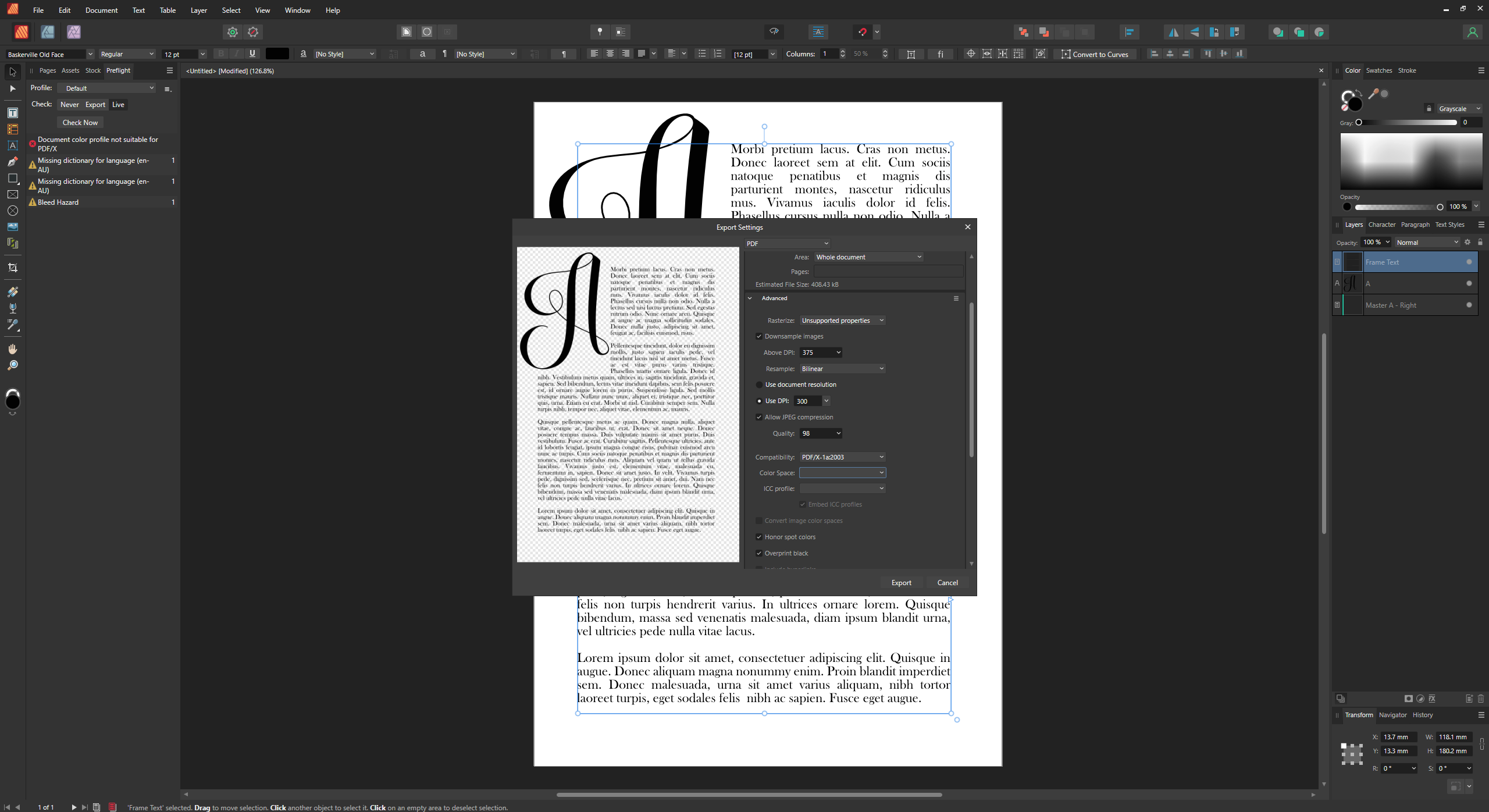
 Hello, I’m trying to prepare a file on Publisher for Ingram Spark and something bizarre is happening with the color space. I create a document in Grayscale (text colour set to Gray 0), yet when I try to export, the Preflight checker objects and says that the “document color profile is not suitable for PDF/X”. Now, Ingram absolutely requires their book text in Grayscale, and exported as PDF/X-1a:2001 or PDF/X-3:2002 (apparently PDF/X-1a:2003 or PDF/X-3:2003 should also work), so I forge ahead and export it as a PDF/X anyway. However, when I reopen the PDF as Grayscale in Affinity, the book text is now Gray 5. When I reopen it without specifying to open as Grayscale, it opens as CMYK, and the black of the body text is all over the shop! C72, M67,Y67, K86. So what is going on? Please note I’ve had to learn this software rather swiftly and haphazardly, with no prior knowledge of anything digital/graphics related. I work in ink and dip pen, usually, so pardon any obvious idiocy I’m committing here. On Ingram’s very helpful File Creation Guide, they note: “SPOT COLORS/ICC PROFILES: Please do not include Spot colors or ICC profiles in your file as these can produce unexpected results during processing. ICC profiles applied to 100% black text often convert to a shade or percentage of gray (less than 100% black). This will result in text in your proof that is not solid black. If text is intended to appear as solid black, including Spot colors or ICC profiles can cause delays in receiving a correct proof.” So this could be the problem. But in the export settings, the option to set the colour space or ICC profile is blank, and the box for “Embed ICC profile” is already ticked and grayed out, so I can’t alter it. I bodged up a quick file to show as an example, here: My text very much needs to be 100% solid black, so any advice would be greatly appreciated! I've searched the forum for anything Ingram Spark related, and have found some very helpful threads, but nothing dealing with this issue, yet. It might be a bug? I also have a related question about this bit of their specifications: “Resolution: 600 ppi for 1-bit black & white line art / 300 ppi for 8-bit grayscale continuous tone images” Color Space: Grayscale LPI (lines per inch): 175 visual (Where do I set this?) Preferred file format: PDF (.pdf) PDF producer: PDF/X-1a:2001 or PDF/X-3:2002” I presume by ppi they mean DPI also, so for a book containing both text AND black ink drawings, do I set the document up at 600 DPI?? And then untick the “Downsample images” box during export? Sorry for so much floundering! Cheers for any help! Valliard
-
 I’m suddenly getting this kind of error when exporting to PDF. This didn’t happen in my previous exports. Used the same fonts as I did before. Had no errors in preflight aside from spelling corrections and bleed warnings before exporting. Weird thing is that this error does not happen when I’m using the Print option.
 -
 Publisher 2.0.0.1604 is crashing a lot. I understand how a crash works. What I wanna know is how I give you as much information as you need to understand where my crashes are coming from and how to stop them in Publisher 2.0.1 or 2.1. Dassit. I'm on Mac Ventura 13.1.0
 -
 I had Affinity Photo, Designer and Publisher 1 set in Window 10 Pro Graphics Settings to use High Performance. Now I have the three V2 applications, the browse button in Windows 10 Pro's Graphic settings seems unable to find the new versions. Is it no longer possible to force high graphics performance with the new version, or is there a work around?
 -
 I have tried everything to toggle on the baseline grid and it wont show up even after adjusting the parameters on the top of the screen. The baseline grid settings don't show up like the other grid settings menu on the right side of the page. Any help would be appreciated!