Search the Community
Showing results for tags 'poetry'.
Found 5 results
-
 I need to lay out a book of poetry. Sometimes the left aligned lines (paragraphs in fact) are too long to fit the page and the customer wants the 'overflow' line to be right aligned. I've been looking to set a style for this. The option of Justify Last Line Right works if there is a first line (although it can look messy with big gaps) but if all the text fits on the line it is also the last line and so becomes right justified. Is there some way out of this? I.e. left aligned for the first line but right aligned for the second?
 -
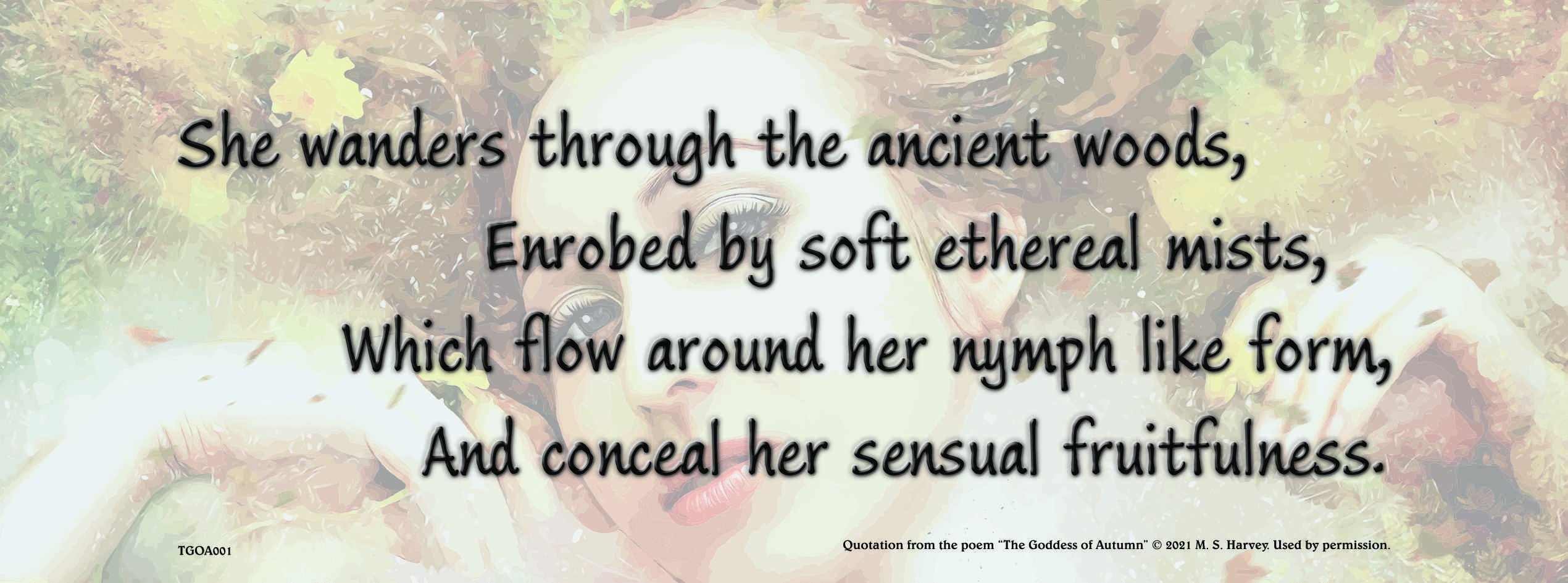
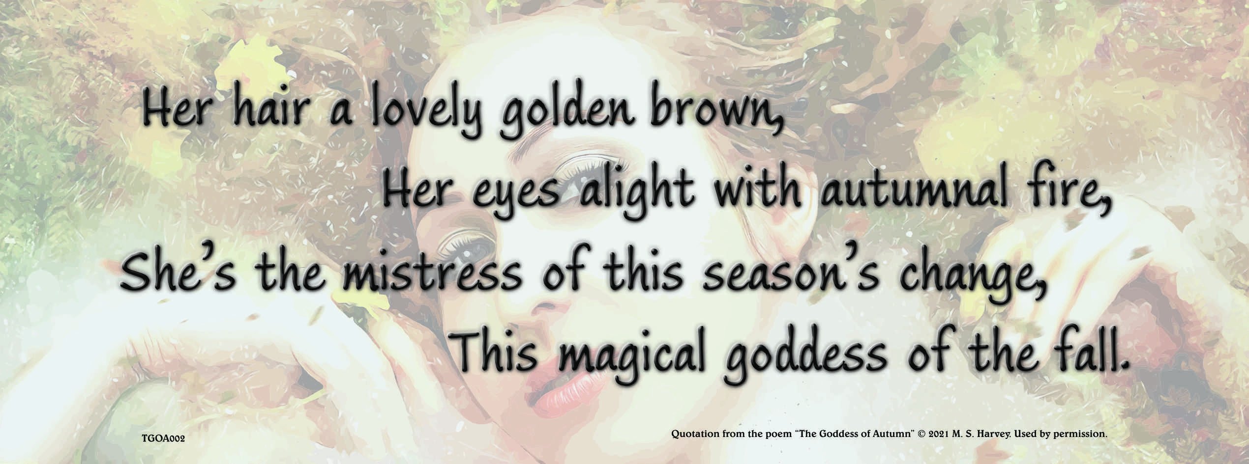
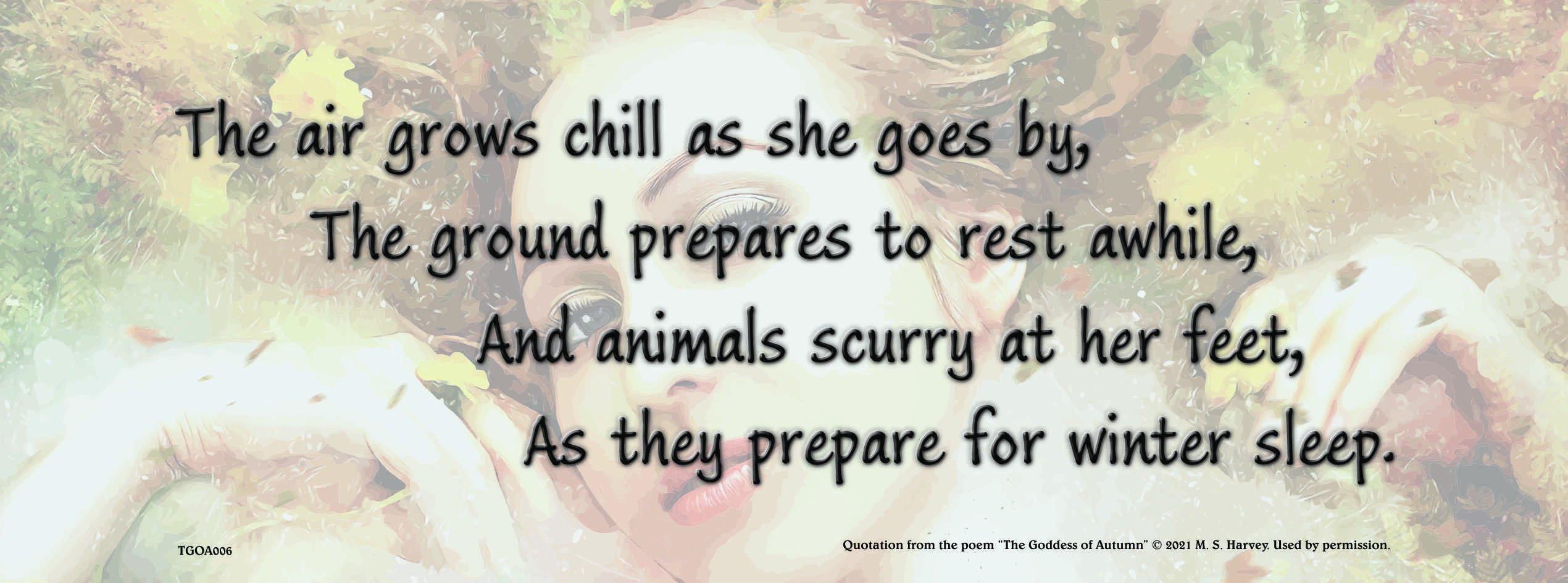
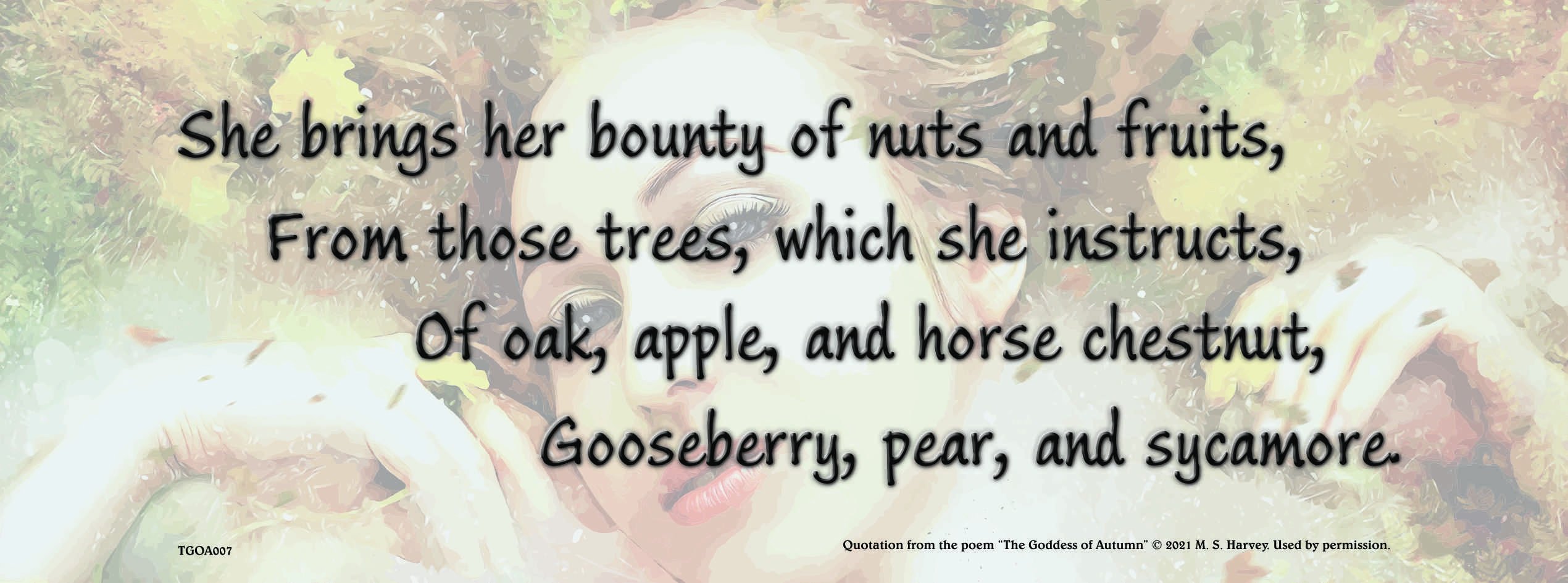
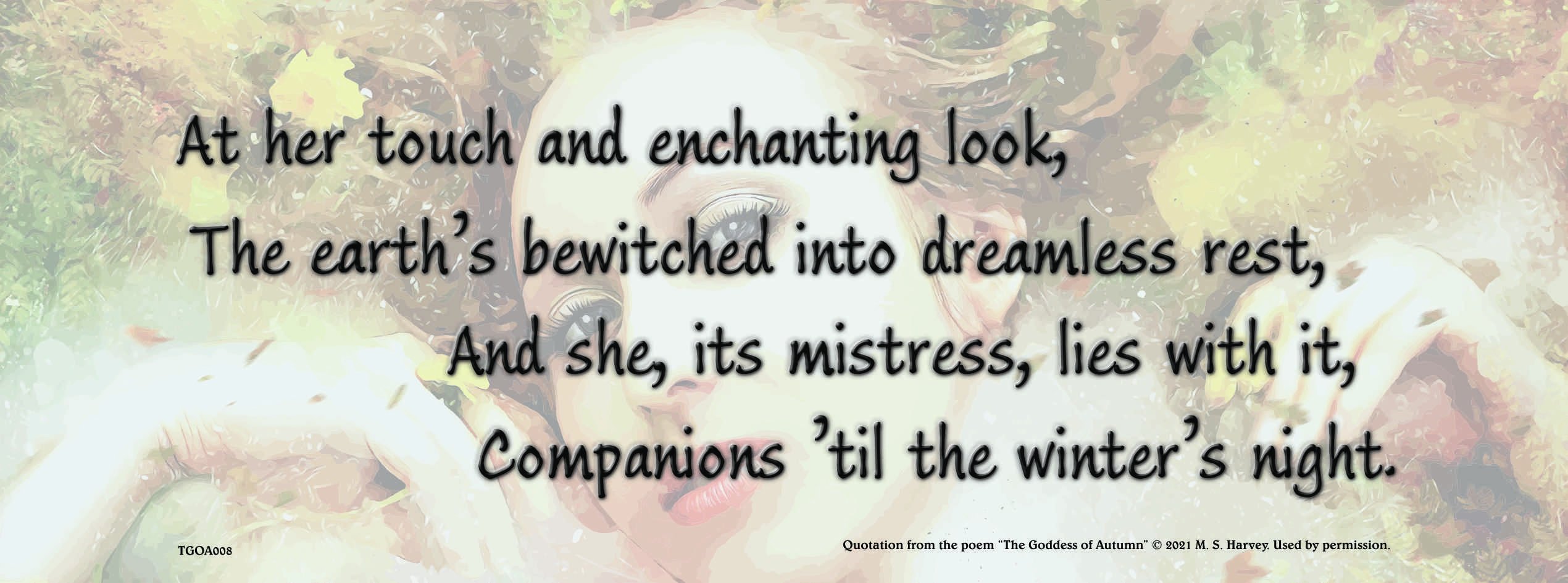
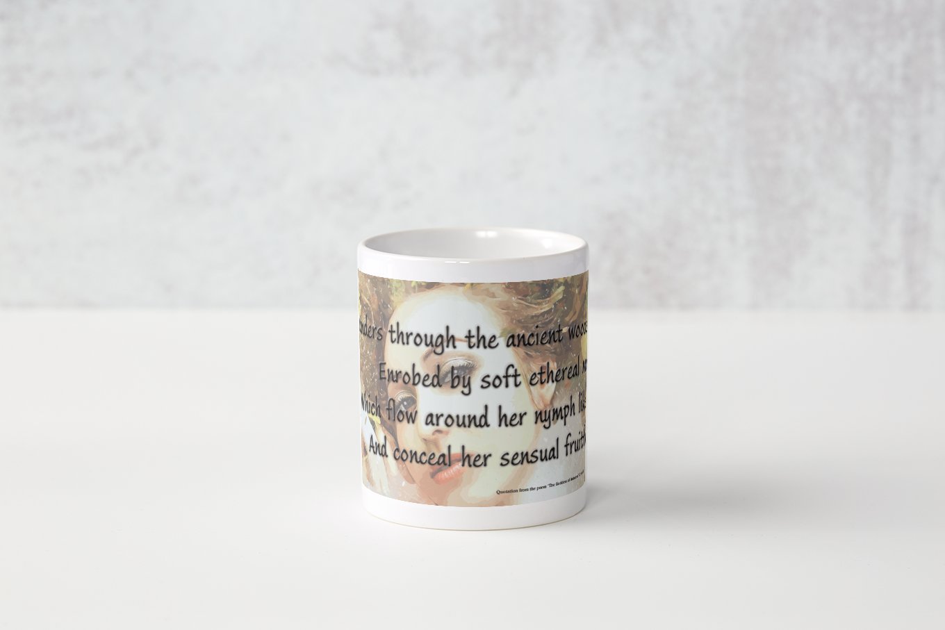
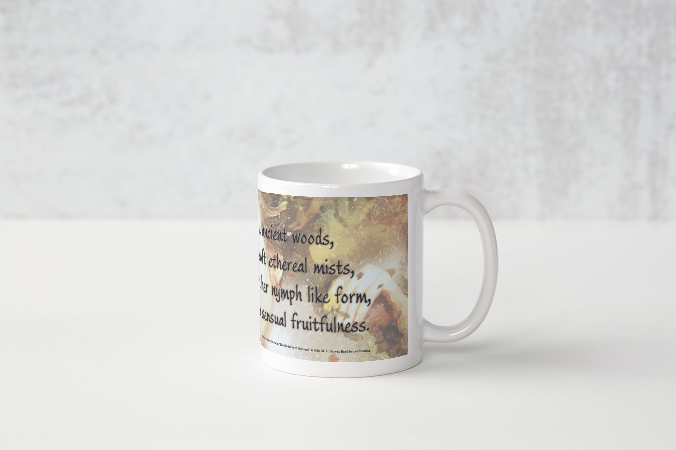
 As an experiment in getting poetry onto every day items, I thought a set of mugs might be interesting. This was an interesting trial. I chose The Goddess of Autumn as it is the most classical style of poem I have written. The font used is Ink Journal and the image is a vector traced version of an excellent image from Pixabay. I used Artistic Text and Alignment Tools to create the staggered line layout. The emboss effect was used to add a little interest to the main text design. Here are eight JPG files of medium quality to showcase the designs.
-
William
-
Here is a poem I created in LibreOffice Writer and laid out in Affinity Publisher. The toasted cheese image used was created by using a combination of Corel Painshop Pro X4, BenVista PhotoZoom Pro, Fotosketcher, Corel Paint It and Affinity Photo. Affinity Photo was used to enhance the detail in the Tone Mapping Persona. Toasted_Cheese.pdf
-
- 1
-

-
- photozoom
- corel paint it
- (and 6 more)
-
I'm a day early, but you might be busy tomorrow! My New Year video, made in the usual way ...


.png.68afc99346fd71b10d82ec41ad638fe8.png)
.png.d207e28de8d031f8520ab5cefa05209b.png)
