Search the Community
Showing results for tags 'photorealism'.
Found 14 results
-
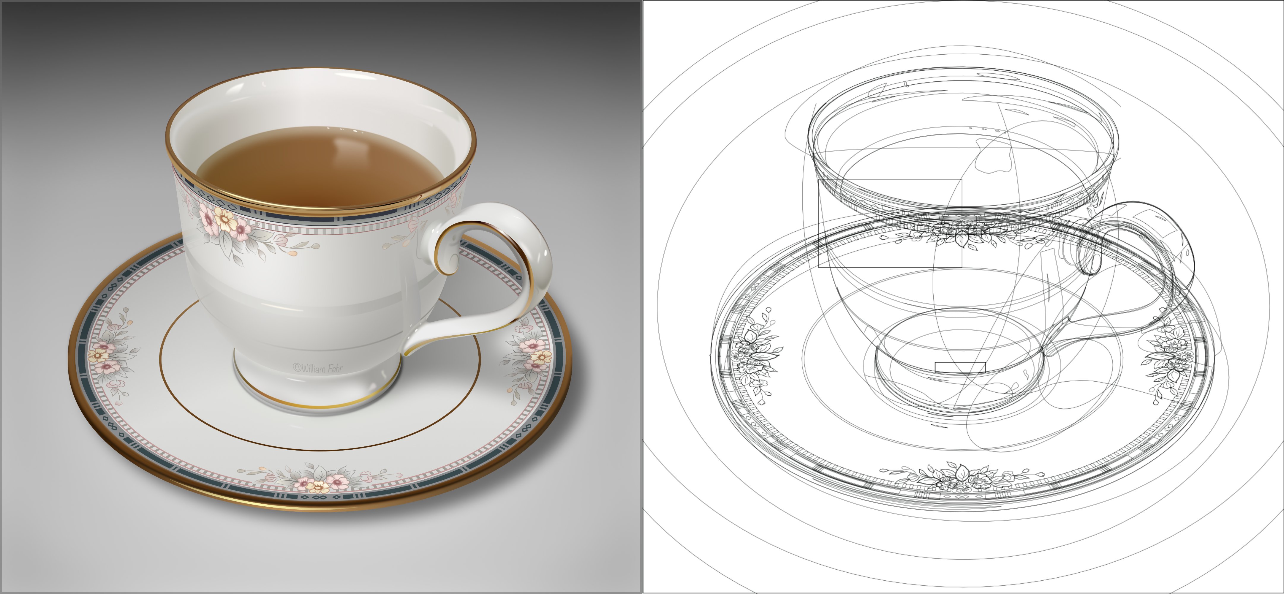
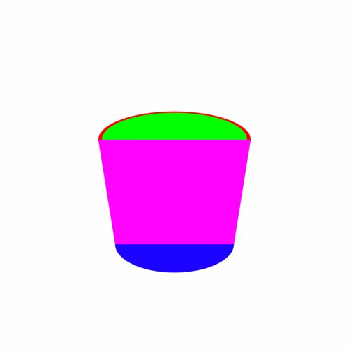
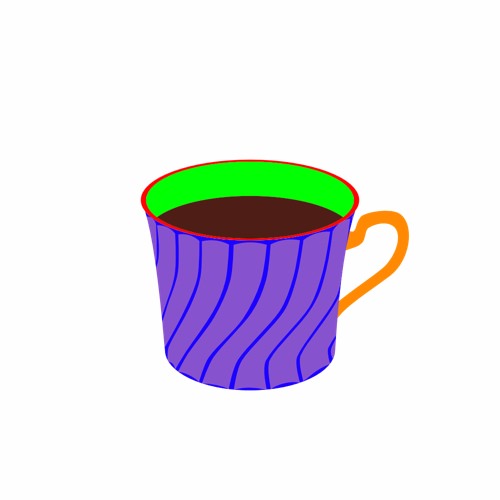
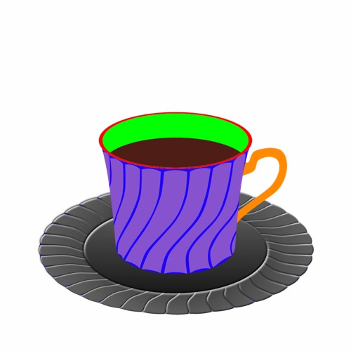
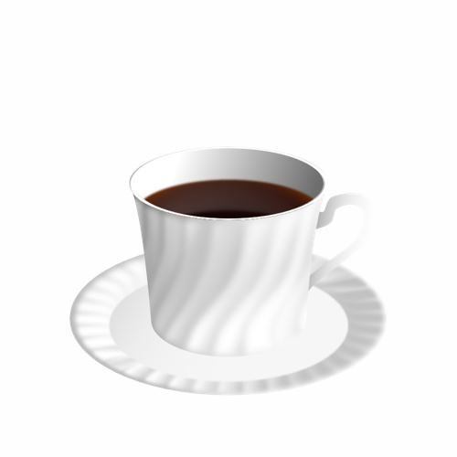
“Coffee Time” I’m really not very good with hand drawing (stick figures only!) so I really like the concept of vector drawing in which I can make changes after the fact and tweak to my hearts content. To learn how to use Affinity Designer (I have played with some vector stuff before in Inkscape but nothing much at all), I decided to make something look as real as I could that wouldn’t need too much raw drawing skill and I came up with “Coffee Time” : 100% created from scratch vector drawing (no brushes or pixel layers except for the use of the fx “Layer effects"). I did use a photo for reference but I didn’t do any tracing or anything. I’m really, really happy how it turned out. I tried out all sorts of things and learned a lot but it was a lot of fun :) As this is a "Learn and Share” forum, I thought I’d share exactly what I did (see the other other attached pictures). It’s not perfect and I’m a beginner, but hopefully others might be able to learn something, too Enjoy! :) My Process: 01 Create 2 sets of circle shapes to represent the top and bottom of the cup. Squish the top and the bottom with the move tool. The top circle has a smaller one on top to remove later to make a lip for the cup. I deliberately used bright colours to make the shapes easy to distinguish from each other. 02 Join the circles with the corners of a rectangle shape to form the side of the cup. 03 Shape the rectangle with the node tool. Add a handle. Clone the top circle and move it down to make the surface of the coffee. 04 Create a set of “shading shapes” to put on top of the side of the cup. These will then be given a gradient colour and transparency to give the illusion of a bumpy surface. 05 Create some circles and overlay some shading shapes . I used the the smart duplicate function to repeatedly rotate duplicates of the shading shape easily. 06 Squish the saucer with the move tool and move into place under the saucer 07 Change the colours to something closer to the final version and play with gradients and transparencies. I also blurred it to make it blend more naturally. Once I got something that looked good, I made a style of it and then applied it to the others and then hand tweaked each one. 08 Do the same to the saucer. Also added some detail (reflection of the inside of the cup and blurred it) to the coffee. 09 Add a background with a gradient. I used the noise slider to give it some texture. I also added some steam with just a hand drawn shape. 10 Add a shadow. I just duplicated the cup and saucer, blacked them out and then put them in place underneath everything and used the shear tool to project it out. I also added some fine detail on the edge of the side of the cup to add to the bumpiness illusion. Made the lip a nice shiny gold with a slightly tweaked version of the built in “metal” style. Added some self shadowing to the saucer and further deformed the circle shape it to give a more 3D look to it. 11 Added reflections and spectral highlights to the cup and saucer. Now it looks nice and shiny. For the final version, I also added some bubbles to the coffee (lots of circle shapes) and the text, converted to curves and then given a steam like style (actually the same one I used for the shading shapes!) and then each character rotated and scaled to make it look like steam from the coffee.

- 10 replies
-
- 13
-

-
- coffee cup
- vector
- (and 3 more)
-

affinity designer A can vector done in Affinity Designer.
nasu wong posted a topic in Share your work
You can see How to do this in my channel on you tube. Hope you like it. Thank you.
-
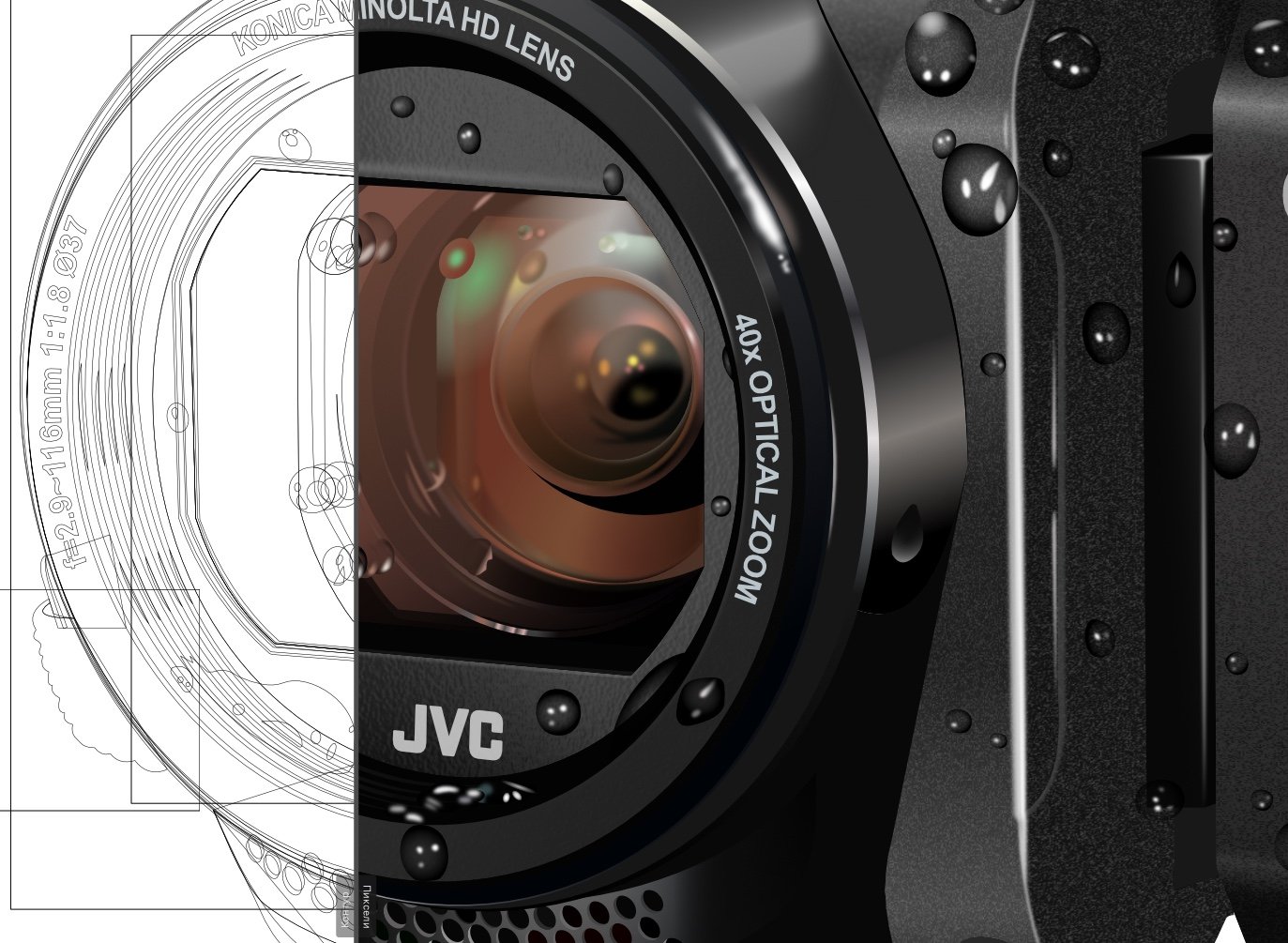
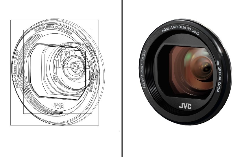
This is a work in progress trying to create Photorealism from vectors using Affinity Design. Unfortunately not having a mesh warp tool is proving difficult but we are getting there slowly
- 13 replies
-
- 2
-
-
- mesh warp tool
- photorealism
- (and 1 more)
-
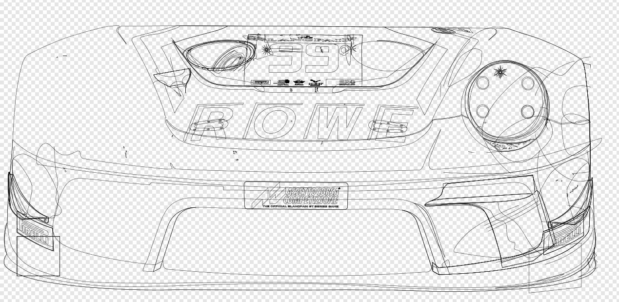
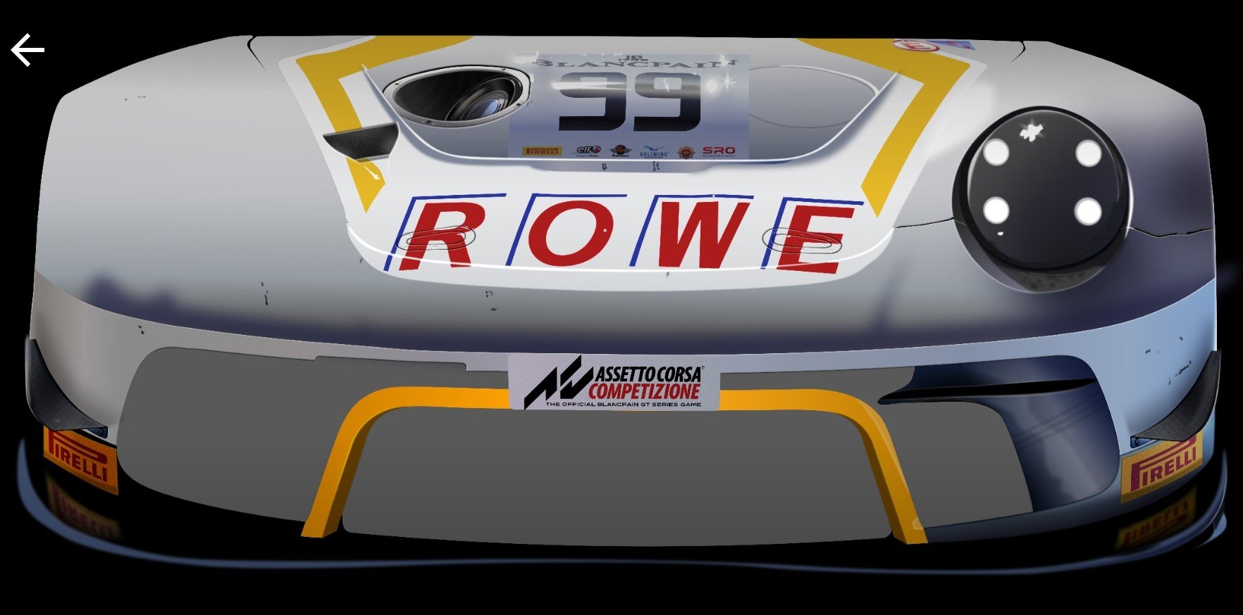
Car all vectors no raster layers
- 25 replies
-
- 31
-
-

-
- car all vectors
- photorealism
- (and 1 more)
-
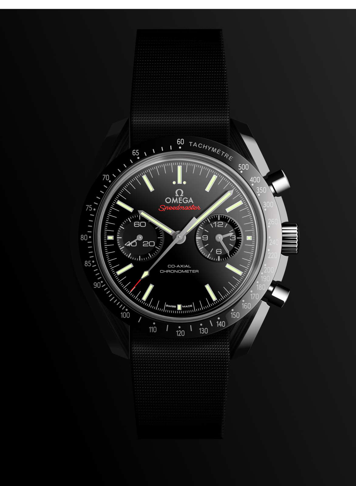
Hi, For my fourth try in AD I wanted to illustrate at Omega Speedmaster watch. Think it worked out well :-). Still a few glitches here and there :-( The hardest to figure out how to make was the wristband with the try to make it look woven. I did it with a costume made brush I made. I am still amazed how well AD performs. Great to get under the skin of the software. I set my self these challenges (HTC Phone, Nexus phone, Bulb and this) so that I would be sure to really learn to use AD, not just fooling around. Compared to how I usually does these illustrations Photoshop (Vector Layers), then AD is by far the easiest. Please enjoy! If anybody is interested I can upload the original AD file. UPDATE! I have added the AD original file also now. Br, Philip Omega.afdesign
-
Per suggestion from @Alfred Affinity Designer on the iPad Pro...my go-to software/hardware combination. Thanks Serif. IMG_0195.MOV
-
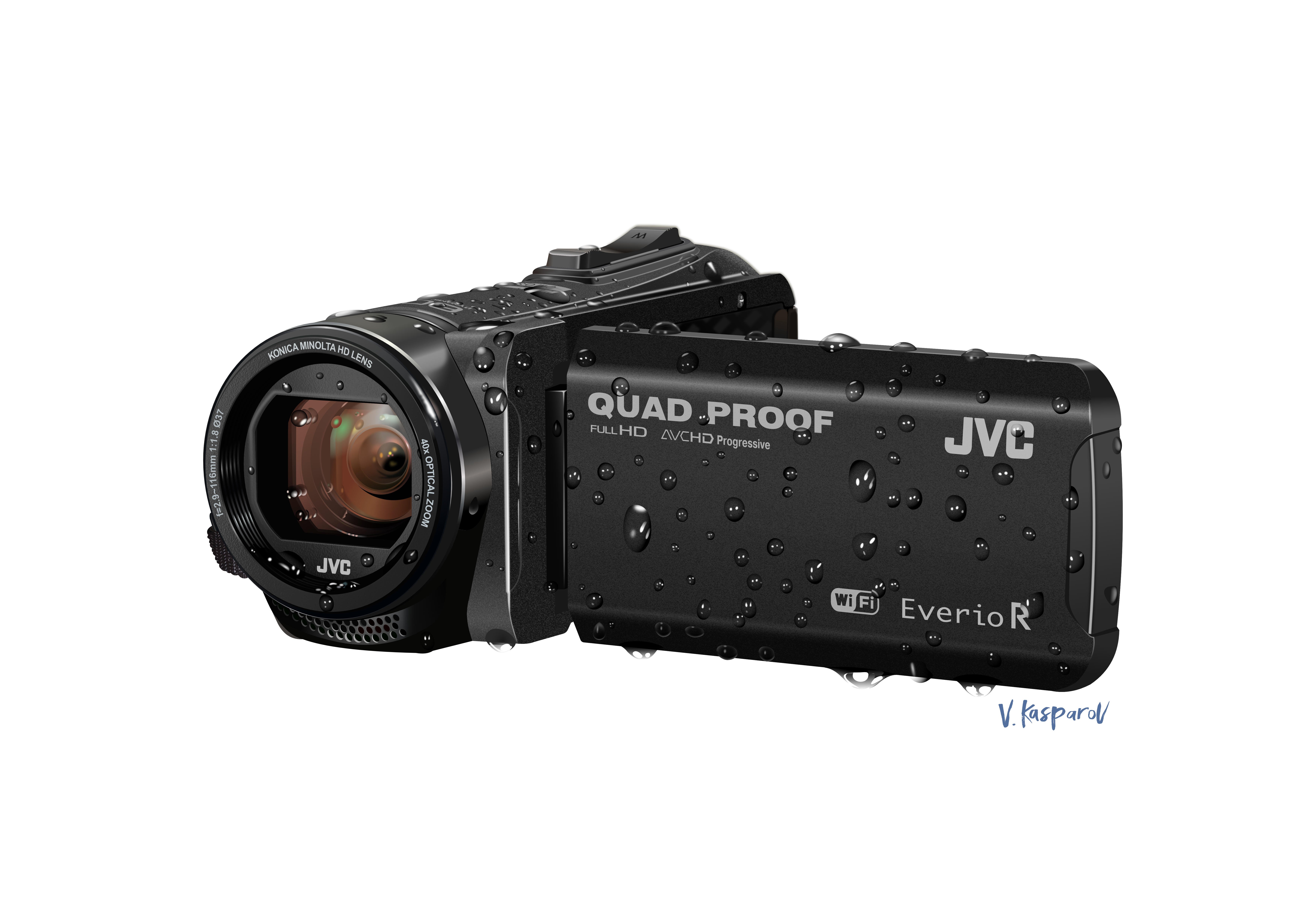
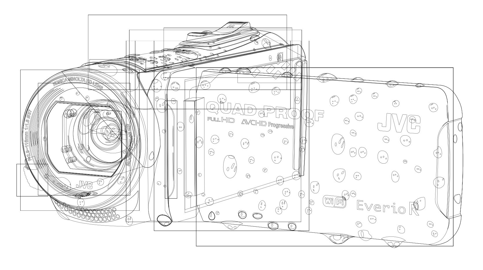
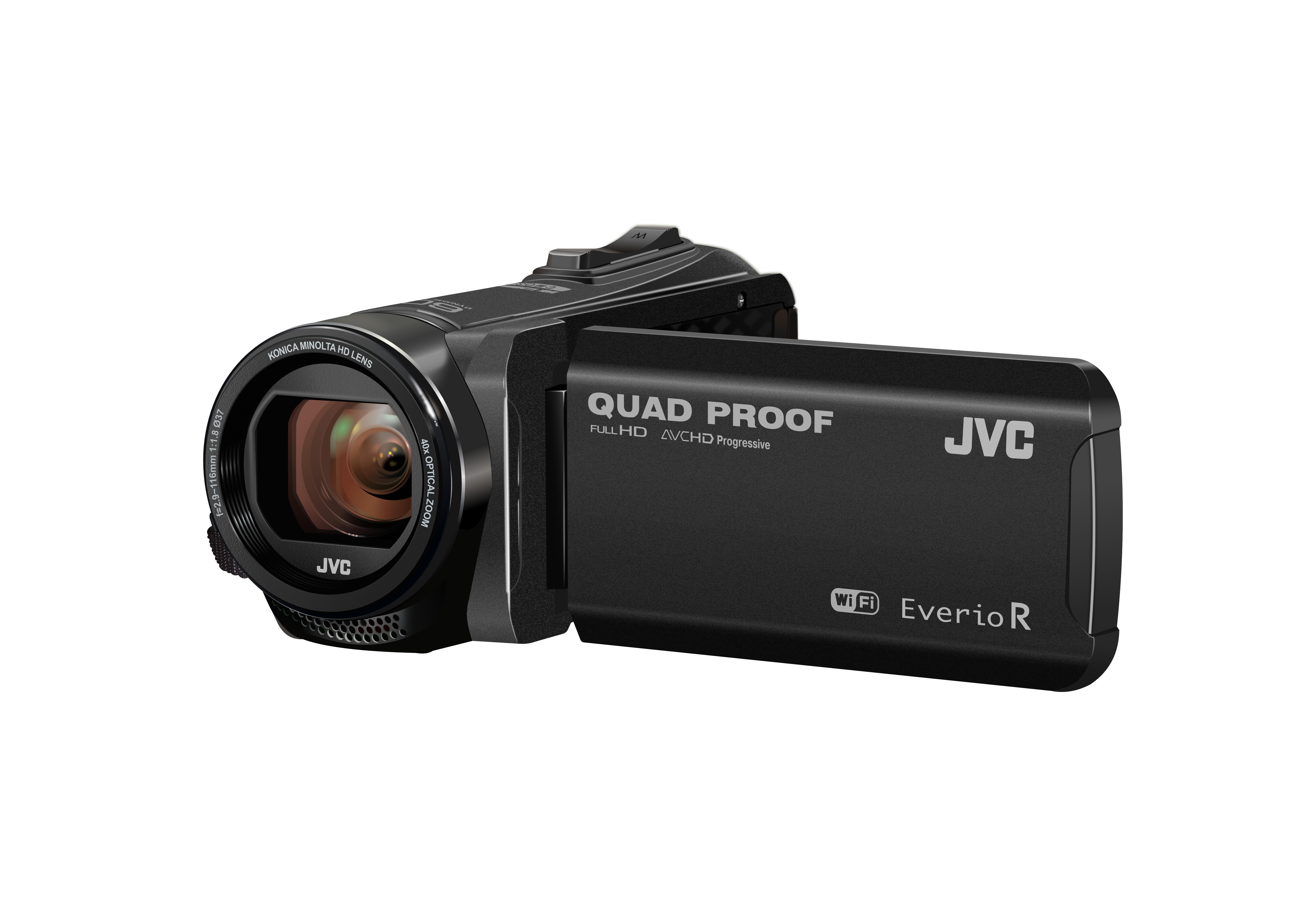
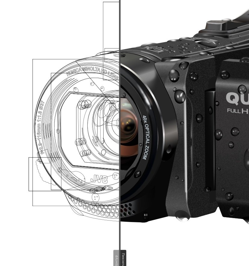
In the footprints of my video camera. Drawing an object photograph.
-
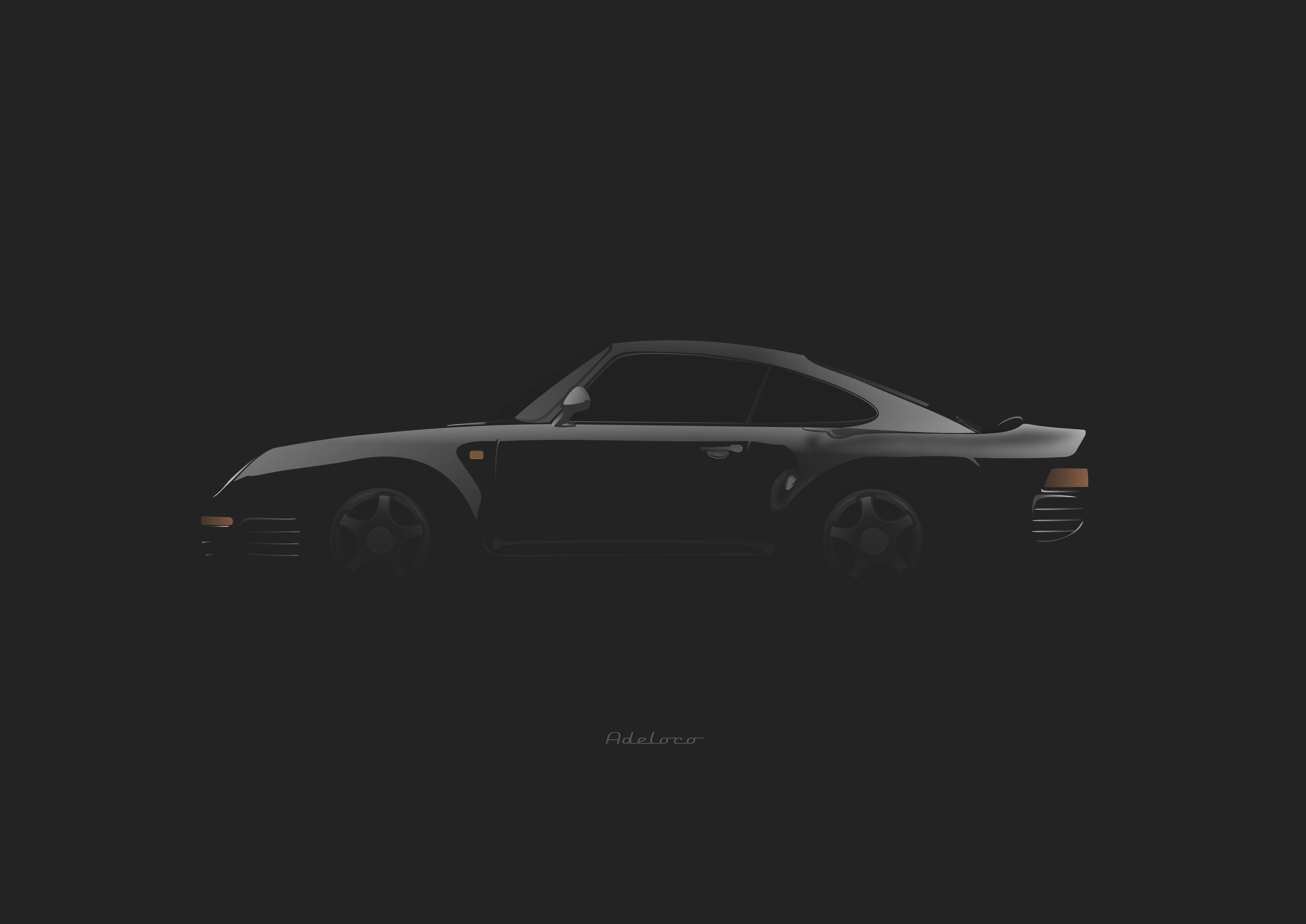
Inspiration, PORSCHE 959.... With AD :)
-
I must say that I don't miss Adobe at all. Kudos Affinity on creating great design tools!
-
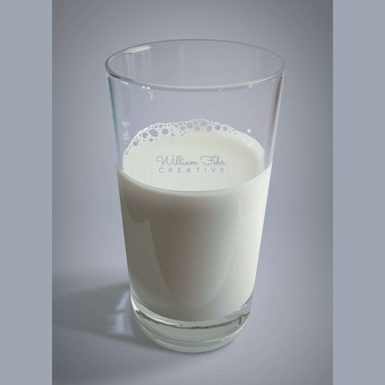
I feel a cup theme coming on. All done in Affinity Designer's Draw Persona, lot's of blur fx and transparencies. Ideally, I would have used a' blend tool' or 'blend along path' to created the equaliy spaced and repeating patterns, but AD doesn't have it. Soooo, I had to eyeball everything, and I now have a headache. :-)
- 14 replies
-
- 24
-
-
-
- vector
- photorealism
- (and 1 more)
-
100% vector
- 4 replies
-
- 6
-
-
- illustration
- realistic
- (and 2 more)
-
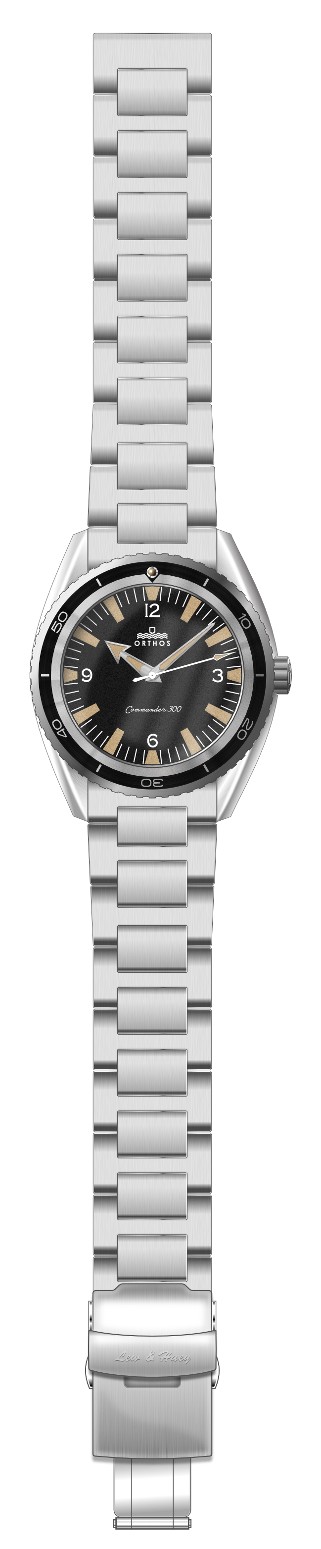
Hey guys. I'm loving Affinity Designer and Photo and switched over as my Adobe subscription ran out around Affinity's release day. I am participating in the betas and am really impressed with the team's work and engagement with users. I am currently working on a watch project in WatchUSeek's F71 (Affordables) forum and this is the result. An homage to the vintage and modern Seamasters and James Bond, we are partnering with Lew and Huey watch co to have this made into a real watch! This has been my first full project rendered completely in Affinity apps and am now not pining for AI, or PS in any way. lol :D
- 7 replies
-
- 5
-
-
- affinity designer
- affinity photo
- (and 1 more)
-
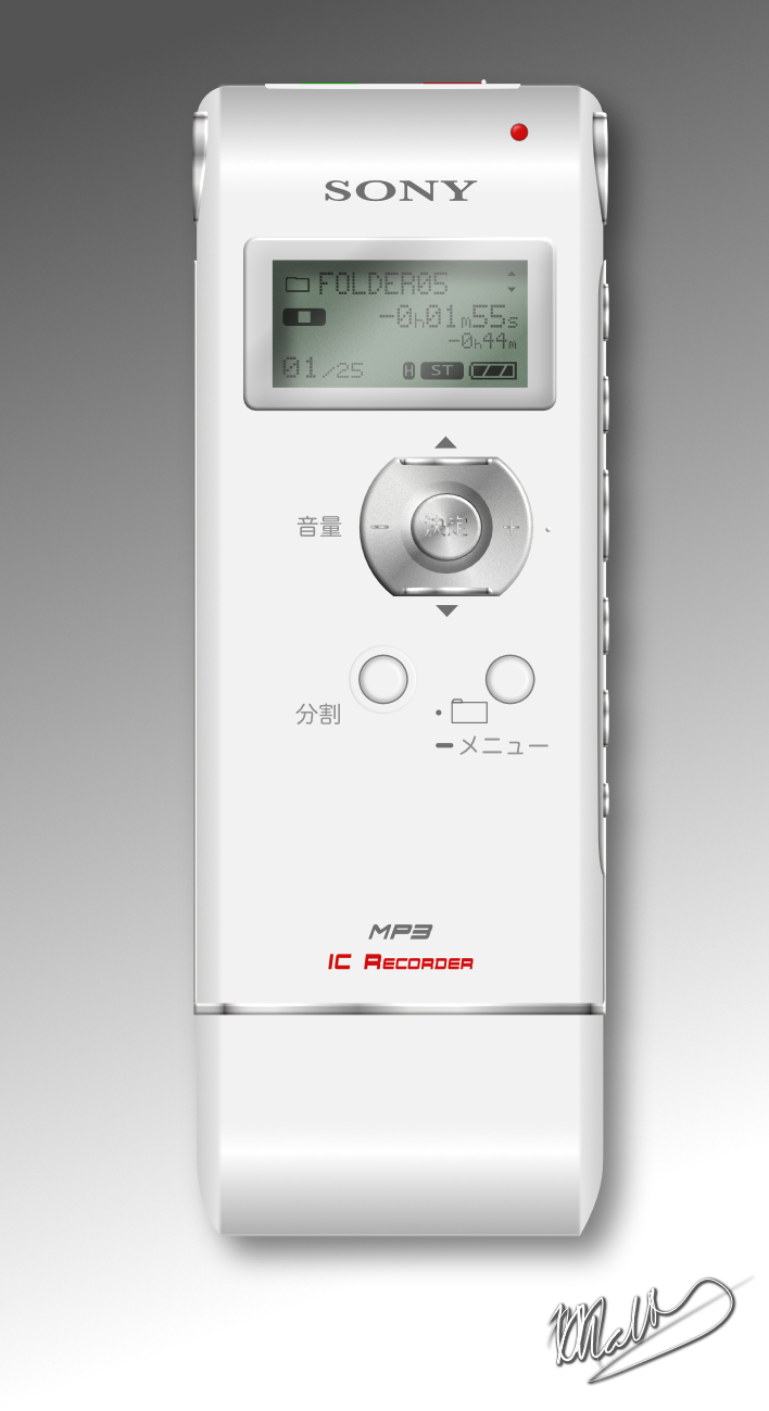
Hi all Its been a while since I posted any work and I was wanting to make another custom icon for a device I plug into my computer again: this time my "Sony IC Recorder" voice recorder. I wasn't able to match the fonts exactly, but it looks good enough for me (especially when its resized really small when used as an icon!). I did find the advanced font adjustments useful at getting "close" to the originals. I was also quite happy with how easy it was to give the rounded effect on the top and the bottom of the device by simple adding more points to a gradient and moving them around until I got a convincing shading. I also took the opportunity to make a custom style for the LCD display, so now if I want one, I just click once and all the works already done! :) Hope you like it :)
- 11 replies
-
- 5
-
-
- sony ic recorder
- realistic
- (and 2 more)
-
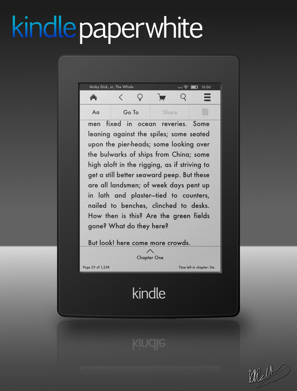
I was making a icon to use as a replacement for the one automatically displayed on the desktop when I plug in my kindle paperwhite and it turned out quite well. So, I thought I'd make it even more accurate and make a marketing-type poster. All vector and all done in Affinity Designer, including all the text, lines and icons on the display. It really wasn't as hard as I thought it would be, mainly because its really a lot of rounded rectangle shapes, but that's what makes vector art (and AD) great :) I'm hoping to make a more 3D-ish one that appears to be rotated around 20~30 degrees around the y-axis sometime, but I'm happy with this "straight on" one, too. I've also include the icon as a png if anyone would like to use it. Hope you like it! edit: re-uploaded the png with a few minor fixes for some strokes getting too big after resizing the layer


.thumb.jpeg.3b39f5fbb33d6270a620ed67c2ebde92.jpeg)