Search the Community
Showing results for tags 'palettes'.
-
 I have the following suggestions for improvement to make working with the Colors palette easier and more efficient: When working professionally, it is usually necessary to use the document color palette, because you usually need a clear color list with the colors that are specifically needed in the document as is the case, for example in most layout programs (such as InDesign and QuarkXPress). Therefore, it would not be bad to be able to set in the preferences that when creating a new document, the document color palette is always automatically selected and displayed as default. In the preferences you could also set the color palette view (e.g. color swatches or list of colors). Furthermore, it would not be bad if this document color palette already contained a few important colors, as in InDesign and QuarkXPress: The three CMYK basic colors, a black which is already set to overprint and a color for registration marks. Until now, unfortunately, you have to create these special colors manually each time. This is very annoying, especially with the black, because you usually need it for the text, which always has to be professionally overprinted. It would also be generally better with the color palettes if you could change some color options, such as color names directly in the color list. Up to now, you always have to open the color dialog window of the respective color first. This could be done like in InDesign, where you click in the list name and move the mouse cursor out a bit. On the other hand, it would not be bad to be able to set some color settings in the color options dialog window, which until now can only be changed via the context menu of the selected color (e.g. spot color/color spot or overprint). In the document color palette you could also add that when you create a new color, you can take one from another palette in the program (e.g. insert a Pantone color into the document palette). I hope that some of these things can be implemented in newer versions. The preset options alone would be a great help when working.
 -
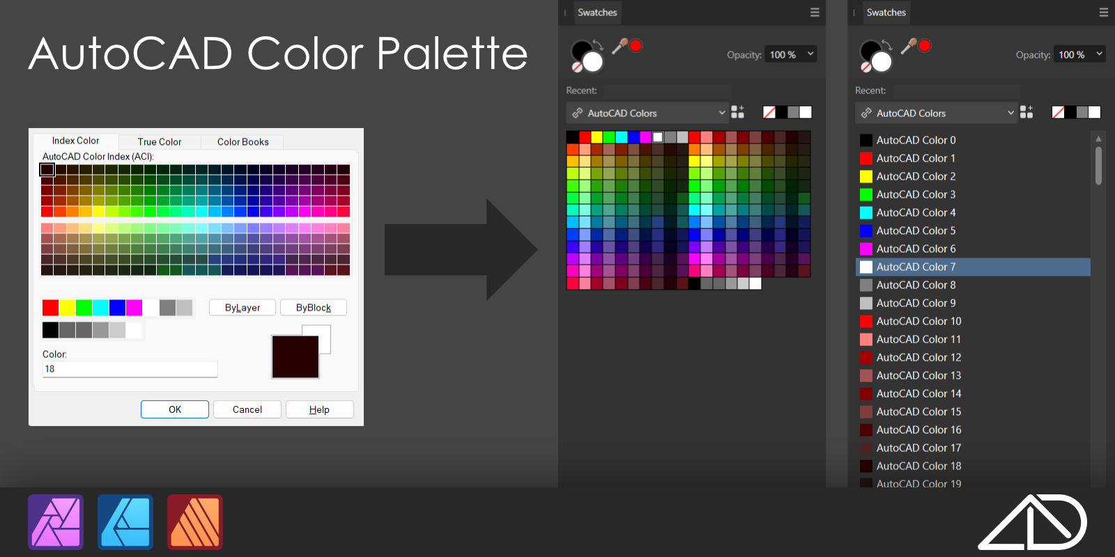
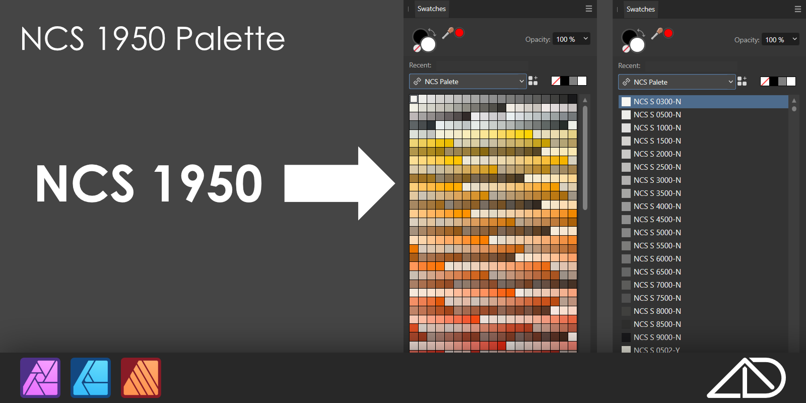
For those who will find it useful. Hopefully organised to your linking. AutoCAD Color Palette Color Palette of 256 *AutoCAD Colors with names as AutoCAD Index numbers. https://archidolt.gumroad.com/l/cadcolaff RAL Classic Color Color Palette of all 216 RAL Classic colors with number and name in English. https://archidolt.gumroad.com/l/ralcolaff NCS Color Palette Color Palette of all 1950 of NCS (The Natural Color System) colors named with their code. https://archidolt.gumroad.com/l/ncscolaff

-
 Hi everyone, I've several documents which share a set of "brand" colours for text and shapes. I now need to change the colours across all the documents. I'm expecting that this may not be the only time I'm asked to do this so I'd like to rejig everything so that it can be done efficiently on the second and subsequent request. The history: for the first document I created a "base" document with a document palette and used (standard?) colours defined in it. No Global or Spot colours (yes, I know - silly me). I then copied this document as the basis for the others and built the contents for each one. Then came the client change requests. So I'm now in the position where I have several text frames and artistic text strings, for example, spread across several documents that are the wrong colour and need to be changed across all of them. From my understanding I think I need a Global Colour in an Application Palette. However, this seems to be impossible to create. I can create Standard Colours in an Application Palette but this isn't bound to the objects that use the colour, instead it appears that the colour is copied from the palette when first assigned and after that the object's colour is independent. Is my understanding correct? I feel that I've unwittingly painted myself into a corner with this one and that there is going to be a truck load of work applying these change requests. If anyone has any suggestions of how to ease the pain then I'd appreciate hearing them. (As an aside, is there any fully comprehensive documentation that explains how the palette system works in AD, apart from the online help?) I'm using the latest release of Affinity Designer on Windows10.
 -
 I hate to complain but until Affinity "fixes" its absurdly weird colour system, the suite will remain second best compared to Adobe. The Bullet List maker is a total cock-up, too. They are both so irrational that I can't even explain what's wrong with them. Adobe has Aff beaten in this regard, hands down.
 -
 Is it possible to access swatches from the context menu as shown below? Of course I mean document palettes should be listed here shouldn’t they, logically? If not, why not? Thanks
-
Created this palette as I'm yet to set any colours for print as RGB/HSL 🧐 Palette simply contains C/M/Y/K at 100% plus some rich and super blacks Default-CMYK.afpalette
-
Serif Team! - Killing in in 2020! - Just a couple of ideas I had today and the context for them. I have been doing experiments comparing the pressure curves and response in Affinity vs that of Procreate. In my old workflow, i was doing most of my drawing and inking in Procreate, and moving my inks or pencils over to Affinity to complete any color or vector work that I was doing. I have come to enjoy the tight control I am able to achieve using Affinity Designer's brush settings and customization and want to start completing my entire workflow from start to finish in Affinity. That being said here are my ideas. 1. I enjoy being able to hide the studio, and I even like the tap patterns set up to operate it; but it seems sensitive. I often reveal it by accidental touch even though "touch for gestures only" is set to on. - Why not put another tap option there once the studio is hidden? - I envisioned a "lock" icon. So that I could hide the studio - then lock it. That way I can focus on drawing, and not be interrupted by the reappearing studio, and accidental touches. 2. The Palettes. Procreate really did a great job in the last update; allowing users to move the palette around on the canvas. - Why not do the same, using a similar interface method. - A handle at the top of the window, allowing for it to be moved around the spread. - Maybe even appearing on the screen as the studio is hidden? - So I cold minimize my distractions while I am changing colors etc. - I just want to paint, tap and select a new color, and paint some more. That's my two cents for the day! - Keep it up!!!!!! Enjoying the heck out of this app, and all your apps every single day! Cheers, Robert
-
 I'm not finding any easy way to edit palettes. For instance, I accidentally added a bunch of colors to the provided 'Greys' palette, and want to delete them, but right clicking each color one by one and then confirming that I'd like to erase the color is tedious. Is there a better way?
 -
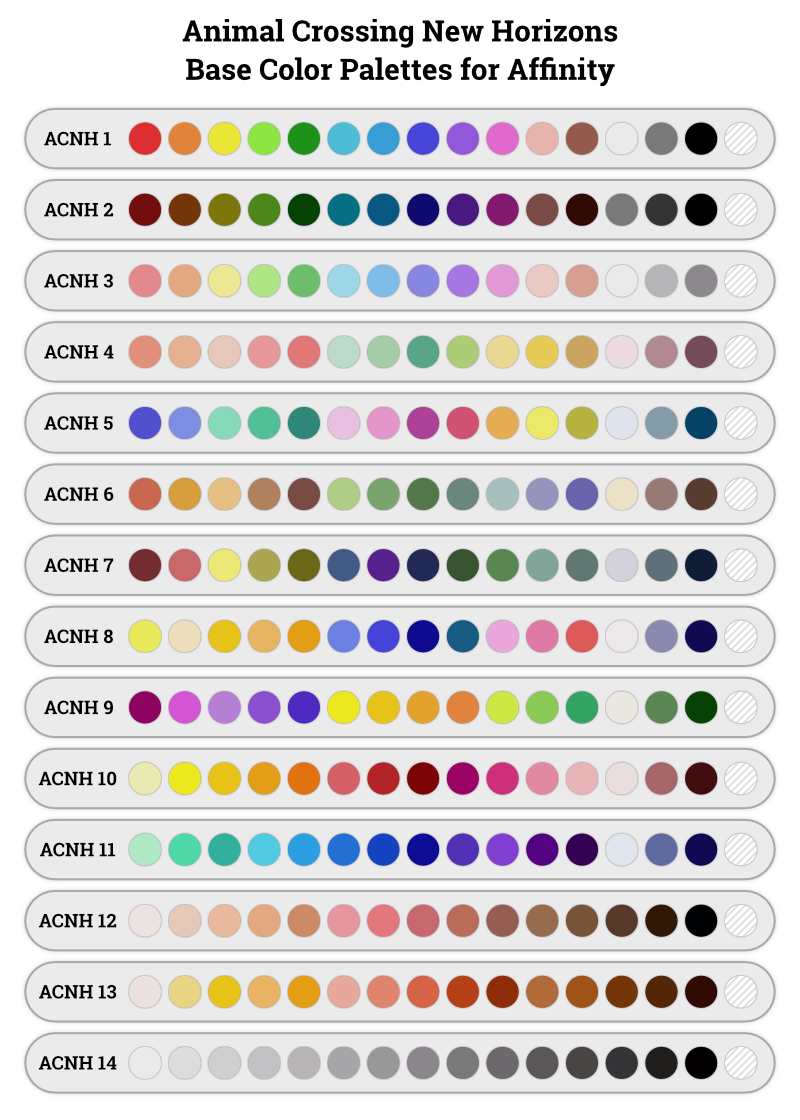
Do we have any Animal Crossing fans in this forum? Animal Crossing New Horizons was just released yesterday, and as it's the weekend, I am letting my nerd side show stronger than usual. I have created a series of Affinity palettes that correspond to the 14 palettes of base colors for designing patterns in Animal Crossing New Horizons. I would rather work on my designs in Affinity Designer and then copy them into Animal Crossing. If you are like me, maybe these palettes will save you some time. Here is a reference image for all the palettes: Here are all 14 palettes and the reference image in this zip file: Animal Crossing Affinity Palettes.zip Credit and disclaimer: I created these palettes based on an image posted in reddit. I make no claims to 100% color accuracy.
-
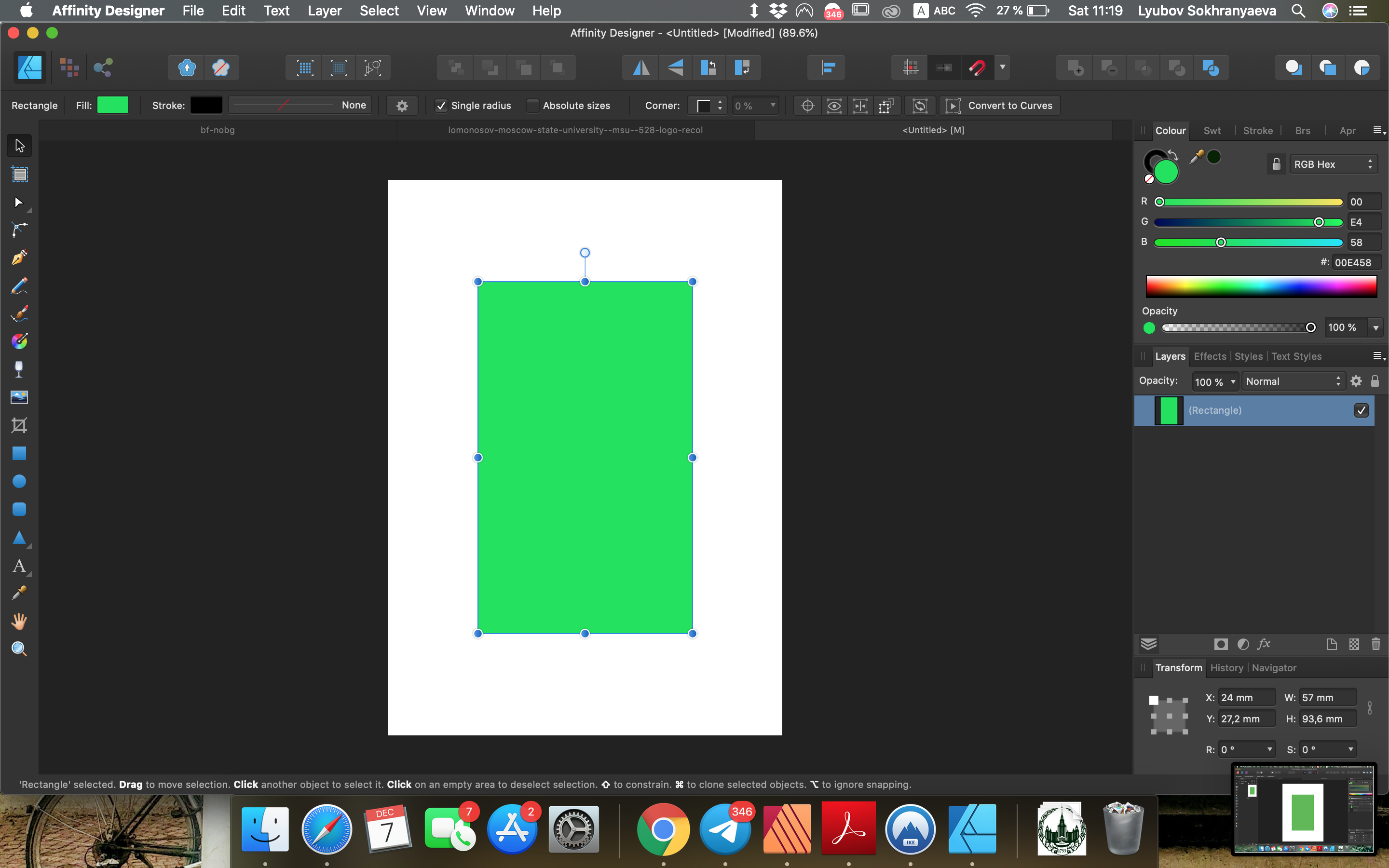
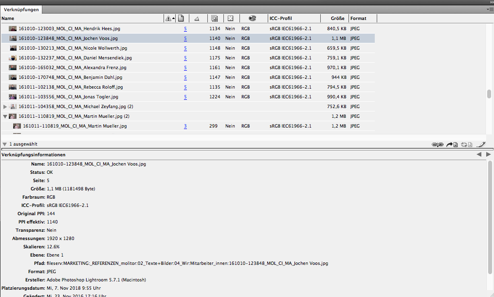
 Dear everyone I recently started using Affinity products and I'm having troubles figuring out why I have incompatible color palettes in Publisher and Designer. Maybe I've messed up some settings or something, but when I copy color number from Publisher and paste it in Designer I get a different color. It looks like the same color is brighter in Designer than in Publisher. You can see it on screenshots attached. This is very annoying and I don't know how to get rid of this problem. I would appreciate your help. Thank you very much!
-
 Is there a way to click on an object within your artwork and have the swatches palette show you which color is actively selected? I want to build out a colors list and then know which color I’m working with when I select an object I’ve added to my artwork. I use a collection of Montana spray paints and need to know which colors to buy after I’ve designed the artwork.
-
Has anyone been able to import palettes to Designer on the iPad? I work with Montana brand spray paint and want to be able to import and/or their entire color palette. or do I have to use the eyedropper to import each color individually and name it individually? Also wondering if there is a way to rearrange the colors within the palette list view?
-
Firefox recently introduced a new design language along with their browser rebrand, so I took the liberty of making an AP palette of their colors. Firefox Design.afpalette
-
Link to Metallic Gradients Share Here are some fancy metallic gradients I put together.
- 22 replies
-
- 25
-

-

-
Just a Heads Up for those not aware of this Website (NOT MINE) created for All Things Affinity .https://affinity.graphics/
- 2 replies
-
- 4
-
-
- free
- commercial
- (and 8 more)
-
Good morning everyone Would anyone in here know where I may aquire the Affinity photo Frankentoon jungle palette. I have done a search but I have had no luck so far. Many thanks for your direction and guidance. Gaynor
-

styles brushes and more FREE STUFF~! Posted on Affinity Graphics
LyricsGirl posted a topic in Resources
A heap of my stuff- Styles Images and more Fantastic FREE stuff from the site Hosts and other members! https://affinity.graphics/
-
Material Design color palette Last update : September 7, 2019 Version : 1.0.0 About This afpalette file contain all the main colors and variants of the Material Design color palette extracted (manually) from the Material Design Color Tool Website. Getting started Open the swatches pannel (View > Studio > Swatches). Click Panel Preferences (top right of the swatches pannel window) and select a palette type from the Import Palette sub-menu. Locate the file Material_Design_Colors.afpalette and click Open. The newly imported palette will now be available to choose in the palette pop-up menu. Missing variants Some variants are missing : All colors 50 light variants are white (#FFFFFF). Red, Grey and blue grey 100 light variants are white (#FFFFFF). Grey 900 dark variant is black (#000000). Text color swatches For texts on a light color background : Black - Disabled (#000000 38%) Black - Medium (#000000 60%) Black - High (#000000 87%) For texts on a dark color background : White - Disabled (#FFFFFF 38%) White - Medium (#FFFFFF 60%) White - High (#FFFFFF 87%) Readability You can change the appearance of the swatches in the pannel for a better readability : Open the swatches pannel (View > Studio > Swatches). Click Panel Preferences and select Show as list from the Appearance sub-menu. Click Panel Preferences and select Alphabetical from the Sort sub-menu. Sources Material Design Color Tool Material_Design_Colors.afpalette
-
styles palettes and more All my Shop Designers Kits and More!
LyricsGirl posted a topic in Resources
for September 2019 -ALL of my Designers Kits and other products on a once only Super Sale. Over 29 GIGS of Archived product files in the one bundle. Affinity Designers' kits including Rose Petals Leadlight Glass, Coffee, romantic Hearts, Frames, Cafe Kit, Greetings Cards panels for Birthdays Christmas and more. Australian Themes, Vintage Aircraft, Kids Birthdays Treasure Maps So much more! Available for a LIMITED TIME! $25 the LOT https://gumroad.com/l/EciWh FULL Commercial Use! Including POD (Print On Demand). HURRY!!!
-
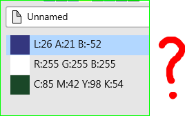
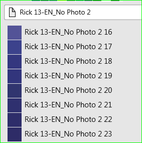
I love Publisher but IMHO it has the worst colour system I have ever seen (in over 30 years). How did LAB, RGB and CMYK end up on the same palette when I only work in CMYK and the publication was set for CMYK? I NEVER work in LAB. I have 68 colours like this: "Rick 13-EN_No Photo 2 is the name of the publication. Useless as colour information for an in-document palette. It should be simple to create my own custom CMYK palette but instead it's horribly complicated, if not impossible. It's a monumental time waster. Why can I change a colour in this dialogue but not in that one. And then I can only change it in THAT dialogue, but not this one. A lot of things seem too clever by half in Publisher but colour handling is a serious fault in an otherwise pretty good app.
-
Pantone are offering three .ase (Adobe Swatch Exchange) files, free, one is new. https://www.pantone.com/eblasts/20190507/index.html These three palette files are good for trying out the Import Palette feature of Affinity Publisher. Readers are invited to post images using one or more of these palettes in this thread. William
-
Hi all ! This is my palettes, extracted from Web/CSS Frameworks (Bootstrap, UI Kit, Material UI...) and Many brands. Get for free from my Github Repo Or from attached files... What is it ? In my work, like many people, i need to make lots of website sketch/présentation created with common Frameworks like Bootstrap or others. I made this with the excellent software Affinity Designer, and so, here are my own palettes created for this last. Palettes details Web/CSS Frameworks : Bootstrap 4.afpalette : 16 colors from Bootstrap 4 default theme {prefix bt4-} Bulma.io.afpalette : 19 colors from Bulma default theme {prefix bulma-} Groundworkcss.io.afpalette : 22 colors from GroundWork default theme {prefix gndwrk-} Material-ui.afpalette : 19 colors from Material UI default theme {prefix mui-} Spectre.css.afpalette : 7 colors from Spectre default theme {prefix spectre-} Uikit.com.afpalette : 12 colors from UI Kit default theme {prefix uikit-} - Kube.afpalette - Foundation.afpalette - Semantic-UI.afpalette Others : Brands.afpalette : 70+ brands colors (Affinity, Apple, Google, Microsoft, Amazon, Coca-Cola...) FlatUI 2 Japan.afpalette : 20 colors of Japan Flat UI 2 Old Colors.afpalette : 60+ old/vintage colors Human Body Human Body Bones.afpalette : 6 colors for human bones Human Body Hairs.afpalette : 70+ colors for human hairs Human Body Intimity.afpalette : 25 colors for human private parts Human Body Skins.afpalette : 26 colors for human skins Screenshots Material-ui.afpalette Spectre.css.afpalette Uikit.com.afpalette Bootstrap 4.afpalette Brands.afpalette Bulma.io.afpalette Groundworkcss.io.afpalette Human Body Skins.afpalette Kube.afpalette Foundation.afpalette Semantic-UI.afpalette FlatUI 2 Japan.afpalette Old Colors.afpalette Human Body Bones.afpalette Human Body Intimity.afpalette Human Body Hairs.afpalette
- 2 replies
-
- 1
-
-
- bulma.css
- spectre.css
- (and 7 more)
-
 Hey, please make the Resource Manager available to the Studio palettes for better integration in the UI. I need it right by my side all the time like the Layers and Pages panels. Please also add more options to pieces of information like Color Space, Transparency, Rotation, Dimensions, File Path etc already in the list. Cheers Benny
-
 Doesn't seem to be possible - or am I just being stupid …? Also could there be a way - if there isn't already to layer shapes on top of a photo…? I'm redecorating my bedroom at the moment and I've laboriously converted all the colours I'm considering into RGB and Hex values, I just need a way of playing around with them. I don't see any way of adding additional swatches to a palette (it is almost 03:30 though, but I do better at night). Yes, I know that screen colours are not going to be the same as the actual paint (wouldn't it be wonderful if there was a way of reconciling them somehow, some kind of intermediary colour space).I've already found that one green I was considering was far bluer 'in the flesh' than it was on Dulux's website.
 -
 I keep color swatch books for all my clients. Coming from Adobe, I can just create a swatch collection for each client and upload to Creative Cloud. Then when I need to work on something for that client I simply load their folder and have all my swatches ready to use. I thought I could do the same thing with Affinity's Palette system, but I am running into issues. In order for a Palette to be available to all Affinity programs, I have to make System Palettes. It works, except when it comes to saving Spot colors (I need a set of Pantone colors). When I try to save a Pantone swatch in the System palette, the swatch gets saved to a new Document palette instead. This does me no good because next time I start a new document, I have to go looking for all the swatches. Furthermore, I cannot make them Global. Am I missing something? Or will I have to create an Application palette each time and export that to import into the other 2 programs every time? That will get annoying if I have to update their color schemes down the road.