Search the Community
Showing results for tags 'options'.
-
I love the Assistant's intelligence in allowing you to continue with your creative process without interrupting you for technical details. And I love how it is user configurable. Perhaps another option to consider adding: It would be very beneficial to have an option so that whenever the Assistant rasterizes a vector object, it keeps the original turned off and adds the label (original) beneath the newly rasterized version in the layer stack. It could also present a sub-option to place both items in a Group for easier Layer management. This would further AD's ethos of infinitely adjustable and non-destructive creative process. Just 2 more cents...
-
Hey there! I use the tools in the Transform window and the tools in the Alignment window all the time, but I really dislike pressing the button that opens the Transform window in the hopes of it opening the right one upfront. This would be solved completely by having a seperate button for the alignment tools! Perhaps there is already a way to customize the buttons in the toolbar that I just haven't found yet? Adriaan
-
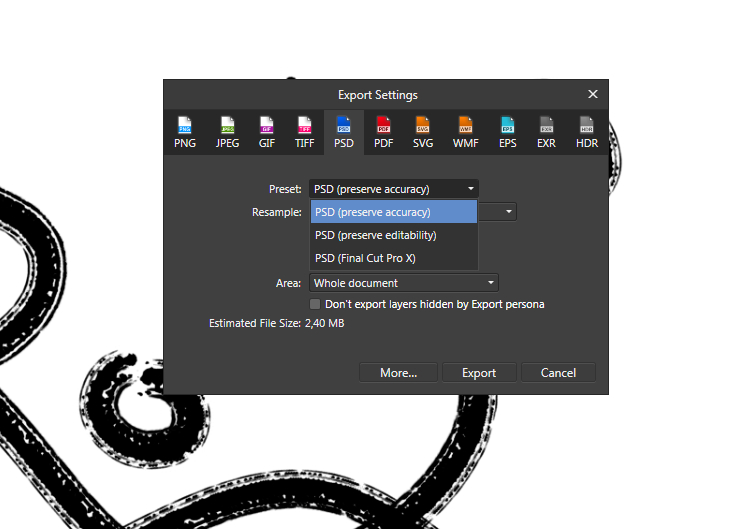
[English version below] Hallo zusammen, ich erstelle Pläne und Grafiken für digitale Präsentationen (Fachgebiet Architektur). Folgendes Problem: Ich stelle die gewünschten Farben in Affinity Designer mit dem HEX-Code ein. Wenn ich die Grafik exportiere, wird diese immer mit knalligeren Farben exportiert, als eigentlich eingestellt. Ich benötige PNG, JPEG und PDF-Formate. Mit allen Formaten, mit allen denkbaren Einstellungen habe ich bereits herumprobiert. Das Programm, das Dokument und im Export haben die gleichen RGB-Einstellungen und ICC-Profile. Eine zeitlang ist bei der Einstellung Neuberechnung: Lanczos 3 die gewünschte Farbe bei einem Export als PNG-Datei herausgekommen. Seltsamerweise funktioniert auch das nur ab und zu. Da ich mich mit Farbeinstellungen und ICC-Profilen nicht sonderlich auskenne, hoffe ich, dass mir hier jemand weiterhelfen kann! Anbei ein Screenshot aus Affinity Designer (nutze die Windows-Desktop-App) und ein Besipiel für die exportierte Grafik. Die gewünschten Farben waren: 000000 (schwarz), AED9E0 (hellblau) und D36135 (rot). Heraus kamen schwarz, AED9E2 und D76436. Ich würde mich freuen, wenn jemand mein Problem erkennt und mir weiterhelfen würde! Danke! Hello everyone, I am creating plans and graphics for digital presentations (architecture). The following problem occured: I set the desired colors in Affinity Designer with the HEX code. When I export the graphic, it is always exported with more gaudy colors than actually set. I need PNG, JPEG and PDF formats. With all formats, with all conceivable settings I have already tried around. The program, the document and in the export have the same RGB settings and ICC profiles. For a while, the setting Recalculate: Lanczos 3 brought out the desired color when exporting as a PNG file. Oddly enough, even that only works once in a while. Since I don't know much about color settings and ICC profiles, I hope someone here can help me out! Attached is a screenshot from Affinity Designer (using the Windows desktop app) and a sample of the exported graphic. The colors I wanted were: 000000 (black), AED9E0 (light blue) and D36135 (red). Out came black, AED9E2 and D76436. I would be happy if someone recognizes my problem and helps me! Thanks!
-
I recently posted on the support forum, but there does not seem to be an option for this. So posting here now as a feature request. I would be super great if there a way to change the space or distance between the spreads/pages/pasteboard? Within InDesign preferences ( Preferences > Guides & Pasteboard > Pasteboard Options ) there is a way to set this. I can't seem to find this in Publisher. I always found this helpful because sometimes I don't want to see the other page and prefer to focus on the page I'm designing. Keep up the great work Affinity!
- 21 replies
-
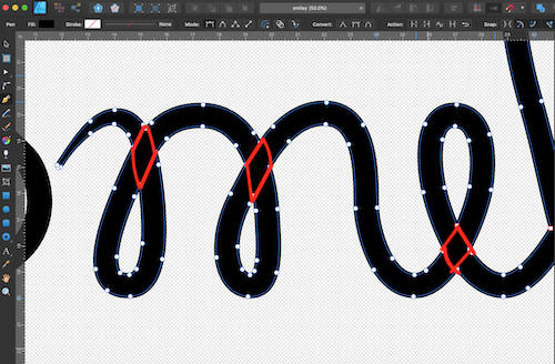
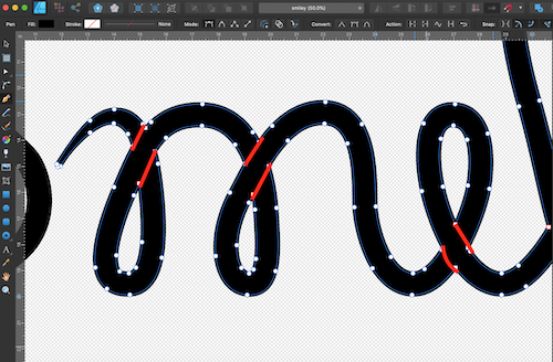
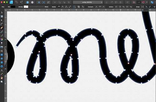
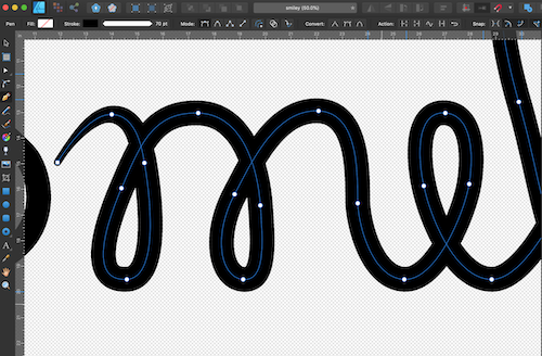
I have a single stroke making a word in cursive. The sections of lines that overlap merge into a single flattened shape when I expand. I would like for the stroke to be expanded as just the path or in sections so I can make the stroke appear to be weaving. (Images: 1.Stroke, 2.Expanded Stroke, 3.Output if stroke were consistent with path, 4.Output if stroke expanded in sections)
- 4 replies
-
- affinity designer
- stroke
-
(and 3 more)
Tagged with:
-
I have created a simple design which I hope to use in mapbox as an icon. mapbox requires svg. I export my design to svg but when I load into mapbox, the fill colors are not there. the icon is "there" in my custom styles list but the colors do not appear at all. I have tried multiple different settings on the AD Export More options from the svg export tab (making sure to check Use hex colors, flatten, etc) , but they all have the same result when brought into mapbox. Mapbox has troubleshooting for Illustrator and other problems here - https://docs.mapbox.com/help/troubleshooting/studio-svg-upload-errors/#common-issues I cannot find the equivalent settings for what is suggested for Illustrator in Designer. I also tried to understand the svg file by changing the .svg to .txt and examining it in notepad. I checked the various tags against support / unsupported elements, and I cannot see any problems (admittedly I am not a web designer however) I can see the .svg in both firefox and chrome. Thank you for any help. Windows 10, AD 1.8.2 training.afdesign training_7_unchecksetviewbox.svg
-
The current colors are really ugly, and intrusive. The Bright colors are distracting from the main artwork... I recommend soft pastels instead of the current options (something that doesn't contrast too heavily from the UI interface too)
-
Hey everyone! In the top right corner, the color picker can be dragged to increase and decrease brightness. Personally, I am disabling the UI a lot (button next to color picker) and it would be helpful if there was an option to disable this feature to prevent unintentional color change. Best wishes, Shu
-
I think it´s a quite good idea to have patterns. For example for CD´s, business cards, envelops, external labels and calendars. And also for these patterns matching print options specific for them.
-
Will there be import format options in Publisher. Like many I suspect, I have existing files in other native formats. Most of mine are in InDesign. Will there be a way to import these other formats into the release version of Publisher? Just started looking through the beta and I'm liking a lot of what I see.
-
Why should a user have to go through two splash screens before the app opens ? The first is the woman near the water and the second a woman's face with the version number. I find both in questionable taste and representing an outdated sensibility, however that is a personal view. The bigger issue is why should I have two splashes and not just one ? Ideally I would prefer to have a simple option to turn them off entirely. I have used Affinity on an iPad since it was released and perhaps an update did not clean out the old data, but I would appreciate some way to get rid of them or at least get rid of one of the two. Thanks Steven
-
Hi does anyone know how to get the lines to connect or intersect? Is there a special setting I need to fix? If you look at the lines closely every time I try to cross the lines there spacing between them. I'm on the latest version of affinity photo and I want the lines to connect for drawing purposes.
-
Hello would it be possible to have a separate windows mode but keeping all the rest of the tools and nice dark grey background present in the back and keeping those two separate windows separate but inside this dark grey area. Thanks this would be a very useful option i think. Also being able to save various layout to be able to accommodate our tools according to the available space and monitor. Best Regards.
-
I have always Grayscale mode in my Info panel in PS. It tells me where my colors in the scale of 0 to 100% of lightness are. It's especially important on the edges of a Histogram - in very light and very dark colors. I miss the possibility to see Brushes in icon mode and I miss the possibility to see the Grayscale on Info panel. The Greyscale readout is very important (if not one of essentials) for the exercises for my students too! How can I turn it on, if not, will it be solved any time soon? ...There is no reason not to compare competitive App. with Adobe PS, since it's an industry standard, and there is no chance for competitive App. if producers try just to make it different, as we've seen many times in history, it must be better (!) and AP in many ways is ...
-
SVG Export Options Quandary
jlarmstrongiv posted a topic in [ARCHIVE] Designer beta on macOS threads
Hi all, I am trying to use Affinity Designer to export my artboards as svg. However, I cannot seem to accomplish the following: - Exporting Multiple Artboards at once: I can export one artboard at a time or all my artboards in once svg, but not a one to one artboard export to svg that runs all at once. - Link Images in SVG: I cannot seem to have my raster images linked—for instance, if I place a png inside my svg, the jpg is converted to base64 and inlined inside the svg. Rather, the export should create two files: the svg (with an image tag linked to) the jpg. Current encoding is something like: <image id="_Image1" width="1575px" height="2361px" xlink:href="data:image/jpeg;base64,/9j/4AAQSkZJRg....... Encoding should be something like: <image id="artboardName-imageLayerName" overflow="visible" width="1575px" height="2361px" xlink:href="artboardName-imageLayerName.png"> </image> -
The arrow tool in Affinity Photo for iPad seems to be missing options: namely the options for ends. The other shape tools seem to provide the same options as the desktop version, but the arrow tool only seems to offer Thickness and To Curves. It's not particularly useful if you can't at least choose which ends get arrows.
- 1 reply
-
- Shape tools
- options
-
(and 1 more)
Tagged with:
-
This is a request for an "Undo Break" option (to remove page, line, and other breaks from text). I have searched high and low and cannot find a way to remove a Page Break from my text formatting without undoing all the formatting (I have color, italics, bold, etc. within my text that I do not want to lose to remove this page break that keeps moving my text to the wrong page when I attempt to overlay an image (no, it's not a text wrap issue). Please help by upgrading the software to include an option to remove page, line or other text breaks without having to alter any of the other formatting within a given area of text. Thank you!
- 2 replies
-
- Undo
- Page Break
-
(and 3 more)
Tagged with:
-
I use a Surface Book with Affinity Designer and frequently I end up drawing little spots around the canvas when I rest my hand on the screen to draw. In MyPaint there was a way around this in Preferences > Devices where you can set what pointers interact with what like so: I was wondering if Affinity Designer could benefit to gain some options like this. The current workaround for this is disabling the touch screen in device manager on my Surface so that only the stylus pen works, and this frequently gets annoying when switching back and forth and not being able to use my fingers to zoom or press buttons in the interface.
-
- affinity designer
- touchscreen
-
(and 3 more)
Tagged with:
-
In AD, when exporting through the Export persona, the replace dialogue is quite small and often causes horizontal scroll. Since the checkboxes are all on the right side (which I find strange since on the Preferences and generally, on the web and other apps, they are on the left) it's hard to be sure if you're activating and deactivating the right files, as some part of the path might be hidden outside the scroll. If this window could be resized and keep the resized size between exports and between documents this would be great.
-
Hi, I'm new to the Serif world and wow, where have I been - I digress. Was wondering if there was a way to create cinemagraphs or plotagraphs using Designer? Just wondering as this would be a super awesome feature and I could use just one awesome tool. Thanks in advance
- 1 reply
-
- cinemagraphs
- plotagraphs
-
(and 3 more)
Tagged with:
-
There is a discussion on PPI vs DPI in the Questions and Feedback section. After discussion and consideration, I'd like to make an official feature request. In the User Interface section of the Preferences in both Designer and Photo, I request that you include a checkbox to change the default DPI setting of documents to PPI. I understand a portion of your staff believe DPI is an appropriate choice, so it could be set to DPI by default, and every one who feels strongly that it should read PPI could have a customization option to change their user experience within the software. I feel that's a good compromise, considering everyone who understands what the field is for would understand that it would typically make no difference to anyone's workflow, and it would appease each party that has a preference to one acronym or the other. Thank you for your consideration, I appreciate your time.


