Search the Community
Showing results for tags 'optical alignment'.
Found 11 results
-
 Would be nice if I could apply rules for right edge of the text frame in left align mode. Currently It works only in right align and justified mode. I would like to push punctuations to outside o the frame.
 -
The optical alignment is applied to wrong characters and isn't applied to characters that suppose to in Japanese. e.g. a rule for フ affects both フ and ブ. and a rule for ブ doesn't affect ブ. see the attached file. ブ is the sonant form of フ. Most characters in Japanese have its sonant form and the optical alignment seems to affects all of them. optical-alignment.afpub
-
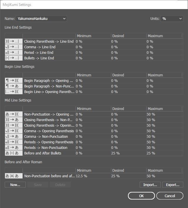
Need improvement for Optical Alignment rules. Conditions for Right and Left should be able to set separately even if they are for the same characters. Also "Middle" condition is needed. The purpose of this suggestion is to merge Mojikumi(Asian text spacing rules) feature that's not available currently into the optical alignment. So there's no need to add separate feature and it can prevent confusions or conflicts. Ultimately something like the attached picture(Mojikumi in Adobe) would be needed, but I think merging Mojikumi into the the Optical Alignment would be good in Affinity way rather than adding it separately.

-
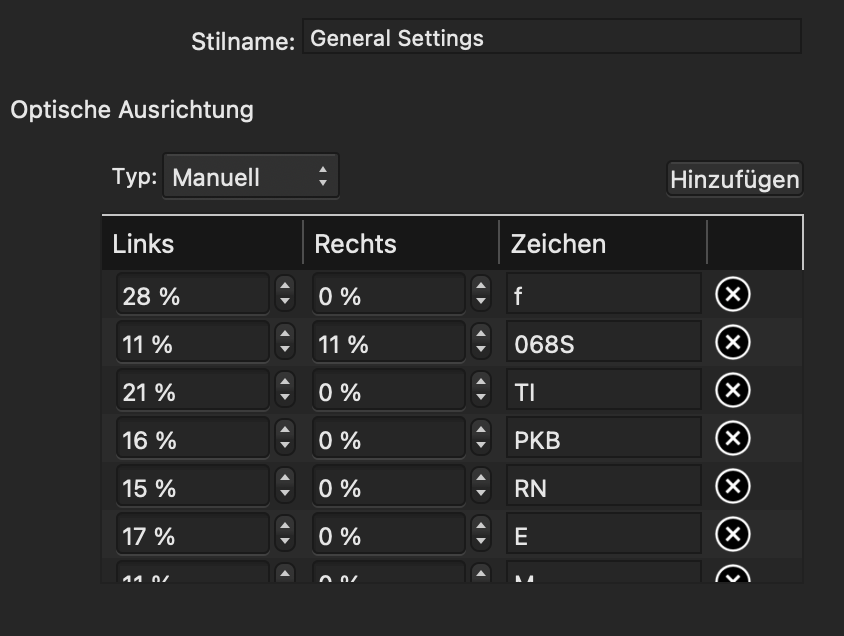
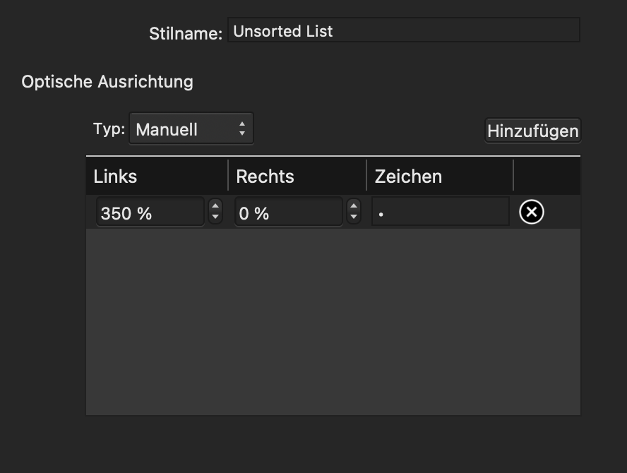
 MacBook Pro (15", 2019) macOS 11.2.3 Publisher 1.9.2 Hi everyone, I set up a document in Publisher and organized my text styles in groups in the following way: Group Style (General Settings) Group Style (01 Body Texts) Paragraph Style (Body Text) Paragraph Style (Unsorted List) … … … The group style "General Settings" acts like a master style. Here I setup all the things that should stay the same across all further subordinated paragraph and group styles. As those things work, the settings I make in "01 Body Texts" should override the settings from "General Settings" and "Body Text" should override the settings of "01 Body Texts". So far that has always worked well for me, except in one case. For the paragraph style "Unsorted List" I changed some optical alignment settings and as expected, these settings override the settings of "01 Body Texts" and "General Settings". The problem here is, that it doesn't just override the optical alignment for the characters where I adjusted it, but also resets all other characters that I previously setup in "General Settings". This kind of breaks my workflow, because now if I want to change the optical alignment of a character, I have to do it in "General Settings" and in "Unsorted List" which ultimately will lead so some inconsistencies down the line. So my question here is, am I doing it wrong? Is it a bug? Or if everything works as intended, could it be implemented that the optical alignment of characters can be overridden character by character instead of resetting all characters that are not adjusted in the overriding paragraph style? I hope my writing is not too confusing. Thanks for the help in advance! Here is an Example: In "General Settings" I set "f" to 28% left and in "Unsorted List" I only set "•" to 350% left. My wish would be that the character "f" is still pushed 28% to the left when the paragraph style "Unsorted List" is activated, without having to manually add it as a setting. Mabye this example makes it more clear?
-
 Windows 10 20H2 build 19042.964; Affinity Publisher 1.9.2.1035 I am trying to do something that seems very straightforward, but I am hitting a wall that might be a bug. Below you see text with a "quotation" paragraph style applied. Each line is a separate "paragraph", and two lines are indented even further. No problems there. The problem is with the "optical alignment" and the quotation mark. I clicked "add" below to show the values being used. My desire is for all the letters W to be perfectly aligned, and to have the quotation mark floating on the left. I assumed that having a value of Left 100% would accomplish that, but no. The dialog won't let me increase beyond 100, and it will not let me manually type a value larger than 100. Any suggestions, short of manually fiddling with the indentation for these sort of poems/quotations? As a minimum, I would have liked the optical alignment to allow me to set a value where the character completely disappears into the margin...
-
 Optical alignment for special characters such as page numbers can be set manually for special character on master pages but no on the normal pages. Is there a workaround other than adding all 200 page numbers in to optical alignment options?
 -
 Hanging Punctuation. I have downloaded the free trial for Publisher on my mac laptop. I can not find Optical Alignment anywhere. Seasoned pro from quark to indesign and beyond hopefully. But stuck here. It's not in the under Character panel: Show Typography: Litigures, Alternates, Ornaments. Figure style, width, position. Capitals. its not in the Paragraph pane: No Style and New Style. Nothing to edit. Not under text styles: all I get when I control click is: Remove Styles from Paragraph None of the instructions I've found make any sense. The videos show clicks I can't find. Help?
 -
 Hi There, I enjoy using Publisher for formatting books. One challenge I just can't overcome is by applying optical alignment to the text. There are words in italics in the original manuscript, that gets lost as soon as I apply optical alignment. In the 'edit' section, I've set the font: no change. I checked the font settings too. I cant find what is overwriting my format. Anybody could help me please? Thank you, Bluebell
 -
 I am filling text frames in Affinity Publisher. One and only one character, the letter "f," always falls outside the right edge of the frame (as shown below). I am unable to fix this. The font is 08 EB Garamond Regular.
 -
 When adding, say an asterisk 100% outside the margins, I select a paragraph/character style and choose optical alignment, "manual" and select OK, my other paragraph styles "extend" the right margin, thus messing up the flow of text onto the next line throughout the text frame. And it doesn't matter if I create a new style and base it on "No Style". That creates the same effect. I will have see if it applies to all text frames in the document with the same paragraph style or only is applicable to the text frame I am trying to apply a hanging quotation/glyph. Currently, I only need it in one text frame. RD
 -
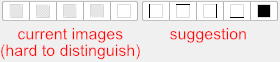
Thanks for letting users get a first impression of Affinity Publisher at this early stage (1.7.0.58 on Windows 7, 64 bit, German). And since this a bug forum, I just report basic bugs or strange behaviour, but not the good stuff: Page Up + Page Down keys don't work: Independent of the number of pages, the magnification, or whether or not an object or some text is selected, the PgUp/PgDn keys don't do anything. It would be nice to have them work properly, e.g., as in PagePlus... Unintuitive ruler subdivisions: This is valid for all Affinity programs, but I didn't bother to mention this until now: The ruler subdivisions are sometimes unintuitive and difficult to interpret. In the attached screenshot 'rulers.png' with mm rulers, there are 20 subdivisions from 40 to 60, which is wonderful. Unfortunately, every fourth tick is longer than the others, letting you easily see the not-so-often wanted and rather unimportant numbers 44, 48, 52 and 56. It would be much nicer if the longer ticks were also distributed in 1-2-5 distances, in this case 20 subdivisions as before, but every fifth tick longer, to show the much more important numbers 45, 50 and 55. Missing 'Actual size' zoom: The help pages claim that some 'Actual size zoom' popup would be available in the document setup for pixel and point document units, but I could never see anything like that. Optical alignment edit fields buggy: In the 'Edit text style' dialog, the optical alignment can be defined in a style similar to PagePlus (fine). Unfortunately, all the 'Right' edit fields don't work properly: The percentage one enters there is properly used for the text style (fine), but, after pressing Enter or focusing a different edit field, the entered percentage is divided by 100, rounded and then displayed. This then shows only one of the two choices '0%' or '1%' (numbers up to 49 are rounded to 0, numbers from 50 onwards are rounded to 1). The previously entered value is still properly used for the text style, but the user cannot see that in the edit field any more. 'Ignore space for same styles' not fully memorised: In the 'Edit text style' dialog, the spacing setting 'Ignore space for same styles' is not correctly memorised. After closing the dialog and opening it again, it always shows up 'greyed', independent of the selected state when closing the dialog with OK. Decoration buttons undecipherable: In the 'Edit text style' dialog, all the 'decoration' buttons show an image that is either misleading or unintelligible: The first four show a grey fill (but are not used for the fill) and the position of the lines is more or less invisible (at least for me), and the fifth shows a border, but no fill (this is used for the fill, but not the borders). Very confusing. The images should better be self-explanatory, as in the attached picture 'decorations.png'. With best regards, Andreas Weidner