Search the Community
Showing results for tags 'multi'.
-
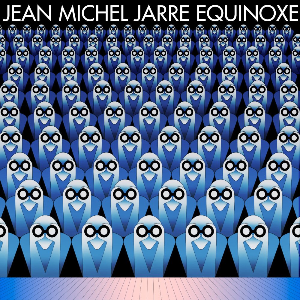
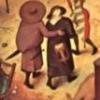
Hey Everyone! I decided to play with the Equinoxe cover reproductions. Post-production is done in Affinity Photo, but before that, everything in Affinity Designer.

-
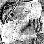
I have written a poem which reflects on the invasion which took place in 1978 all around the world. It is written from a UK perspective on the phenomenon called SPACE INVADERS. The title graphic was created in Affinity Designer, the text edited in LibreOffice, the layout done in Affinity Publisher and the graphic editing done in Affinity Photo. The YouTube link takes you to an audio version of the poem with backing music created in OpenMPT and speech created using Microsoft Sean TTS and mixed in Audacity. The frame effect was done in Fotosketcher. I hope you enjoy this retrospective on this seminal arcade game.
-
- 3
-

-

-
- affinity publisher
- space
- (and 6 more)
-
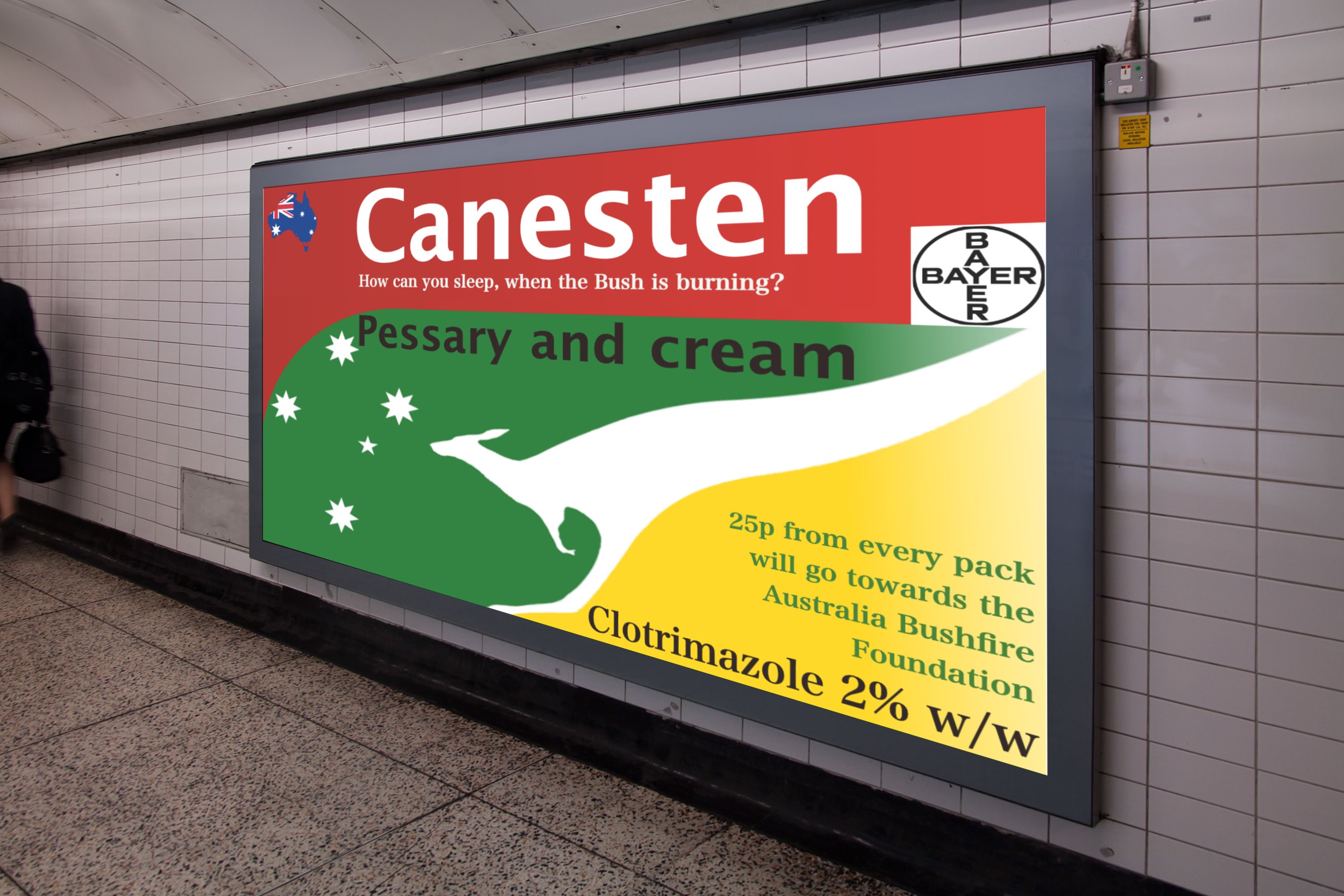
I've finally entered the world of creative advertising, by submitting my entry to The Chip Shop Awards for judging next spring. Not a cheap hobby. Being allowed to create something witty, close to the knuckle and quite apt is something I've wanted to do for a very long time. This is my entry. It is an ointment manufacturer, helping out the seasonal homeless down under, buy their product and they'll donate the proceeds to a charity. Of course it is full of puns, some of you know me well enough by now! Its called How can you sleep when the Bush is burning? Pungent: noun. a bloke with rotten jokes!🤢 The photo is from the web. The packaging was done this Spring in AD. The skewing, backlighting and montage was done in APh. Wish me luck. Peter (The Drum Chip Shop Awards celebrate pure, unadulterated creativity. It's a platform where anything and everything is allowed, an awards show with no rules and no boundaries meaning the possibilities are endless!) The prizes are not glossy statues or metallic masks: they are a resin bottle of vinegar and an oversized chip.
- 6 replies
-
- 3
-
-

-
- poster
- competition
- (and 5 more)
-
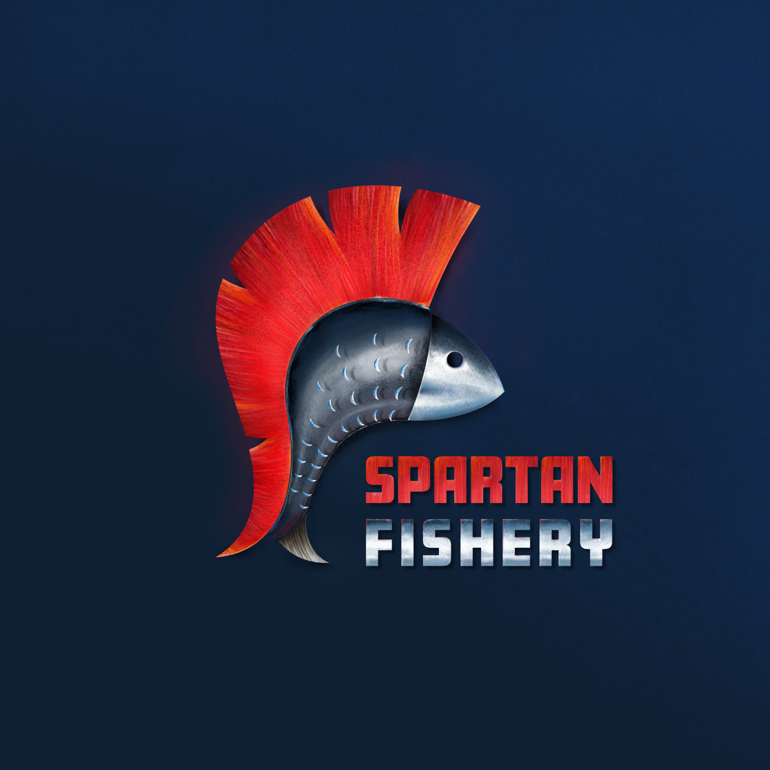
 I am Adobe Illustrator user from many years and using Affinity Designer and Photo from beta but never made logo from basic to finish in Affinity. I was previously made basic vector in Adobe illustrator and then put some colour and gradient in Affinity Designer. oday i thought i sjould give a try to make this logo concept all in Affinity and i made basic drawing in Affinity Designer and then used Affinity Photo brushes to paint. Hope you like my first try
- 3 replies
-
- 5
-
-
- logo
- logodesign
- (and 2 more)
-
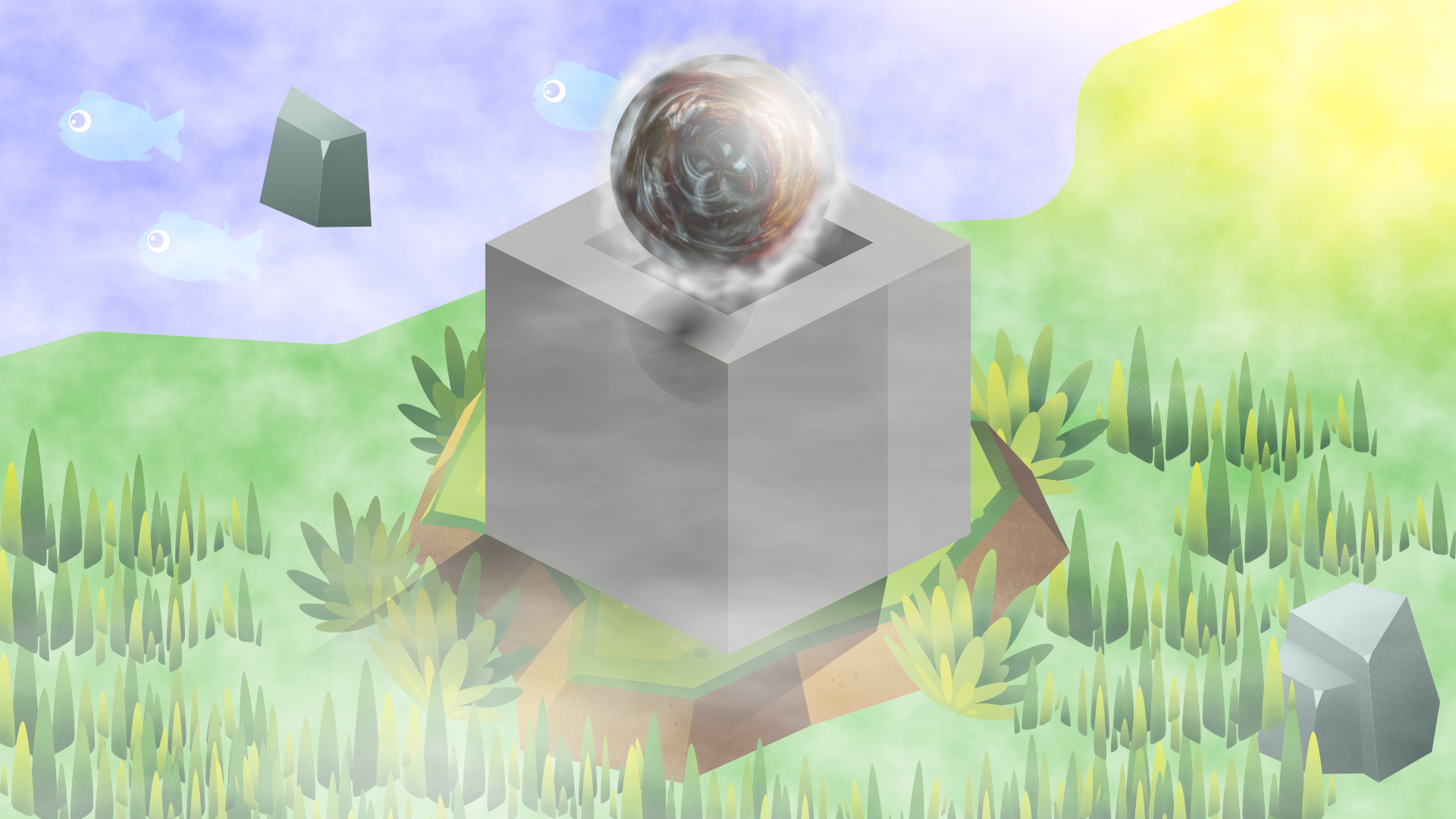
Made this on stream tonight, between Designer (most of the work) and Photo, started off as just the cube, then found the greenery assets while trying to find how to create a sphere... Then added some of the assets and things from the Affinity store. It's nothing overly special, but probably one of the nicer things I've managed to put together. Probably a lot/too much going on, but was just playing around - rather happy with how it came out. Name of it came from a viewer which is why it went from more than just the cube to what it is.
-
 Why do you make your artwork the size that you make it please? Looking through the Share Your Work forum, artwork is in many different sizes, so I am wondering why people choose the size that each of them uses. For example, I often use 2171 pixels by 1571 pixels because I am producing artwork with the intention of producing hardcopy prints by using what are termed Photo greetings Cards at the Papier facility. https://forum.affinity.serif.com/index.php?/topic/138654-artwork-for-greetings-cards/ William
 -
Unicode Inc. announces design competition http://www.unicode.org/announcements/u14call/index.html William
-
From looking at some of the wildlife & landscape pictures in this forum there is no doubt that there are many talented photographers here but I find myself no better off in my use of Affinity Photo just by looking at these stunning pictures. To be honest I could find the same sort of pictures just by using Google. What would be nice is if the people uploading these pictures could supply a before and after picture and detail the steps used in Affinity Photo to get to the final results. That way I am sure mine and others use of AP to create these stunning photos could be greatly improved. Isn't that what forums like these are all about? Or am I missing the point and is it that professional photographers would rather not reveal their workflow in fear of increasing the competition in their chosen profession. Honest answers appriciated
-
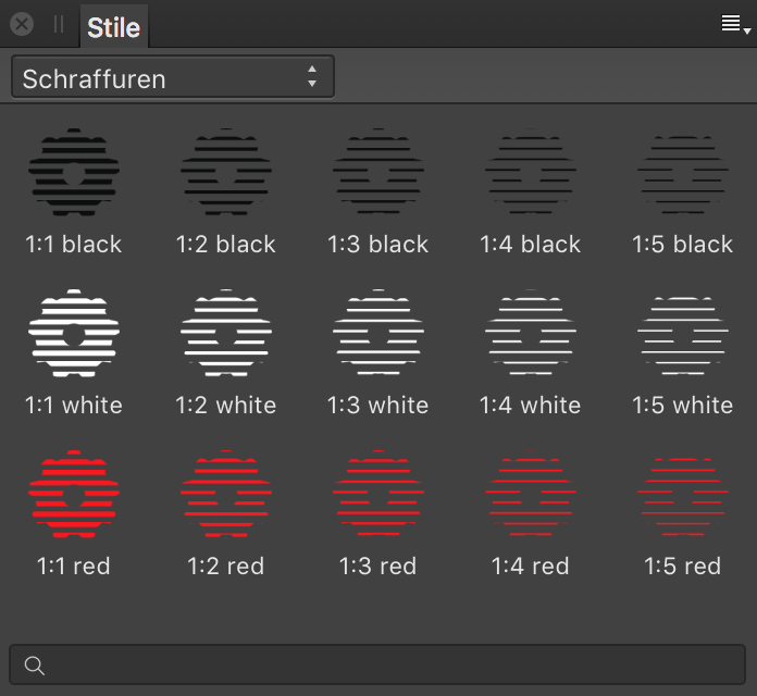
With these simple hatching styles you can hatch your vector objects in Affinity Designer or Affinity Photo. Affinity Publisher Beta seems not working yet (previews looks strange on my machine). DOWNLOAD: https://mensch-mesch.com/download/affinity-designer-schraffuren-hatchings/ With the red styles you can easily change the color of the hatching while using an adjusment layer recolor. Keep on drawin' Norbert
- 11 replies
-
- 16
-
-
-
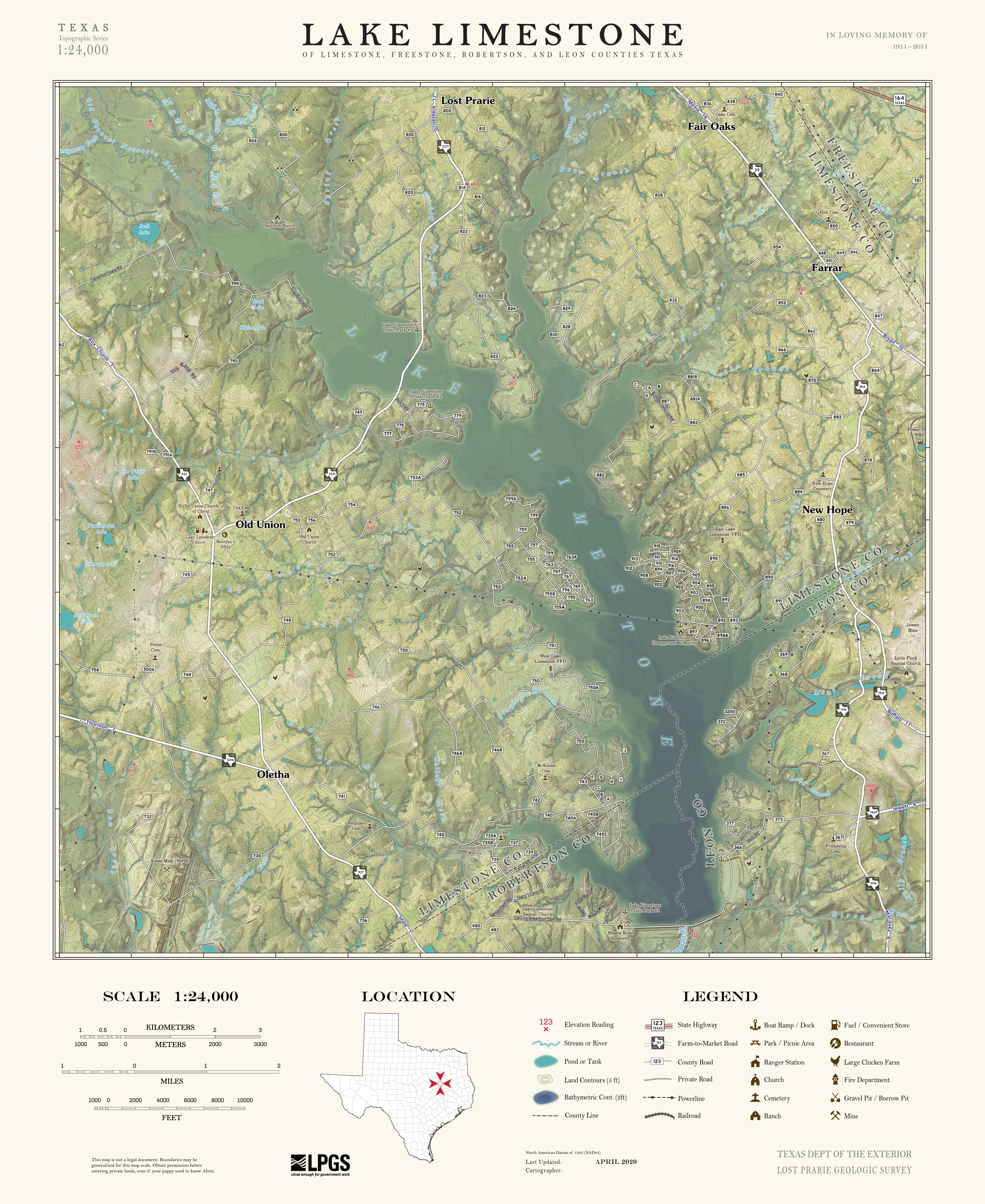
 I'm curious if anyone else out there is using Affinity products for making maps? These days , probably >95% of cartographers make their maps almost entirely within GIS software, but I was always frustrated by the limited options and lack of precision for controlling stylistic elements on maps in those software suites (both QGIS and ArcGIS), so I figured why not outsource the styling to Affinity products For those unfamiliar, mapmaking is not unlike standard graphic design. You have a document comprised of a bunch of different layers, some of which can be vector (like road lines, point data, etc.) and some of which can be raster (like elevation maps, aerial imagery, etc.). The only real difference is they are all encoded with spatial information. So what I started doing is using the GIS software just to compile and size (spatially aware trim/crop) all my different layers of geographic data, and then exporting a bunch of identically-sized layers that I then reassemble in AD / AP (i.e export a PDF of *just* the road lines, export another PDF of *just* the water body polygons, export a PNG of *just* the aerial imagery, etc.). As long as I maintain identical pixel dimensions for the exported raster layers, and identical aspect ratios for the vector layers, maintaining the appropriate map scale / size and reassembling the layers in AD/AP is trivial. Once I have all the data in AD/AP, I can take advantage of those graphic design features that GIS software could never hope to do, like advanced masking and layer blending modes, brush-based editing, pixel-perfect label placement (HUGE), etc. Another great thing is this method gives you ultimate control over design of the map frame and you're not stuck using the preset layouts and scalebars that are baked into GIS software suites. The included example is a map I made for my mother last Christmas of the area where her ancestors settled 150ish years ago. Its sort of like a modern take on the classic USGS topo map styles from the 50's-80's. (there are two typos I'm aware of, 'prairie' is misspelled in both instances, and 'convenience' is written as 'convenient' in the legend... if you see anymore, let me know!) cheers
- 27 replies
-
- 23
-
-
-
- affinity designer
- affinity photo
- (and 1 more)
-
Inspired by the isometric grid 🙂 AD + AP 1920x1080, png 8bit
-
 How can I view the invisibles within text? I'm sure it must be possible but how
 -
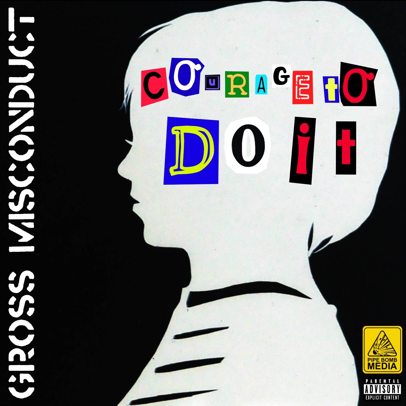
These are fake album covers I made with Affinity Photo for the Album Cover Challenge thing. I also included the a simple logo I made for my project 674D55F3-4B1D-45C2-9FA9-180D4776B1CC.MP4
- 8 replies
-
- 1
-
-
- affinity designer
- affinity photo
- (and 2 more)
-
Just a silly experiment which I was playing around with after half-remembering something I saw on a TV show. Nothing special, just thought some people might like to see it, and maybe it will motivate someone into making something better. (All the Live Filters I used on this really hammered my machine – poor little thing.) Note: In case anyone is interested, the globe was originally monochrome and the background was a full-colour photo, the rest was created in either Photo or Designer.
- 2 replies
-
- 6
-
-
- affinity designer
- affinity photo
- (and 1 more)
-
Hello folks, My name is Dennis. I created this pixelated self-portrait a few days ago. Started it in Dottable, a pixel-art app on a mobile phone, then traced it in Affinity Designer with the grid snap feature. Then I added a few grunge textures over masked areas, imported it into Affinity Photo, and finished it off with LUT filters and monochrome noise for a subtle paper-like feel. I like how precisely the applications work together and that you can add pixel-based textures directly in Affinity Designer without having to change the application, it integrates very fluidly into the workflow. Anyway, I hope you like the result. Dennis aka MrDoodlezz
- 35 replies
-
- 14
-
-
 Hi everybody, Probably a silly question, though still worth asking: how do you ad selections when you have already created one? Example: pick the Lazo tool and select an area of your image (or the Rectangular Marquee... Any selection tool really). Now select another area while maintaining the previous one intact. Just add more selections after the first one in the same image. In Photoshop you just hold "Shift" and keep adding selections. Second question: customizing the keyboard shortcut doesn't seem to work. When I insert a new shortcut, in my case "ALT + Backspace" to fill the canvas with the foreground colour, the software doesn't let me write the "Backspace" bit after the "ALT". I hope someone will be able to answer and clarify both my questions? Thank you in advance! Mauro P. S. I forgot to mention that I am on Windows and the last version of Photo.
 -
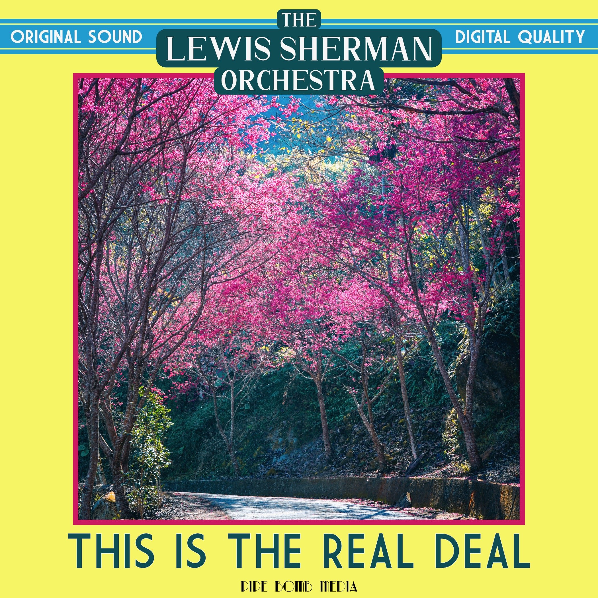
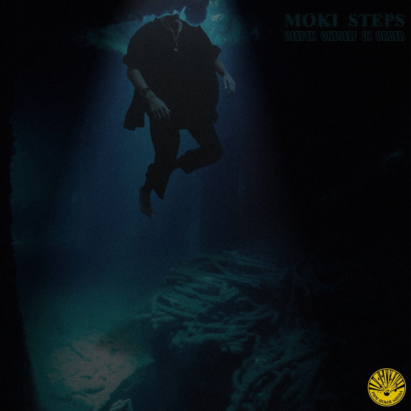
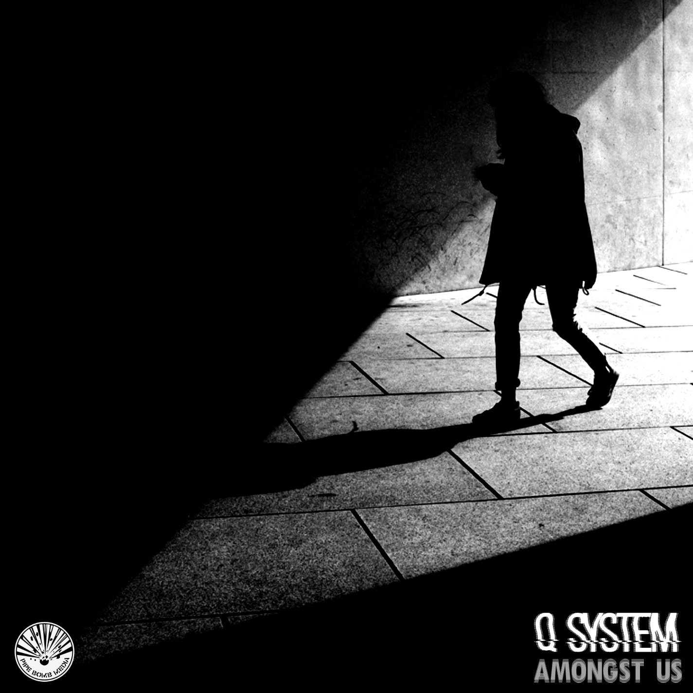
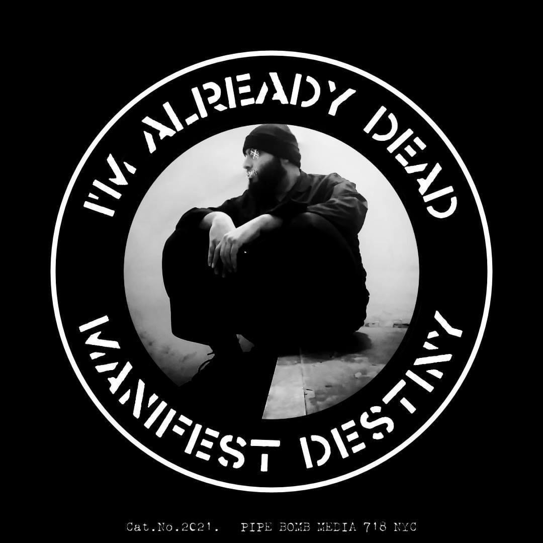
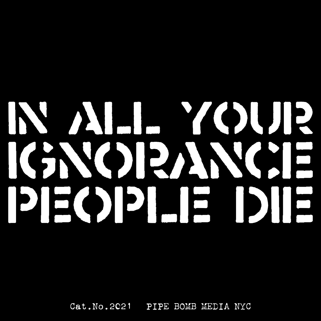
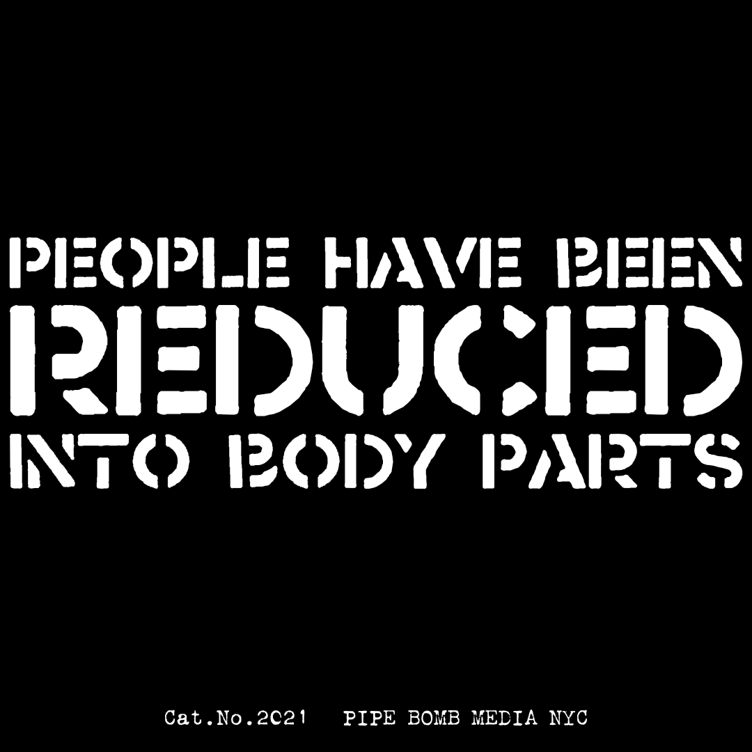
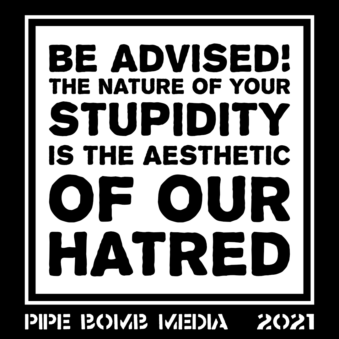
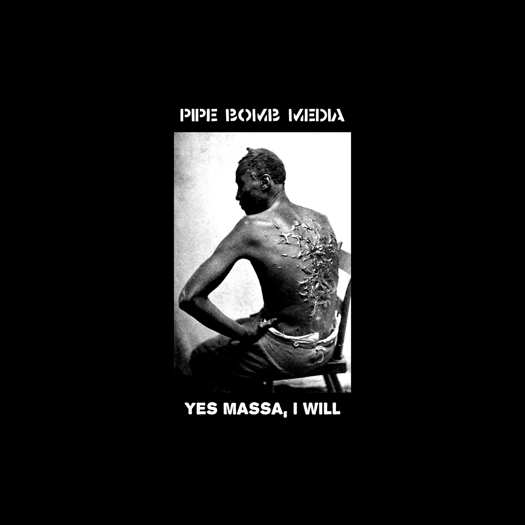
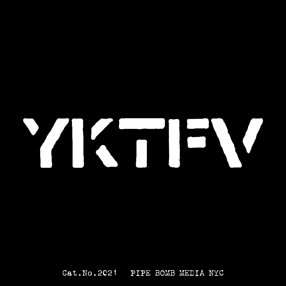
These are designs I created in Affinity Designer and Photo. Inspired by 70's Anarcho punk band Crass from the UK. I am using these for my attempt project called PIPE BOMB MEDIA. I'm the guy sitting in the "I'm Already Dead" image, I am also using the pseudonym "Manifest Destiny" for this project. I am a really big fan of this style and minimalism in general.
-
I've drawn an illustration of a crocodile for no reason except too much time. 🙂 I'am working with Designer and Photo on a windows pc with a wacom tablet attached. The original photo was taken by vaun0815 at unsplash.
-
Hi, I required Affinity Designer in november, so please bare with me. I saw Wonderwomen, a car and a plane made by really, really great artists. I have no intention to get that good, but to get better I need to share my work for getting suggestion and tips. I am at kindergarten level. Starting out with 2 courses at Udemy, watched dozens of youtube tutorials, and glad I got it so far. The fur on the head is kind of okay, the body does not really fit. thearms stick out too much, shadowing is pretty hard. THe eye is jpg, I was unsuccesfull in following 'art with Flo' . I can not get the mouth blend better, like the illustration from Deema Egerov. (I need other artists work trying to recreate to develop myself.) So if anyone has some time to get me some tips, I love to hear from you. Many thanks, Yolanda monster1F.afdesign
-
 Linking an image instead of embedding it, would be useful if you're working on different documents with the same file, i.e. a logo in a design phase. So if you change that logo it will be respected in every file it is linked. Besides that it doesn't increase your Designer file, that could be crucial if you're working with large files and make a lot of versions / copies of your Designer file. I think it's like the new version of the Photoshop Smartobjects (CC version). Would be great if this makes sense to you too and isn't too hard to implement. Thanks!
- 85 replies
-
- 15
-
-
Print Templates [ AFFINITY PUBLISHER | AFFINITY DESIGNER | AFFINITY PHOTO ] #1 Travel Agency Brochure DOWNLOAD HERE
- 14 replies
-
- 1
-
-
- affinity designer
- affinity photo
- (and 1 more)
-
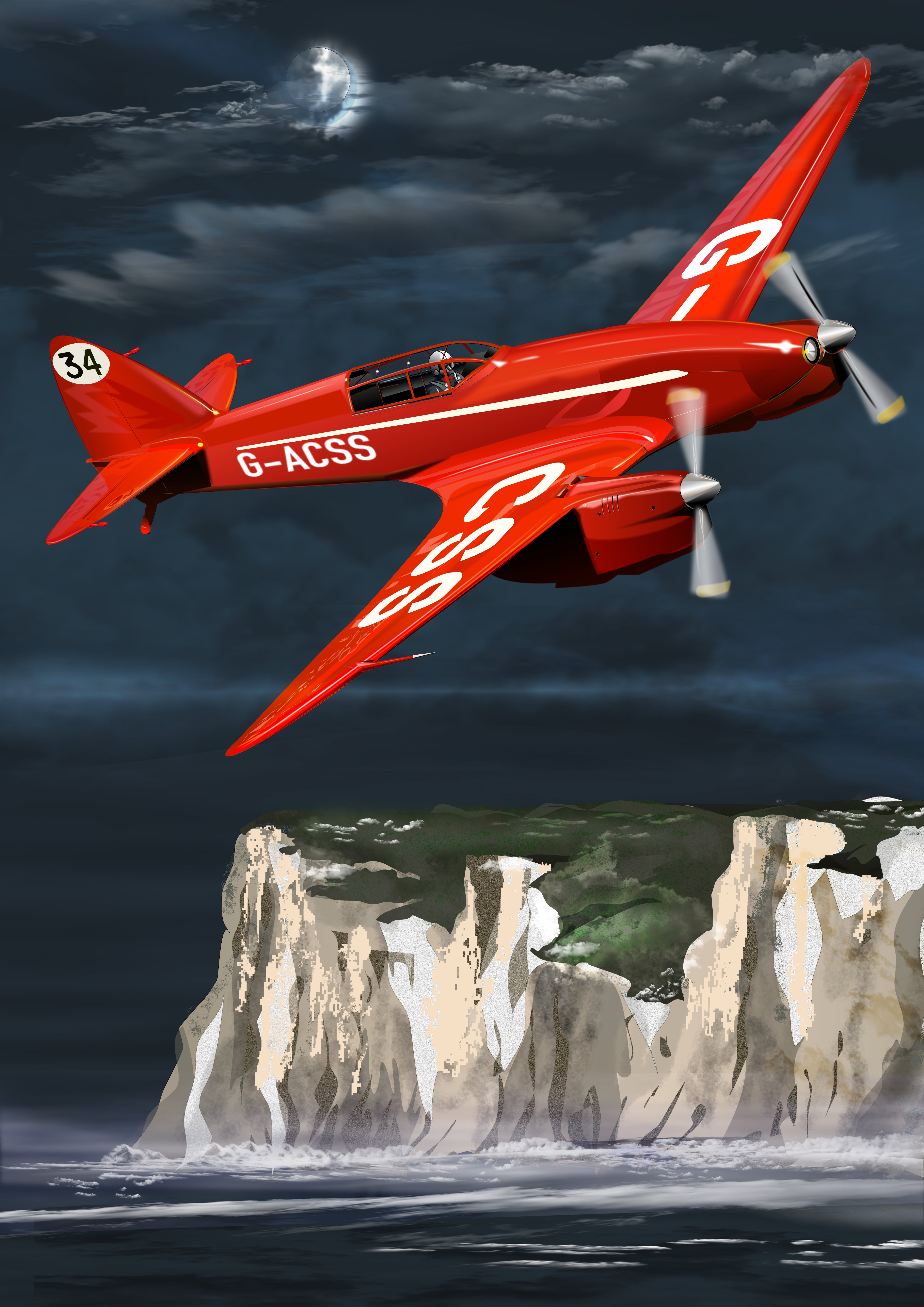
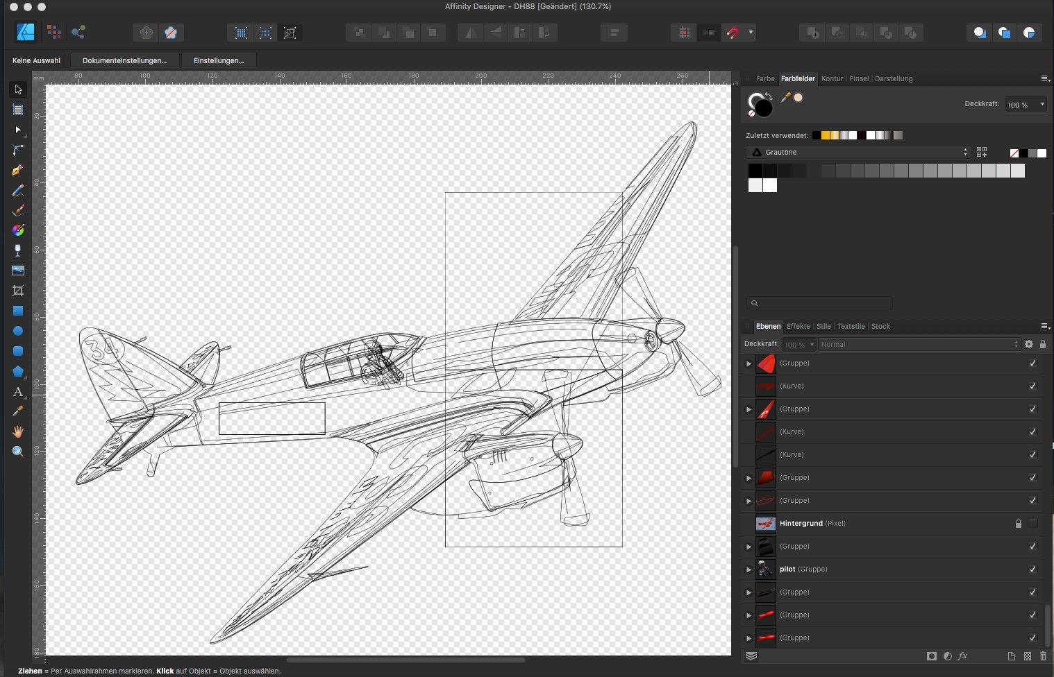
I love the aircraft from between the wars, they experimented and tried all kinds of airframes and paved the way for the aircraft we see today. One of those was the De Havilland DH 88 Comet. Three of these thoroughbreads were built for the 1934 air race from England to Australia. All done in Designer and Photo with oodles of Perlin noise in the background.
- 7 replies
-
- 11
-
-
- affinity designer
- affinity photo
- (and 2 more)
-
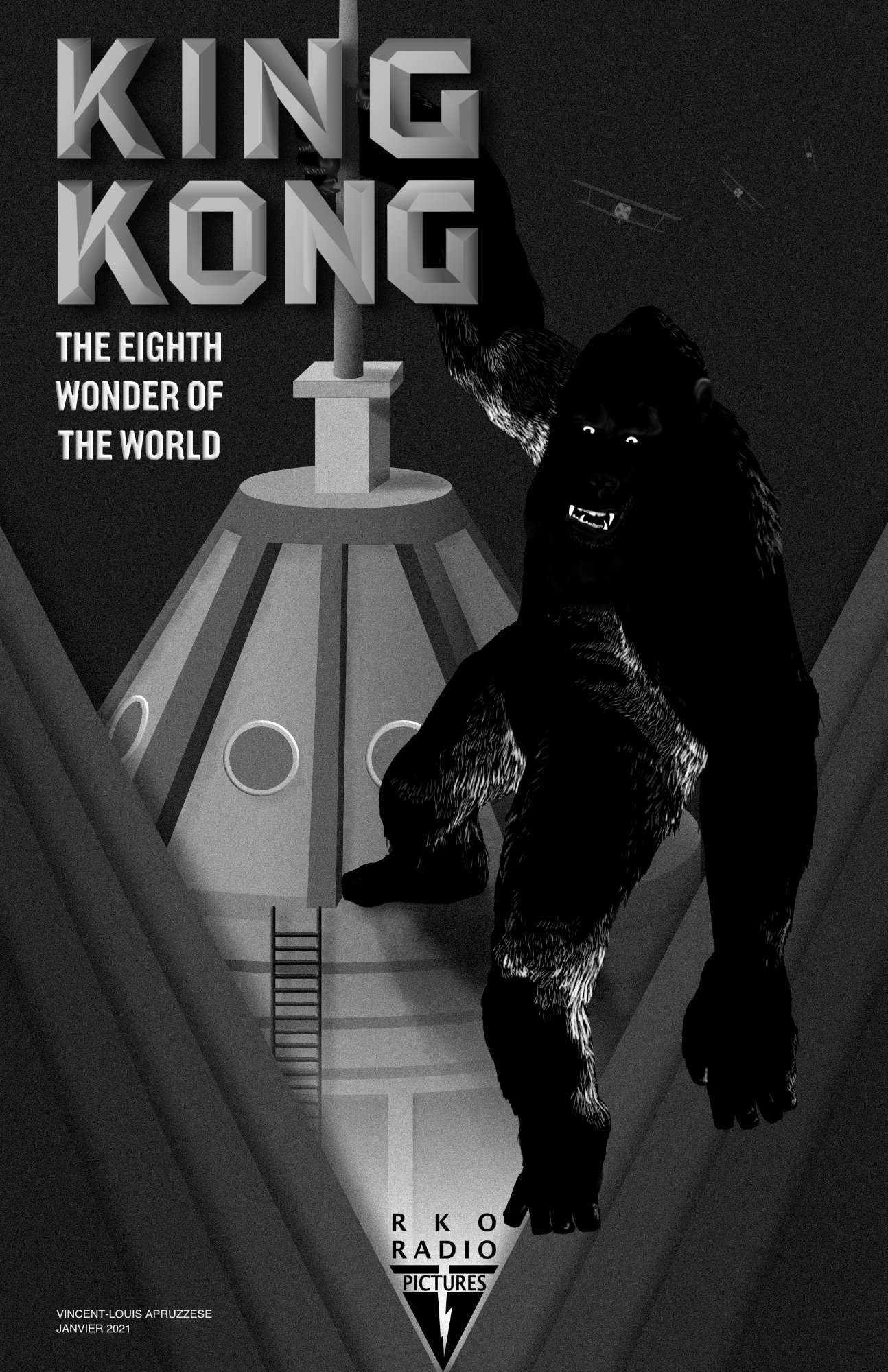
Made with Designer and Photo. I went through the movie frame by frame for references and then came up with something that was a little modern but more anchored in the art deco design of the original movie. I also looked through Willis O'Brien's pre-production images of Kong since i wanted him to have a rougher look.
-
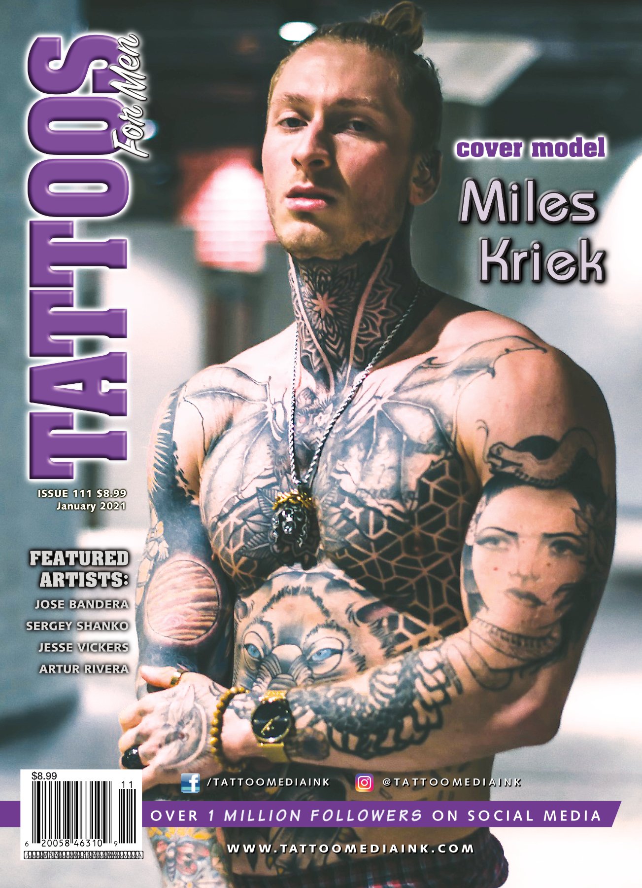
Third magazine created with Affinity Publisher (and Photo and Designer). No Adobe products were used in the creation and proofing of this issue. There was a problem about halfway through the creation where Publisher 1.8 would seize up the file when saving and for whatever still unknown reason, the file could not be opened. All sorts of error messages. Thankfully there was a backup through Time Machine, although much work was lost. Paranoia set in and started saving copies every few minutes to several different folders. Sure enough, the same saving error occurred and file would be corrupted so I'd open a backup and kept juggling like that for half a day. Long story short, I reinstalled 1.7 and carried on with no problems. I did post the problem in the forums but the only semi-useful suggestion from another user was to try the 1.9 Beta. As my deadline was shortened by the problems I couldn't take the chance with the Beta version and reverting to 1.7 solved the problem. Still love the program despite that glitch (although there was much cursing during the crisis mode!). Before anyone asks, it was the magazine's publisher that requested the cover logos be turned on their sides. When anyone figures that one out, please let me know! As there are two covers, let me explain. It was decided that the two magazine titles were to be combined into one issue, evenly split (50 pages each). At the 50 mark, the pages are flipped upside-down. Not something I'm crazy about but then again, my job is to Art Direct and produce the magazine.
-