Search the Community
Showing results for tags 'multi' in content posted in Share your work.
-
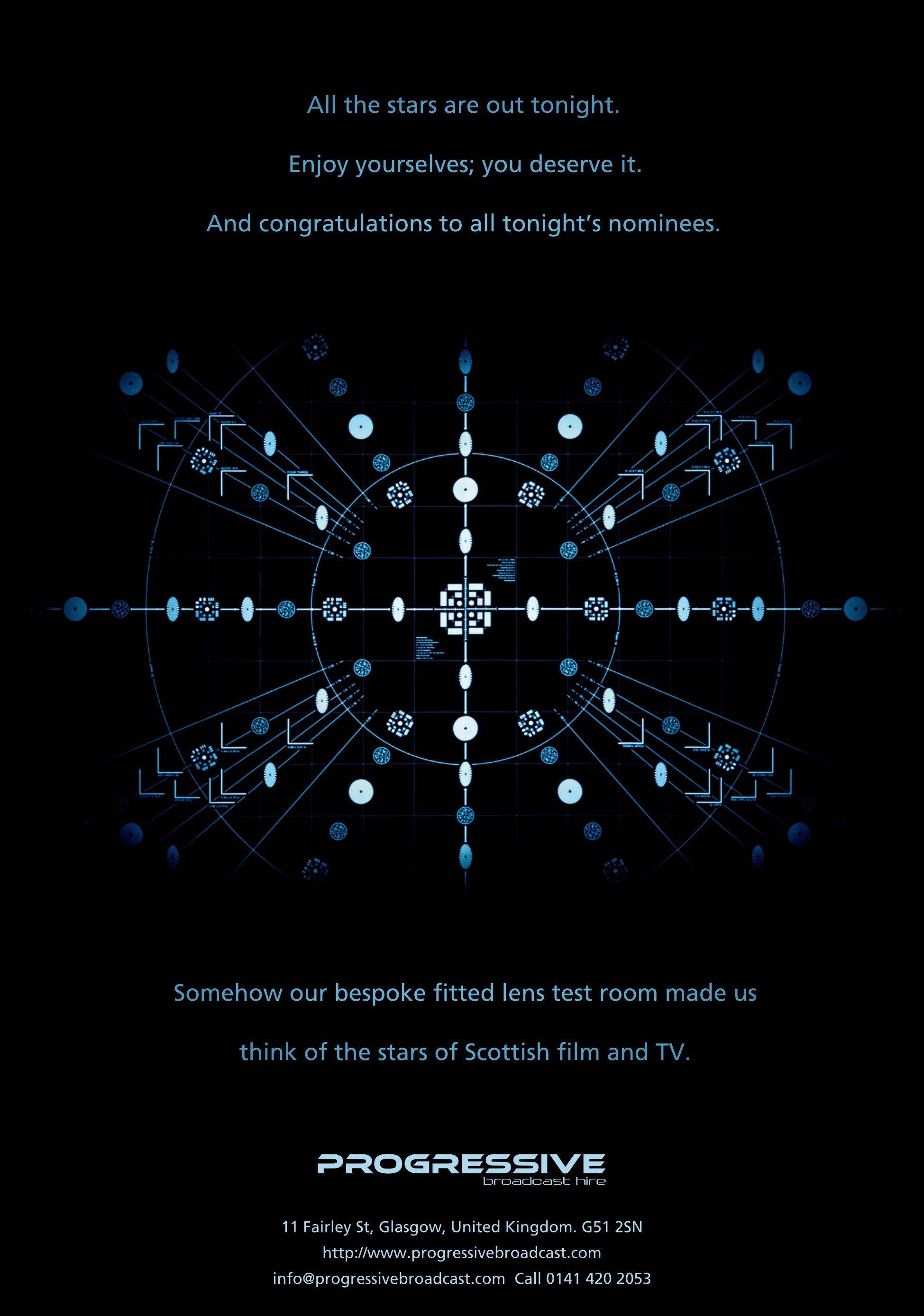
Progressive Broadcast Hire commissioned me to do a full-page ad in the Scottish Bafta 2021 Awards programme. The image is from their newly installed lens test room. The primary purpose of the ad was to celebrate the talent in Scottish film and TV and congratulate the evening's nominees. Then suggest how Progressive can help them achieve even better results.

- 1 reply
-
- 4
-

-

-
- affinity designer
- affinity photo
- (and 2 more)
-
My personal crest created in Affinity Designer and Photo. Brief tutorial on how to draw non-linear texture (the snakes's scales) at: https://communicats.blogspot.com/2021/12/creating-my-personal-crest-in-affinity.html
-
With this issue I'm all caught up with posting. Constantly learning new bits and pieces about all of the Affinity programs. Always getting better. I have jumped into QuarkXpress to update and export some older files and after using Publisher for almost 3 years, Xpress feels like I'm fighting the program at times. Forget about adobe indesign (the monolithic beast). However, to each their own.
- 2 replies
-
- 6
-
-
- multi
- affinity photo
- (and 1 more)
-
Un placer saludarles de nuevo. Comparto con ustedes un nuevo proyecto de arte realizado en Affinity Designer y Affinity Photo. El Diseño vectorial fue inicialmente realizado en Designer para luego rasterizarlo para aplicar efectos de desenfoque, texturizado y ruido en Affinity Photo. Gracias por la oportunidad que me dan de presentar mi trabajo. Especialmente a todos aquellos que han hecho posible el diseño y funcionamiento de esta suite de aplicaciones Affinity con herramientas tan alucinantes y que no limitan nuestra capacidad creativa. Espero sus comentarios. ¡Gracias!
-
- 4
-
-
- affinity designer
- affinity photo
- (and 1 more)
-
Most of this drawing was done with affinity designer. Affinity photo was used for some elements. It was a trial and error process took about a month to complete. A few tweaks have been made.
-
‘Guilt’ is a BBC Scotland drama series where only the strongest liars, bluff merchants and crooks survive. This is the work I came up with when Progressive Broadcast Hire asked for another ad. It presents their part in the production. I am delighted with the wording; it’s that latent copywriter in me coming out again. It appeared in British Cinematographer magazine.
-
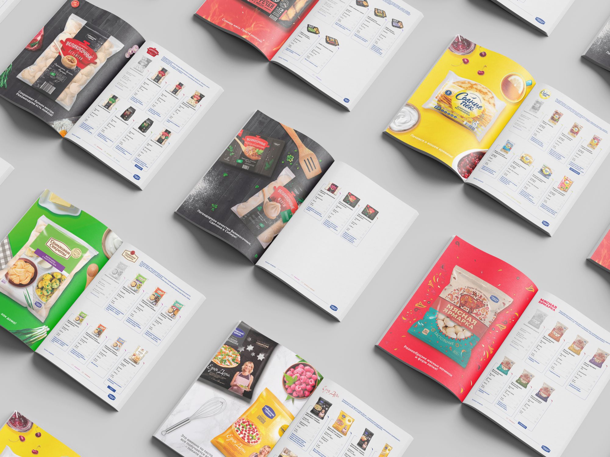
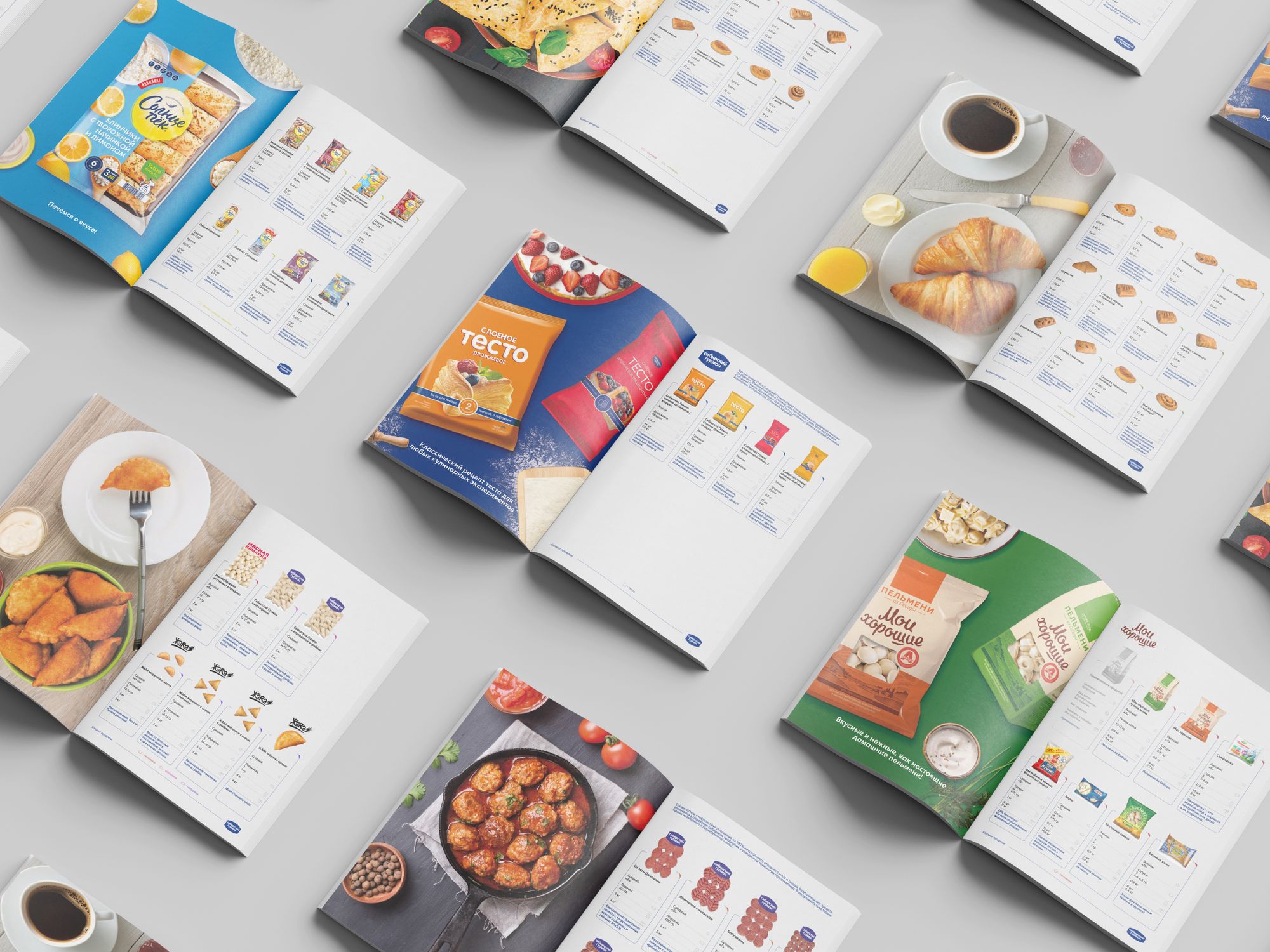
While working on this catalog, I used all the programs from the Affinities package.
-
- 11
-
-
-
- affinity photo
- affinity designer
- (and 1 more)
-

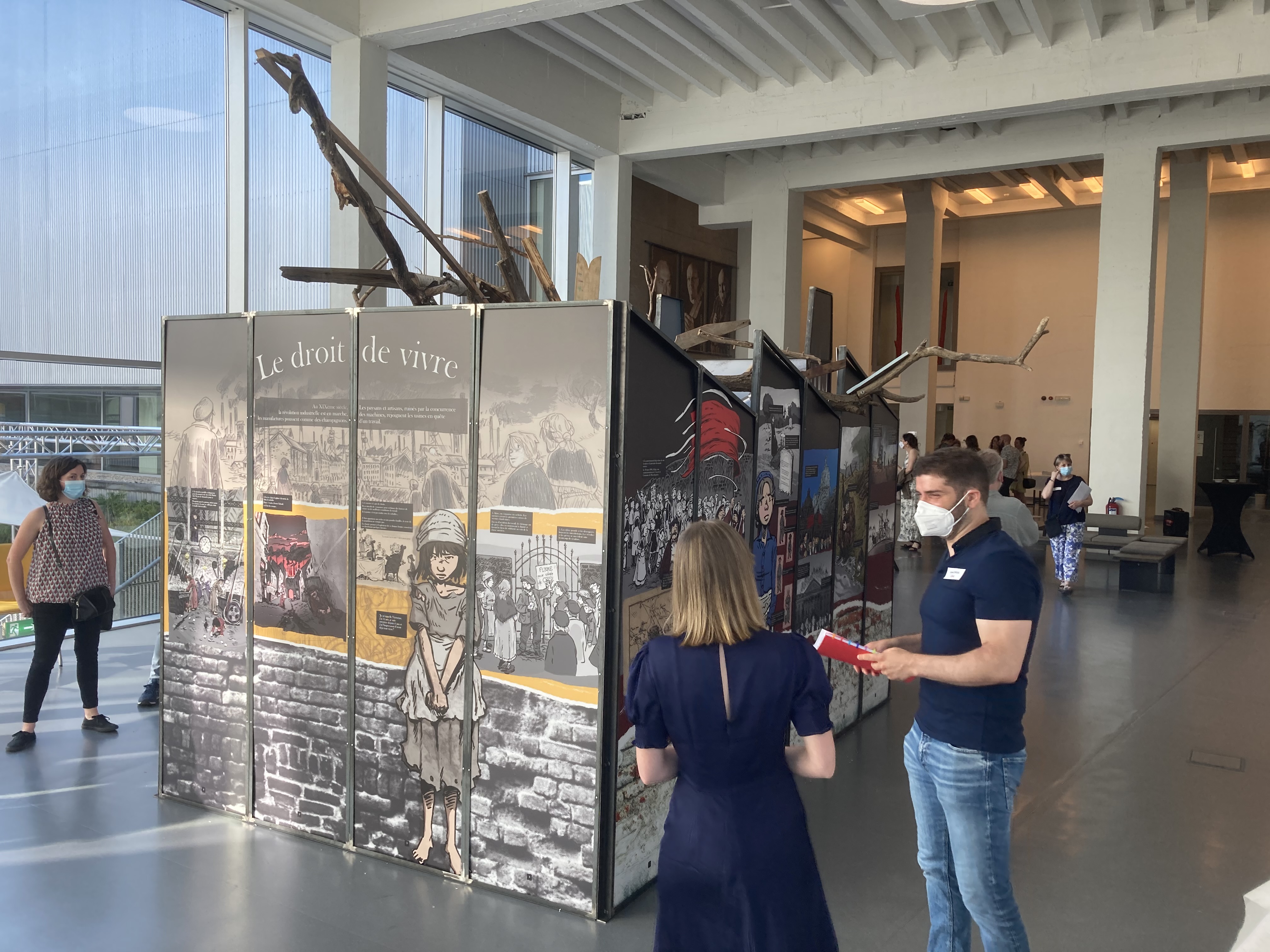
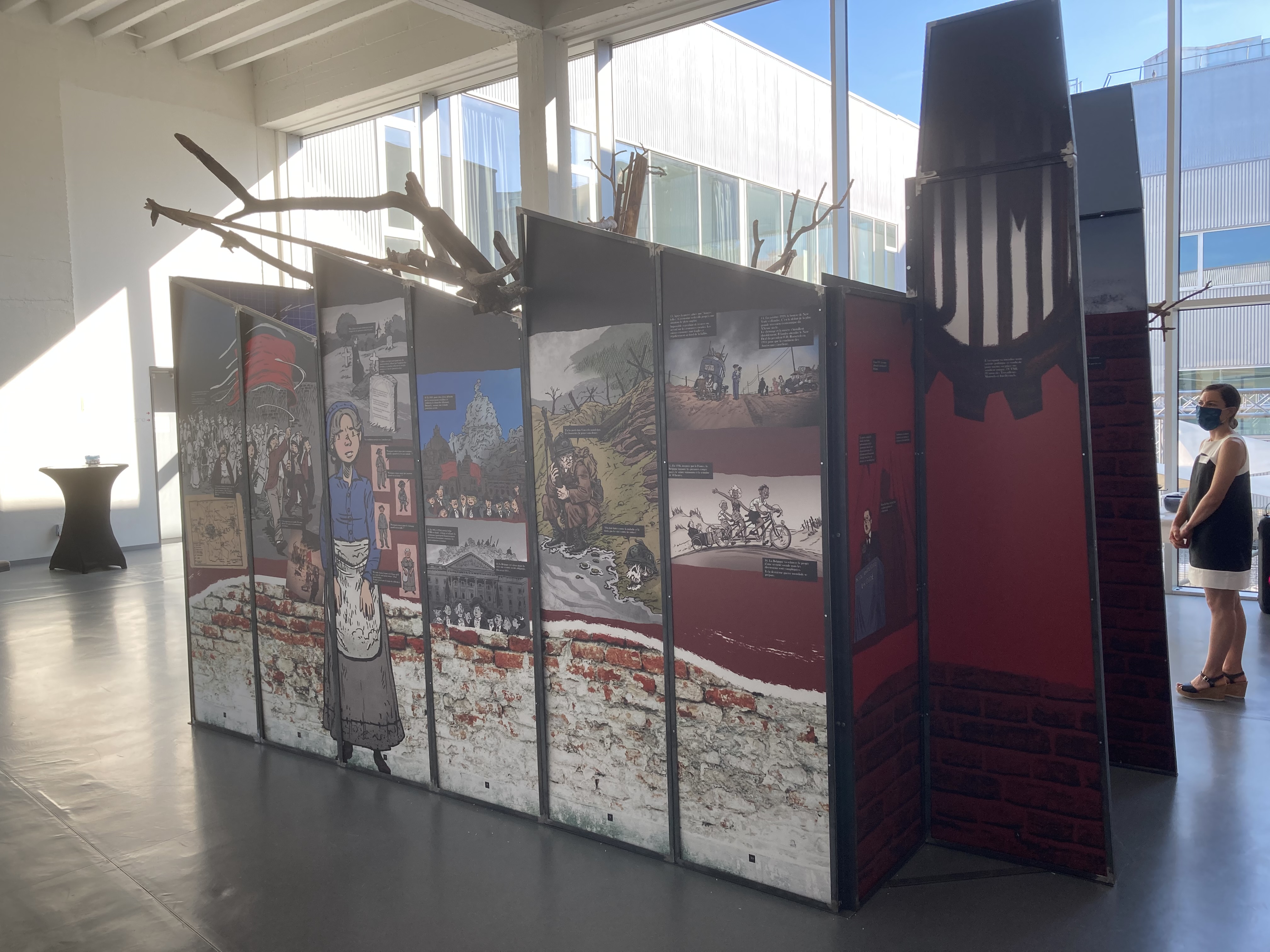
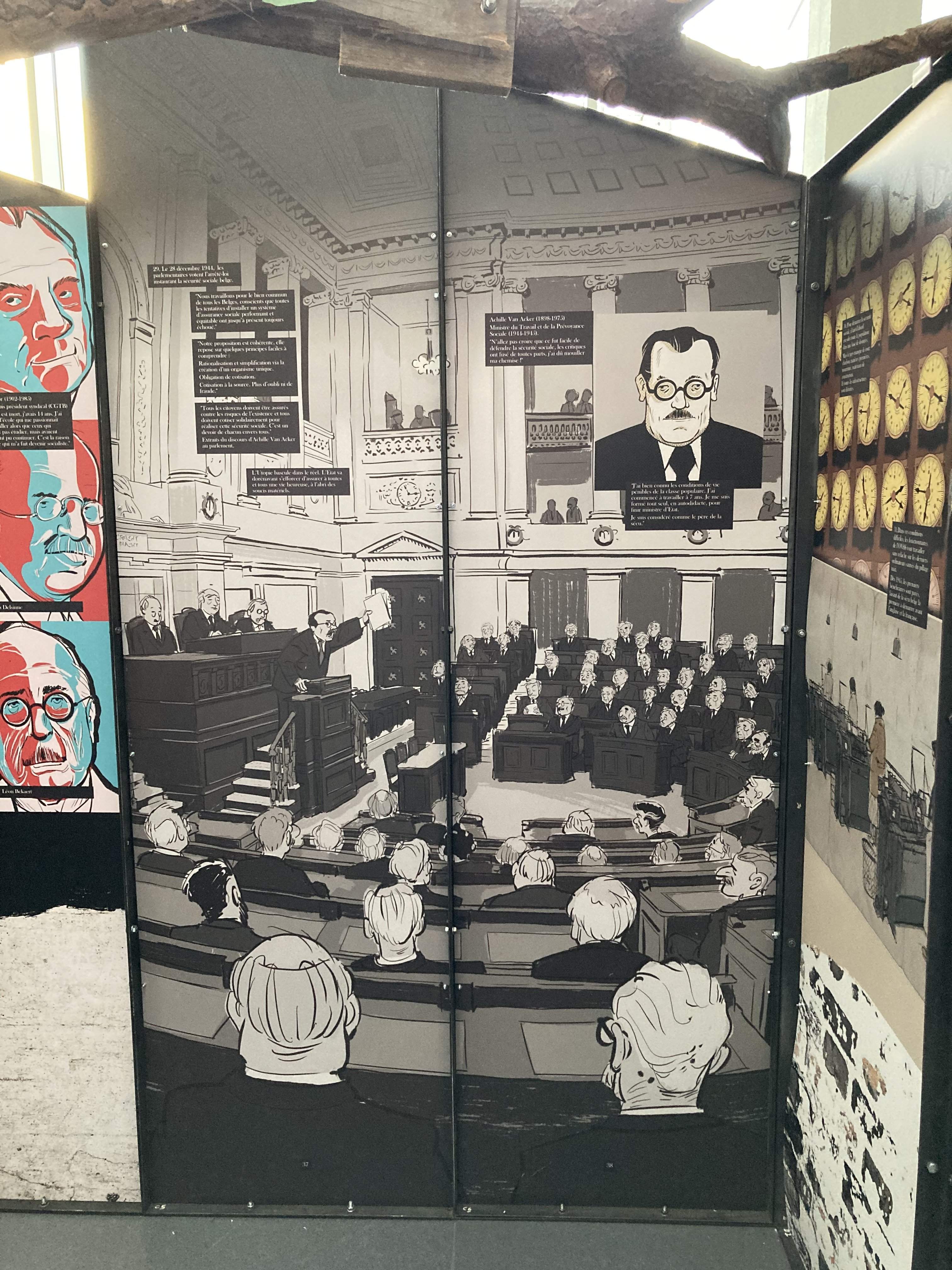
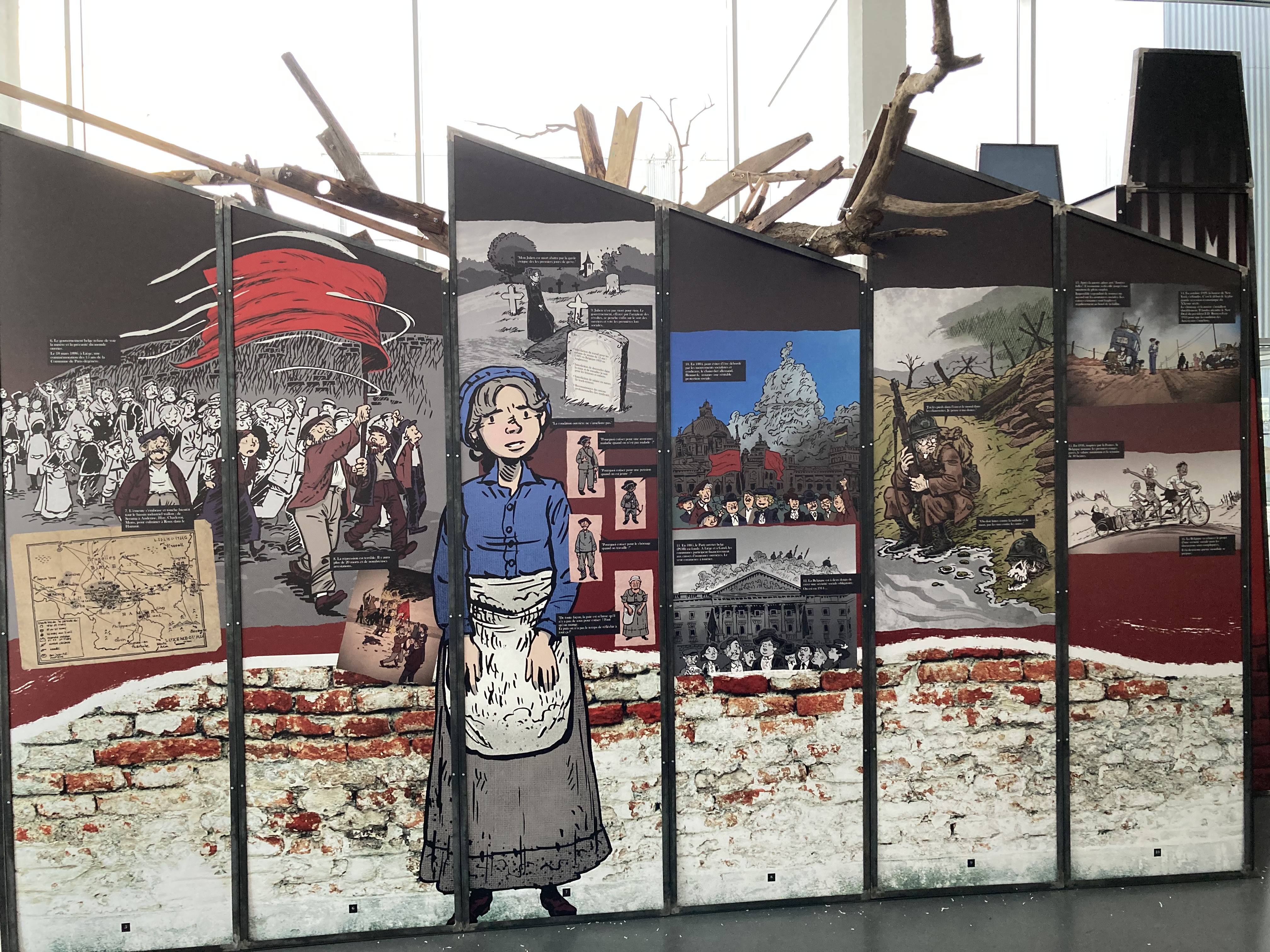
multi My first exhibit with Affinity (mainly Designer and Photo)
Bentox posted a topic in Share your work
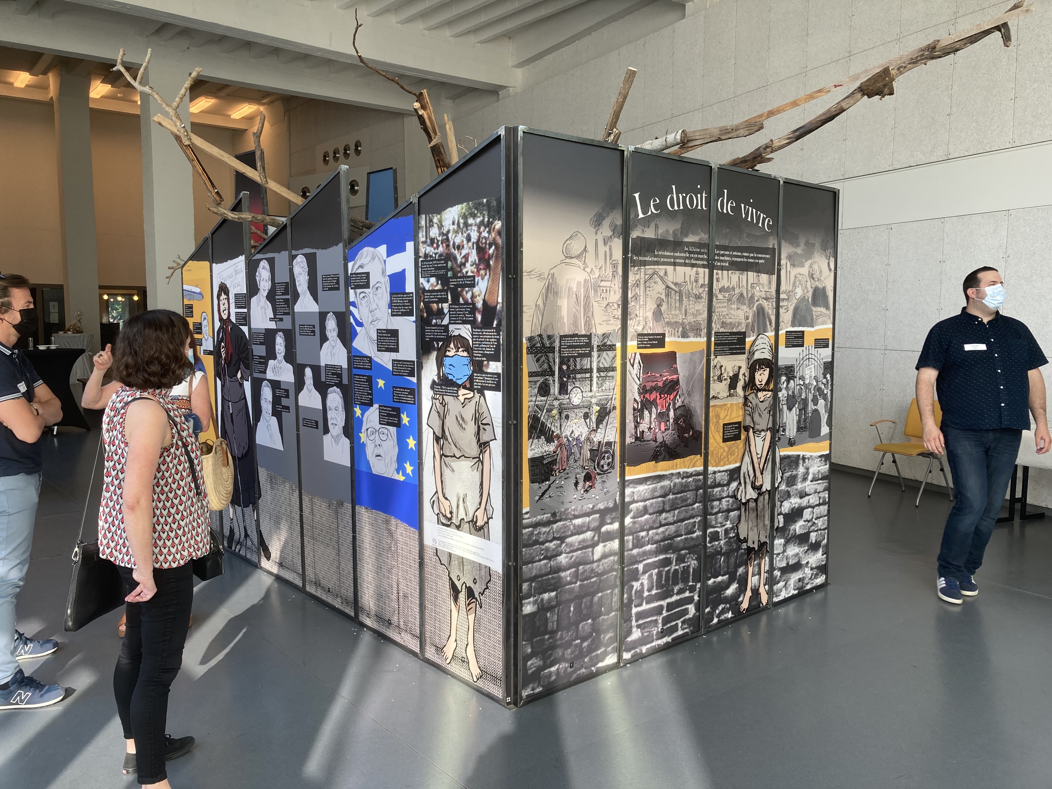
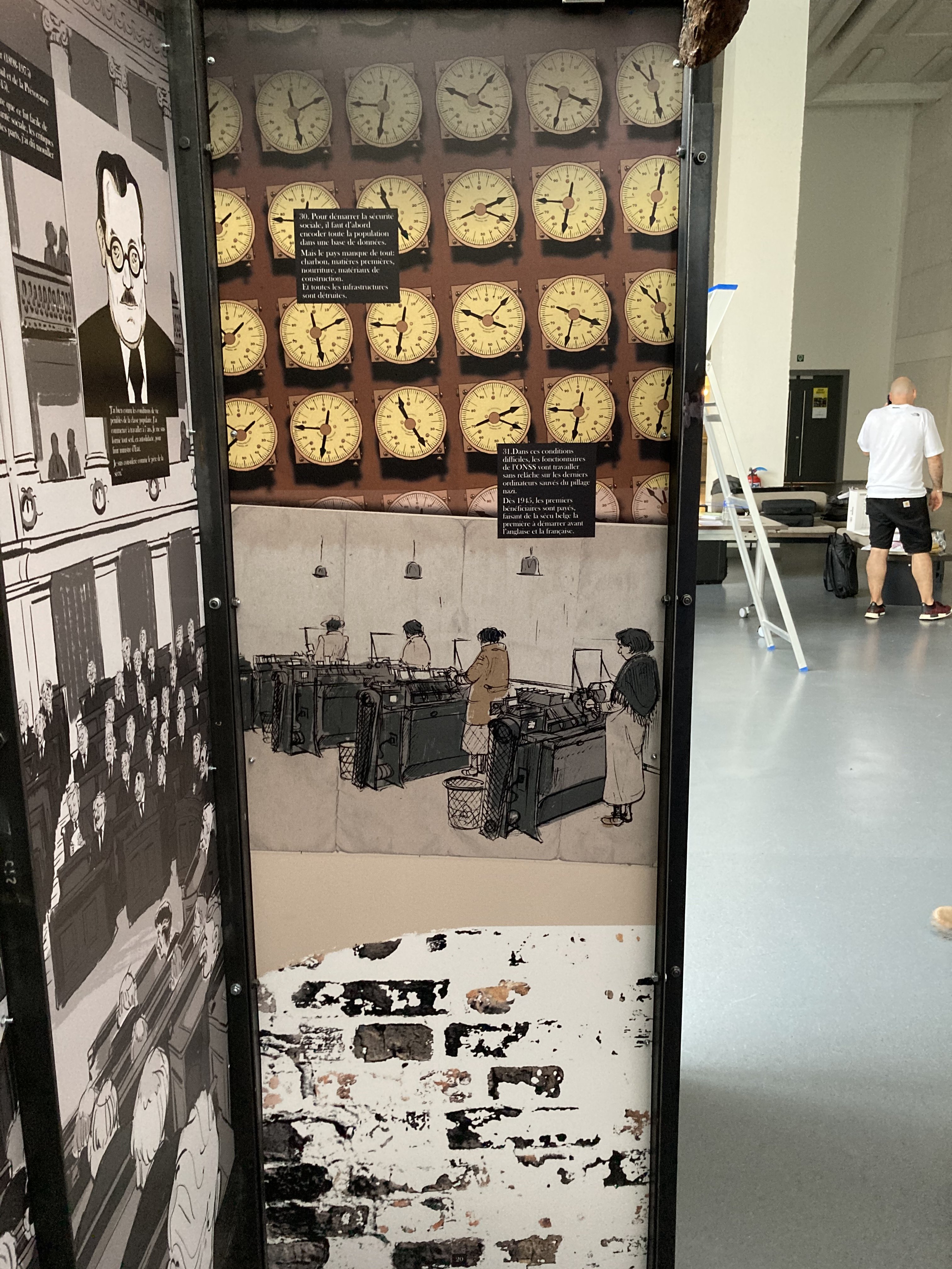
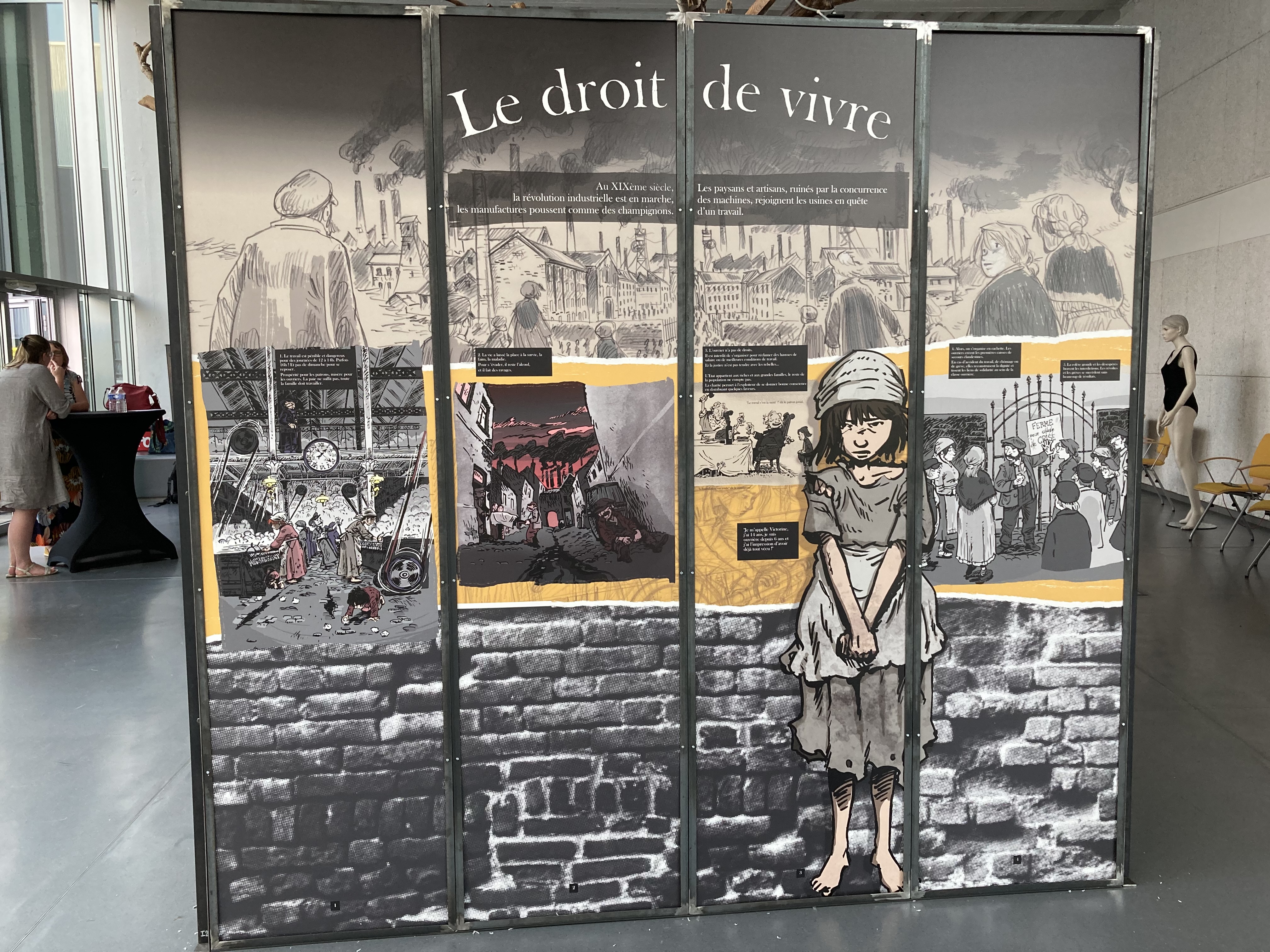
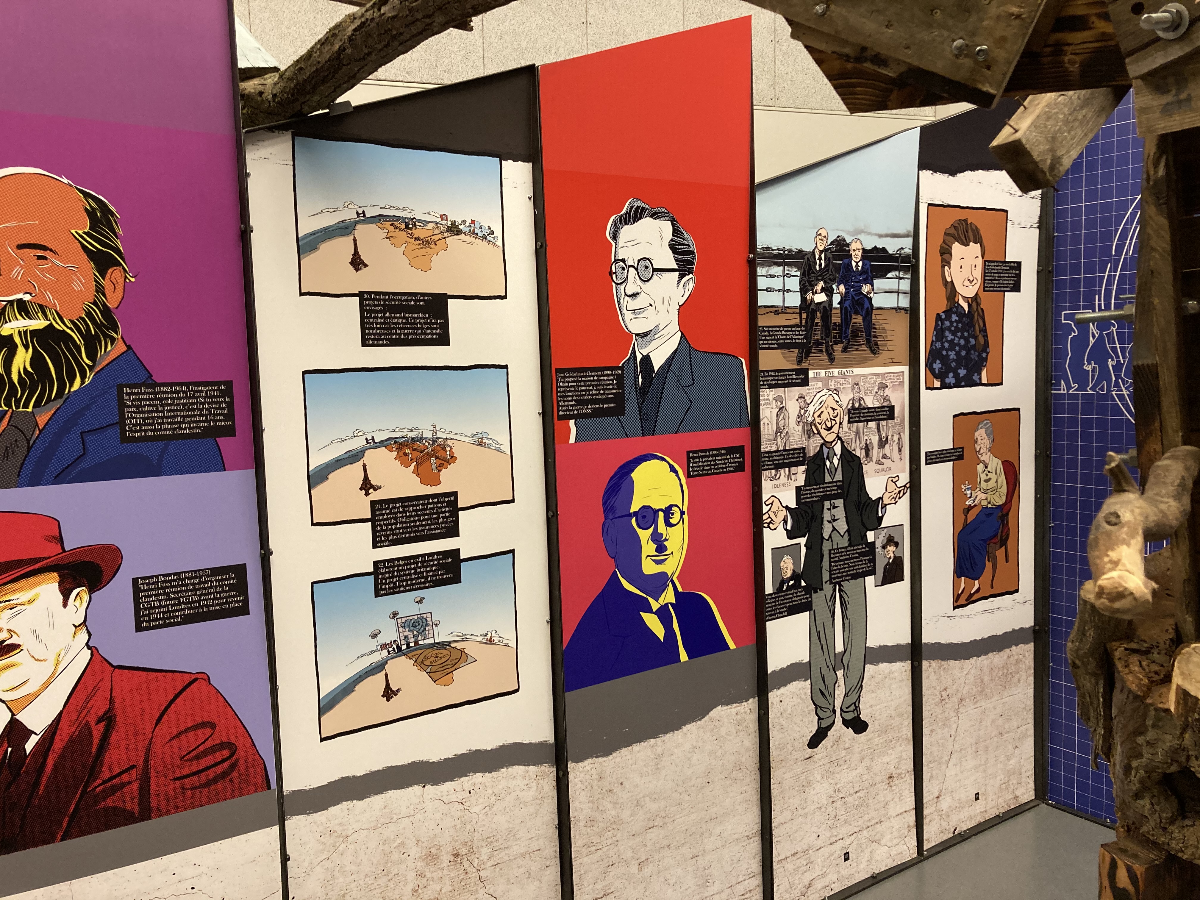
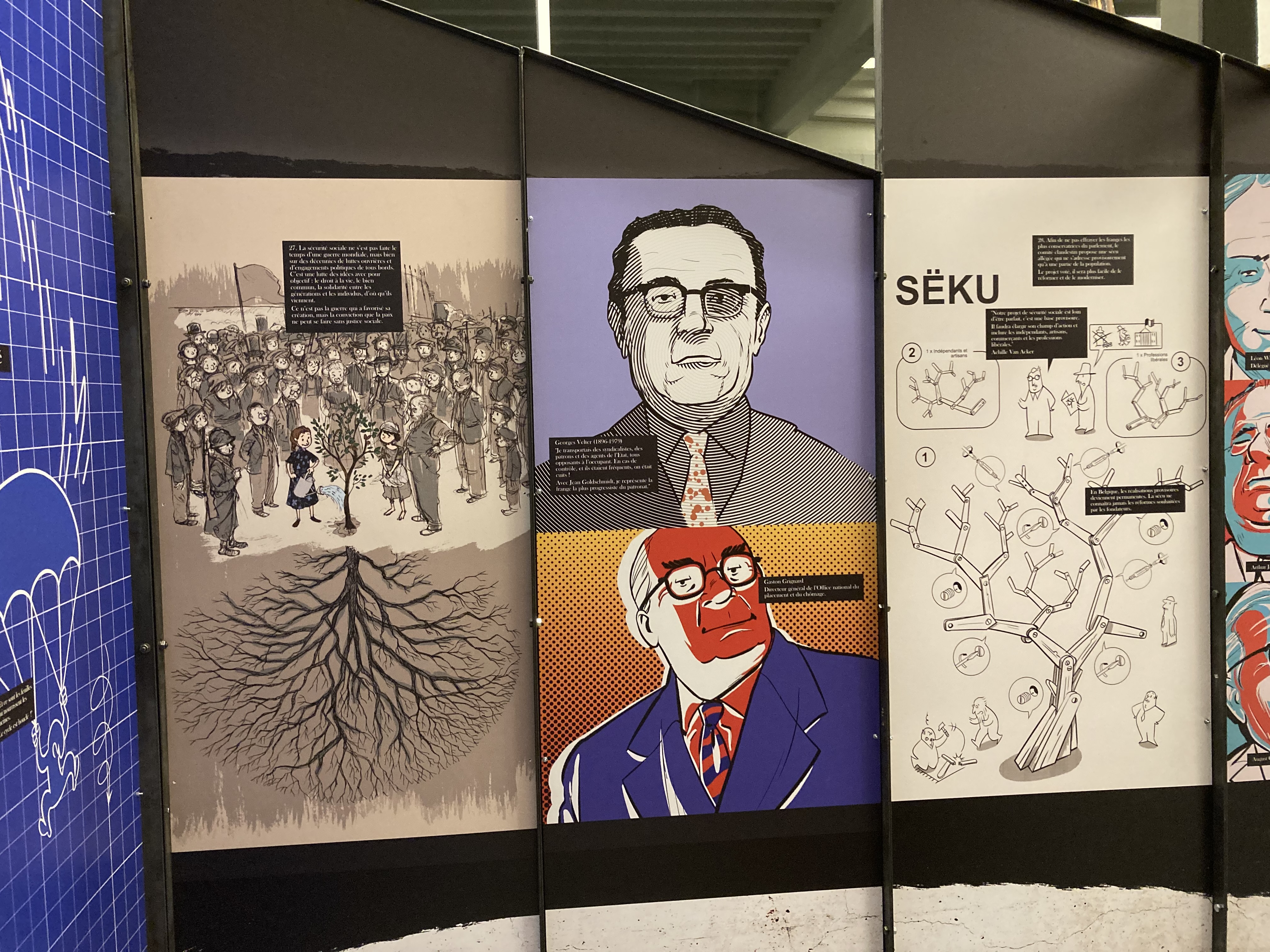
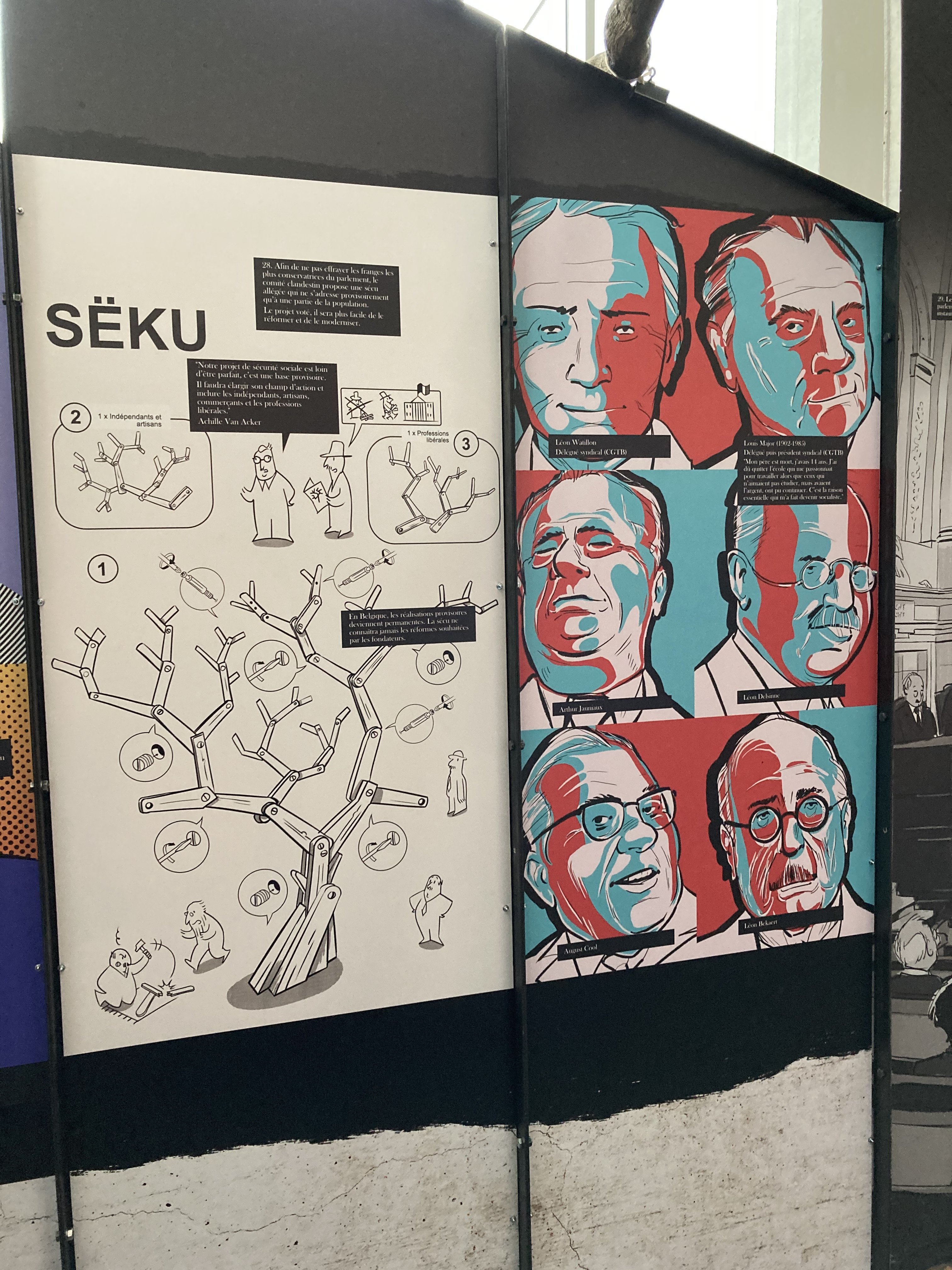
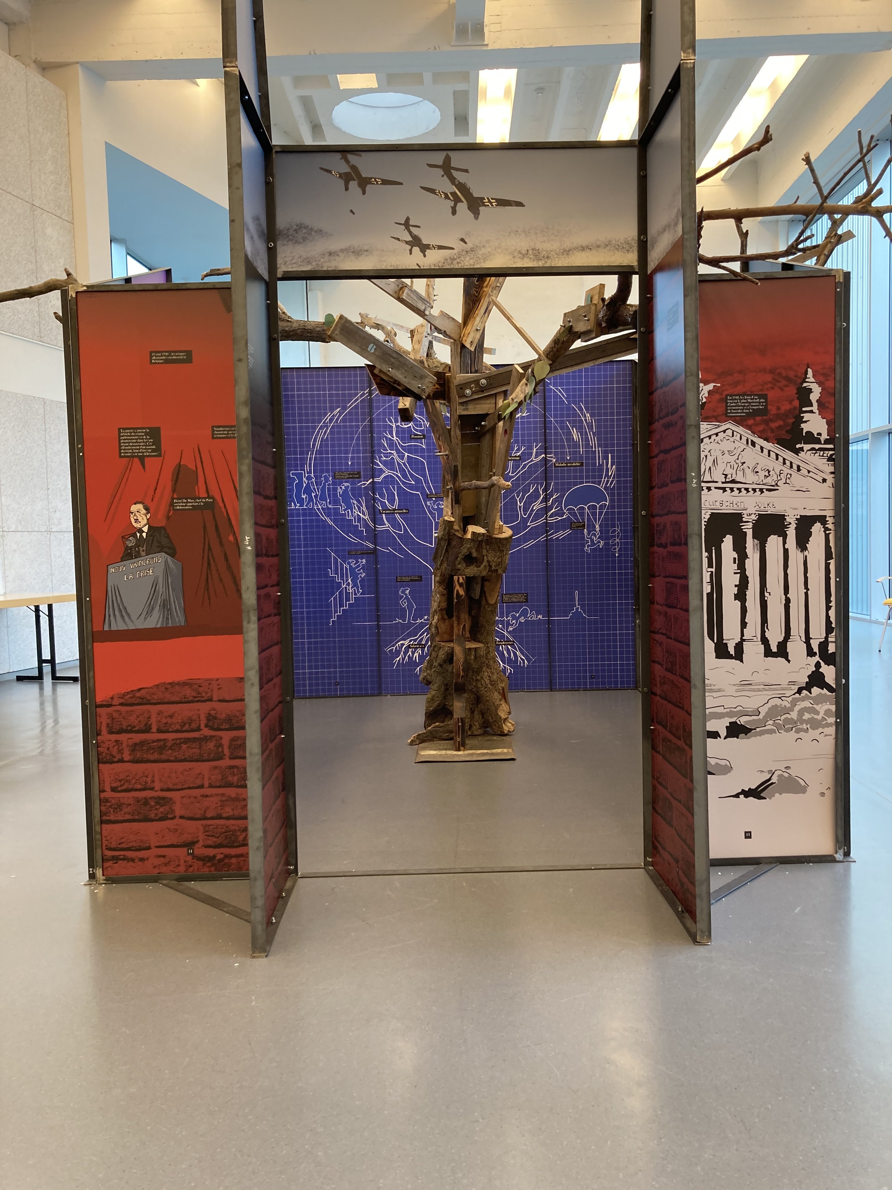
I've been working on an exhibit on the social mouvement in Belgium since the beginning of the industrial revolution.It's a long project started in september 2020, delayed many times due to the covid and finally released in june 2021. The content is partly inspired by a comic book I relaesed in january 2020 on the Belgian social security system history. Done on Adobe, and as so many people I just wanted to quit. So I finally played with Affinty on the hard side, directly on big size filed for final production. The stress was High, very high ! I messed up a little with Publisher but finally get my way through the learning curve and, oh boy, I loved the export persona option. It saved my day ! Here is the pictures off the exhibition in Dison, near Verviers, the drowned town in southern part of Belgium.
-
 Here is a link to a font produced today using artwork from 2014 and 2016. I wonder how the glyphs can be applied today using Affinity products. https://forum.high-logic.com/viewtopic.php?f=10&t=4930 It is a colour font with monochrome graceful fallback glyphs included. William
 -
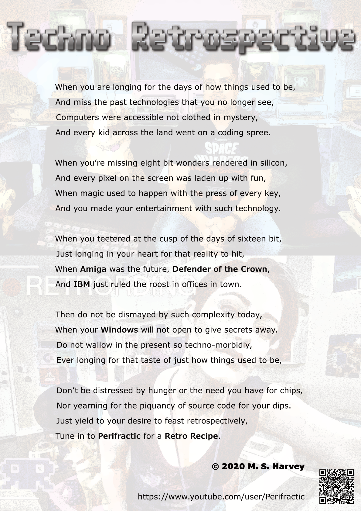
Here is a piece of work I created as an advertisement / poem which reflects on retro technology.All work done in Affinity Photo using the G'MIC plugin and Affinity Publisher. The only exception was the creation of the QR code in Serif PagePlus X9 and the text edited in LibreOffice Writer. See YouTube video at (Time Mark 37:35) to hear it read out:
-
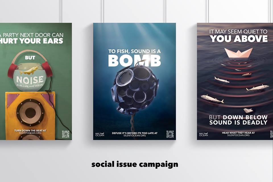
Silent Ocean - Campaign (2018) While studying at SAE for my Bachelor of Design, I got the change to work on a social issue campaign around noise pollution in the ocean with the goal to make 10 posters around the campaign and ended up making 12 posters, 10 badges, art display piece, and a website. This project was amazing to work on allowing myself to break out of my "normal design style" and really allow me to just play around with mix design, merging vector, paper craft, images and 3D together to create something amazing Made with: Affinity Photo (Mac + iOS (iPad Pro) Affinity Designer Autodesk Maya (for 3D) "Click Here" to view the website. __ Need of a graphic designer? Check out my work: http://bit.ly/2vjCmTi Social Media: Website: www.andrewsalfinger.com Portfolio: http://bit.ly/2vjCmTi Twitter: http://bit.ly/andrewdestwitter Facebook: http://bit.ly/andrewdesfacebook Instagram: http://bit.ly/andrewdesinstagram Behance: http://bit.ly/andrewdesbehance Etsy: http://bit.ly/andrewdesetsy
- 22 replies
-
- 24
-
-
-
- maya
- affinity designer
- (and 6 more)
-
The last client illustration project I worked on in 2020, and the first one I've posted in 2021 - had an absolute blast creating this! 👾 I used Affinity Designer (for plotting the initial layout and perspective guides), and Affinity Photo, with an XP-Pen tablet, for the drawing/painting, colouring, and finishing effects. There's a bit more insight into the process on my Bēhance if anyone's interested: https://www.behance.net/gallery/111102577/Pips-Meadery-Code Hope you guys like it! Stay safe out there, Christi. 🤙 http://www.instagram.com/christidutoit
- 1 reply
-
- 16
-
-
- design
- illustration
- (and 3 more)
-
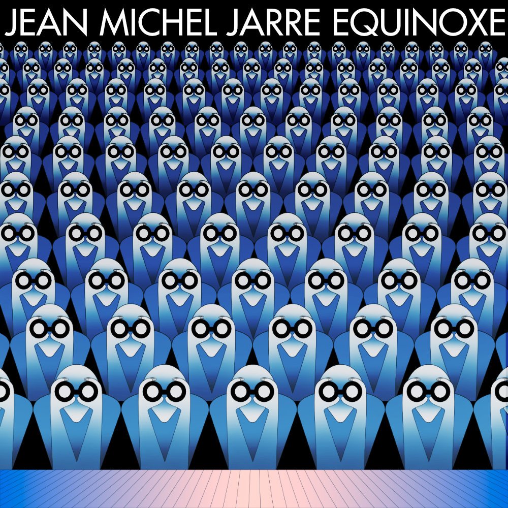
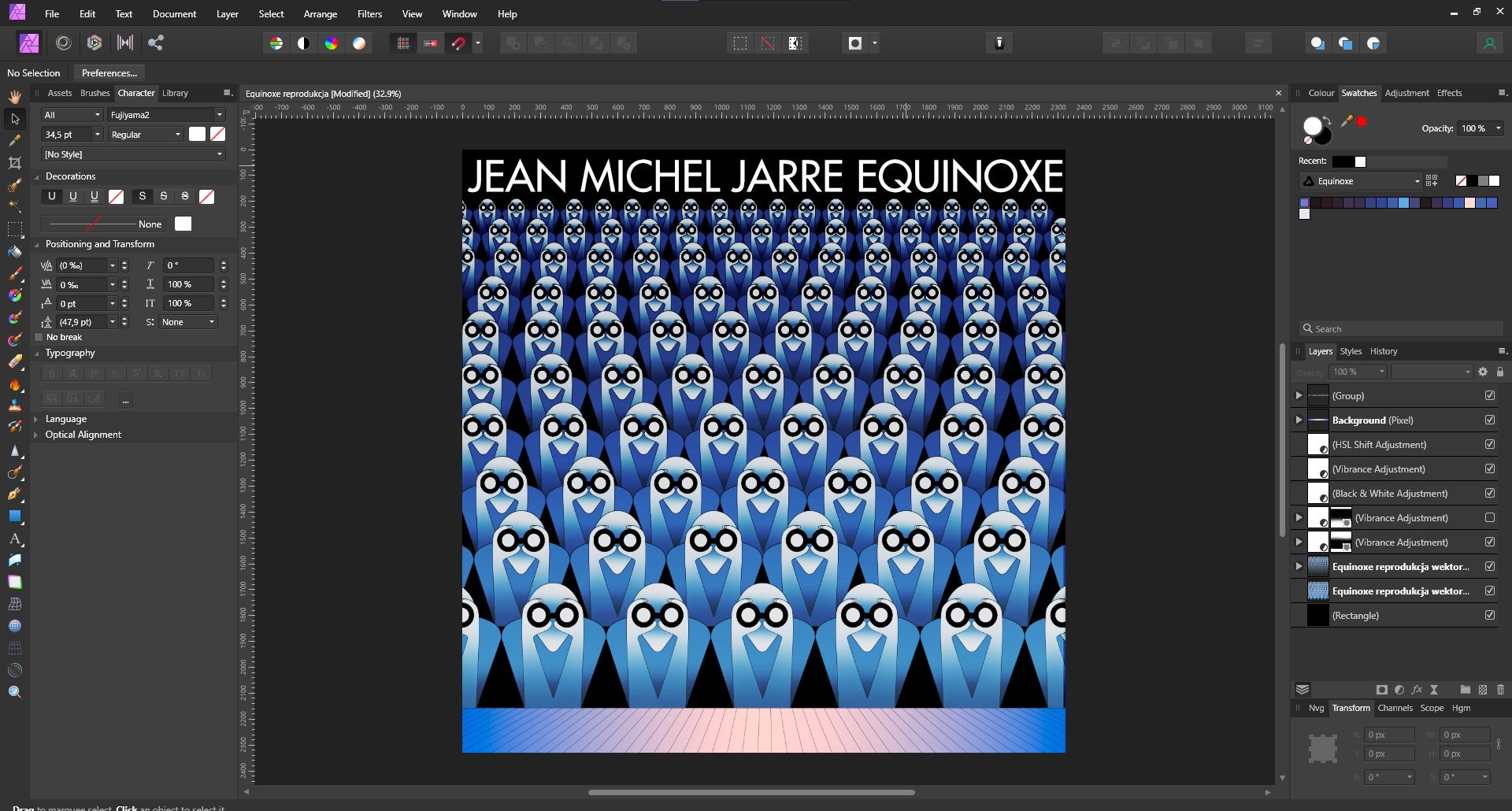
Hey Everyone! I decided to play with the Equinoxe cover reproductions. Post-production is done in Affinity Photo, but before that, everything in Affinity Designer.
-
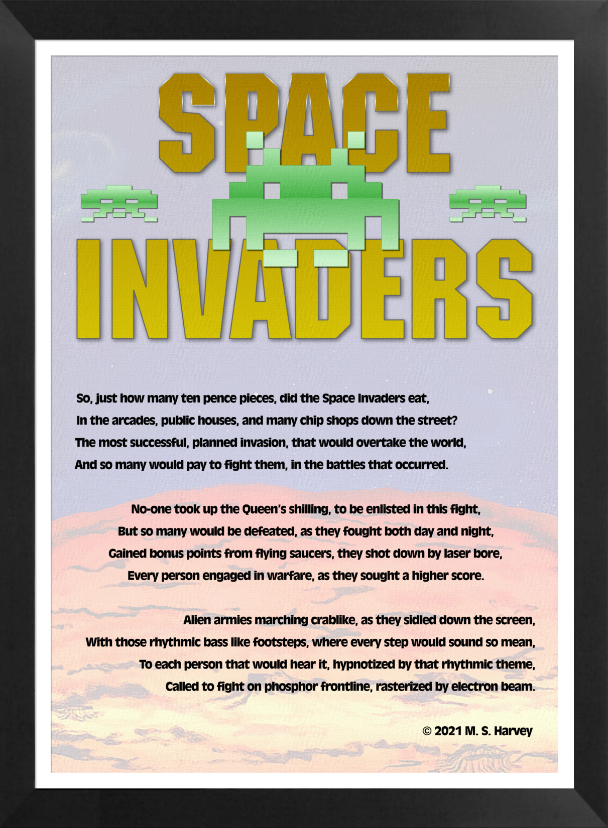
I have written a poem which reflects on the invasion which took place in 1978 all around the world. It is written from a UK perspective on the phenomenon called SPACE INVADERS. The title graphic was created in Affinity Designer, the text edited in LibreOffice, the layout done in Affinity Publisher and the graphic editing done in Affinity Photo. The YouTube link takes you to an audio version of the poem with backing music created in OpenMPT and speech created using Microsoft Sean TTS and mixed in Audacity. The frame effect was done in Fotosketcher. I hope you enjoy this retrospective on this seminal arcade game.
-
- 3
-
-
-
- affinity publisher
- space
- (and 6 more)
-
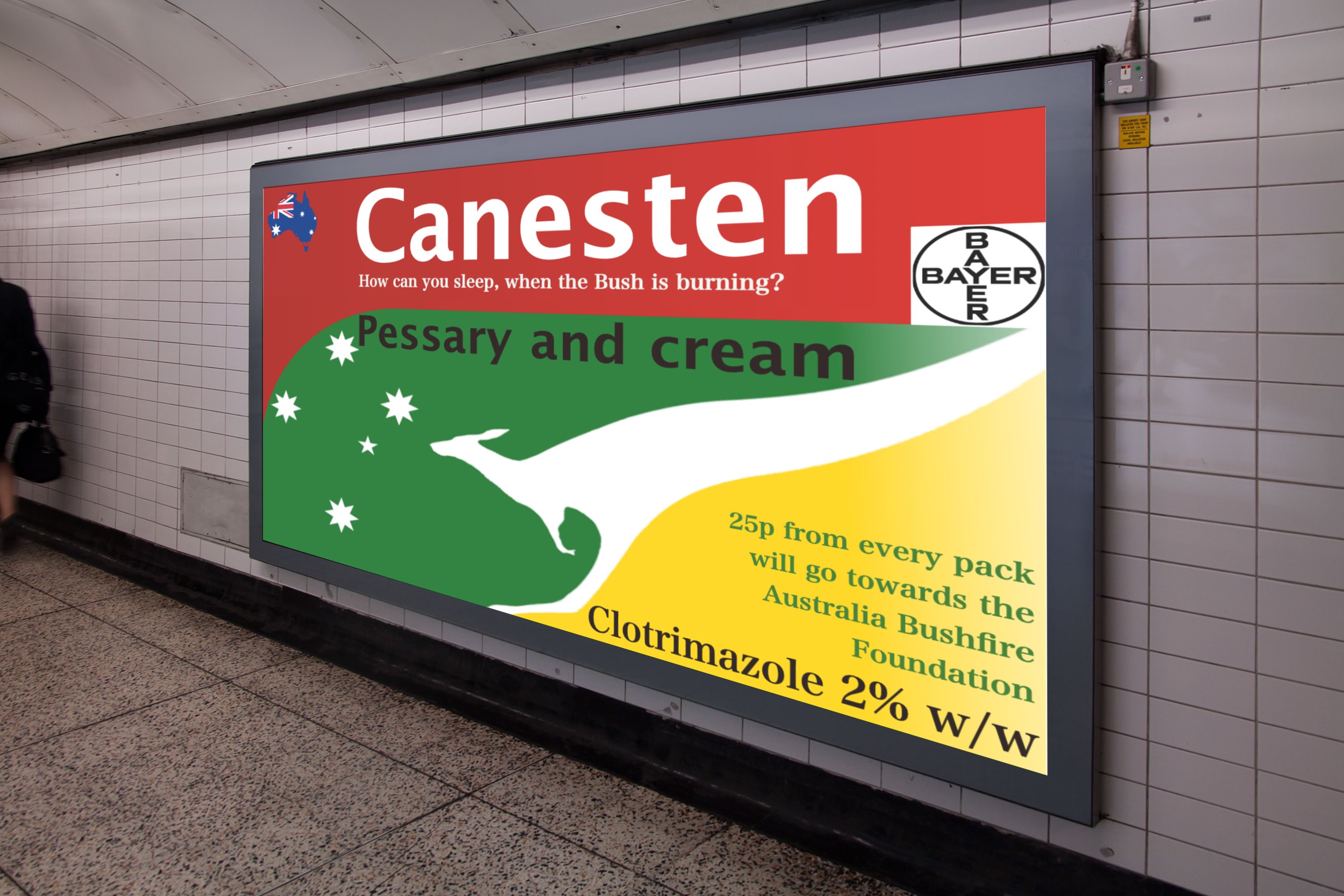
I've finally entered the world of creative advertising, by submitting my entry to The Chip Shop Awards for judging next spring. Not a cheap hobby. Being allowed to create something witty, close to the knuckle and quite apt is something I've wanted to do for a very long time. This is my entry. It is an ointment manufacturer, helping out the seasonal homeless down under, buy their product and they'll donate the proceeds to a charity. Of course it is full of puns, some of you know me well enough by now! Its called How can you sleep when the Bush is burning? Pungent: noun. a bloke with rotten jokes!🤢 The photo is from the web. The packaging was done this Spring in AD. The skewing, backlighting and montage was done in APh. Wish me luck. Peter (The Drum Chip Shop Awards celebrate pure, unadulterated creativity. It's a platform where anything and everything is allowed, an awards show with no rules and no boundaries meaning the possibilities are endless!) The prizes are not glossy statues or metallic masks: they are a resin bottle of vinegar and an oversized chip.
- 6 replies
-
- 3
-
-

-
- poster
- competition
- (and 5 more)
-
 I am Adobe Illustrator user from many years and using Affinity Designer and Photo from beta but never made logo from basic to finish in Affinity. I was previously made basic vector in Adobe illustrator and then put some colour and gradient in Affinity Designer. oday i thought i sjould give a try to make this logo concept all in Affinity and i made basic drawing in Affinity Designer and then used Affinity Photo brushes to paint. Hope you like my first try
- 3 replies
-
- 5
-
-
- logo
- logodesign
- (and 2 more)
-
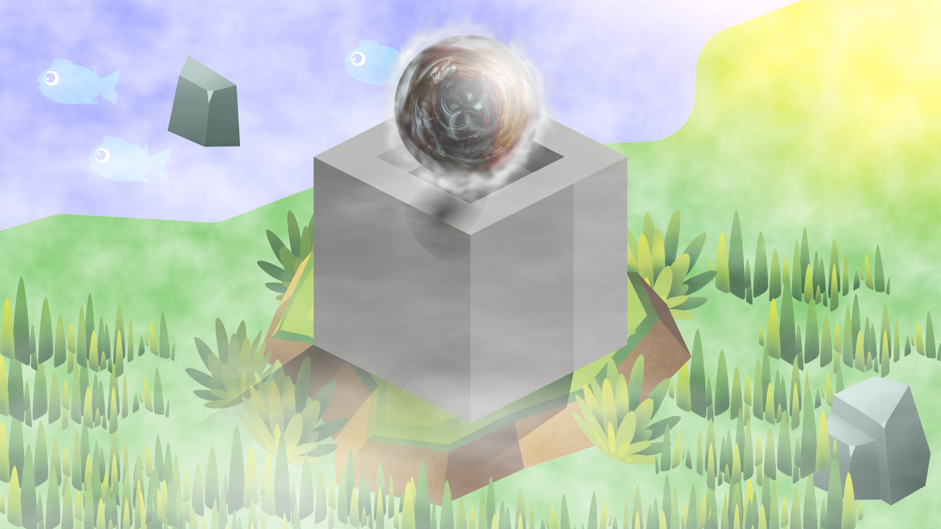
Made this on stream tonight, between Designer (most of the work) and Photo, started off as just the cube, then found the greenery assets while trying to find how to create a sphere... Then added some of the assets and things from the Affinity store. It's nothing overly special, but probably one of the nicer things I've managed to put together. Probably a lot/too much going on, but was just playing around - rather happy with how it came out. Name of it came from a viewer which is why it went from more than just the cube to what it is.
-
Unicode Inc. announces design competition http://www.unicode.org/announcements/u14call/index.html William
-
From looking at some of the wildlife & landscape pictures in this forum there is no doubt that there are many talented photographers here but I find myself no better off in my use of Affinity Photo just by looking at these stunning pictures. To be honest I could find the same sort of pictures just by using Google. What would be nice is if the people uploading these pictures could supply a before and after picture and detail the steps used in Affinity Photo to get to the final results. That way I am sure mine and others use of AP to create these stunning photos could be greatly improved. Isn't that what forums like these are all about? Or am I missing the point and is it that professional photographers would rather not reveal their workflow in fear of increasing the competition in their chosen profession. Honest answers appriciated
-
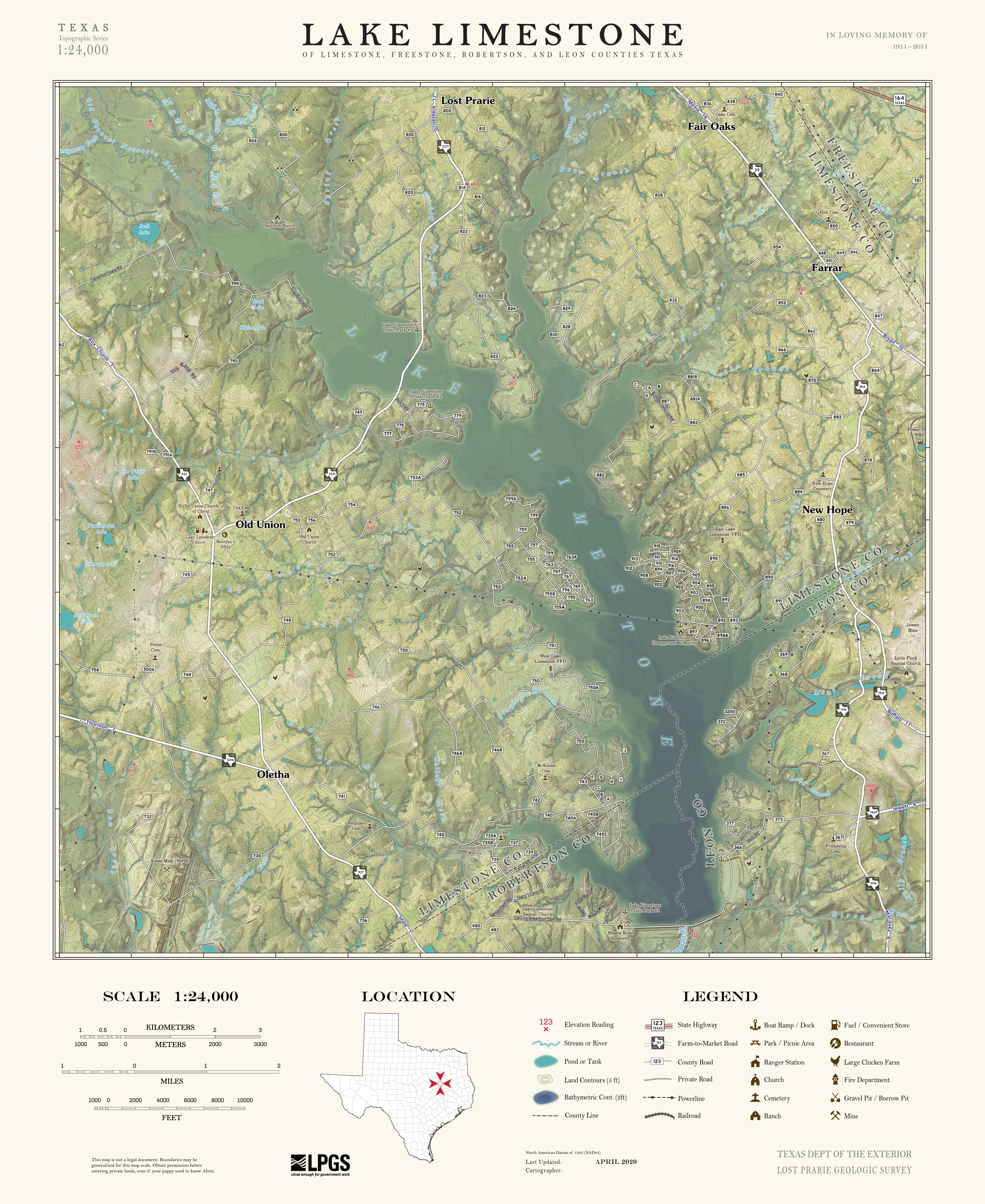
 I'm curious if anyone else out there is using Affinity products for making maps? These days , probably >95% of cartographers make their maps almost entirely within GIS software, but I was always frustrated by the limited options and lack of precision for controlling stylistic elements on maps in those software suites (both QGIS and ArcGIS), so I figured why not outsource the styling to Affinity products For those unfamiliar, mapmaking is not unlike standard graphic design. You have a document comprised of a bunch of different layers, some of which can be vector (like road lines, point data, etc.) and some of which can be raster (like elevation maps, aerial imagery, etc.). The only real difference is they are all encoded with spatial information. So what I started doing is using the GIS software just to compile and size (spatially aware trim/crop) all my different layers of geographic data, and then exporting a bunch of identically-sized layers that I then reassemble in AD / AP (i.e export a PDF of *just* the road lines, export another PDF of *just* the water body polygons, export a PNG of *just* the aerial imagery, etc.). As long as I maintain identical pixel dimensions for the exported raster layers, and identical aspect ratios for the vector layers, maintaining the appropriate map scale / size and reassembling the layers in AD/AP is trivial. Once I have all the data in AD/AP, I can take advantage of those graphic design features that GIS software could never hope to do, like advanced masking and layer blending modes, brush-based editing, pixel-perfect label placement (HUGE), etc. Another great thing is this method gives you ultimate control over design of the map frame and you're not stuck using the preset layouts and scalebars that are baked into GIS software suites. The included example is a map I made for my mother last Christmas of the area where her ancestors settled 150ish years ago. Its sort of like a modern take on the classic USGS topo map styles from the 50's-80's. (there are two typos I'm aware of, 'prairie' is misspelled in both instances, and 'convenience' is written as 'convenient' in the legend... if you see anymore, let me know!) cheers
- 27 replies
-
- 23
-
-
-
- affinity designer
- affinity photo
- (and 1 more)
-
Inspired by the isometric grid 🙂 AD + AP 1920x1080, png 8bit
-
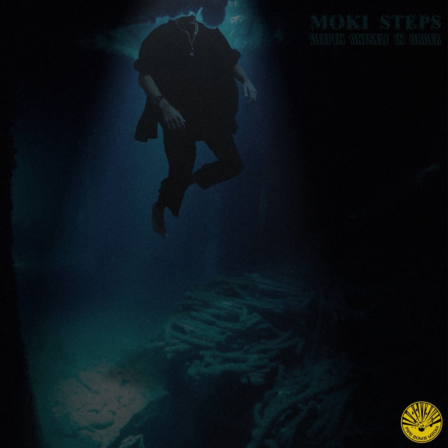
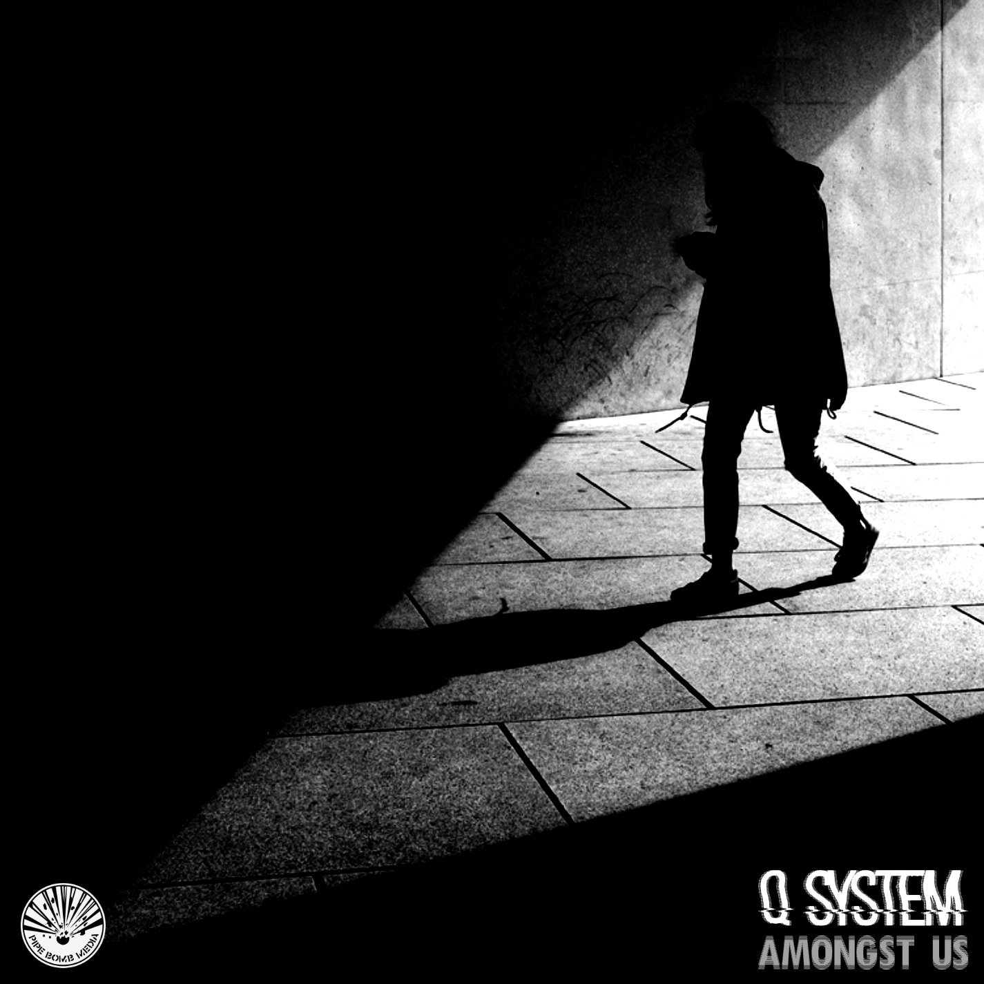
These are fake album covers I made with Affinity Photo for the Album Cover Challenge thing. I also included the a simple logo I made for my project 674D55F3-4B1D-45C2-9FA9-180D4776B1CC.MP4
- 8 replies
-
- 1
-
-
- affinity designer
- affinity photo
- (and 2 more)
-
Just a silly experiment which I was playing around with after half-remembering something I saw on a TV show. Nothing special, just thought some people might like to see it, and maybe it will motivate someone into making something better. (All the Live Filters I used on this really hammered my machine – poor little thing.) Note: In case anyone is interested, the globe was originally monochrome and the background was a full-colour photo, the rest was created in either Photo or Designer.
- 2 replies
-
- 6
-
-
- affinity designer
- affinity photo
- (and 1 more)
-
Hello folks, My name is Dennis. I created this pixelated self-portrait a few days ago. Started it in Dottable, a pixel-art app on a mobile phone, then traced it in Affinity Designer with the grid snap feature. Then I added a few grunge textures over masked areas, imported it into Affinity Photo, and finished it off with LUT filters and monochrome noise for a subtle paper-like feel. I like how precisely the applications work together and that you can add pixel-based textures directly in Affinity Designer without having to change the application, it integrates very fluidly into the workflow. Anyway, I hope you like the result. Dennis aka MrDoodlezz
- 35 replies
-
- 14
-