Search the Community
Showing results for tags 'light ui'.
Found 5 results
-
v2.0.3: K Only button state invisible with Light UI
loukash posted a topic in V2 Bugs found on macOS
With the Light UI active, the current state of the K Only button is not visible, it remains in "inactive" mode: This is especially annoying when wanting to apply K100 because there is barely any difference visible on the image itself. Affects APu, ADe. MacOS Catalina MacBookPro9,1 Workaround: Temporarily apply a color fill first to identify if the current K Only state is on or off.
-
 Would be nice if you could make it more distinctive. It's too vague.
-
Not a bug I guess, but an improvement for the next round of updates. There are some nice new assets coming with the latest version, but they are barely visible when using the light UI. The marking on the right side of the screenshot is something I complained before. Perhaps it would help already, when the assets would have a border. There are more assets than you see and that there are more, you see only when showing the assets as list.
-
Default dialog buttons in sheets and modal windows are blank in Light UI Style on El Capitan. Same in Designer and in Photo. Publisher v1.8.6 from Serif Store, Designer & Photo v1.8.6 from Mac App Store.
-
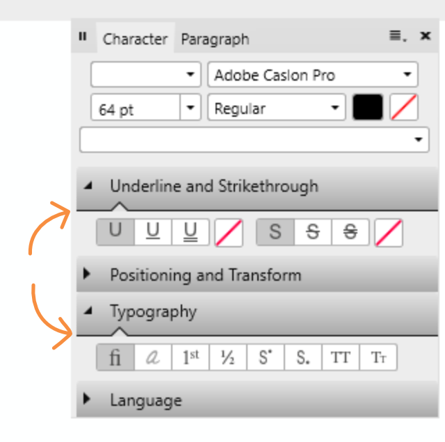
Hi there, A few remarks about the light UI: 1) Point size in toolbar is not properly aligned: 2) Line around fill less crisp than around stroke: 3) Contrast and hierarchy seems to be off in this example: Lack of contrast in panel header between selected Character and Paragraph. Subheading seem darker and more defined than panel header Point of high contrast and clearest division is the line when de-collapsing the subheading (orange arrows). There's a stark division within the subbox and barely any contrast between the light of the gradient (top of subpanel) and the rest of the panel. At first glance the marked lines seem to divide the entire panel in three blocks.