Search the Community
Showing results for tags 'ligatures'.
Found 12 results
-
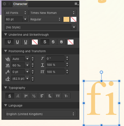
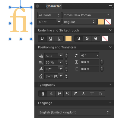
 It seems like enabling Drop Caps breaks down ligatures, regardless of whether I set the drop caps to affect only the first character, the whole three involved in the ligature, or even in auto mode. Is this a bug or must I enable some option somewhere for them to work together? I'm using Affinity Publisher v2.0.4 for macOS 12.6.3. Thanks!
-
A pdf was opened from publisher in Photo are displayed destroyed. Not so nice. („Bitte” and „bitte”)
-
EB Garamond - a font with lots of ligatures https://fonts.google.com/specimen/EB+Garamond I a using the fonts in the folder named 'static'. In Affinity Publisher one needs to use Text Ligatures Use All ---- I found that this font has the ligatures by a rather serendipitous route. In https://www.unicode.org/L2/L-curdoc.htm there appeared the following document. https://www.unicode.org/L2/L2021/21101-manyoushuu.pdf I downloaded a copy and opened it in Adobe Reader. Upon reading the descriptive text, which is in English, I quickly noticed the use of a ct ligature in the word 'character'. So I did a copy and paste to WordPad, and found the font to be EB Garamond. I did not know of the font, so I searched for it and found the link. I looked at the font using the High-Logic FontCreator program and here is a copy of the OpenType code for discretionary ligatures. lookup Ligature5 { # Referenced by feature "DiscretionaryLigatures1" sub Q y -> Q_y; sub T h -> T_h; sub c h -> c_h; sub c k -> c_k; sub c t -> c_t; sub f f b -> f_f_b; sub f f h -> f_f_h; sub f f i -> _1034; sub f f j -> f_f_j; sub f f k -> f_f_k; sub f f l -> _1035; sub f f t -> f_f_t; sub f b -> f_b; sub f f -> _1031; sub f h -> f_h; sub f j -> f_j; sub f k -> f_k; sub f t -> f_t; sub q uniA76B -> q_uniA76B; sub s t -> s_t; sub longs longs b -> longs_longs_b; sub longs longs h -> longs_longs_h; sub longs longs i -> longs_longs_i; sub longs longs j -> longs_longs_j; sub longs longs k -> longs_longs_k; sub longs longs l -> longs_longs_l; sub longs longs t -> longs_longs_t; sub longs b -> longs_b; sub longs h -> longs_h; sub longs i -> longs_i; sub longs j -> longs_j; sub longs k -> longs_k; sub longs l -> longs_l; sub longs longs -> longs_longs; sub longs s -> longs_s; sub longs t -> longs_t; sub t t -> t_t; } Also, the font has the characters needed for Esperanto. William
-
 I like Affinity Publisher's ligature support for Open type fonts. It is very good. Is it possible to make it more intelligent in the future to handle fonts which have ligatures in them but shouldn't use them when the font chosen doesn't support them properly for said font? Linux Biolinum Caps Linux Libertine Initials It can be sorted out manually but it would be nice if Publisher remembered fonts which don't perform well using standard settings. Maybe a preferred font features setting for fonts which don't work as expected? Examples attached. Nottingham.afpub Nottingham.pdf
 -

Ligatures in Affinity Publisher latest update
Fahneflycht posted a topic in V1 Bugs found on Windows
Hi everybody, since the last update ligatures in Affinity Publisher (Version 1.8.0.584, Windows 10) only work properly if text is not justified. If I set text as left-, center- or right-aligned, ligatures like ff or fi are set correctly, but if I then set that same text as justified (last line left, centered, or right) the previously correctly set ligatures disintegrate into individual letters. The problem seems to exist independently of my choice of typeface. Also relevant to this are the following points: A couple of days ago, my Windows 10 was updated to version 1909 (Build 18363.693), which also included an update of Microsoft.NET. I have many German blackletter (fraktur) fonts developed by Gerhard Helzel that set the frequently used long s automatically, where this is appropriate. In addition, I have many (free) blackletter/fraktur and antiqua fonts from Ligafaktur (www.ligafaktur.de), all in the LOV-version, that set the long s and other ligatures automatically where appropriate. All fonts (ordinary antiqua, Helzel, and Ligafaktur) use the correct ligatures in Microsoft Word 2016, regardless of the paragraph alignment is left-aligned or justified. Similarly, all fonts worked flawlessly in Affinity Publisher until the latest update (to Version 1.8.0.584). All fonts (ordinary antiqua, Helzel, and Ligafaktur) work flawlessly in Affinity Publisher if texts are simply set as left-, center- or right-aligned. If texts are justified (last line left, center, or right), however, all ligatures are dissolved into their individual components. The Helzel fonts still set the long s, where this is appropriate, but all other ligatures are dissolved. With the Ligafaktur fonts, all ligatures are dissolved and a round s is erroneously substituted for the long s. From this I conclude that the ligature problem lies with the newest update to Affinity Publisher (to Version 1.8.0.584). I'm not qualified to speculate as to whether or not the contemporaneous update of Microsoft.NET is likely to have something to do with it. If I set kerning to "manual" or optical alignment to "none", there is no change. Does anyone else have this issue? Does anyone know of a quick and simple fix to it? Many thanks in advance. Faneflycht- 9 replies
-
- 2
-

-
- ligatures
- justified text
- (and 1 more)
-
 I've looked for similar posts, but not seen this reported: Faulty Text Ligatures when PDF is Displayed using MS Edge Browser. Affinity Publisher 1.7.1.404 running on 64-bit Windows 10 Pro 1903 After creating a short booklet using Arial headings and Times New Roman body text, I wanted to export review copies in PDF format. I chose Export... PDF (for Web), using Affinity Publisher's default settings. Problem When the PDF (for Web) file is viewed using the MS Edge Browser, Microsoft's default viewer for PDFs on Windows 10 PCs, several text ligatures are faulty. When the same file is viewed using Adobe Reader, the ligatures are OK. But many PCs will be set to Microsoft's defaults, so will open PDFs using MS Edge. Possible Temporary Workaround Using the "More" option, change the PDF (for Web) preset to embed "All Fonts," making sure that the "Subset" option is ticked. Then "create this preset" with a new name. This makes the PDF file slightly larger, but does give it a better chance of displaying correctly.
-
I frequently create documents set in the traditional German Fraktur alphabet, which requires certain ligatures that are not used in texts set with ordinary Roman letters. The most important one of these is the use of the so-called long s (Unicode U+0073), which may not be used interchangeably with the normal so-called round s but is used according to certain rules. The best Fraktur fonts out there are those that have been digitized by Gerhard Helzel (see http://www.fraktur.biz/). His OpenType fonts have been programmed to employ all required ligatures including the long vs. round s. These fonts work perfectly with Word for Windows 2010 and later and with InDesign as well as with XeLaTeX and certain other freeware programs. Most of them (not all) also work with QuarkXPress 2015. With the beta version of Affinity Publisher, the automatic setting of long vs. round s doesn't work, although conventional ligatures do seem to work. On my wish list would be that the above-mentioned OpenType ligature automatic would work also with Affinity Publisher.
- 3 replies
-
- 1
-

-
- typography
- fraktur
- (and 1 more)
-
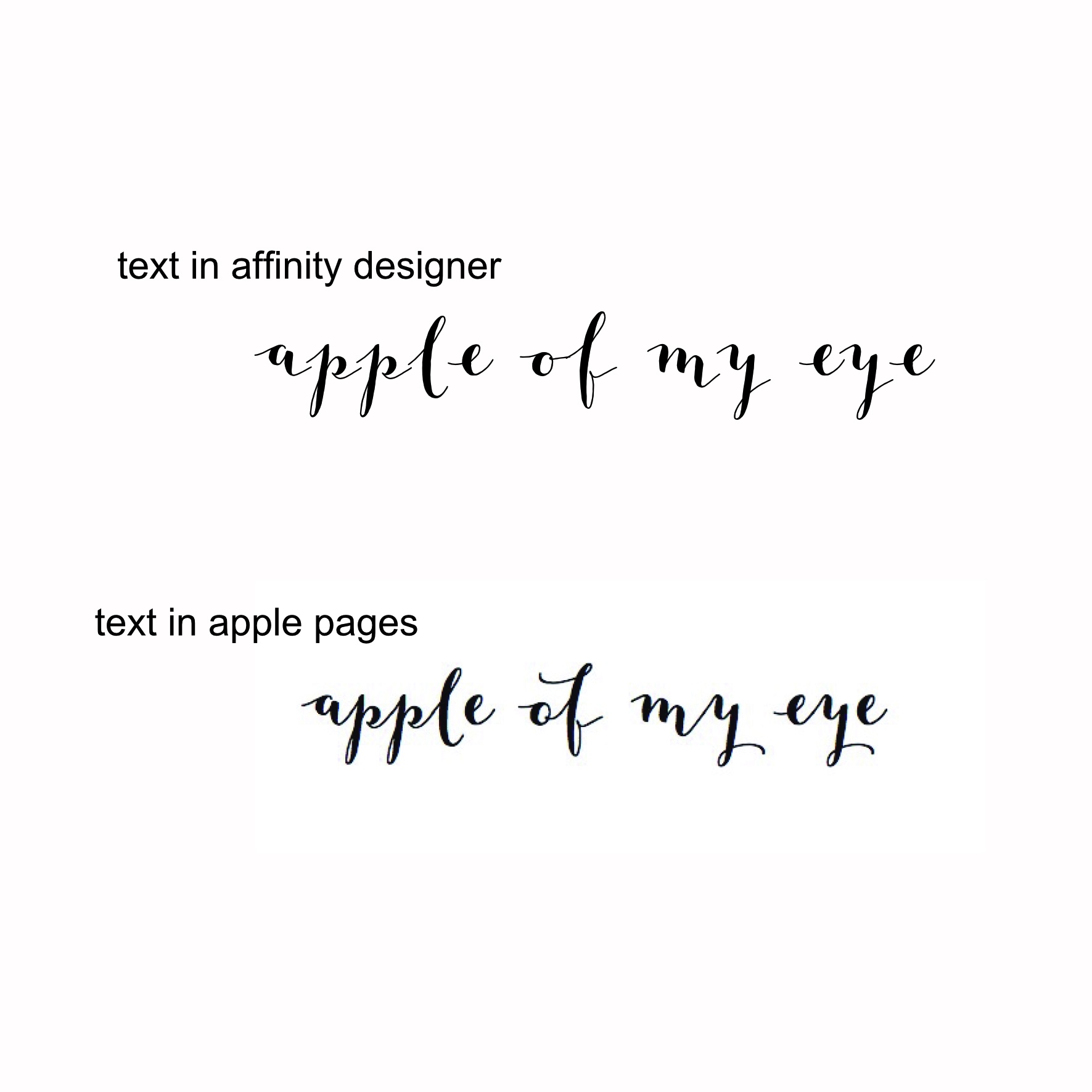
 Hi I purchased a font from my fonts today (mila script) and when I have tried to use it in Affinity Designer, none of the letters join up. I tried the TTF and the OTF versions to no avail. I know the font is sound as it works fine in Apple Pages. Can anyone give me any advice? Thank you
-
Hello, I'm new to the Affinity product base but have purchased and am starting to use Affinity Designer. One issue I am running into out of the gate is trouble accessing various characters of Open Type fonts. Particularly those not mapped to Unicode. For example, I am currently working with the Antonietta font, which is partly mapped and partly not. While many of the alternates do not show up on some character maps that I use, I am able to access them via Stylistic Sets in AD. However, there are also characters that are not assigned to Stylistic Sets, nor are mapped, that I am unable to access. I know they are there as I can see them in a glyph gallery listing, and I can see them via Glyph Mode in MainType's character map, however they have no codepoint. That, in conjunction with the fact that there is no character map in AD, means I am unable to access to them and bring them into the workspace. Is there something I'm missing that would allow me to access these unmapped characters?
-
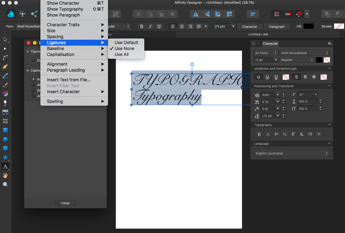
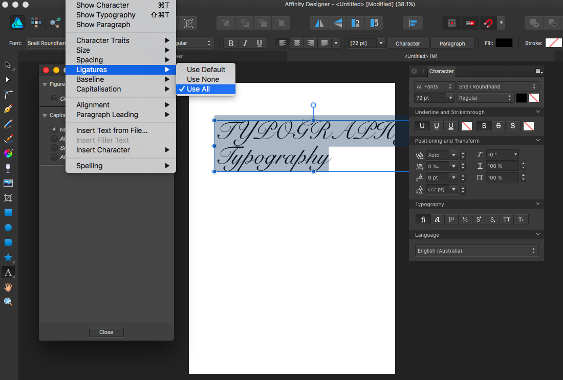
 Hi, I'm trying to switch between the ligatures options mentioned in the video tutorial Open Type Typography, by going to Text -> Ligatures -> Use All or -> Use None, and there doesn't seem to be any difference between the two. I have tried about 10 different fonts including Snell Roundhand, Zapfino, Gabriola and Footlight MT Light. No difference in appearance whether Use All or Use None selected Also I have tried doing it by opening the Typography options box but the Ligatures section isn't even there. Please see attached screenshots. What am I doing wrong? Thanks Amy
-
 Please fix this next beta. Ligatures cannot work on Version 1.5...beta but the store version can work very well. Cheers :) . Ligatures_for_testing.afdesign
-
I tried to write words with double ff and tt and it could not show the letters. After few second program hanged and crashed. Later on i found out that the problem must have been ligatures.