Search the Community
Showing results for tags 'interface'.
-
First of all, AP is a great app. It may well be the equal too, and in some ways, superior to Photoshop. The problem isn't the tool but in the interface. Or more precisely, learning the interface. Choosing to appeal to PS users, disaffected or otherwise, I believe the Serif team made two incorrect assumptions about those users in development, including: 1. That changing terminology from the gold standard Photoshop wouldn't be a problem. The words we call things matter. Example, if common usage (the base term) is that A is a process that uses tool B, changing the base term to C means that user has to learn that C now redefines the process, renames it and so moves it into a different indexed space, just to find, and use, tool B. That is further complicated if the assignment of A to C using tool B is changed to assign it to tool D without a reference , e.g., "if you used B in Photoshop to do A, to do the same thing in Affinity you should use D to do C." Without that guide, a digital Rosetta Stone, the learning curve becomes much more difficult. 2. That everybody who used Photoshop used the tools in the same way. This may be the greater mistaken: PS users do not use PS the same way. The many-ways approach isn't just a marketing term for PS, it was integral to how many long-term users learned and applied the program. Like many other PS users, I've been at it through several generations of the app, and learned which of the myriad PS ways to completing a task worked best for me. Not the best ways, perhaps, but my ways. In fact, these two assumptions are why I'm struggling with AP and may have to switch back to PS.
-
 I think that Affinity Designer needs to be able to create animations of transformation and transition of an interface and more generally the UI/UX prototyping. Thanks. I love this software.
- 8 replies
-
- 1
-

-
- animation
- animations
- (and 7 more)
-
Hi A very happy user of Designer here. I am using Assets extensively, but wondered if we could have the option of increasing the size of the preview in the catalog. It was also be useful to have the names under the asset instead of only showing up when hovering the mouse. Thanks Simon
-
In Affinity Photo blend modes are a feature - and I guess most people with some experience have tried them or know how to use them. They are arranged in groups - but it would be helpful if the menu could be presented either with spaces or other delimiters between groups in the menu, of with different backgrounds or features so that the groups become clearer - e.g. Darkening group, LIghtening group and so on. I've not checked right now with the iPad version as well, but it would be good if this also applied to that version. This wouldn't alter the functionality, but might make the interface easier for some people.
-
- 1
-
-
- blend modes
- group
- (and 1 more)
-
Is it just me, or do others find the iPad version and its interface confusing, compared with the desktop version? There doesn’t always seem to be enough visual feedback, such as a visible brush circle, and perhaps sometimes that’s because there isn’t a brush selected or the wrong kind of layer is being used. If the user doesn’t know this, a lot of trial and error “work” is needed to fix things - or not! Some form of status panel could be very helpful, together with better feedback on the photo being edited.
-
 Dear Friends, Hi, my interface is f...ked up. I can't see either the context bar or the the tool bar. I tried restarting with the control key and that didn't help. I tried checking and unchecking the show and hide commands in the view menu, no luck. Also Develop Persona opens with the Studio panel smack dab in the middle of the photo and I can't move it or get to box to click on develop. It seems to be off screen. Help! Thanks.
-
 It would be nice if the Layers panel disclosure widgets had the same behavior as Finder's List view, expanding and collapsing all child containers when Option-clicked.
-
- 1
-
-
- interface
- interaction
- (and 2 more)
-
 Hi all, I'm trying to use AD on my Surface Pro to design UI wireframes. I almost have a good workflow in place, but it's falling apart because I can't see any way to add arbitrary menu items to the top toolbar. Specifically, I need to be able to add options like "Toggle UI" and "Hide Studio" to the toolbar, so they are just a button press away. Consider AD in the following scenario: I'm working on my Surface with the pen, in "studio mode" (kickstand flat) and no keyboard connected I'm wireframing, so I'm in the brainstorming stage, and I really, really don't want any disruption caused by UI friction On Surface at 200% scaling, the AD interface feels a little cramped, so I work mostly with the UI off However, without keyboard shortcuts, there is no easy way to quickly toggle the UI or hide/show studio panels... so I have to keep digging through the menus using touch/the pen and break my creative flow It's annoying, because I'm so close to having an end-to-end AD workflow that works for me. I want to wireframe in AD with the Surface, because then I can just pick up those designs and layer actual objects on top once I'm with my desktop. A few other annoyances while trying to use AD without a keyboard: Why can't you pan around using a single finger on the background (behind artboards)? You cannot deselect objects just by tapping somewhere else; you have to explicitly deselect or choose a new tool I really, really wish AD could behave like Windows Ink Workspace, and automatically select the paint brush tool whenever I put my Pen to the screen (and eraser when the pen is inverted), then automatically switch back to select/last used tool etc. when I'm interacting with touch So really I just have a series of issues which individually are minor but together mean working with AD is unexpectedly frustrating when just using pen and touch, which is when I want to have the minimal UI friction possible. On my 3440x1440 desktop, I never have any issues with the AD interface... but then I have keyboard shortcuts and I'm not trying to use my pen. Proposal: - Allow adding arbitrary menu items to the toolbar (e.g. View > Studio > Hide Studio, Select > Deselect etc.) so they are one tap away - Add a "Toggle UI" button to the application titlebar (maybe with a fullscreen diagonal arrow icon); this would allow single-tap toggling including when the toolbar is hidden Just solving these two problems would go a long way to making AD more usable as a tablet app to dump brainstorming ideas to follow up on and properly design later! ilmiont
 -
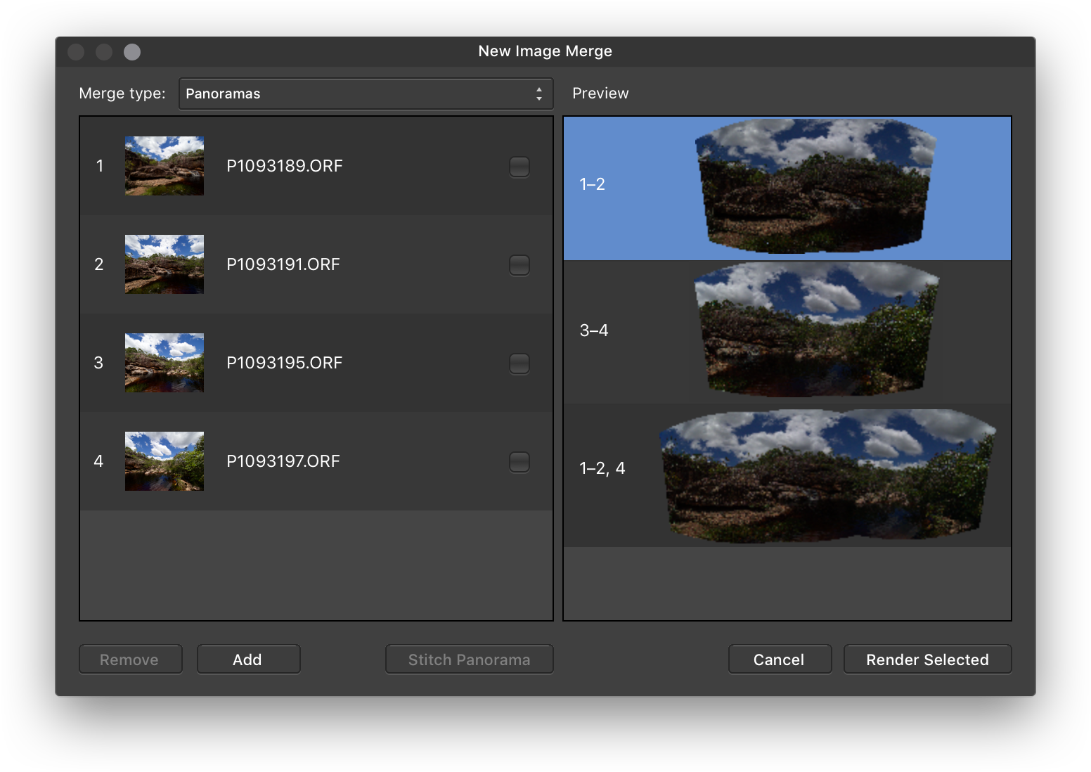
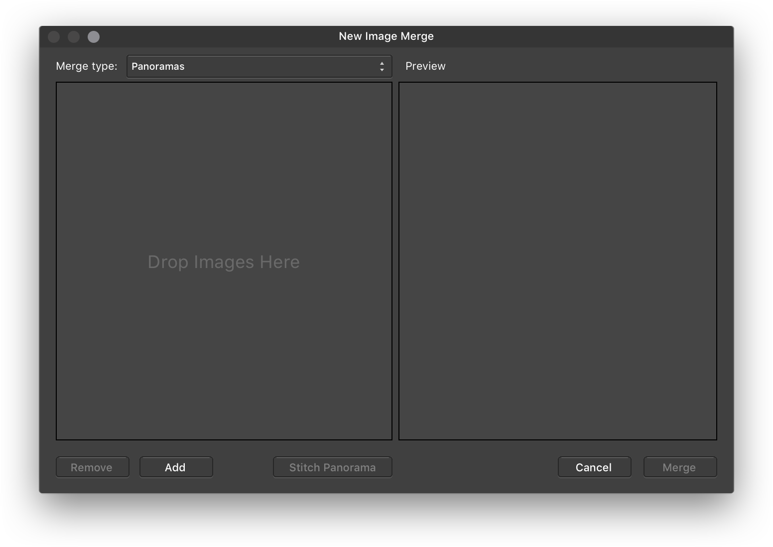
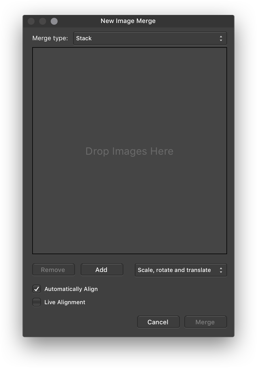
Hi, I mocked up a few ideas that I think would improve the functionality of the Photo merge tools by making it easier to switch between them and add images directly. Say you drag a few images into one of Photo's merging tools, only to realize you opened the wrong one. The commands are grouped in the menu, two have keyboard shortcuts right next to one another, and the tools have similar layouts, making this a fairly easy mistake to make. Rather than having to hit Cancel, open the intended merge tool, then relocate the images you want to merge, what if you could just switch to it, with the images you added still in place? The functionality of the Batch tool seems different enough to warrant it remaining separate. To keep the various merging options visible to the user, it might be best to keep their individual items in the File menu. Each would just open the unified interface to the appropriate tool. It would be great to be able to drag-and-drop directly to the Images pane rather than having to open the file picker, then drop to it, then click OK. The visual styling of the window widgets is a bit confusing; the brighter widgets are disabled. This is contrary to most GUI conventions, including how the OK button is disabled in the tools themselves. If the Panorama tool isn’t resizable because the panorama previews would have to be re-rendered (a processor-intensive task), just fix the width of the preview pane while allowing the Images pane to expand. There is some ambiguity in the Panorama tool when you have stitched multiple panoramas together. If you don't explicitly select all of them in the preview pane before you hit OK, only the last selected one will build. A different button label or counter tallying how many panoramas will be rendered (Render 2 Panoramas) might be sufficient. NTH: a way to tell which images constitute which panorama after the panorama preview is generated. This could look something like the mockup below. Ideally, the number displays next to the panorama preview would handle discontiguous stitches nicely, so if you used three of 4 images out of sequence, something like “1 – 2, 4” would appear next to the thumbnail. Originally posted to my weblog.
-
 Hello, i am just switching from PS to Affinity Designer. I am a UI Designer for FatClient Apps on Windows. My first impression of Affinity Designer is great! What I am really missing is the abbility to set up an own folder structure in the LayerPanel Window! Including the the abbility to set colors for each folder. At the moment it is really hard to overview the LayerPanel Window. The function "Grouping Layers" does not replace the need of seting up folders! F.e. Grouping a font with pixel aligned graphics will often result in a blurred view. Feature Request: Abbility to set up an own folder Structure in the LayerPanel Window Set Different Colors to these folders Make the Layers searchable by Attribute or Name Please Make the selected state color more visible in the Layerpanel, at the moment its a dark "marineblue" which is hard to recognise on the dark ui THX for the cool Applikation so far! Best regards Nod
 -
Been trying to come up to speed w. Photo on the iPad. While I've found where to change the stroke weight on vector objects, thru the Pen tool, I haven't been able to find a dialogue for changing color, mitre, etc. Anyone know what or how to tap? THX
-
Hello would it be possible to have a separate windows mode but keeping all the rest of the tools and nice dark grey background present in the back and keeping those two separate windows separate but inside this dark grey area. Thanks this would be a very useful option i think. Also being able to save various layout to be able to accommodate our tools according to the available space and monitor. Best Regards.
-
 Pie tool could be hugely improved if there was the possibility to use percentages as angle unit. As it is now, you must calculate the angle [(360/100)*percentage value] So you need a calculator at hand (boooooring, slooooower). It could be acceptable, but problem here is that a lot of percentages (specially in investigation charts) result in values with decimals, and you cannot use decimals as angle value, it gets rounded. At the end, on a pie chart the circle is not complete as the different rounded values sum are always less or more that 360º and you must adjust it by hand (to add to the long process of calculate and input values) I suggest to allow it to use decimals on the angle, and to accept or to have an specific field for percentage values. Or, as others suggested, create a good chart tool… but that is another story.
 -
 I looked for a Setting in preferences to change the background to white instead of black and only found a slider for gray value "Background Gray Level" that doesn't appear to do anything. 1. Is there a way to set background to white or gray and 2. What is the "background gray level" control supposed to do?
 -
I would like to ask you to add Czech language interface to Affinity designer. And to Affinity Photo too. I will make the translation, if you tell me, how.
-
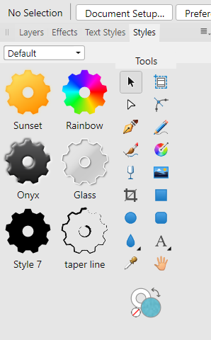
 I just got the PC version of Affinity Photo yesterday and I wondered if I could change the Styles panel for the Filters panel which I use more? (Presently, Adjustments Layers Effects Style Stock) I also don't use Stock. I'm comparing to Photoshop where panel tabs can be rearranged by dragging. Also, how long should the program take to load? If mine is slower, can I adjust preferences in any way? Does having an image re-load from previous session slow it down?
-
This was a test for a game company one is totally with affinity but the drawings are just sign places from the web. and here you can find also another animated version half with affinity and half with illustrator, more futuristic, minimal. the text is bold and near to the border of the buttons because they have some elements of the sci-fi films of 60s with also the minimal style of the moodboard provided. Hope you like it, and if anyone is interested, I'm actually available for game companies <3
-
Please add: - Copy FX - Paste FX - Merge selected layers
-
Not sure if this is intentional, but when undocked the tools panel no longer has a drop shadow. Personally I think this is a good thing (cleaner looking) and brings it into line with other panels when they are undocked. But it still can look a bit odd in some situations though.
- 3 replies
-
- 1
-
-
- tools panel
- interface
- (and 1 more)
-
 Hey guys, Some months ago I saw a redesigned Apple Music, I liked the idea, so made my own. To check out all the story behinds it, I made a huge publication on medium, with images and screens all made on Affinity Designer and Photo. would love to you guys check it out! https://medium.com/@gustavoantoniogonalves/i-saw-a-redesigned-apple-music-so-i-kinda-redesigned-it-again-8b3dfb5c5abf?source=linkShare-92ff1568a988-1507110699
 -
Hello Some new features for affinity photo 1. Possibility to open an infinite number of layers. Because right now from 15 16 I can no longer have access to background layers 2. Have the ability to make a quick selection on a layer mask. 3. Copy paste a layer mask onto other images simply by dragging it onto a layer. 4. Integrate multiple images on a project so you can crop an image without having to do it on other projects, save and add an image. Simply have in a document several separate images to cut or retouch separately to then add to the single image slide over each other. 5. Make an affinity photo interface closer to the computer interface 6. Make a more simplified interface with the interface selection directly in the interface the basic interface of retouching 7. And move the retouching filters to a search bar at the top with search by name. Because at the moment it is difficult to find a filter quickly by spanking all. 8. Add more fonts to the text. Or the possibility to download via internet 9. Decrease or move the adjustment filter 10. Have the ability to modify and move each interface, icon and search bar as we wish in the interface 11. Have a closer interface than Photoshop CC if possible .. with all the features, retouch, filter at the same places instead of looking right to left
-
I would find the ability to import and export swatch palettes incredibly valuable. Furthermore, the ability to re-arrange my swatches by drag and drop would be very useful when working with large palettes so I don't have to be mindful of the order I add them in. Finally, is it really necessary to ask the user Are You Sure you want to delete this? Especial;lily considering I've already had to tap and hold on a swatch, only to be presented with a menu which then asks me to pick between rename and delete. Is the modal pop-up Are You Sure needed? - Along those lines, when in swatch list mode, a double tap on a swatch to start renaming would be appreciated. Little details which I hope would help make the management easier, fun and swifter. But especially swatch import please.
-
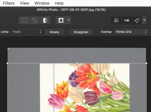
 Hi, I'm new here, and have tried to find an answer for my question: Is it possible to change the color/thickness of the actual crop line? When cropping inside/along the border of a white/bright surface, Affinity Photo Crop Tool (v.1.5.2 Mac) adds a dark line (1px) on both sides of the otherwise white cropping line. This makes it impossible to see the difference between the extra thick cropping line and the edge of the subject (eg. when the area around the subject is dark - see attached screenshot). Thanks, Paul
-
I downloaded the trial versial and it doens't fit my needs. As a photographer, I edit like 200 photos one by one in a row. Using lightroom I can load all images in miniature and they are kept in a toolbar. When I click them they are loaded and I can edit, the moment I select another one the previous is "discarded" from ram and the modification are storaged. With Affinity Photo I can only load full images. I can't load at the same time 100 images, they would take a lot of time and ram. Therefore, it doesn't suit me.