Search the Community
Showing results for tags 'graphic design'.
-
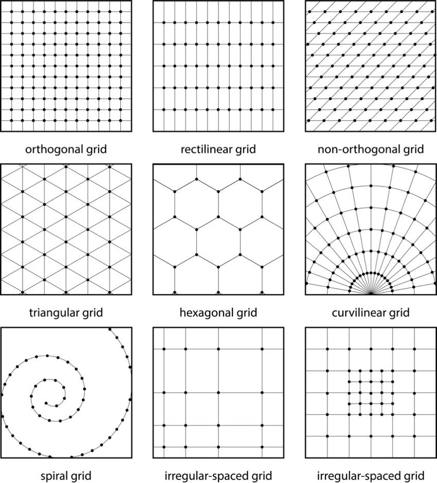
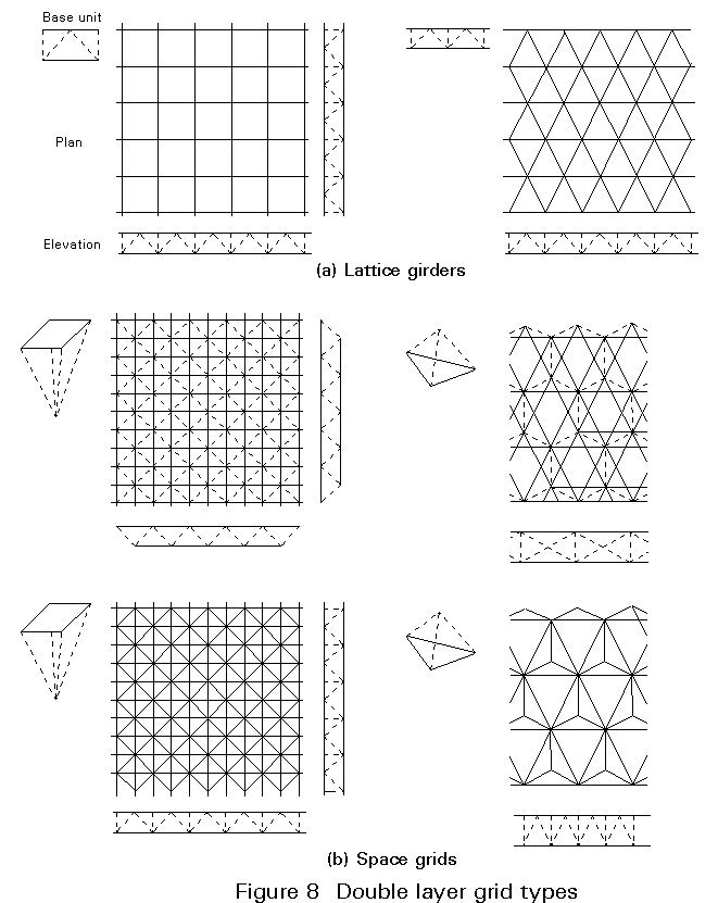
 How do you create different grids in Affinity without doing things ridiculously hard? I'm not talking about the grid in the background. Yes, I know the hard way of doing it, but there's got to be a much easier way. I like to make a grid and then use a combine tool, which I guess is "Shape builder tool" in Affinity, to make logos. I attached a picture of some of the different grid types if you don't know what I'm talking about. How about an easier way to make/have Fibonacci squares/spiral/Circles aka golden ration squares/spiral/Circles? Anyone know how to do that in the least painful possible way? If you know a process let me know and if you know a process on the iPad app too (if it's different) on how to do it there too. Thanks everyone! _____________________________________________________ My computer specs if needed. Program or App: Affinity v2 Designer 2.4.1 ——— MacBook Pro 2018 MAC os: Sonoma 14.4.1 (23E224) Processor: 2.9 GHz 6-Core Intel Core i9 Graphics: Radeon Pro 560X 4 GB, Intel UHD Graphics 630 1536 MB Memory: 32 GB 2400 MHz DDR4 Storage: 1TB ——— Safari: Version 17.4.1 (19618.1.15.11.14) Google Chrome: Version 123.0.6312.107 (Official Build) (x86_64)
-
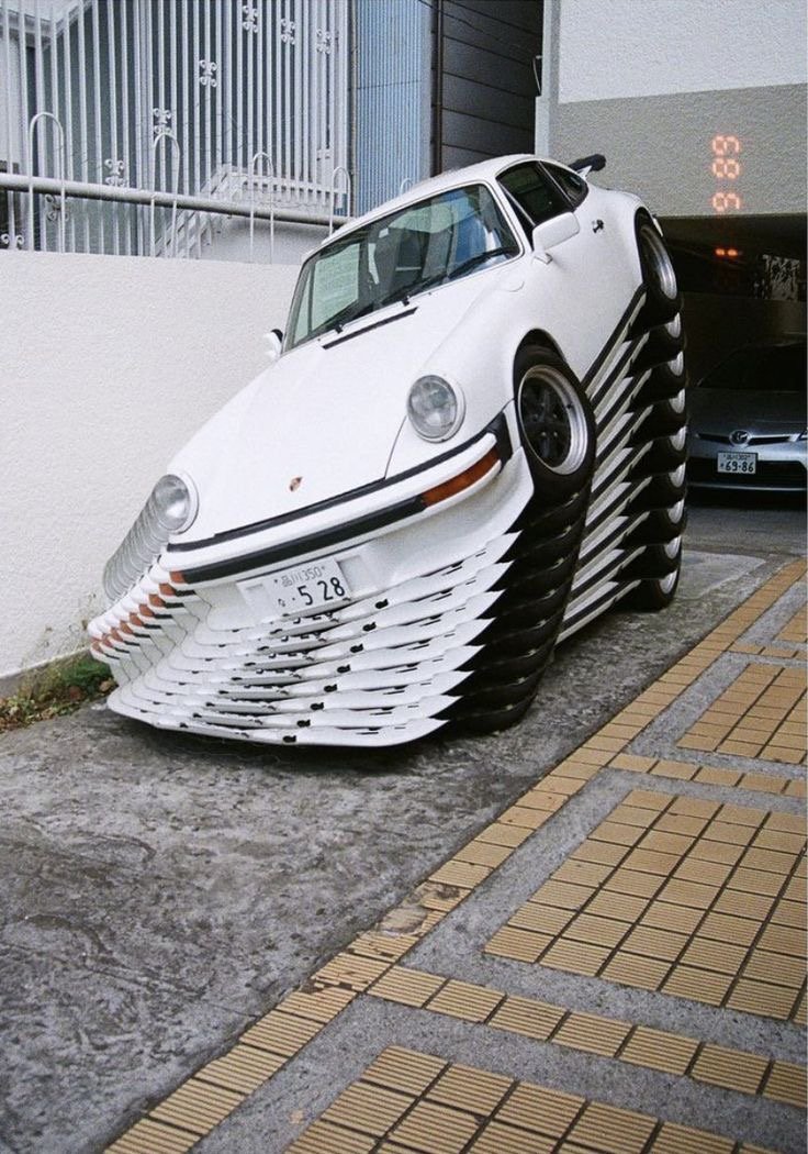
Hello again everyone, I’m currently looking for any assistance in recreating this effect for a friend of mine after a recent photo shoot we had. He specifically wanted an image like this so he could post on his socials with some of the static images. This stacked effect is really hard to find online and I’ve been searching for a few days now with no luck so I’ve turned to the forum, hopefully we can uncover the secrets to this effect and make it a bit easier to find for others who may be struggling like myself. Once again any help is super appreciated and welcome. Thank you all and have a good day I look forward to the replies.
-
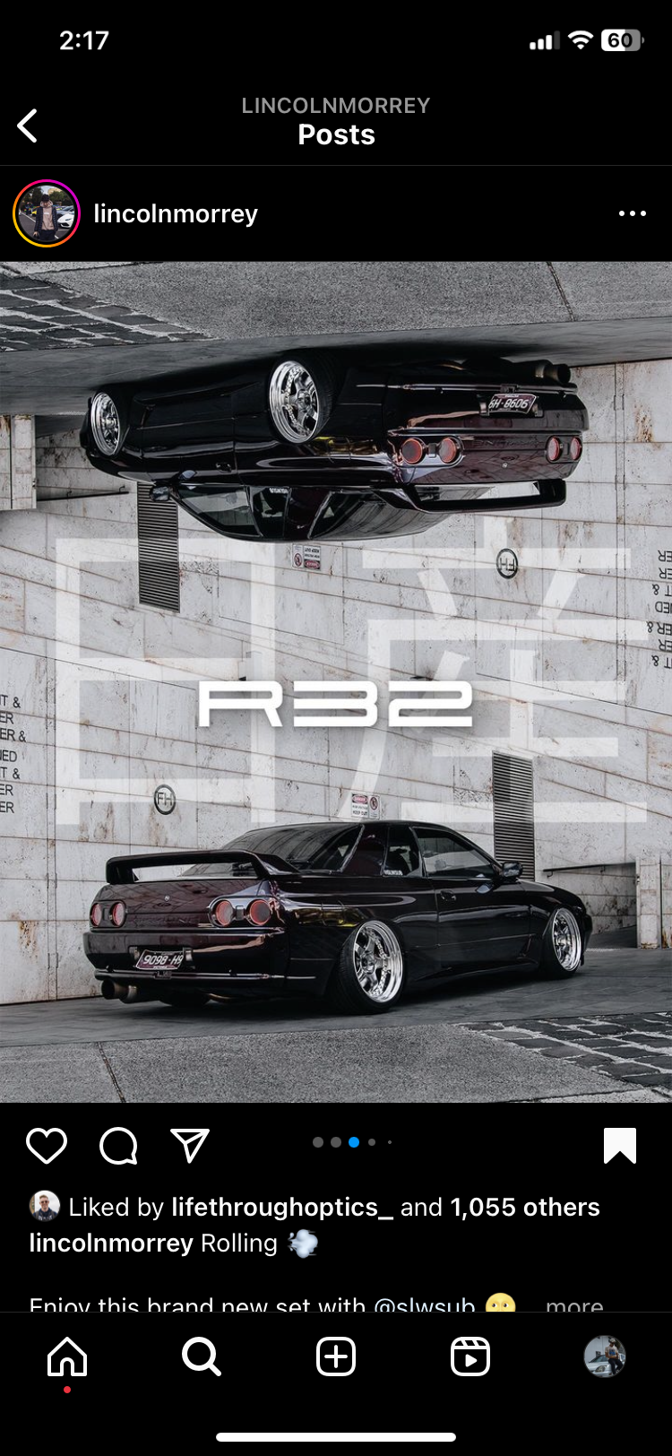
 Hello everyone I had a question and wanted to know if anyone has a solution to this possibly. I’ve seen a lot graphic designs using effects such as this and wanted to know if anyone has any idea how to recreate it in affinity, mainly the mirroring of the image is what I’m looking to recreate. Any help would be super appreciated.
-
Hi there forums! I have been using Affinity off and on since Publisher V1 came out, I have 2.x ready to install but I'm waiting on some upgraded hardware first, so I'm still using the version 1.10.x apps for now. I mostly use Publisher, but I am learning Designer and Photo some. Prior to this I used mainly Microsoft Publisher and Paint.net as there was no way I could afford the Adobe products. So thank you Serif for making Affinity so affordable. Anyhow, I thought I'd share a three-fold brochure project I just turned out for my wife's accounting firm. I'd love your opinions and critiques. Thanks. Jared Finkenbinder Proximitas Local Marketing, LTD Alpha TaxHelp Brochure.pdf
-
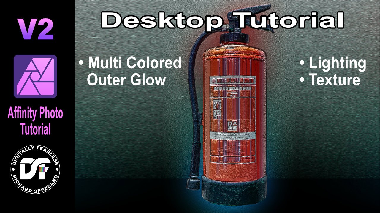
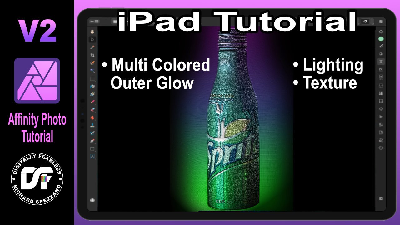
 In this Affinity Photo V2 tutorial Desktop version, I use show how to create multi colored outer glows plus add texture and lighting https://youtu.be/sTxKHA7Grpo Note that I also have an iPad version of this tutorial
-
- 1
-

-
- multi colored outer glow
- texture
- (and 6 more)
-

affinity designer Book Cover created in Designer
AutomatonicGinfizz posted a topic in Share your work
One of the first things I created in Designer. I've learned a lot since this, but I still love it.
-
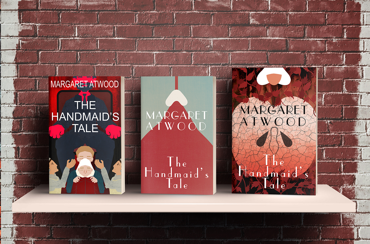
I thought I’d build up my cover design skills by designing three covers for one of my favourite books. This is Margaret Atwood’s The Handmaid’s Tale with three covers designed off three lines/happenings in the book. (Behance link) I've included mock up image below.
- 3 replies
-
- 4
-
-
- book cover design
- behance
- (and 1 more)
-
 A vector illustration of a beetle car with a cool vintage 60's look. The other vectorial elements and color gradients add to give this illustration a warm summer vibe . This flat design image was created by following a tutorial by visual artist Isabel Aracama (www.isabelaracama.com). If you wish to see more of my visual art designs: https://www.instagram.com/anacardoliva
- 4 replies
-
- 5
-
-
- flat design
- vectorial
- (and 7 more)
-
A funny cartoon of a proud bee to celebrate Pride Month. This image is the last cartoon made from a group of other elements (logos, menus, etc.) created as the communication design for a business visual concept.
-
- 3
-
-
- communication design
- cartoon
- (and 7 more)
-
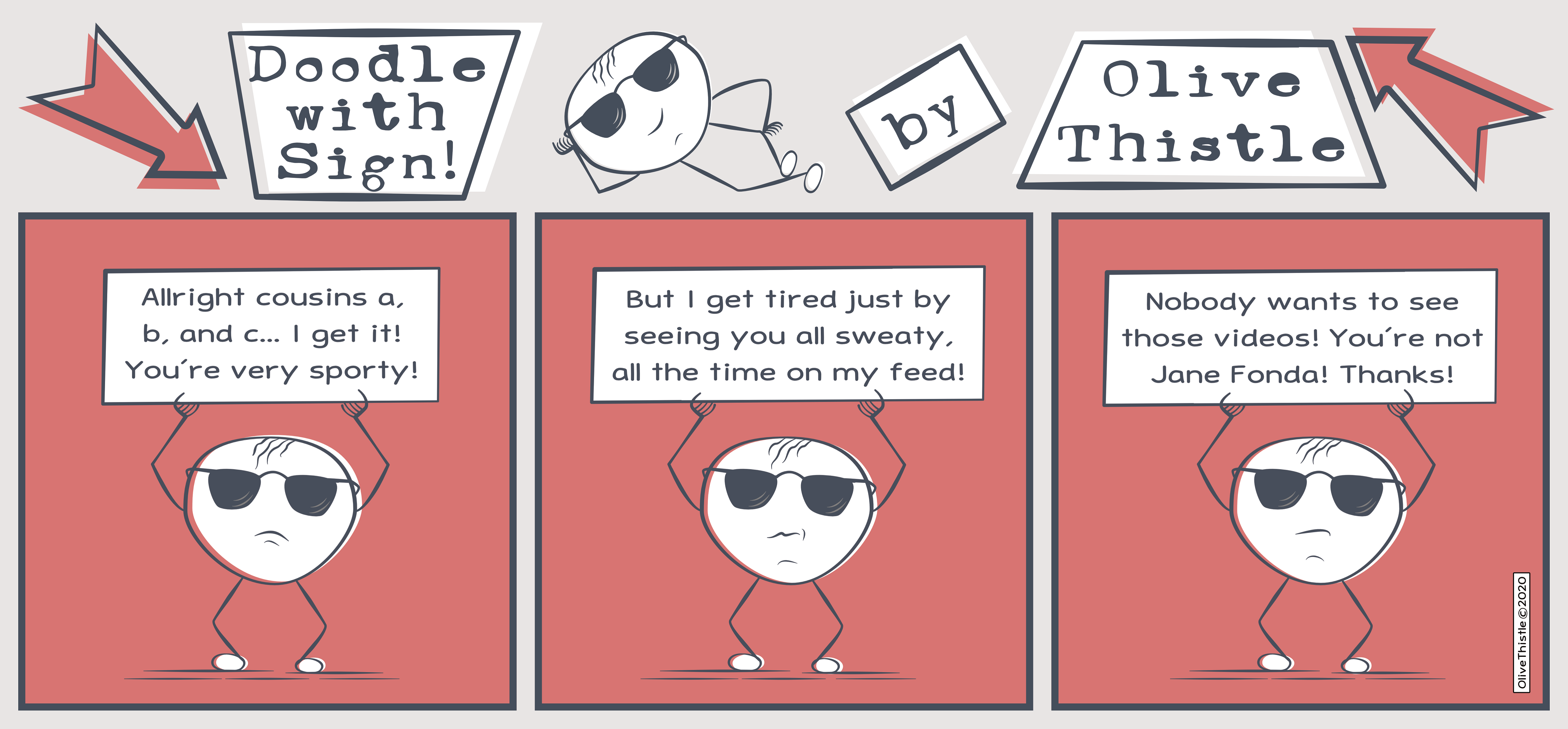
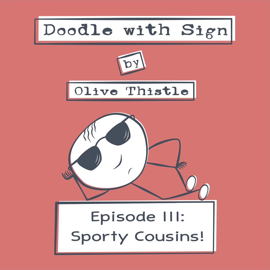
Besides using A. Designer tools to create more elaborate illustrations, I also like to use it in more simple designs, like for instance cartoons. I created “Doodle with Sign” as a comic side project, also inspired by the “Dude with Sign” viral street performance. The visual concept is defined by minimal ink lines and a vintage graphic aesthetic. The 2nd. image is the intro image I created for posting this cartoon in slide mode, in certain social networks. Note: “Olive Thistle” is my alias for cartoons. Enjoy!
-
- 2
-
-
- cartoon
- cartoon art
- (and 7 more)
-
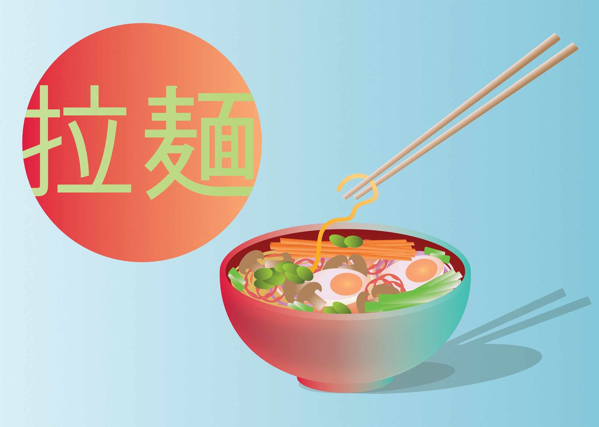
affinity designer Ramen bowl - Vector Illustration
Ana Cardo Oliveira posted a topic in Share your work
A vector illustration of a ramen bowl, with use of basic shapes, gradient colors and shading effects. This work was made following a tutorial by visual artist Isabel Aracama.
- 3 replies
-
- 10
-
-

-
- vectors
- digital art
- (and 7 more)
-
Client project using Designer
-
More project details in > https://www.behance.net/gallery/117824581/Sonicnova-Album-Cover
- 1 reply
-
- 6
-
-
- album cover
- cd cover design
- (and 6 more)
-
Digital marketing post using Affinity Designer
-
 Are you guys or would you guys consider adding prepress tools into publisher such as those that are found in Acrobat?? Maybe folded into the document checking system? Ie a way to see what inks are being used especially spot and CMYK I'd assume there are the likes of t-shirt/textile printers that would like to be able to proof the separations either after creating a PDF or before.. thoughts??
 -
 Hello everyone, From today i believe i have to start sharing few of our design works (actually i'm working alone but i do build a team from time to time depending on project size ) Most of our client/requesters are Church based and we really enjoy doing stuffs for them but what you will se here is more about Smarty Studio standing with other studio/teams together into what is to become Congolese Design Style. Well each country have it's own style of design but Congo doesn't have a proper thus most of Congolese designers simply clone/copy styles from everywhere. This is a beginning, please your inputs on each design palet/kit will be of great help and will help us improving better. Blessings !
- 103 replies
-
- 2
-
-
- graphic design
- projects
- (and 7 more)
-

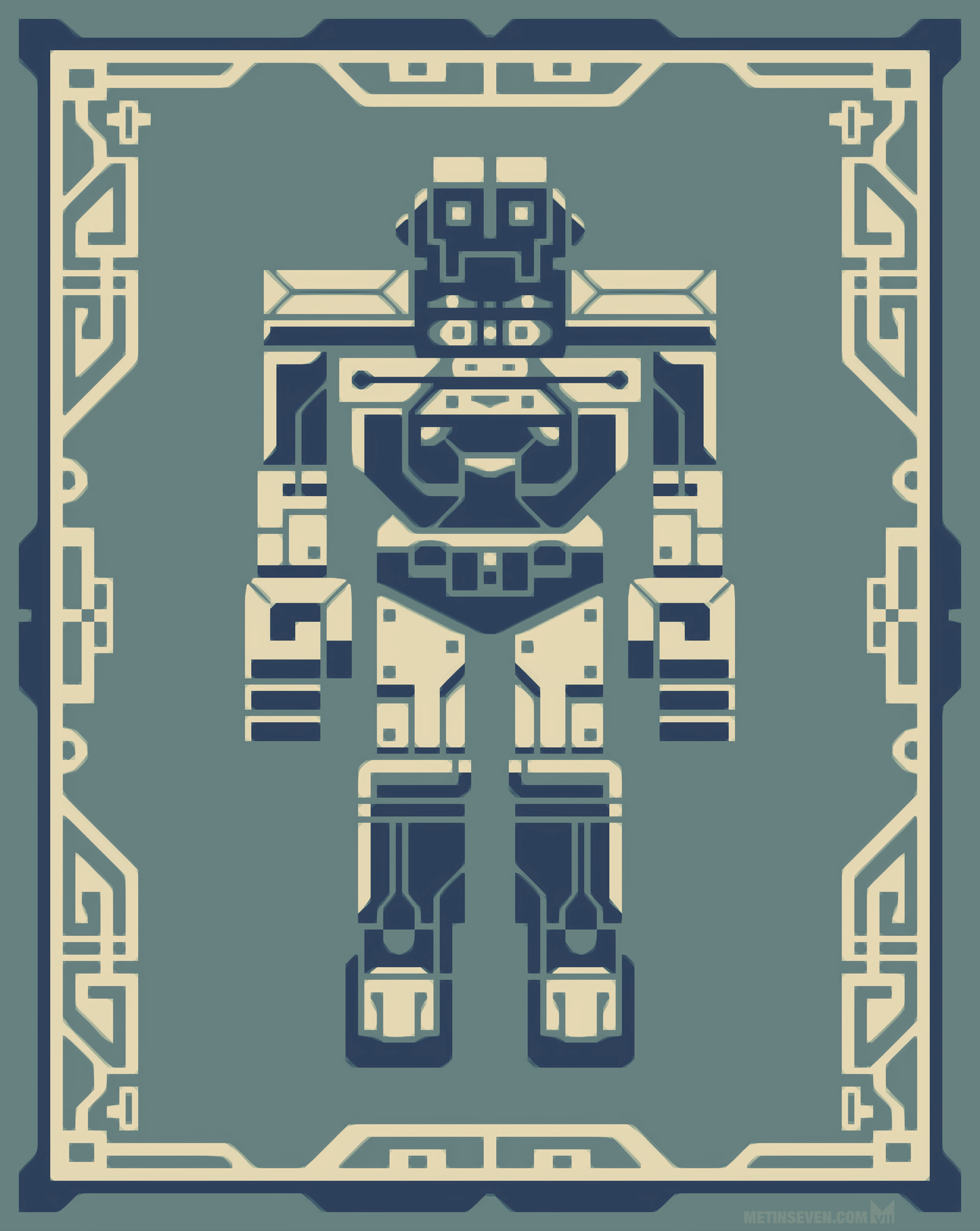
affinity designer Mecha robot graphic character design
Metin Seven posted a topic in Share your work
Mecha / robot character illustration in a graphic design style. 🔗 metinseven.nl
-
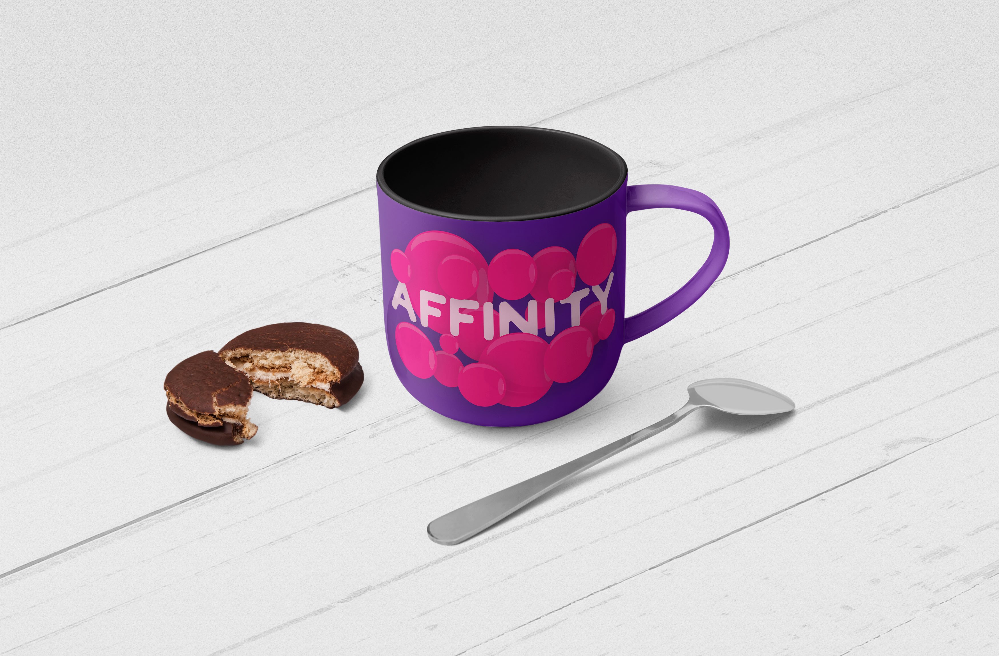
This is a quick work done using Affinity Designer. Bubble Effect and different Color Pallets.
-
-
 Affinity Photo and Affinity Designer are quickly becoming a realistic alternative to other software for many uses. They boast a great arsenal of features comparable to current industry-leading options, and I personally appreciate how they go out of their way to make the user's workflow more streamlined and simple without dumbing features down or restricting the potential for fine-tuning and more advanced control. From a creative/artistic point of view, both software packages succeed at delivering a very solid and stable experience and the interface hardly ever gets in the way of creative flow. That said, I believe there are some minor improvements that could be made to the software in order to help streamline the workflow for artists. This thread serves as a sort of compendium of suggestions and feature requests relating to improving the workflow for artists. If anyone else has any other ideas that you believe belongs in this list, you can add it below. NOTE: To my knowledge, this category of the forum deals only with the desktop software (Windows/Mac), but to avoid confusion, this thread is about the desktop versions only. View Rotation Precision (Designer and Photo) The view rotation feature is especially helpful for hand-drawn art, especially when using a drawing tablet that cannot be easily repositioned. It seems, however, that the canvas rotation feature is very limited, only offering a set rotation increment of X degrees left and right. Sometimes the jumps can be too big to find a good angle, and other times the user may want to precisely align the view to a line or a guide. The existing rotation controls can be mapped to hotkeys, but there isn't any default way of performing canvas rotation easily. My suggestion would be to add a feature that uses one of the modifier keys to freely rotate the canvas to an arbitrary angle. The canvas could rotate about the center of the current view, and moving the mouse around that central point would control the rotation. This is how I've seen other programs handle canvas rotation, and it works beautifully. An option to non-destructively flip the canvas view vertically or horizontally would also be welcome. Related link(s): https://forum.affinity.serif.com/index.php?/topic/49658-view-rotate-is-hard-set/ https://forum.affinity.serif.com/index.php?/topic/43396-arbitrary-canvas-rotation-angle-without-trackpad/ Better Control of Variable Pressure (Designer) The pressure graph can be used to control the thickness of strokes along their length, which is very useful for fine-tuning the look and feel of a drawing. However, there are some cases where the graph approach is awkward and cumbersome to use, especially when the user is trying to place a thick or thin segment at a very specific place. Since the graph is stretched from the beginning to the end of a stroke, simply moving points in a way that changes the total length of the stroke can ruin a carefully adjusted pressure graph. As others have suggested, I believe variable stroke thickness should be handled on a per-node basis such that the user can (for example) roll the mouse wheel over a point to easily adjust the thickness of the stroke in that location. I don't know if that necessarily warrants an entirely new tool since it could probably be combined with the node tool, but I wouldn't be opposed to it. Another issue worth noting is that strokes drawn using the vector brush tool don't appear to allow variable pressure adjustment; the graph can be opened, but changing it doesn't seem to have any visible effects on the stroke. Related link(s): https://forum.affinity.serif.com/index.php?/topic/496-stroke-width/ Pixel Tool (Photo) When using the pixel tool, if you click to place a single pixel, it generally doesn't do anything. The pixel tool seems to work only if the mouse is dragged. It would be much more comfortable to be able to simply click where you want to place a pixel and have it appear. As it stands, using the pixel tool for precision work feels finicky and inconsistent at best. Resetting Sliders (Photo) I noticed that in Affinity Photo's Develop persona, double-clicking on the sliders in the right toolbar resets them to their original values. This feature is incredibly convenient and sensible, but it seems to be the only place in the program where it works. Double-clicking on other sliders in other personas seems to do nothing. I don't know if they were originally intended to do this everywhere and a glitch broke the functionality, but I personally think it's a great feature and would love to see it expanded to the entire interface. As I said above, if anyone has any other points, please feel free to share! Affinity's software has been enjoyable and rewarding so far, and it approaches the quality and caliber of Adobe's product line without forcing a subscription. I want to see the software improve and flourish, so keep up the good work!
 -
This will be the thumbnail for my next video. The character was drawn in Krita, everything else, Affinity Photo
-
 So, I'm about to show you 4 simple (and pretty common) graphic design elements, but I confess I'm dying to learn how to make them properly! 1. What's the proper way to make this diagonal striped square? I'd power duplicate all the lines and put a square mask to cut them. 2. Similarly, what about this one? I'd make one circle, power duplicate until I have a line, then power duplicate the line. After all this, the mask. 3. How can I make this abstract shapes? No need to explain the texture, just the shape. I would make a rectangle with rounded corners and add them, but I wouldn't get the right curvatures. 4. In the same image, there are these "curly" lines. How? I admit I'd take the pen tool and make lots of points, trying to replicate the curves perfectly. After all these confessions, would you help a friend in need? Thanks!
 -
details will be found in the image. https://dribbble.com/shots/4853510-Discharge-Logo
- 2 replies
-
- 1
-
-
- logo design
- logo
- (and 6 more)
-
 This video is an excerpt from my -soon to be launched- "Learn Affinity Designer Fast" e-course. The most complete and comprehensive course on Affinity Designer. In this video I'll show you how to customize the object defaults, which allows you to set the fill color, gradient, opacity and noise values. You can also set all of the variables for the stroke, including color, gradient, opacity, noise, style, width, cap, join, alignment, draw behind, scale with object, and pressure curve values. This includes using a brush stroke! Being able to set the defaults for your objects whether it is just for that document or globally for future documents, is a great time saver. Your workflow will be come more efficient and your creative juices can flow freely without getting bogged down in the details. Setting defaults is a great web design tool for all you app creators out there. Enjoy and happy creating! Jen
 -
The Secret to Sexy Curves is a 19 minute video about how to use the pen tool in Affinity Designer. I share the secrets to a perfect sexy curve and together we cover everything you need to know to successfully use the pen tool to create your own sexy curves. This is a great video for both beginners and intermediate users. You’ll learn how to join lines, add and delete nodes, determine the perfect placement for a node, and how to use and adjust the control handles. I’ll show you the shortcuts to moving in and around your artwork, and we’ll even set your mouse up to zoom in and out as you work with the pen tool. In no time at all you’ll be an expert user of the move, node, pen, and view tools. Join me in exploring the versatility of using the pen tool for all types of drawings: perspective, graphic designs, illustrations, fantasy, manga, cartoons, silhouettes, and literally anything you can trace with the pen tool. Using the pen tool is considered a core skill in creating digital media. Take your time, practice, and you’ll find it becomes easier every day. I’ve had a great time creating this video for you. If you like it - if you learned something - please show a bit of appreciation by subscribing to my channel. It really does make a difference. Feel free to leave comments, suggestions for future videos, and don’t be shy; go ahead and share your art with us. :-) Thanks for watching, & Happy Creating. Jen Timelapse segment begins at 15:00 Final summary & and complete illustration starts at 17:30
-
- 6
-
-
- affinity designer tutorial
- pen tool
- (and 8 more)