Search the Community
Showing results for tags 'grading'.
Found 8 results
-
21 macros for Affinity Photos to make your photo awesome :) Made by me Download: Egor_Komarov_color_grading.afmacros Examples: Download: Egor_Komarov_color_grading.afmacros

- 22 replies
-
- 16
-

-

-
 Hello again, all … Yes it's me and I'm back again for Round MMXXI(b) … Today's question is: Can we use Presets in Affinity Photo (or Designer / Publisher) as we would in Photoshop, Lightroom, ON1, etc? If the Majiqual Answer be-eth 'Yes,’ the follow-on query then becomes ‘How we do dat, hah?’ It's easy enough to install and use LUTs in Photo, but there seems to be no method to install or access the presets’ .xmp rider files. It seems that would be an easy trip down Code Road compared to other feats discussed in these pages. Please advise if there's a way to implement access and use of the .xmp presets files that already reside in the Camera RAW / Lightroom folders … Thanks again to all for your informed input.
 -
 Hi guys, I find the Selective Color Adjustment extremely useful with its possibility to adjust not only selected hues, but also tones. What seems weird in it though, is that regardless of the current document color mode, it operates in CMYK primaries. Surely, this works, but wouldn't it be more intuitive to have RGB sliders as an option? How about a more general selective color tool, that would allow hue range selection like in HSL Adjustment, but also with similar tone selection for shadows, midtones and highlights? It could offer a choice whether you want to adjust the selection in HSL, HSV, Lab, CMYK or RGB. Wouldn't such a tool be more straight forward than variety of different tools for the same purpose, that can only be applied one on top of another, distorting the input color for every next one? Think of it: HSL, Selective Color, Color Balance, Split Toning and Shadows / Highlights are all essentially selective color tools, but for some reason each of them lacks some functionality that others offer. I understand that they are important to make transition from Photoshop easier, but Photoshop is a very old software with legacy of limitations and concepts changing over time. Affinity Photo, being a new application designed from scratch, can be more streamlined and logical, while also supporting older Photoshop approaches for those who need them. Why can't we have one adjustment layer where all the tuning based on hue and luminance can be made in one place using same consistent logic? If you care about a possibility to separate adjustments into steps, you could just apply this tool several times, and each instance would adjust different things, but using same simple idea. P.S.: speaking of HSL, I think it should use Lightness slider instead of Luminosity, because Lightness is what L stands for in HSL.
-
 Following an AP tutorial I have created my own swatches. I use 5 colours palette that to my judgment correspond well to what i see in the original (template) image. If this is not a case, the 5 colour palette by AP is incorrect, I create a swatch again with a higher number of colors and make my selection to limit them to again 5. When color grading with 5 colours I add 5 colours from the swatch palette very carefully by ensuring that the Location value on color grading scale matches the Lightness (L) value of the color an indicated in a window for color picker. When I copy the colour palette from the swatch and apply it to my own image the result is different as regards tonality. Some additional adjustments are needed to match my image with the template. However, it is almost never the same. Is it what correct? Using swatches for color grading does not guarantee that the image that is edited will match the template and there might be differences?
 -
I have been learning to use the color grading technique by using swatches and LUT created on my now swatches. I have noticed that there are differences in color tones in my final images after the color grading is applied. I use 5 colour palette created from Image, saved on Location: Application. I have followed instructions from one PS tutorial and when adding colour from a palette to grade scale, I make sure that 2 colours, the two between black and midtown, midtown and white, are given values corresponding to L value showing up in the color picker window. Unfortunately, I cannot add the L value for the white and black point, as the Location box for these two in AP is inactive. The PS tutorial proposed also one step more: match the tones of colors by adding the tones values to the curve (see minute 8). I don't find this option in AP, when working with a swatch there is no way to adjust the curve. Any idea how I can match better the tones from th template in swatch palette? Please see the minute 8 in this tutorial. I do not know how to replicate this step in AP. Is it possible?
-
Free download on my website http://www.andreacaliendi.com/affinity-resources/
-
In some applications i use, i can click up and down buttons to go through all of the LUTs in a particular directory while previewing applying each over your image. This would be epic.
-
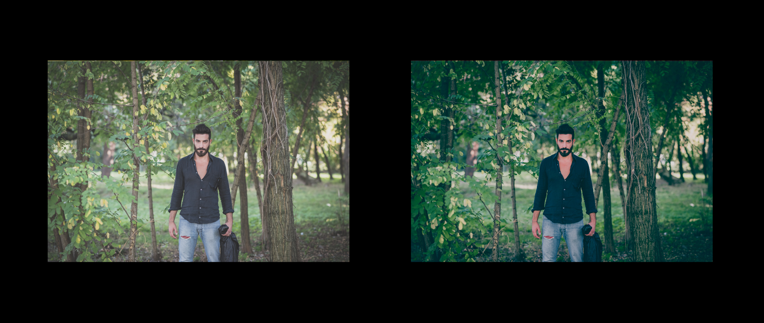
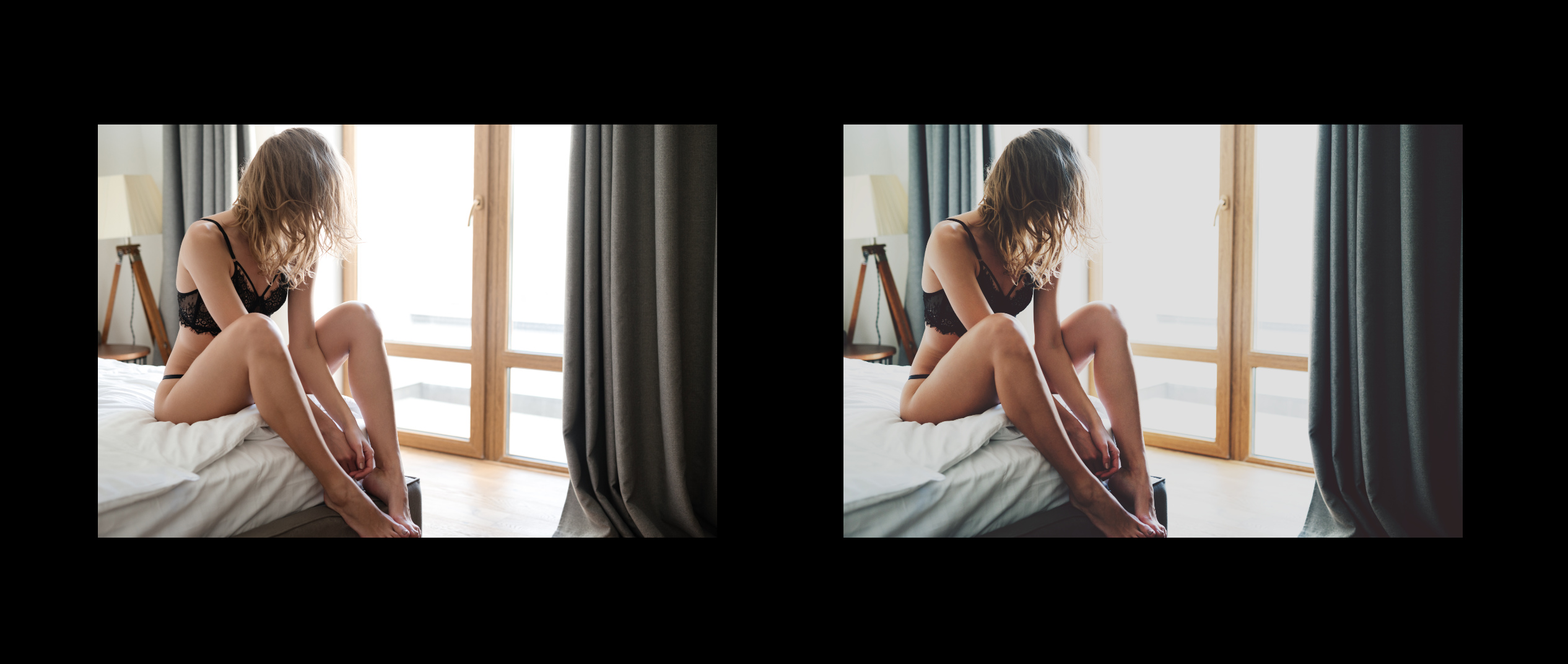
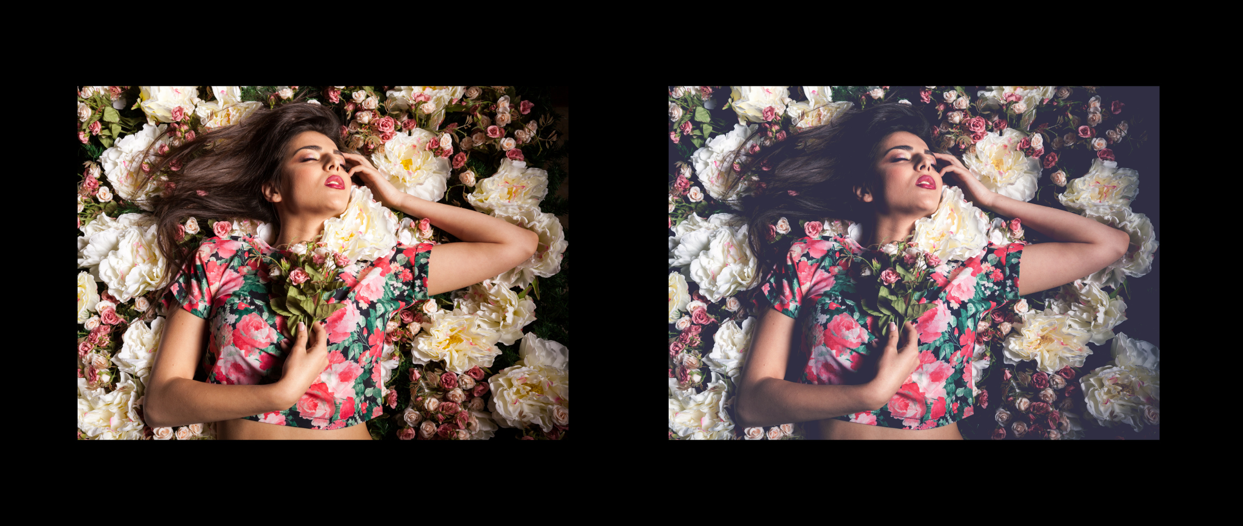
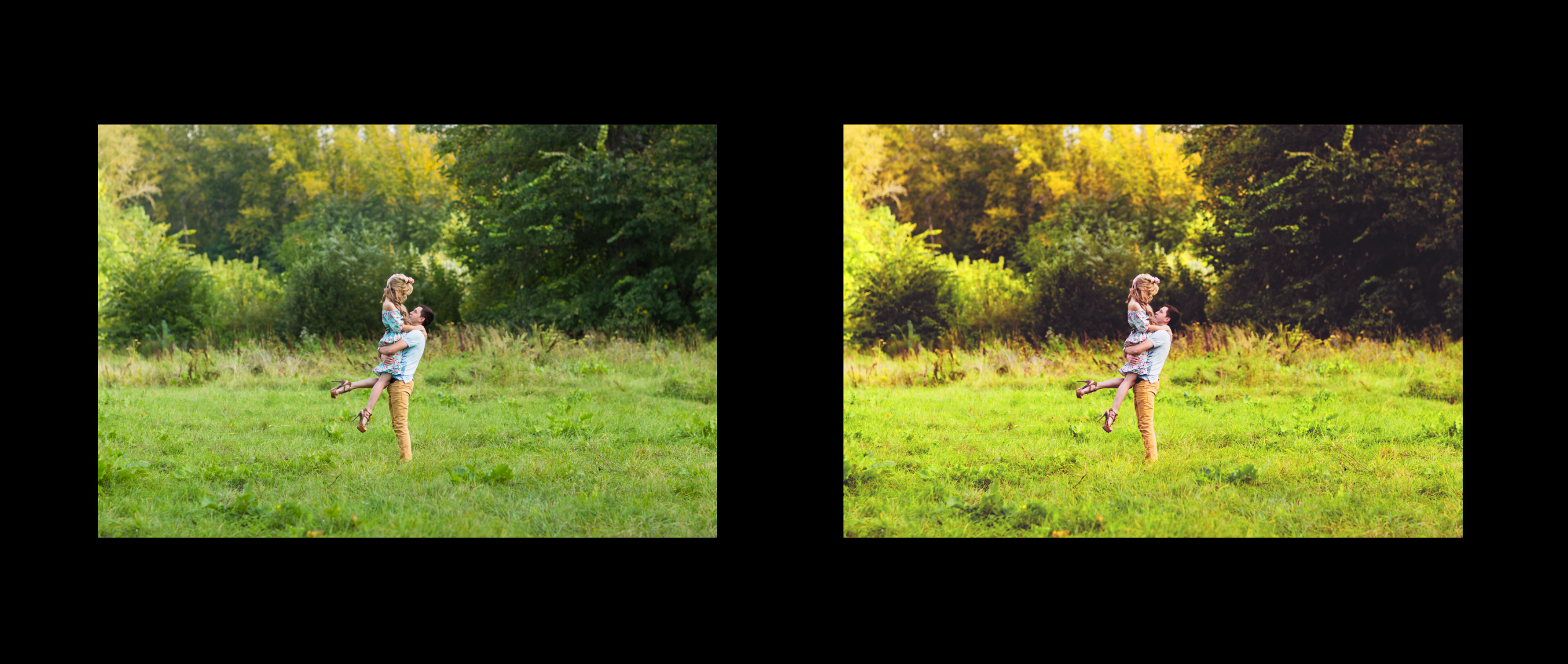
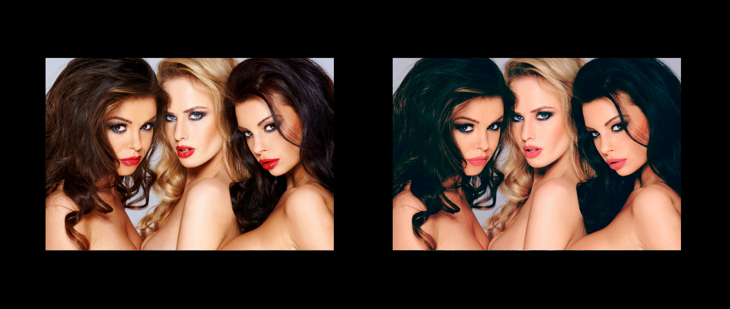
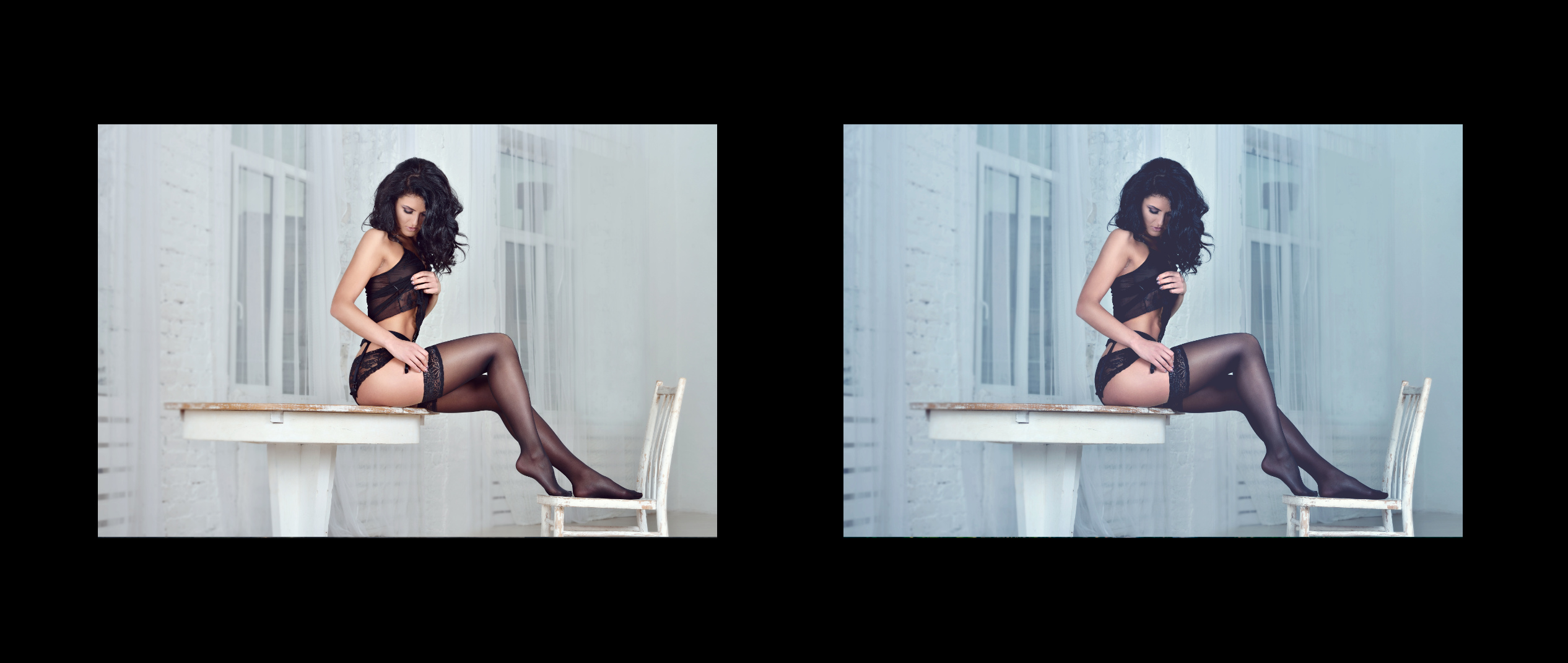
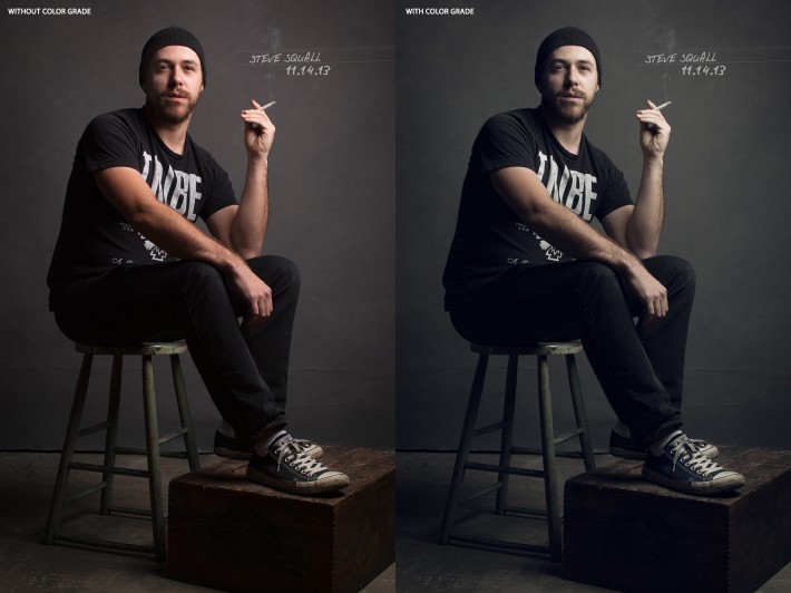
 Hi everyone! I'm learning photo processing with Affinity Photo, and actually I don't have much experience with photo processing at all. So I found official tutorials extremely useful! But I can't find much tutorials related to specific area - color toning techniques for portraits. I believe it's a kind of specific because often people and background objects are processed differently to achieve some artistic effects and get high quality works. Of course, there are many tutorials for LR and Photoshop, but it's twice harder to learn something new that way. I'd appreciate any links or hints on how to dive into this. Just a couple of toning samples I liked in attachments.