Search the Community
Showing results for tags 'glyphs browser'.
Found 2 results
-
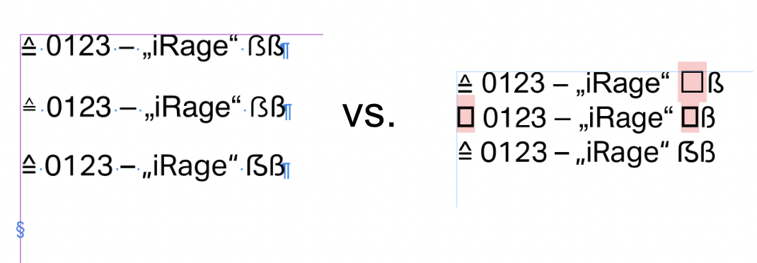
 Hello Friends 👋 I have to deal with many glyphs and despite format sets I very often have to pick out individual glyphs or alternative glyph variants. When doing so, a few things are bugging me anew every time. 1. Jump directly to the selected glyph Is it possible to directly highlight the selected glyph in the text field in the glyph panel? Reason why: 1. Instantly find similar glyphs in a glyphset / range and not have to search through the whole Glyphset 2. To check if it is the right glyph (info text + code in the glyph) 2. Show missing glyphs ! Dangerous ! Missing glyphs are not shown. How may I know if the glyphs are not present in the specific font? OK, I can check it in the preflight. But it would be better if I get it displayed directly in the text field: Yes, I think it's sometimes a helpful feature to rely on Apple's internal fallback for missing glyphs, but for professional workflow it's very dangerous because you never know in which font the missing glyph is displayed and exported in PDF. 3. Make a high contrast appearance Why are the glyphs grayed out? All glyphs are very blurry / fuzzy to recognize. More contrast would help to see the glyphs even better. Please make the visualisation in 100% Black on 100% White. Or at least 100% black. And yeah, 4. Maybe we should be given the option to scale the glyphs even further than the largest size at the moment? Reasons: - 5K displays - small diacritics hard to distinguish - Fonts with very similar glyph alternatives with differences in details. → I think all of the suggestions are just a small thing, but it helps for a good feeling in a subtle way dealing with glyphs I'm sure a lot of other publisher users would be very happy about it too!
- 5 replies
-
- 2
-

-
- affinity publisher
- glyphs browser
- (and 2 more)
-
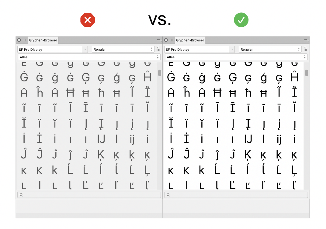
Hello, I'm very glad that we now have a glyphs browser, but I personally feel that its looks can be improved. Virtually all typefaces are made primarily for use on a light background, and to correctly evaluate a glyph I think the glyph browser should reflect this by having a white background with black glyphs. Right now the dark UI theme shows light glyphs on a dark background and the light UI theme shows grey type on a light background (which is better but lacks contrast). The font dropdown however does have black type on a white background in both themes, which I think is a good choice. Looking forward to your thoughts! Best, Bauke
- 5 replies
-
- 1
-
-
- colour
- glyphs browser
- (and 2 more)