Search the Community
Showing results for tags 'font'.
-
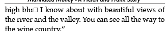
 I haven't been using Publisher for a long time, and I've learned a lot through videos. I just finished a 204pg book, 5 x 7, everything looks great. I had to start over twice, had to tweak margins ... and almost a third time, due to some weird thing that happened when one page got pasted in the wrong place. By accident, I figured out how to move it (as cutting, deleting, etc, was deleting the entire chapter). But I digress. I'm done, finished. It looks terrific. I export as a PDF. It looks jaggy. I go back into the filer and everything is not 100% black. It's some 'almost" black. I had created it with CMYK since it will printed not online. Perhaps I didn't have to do that and the publishing company would fix it? But in any event, I found I had to manually change the headers/footers, the Headings, the body font, etc. to 100% black with the sliders. Thankfully, I was able to change the body text with an "all" but ... the "all" didn't include the other items I mentioned. Going forward, why was the content NOT 100% black as a default. #2. This is the most serious issue as I do not want to have to try and change fonts or recreate this ENTIRE thing again. The "ffs" in any word that has a double ff ie bluff, off, offer, ANY word, the double ff is a square indicating missing elements. If I save as a PRINT PDF, they are there. However, that does me no good as that save is on 8 1/2 x 11 and isn't set to print as a book. So... here I am, the penultimate stage to "just simply" send to the client to review so I can "just simply" upload onto Ingramspark and I have flummoxed. What mystery step is alluding me? What setting? What do I need to do to fix this? I assume it is to be exported as PDF/1 ... I think I got the black handled... but this is a head scratcher.
- 32 replies
-
- 1
-

-
- font
- 100% black
- (and 2 more)
-
 My Affinity Designer document contained a dozen lines using a font named Barmeno. It only has 4 weights and I used 2 of them. The file looked fine but it refused to print. After much time of instituting a repair of all 3 Affinity apps (they were never broken), reinstalling my HP printer (it was never broken either) I finally discovered the problem. I printed a different file from Affinity and it printed so I knew it had to be the font. After swapping it for another, problem was resolved. I'm recreating my CorelDraw files in Affinity but this issue has me nervous. Why did this font not print??
 -
 HI All, I recently purchased all three programs and moved to Windows 10 OS. I have a new PC so I'm starting from scratch - installing fonts onto my system. I'm still using Adobe CS6 products while I transition to Affinity, I have a lot of print files (Magazines, Ads, Flyers etc.) which use specific fonts that I have to continue using so in order to move I have to be able to access the font files in Affinity. I have hundreds of fonts Truetype, Open Type and Postscript Type 1. The installed fonts all showed up in my Adobe Suite but not in Affinity? I use FontExpert to manage installs but I have also tried installing directly to Win10 fonts folder. The results are quite random. I get a different (Limited) selection of installed fonts each time I open a program - and never the full range of typeface options (Light, medium, regular, bold etc) Is there a setting I am missing to activate the installed fonts? Any solutions welcome? Thanks in advance
 -
 Hello everyone, recently my computer was updated to WIndows 11, when trying to use Photo, I realize that the letters and font of the UI are unreadable, I leave a screenshot. I already reinstalled Affinity Photo with no changes.
-
 Hi guys, here's a new video about how to add a new font into Windows 10 so you can use it in any of Affinity software, and not just that, I'm also gonna show you where is the place to find any free fonts and icons for any of your projects. I hope you enjoy this video, thank you!
 -
 I recently got a 4K 32” external monitor for my laptop and this obviously caused me to work differently than using my laptop display, namely, as screen size increases, one must sit back further from the display. Doing that, the Affinity UI is barely legible to me. I feel like I’m trying to tap on a grain of sand using a needle. I already have the UI Font preference set to Large but it’s not nearly enough. I don't want to use Display Scaling resolution in system prefs as that negatively impacts performance and I want to use the maximum number of available pixels. I know this is not a trivial thing to address, but I’m hoping / praying the AMAZING devs fundamentally address the UI in version 2 of the Affinity Suite in terms of functionality and customization, and this would include being able to resize the entire UI, including font, it's size and letter-spacing (critical for legibility), as well as icons, Studio panels' buttons and icons. Please consider engineering a responsive UI just like modern websites which can resize any and all elements based on the device used for viewing via CSS. That way users can create profiles for desktop and laptop UI preferences. Larger displays can use an enlarged UI and laptop displays can use a more compact version. Thanks for your consideration and all you do. Happy new year and God bless and heal the world!
 -
Can you enable mouse drag to resize selected text/font in the character menu, similar to character tracking, kerning and scaling functions.
-
 So I was building my portfolio with Windows Affinity Designer 1.10.1.1142, I used the text box to create a subheader, it was all fine till just now, when I created a new text box and adjusted the box size for a smaller width. For some reason, when I type the textand get to the second line of the text box, it centers the text alignment for only the second line of the sentance. When I checked the text alignment, it says its aligned to the left, which is what I need. I'm not sure how I can fix the alignment of the second text line, and I haven't touched anything on the Font Character Window, only what was available on the default workspace character tool bar at the top.
-
Hi guys, I am experiencing a weird behavior of Publisher with a preproduction font that lays heavily on the contextual alternate Opentype feature. The problem: The font is valid and works fine in Indesign CC 2021 and the Typeface font manager as well as on fontdrop.info. However, when I turn on the contextual alternatives in Publisher, all of them are rendered except for the ones related to the lowercase "i" (like "is", "in" etc.) . See first screenshot for Publisher (blue), second for Indesign CC (black). I am able to reproduce the issue. Please note that I can only provide the font file directly to the support staff. Cheers, Johannes Latest version of Publisher macOS Mojave (latest) Hardware Acc.: On
-
 Please I am from an Arab country most of my work is based on Arabic Fonts (Right to Left fonts) so I find a difficulty in Affinity Designer because it doesn't support tight to left fonts. I have to right it in Adobe illustrator export it as a png then import to to my Affinity Designer project as a png image. You see how it is difficult! My request is that you can fix that problem and support Arabic fonts or right to left fonts. Thank you in advance.
- 2 replies
-
- 2
-
-
- arabic
- arabic font
- (and 5 more)
-
 Hi guys! All my important fonts are now showing up as red in the font box and any design using those fonts are now being edited into a standard arial font! This is an absolute nightmare for me as I use these fonts daily for work and clients items! I’ve tried re-importing and seeing if they work but no luck! Any ideas why this is happening and how I can solve it ASAP? Thanks so much! Bobbi x
-
 Hi, in Affinity Publisher, when I export the document to PDF, text is displaying as gibberish (see attached screenshot). The font is a standard Google font (Lato) , so there should be no licensing issues. What might be causing this, is there a way around it? Thanks!
-
Hello, Are you planning on adding functionality for the new OpenType variable font technology in Designer, Photo and Publisher? Best, Bauke
- 41 replies
-
- 4
-
-
- variable fonts
- variable
- (and 3 more)
-
 I was wondering if it was possible to warp text in Designer. I attached an image with what I am trying to accomplish.
-
 Currently I've been Downloading Fonts And Other assets onto my mac so That I can have a wider arsenal of resources. I was just doing a design for one of my friends and realized I couldn't find the font I just downloaded, I Thought it'd be amazing if there was little folders of some sort within the app that'll differentiate the downloaded "user" fonts, and the fonts that The computer you are using comes with, for better organization. even though i've never seen this feature on any other apps or software, is there a way you could implement this?
 -
 All fonts in the family Rubik from Google Fonts are showing as Rubik Light in Photo and Designer. I tried uninstalling/reinstalling the font, also Photo and Designer, there was no change. I read that ufont has crappy quality and likely old fonts that are not updated to work well, are Google Fonts just as bad? Is there any way I can make this font work correctly without buying software?
- 16 replies
-
- 1
-
-
- affinity photo
- affinity designer
- (and 1 more)
-
 Hi, I am having a problem with a font (Nickainley) when exporting as a pdf. The font is uploaded everywhere & there are no pre flight warnings to alert me to a potential problem. When I export the file as a pdf the font changes - see below for before & after export! I have never had this happen before ~ Could anyone help me please??!
-
 I love Affinity products but there are still insufficient points. Please forgive me for appealing the missing features I really want. State Previously known as frames, states are used for animation purposes. They are also used for defining behaviors in cases of symbol buttons like Up, Down, Over (changing the visual style of buttons on click, release, and hover with the mouse). Common examples of symbol with states are buttons, checkboxes, and animated toggle buttons. These symbols need to change when users interact with them by tapping or hovering over them. Currently Adobe XD has this feature recently. I believe "State" must be essential for creating our design mock-up soon. Auto kerning option for text Kerning involves adjusting our typography to look right rather than creating mathematically equal spacing. Though we can set them one by one manually, it's difficult to do with a large amount of text. On the other hand, I can see this feature is only available in Publisher. This must be also essential in Designer. Thanks and regards, Naoki Matsuo
 -
The stroke on text with particular font will be shifted when printing. I can send the font(it's a paid font so I can not upload here directly) as sample.
-
 Just curious if there is a standard practice for designers exporting PDFs using AD…when you create a pdf, do you prefer to embed your fonts in the pdf, or do you convert them to curves when exporting? (I assume “Convert to Curves” is the AD equivalent of Adobe’s “outline fonts”?) I haven’t run into any issues either way but wondered what others do. Thanks!
 -
 Hi there, User of affinity photo and designer for windows (desktop). Is there any way to ONLY show fonts from a specific folder instead all the installed ones? Is a mess to guess if one is good or not for a purpose or another one deppending on its license. Would be helpful having the option to list only those ones we have in specific folders. If is imposible at this point, I suggest to add this feature.
 -
 Hey there, I am currently having an issue importing IDML files into Affinity Publisher that is bugging me a lot. I have been working on a document for quite some time now in InDesign and want to continue work in Publisher. So, I exported the file as IDML and imported it into the Affinity software. My problem is that all font sizes are wrong now. E.g. a text with 11 pt font size which fitted perfectly into its frame in Design will now not fit into the frame at all since the font size is way too big. Am I overseeing a conversion step or something? I would be thankful if you guys could help me out here Thanks a lot!
 -
EB Garamond - a font with lots of ligatures https://fonts.google.com/specimen/EB+Garamond I a using the fonts in the folder named 'static'. In Affinity Publisher one needs to use Text Ligatures Use All ---- I found that this font has the ligatures by a rather serendipitous route. In https://www.unicode.org/L2/L-curdoc.htm there appeared the following document. https://www.unicode.org/L2/L2021/21101-manyoushuu.pdf I downloaded a copy and opened it in Adobe Reader. Upon reading the descriptive text, which is in English, I quickly noticed the use of a ct ligature in the word 'character'. So I did a copy and paste to WordPad, and found the font to be EB Garamond. I did not know of the font, so I searched for it and found the link. I looked at the font using the High-Logic FontCreator program and here is a copy of the OpenType code for discretionary ligatures. lookup Ligature5 { # Referenced by feature "DiscretionaryLigatures1" sub Q y -> Q_y; sub T h -> T_h; sub c h -> c_h; sub c k -> c_k; sub c t -> c_t; sub f f b -> f_f_b; sub f f h -> f_f_h; sub f f i -> _1034; sub f f j -> f_f_j; sub f f k -> f_f_k; sub f f l -> _1035; sub f f t -> f_f_t; sub f b -> f_b; sub f f -> _1031; sub f h -> f_h; sub f j -> f_j; sub f k -> f_k; sub f t -> f_t; sub q uniA76B -> q_uniA76B; sub s t -> s_t; sub longs longs b -> longs_longs_b; sub longs longs h -> longs_longs_h; sub longs longs i -> longs_longs_i; sub longs longs j -> longs_longs_j; sub longs longs k -> longs_longs_k; sub longs longs l -> longs_longs_l; sub longs longs t -> longs_longs_t; sub longs b -> longs_b; sub longs h -> longs_h; sub longs i -> longs_i; sub longs j -> longs_j; sub longs k -> longs_k; sub longs l -> longs_l; sub longs longs -> longs_longs; sub longs s -> longs_s; sub longs t -> longs_t; sub t t -> t_t; } Also, the font has the characters needed for Esperanto. William
-
 Hi there, I have to say I really appreciate your effort and I do like your apps. I still hassitate about switching from CS6, but there are people around who made the step and rely on your apps. I was asked for help by one of those people with a relatively simple document in Publisher. We sorted things out, but then I looked closely at an advert that came from exterlan studio as a usual PDF and I could not believe my eyes. The document had all fonts substituted! It did a relatively good job and the difference was not huge, but still - it was different. I tried to import the file in a different way, looked in the preferences for some kind of a switch, that would allow to leave the PDF as is and not parse it on import. NOTHING. So I tried the other two apps, hoping for a way of at least rasterizing the PDF in Photo. NOTHING. I have not found a way of including the external PDF in the publisher document so that it looks as intended. If that is correct (and it is not my mistake of not finding a way) then it is a BUG hidden behind the facade of a feature. The software is unusable for everyone who needs to include external PDFs in his documents, because there is no way of having all the fonts included in any external PDF. And there is no way of having all texts in the external PDFs outlined. It might work with 50 % of them, but the rest... Q1: Is there really no way of importing a PDF "AS IS" (without parsing is and thus substituting missing fonts and altering the look of the document)? Q2: Is there really no way of rasterizing a PDF "AS IS" (without parsing is and thus substituting missing fonts and altering the look of the document)? Suggestion: If the imported PDF had and option (at least in Photo and Publisher) to leave the PDF intact and parsing it only if the user needs it... that would solve the problem (it could be rasterized and imported as bitmap (only a suggestion). I understand, that designers who do not import PDFs from other designers do not encounter this problem, but for all the others (including me) it is rendering the apps unusable. If the above statements are true, PLEASE try to solve this very soon. Thanks. Marek
 -
 I just opened a document in Publisher v1.92 In it there was some text formatted with Estelle Black SF. Now I get the usual manager question about substitutions. When I check the font list, this font is not listed. But it is installed, and if I go to Word, there it is. So why is Publisher suddenly ignoring my fonts