Search the Community
Showing results for tags 'font'.
-
Hello I have a weird issue with the font caviar dreams. For whatever the reason in the system at home it show all the variants of the font, regular, italic, bold, bold italic, but I went to the office today only to find out that there with the same fonts and the fonts working on others apps, the affinity designer can't see italic and bold of that font for some reason. I don't know if this is present in another font I just use this for a work and I get the error when I open the file that the caviar dreams bold is missing. I checked in other applications and the font manager I use and the font is there. I tried to install in system just in case and still it doesn't work... I'm confused, everything between my home and office are at sync, windows, affinity versions, etc. Is there an option that I miss and probably force this font out? Thank you!
-
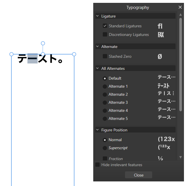
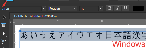
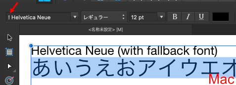
 Well, I didn't know before😅, but it's easy to work with japanese texts in vertical style inside Affinity Designer V2 and even in V1. Also, it will change all punctuation marks that work only for vertical writing style. Take a look on this video. vertical - Trim.mp4 You only needs to change the typography alternative on Text Style> Typography> All alternatives: change 0 to 2. And is done. The same option is right here on the 3 dots. I figure it out about alternatives right on this panel: So, I thought on going to text style and automate those changes. I had the following issue, but I get it now! Start by changing to Heading 2, (it will revert to the default font Arial). Then, inside the Edit Text Style panel> Font Family>from [No change] to [Hiragino Font], this action will break that previous alternative. I just realized that only the Hiragino font weights W0 and W7 work for vertical style on my PC!! (These two fonts where originally from my MacBook, so I converted them to use on windows.) The font MS Gothic is from the windows system, and it doesn't have and alternative to change the horizontal bar to vertical. By the time I wrote this post, I had figured out the issue regarding changing typography to a vertical style. I hope it helps! I just don't understand if MS Gothic font isn't complete or something, that's why this won't work...
-
- 1
-

-
- japanese font
- vertical writing
- (and 7 more)
-
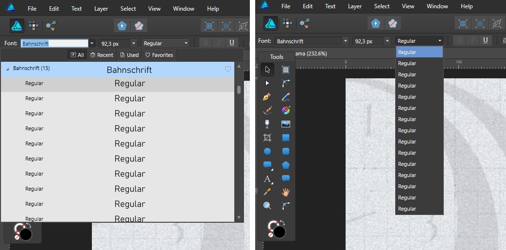
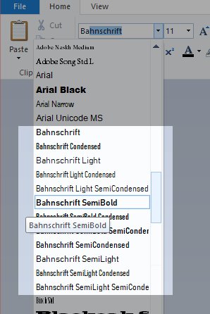
For some fonts problems arise in Designer in the font style dropdown. As you can see in the images below Windows shows the several types of the Bahnschrift-font the correct way, but in Designer there's only a list full of 'Regular's for this font. The font is included in the attachments. Bahnschrift Bold Condensed.otf
-
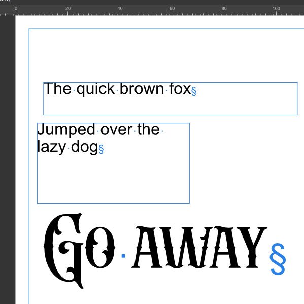
 I've suddenly gained this odd symbol when using both Artistic and Frame Text tools. I've gone through all the character and paragraph options but can't see anything checked that would cause it. Does anyone know what it is and how to get rid please? It is still visible after deselecting the font tool. It doesn't show up on exported files, but it's annoying and distracting.
-
Affinity Publisher doesn't render all weights in Apple's font SF Pro correctly. https://developer.apple.com/fonts/. The SFPro-ExpandedRegular is what I used. But the Compressed versions are also not correct. I have attached screenshots from Affinity Publisher and Pixelmator Pro, which render the correct correctly. SF Pro Format: OpenType TrueType Version: 19.0d6e1
-
 I was wondering if plugins like fontself would work on AD? https://www.fontself.com/
 -
 I'm using Affinity Publisher 2 on windows but the issue is with the entire Affinity line. I got this free font Aquire Free Font - Download Free Font (befonts.com) Inside the software the font is rendered like this But after export to pdf for example it looks like this The font renders without letter spacing in other programs as well. It's only Affinity issue. What could be the problem? Is there any setting I can change to fix this? This makes the software basically unusable because the final exported image never looks like the edited image...
-
 the font I have problem with is: Seravek It was the default font on my mac. Once upon a time I've updated macos and found that they delete the font from the system, so I reinstalled it to my mac manually but anyway affinity designer doesn't see the font (other apps see) I need that font, how to make it work?
 -
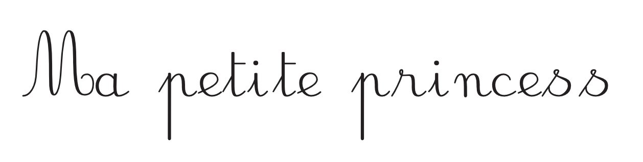
Hello, I’m encountering an issue with the JBCursive font when using it in Affinity apps, yes all 3 of them. While the font appears as expected in other programs, all Affinity apps seems to space out the letters, disrupting the continuous cursive flow. I have attached screenshots showcasing the correct rendering in another program and the spacing issue in Affinity Publisher. I’ve confirmed that the JBCursive font is installed correctly, and it behaves as intended in various applications except for Affinity apps. Has anyone else experienced a similar problem or can offer insights into resolving this issue? Note: Please be aware that adjusting the tracking did not resolve the problem.
-
Caution sign for the fallback font on the font selector is not shown on Windows.
-
I think the way font assigned by Affinity should be changed for non English languages. Substitute fonts no longer work from Ventura. This problem constantly raised by Japanese users. They don't expect that they should select Japanese font first. (Also changing font on blank text object often doesn't work.) Here's suggestions. - Japanese font should be the default font with Japanese UI. Arial does not contain Japanese characters. - If pasted/typed text includes non Ascii characters, a multilingual font should be assigned at least. Here's a related topic.
-
 Hey has anyone noticed any problems using text in AD? It is very slow for me. If I use a text frame, after less than a paragraph it starts to slow down -- I type in text and it takes a moment or two to show up on the screen. It gets slower as I integrate more text. Slightly worse with artistic text. I've tried changing the render settings (paths only, pixel, etc.) but no difference. I don't have many fonts installed, it's a fairly new OS install (Win 10) and I've only installed a few additional fonts. This is not much text (I realize more text belongs in Publisher) basically a few paragraphs that might appear on any flyer or poster. Strange: I have a dual-screen setup -- when I use the second screen for the dockers (I would like to have this setup) the problem is even worse. Any ideas are much appreciated!
 -
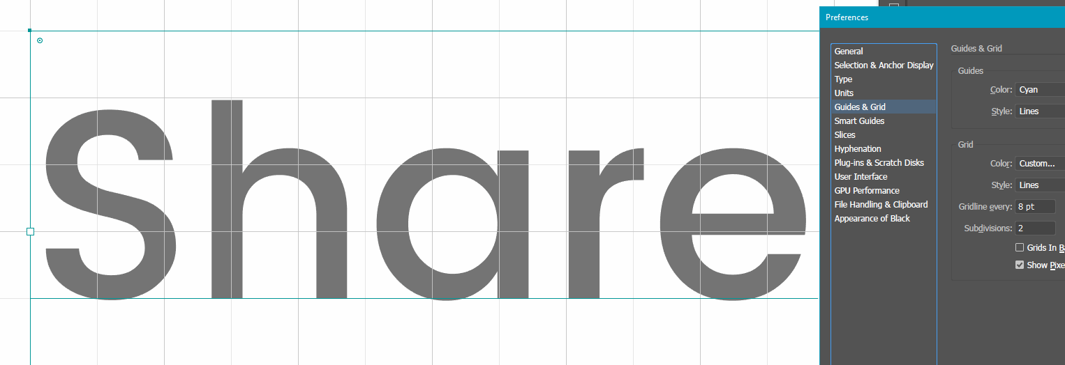
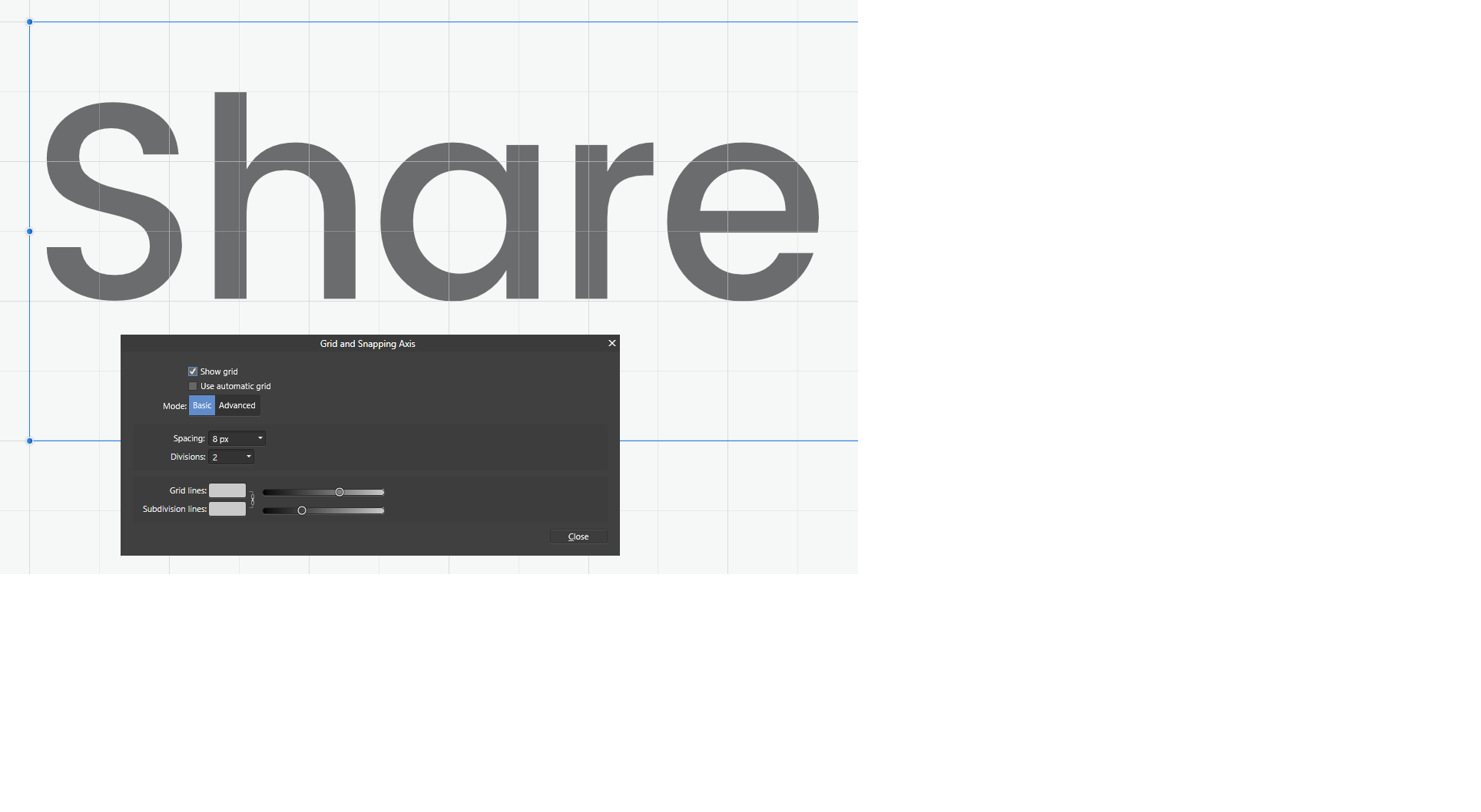
 Letters with a round form should extend past the grid line (see 2.png for correct alignment). AD aligns the rounded forms to the baseline instead (3.png). Grid 8 / 2 Text field height: 24 Leading/Baseline: 16 (illustrator) -4 (AD) I might be doing it the wrong way, so if there's another way of doing it, let me know.
-
 Hi When I place PDF-Documents into Publisher (Windows-Version), it complains about missing fonts, although the fonts are embedded in the PDF. I don't want to edit the PDF, so I don't need the fonts to be installed on my system. Greetings max1josef
 -
There's a strange problem with these fonts. GenEi Gothic N / 源暎ゴシックN GenEi Gothic P / 源暎ゴシックP Somehow only the numbers are distorted only on Windows. And it happens with only these traits. Light, Semi Light, Bold, Semi Bold You can obtain those fonts here. https://okoneya.jp/font/download.html#dl-geg-all
-
Affinity doesn't recognize some font names that are treated as a font trait in Affinity other than predefined traits such as Bold. Many apps including Word treat traits as a individual font. so the name is different between Affinity and others. When I paste text with those fonts, the question mark appears on the font selector. Such as these fonts: Calibri Light (Calibri and Calibri Bold have no problem.) Yu Gothic Light / Yu Gothic Medium (Yu Gothic and Yu Gothic Bold have no problem.)
-
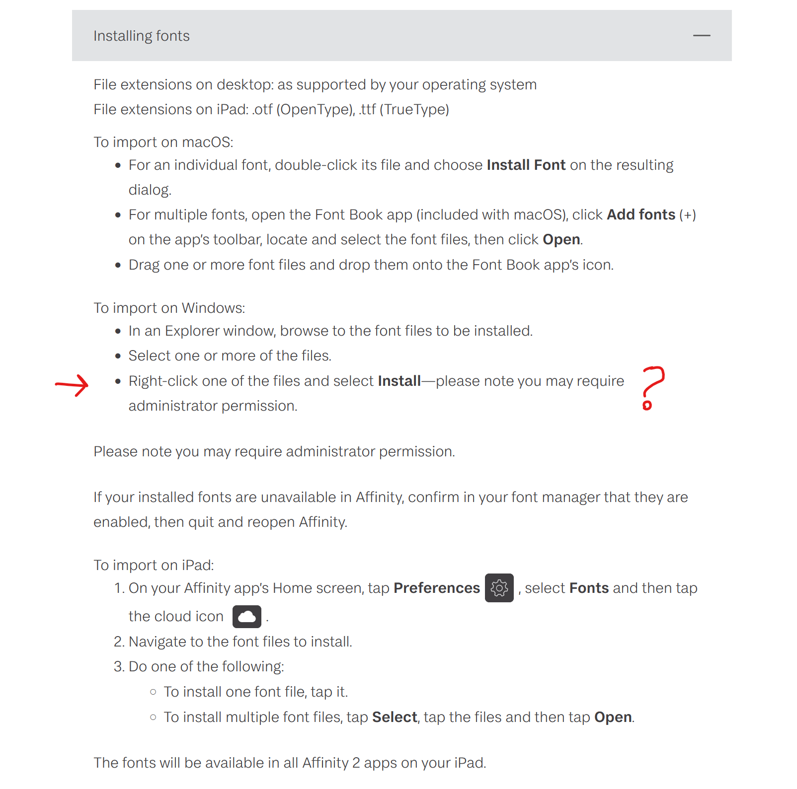
For the Publication Typefaces Collection that is part of the Creative Collection, the fonts are provided as .affont files. But I can't seem to find how one should install those. The OS doesn't recognise it as regular fonts and there doesn't seem to be a button to install fonts from within the Affinity suite. Also, the bundle is not showing up in the addons (downloads) section of the user account. From the install guide: tl;dr How am I supposed to install these?
-
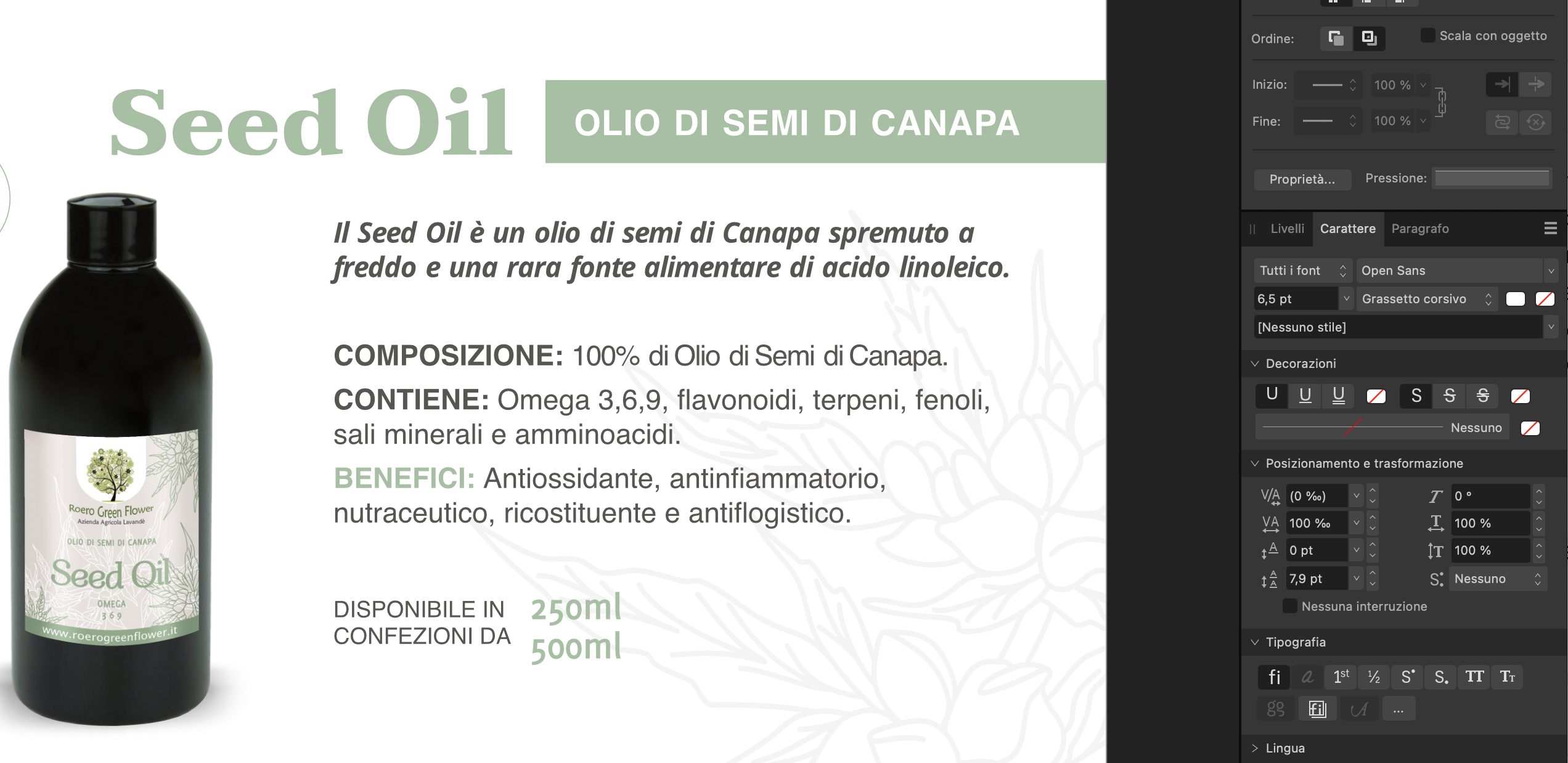
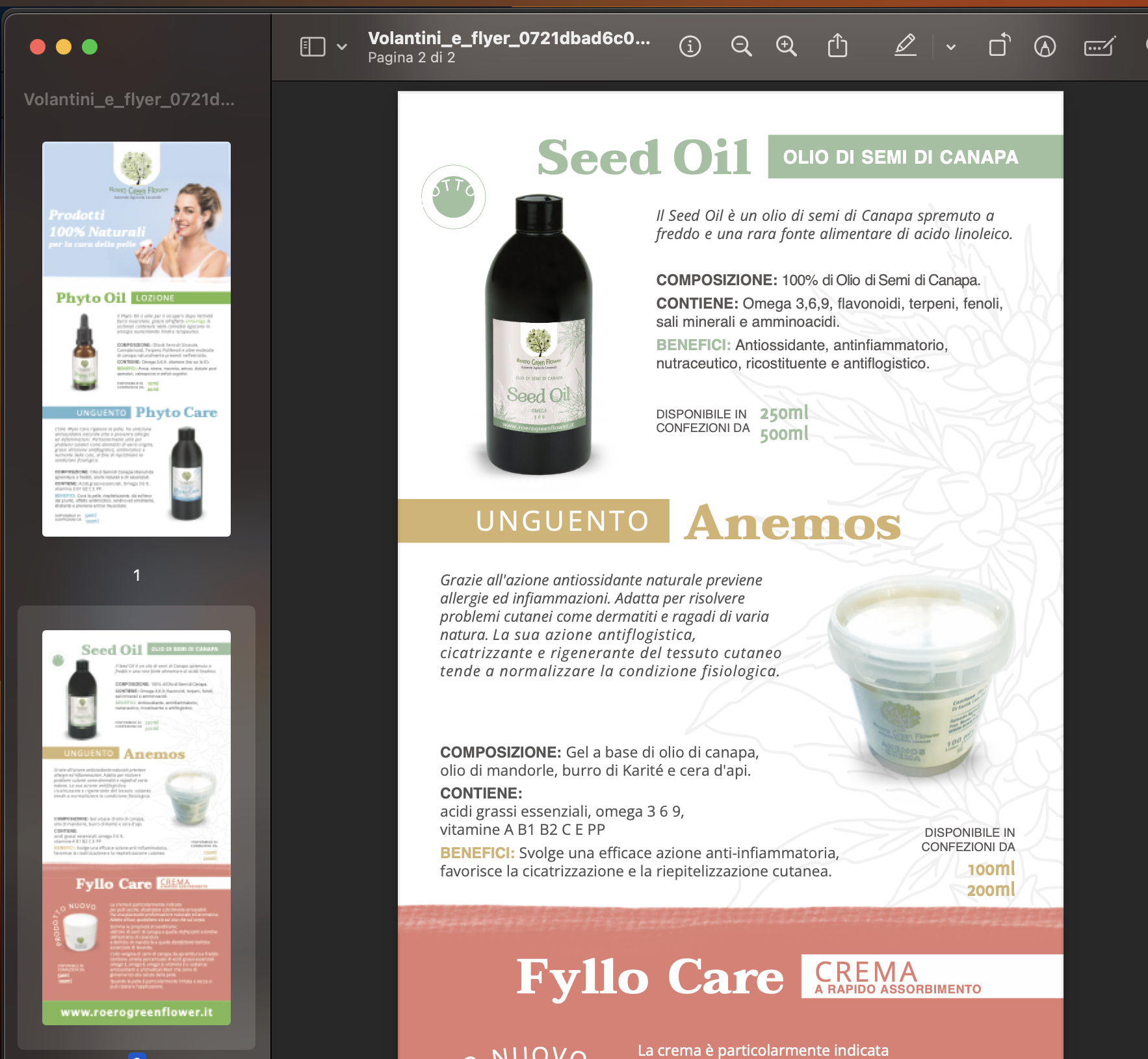
 Good morning everyone, I have noticed a big problem that I do not know how to solve with affinity publisher. For some projects, I am using quite common FONT families like OPEN SANS. and the whole family so with text part bold, light, italic... the problem is when I export to pdf half of those texts are transformed into REGULAR. Does this only happen to me? What can I do? on the screen an example
-
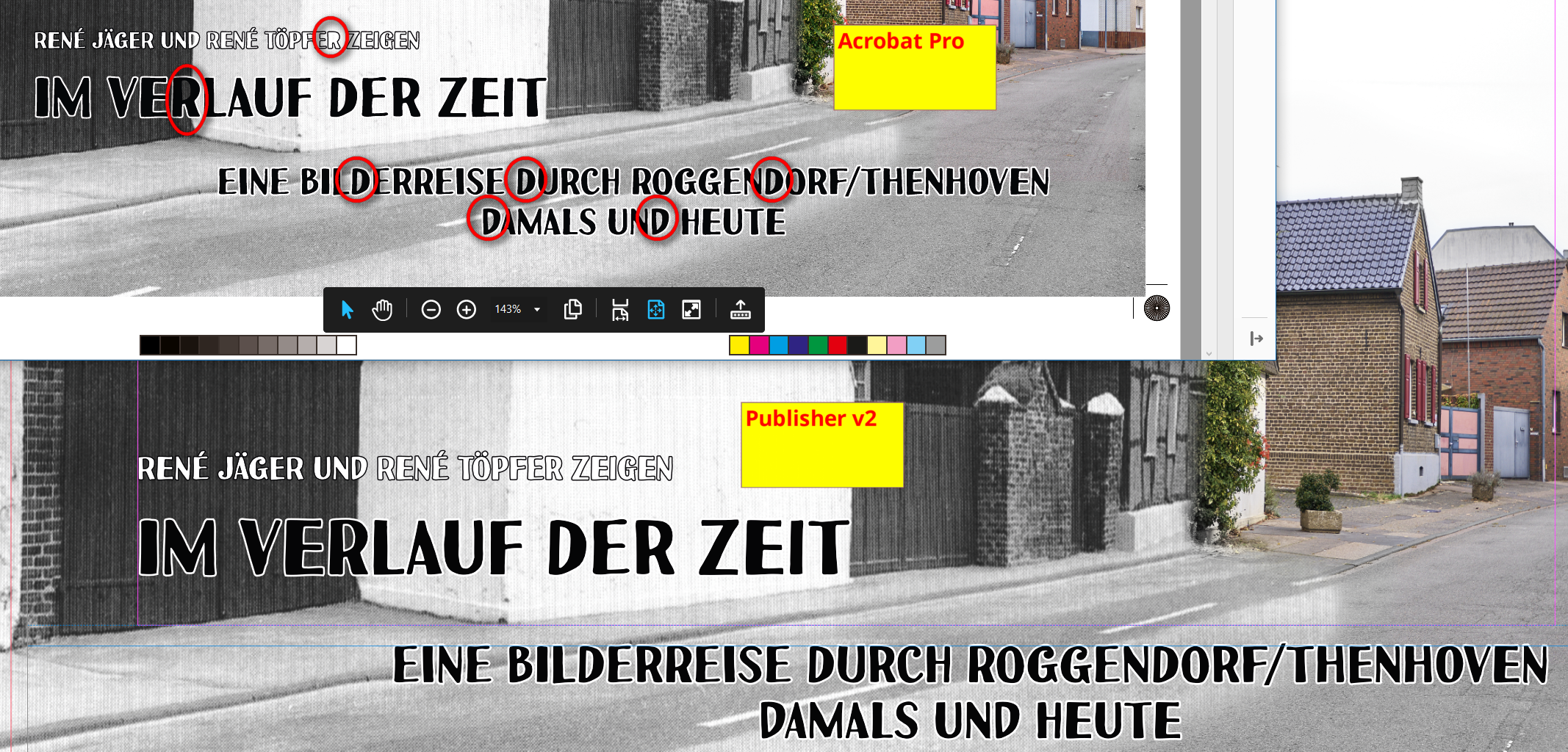
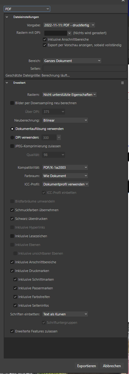
In some cases I have an issue with the border of a font (also if converted to curve). Within publisher it is shown propperly but the exported PDF contains the mistakes circled by me . As written in den beginning, it is independed if font or font converted into curve. I have checked the license of the font and it allows to use the font like I use it. The settings of the PDF are: I have attached the Publisher and PDF files to this topic. fehler.afpub fehler.pdf
-
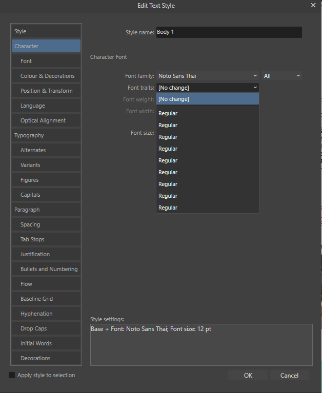
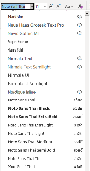
I work on Windows 10 and use Affinity 2.1.0 and I installed the Thai Font Noto Sans Thai (https://fonts.google.com/noto/specimen/Noto+Sans+Thai) which contains many different font traits. In Microsoft Word, each trait appears in the font list and can be selected and used. In Affinity however, the font gets correctly recognized as a font with multiple traits but all traits are called "Regular" and changing them has no effect. My workaround to use a specific trait is to uninstall the font completely form the system and install only the desired trait. But then there is only one trait available. Can anybody else reproduce this behavior?
-
 Are there any updates on automatic font activation for font manager applications, both Mac and Windows? There were at least two threads in the past that I could find, now archived, but there was never a real answer from Serif/Affinity as to if and when this feature would finally be integrated. The latest news is that FontBase has tried to contact Serif on several occasions (according to a thread in their forum), but has not received any response. I would love to be able to use this super handy feature of Fontbase, or by now almost any other font manager out there, together with Affinity Suite, but nothing seems to have happened in this area for years.
- 10 replies
-
- 2
-
-
- plugin
- affinity suite
- (and 6 more)
-
 Hi, I wonder if it's possible to do stuff like this: How to customize a font in illustrator! (& the tools I use) - YouTube In Affinity Designer. I have tried myself, but it's not working like in the video. The pencil tool just... Draw a line instead of making the font curves or whatnot. Thank you, Cheers!
 -
Typography is one of the most important(if not the most important) factor determining the quality of visual communication. I’ve always had trouble finding the right typeface. Wasting countless hours browsing various websites in search of "the one" that I currently want to use. I came up with an idea to create a list of free high-quality typefaces that you can use when the client’s budget doesn’t allow the use of paid ones. Typography is a tough nut to crack especially at the beginning of your journey, so I prepared a list with only good positions. ● Full version: https://fircyk.gumroad.com/l/fontslist Free version: (just put 0 in the price box) https://fircyk.gumroad.com/l/fontslistfree ● FONTS – Free Only Needed Type Set A complementary collection of carefully selected free typefaces that contain the best positions to fulfill every need in a graphic designer’s work. Your benefits: Graphic designers: Sometimes when the budget is too tight we need a free for commercial use but high quality typeface for our project—with this list you won’t waste your time searching the internet in order to find the right one. Content creators: Base your brand-building on proven typefaces to increase the quality of the materials you produce. Strengthen the power of your communication with your target audience. What is included: + LIST OF TYPEFACES A balanced list of free typefaces that combines the right level of versatility and personality. Created as an alternative to the original premium typefaces. Selection was based on: Glyph similarity Variety of weights Tone of voice Development state Language support Glyph count Opentype features + COMPARISION LIST Every free typeface on the list has its paid equivalent so it adds 40 positions and compares the free and paid classic that was the main inspiration. In addition, a comparison list has been prepared for printing. + FUNDAMENTAL RULES OF GOOD TYPOGRAPHY 10 timeless rules that will drastically increase your skills in the beautiful art of typography. + COMMON TYPOGRAPHIC MISTAKES 10 mistakes you can make in your career as a graphic designer. + MASSIMO VIGNELLI PICKS Original list of typefaces selected by one of the best graphic designers of our times. + LINKS TO SOURCE FILES Links to direct sources of selected free typefaces. + QUICK CARDS A preview prepared for quick comparison of the free typefaces included in the list. + QUICK–INSTALL FOLDER Latest versions of typefaces from the list in one folder for quick installation. Version 1.1 has already been implemented. In version 1.2 a typography checker will be added(as an Affinity Designer template file), where you will be able to check the quality of a selected typeface. —— Be effective. Stay creative. ——
- 3 replies
-
- 2
-
-
- typography
- font
- (and 2 more)
-
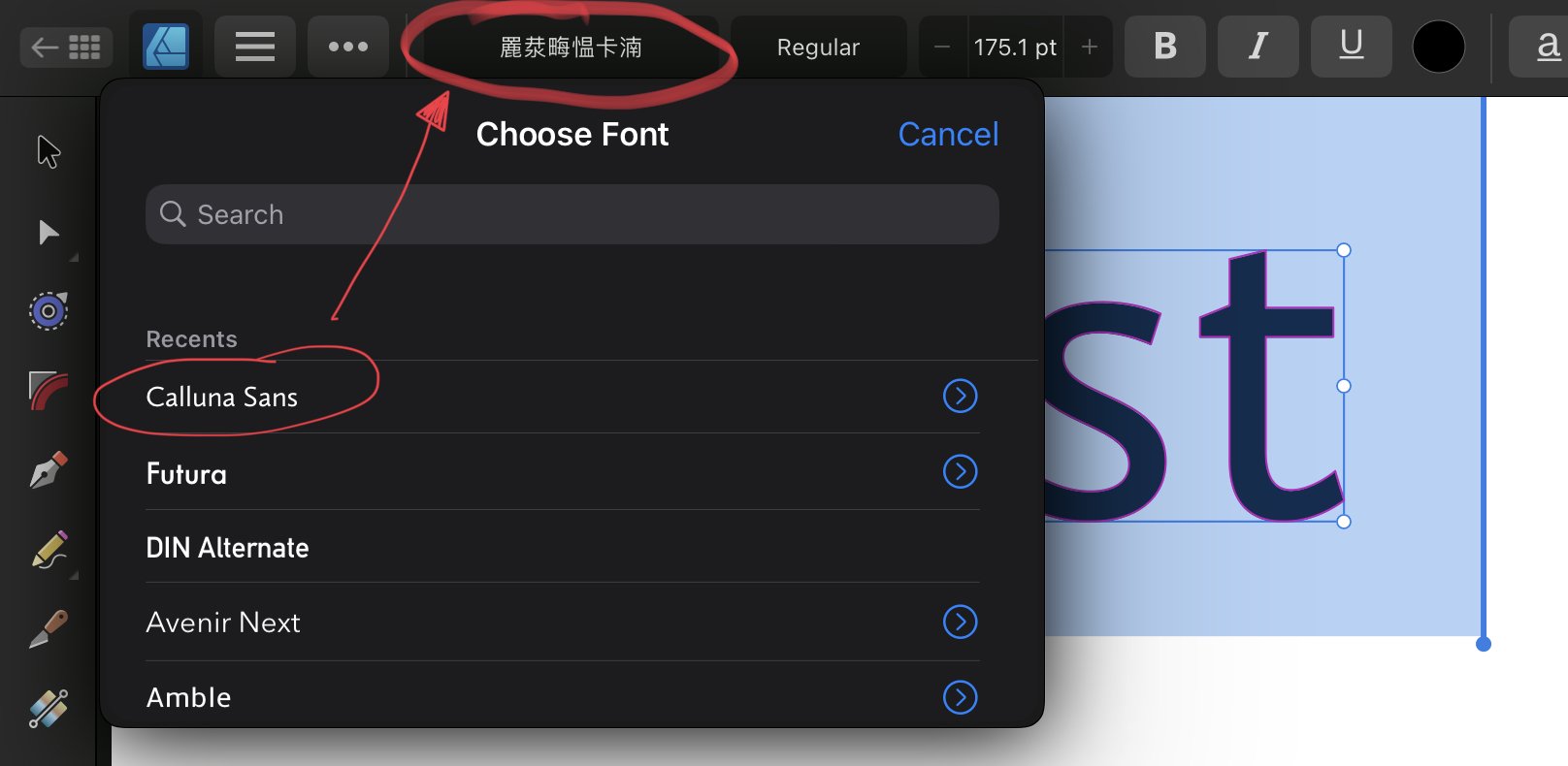
Hello, I’m having an issue with custom fonts that are installed on my iPad with affinity designer, 2.0. For some reason when I’m in the iPad app the font name shows with Chinese (I believe) characters. Does anyone know why? I’ve restarted my iPad and it doesn’t seem to fix the problem. For example, Calluna Sans, or any other custom font shows like the image attached. Thanks.
-
 I have a large design file that I made using one font. Because it was a font I constructed I made an update to that font which included a name change. Now my design file is full of Helvetica and there appears so be no way to replace missing fonts or "select same font". Is there any way to do this? If not, please add it. This process is exhausting otherwise.


.jpeg.57e91d684ef68d63e46d942c44846e5d.jpeg)