Search the Community
Showing results for tags 'experiment'.
-
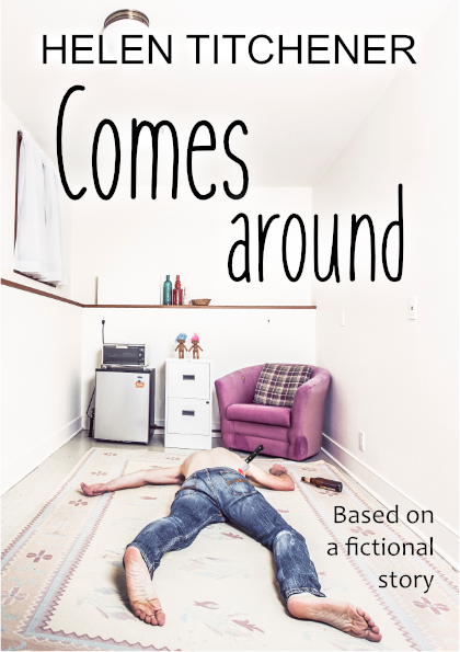
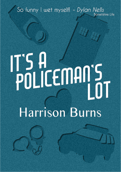
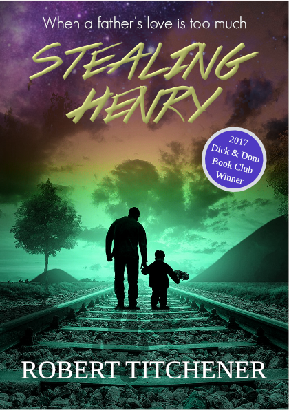
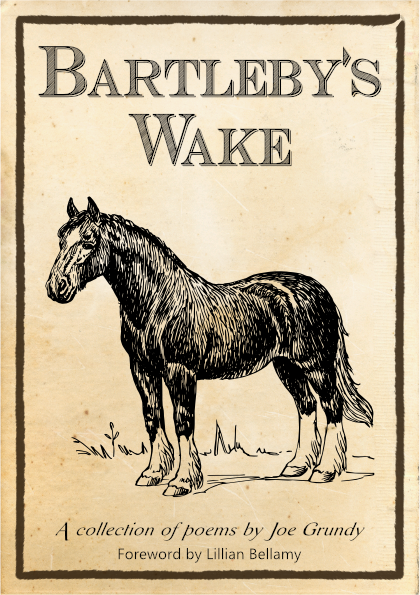
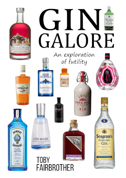
For a bit of fun at the weekend I thought I'd make some basic book covers, all set within an overall main theme but with each as its own story and genre. I've tried to match each cover with that which can be seen on existing books with the same sort of story/genre. The stories are (vaguely), in no particular order: * Animal Farm 2 - Intrigue and revenge behind the pig arks; * Comes Around - A gritty tale of abuse, betrayal and consequences; * It's a Policeman's Lot - A whimsical story of a "Bobby on the Beat"; * Stealing Henry - A thriller where a cruel father tries to kidnap his son; * Bartleby's Wake - A collection of awful poems by a grizzled old farmer; * Gin Galore - A hapless dreamer tries his hand at being an artisan distiller. Listeners of a certain long-running UK radio drama might be able to guess the overall theme (particularly from the authors' names). They're all silly throw-away experiments - just a few hours of messing around so there are probably lots of problems with each - but if anyone has any suggestions or comments I'd be happy to hear them.

-
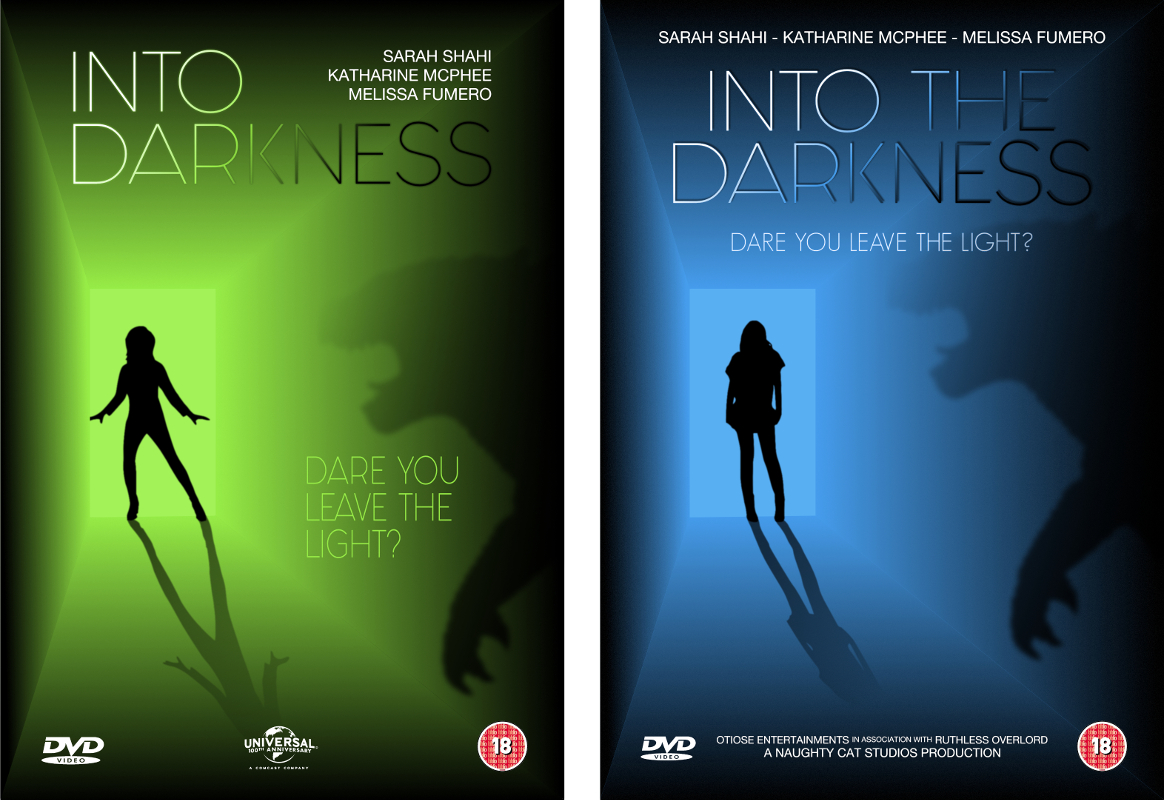
Here's another DVD cover experiment that I've been playing around with today (it's not for anything real, it's just for fun). First version is on the left, second version is on the right. Some notes on the changes for the second version: * some text has been added/removed/moved around; * the colour has been changed to something I thought was more "ephemeral"; * the effects on the logotype have been altered; * the monster is a bit nearer to the girl; * the girl has been changed to a figure that looks more "wary"; * some noise has been added to the darkness. What does anyone think? (I keep thinking it's missing something but every time I add something - another monster, some grasping hands, etc. - it looks worse.) Is there anything you would change? Are my font choices okay? Could the layout be better? What do you think of the colour choices? Is there anything you really hate? Is the anything you really like? Have I made any glaring mistakes? As usual, all constructive comments/suggestions/criticisms are welcome.
-
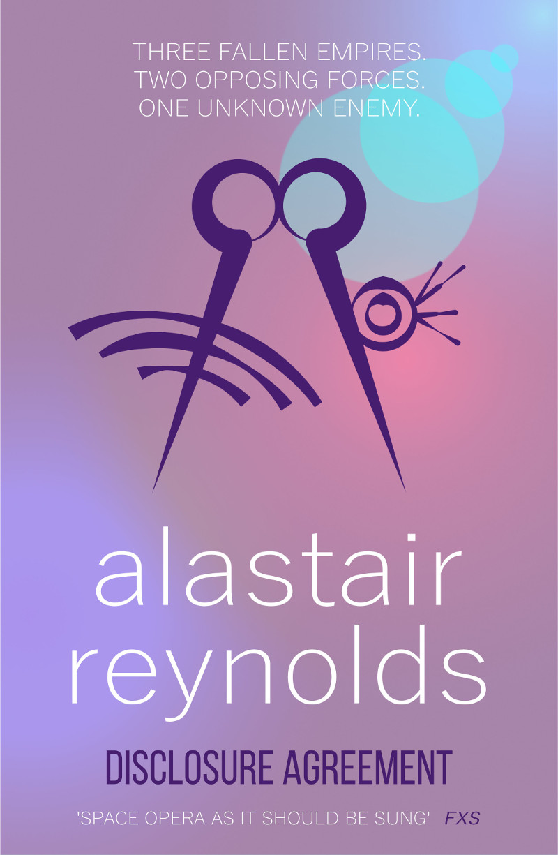
Hello everyone. This is my first post on the forum so I thought I'd introduce myself by way of attaching a simple book cover that I've been experimenting with. I know it's pretty basic stuff but I'm still finding my way around. No external images were used, everything was drawn in Affinity Designer. (My inspiration came from: https://raru.co.za/books/4126333-poseidons-wake-alastair-reynolds-paperback ) I've only been using AD for a week or so - mostly just a few hours here and there when I get the time - but I'm very impressed with the features and usability so far. I made the cover as a throwaway experiment but if anyone has any suggestions about improvements - fonts, colours, lighting, whatever - then I'd be happy to learn. I know the "alastair reynolds" font isn't right but I can't find the correct font - I think it's supposed to be Helvetica Light - for free. Can anyone give me a link to a better free font? I'm not entirely happy with the background. If anyone can point me in the direction of a good tutorial for this kind of thing - merged gradients and lighting - that would be great. If I get some good suggestions then I might do an updated version and post it here. Edit: I've attached a smaller image so it can be seen more easily.
-
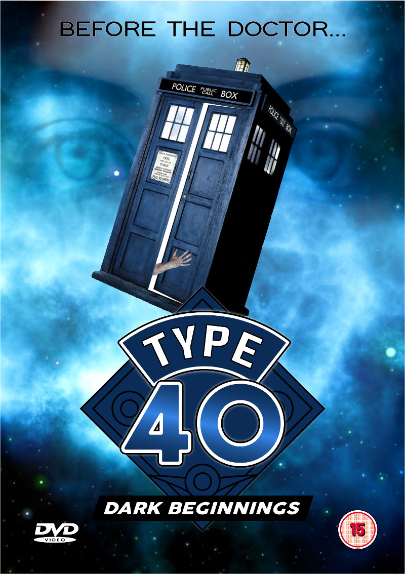
Here's a version of a DVD insert experiment which I originally created with some other software a while ago. It's not perfect by any means - a lot of work would still need to be done if it wasn't just for fun - but it was easy to do with AD and gave me a chance to try various features. (It was a lot easier to put this together with AD than it was with the other software.) Comments, criticisms, tips and advice are all welcome.
-
 Hello everyone, like I posted in my previous topic, I really appreciate the pixel-view in Affinity Designer and wanted to explore the Pixel Persona a bit more. I wanted to experiment a bit and see how far I could push it. I really enjoy automotive design and well.. pretty much everything about cars, so I thought I'd do a bit of a virtual tuning thing with the Pixel Persona and see how it goes. I looked through the tools and messed around for a while before I set off with the project, and pretty much figured, that AD has all the basic tools needed for photo manipulation, aside of it's powerful set of vector tools. I drive a '98 Nissan Micra K11 preface, so I thought I'd give that model a bit of a touch up. Now please bare in mind, that the last time I gave a car the "photoshop-chop" treatment was probably about 10 years ago, so I'm a bit rusty in that regard, but I am really happy with the final result: The full resolution is 1080p, just click on the picture to view it. Here's the original image: So do I think Affinity Designer is not only a great vector software, but also a killer photo manipulation software? Absolutely. Obviously something like a mesh-distortion tool would make the process much easier and will open up a lot more possibilities, but even as it currently is, you can still manipulate the software and cleverly use it's functionality to do some complex pixel work. As in my previous project, I recorded the entire process, but I have to edit the video first. I wanted to share with you my result, so I'll post the video as a comment, when it's ready (I'll get right on it). Thanks for having a look!
 -
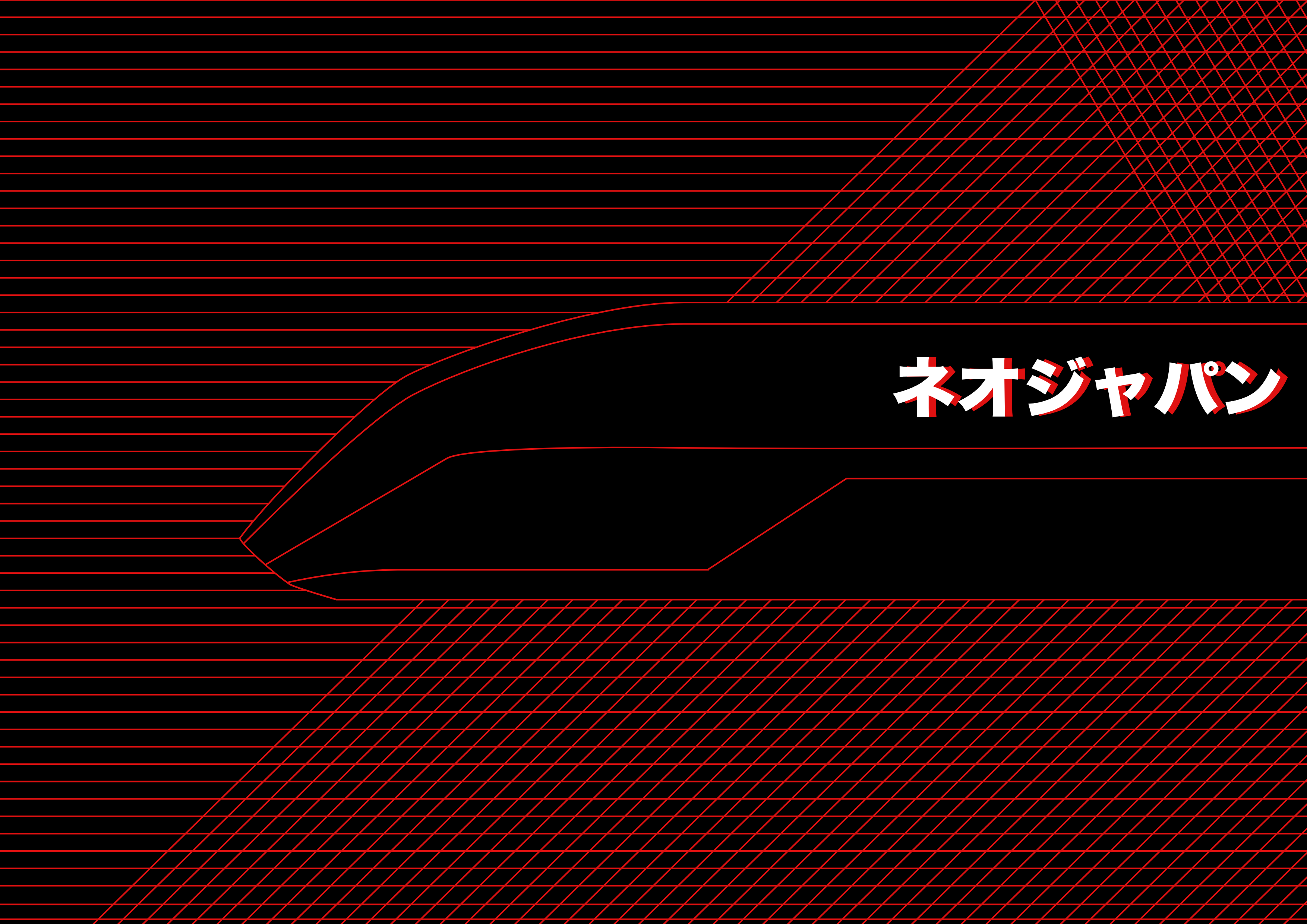
Hola Amigo, Played with Affinity Designer today too. Trying to get familiar (i am not that good at illustrator too). Today I made a small poster called "Neo Japan" :P :) Feel free to share your suggestions.
- 1 reply
-
- 1
-

-
- illustration
- experiment
- (and 3 more)
-
Hello Everyone, Nice to see an active forum. I really love the work posted by the artist, nice designs. Yesterday I bought Affinity Designer. It's a cool software. First impression, I like it. Peaceful and neat UI. Good job. I really to see more tutorials and modular documentation for using the tool. Currently, you have good tutorials. But like to see Serif initiative to give design tutorial from scratch that give more confident to the new users I think. It's just a suggestion. One more thing, I made something in Affinity and like to share with you. Welcome to the Machine poster based on Pink Floyd song https://www.behance.net/gallery/26923669/Welcome-to-the-Machine-Revisited Project Facemash, It's my personal project https://www.behance.net/gallery/26906337/Facemash-Part-3 Please feel free to share your valuable suggestions and Say Hai to me. :)
- 4 replies
-
- 1
-
-
- experiment
- newbee
- (and 5 more)