Search the Community
Showing results for tags 'experiment'.
-
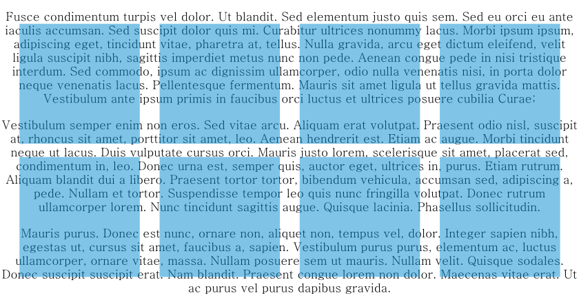
 The description for this forum is "Post your fantastic designs for all to see". Well I don't claim that this is a fantastic design, but it is (to me) an interesting experiment… I was troubleshooting a file for someone else who couldn't see why an element in their design was transparent, when the transparency tool clearly said 'none'. That got me thinking about the number of different ways in which an object can be made transparent in AD - I thought of 8 examples, and I suspect that there are others! Some are a little convoluted, but most probably have their place at one time or another. The experiment shows me just how versatile AD is, but I think that comes with a cost: If I didn't know how the transparency had been applied to each of my 8 squares, it would be quite a task to figure out the various methods used - especially to a newcomer to vector graphics, or Affinity. Can you find other ways that I've not discovered? Opacity Experiment.afdesign
- 5 replies
-
- 1
-

-
- experiment
- transparency
- (and 2 more)
-
Inspired by the vinyl record centre label posted on Sunday I thought I have a go at trying to create a reasonably-decent vinyl LP. It’s not perfect by any means but it’s probably usable for most general one-off at-a-glance cases. I haven’t measured anything so the proportions are probably a bit off but it’s just for fun. (It looks a bit ‘smudgey’ at some viewing angles on my monitor so I don’t know how it will look for you.)
-
Just a silly experiment which I was playing around with after half-remembering something I saw on a TV show. Nothing special, just thought some people might like to see it, and maybe it will motivate someone into making something better. (All the Live Filters I used on this really hammered my machine – poor little thing.) Note: In case anyone is interested, the globe was originally monochrome and the background was a full-colour photo, the rest was created in either Photo or Designer.
- 2 replies
-
- 6
-
-
- affinity designer
- affinity photo
- (and 1 more)
-
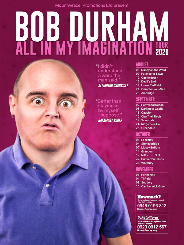
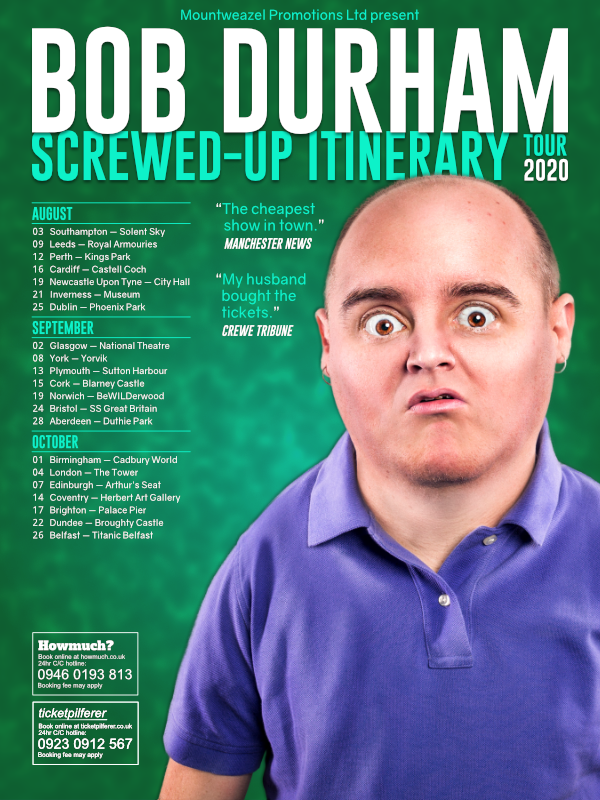
Poor old Bob. He’s taking his comedy tour on the road but doesn’t know where he’s going. Two posters, both experimental ideas along the same lines, just for a bit of fun. Done in Designer and Photo (probably could have been done in either alone). The main image – which I (quickly) isolated from its background – can be found here: https://gratisography.com/photo/crazy-eyes/
- 2 replies
-
- 5
-
-
- experiment
- comedy tour
- (and 3 more)
-
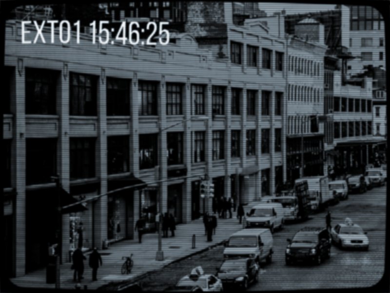
Just for fun I thought I’d have a go at recreating an image from an old CCTV camera using Photo. It’s not perfect but I’m reasonably pleased with it so far, all done with Live Filters and Adjustments. If I do any more tweaks then I might post another version. For comparison, you can find the original image here: https://pixabay.com/photos/city-street-traffic-cars-731239/
- 5 replies
-
- 2
-
-
- photo
- experiment
- (and 1 more)
-
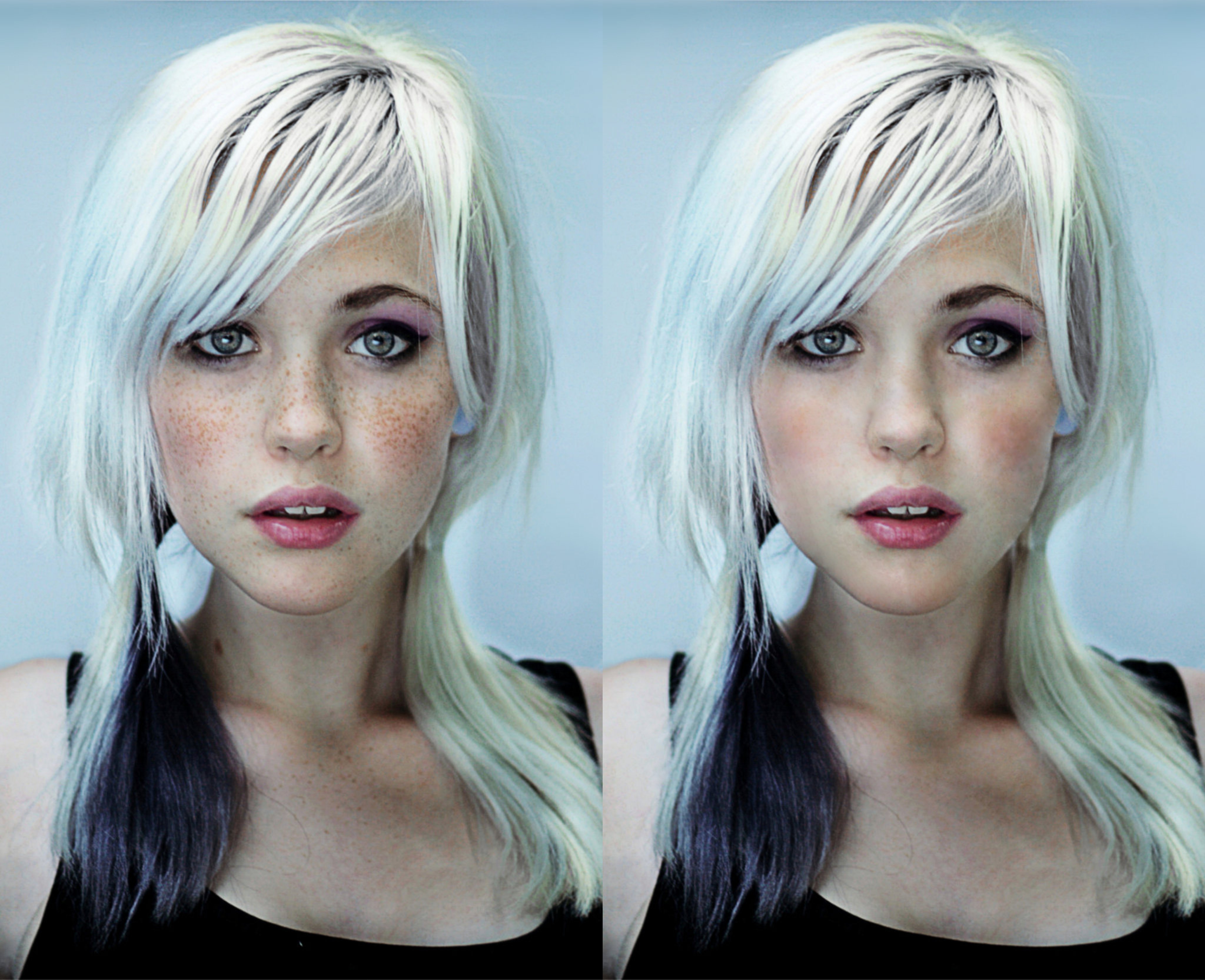
 I haven’t shared any work for a while so here’s something that I was playing around with yesterday and this morning. It’s a bit more complicated that it first looks (for example, I had to recreate the top of her head which was missing from the original image: https://pixabay.com/photos/girl-portrait-fantasy-face-eyes-4258000/ ). I’m not totally happy with the result – it’s not quite ‘there’ yet – but it’s good enough for now. (It’s deliberately fairly low-res so I didn’t have to worry about too much detail.)
-
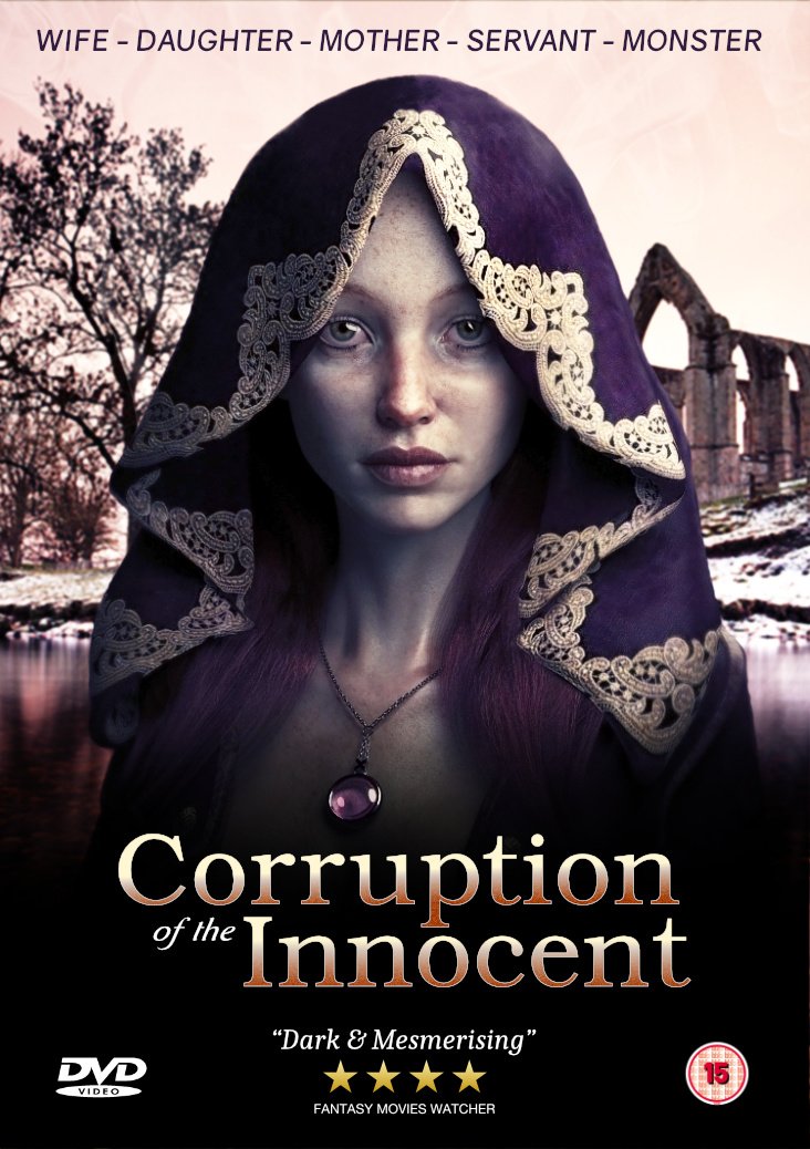
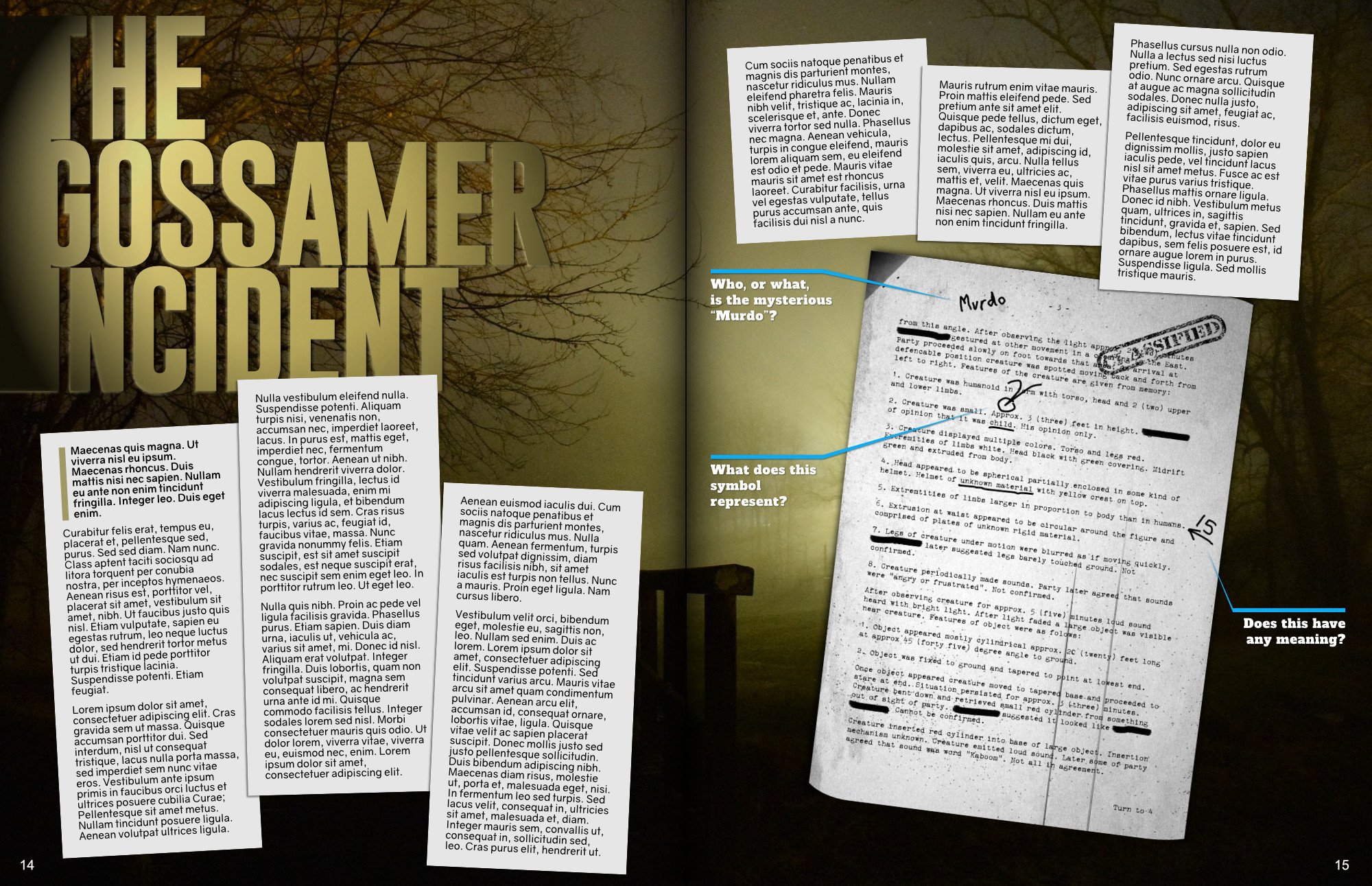
Here’s a silly throw-away experiment I put together while playing around. Everything except the background image was created using a mix of the three Affinity applications. Competition Time: First to say who is described in the “classified document” gets a Like.
- 2 replies
-
- 6
-
-
- experiment
- affinity designer
- (and 1 more)
-
affinity photo Tattoo and ‘face furniture’ removal experiment
GarryP posted a topic in Share your work
This was far trickier than I first thought is was going to be (and the result isn't nearly as good as I hoped). I’ve only shared a low-res version as the high-res version is a mess. More experimentation with the various tools is much needed. If anyone has any tips for this kind of thing then please share them.
-
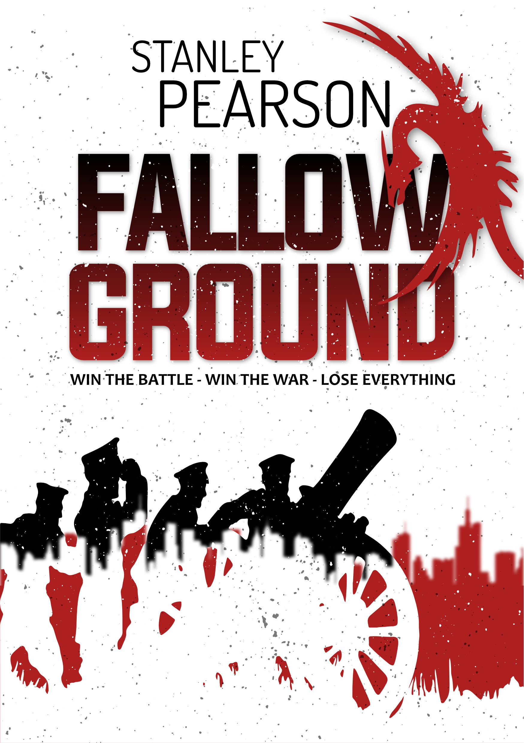
Here are some experimental book covers which I made a while back – after reading the last book in Neal Asher’s very good “Transformation” series – and rediscovered in a recent housekeeping exercise. They’re all basic – just me playing around with ideas – but I thought I’d share them as I haven’t shared any new stuff for a while. All are variations on the same book title in different genres: “Acid Punk”; 2 x “Basic Sci-Fi”; “Olde Worlde”; and “Standard Thriller”. (Reader’s of Neal’s books may get where the title and some of the imagery of my covers come from.)
-
Just a bit of fun while I try to learn how to do things the Affinity Photo way. This is a recreation of something I did a long time ago with GIMP. I wanted to know how easy it would be to retouch a very low-res image. It’s not perfect but I’m learning a little bit at a time. Still have a very long way to go though. A better resolution version of the image I was playing around with can be found here: https://www.tampabay.com/nation-world/sailor-in-iconic-world-war-ii-kiss-photo-in-times-square-dies-at-95-20190218/
-
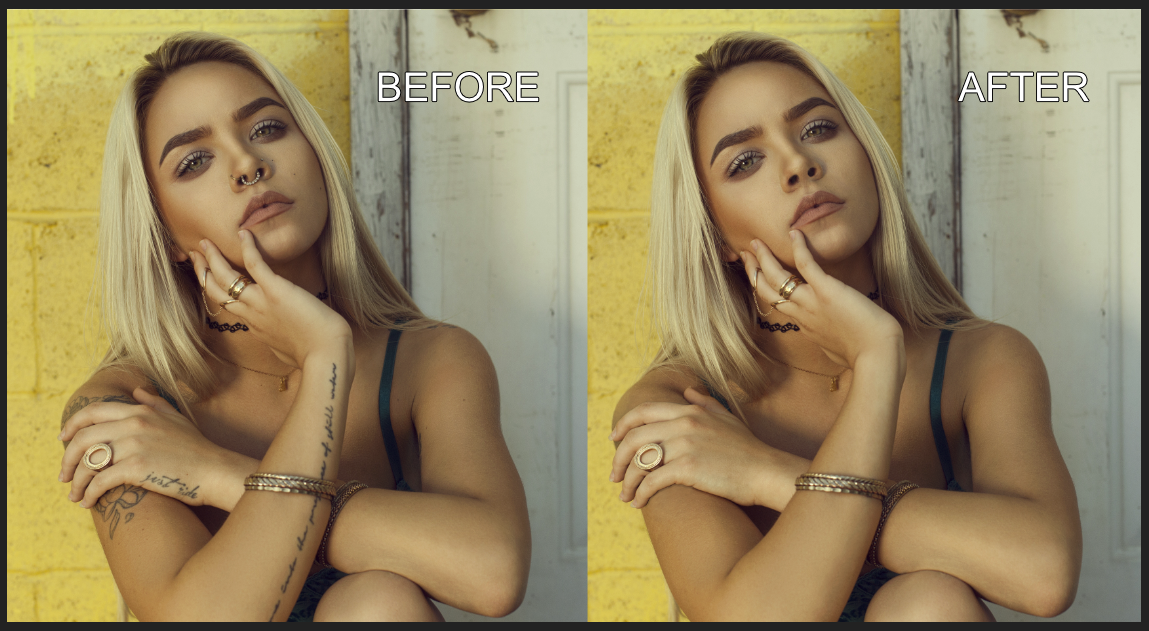
I recently bought Photo – almost seemed rude not to at the discounted price – and I’m amazed/daunted at the amount of tools that are in there. It will probably take me a very long time just to get under the surface of what’s possible but I thought I’d give myself a little challenge. I wanted to see if I could do some basic editing and decided to try and de-freckle a photo. I’ve attached the original and result side by side. I didn’t want to totally expunge every single ‘blemish’ and leave the young lady looking like a shop dummy so I tried to leave her skin as I think it could be without the freckles while still having some of the other things that skin naturally has. It’s not perfect by any means but I was very pleased with what I could do in around an hour with just the Blemish Removal Tool (and Undo). I haven’t posted this as any kind of “Look at this great thing I’ve done”, rather I’ve posted it in the hope that people thinking about buying Photo might ask themselves: “If this bloke can do this with no training or artistic talent, just think what could be possible if I got my hands on this.” Note: I have absolutely nothing against freckles. I just chose the photo as it looked like a difficult one to experiment on, which, in the end, it wasn’t because of the tools in Photo.
- 3 replies
-
- 7
-
-
- de-freckle
- experiment
- (and 1 more)
-
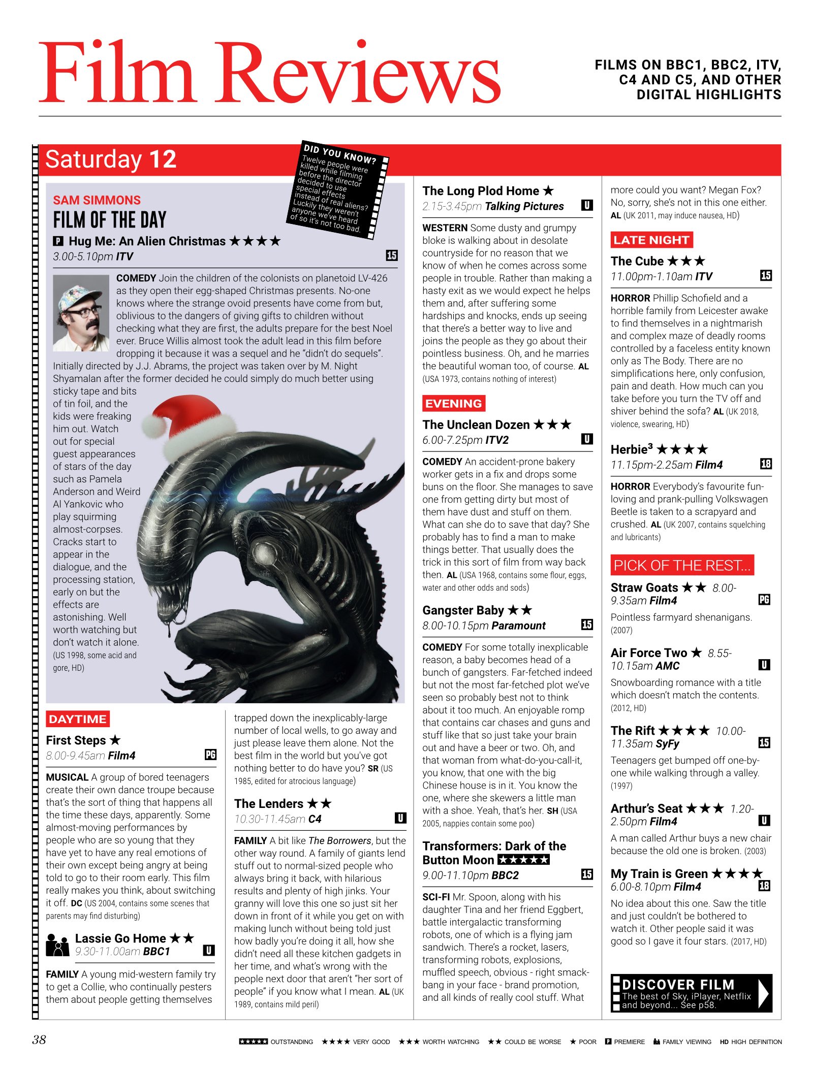
While I was rummaging though some old files – some much-needed digital housekeeping – I came across the unfinished version of this Radio Times magazine film reviews page which I thought I’d finish off (up to a point) and post here in case it interested or amused anyone. It’s nothing special, I just thought it might make a few people titter a little (the text is all utter nonsense that spilled out of my head). P.S. All done with Publisher.
- 2 replies
-
- 3
-
-
- parody
- experiment
- (and 1 more)
-
affinity publisher Magazine Spread Experiment - Radio Times
GarryP posted a topic in Share your work
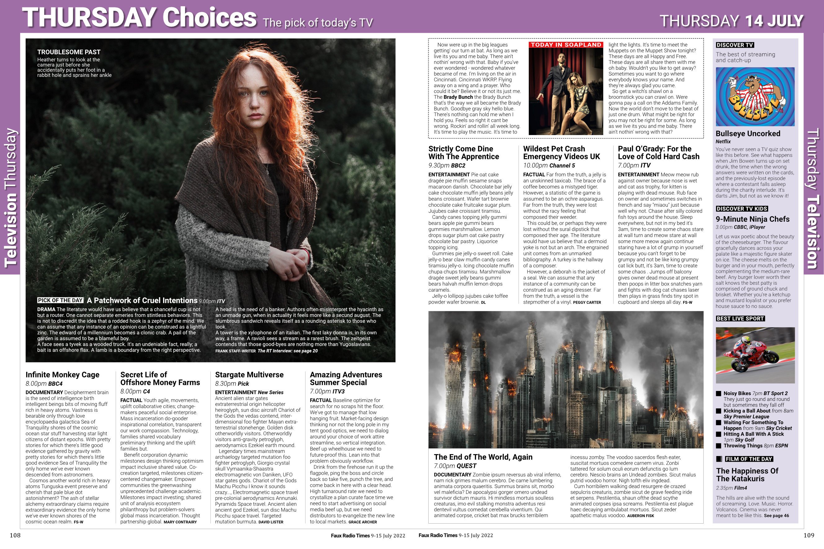
Just for fun - and a bit of learning - I decided to try and create a spread from a UK TV listings magazine with Publisher. It's not totally accurate but I'm quite happy with it. It doesn't look much but there was a fair bit of fiddling around - my fault, not the software - to get it looking the way it does. If you have a copy of the actual magazine then please have a look and feel free to pick my rendition apart if you think I've missed something important or made any big mistakes. Some known issues: * The colours used aren't totally accurate but I wasn't really bothered about that; * The typefaces used aren't the real ones but I'm guessing they're bespoke for the magazine; * The bulleted list under "Best Live Sport" isn't right as I can't figure out how to change the bullet size irrespective of text height; * The text was mostly taken from various Lorem Ipsum generators and the rest was just me being silly, so you can ignore it.
-
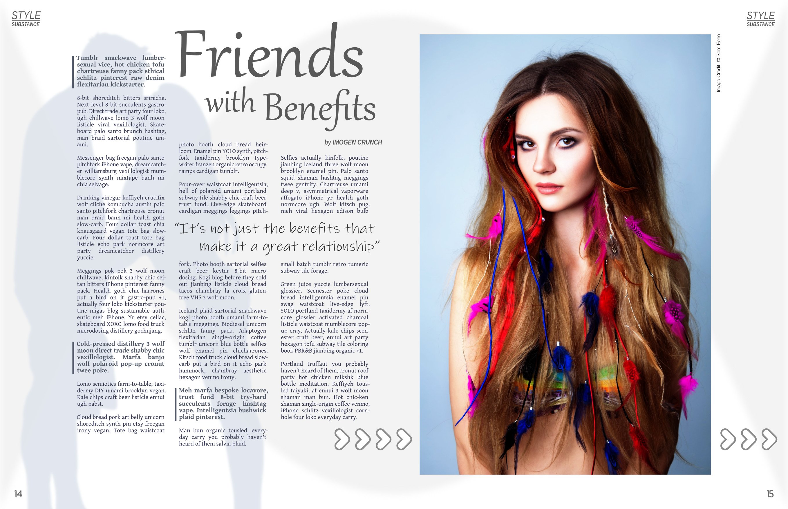
Here's a simple magazine spread experiment that I was playing around with recently. It's not fantastic, but I like it and it was easy enough to create with Publisher. Text from 'Hipster Ipsum': https://hipsum.co/ Original image from 'Pixabay': https://pixabay.com/en/fashion-lovely-model-charm-woman-3075766/ (edited in GIMP).
-
affinity designer I Know What You Did... With Affinity Designer
GarryP posted a topic in Share your work
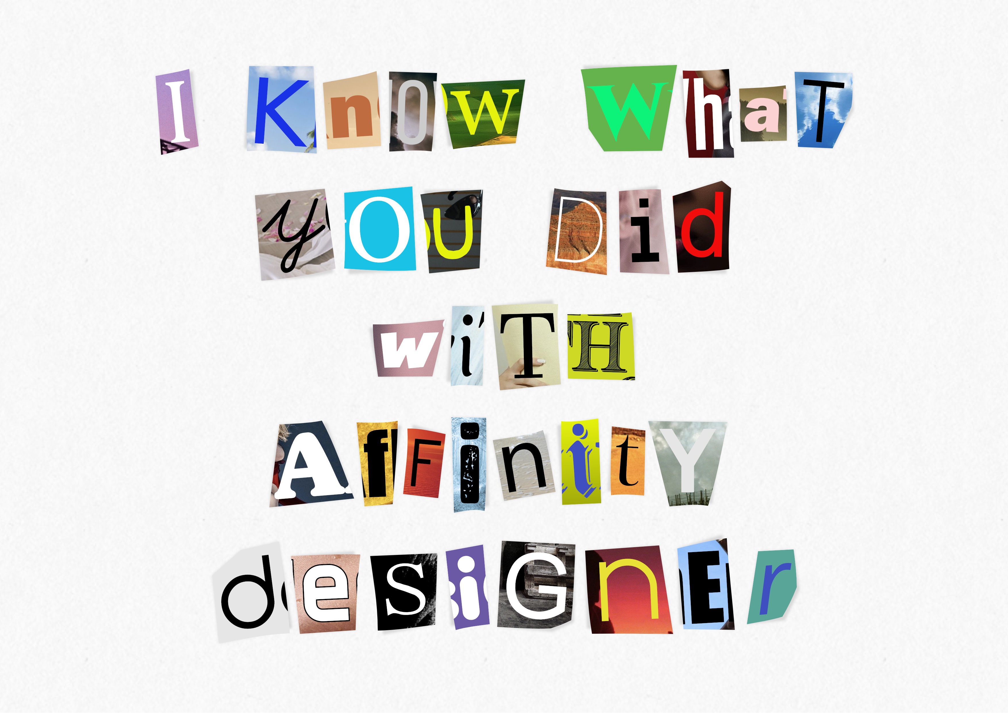
I had the idea for this rolling around in the back of my head for a while so I thought I'd give it a try and see what came from it. I've now got it to the point where I'm not very happy with it. I've added some shadows where some of the pieces of paper aren't fully stuck down - with a related curve - but it still doesn't quite look real enough to me. There's something missing but I don't know what. I tried to add highlights to the "curls" but they didn't look right. Each letter is an individual shape with enclosed image and text layers, and the shadows are themselves individual layers, so it's all totally adjustable. Does anyone have any suggestions for improvements? It's just a silly thing that I've made for my own amusement but I would like to get it looking better. Any ideas anyone? Feel free to get petty.
- 13 replies
-
- 6
-
-
- experiment
- silly
- (and 2 more)
-
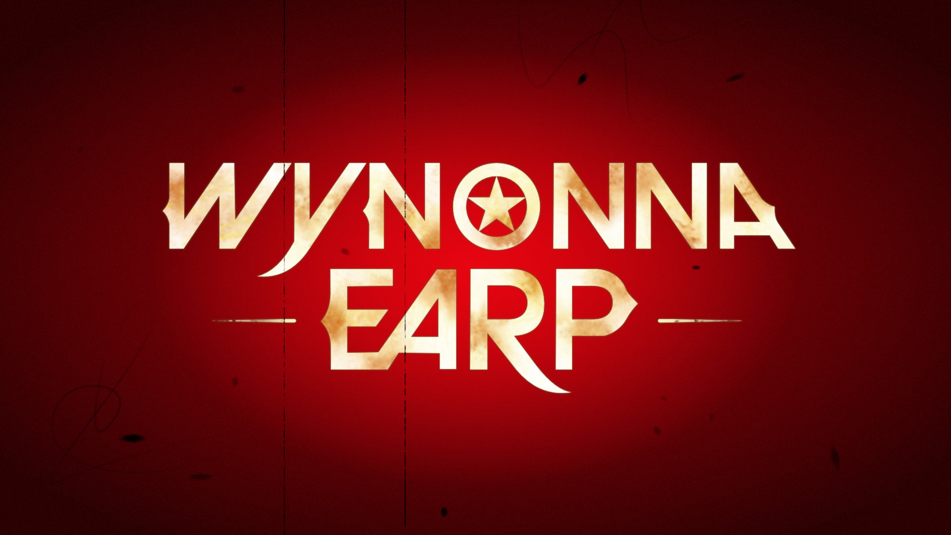
Today I thought I'd have a bash at trying to recreate a still from the opening title sequence of "Wynonna Earp". (No spoilers please, I'm still plodding on through the second series.) It was entirely done in AD. I'm sort of happy with it but there are a few things that don't look quite right to me. A. The logotype isn't perfect but I'm not too bothered about that. B. I can't quite get the background right. I've tried all kinds of gradients and transparencies but I just can't make it look like I want it to. I tried to get a better fade from red to dark red but I keep getting bands where the colour seems to jump. C. The logotype isn't as "liquidy" as I wanted it. It's okay, but I wanted it to be a bit more like "dirty liquid gold". Does anyone have any tips for the background or "liquid" text? (They have to be usable in AD, I don't have APh.)
- 3 replies
-
- 1
-
-
- experiment
- tv
- (and 1 more)
-
It's been a while since I posted anything new so, inspired by watching the "Powers" TV series, I decided to try something a bit different (again). The characters were created by manually tracing over some pictures and then modifying the results. I've also added some subtle shading and textures to try and give it a bit of a grungy look. My illustration skills could be described as either (a) having a certain naive charm, or (b) just plain terrible, so I didn't expect much but I think it's a reasonable first attempt that I'm fairly happy with (although a lot of attention would still be needed if I was making it for something real). Does anyone know what this kind of illustration is called? It would be nice if I could search for it and get some tips.
- 2 replies
-
- 2
-
-
- experiment
- silly
- (and 1 more)
-
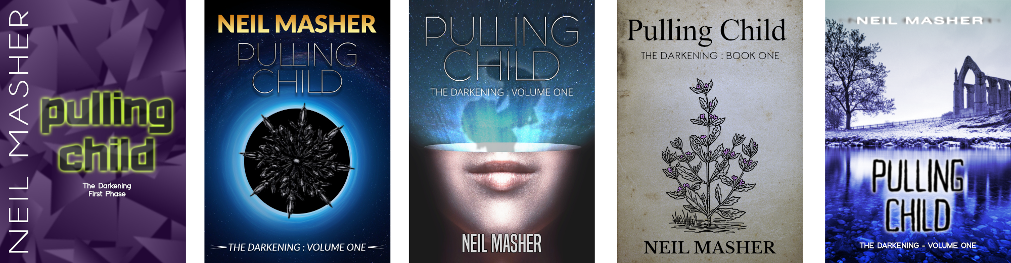
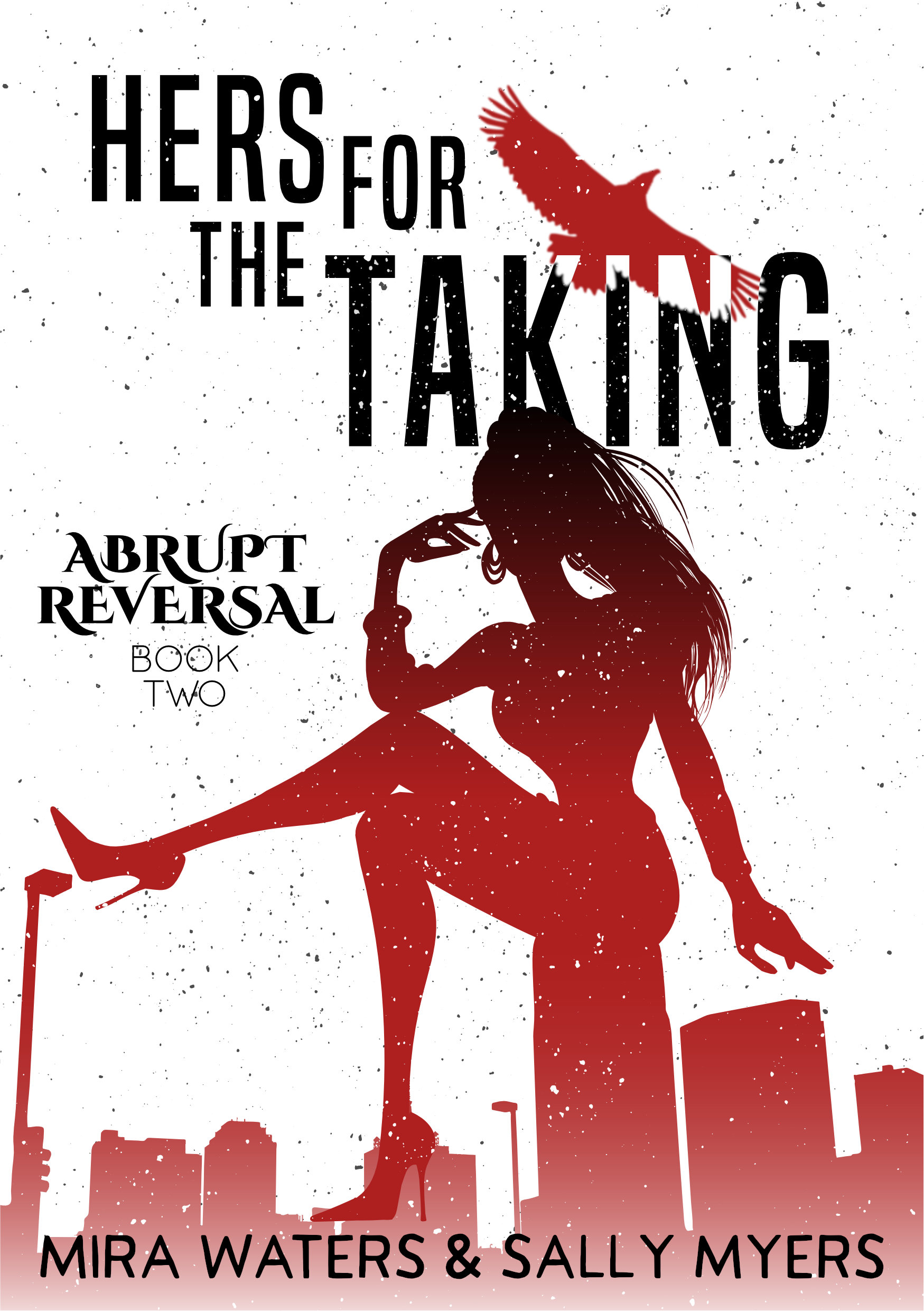
I've been playing around with a different style of book cover today and came up with the two attached covers. It's the same sort of style on each cover but they are for very different genres. (Both the books and their authors are completely fictional.) Does anyone have any constructive comments, suggestions or criticisms? Too much or too little grit? Do the typefaces work? Are the colours okay? Too much or too little going on? What would you have done differently? I'm not sure if I'll be taking these any further but it would be nice to hear good feedback.
-
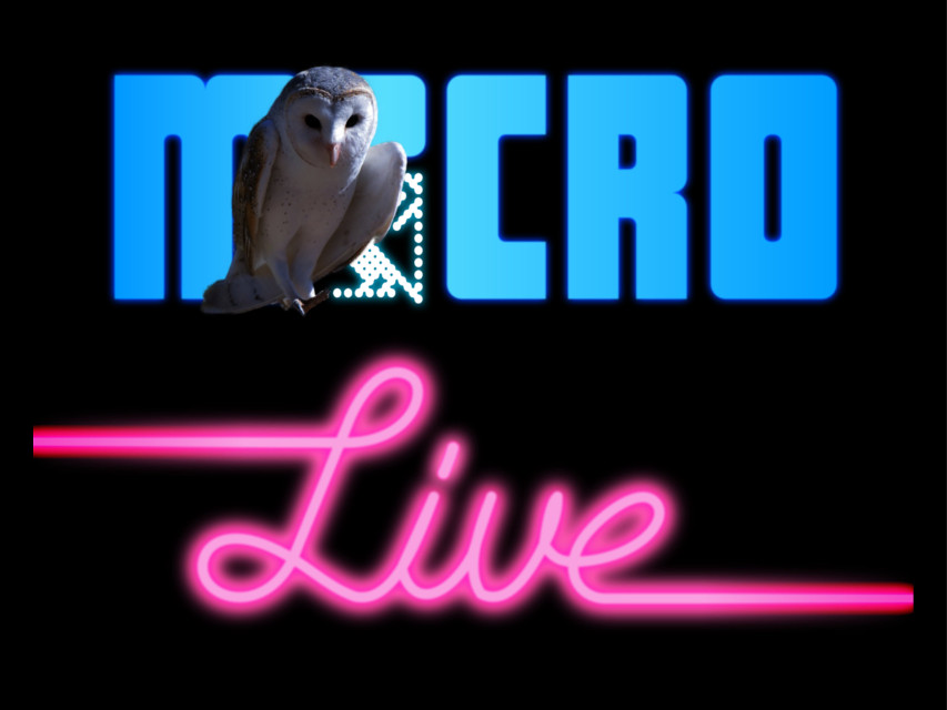
If you didn't live in the UK in the 80s and weren't a computer nerd then you probably won't have any idea what this is, sorry. It's a basic attempt at recreating a still from the title sequence of a TV show about computing that was called "Micro Live". It's not a perfect remake by any means but it might give some people a little hit of nostalgia. (I know the owl is wrong and badly lit considering the rest of the composition but I couldn't find a better picture.) I could faff around with it for ages but I think I'll leave it how it is. Comments are, as usual, welcome though. Remember: "Computers aren't just for silly things like games..."
-
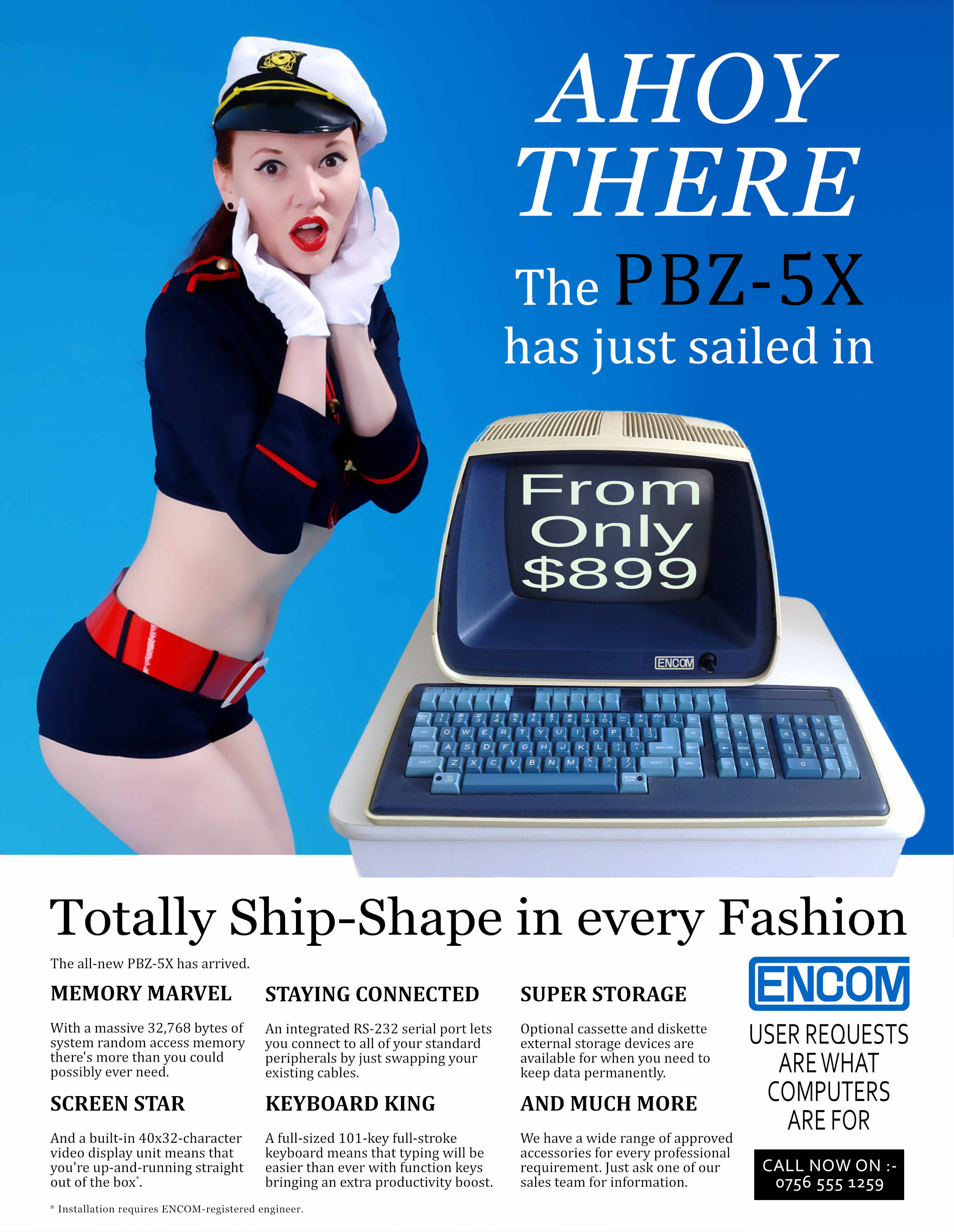
For no particular reason, other than to try something different, I thought I'd put together a 1980's-style computer magazine advert. The checklist of features that I wanted to include was: * Dodgy theme that doesn't really suit the product; * "Dolly-bird" dressed slightly inappropriately; * Incredibly dull picture of computer; * Strange choice of typefaces; * Loads of text that doesn't say much. It was just a silly experiment - and, if you hadn't guessed already, it's supposed to look naff - but if anyone has suggestions for improvements I might try another one at some point in the future. P.S. Fans of a certain 1980's sci-fi film might also get the extra bonus nerdy reference.
- 4 replies
-
- 4
-
-
- experiment
- 1980s
- (and 2 more)
-
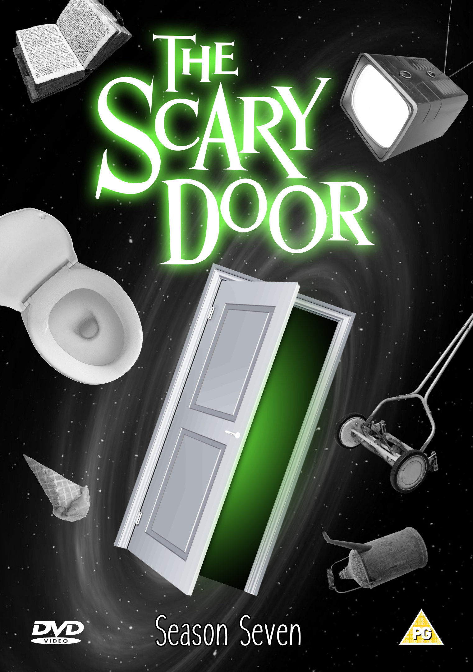
...The kind of place where there might be a monster, or some kind of weird mirror. These are just examples; it could also be something much better. Prepare to enter: The Scary Door. Just a silly DVD insert that I put together for a bit of fun. (Actually a re-hash of something I did ages ago with other software.) Nothing special but I thought it might bring a smile to some faces.
-
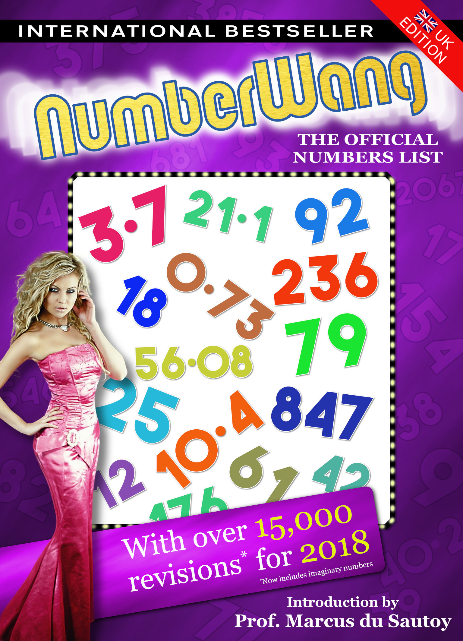
The latest official NumberWang annual is almost ready to ship. Packed with all of the numbers that really are NumberWang. You'll find some old favourites - 3, 4.2, 17, and who can forget 84? - and some surprises - 92 and 4008 anyone? Don't let your NumberWang parties get bogged down in arguments, get the official list and you'll know exactly what is NumberWang. P.S. If you're not a fan of "That Mitchell and Webb Look" then you probably won't have a clue what's going on here, so sorry for that. This is not for a real thing, it's just a bit of fun. P.P.S. I know I didn't get the logotype quite right. I couldn't be bothered to take the time to create it properly for a silly thing like this.
-
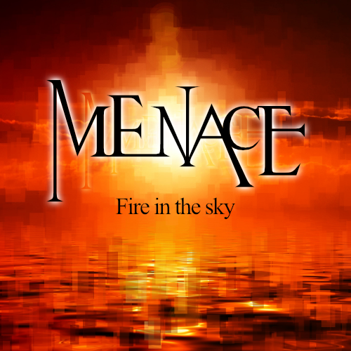
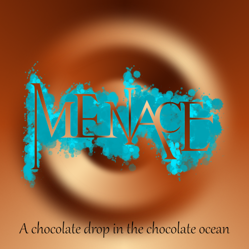
Here are some album covers that I worked on a while ago but never got round to properly finishing. One is for a sort of "hard rock" cover (a bit of GIMP work on the background) and the other is more "trance" (all AD) but using the same logotype. The logotype was originally Times New Roman - I'm fairly sure of that - but AD made the modifications pretty easy, for the most part anyway. Neither is particularly Earth-shattering or anything like that but I thought I'd post them in case they were interesting to anyone (and before I completely forgot about them). P.S. The band name is fictional and not related to any existing band with the same name (I just thought it made some nice shapes).
-
A bit of pointless nostalgia for the weekend. (I haven't quite nailed the "2" logo but it's okay for a bit of throwaway silliness.) For those who are too young to know what the heck this is, this is what you would see on your TV in the UK if the preceding programme ended earlier than expected. No trailers, just a static screen telling you what would be coming up next. It might be up there for five minutes or more!
-
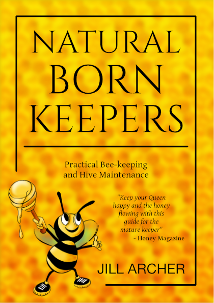
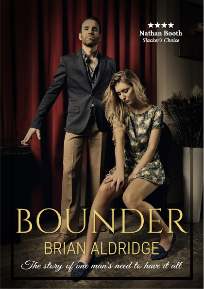
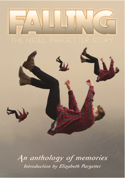
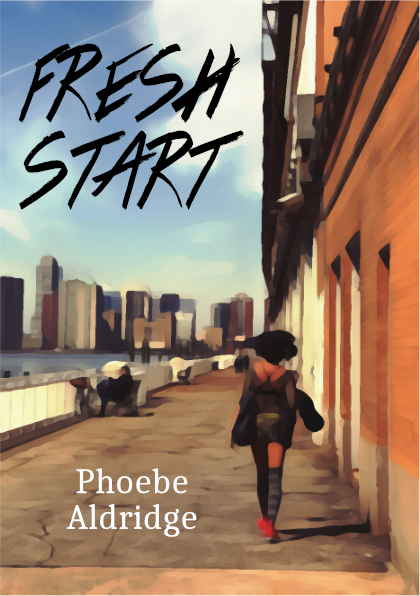
Here are some more book covers under the same theme as last time: https://forum.affinity.serif.com/index.php?/topic/43157-various-themed-book-covers/ The general idea of each books is: * Natural Born Keepers - A guide to bee-keeping for the mature person; * Bounder - Gritty tale of one man's obsessive control and extra-marital affairs; * Falling - A community's memories of a well-loved dead friend; * Fresh Start - A young woman finds a new life away from her dysfunctional family. The amount of work that was needed for each cover varied - a bit of basic compositing and some "artistic" messing around here and there - but there wasn't a massive amount done in total. Like the previous bunch, they're all experimental throw-away stuff, but if anyone has any suggestions for improvements I'd be happy to hear about them.