Search the Community
Showing results for tags 'drop caps'.
Found 11 results
-
 It seems like enabling Drop Caps breaks down ligatures, regardless of whether I set the drop caps to affect only the first character, the whole three involved in the ligature, or even in auto mode. Is this a bug or must I enable some option somewhere for them to work together? I'm using Affinity Publisher v2.0.4 for macOS 12.6.3. Thanks!
-
 Very new to APub. In defining a paragraph style for drop caps, I specify that two characters be dropped and indicate the character style for the drop caps. However, no matter what I do, APub only drops the initial character and applies the character style just to that first character. What am I doing wrong?
 -
 Hi there, i am facing a problem with the drop caps, don´t know if i just didn´t get how they work or there is a bug or so. I have a drop cap at the start of the text. But if i change the size of the textbox the drop cap changes in size. The only solution i found was to ignore the baseline grid. Which i am certainly not a big fan of. Am i missing something? 2020-10-25_14-05-31.mp4
 -
 I have a book interior that I created about a year ago. It has many drop caps. It is impossible to tweak their layout with the most recent version of Affinity Publisher. Note image A. On the left is the drop cap made with an earlier AP version. On the right is the drop cap from the same file using the current AP version. Previously, I could keep the first word together and still adjust the distance to the text independently. With the current version that is impossible. Image B shows this problem more clearly. Is there any way to regain control over drop cap placement?
-
 Can you create a paragraph style that specifies a drop cap in a different font from the main paragraph text? Right now, I have to manually change the font of the drop cap letter. And then it doesn't line up correctly. See below - in Microsoft Word, the drop cap looks nice and even, but in Publisher, not so much.
-
With thanks to everybody who helped on the forum with how to out dent Dropped Caps, here is my latest layout in Affinity Publisher. I used the Manual Optical Alignment facility to achieve the out-dent effect. On the downside this affects the ability of the alignment function to centre the text frame automatically so it has to be adjusted by eye only. I Am a Good Boy I Am.pdf
-
 I have been experimenting with drop caps in my poetry layouts and like the possibilities it offers. However, is it possible to have a Drop Cap out-dented from a paragraph or text body style so that it appears as though it is in a margin only?
-
 I found that Publisher has problem with certain swash fonts when Scale for descenders is enabled. APub 1.7.0.293 Steps to reproduce: Detach all styles (for keeping minimal number of styles; this step is not required) Create a new character style (let's call it Drop Cap Style): Font family: Gabriola (one of Windows fonts) Variants: Stylistic Set 06 set to 1 (other set to 0) Create a new paragraph style (let's call it Drop Cap): Drop Caps: Enabled Height in lines: 3 Scale for descenders: checked Style: Drop Cap Style Now type a few lines of text starting with lowercase g. Result: Only two lines of the text are indented due to drop cap, despite of setting height in lines to 3. The same issue can be observed in Yana regular font with Stylistic Set 03 enabled, when J is a drop cap letter.
-

Serious issue with drop caps
FlatCat posted a topic in Feedback for Affinity Publisher V1 on Desktop
If one cares about the end typographic level, there is a serious issue, as far as I can see, with the drop caps feature in Publisher. The top of a drop cap should align with the tops of capital letters on the first line next to it. I haven’t tested every single font of mine, but most come in on various distances lower than that. Other than your standard Arial, only two fonts, Caslon and Bodoni are acceptable. I would not use the drop cap function until fixed. There is also a possibility to align the drop cap to the left, which works fine on some fonts/letters, however not at all on others… Other design software offer a possibility to fix this manually by adding a word space before the drop cap, then giving it a minus distance (as first line indent). But Affinity only offers the possibility to make the indent wider. This is one of the professionals’ trade tricks, but we need them -
 Hi there I'm experimenting with Publisher to lay out my next indie novel. It would be handy to have a check-box function added to be able to apply drop-caps to the second character in a paragraph, rather than the first character - as the first paragraph in a fiction-based novel often starts with a speech mark, and in that instance, you want the drop cap applied to the actual character, not the speech mark. E.g., if a chapter started: "Don't you look at me like that!" snarled Bob. You'd want the 'D' to be the drop cap, not the initial speech-mark, " This feature already exists in Adobe In-Design, but not the open source package, Scribus. Congrats on your mind-blowing software, by the way. I just cancelled my subscription to the complete Adobe Suite (the price rises were too much for me as a non-design agency amateur, with no clients to bill to justify the cost), and have been casting around for pro-level replacements for Photoshop, Illustrator and InDesign on the PC, and came across the Affinity range by accident via a youtube video that mentioned them. Stephen >>>>>>>>>>>>>><<<<<<<<<<<< Stephen Hunt **************** International best-selling author of ... The Court of the Air (HarperCollins Voyager/Tor) The Kingdom Beyond the Waves (HarperCollins Voyager/Tor) The Rise of the Iron Moon (HarperCollins Voyager/Tor) Secrets of the Fire Sea (HarperCollins Voyager/Tor) Jack Cloudie (HarperCollins Voyager/Tor) From the Deep of the Dark (HarperCollins Voyager/Tor) In Dark Service (Gollancz/Hachette) Foul Tide's Turning (Gollancz/Hachette) The Stealers' War (Gollancz/Hachette) **************** Find all my latest fantasy and SF novels on my web sites at ... StephenHunt.net (my blog) SFcrowsnest.info (my magazine) >>>>>>>>>>>>>><<<<<<<<<<<< Get social with me at... facebook.com/steampunkish facebook.com/SciFi.Fantasy twitter.com/s_hunt_author >>>>>>>>>>>>>><<<<<<<<<<<<
 -
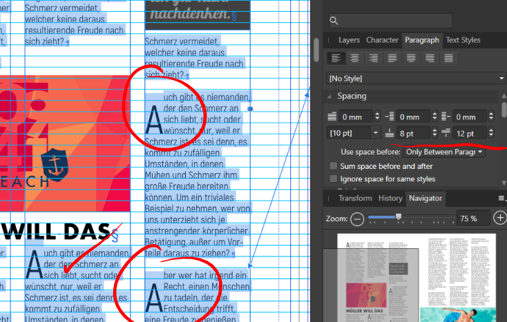
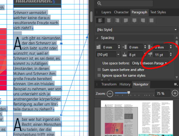
 When applying the general Baseline Grid for the whole document and have a bigger space defined in pt between paragraphs than the font size itself, depending on how big the space is, the drop caps are not aligned to the top but a line below. In some cases it's ok, in some not. Maybe it´s also a combination of space before and after a paragraph. Font: Akrobat (regular), Text height: 10pt, Paragraph leading (default 10pt), Space after paragraph 12pt. Se further screenshots which show different spaces between paragraphs. Further finding: Text Frame/Vertical Alignment/Baseline Grid overrides the general document Baseline Grid and seems to work fine according to drop cap aligning.


.png.e0b28c5404a26b6e873d9b15edb41818.png)
.png.61872762dd01da012b82863ab96d8d1a.png)
.png.c9472595c69581ce707211a43904a0d4.png)
.png.2b0d624b79f56be0ab87321c1464439f.png)