Search the Community
Showing results for tags 'dither'.
Found 9 results
-
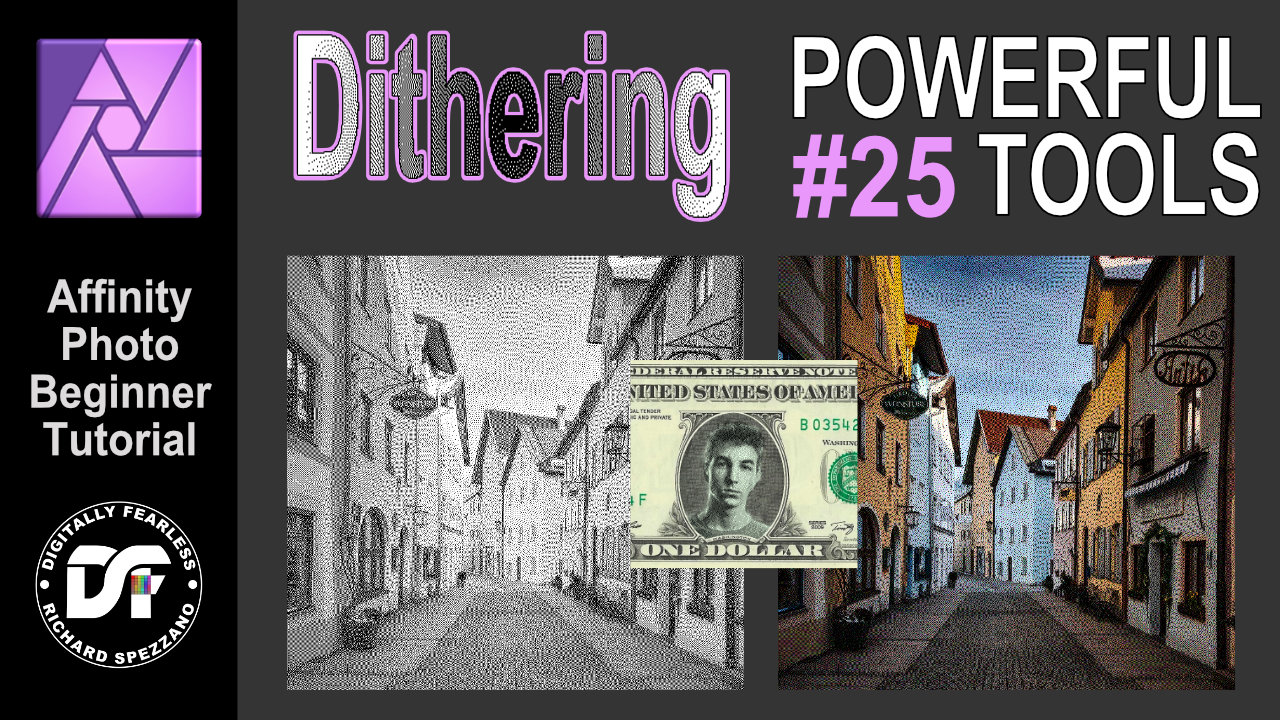
 Dithering filter. Affinity Photo beginner tutorial Power Tools #25 You can create some interesting effects by combining the Dithering filters and blend modes. This is an Affinity Photo beginner tutorial and number 25 of my Digitally Fearless Power tools of Affinity Photo playlist. https://youtu.be/x5aqafgKbyo
-
 Under Preferences -> Performance, there's an option to dither gradients, however I noticed that it only applies to gradients made with the gradient tool, and not with gradients you apply in Layer FX. Not sure if this is a bug or just something that has been overlooked.
 -
When exporting an image with a solid white background as a GIF, the resulting file does not have a pure white background (255,255,255) and is off-white (e.g. 253,253,253) and sometimes dithered as well. This even happens when pure white is the dominant colour in the image. As a web developer it causes huge problems because the image sticks out like a sore thumb against pure white elements adjacent to it on the page. It's supposed to blend in, but it looks horrid. It was reported 3 years ago by someone else and has not been fixed. Having used various software for exporting to GIF for the last 25 years, Photo does the worst job of managing the palette and dithering. It needs to realise what the dominant colours are and ensure they're prioritised and made into one of the indexed colours in the palette. I'm tired of having to export as a full colour PNG and then use a different program such as Photoshop 6 or Faststone Image Viewer to save it as a nicely processed GIF. For a one-off export it's okay but when you have dozens of GIFs to export it's a very painful joke. Photoshop has a feature to let you manually lock individual colours in the palette if it's automatic assignment of indexed colours wasn't to your liking. 8/10 times it does a good job by itself while Photo is more like 0/10 times. 😞 Photo also has a problem exporting GIFs with a transparent 1 bit background, but I don't want that to side track from the main reason why I'm reporting this as a bug here. Please show the export tool some ❤️ which hasn't really changed since Photo was launched. Apart from fixing the GIF issue, it would be nice to have a live preview like other programs have had for, oooh, 20 years. The example1 attachment is an exported GIF from Photo and example2 is a zoomed in screenshot to illustrate all that horrid and unnecessary dithering of the dominant background colour which effectively gives it an off-white colour. I've included the original afphoto file too. Thank you. original.afphoto
-
 Is it possible to truly disable dithering for gradients? I only found the option in the performance settings, which is however limited to the preview rather than the final result. Meaning as soon as the gradient/s in question are rasterised the dithering is back on, which leads to undesirable results. (Preview) (Rasterized/Exported)
-
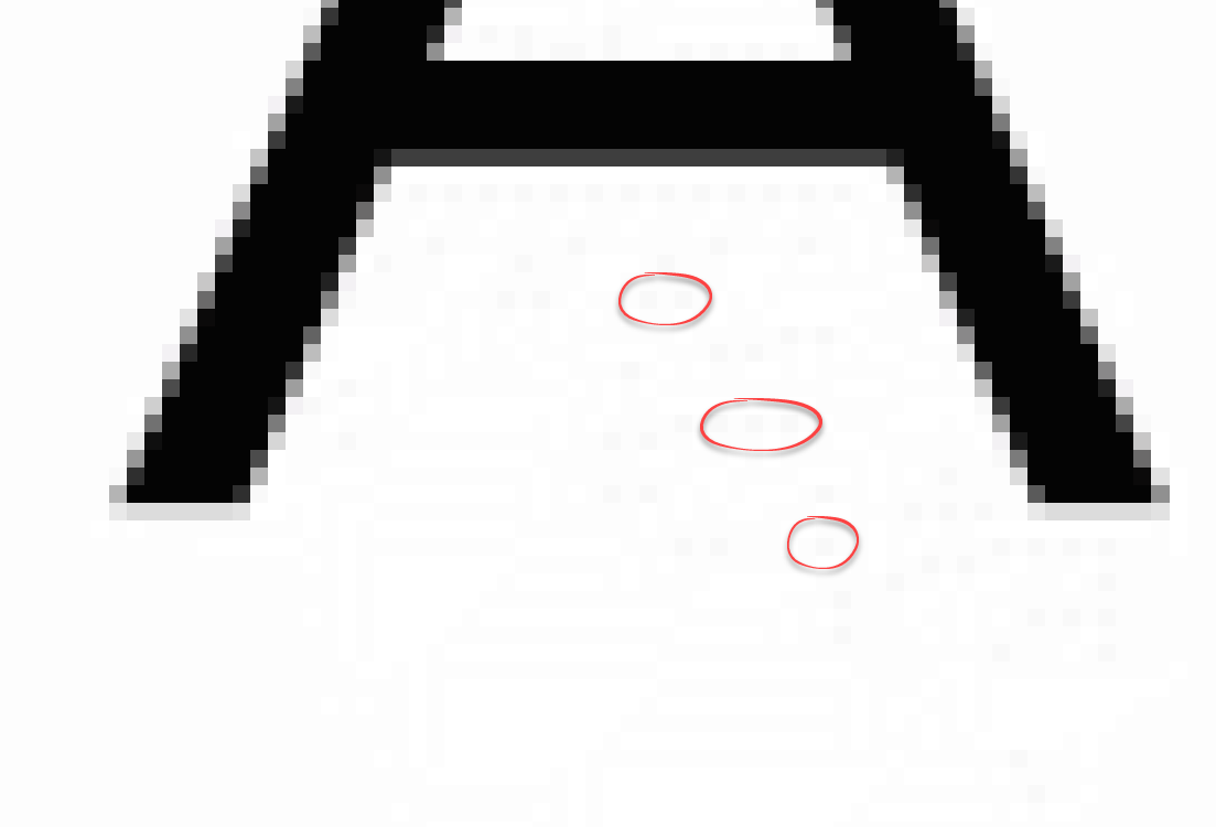
Hi Guys, I have been trying to export png's of icons for a website. These are pretty small but there's a lot of them as they are used in CSS sprites. Normally I would export these as a gif or png8, but your settings only allow export to be dithered and that gives me some real quality issues. I'd love it if we could have an option not to dither the png8 and gif exports. I've attached the following files so you can see the problem: - site-product-icons11-OLD - The original png8 file out of Photoshop, undithered - I have just added 1 icon to the bottom of this file site-product-icons11a128 - 128 export (dithered) out of Affinity Photo - you can see the problem in spots of colour on say the LR logo 900px down and the steel logo at 450px down site-product-icons11a256 - as above but more colours to see if that was the issue site-product-icons11 - png24 export not showing these issues (no surprise really), but is almost 3x the file size. Thanks
-
 I am on Page 258 of the Affinity Photo Workbook and Paragraph 1 states Quote "Above the Background Dither Layer, create a new HSL adjustment by going to the Layer Menu and etc., etc. I do not see a 'Dither Layer' on the layers on this particular exercise and I do not know what Dither Layer is anyway. Can you help explain this Please. Thanks
 -
Please add a choice of dither types when exporting GIF and PNG 8-bit images. As most web designers know, to get the best out of limited palettes you need to use the most appropriate dithering algorithm. Photo doesn't provide any choice, but it would be extremely useful to web designers who care about optimising their images for both file size and quality. If it can be implemented at the same time as a LIVE PREVIEW of the export settings then that would be mega cool. Thanks.
-
Hi, I need a precise gradient in 32-bit mode, to go from left to right. (I use it as a texture in a game - the values control some math functions over time.) The "Noise" value is set to 0 (or so I guess, because there is no numerical input). Yet still there is a visible dither. I use version 1.5.0.35. Win 7 64-bit, NVidia GTX 760, newest drivers. Oskar gradient.afphoto
-
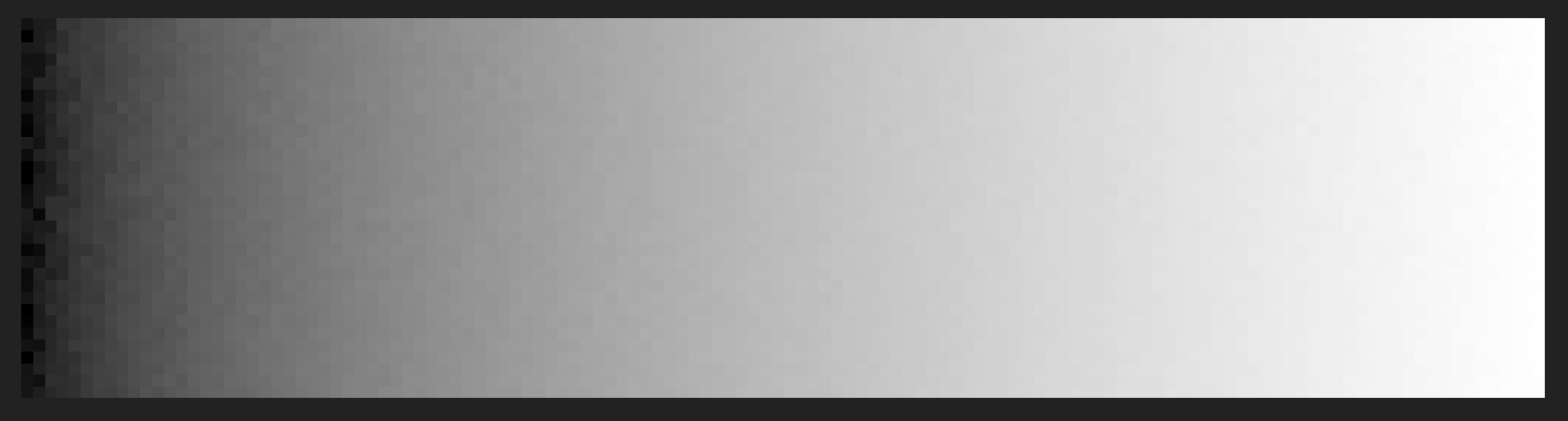
 FYI, this question has to do with AP: Looking at a recent image, I noticed some faint banding that was visible when I applied a color gradient (maybe it was there in the B&W version, but I couldn't see it). See the darker of these two images: https://forum.affinity.serif.com/index.php?/topic/20687-photos-from-a-mountaintop/(FWIW, I see the banding on my non-retina, late 2013 iMac; I haven't checked on other machines). Searching the forums I came across a comment about the "Dither Gradients" preference and the different effects if you are working in 8-bit or 16-bit (see MEB's comments in this thread: https://forum.affinity.serif.com/index.php?/topic/13742-unwanted-noise-in-gradients). So, my question: If I'm working in 16-bit, is it better to leave "Dither Gradients" preference checked? Or unchecked? Thanks, Darin