Search the Community
Showing results for tags 'critique'.
Found 3 results
-
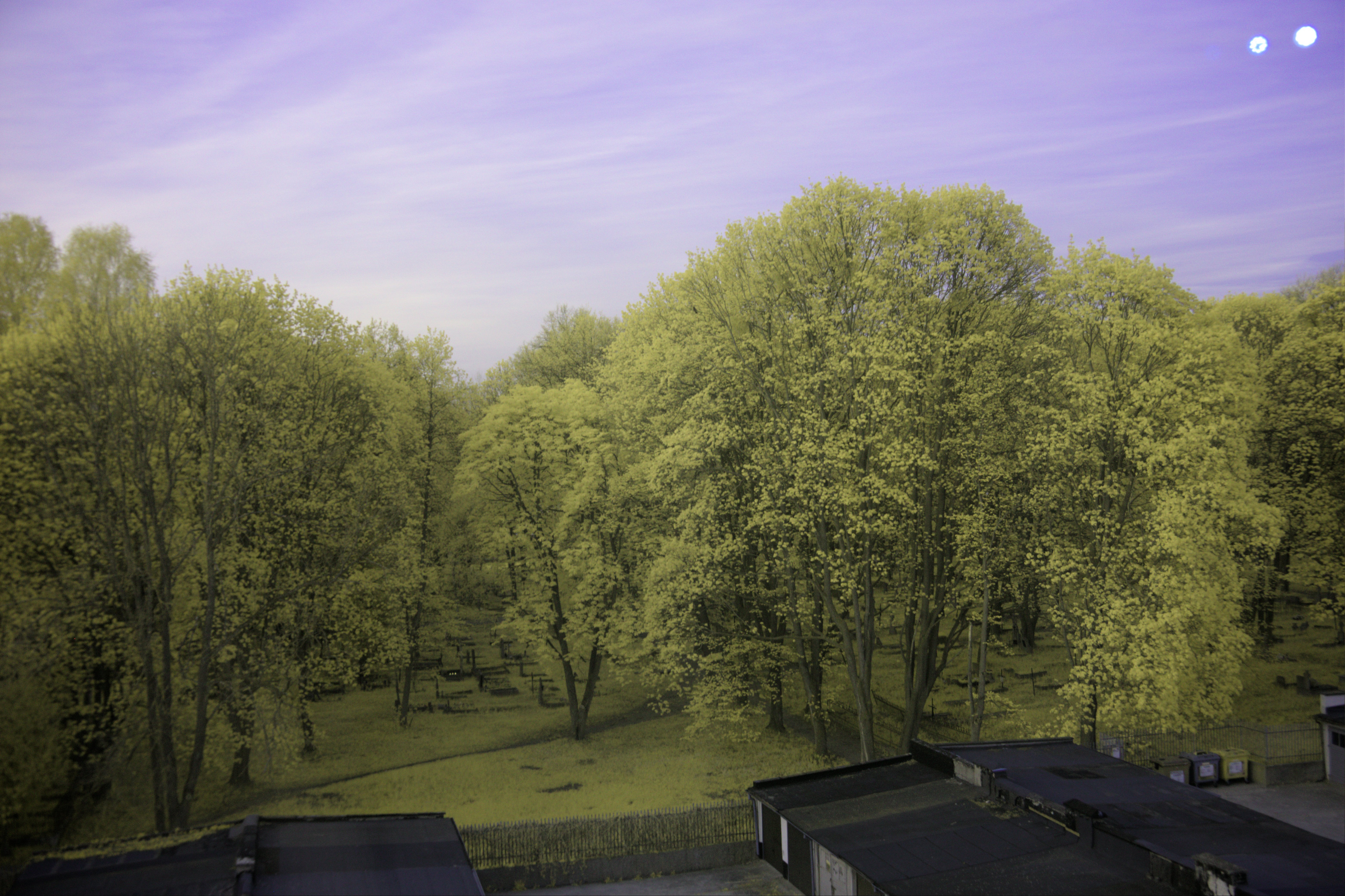
 When taking pictures in IR, if the photographer doesn't set the white balance in camera and intends to change it via Affinity Photo 2, they come across the issue where the white balance tool in the Develop Persona of Affinity Photo 2 does not have enough range to correct colour casts on the whites in an image. (even when using the picker tool, which extends it slightly) I've attached an example shot I took with an 'ultrablue' filter, the second image corrected using another software, and the first using Affinity Photo 2. There is also the original .RAF raw. The 'correct' white balance that I'm looking for is one where the white of the walls on the parking lot buildings (and the stickers on the recycling containers on the bottom right) is as close as it can be to neutral (no tint). Using the picker tool on the white part of the wall, the tint gets pegged at 100%, meaning it does not have enough range to fully remove the colour cast. This is a huge issue, as the user cannot properly set the white balance in a lot of pictures. Moreover, even if the user does set the white balance in camera, and it is closer to the intended one but still needs adjustments, when enabling the white balance adjustment in the Develop Persona, it oftentimes gets worse due to the range being less than that of the camera's. My suggestion to this issue is: add a checkbox that would enable an extended range of values to be edited. (This would also help people who white balance old negatives.) DSCF6517.RAF
-
- 1
-

-
- affinity photo
- white balance
- (and 4 more)
-
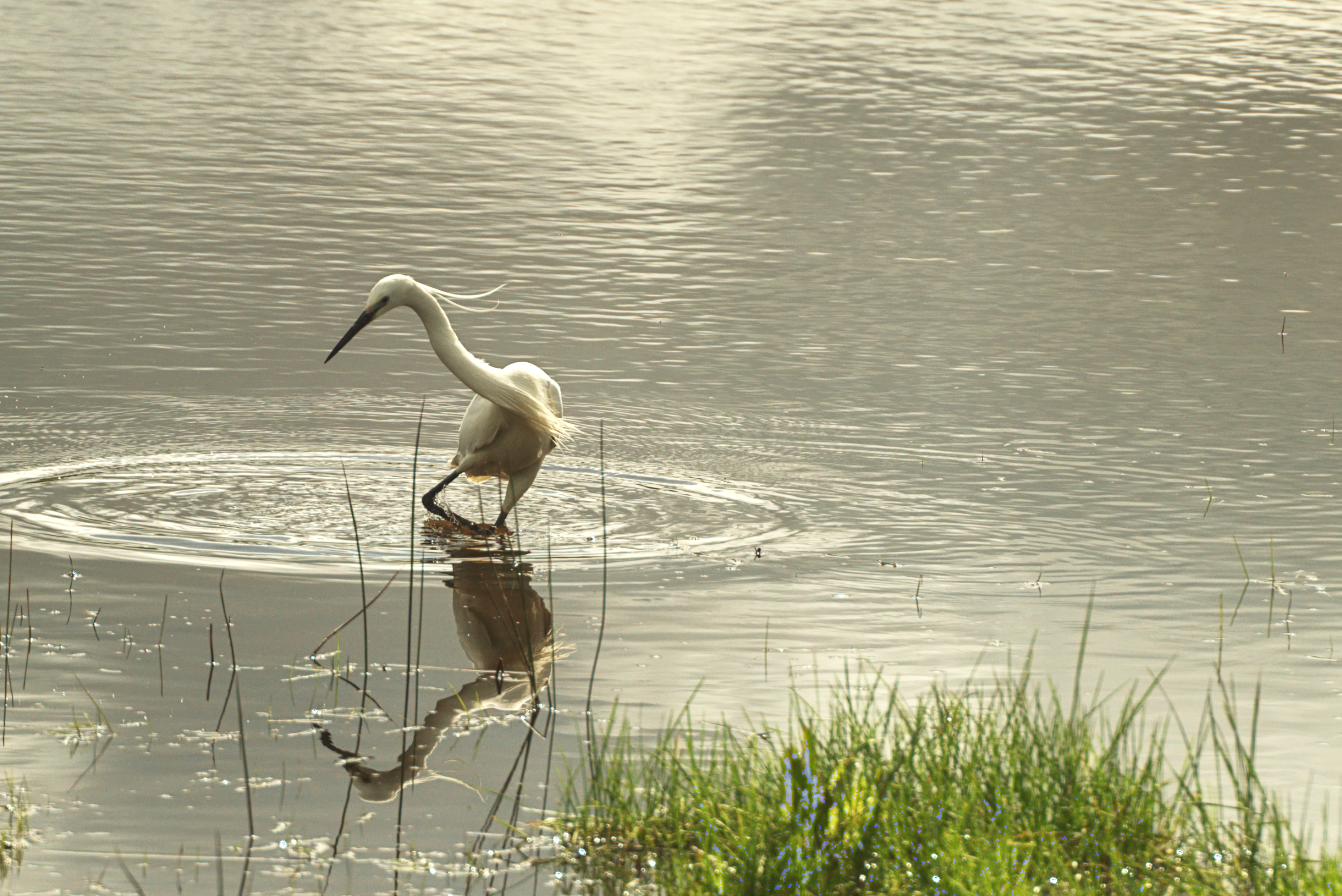
I often take some nice wildlife shots and am looking for advice on how I might improve them. This is one of an Egret and whilst I like the subject I am not sure about the water definition. And yes - I have just noticed the blue in the reed beds Any advice would be much appreciated. This is also a crop from a larger image so I do have more of the ripples
-
Howdy all! Getting geared up for a series that is my "homage" to the great cosmic epics by Kirby and Starlin. Here's my logo design for the series. I need so input from you good peeps here. I have design A and design B and don't know which one to use. In the upper right is a infinity symbol with arrows, that's what I need help with. I like that icon-logo a lot, as it sums up the gist of the story (infinite rebirths of reality, each reality has infinite universes within). I kinda like the 3D effect on A, but the simplicity of B matches the rest of the design well and uses the only color to pop. So if you'd be so kind as to indicate a choice, I'd be ever so thankful. And everyone who participates in this here poll and topic will get a mention in the print edition of this series. Any critiques are welcome, too, btw. Some background, This will be a prelude to the main series "Cape and Cowl Opera." I wanted to make this series, "A Prior Reality" different from the main series. So I thought that since comics (as we know 'em today) began life as compilations of the comic strips of the '30s and '40s and began to have new non-reprint stuff when newspaper comic strips ran out of new material. So this series will have 6 "daily" comics and 1 "sunday" comics each week. It'll be released on the web as such. It's early on, I won't start putting it on the web until I have at least ⅓ or ½ of the darn thing done. I'm jazzed about this, as the comic will be drawn, lettered and colored entirely by hand on paper. Except for the Title page and chapter headings. I couldn't have done that icon-logo without the Doughnut property! mmmm doughnuts.... It allowed me to eyeball the width of the circular shapes to match up the 4 objects and the Pie property (why am I getting hungry?) made it oh-so-simple to get the part of the outer circle just the way I want it. And topped it off with a cherry... no I mean triangle. The black background used the rounded rectangle and some hand editing to get the curves and sharp angles the way I wanted them. And thanks for any votes and comments!