Search the Community
Showing results for tags 'cover'.
Found 22 results
-
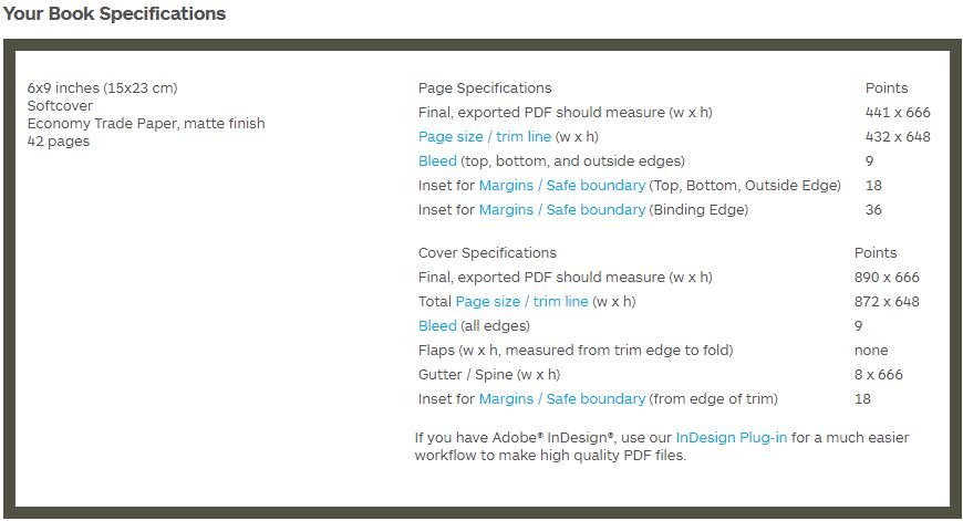
 I'm using Affinity Publisher to print a Blurb tradebook (6x9), and I'm having issues creating a cover for the book. When I put in the cover specifications (See attached image) when creating a new document, I don't have a place to input the Gutter/Spine measurements. This means when I hit "OK", the document looks like a wide rectangle with no spine in the middle, making it difficult to see if the title will be off-center. There don't seem to be any good tutorials for creating a Blurb book (or any book from start to finish) with Affinity, but if there is one, I'd love a link. Thank you!
-
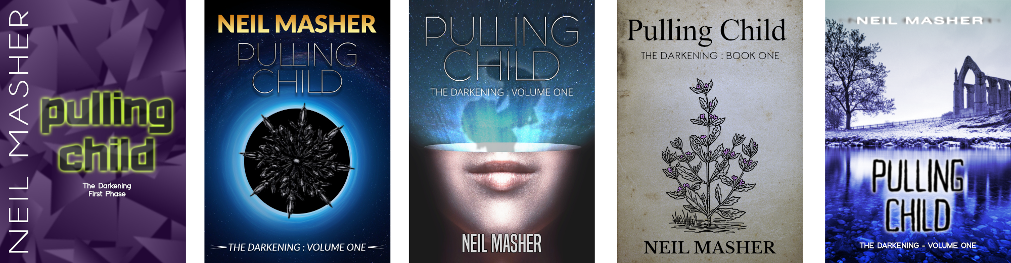
Here are some experimental book covers which I made a while back – after reading the last book in Neal Asher’s very good “Transformation” series – and rediscovered in a recent housekeeping exercise. They’re all basic – just me playing around with ideas – but I thought I’d share them as I haven’t shared any new stuff for a while. All are variations on the same book title in different genres: “Acid Punk”; 2 x “Basic Sci-Fi”; “Olde Worlde”; and “Standard Thriller”. (Reader’s of Neal’s books may get where the title and some of the imagery of my covers come from.)
-
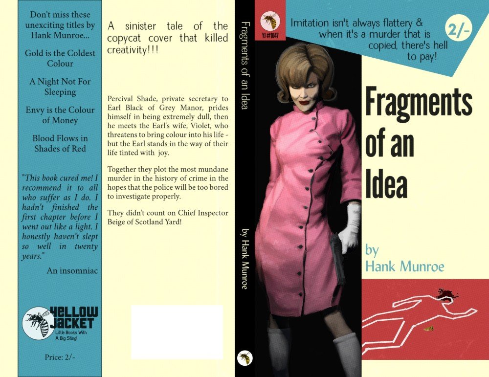
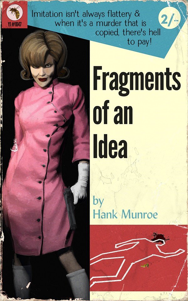
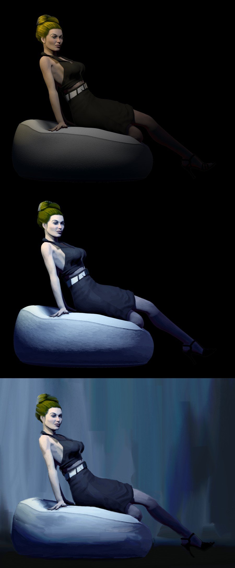
I've been working on how to create book covers that imitate those of the pulpy paperbacks of years past. The idea was to work on a method that others could use as a viable - and so necessarily cheap - option for the self and Indie publishing market. I had been making do with an old version of Photoshop Elements that came with my Bamboo Fun & Touch tablet but decided to take the plunge and try Affinity Photo when I got a new computer, and that turned out to be a very good decision. So... I start off in a program nobody likes to mention - Poser. I'm not too fussy about render settings as so much is changed in post, what matters is the figure, the posing, and the lighting. The result is then opened in Affinity Photo, where I start with some adjustment layers (highlights/shadows, brightness/contrast, colour balance), along with a plug-in from Topaz called Simplicity. This result is then saved out and opened up in a paint program called Art Rage and then attacked with an oil brush and knife to leave me with a faux painting. In Affinity Photo, I've been building some book cover templates and the faux painting is introduced there, with some wear and tear added for a display version. The two designs I've posted here were both based on Mike Shayne covers (the first is one I've seen copied by other publishers, the second is a bit of a classic - enough for someone to have created a font based on it). For very simple designs like this - ie a single figure with one or two props, and also assuming a cover design template is used, then the production time can be between 2-3hrs. I believe that someone more skilled than myself can probably do both a better job of it and at a faster time but even at my speed, I think this could mean a low enough cost for the target market. I don't think I'm ever going to be sufficiently happy with my own efforts to enter that market myself (or, to be honest, with enough free time), so I would like to encourage others to have a go themselves.
- 15 replies
-
- 18
-

-
I've been playing around with a different style of book cover today and came up with the two attached covers. It's the same sort of style on each cover but they are for very different genres. (Both the books and their authors are completely fictional.) Does anyone have any constructive comments, suggestions or criticisms? Too much or too little grit? Do the typefaces work? Are the colours okay? Too much or too little going on? What would you have done differently? I'm not sure if I'll be taking these any further but it would be nice to hear good feedback.
-
New book cover design for the story/novella "Das kleine Stück Himmel" (Little Piece Of Heaven) by Alex Beltheim. Created with Affinity Photo, using various layer effects and the artistic text tool. Snow and blood are made with different spray paint brushes. http://b-bertuleit.de/buchcover-design-das-kleine-stueck-himmel/
- 2 replies
-
- 1
-
-
- book cover design
- book
- (and 1 more)
-
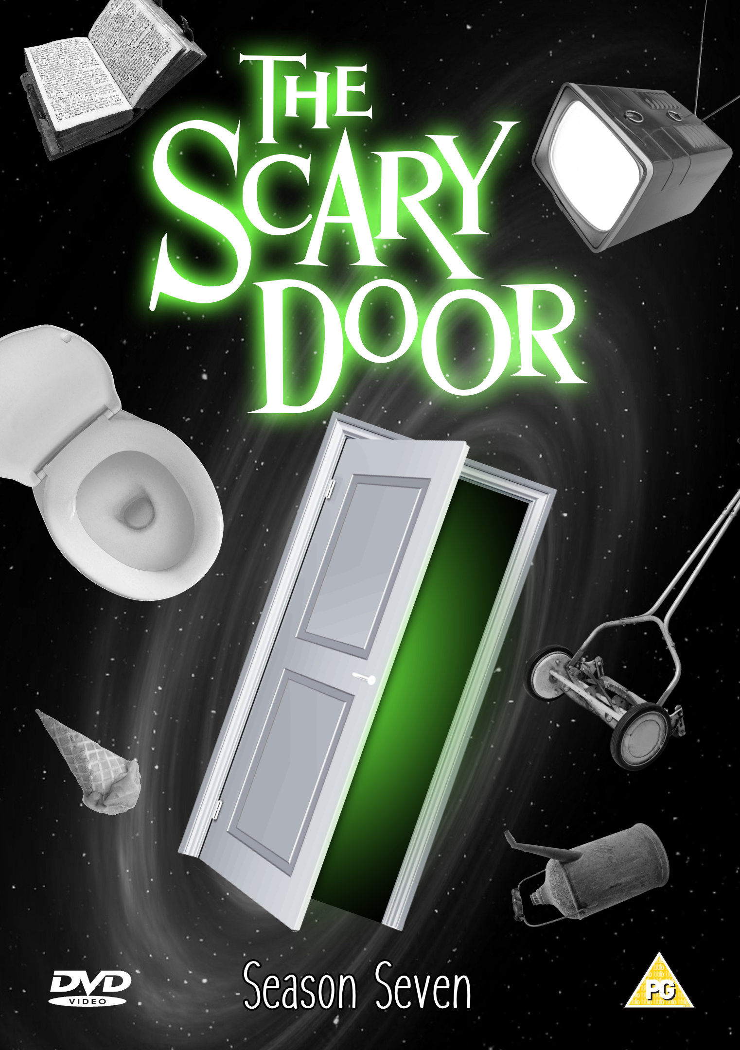
 ...The kind of place where there might be a monster, or some kind of weird mirror. These are just examples; it could also be something much better. Prepare to enter: The Scary Door. Just a silly DVD insert that I put together for a bit of fun. (Actually a re-hash of something I did ages ago with other software.) Nothing special but I thought it might bring a smile to some faces.
-
The latest official NumberWang annual is almost ready to ship. Packed with all of the numbers that really are NumberWang. You'll find some old favourites - 3, 4.2, 17, and who can forget 84? - and some surprises - 92 and 4008 anyone? Don't let your NumberWang parties get bogged down in arguments, get the official list and you'll know exactly what is NumberWang. P.S. If you're not a fan of "That Mitchell and Webb Look" then you probably won't have a clue what's going on here, so sorry for that. This is not for a real thing, it's just a bit of fun. P.P.S. I know I didn't get the logotype quite right. I couldn't be bothered to take the time to create it properly for a silly thing like this.
-
Here are some album covers that I worked on a while ago but never got round to properly finishing. One is for a sort of "hard rock" cover (a bit of GIMP work on the background) and the other is more "trance" (all AD) but using the same logotype. The logotype was originally Times New Roman - I'm fairly sure of that - but AD made the modifications pretty easy, for the most part anyway. Neither is particularly Earth-shattering or anything like that but I thought I'd post them in case they were interesting to anyone (and before I completely forgot about them). P.S. The band name is fictional and not related to any existing band with the same name (I just thought it made some nice shapes).
-
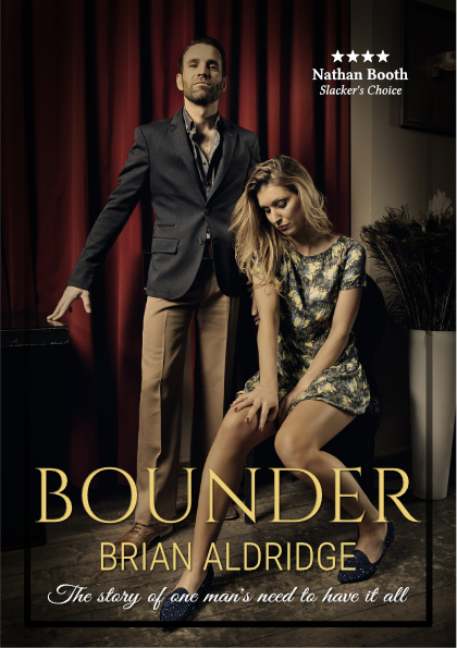
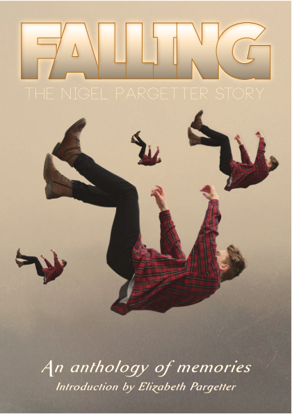
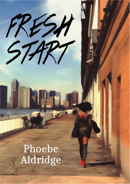
Here are some more book covers under the same theme as last time: https://forum.affinity.serif.com/index.php?/topic/43157-various-themed-book-covers/ The general idea of each books is: * Natural Born Keepers - A guide to bee-keeping for the mature person; * Bounder - Gritty tale of one man's obsessive control and extra-marital affairs; * Falling - A community's memories of a well-loved dead friend; * Fresh Start - A young woman finds a new life away from her dysfunctional family. The amount of work that was needed for each cover varied - a bit of basic compositing and some "artistic" messing around here and there - but there wasn't a massive amount done in total. Like the previous bunch, they're all experimental throw-away stuff, but if anyone has any suggestions for improvements I'd be happy to hear about them.
-
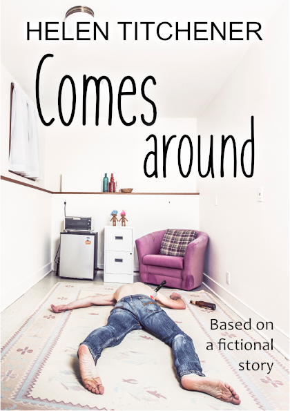
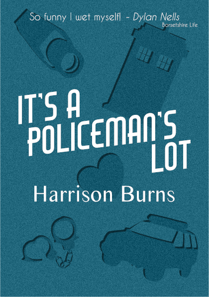
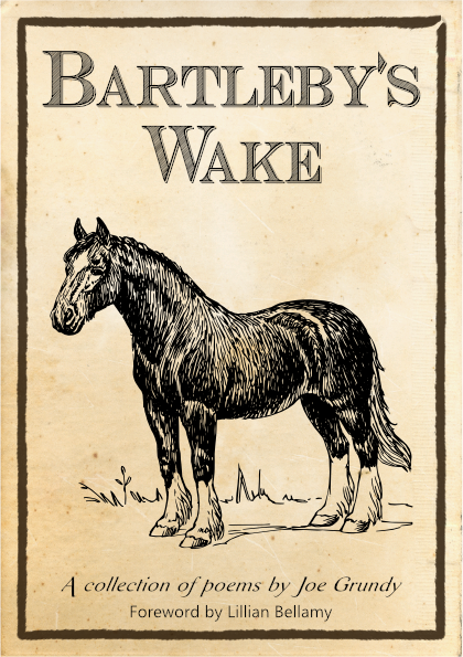
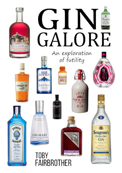
For a bit of fun at the weekend I thought I'd make some basic book covers, all set within an overall main theme but with each as its own story and genre. I've tried to match each cover with that which can be seen on existing books with the same sort of story/genre. The stories are (vaguely), in no particular order: * Animal Farm 2 - Intrigue and revenge behind the pig arks; * Comes Around - A gritty tale of abuse, betrayal and consequences; * It's a Policeman's Lot - A whimsical story of a "Bobby on the Beat"; * Stealing Henry - A thriller where a cruel father tries to kidnap his son; * Bartleby's Wake - A collection of awful poems by a grizzled old farmer; * Gin Galore - A hapless dreamer tries his hand at being an artisan distiller. Listeners of a certain long-running UK radio drama might be able to guess the overall theme (particularly from the authors' names). They're all silly throw-away experiments - just a few hours of messing around so there are probably lots of problems with each - but if anyone has any suggestions or comments I'd be happy to hear them.
-
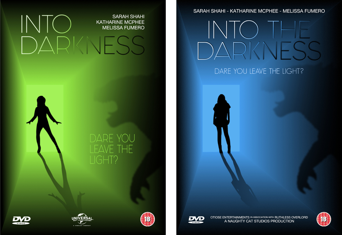
Here's another DVD cover experiment that I've been playing around with today (it's not for anything real, it's just for fun). First version is on the left, second version is on the right. Some notes on the changes for the second version: * some text has been added/removed/moved around; * the colour has been changed to something I thought was more "ephemeral"; * the effects on the logotype have been altered; * the monster is a bit nearer to the girl; * the girl has been changed to a figure that looks more "wary"; * some noise has been added to the darkness. What does anyone think? (I keep thinking it's missing something but every time I add something - another monster, some grasping hands, etc. - it looks worse.) Is there anything you would change? Are my font choices okay? Could the layout be better? What do you think of the colour choices? Is there anything you really hate? Is the anything you really like? Have I made any glaring mistakes? As usual, all constructive comments/suggestions/criticisms are welcome.
-
Hello everyone. This is my first post on the forum so I thought I'd introduce myself by way of attaching a simple book cover that I've been experimenting with. I know it's pretty basic stuff but I'm still finding my way around. No external images were used, everything was drawn in Affinity Designer. (My inspiration came from: https://raru.co.za/books/4126333-poseidons-wake-alastair-reynolds-paperback ) I've only been using AD for a week or so - mostly just a few hours here and there when I get the time - but I'm very impressed with the features and usability so far. I made the cover as a throwaway experiment but if anyone has any suggestions about improvements - fonts, colours, lighting, whatever - then I'd be happy to learn. I know the "alastair reynolds" font isn't right but I can't find the correct font - I think it's supposed to be Helvetica Light - for free. Can anyone give me a link to a better free font? I'm not entirely happy with the background. If anyone can point me in the direction of a good tutorial for this kind of thing - merged gradients and lighting - that would be great. If I get some good suggestions then I might do an updated version and post it here. Edit: I've attached a smaller image so it can be seen more easily.
-
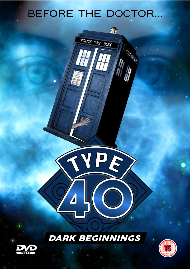
Here's a version of a DVD insert experiment which I originally created with some other software a while ago. It's not perfect by any means - a lot of work would still need to be done if it wasn't just for fun - but it was easy to do with AD and gave me a chance to try various features. (It was a lot easier to put this together with AD than it was with the other software.) Comments, criticisms, tips and advice are all welcome.
-
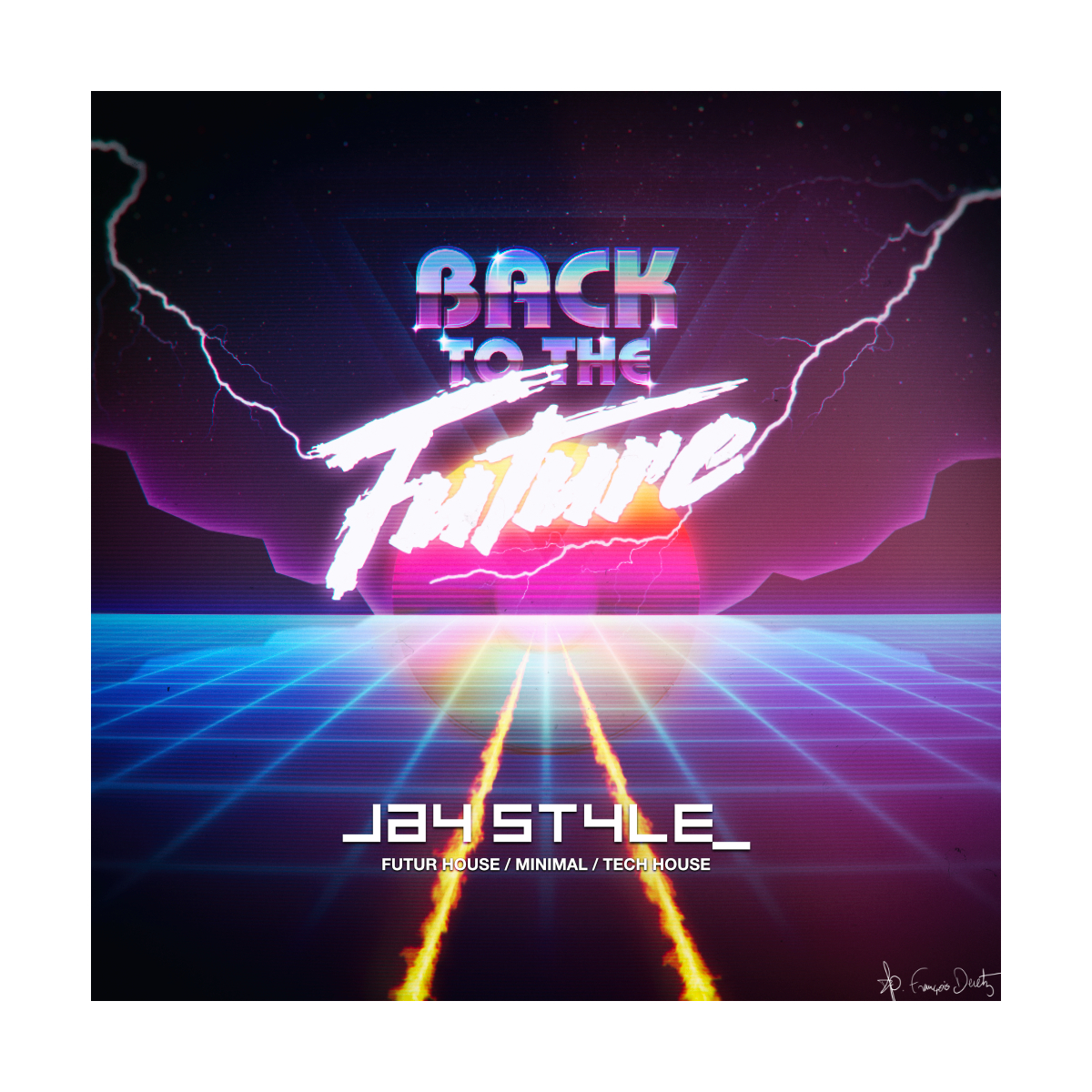
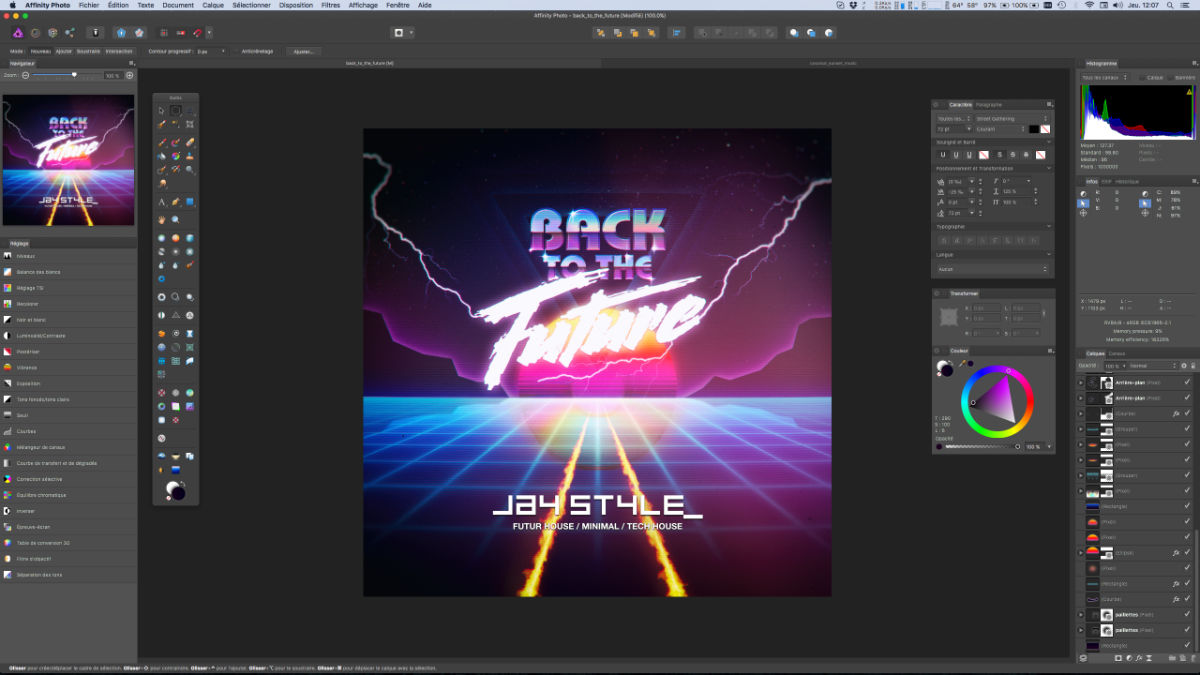
Hi everybody, 80s retro graphic design for a famous french DJ (and a friend). He asked me to illustrate his podcast channels. We have validated together a retro 80s design style with all the codes of this period. Here are the first two design of this project ... Fully made with Affinity Photo. Enjoy it :-) Note : I hope the 1.5 version will solves the issues I met during the process.
-
 I have been working on a cover design in Affinity Designer and I was curious as to how publishers like to receive files. Do I send the native Affinity file or a PDF or something else? I ask because the set up is different then it has been in the past. The people writing the book are doing the work in Word instead of a layout program for an example. I would love to know what experiences others have had in this area. When I self published by first book with InDesign (just using a basic laser printer) I would export the interior as a PDF and then print the cover straight out of InDesign. Since the cover is just one page (of course) I figured Affinity could handle that job.
 -
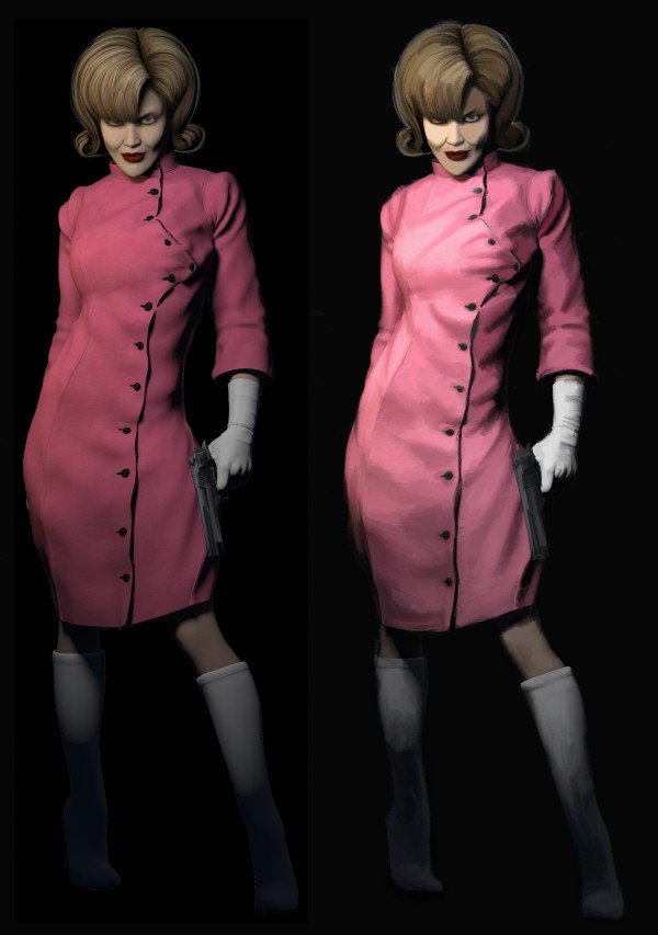
Need your help;-) which version is more sinister, more scary? It should be a book cover (Thriller). Thank you for your opinions, comments … :ph34r: (the subtle differences can be found in the face)
-
http://b-bertuleit.de/buchcover-4/ An award winning book cover, made with AP - thank you, serif ;)
-
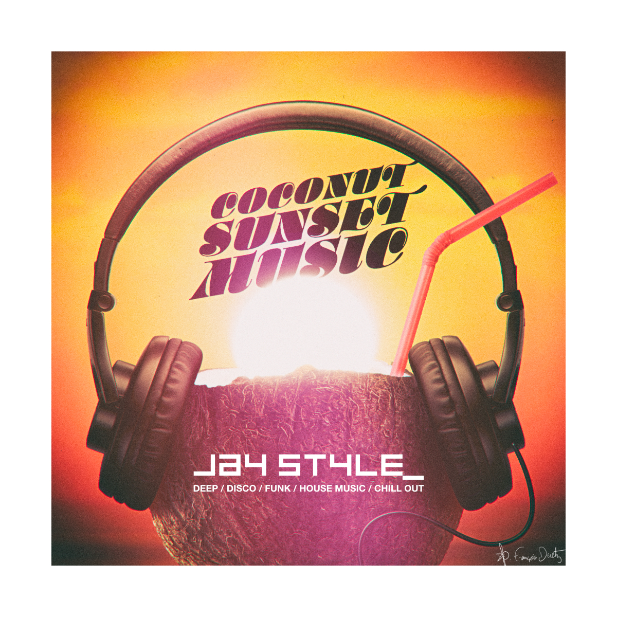
This is the cover of a sample pack and my FB banner (2nd and 3rd image). The cover was made on the pixel persona of AD with a light retouch on AP. And the banner was recently made on AP since I've just acquired the app. How it looks on FB. https://www.facebook.com/aurantiummusic/ Really love to make textures on AD and AP.
-
 I want to use Affinity Photo to design paperback book covers. Because many elements of my book covers use standard fonts and positioning. The standard elements are simple text and boxes (author name, publisher and price info, box for back cover text, white box for bar code) and some guides for spine, margins, and bleed. I would like to create a template with these standard elements. The challenge is that the page count differs for each book. The page count affects the spine width, which in turn affects the x positions of the front cover elements. I could move the text and guides manually, but anything I do manually is a nuisance and prone to error. Until now I have used InDesign for book covers. My InDesign book cover template uses a spread with three pages: back, spine, and front. The front cover page is positioned relative to the spine’s right edge. The front cover elements are positioned relative to the front cover page. So if I adjust the spine width, the front cover moves over to make room, and all of the front cover elements and guides move with the page. Is there a way to do something similar in Affinity Photo? Or is Affinity Designer a better choice? Or a combination?
 -
My latest project with AP, the book cover for the thriller (novel) „Die Heilanstalt“ by the german author Simon Geraedts. The cover will be featured in the new edition. It's just great to create book covers with AP :) Thanks to the developers ... :rolleyes: http://b-bertuleit.de/die-heilanstalt/
-
Hi everyone, Cover for Summer School Show. Hand drawn basic outline then scanned and bought into Affinity Design to Trace. This is the first actual project I've done in AD and really like the workflow (once I got used to certain ways of working). Looking forward to playing around a bit now this done.
- 8 replies
-
- 3
-
-
- cover
- illustration
- (and 2 more)
-
 Hey everyone. I've tried to create a Magazine cover with some of Designer's features to see how they stack up with what I'm used to. I've tried a variety of elements to see what can be done. Hope this could help someone. Various Text Type/Character kerning/Paragraph stuff Gradient Strokes, Fills FX: Glow, Shadow, 3D Pen: Custom Brush style with Pressure profile. Curves: Shape Geometry Add/Fill Download the Affinity Designer File (21 MB).