Search the Community
Showing results for tags 'correction'.
Found 12 results
-
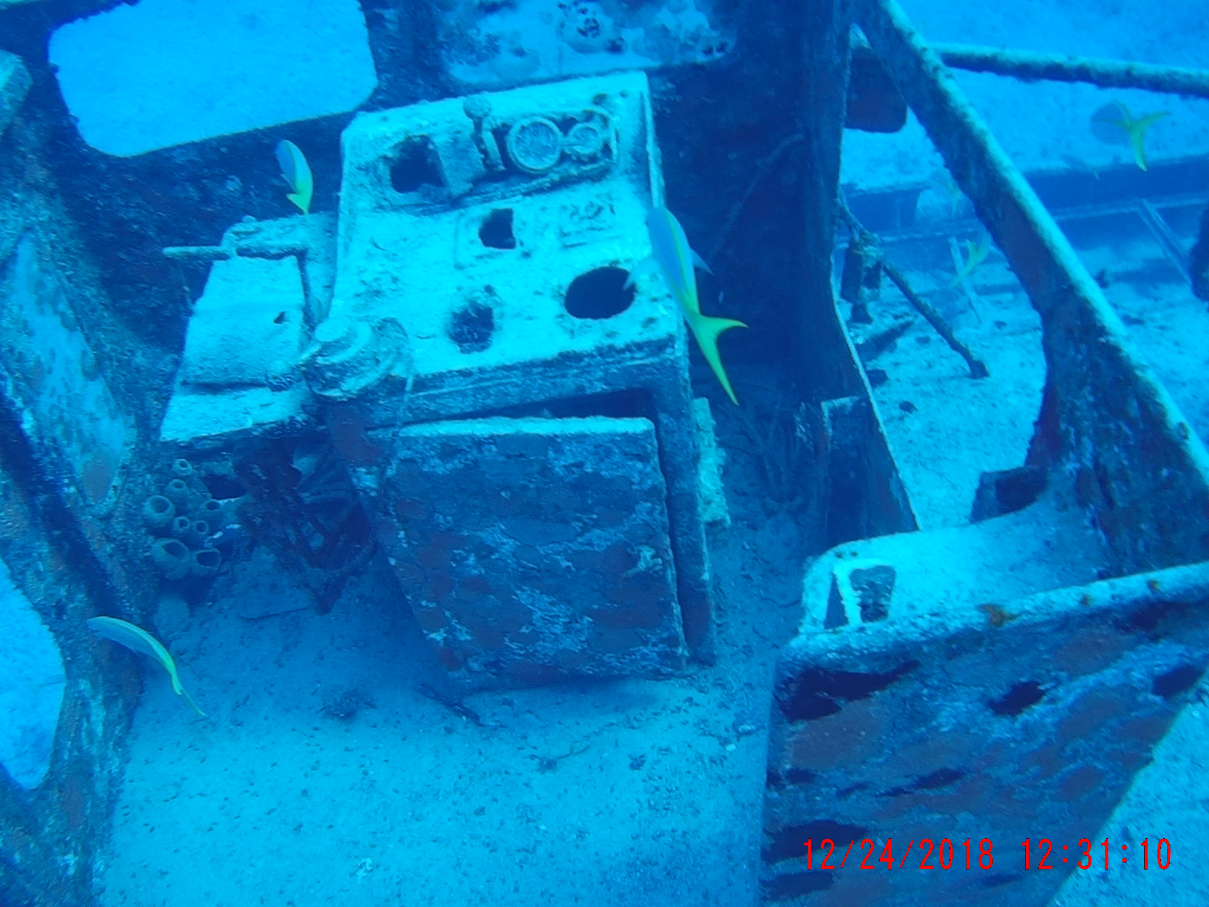
 Greetings, I know what you're thinking - "this guy didn't search the forums before posting"…. I actually have been researching extensively for several weeks now, including several similar posts in this forum, and I've concluded that either my situation is unique or I'm just more dense than your average user (these may not be mutually exclusive lol). So, as the title suggests, I am searching for guidance on color correction on underwater photos. I'll preface by stating I am NOT a photographer, so my knowledge of post-processing technique is frustratingly minimal. It is for that reason that I had previously just written off my failures, just accepting really dismal diving photos. That changed when I was recently introduced to an iOS app called "Dive+". On a whim, I decided to run its color correction function on several shots I had on my phone, and I was blown away by the results! In more than one case, I actually "discovered" fish and corals in my photos that were previously invisible! The ease with which the shots were transformed has inspired me to re-visit touching up many of my underwater shots, but as you can imagine - iOS is certainly not the best or most efficient environment to do it. Re-visiting all the tutorials and articles on the topic, however, has brought me right back to where I began - slightly less crappy photos and a lot of swearing. It seems the majority of the methods described in tutorials (even those for photoshop or other editors) just don't produce similar results for me as they do in the examples shown. For instance, the vast majority of underwater correction guides suggest beginning at adjusting white balance. In the examples, adjustments produce immediate color and contrast improvements, while my photos simply turn from "all blue" to "all green". Additionally, suggested techniques using levels invariably begin with minimizing black levels and maximizing white…. In all my photos, these positions are already selected (and moving them in opposite directions only worsens the output). While I'm certainly willing to tackle a mild-to-moderate learning curve, I have no aspirations of professional photography. What's nagging me is the ease with which this free phone app is able to drastically improve my photos, as well as my inability to determine exactly HOW it corrects the images so I can replicate the process. Below is a random photo from my collection that I hope will better clarify what I'm attempting (and failing) to achieve: This is my original photograph: This image shows the output from the Dive+ iOS app: Applying "Auto" White Balance to the image in AP makes no discernable difference. When manually selecting a neutral area (white dot indicates the area I selected) using the white balance "picker" as most tutorials suggest, a green overlay appears as shown below: This final image shows my sliders for the Levels adjustment layer. Note that the sliders for black/white levels are already at opposite extremes, negating the ability to adjust in the way most tutorials have suggested. The sliders for master/red/blue/alpha all have identical positions. I've attached the original photo in case anyone is feeling gracious enough to play around with it. The edits described above are certainly not the only ones I've tried - I've been playing with pretty much every setting I can find in photo, develop, and tone mapping personas. While I am able to make some minor improvements to my underwater shots, they still don't compare to the difference I get with one tap on the iOS app. Furthermore, the results are very inconsistent compared to the app. For instance, I have freshwater dive photos that have a green saturation in place of the blue shown in this example. Results from the app on those photos are equally impressive, yet the only similarity in my manual edits is the lackluster result. I'd love to know what type of algorithm this app is using so that I can create some type of similar macro or workflow for editing in AP. Heck, I'd even gladly pay to add Dive+ to my workflow if it were available on the desktop, but it is iOS/Android only. If anyone can offer guidance on what I'm doing wrong, or direct me to any tutorial resources that are Affinity-specific, I would greatly appreciate it! Sincere thanks in advance for any advice you have! Best, Kirk ***NOTE: I have no affiliation with the Dive+ app, nor any software mentioned. It is not my intention to present Dive+ as an alternative or competitor to Affinity Photo; my impression is that the latter is a much more capable product in the hands of a knowledgeable user (which I am obviously not!).
-
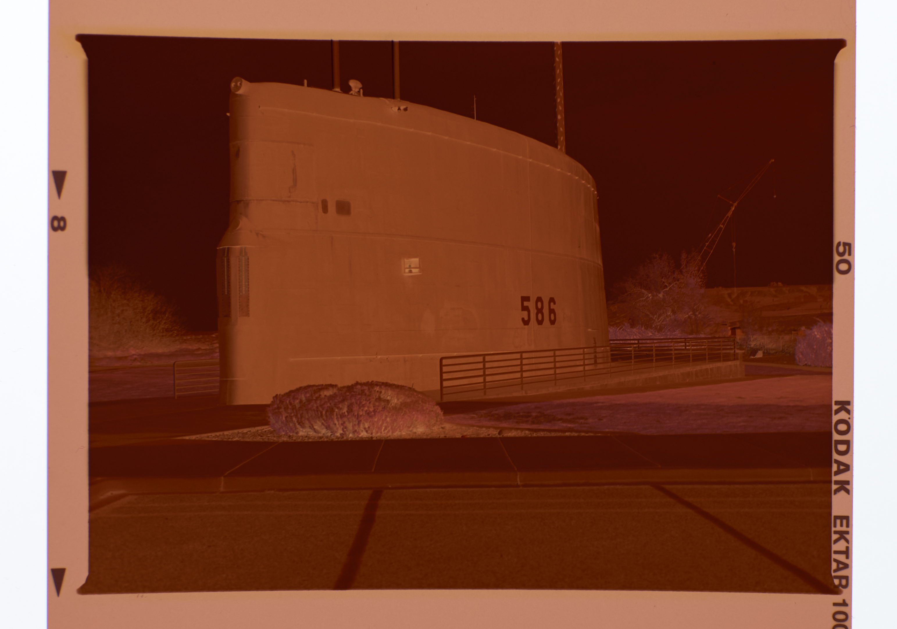
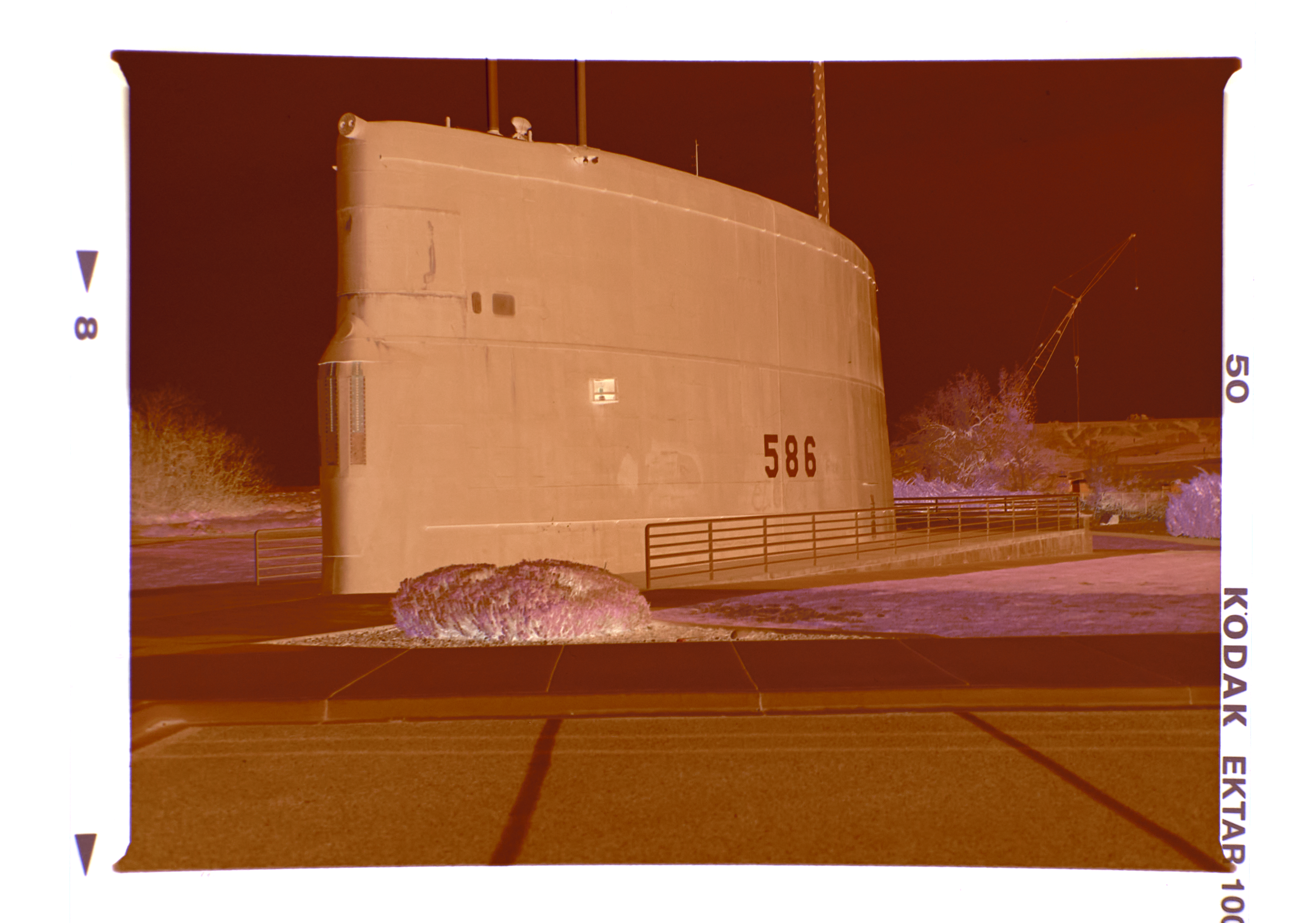
 Greetings all, I know the negative to positive conversion topic has been discussed ad-nauseam. But this is a bit different. Please stay with me on this one. Here are my first steps: 1. Bring in the color negative MF0226_Neg.png below 2. Sample the rebate color to remove the orange cast (MF0226_rebate) and create a fill layer filled with the rebate color. Then change the fill layer blend mode to divide which yields MF0226 Neg and Rebate below. The rebate has been neutralized leaving only a negative without the cast. 3. Then I use the Invert command from the Adjustment Layers which flip the neg to a pos (MF0226_Inverted). NOW here is the problem: I have an overall blue cast that cannot be balanced out. I did process this Ektar 100 film at home using CineStill chemistry. The chemistry was new and just mixed. I checked and rechecked my mixing volumes and temperatures - all OK. Any ideas?
-
 I want to use Affinity Photo to correct film scans so that I have a systematic way to correct skin tones using the vectorscope. I have seen some tutorials with video editors, and I wonder if there are any good workflow examples with AP. I come from Lightroom and I am new to AP, so many things I do is still very inefficient. For example, when I want the vectorscope to only measure the skin I do: crop part of skin -> adjust tones with wb adjustment layer -> copy wb adjustment layer -> go back in history to undo crop -> paste wb adjustment layer. There has to be a more elegant way?
 -
 Hi guys, I find the Selective Color Adjustment extremely useful with its possibility to adjust not only selected hues, but also tones. What seems weird in it though, is that regardless of the current document color mode, it operates in CMYK primaries. Surely, this works, but wouldn't it be more intuitive to have RGB sliders as an option? How about a more general selective color tool, that would allow hue range selection like in HSL Adjustment, but also with similar tone selection for shadows, midtones and highlights? It could offer a choice whether you want to adjust the selection in HSL, HSV, Lab, CMYK or RGB. Wouldn't such a tool be more straight forward than variety of different tools for the same purpose, that can only be applied one on top of another, distorting the input color for every next one? Think of it: HSL, Selective Color, Color Balance, Split Toning and Shadows / Highlights are all essentially selective color tools, but for some reason each of them lacks some functionality that others offer. I understand that they are important to make transition from Photoshop easier, but Photoshop is a very old software with legacy of limitations and concepts changing over time. Affinity Photo, being a new application designed from scratch, can be more streamlined and logical, while also supporting older Photoshop approaches for those who need them. Why can't we have one adjustment layer where all the tuning based on hue and luminance can be made in one place using same consistent logic? If you care about a possibility to separate adjustments into steps, you could just apply this tool several times, and each instance would adjust different things, but using same simple idea. P.S.: speaking of HSL, I think it should use Lightness slider instead of Luminosity, because Lightness is what L stands for in HSL.
-
Bonjour, De temps à autre, lorsque j’utilise la correction sélective, Affinity Photo crash sans message d’erreur et sans sauvegarder mon travail. Précision : j’ouvre mes photos au format CR2 stocké directement sur OneDrive, j’utilise Develop persona d’Affinity Photo pour les développer. Matériel : iPad Pro 12,9’’ 2018 avec Apple Pincil 2 Je vous remercie. Bien cordialement.
-
 Buon giorno, scrivo questo post per riprendere due post precedenti che sono comunque interconnessi, chiedo agli amministratori di chiudere i miei due post precedenti. Uso un altro software con licenza GNU / GPL, o "darktable", e lo uso per una semplice ragione, sfruttando la libreria lensfun che è presente anche in affinità ma che è in grado di applicarla anche su file jpeg e usando un software gnu / gpl adattato allo scopo "ShitfN" per correggere le distorsioni prospettiche attraverso il rilevamento in gruppi di linee di fuga, sia che si tratti di linee verticali o verticali oblique, riesce a farmi guadagnare tempo prezioso nel correggere distorsioni e prospettiva, dato che Affinity ora applica il profilo dell'obiettivo solo ai file raw e non direttamente ma dopo il salvataggio, il che è scomodo, ma per me ancora poco pratico poiché utilizzo una fotocamera "Sigma".Inoltre Affinity per ora non ha una funzione di correzione della prospettiva automatizzata o almeno non di quella che funziona così bene, il risultato è che ogni volta che devi procedere a mano e in termini di tempo, diventa insostenibile ogni volta che devi cambiare un numero pieno di immagini. Chiedo quindi che, dal momento che questi due software, la libreria lensfun e ShitfN siano open source, fare uno sforzo e adattarli il prima possibile in quanto ciò fa la differenza tra un programma comodo e quindi utile e un programma bello ma non completo. Metti un video come richiesto, in modo che tu capisca di cosa sto parlando. Grazie Lorenzo correzione dell'obiettivo prespective correction.mp4
 -

Live Filter: Skin Tone Feature
Uncle Mez posted a topic in Feedback for Affinity Photo V1 on Desktop
Hello everyone ! Hello Team ! Well, i just want to make this request/suggestion that i believe will be of great interest for many in this community. We love affinity Photo a lot but still there are point we often disagree with and tends to make use of other tools but we end up lose a lot of time and some time lose it all. Among those so much wanted features i notice the precious Skin Tone Fine tuning. Well, there are tons of methods that we can use to fine tune our skin tone but when looking closely they are intended for Pro or peoples who have considerable experience with Photo software, but when it comes to newbie ... they just lose it all. So i propose a New Skin Tone Fine Tune - Live filter to be implemented; that live filter must allow us to work fast on skin tone applying quick and auto mask to the subject skin so we can work on it. A bit more ? Well, I suggest this : - an Auto detection of skin tone to be implemented the second we select that filter then a quick mask applied, allowing us to fine tune the mask because skin also share the same color as background and environment. - After mask is okay then we can play with the sliders few of them can be : Smoothing, Brilliance, Vibrance, clarity, sharpening, blemish correction and maybe Hue (for those playing the Hulk stuff) ... do not forget to add a color/picking tool to allow average color picking (kind of manual method for those wanting to select precise areas or ranges) - All this should happen in live mode so we see in real-time what we do and how is the output - When all necessary tuning are done, just click apply Making this a Live filter is a plus that will enable us to come back to it tuning again and again thus increasing the interest Newbie and learners (and even Pro) may have about Affinity Photo. Believe this: the day you will offers us such quick way of working a lot of people will be at peace. Please do not remove or delete the actual way of doing the same job as many people like to do things manually so they have to be satisfied. May another one in this forum fine tune this suggestion for the good. Blessings until this is implemented for the Good of Photography.-
- 1
-

-
- skin
- correction
- (and 7 more)
-
 Dear all, I am quite a newbie to photo editing and Affinity Photo. But after a Udemy Course and hours of searching tutorials, I got stuck on one topic :) The problem: I took a product photo of my watch for my online shop and have many reflections on the polished metal of the bezel. You can see fingers from me triggering the camera on the reflection of the bezel and also some spots on the bezel are overexposed, but nevertheless, I like this shot. My questions is: Is it possible to achieve a polished metal effect with any tool and retexture the bezel of my watch? I want to achieve a reflection as on the attached image. I am looking forward to your help!
-
Hi folks, Using Publisher is allready almost delightfull! I remember when jumping from QXpress to InDesign, lots of glitches and frustrations where poping on screen again ans again: here NOT! I had some troubles with the search and replace, though, but I guess it was my way of clicking too many times on the "Replace all" button. ;/ As small editor, one thing would made of Publisher THE total ID killer: Antidote integration. As you probably all know, typography is a quite demanding matter (and maybe in french printing even more? - Or at least with different glyphs) and transfering text is sometimes a play with lots of unwanted changes. Is this feature in the pipeline already, or will it be in a near future?
-
 Bonjour, In Exif data, I find nothing that says exactly my lens was being use: -- on Canon 760D / Rebel T6s -- lens Sigma 18-35mm f/1.8 DC HSM [A] So, how can a Lens Correction be done in Affinity Photo? And how can I force a Lens Correction based on the Lenses database? Thanks
 -
Hi, I think affinity misses heavily on some good colour correction options. Other software brands allow for almost automatic correction or profiling using great/xrite colour checker cards, e.g. passport, SG24 or DG which are all industry standard. Without that option of automatic profiling Affinity photo is not really to be any valuable tool for pro users who take colour processing seriously. Please add this feature. Thanks.
-
 I'm using AP with RAW files from Canon & Nikon. Exposure correction range is limited to either -2 or +2 stops only. Forum user MBd offered a work-around but it would be great to have a range like -5 or -6 to +5 or +6 stops like Lightroom or Capture One offer. This would simplify my life a lot.