Search the Community
Showing results for tags 'colours'.
-
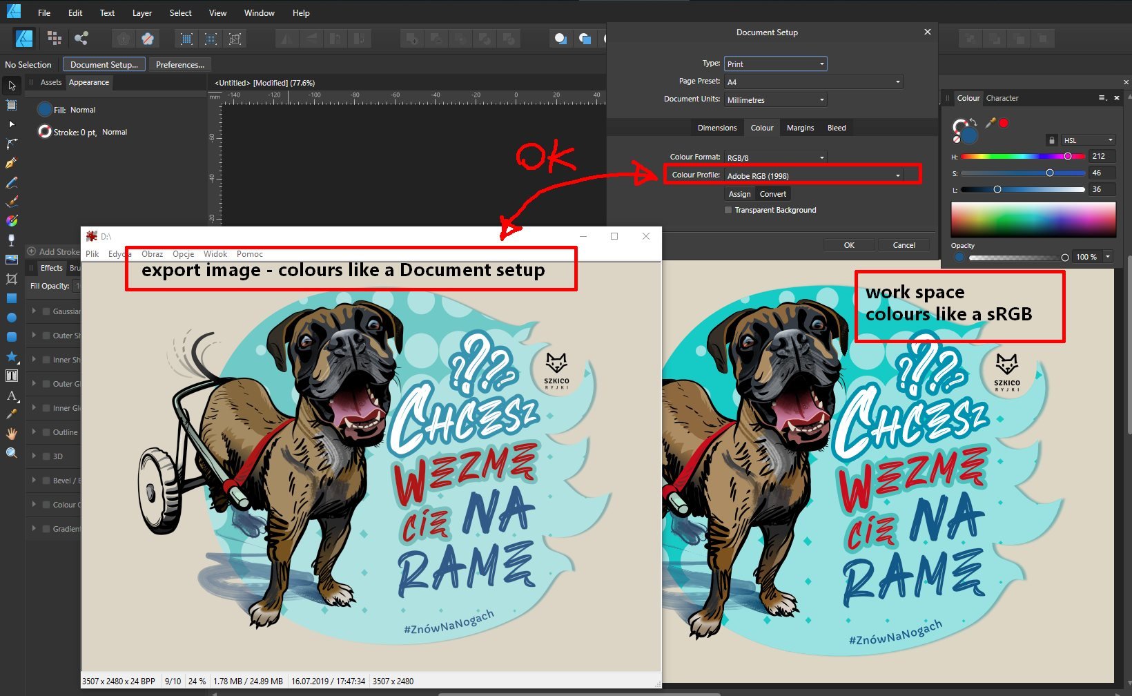
 Hello I set it in: Document Setting / Color / Color Profile / Adobe RGB (1998) Nevertheless, I can see vivid colors on the monitor - after the export the colors fade (OK in the end is Color Profile / Adobe RGB (1998)). How do you set in AD so that the colors are displayed in the same way as it is set (Color Profile) in Document Setting during operation?
-
The colour studio is fantastic. Just two things... Inputting colour values Because sampling colours for inspiration and/or use is a daily occurrence in iOS, I have fantastic colour pickers on iOS. If you can enable Affinity Photo/Designer to receive colour values manually, such as Hex and RGB values, life would be infinitely easier. This means would avoid... Working on an approximate colour in the colour wheel and sliders or... Importing an image of the colour source onto the canvas, and using the colour picker on the imported image (which often happens). Manual input of colour values will not only be easier and faster to work with daily, I will have the precise colour I am after. Exporting colour palettes If you can allow Exporting of colour palettes for future reference, would be fantastic rather than the only option to save them in the document. Remembering which document a colour palette is in can be tough, especially if the palette was created months ago. Having palettes at the application level is fantastic, so thanks for that. I usually have palettes at the document level as its the only way I know the palettes are backed up somewhere. Hope I’ve made sense and is something that can be put into both Affinity Photo and Designer on iOS.
-
 Hello, I'm an affinity novice. Struggling to work out from tutorials how to colour a specific area of background. Have attached photo example. Want to eliminate busy area in top right hand corner and replace with the grey of the rest of the background. Have managed to select area using brush tool but that is as far as can get! Any tips/advice appreciated!
-
I would love to see Affinity products supporting HKS colour systems for printing on coated and uncoated papers, same way as Pantone colours are built-in into applications. The systems are used by many printers, naming just few in UK: Saxo Print, Mixam, FlyerAlarm and many others around Europe. I use HKS at work, but must translate colours into CMYK. It would be really helpful to support these colour schemes (HKS-K, HKS-N). HKS has an app that allows to add HKS-K (coated) and HKS-N (uncoated) to Adobe applications automatically. If not built-in schemes, than maybe this would be a good approach? HKS is also cheaper than Pantone for designers (colour fans and colour tables) and for printers. HKS also include gold and silver inks.
-
 Affinity Photo Reset individual included Swatches to Default. For example one may want to reset Greys or Colors or Gradients to default after adding those that you no longer need.
 -
 Hi I'm moving over to Affinity from Photoshop. One feature of PS [in ACR] is the ability to adjust saturation & luminence separately for each individual colour [red /orange / yellow/ purple etc]. This seems to be missing from Develop persona in Affinity. The only way of approaching it seems to be with Curves [ only for RGB & therefore well near impossible for other tones] or by altering white balance [which is a bit of a blunt instrument]. You can do it to a certain extent with selective colour & HSL in Photo persona, but even here you are only adjusting colour bias, not luminence, & in any case working on the Raw file creates better results. Have I misssed something, please?
 -
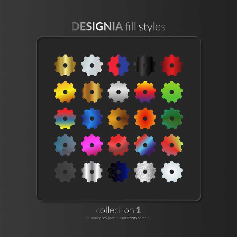
Hello! I prepared new 25 styles for A-Designer, A-Photo and A-Publisher Regards Designia Styles 2.afstyles
-
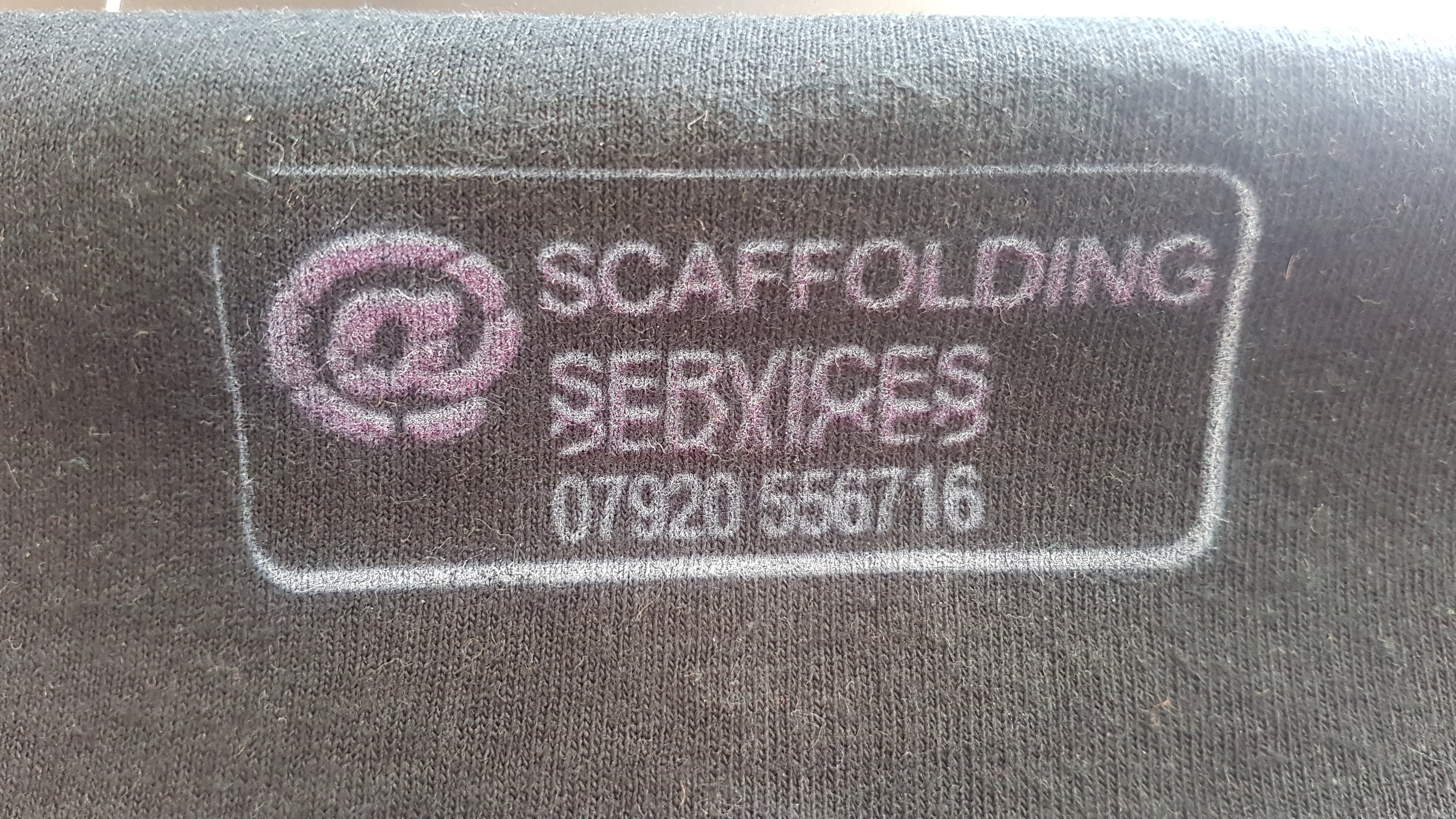
 I am just starting my own direct to garmwnt printing busines and I am having a problem with affinity designer and acrorip. As you can see from the pictures the colour that affinity and acrorip shows is not the same as the print on the t-shirt. I am working in cmyk 8 with u.s. web coated (swop) v2 colour profile. I have exported as a jpeg because acrorip doesn't like .tiff or off files. I also managed to get the same colour profile on acrorip. Please help.
-
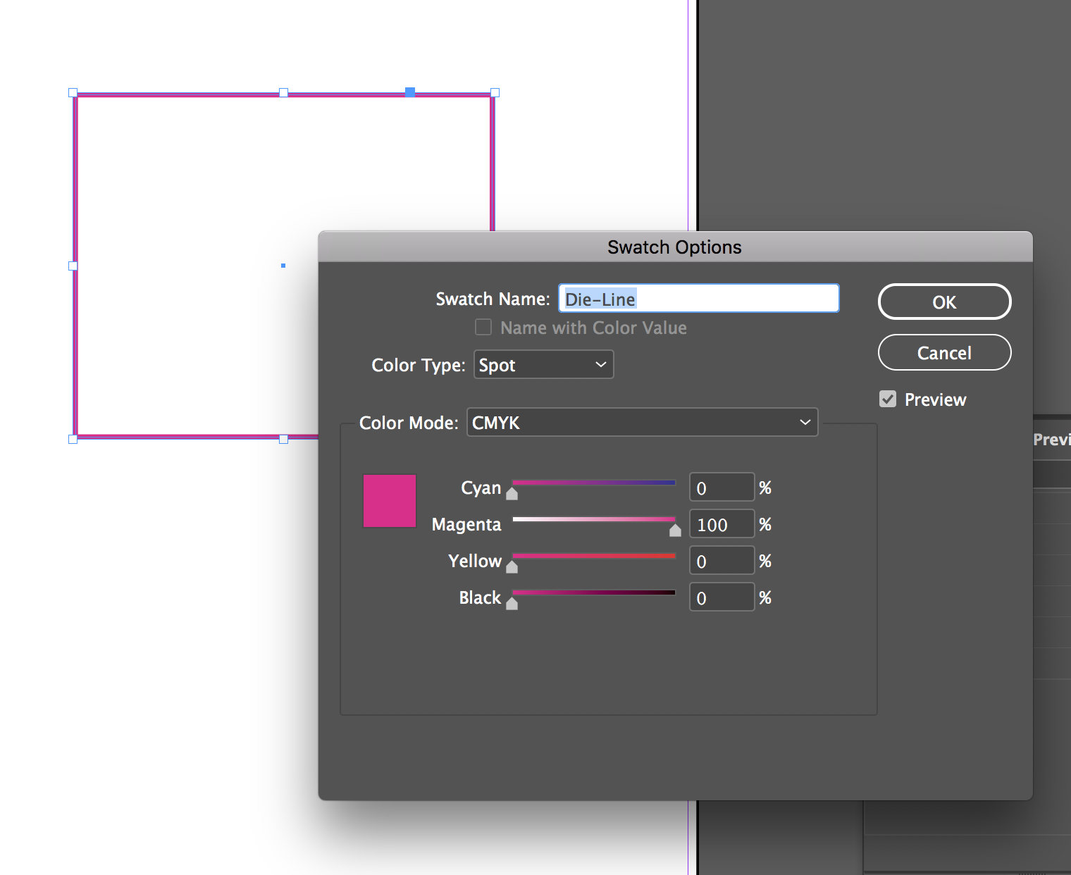
 Hey guys, I can't seem to find a way to convert process colours to spot in Affinity Publisher Beta. Not quite sure if there is a way yet. When I'm doing a print job that has a die-line, perf, fold line, etc, I usually set them up as a spot colour. In InDesign I usually convert one of the colours (either cyan, magenta, yellow, black, or whatever) from Color Type: Process to Color Type: Spot and then assign a name to each (like die-line). Is there a way to do something like that in Affinity Publisher at the moment? Thanks!
-
 Hi I Have a question about inheriting settings in pen tool, when Im work with it and choose colour width and finish shape, the next one Im must start again from zero settings, Im tired with it, in other apps last settings pass on to the next new line. Is this possible in AD nad AP? Im working on Win10 with latest release of AD and AP.
 -
Just released a second color palette with support for Affinity's .afpalette format. It's a set of bright, happy colors to lighten up any illustration or design. Get it at creativemarket
-
 Hi, I'm new and I just start discovering Affinity. I like it very much so far !! Now, I try to set the interface the way I like to work and I can't find any shortcut to make appearing a flaotting chromatic wheel... allowed me to select new colour while painting whitout having to move back to the colour window every 10 seccond. Is it possible ? Am I looking at the wrong place ? any alternatives ? Cheers
 -
 I'm new to the pratical side of design - having previously worked in positions where I've paid people for graphic design, I now want to be able to do it myself, to a degree. I remember seeing designers use the colour wheel (I think) on Photoshop to find colours which complement the colours in a logo and I'm wondering if Affinity Designer has a similar tool. For example, I have a two colour logo. Can I input the colour refs for these into Designer and have it suggest a palette which will work nicely with them? Thank you in advance.
 -
I wanted a base palette that I could use on my illustrations, with a range of shades, and highlights/shadows for each. So I made my own: It's a good starting point for illustrations, icons & UI work. There's more than 100 swatches, nicely organized. Comes in several formats, of course .afpalette included. Grab it over at CreativeMarket!
-
Hello, I created 25 types to fill objects. Designia Styles.afstyles
- 12 replies
-
- 10
-

-

-
- affinity photo
- fill
- (and 6 more)
-
Hi all I bring a time-lapse more than a tutorial for this week. However, I explain how to slow it down so you can follow along if interested. You can also ask me how I did this or that, as usual. Kiss!
-
- 3
-
-
- time-lapse
- car
- (and 6 more)
-
 Hi, so I have a PNG file. It is fairly basic, and has a large part of its background and some other text etc. as a single solid colour (A) that I would like to change to a different colour (B). So basically, how do I change everything that is Colour A to Colour B, preferably the easiest and quickest option if there is one! Thanks so much in advance!
 -
 Hi there, First post here, great software... I'm a Lightroom/Photoshop user but needed a vector tool and wasn't prepared to pay the subscription for Illustrator so very impressed with AD so far! I am using AD to create wedding stationery. In order to keep my workflow simple when creating designs for clients I am making use of several artboards in one document (one for each item of stationery), global colours and symbols. I have made a symbol from a simple text object which includes the bride and groom's names. What I would like to do is be able to change the colour of one or more instance of this text while still being able to change the wording itself, however if I create a new instance of a symbol, switch off the sync button, change the colour and then switch back on the sync button the wording itself seems to be un-linked. Is there a way I can achieve this? Am I missing something simple? An example of what I am trying to achieve; One artboard for a Save the Date card - Bride and Groom's name in pink. Another artboard for a save the date card - bride and grooms name in exactly the same font but in a different colour and larger size. I want to be able to change the name of the bride and groom in one instance and it change in all, including the one with the different colour. Thanks in advance Simon
 -
 I've set the colour preferences to be identical in both Photo and Designer, but colours look different when compared side by side. For example, if I create a simple rectangle in Photo and fill it with blue, then copy its value and create a rectangle in Designer and fill it with exactly the same blue it looks paler in Designer. Does anyone know what I'm doing wrong? Thanks.
 -
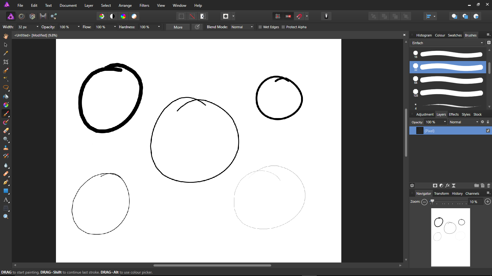
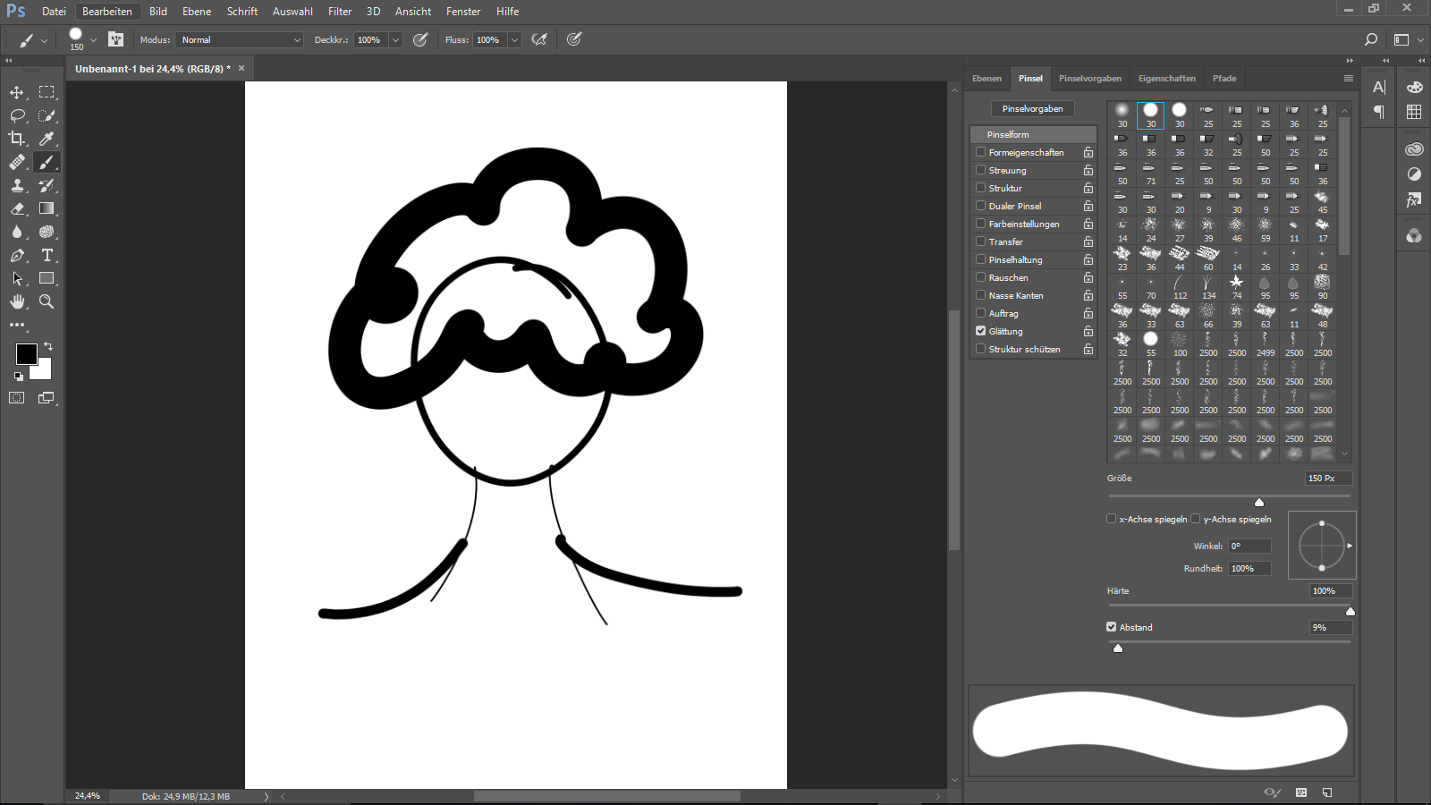
 Hey Guys, I just got Affinity Designer and Photo for my windows surface. Firstly, I'm not a professional, neither in Affinity nor Photoshop. What i want to do: I just want to make some easy sketches in AP, but it turned out to be quite "edgy". When i'm starting drawing with my stylus pen, its not a smooth line (using the brush tool), it's more like little pixel "steps" into the line. In PS i dont have this problem. I will attach some pictures to make it visible for you. I Hope someone is able to help me, maybe i have to do some settings first? The documents used, was 600 x 900 mm sized with a DPI of 300 (in AP) . It would be great getting out of this trouble, thank you! Cheers
-
 I would really appreciate being able to get just the raw the colour definitions out of Affinity products so I can paste them into code. If I were to right-click on the any of the inkwells a drop down menu would appear with: Copy as... RGB Values RGB Hex HSV Values CMYK Values The result would be comma separated values on the clipboard e.g. "232, 124, 45" that I can then paste between brackets in a stylesheet or in some javascript. If it were possible (which I'm sure it is), the contextual menu on a gradient would offer to copy as a full CSS gradient, SVG linear gradient definition or HTML canvas gradient (I'm sure there are other formats people would appreciate). I know there are online tools that will do this, but if I've already got a gradient set up in AP, I don't want to have to re-create it on a website somewhere.
 -
As far as I can tell, one cannot directly add noise when creating a global colour. There's a workaround, but it's a bit cumbersome: - Create an object and create/apply a noisy colour - In the swatches panel create a global colour, this will take you to a new colour creation wheel; create any colour you want - Select your noisy colour from 'recent' and drag it to your 'painter palette with a dot' icon - Delete the first global colour (if you don't have a use for it So the feature request is simply to have a noise slider in the global colour panel Thanks!
- 1 reply
-
- 1
-
-
- affinity designer
- noise
- (and 2 more)
-
 I hate to have to request something that is straight out of Photo Shop but occasionally there is something so neat and simple it's worth replicating. Could we have primary and secondary colours automatically switch to black and white when a mask layer, FX layer, adjustment layer, etc are selected. It's such a tiny thing but it's SO useful. And on that subject a button to reset the colours to black and white would be handy too. I really miss it.
 -
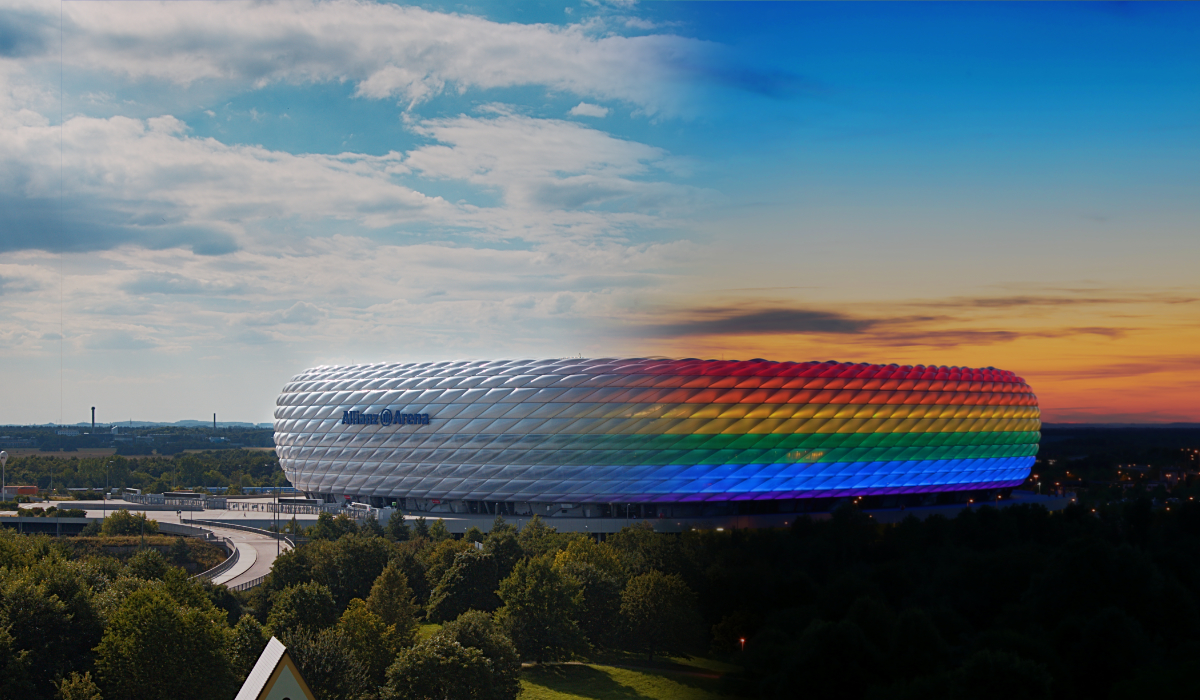
Here is my attempt to merge a couple of shots of the Allianz Arena in Munich going from day into night. The Arena was being lit in rainbow colours to celebrate Christopher Street Day 2016.


.jpg.8d5ed73460054022806ddb74057b8951.jpg)