Search the Community
Showing results for tags 'colours'.
-
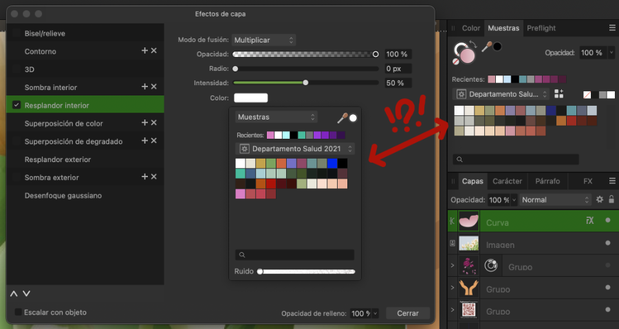
In V2 Designer I'm getting errors with colour display and what object actually is. Attached screenshot show where object has black outline but tool (top right) shows it to have no colour? I'm also (occasionally) find I pick a colour from this tool/swatches and object doesn't change, this seems to be when changing to white, I have to change to another colour then change to it to white for it to work? Hope this info is useful. I'm use Designer v2.2.1 on MACOS Sonoma 14.1.1

-
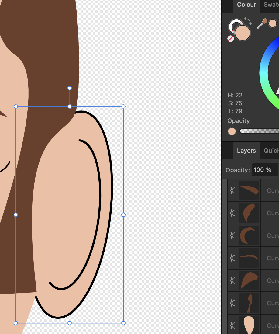
 Hey, I'm in the position showed on the screen. I wanted to change colour of the background. I already did, but how to merge it all together to have green plant and creamy background?
-
 Hello. When I want to change something's color that uses one of my Global Colors it automatically changes color tool to Tint. It annoys me because there is only one slider and nothing else and I must switch it manually to Wheel every time when I want to change color of certain object without changing the Global Color. Can I somehow change it to use automatically Wheel for example? If not - it would be a nice, user friendly function.
-
 This is an v1 old error that has reborn in the v2. CMYK colors on the FX panel are show as pure RGB. So picking a color is more hard as you can't see the real hue. A little disappointed that this error has returned. It was solved on v1. And it reappears often, as versions are released.
-
 I think it would be nice and quite useful to have the option to set the Start and/or End of a stroke to have a different colour to the actual stroke. For example, you could have a black line stroke with a green circle at the Start and End to illustrate the start and finish of something, all done with just one stroke rather than putting in the circles manually. Thanks and keep up the great work!
 -
Hello everyone :) Since I just really love these colours, I made this palette and I'd like to share it with you. These are the colours of the Touch Twin Markers, from ShinHan Art. I numbered and named the 204 swatches, to keep them sorted as they appear in their Colour Chart, but of course you can sort them as you want. Hope you like them. :) Touch Twin Markers.zip
- 11 replies
-
- 22
-

-

-
 Is it possible to use a colour palette to posterize image, please? Can APhoto map all colours from an image to a palette, and/or to closest colour, in this way? tia xx
 -
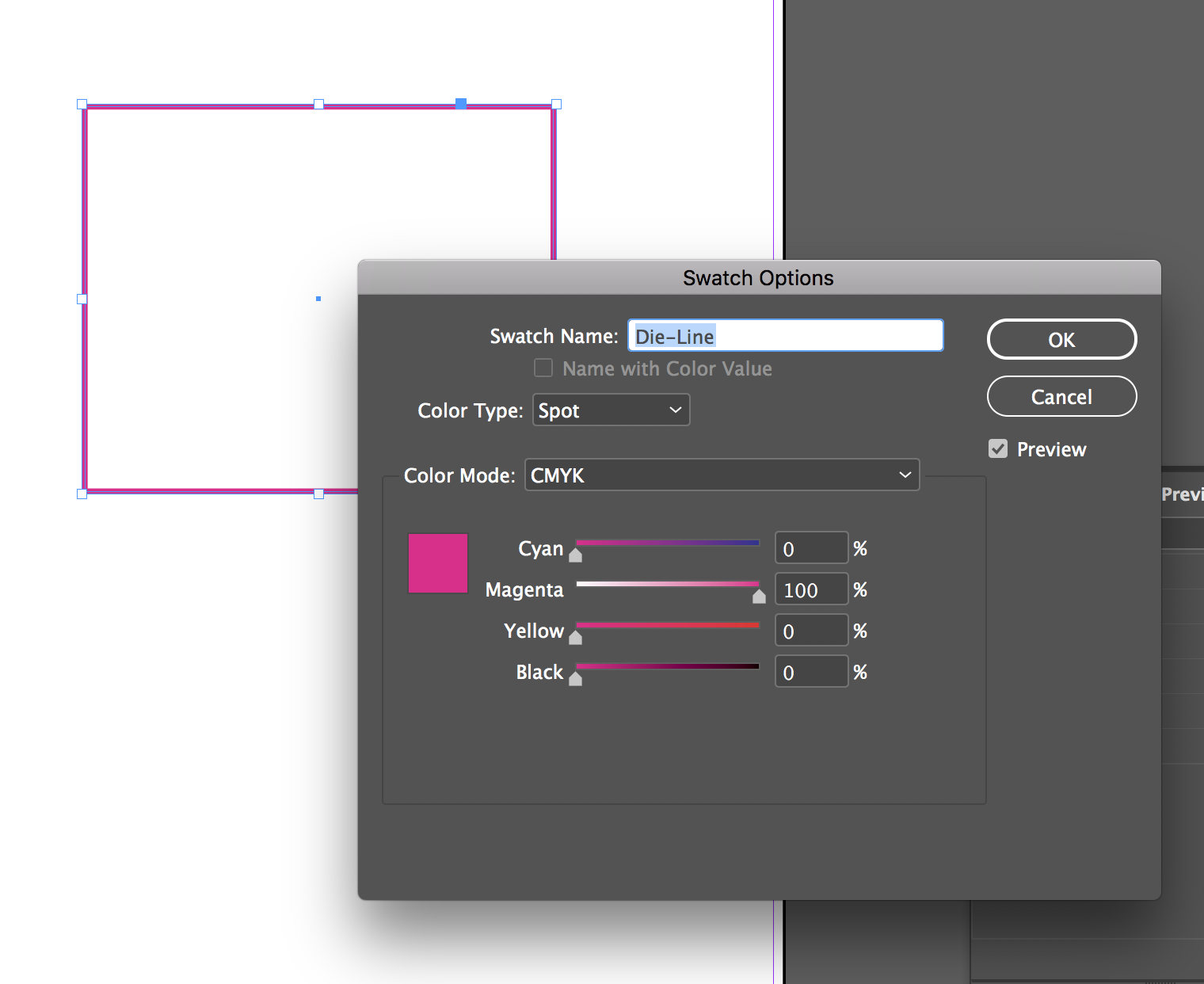
 Hey guys, I can't seem to find a way to convert process colours to spot in Affinity Publisher Beta. Not quite sure if there is a way yet. When I'm doing a print job that has a die-line, perf, fold line, etc, I usually set them up as a spot colour. In InDesign I usually convert one of the colours (either cyan, magenta, yellow, black, or whatever) from Color Type: Process to Color Type: Spot and then assign a name to each (like die-line). Is there a way to do something like that in Affinity Publisher at the moment? Thanks!
-
 As already described/discussed in the support questions, colours are displayed incorrectly when a monitor profile is active in the system. The problem can only be reproduced with Affinity Photo and does not show up in Adobe Lightroom, Chrome, FastRawViewer or Irfanview.
- 2 replies
-
- 2
-
-
- affinity photo
- monitor profile
- (and 4 more)
-
 Hello, I came across another mystery. I have several Global Colours set in the document. But with one special text frame, these colours look differently. They're much brighter almost like they're in another color space. Please, help me 🙂
 -
Download the SVG version of the shapes on this web page and open in Affinity Designer. The colours are consistently different from the ones that appear on the web page.
-
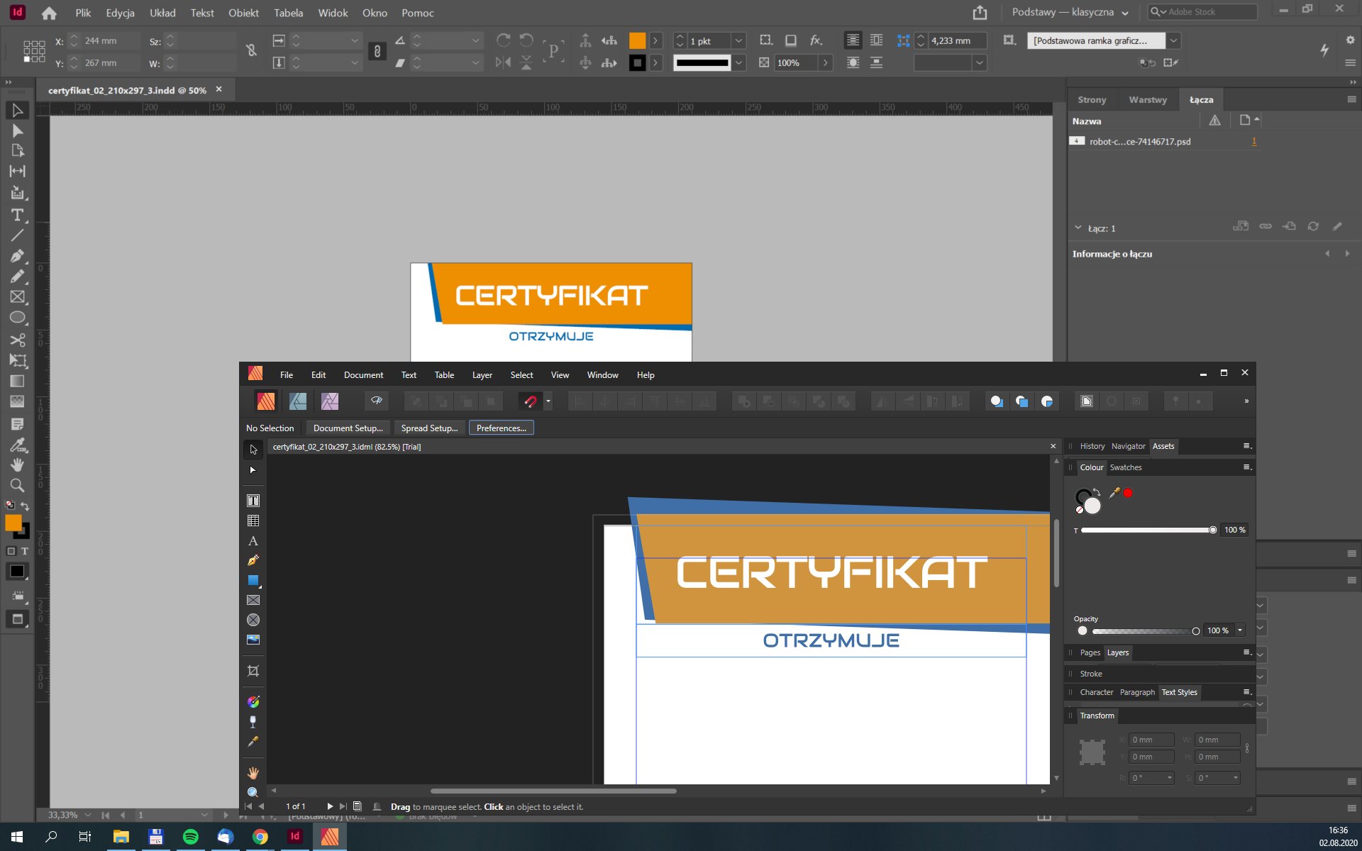
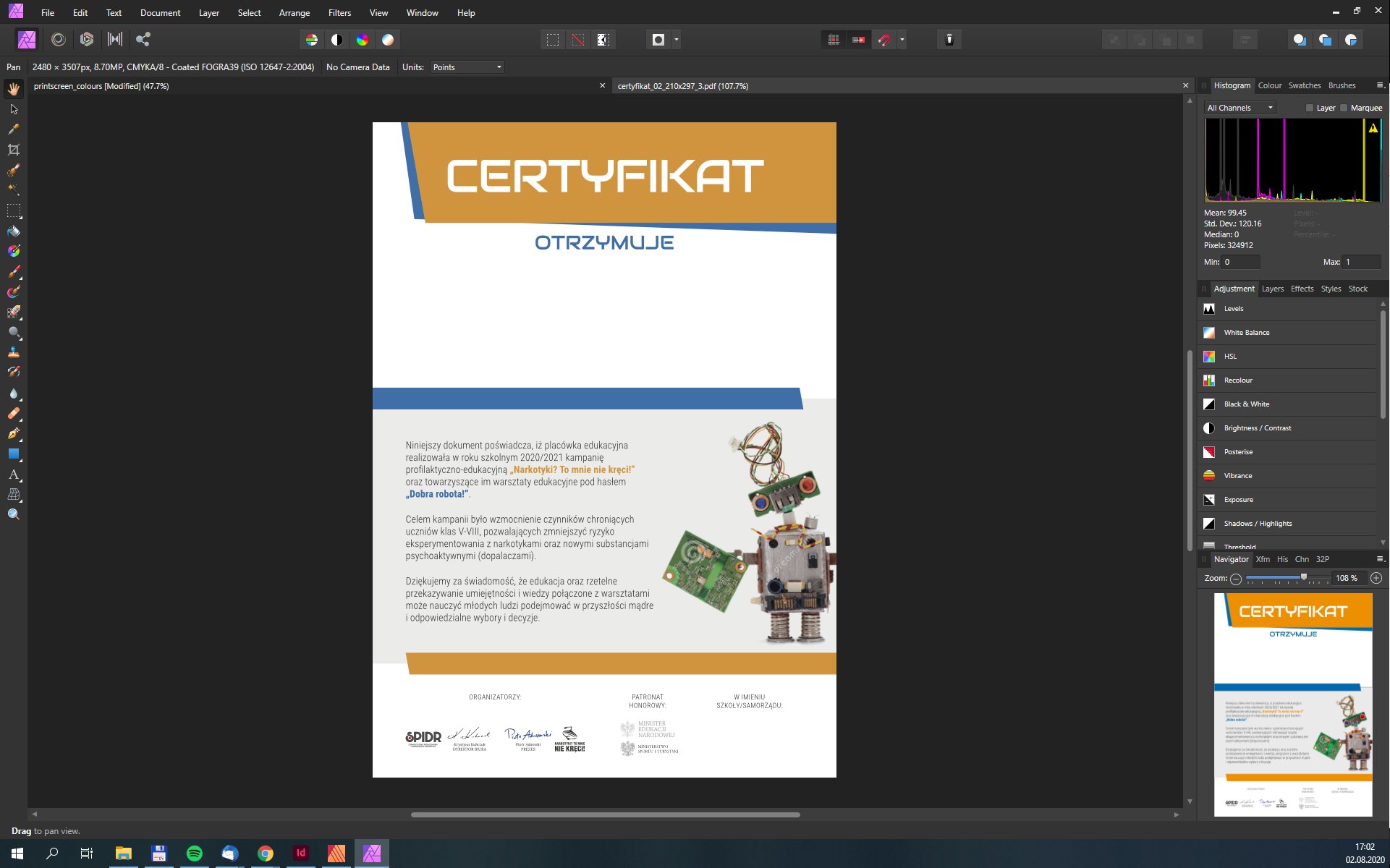
 I have been using PagePlus for some years very happily and am assessing whether Affinity is suitable as a replacement. However, I have found that although PagePlus produces PDFs which accurately match the input images, with Affinity there is a major issue. I attach the original colour swatch I wished to use for the background to the page, and a PDF produced when this was placed in an Affinity file and then output as a PDF. The colours are completely different. For this project it is vital that colours are accurate. NER green.tif NER book covers v2.pdf
 -
New out yesterday is the following document. https://www.unicode.org/L2/L2021/21075-heart-emoji-coverage.pdf I am not sure if this is the correct place in this forum to post about it - but I chose here as it seems to me that this is where people using colour in designs might be most likely to notice it. For comparison, my localizable sentences research currently uses fifteen colours, and I have most, but not all, of those listed in the document, and a few more. They are listed on page 4 of the following document. http://www.users.globalnet.co.uk/~ngo/localizable_sentences_the_novel_chapter_005.pdf So I need to consider adding a few more. William
-
 Hi There, how on earth do I pick colours from an existing gradient, without just using the eyedropper as close to the edges as possible and hoping i get the 'full' end stop colour, not just one of the in-between shades? Lets say I open a file provided by a client and an object has a gradient of blue to grey. I want to use the same blue and grey to create other objects. I can't use the eyedropper as I might not get the full blue or the full grey if I don't click right at the edge of an object fill. Is there an easy way to 'name all colours' or 'add all colors to swatches' that will know the gradient is basically just comprised of 2 solid colours?
 -
First time I designed in Affinity Designer in sted of using Illustrator. Really loved it! Also I used "The Shizzle" pack from Bob Byrne – very cool stuff hi makes!
- 2 replies
-
- 4
-
-
- illustration
- type
- (and 3 more)
-
 Currently the selected colour changes on a tool by tool basis. For example I choose a blue while I’m using a paintbrush but I switch to the fill tool and the colour changes to orange, which was the last colour I used to flood fill a layer 3 documents ago. I don’t personally understand the logic of making the active colour tool driven, rather than context driven. Mask layers are a case in point. The context of working in a mask or on an adjustment layer is that you are working in black, white or grey, yet the active tool and whatever colour you selected dictates the colour in this context. I appreciate I might be missing the grand plan here, but surely I’m not alone?
 -
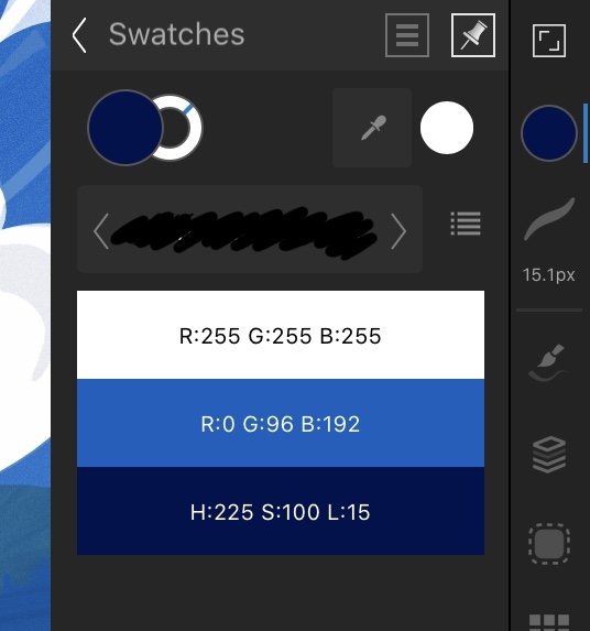
 Is it possible to access swatches from the context menu as shown below? Of course I mean document palettes should be listed here shouldn’t they, logically? If not, why not? Thanks
-
Hello! I've been having an issue while I am painting using this software in which 30% of the time I use the Eyedropper / colour picker tool I get the wrong colour. Not horribly incorrect but very noticeable. I use the HSL color gamut when painting and the error typically manifest's itself into the chosen colour becoming very saturated or very dark. I've looked around on forums and discussion boards and I cant seem to find anyone else having this issue, but some people who've had similar suggest messing around with colour profiles. I have, and to no avail. I've tried reverting to older versions of Affinity Photo, as far back as 1.7 iirc and the issue persists, even with update 1.9. I tried unlocking the colour gamut so that it switches freely between RBG, CMYK HSL LAB which kinda works but is not a great solution to my workflow, and iirc I still have this error. Any help would be much appreciated! If you need photos or comp specs let me know, I've not added in any as it seems to me right now that its unnecessary.
-
 Just swopped from InDesign to Publisher and need to urgently send some artwork for printers. Need to add a spot colour channel. How on earth is this possible in Publisher??! I can't even find any channel view? Or am I missing something? Tight deadline and I am MEGA frustrated right now. Any help greatly appreciated! x
 -
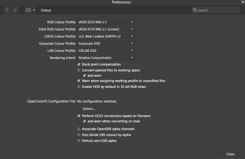
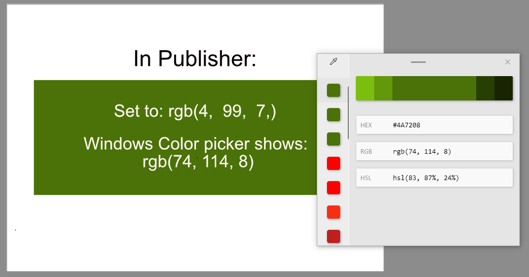
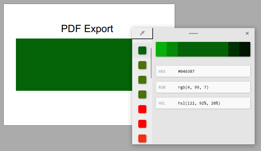
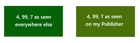
 Affinity Publisher workspace recently started rendering colours differrently to all other apps on my PC. For example, if I set the RGB sliders to 255, 0, 0, i.e. red, the resulting swatch colour is noticeably orange and a colour picker such as Pixie or the Windows Powertools picker shows the swatch as RGB 246, 47, 20. Colours are consistently "off" across the spectrum and across sessions. The problem doesn't appear to be caused by instability. The same problem appears in Photo and Designer. Example: Here's how Publisher renders a fairly cool, mid-dark green colour: RGB 4, 99, 7. As you can see the external picker reads it as rgb(74, 114, 8). The document's colour format is set to RGB/8 and the colour profile is sRGB IEC61966-2.1. Below is the above Publisher file exported as a PDF, using the digital high quality preset with colours set to RGB/8 and sRGB IEC61966-2.1. The green is rendered how I'd expect RGB 4, 99, 7, to look like. Windows' colour picker agrees. Lastly here's the two colours next to each other in MS Word to illustrate that it seems to be Publisher that's having a problem with colour rendering, not other apps or necessarily my monitor. This is my Publisher's colour setup in Preferences (Publisher default I believe): My graphics card is an ATI Radeon HD 4300/4500 Series with the most recent driver available. The monitor is a Dell SP2309W on the standard preset. Windows colour management profile is sRGB IEC61966-2.1 profile. This is the same setup under which Publisher rendered colours reliably before. However, I have tried just about every combination of colour profile, monitor preset, contrast/brightness, Publisher colour management option and software calibration to see whether it made a difference. Unfortunately it didn't. Does anyone have any ideas why it's only my Affinity apps that render colours in a way that means that colour pickers show different RGBs to the one set in Affinity's colour Studio, whereas all my other apps render the expected colour consistently? Could it be a workspace rendering issue, since exported images and PDFs show the colours correctly? If it was a monitor problem, surely I'd be seeing inconsistencies with colours everywhere, not solely in the Affinity apps? Could this be related to the "washed out colours" issue reported in the past? Were any of those users able to resolve it?
-
I would love to see Affinity products supporting HKS colour systems for printing on coated and uncoated papers, same way as Pantone colours are built-in into applications. The systems are used by many printers, naming just few in UK: Saxo Print, Mixam, FlyerAlarm and many others around Europe. I use HKS at work, but must translate colours into CMYK. It would be really helpful to support these colour schemes (HKS-K, HKS-N). HKS has an app that allows to add HKS-K (coated) and HKS-N (uncoated) to Adobe applications automatically. If not built-in schemes, than maybe this would be a good approach? HKS is also cheaper than Pantone for designers (colour fans and colour tables) and for printers. HKS also include gold and silver inks.
-
 Why is it that if I screenshot a section and drag it into Designer, that the colours are off? See screenshot.
-
In the colour studio, I've added colours to a document swatch. How do I change them please? So say I wanted to change the dark blue in the illustration to something more turquoise.. how do I do this? The three bar menu only sports "Add current fill to palette". If I tap-hold on the colour it only brings up "Delete" and "Rename". I tried dragging the circles, but they don't budge, and I can't think where else I can tap on.
-
 Hei, I wanted to start working in Affinity apps (all three), but encountered a serious problem right from the start: colours don't match. The ones on the working space in Affinity are clearly desaturated while after exporting they visibly gain saturation. Adobe, previously used by me, also displays nice saturated colours. I have everywhere set the sRGB profile, except my Eizo monitor (from which screenshots), which has been calibrated with Spyder and has it's own profile. Surprisingly though, when I switch the monitor to sRGB, the colour difference is even bigger. Can you please help? Or at least tell me if/where I can switch of display colour conversion in Affinity programs. Regards, Kati
-
I’m showing a client designs for a logo by screen sharing using zoom but when I send her mockups she is seeing a different colour from what she sees in zoom. I’ve tried viewing pdfs, jpgs and png files on various screens in different software and I’m seeing the same colour with slight variations as you would expect. When I show her the pdfs on my iPad using zoom she sees the same colour as when I show her Affinity on my iPad. She really wants the colour she sees on zoom. I’m using a Pantone and have all the details for that Pantone. I realise this isn’t really an affinity issue but this is the first logo I’ve designed using Affinity for iPad so I don’t know how close the Pantones match to print. Does anyone have any suggestions on how to see what the client is seeing and give them a closer colour match?


.jpg.8d5ed73460054022806ddb74057b8951.jpg)