Search the Community
Showing results for tags 'colour'.
-
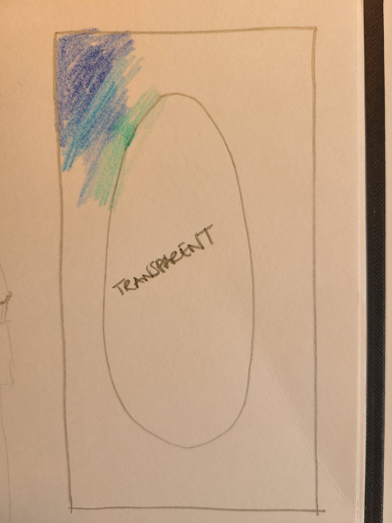
 I'm gonna start by apologising, I am not gifted at illustration, digital or otherwise! I need to create a colour gradient like the photo I've attached - transparent centre in an oval shape, with a gentle gradient going out on all sides. How would I do that please? I got the shape cut out ok, but I couldn't get the right style of gradient pattern so that the colours looked like this all the way around. Any and all ideas greatly appreciated, thank you!
-
I have coloured in images on a previous version and now with the current version, I cannot find and use the colour bar at the top right once I select the painting tool. All I get is grey scale. There used to be a range of colours I could click on and apply to my drawing. Apologies if this is the wrong section of the Forum as I did try the Help but didn't get anywhere. I have attached two files completed on the previous version. I want to do the same with a new drawing.
-
 Is there a way now to organize the colour panel better? I have hundreds of colour swatch groups that I would like to organize better than the current one long list approach. Nameable folders or something similar would be ideal. Cheers for any response. 🙂
 -
 Hello. When I want to change something's color that uses one of my Global Colors it automatically changes color tool to Tint. It annoys me because there is only one slider and nothing else and I must switch it manually to Wheel every time when I want to change color of certain object without changing the Global Color. Can I somehow change it to use automatically Wheel for example? If not - it would be a nice, user friendly function.
-
Why is it so difficult to just fill a rectangle with a colour. Nothing works after over an hour trying everything?
-

Virtual colour strips
PeterBreis posted a topic in Affinity on Desktop Questions (macOS and Windows)
I am a retired designer getting into the Affinity 2 Apps after a lifetime of working with Adobe's Apps. I got the licences for all 3 Apps for all platforms (I have all 3 + Linux) Apple, Windows and iOS. Given my varying qualities of displays and that I do not want to go to the considerable expense of screen testing hardware, nor to paint and light a workspace just for this, does anyone have any thoughts on using an on-screen colour strip to help adjust my eyes and use as a reference whilst working on colour images in the Affinity Apps? I was even thinking of creating a custom neutral grey desktop with an accurate colour strip and sample image. -
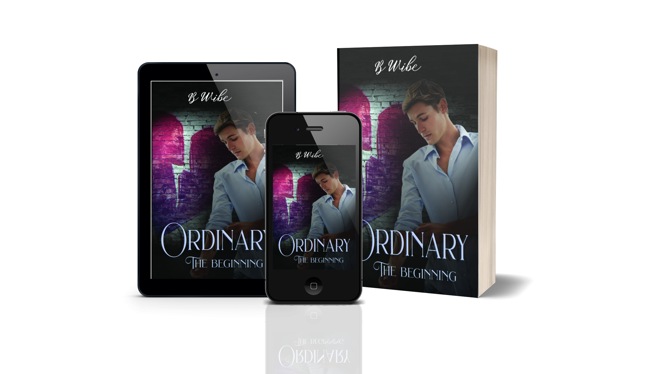
 The first mocup is from V2, and the colours doesn’t match how they are suppose to be. The second mocup are from when I used V1. Everything is correct, and the colours also matched when the book was printed. No I am afraid to use V2 for my book designs in case the colours wan’t match when printed. Help, anyone??
-
 Could you add a flatten transparency command like Adobe Illustrator's? The way it works is that it converts the vector object with transparancy to a non-transparent vector with a colour that matches the one it had when opacity was applied. For more info see this thread: https://forum.affinity.serif.com/index.php?/topic/175099-flatten-transparency-set-opacity-to-100-and-use-the-colour-closest-to-the-transparant-colour/
- 14 replies
-
- 4
-

-
- flatten transparency
- opacity
- (and 2 more)
-
Is there a way to flatten transparency from within Designer? I know you can do this on export, but what about modifying your current document? E: For the feature request refer to:
-
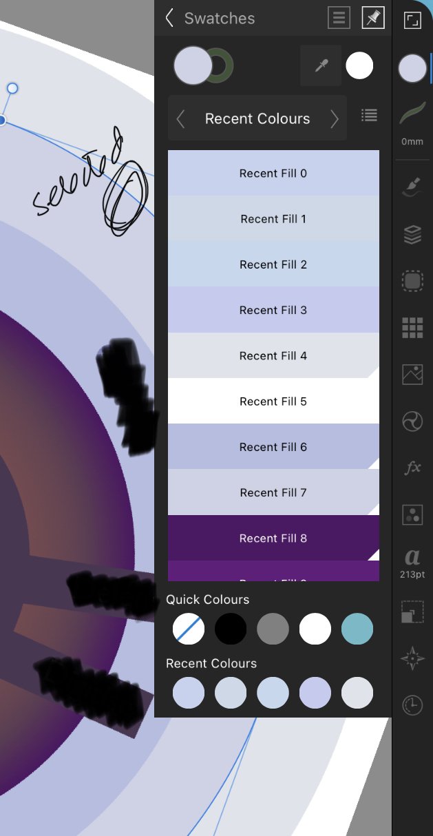
 This is Designer for iPad v1.11.12. (I never bothered updating beyond this.) I filled the selected shape by touching Recent Fill 1. And left the object selected. (There are only 9 fills in the list, so you're seeing them all, btw) You'll see, below, the selected colour is NOT highlighted, in any way, in the panel. Not in the recent list at the bottom, and not in the swatch panel above. It's consistent across all the panels, including document swatches. Can anyone tell me if highlighting selected objects colour in panels now happens in Designer for iPad 2? Thank you.
-
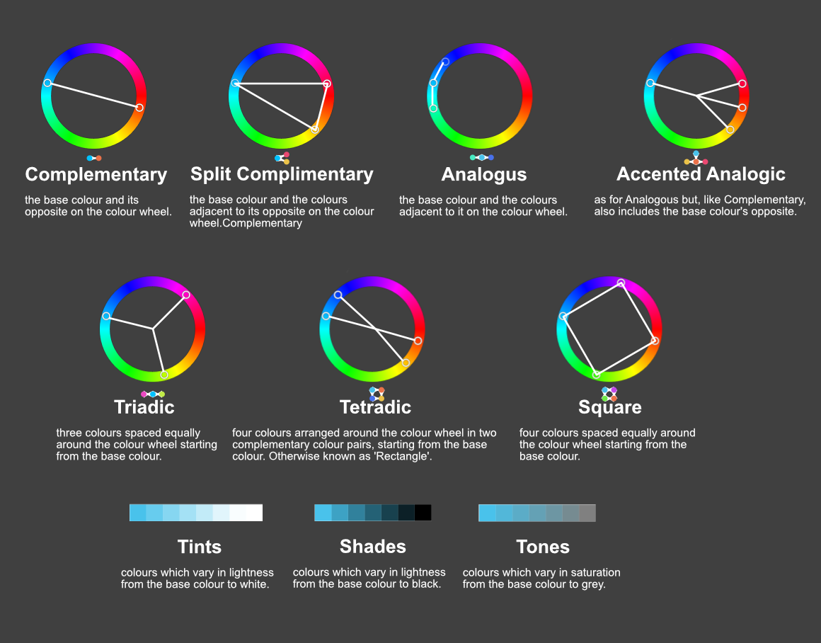
Here is a more visual representation of the colour chord options which are available within the Swatches menu after right clicking on a colour and choosing Add Chord to Swatch. The text as well as used colours are from the documentation.
-
I would like there to be an option in the colour picker to apply sampled colours of filled objects to the selected object's fill colours. Similarly, sampled strokes should be applied to the selected object's stroke colour. This is how it works in Illustrator and bypasses to have to check whether fill or stroke colours are active to determine to where your colour ends up going. For any non-vector objects that were sampled, the colour should still be applied to whether the stroke or fill is currently active. This saves quite a lot of time if you need to apply colours to newly created objects it helps if you can sample them from objects that were already created. This proposal does not cover stroke widths (or appearances in general, which the tool currently does not sample). For that, see:
-
I prefer using the 1 column width toolbar, but it comes at the cost of not having a fill & stroke colour widget there. I prefer to have it there, because it gives me a clear indication on first glance. And it stays there regardless of the studios I have opened. It is also the closest to the canvas and since you already glance the tools to know the active tools, it would be the ideal place to add this. Hopefully this will be reconsidered! Also, see the discussion here:
-
Please add an option to disable the colour wheel from rotating when selecting a different colour. I want to have the orientation fixed, so I can more easily predict where I need to move the picker to.
-
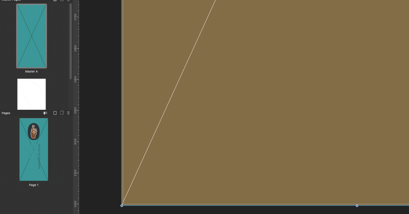
HI, I have created a master page with a colour background, but it displays differently on the page to which the master is applied? I am attaching a screenshot of of the master page A (aqua colour) the page on the right is the actual page colour as it displays.
-
 My problem affects all 3 Affinity programs: Publisher, Photo and Designer... The preview of the selected color does not match the entered values in the view at all. For example (see images) white is displayed in a bright yellow. In Publisher at least the object is displayed in the correct color; in AP and AD also the objects are in the (wrong) color as in the panel. Also on the settingspanel are the icons in different 'whites' (picture 2) However, the colors are printed correctly. I have already installed another graphics card and also tested it on another monitor - the result is the same. I hope that my problem can be seen on the attached pictures. First picture is a screenshot of AP, 2. the settingspanel, the third one are the colorsettings. PS. In other programs (e.g. text program) the color palette is displayed correctly. Does anyone have an idea? Many thanks in advance for them. Greetings from Germany Hans
-
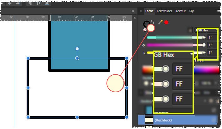
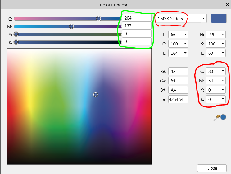
 Win 7 Publisher V. 1.10.0.1127 Why does the colour chooser give me TWO sets of values for one CMYK colour? (BTW, colour is spelled with a "u" in my version of the program). And, there is no "Help" entry no matter which way I spell colour. The red circled values are the ones recorded with the swatch panel.
-
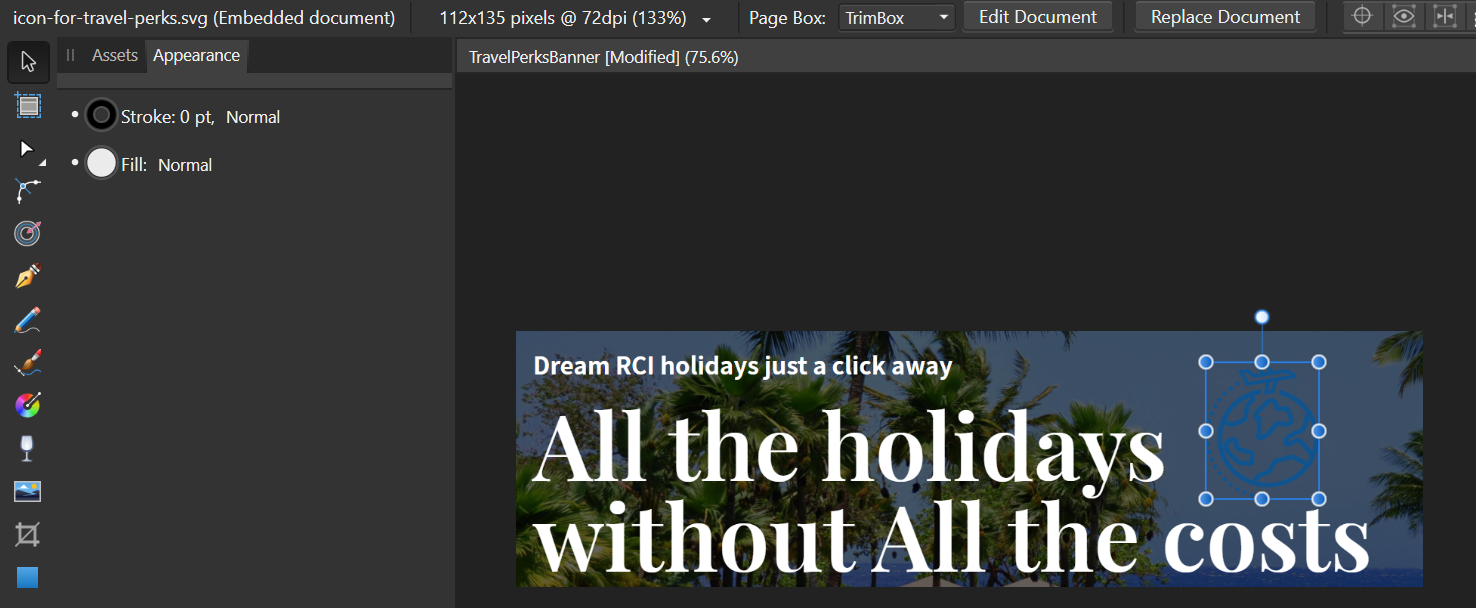
 Hi I have placed this SVG file into the document as seen in the image. What I want to achieve is having that file in white. Like PNG file, so that the image would be white, instead of blue. Ultimately I'd like to put a whole png file on that backdrop, which actually includes the Icon. But I'd want the icon and the Travel Perks UK part all in white, and not have the white background. Is this possible please and what's the best way to end up with the best resolution of the smaller image, on top of the back ground. Thanks
-
 I have large images with pixel shapes (representing cells) and each cell type has a certain colour (6 in total, plus black background). I need to rapidly colour-test different colours to find the best combination for visibility. I have not been able to find a solution anywhere, as most such approaches are about defining a recognisable shape and then altering colours - this is about changing many 'cells' across a large image in one go. Thanks
 -
 Hi, I have created a basic black PNG watermark and loaded it onto a new image brush. So far so good -- it applies. My understanding is, as this is a brush, I should be able to set the colour, e.g. white. But nothing I do changes the colour when I apply the brush. What am I missing here?
 -
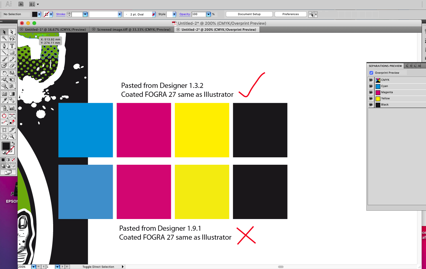
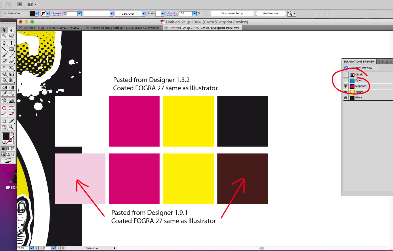
Just got a job on where I need to copy and paste from Affinity to Illustrator CS5 for vector distortions and simplify path, but have noticed that there's a colour shift once pasted into illustrator using the same CMYK profile (FOGRA 27) this has always worked great before, copying and pasting back and fourth retaining colours perfectly so looks like a bug with 1.9.1 Pasting back into Affinity from Illustrator works as expected (no colour shift) so looks to me like the Affinity clipboard as reverted to copying and pasting RGB for external Apps (bad news for a CMYK workflow) I've tried switching on and off the copy items as SVG which makes no difference, even fired up Designer 1.3.2 which works perfectly copying and pasting back and fourth see screen grabs As a temp workaround I'm exporting PDFs from Affinity which open correct in Illustrator and copy paste back to Designer correct
-
 [English version below] Hallo zusammen, ich erstelle Pläne und Grafiken für digitale Präsentationen (Fachgebiet Architektur). Folgendes Problem: Ich stelle die gewünschten Farben in Affinity Designer mit dem HEX-Code ein. Wenn ich die Grafik exportiere, wird diese immer mit knalligeren Farben exportiert, als eigentlich eingestellt. Ich benötige PNG, JPEG und PDF-Formate. Mit allen Formaten, mit allen denkbaren Einstellungen habe ich bereits herumprobiert. Das Programm, das Dokument und im Export haben die gleichen RGB-Einstellungen und ICC-Profile. Eine zeitlang ist bei der Einstellung Neuberechnung: Lanczos 3 die gewünschte Farbe bei einem Export als PNG-Datei herausgekommen. Seltsamerweise funktioniert auch das nur ab und zu. Da ich mich mit Farbeinstellungen und ICC-Profilen nicht sonderlich auskenne, hoffe ich, dass mir hier jemand weiterhelfen kann! Anbei ein Screenshot aus Affinity Designer (nutze die Windows-Desktop-App) und ein Besipiel für die exportierte Grafik. Die gewünschten Farben waren: 000000 (schwarz), AED9E0 (hellblau) und D36135 (rot). Heraus kamen schwarz, AED9E2 und D76436. Ich würde mich freuen, wenn jemand mein Problem erkennt und mir weiterhelfen würde! Danke! Hello everyone, I am creating plans and graphics for digital presentations (architecture). The following problem occured: I set the desired colors in Affinity Designer with the HEX code. When I export the graphic, it is always exported with more gaudy colors than actually set. I need PNG, JPEG and PDF formats. With all formats, with all conceivable settings I have already tried around. The program, the document and in the export have the same RGB settings and ICC profiles. For a while, the setting Recalculate: Lanczos 3 brought out the desired color when exporting as a PNG file. Oddly enough, even that only works once in a while. Since I don't know much about color settings and ICC profiles, I hope someone here can help me out! Attached is a screenshot from Affinity Designer (using the Windows desktop app) and a sample of the exported graphic. The colors I wanted were: 000000 (black), AED9E0 (light blue) and D36135 (red). Out came black, AED9E2 and D76436. I would be happy if someone recognizes my problem and helps me! Thanks!
-
I found a bug in User Interface - which is not changing interface colour after choosing default OS option on macOS Catalina. The bug include just "Artboard Background Grey Level" which stays at the same position no matter which option I will choose - either dark or light. Sometimes it runs with random setting with dark background on Light option and light on dark option. I though it will sop doing that after setting your preferences for both options but it seems like with every instance of the software runs with different background, so every time I need to go back to preferences and change it manually. I'm using automatic options on macOS so either Photo App or Publisher adjust automatically but not a Designer. It's not a huge dealbreaker but it's a little annoying. I would love to see that fix in the next update. I'm using Designer on daily basis so I need to adjust background colour every day. I tried to find that topic before writing that post but I couldn't find it. I think it's worth mentioning. Thanks in advance. Adrian
-
 I'm having a problem; I think I mentioned it before; I'm just hoping that there's been an update or something since it seems like I'm missing something. I have white text on a black page that overflows (correct term?) into black text on a white page. When text is part of the same paragraph I can't seem to alter it without altering the entire paragraph. Ideally there'd be a way of having the text automatically change style when it becomes a part of that text frame. But even if that's not possible; can I not change the colour of the text if it's in the same paragraph? And even if that's possible it's frustrating because if I change any of the layout I have to keep on going back to make sure no text has crept into the wrong section and is the wrong colour which is even harder because it may be white text on a white background and black on black and, thus, invisible. Maddening! Video of the problem. Affinity_Colour_Prob.mov
 -
 Hey guys, im new to affinity photo and i have a big problem. You see i want to recreate this poster (credit : dribble) does somebody know how to make the colors of the background image match? so does the mix of the rounded square and the background looks clean. thanks