Search the Community
Showing results for tags 'colour'.
-
 Hello, Is it possible to make a gradient between severl spot colours in Affinity Designer (without rendering them to Process CMYK)? I just checked, it is possible in Illustrator CC. Thanks, M
 -
 Hi I think it would be great to be able to add and delete separate noods or the little square boxes when you are drawing a logo for instance. When you click on the white arrow tool to be able to individually move the little boxes on the design you have created, it would be so handy to have a tool that you can create new boxes on the line so you can manipulate more sections or take it away. Also, the ability to be able to have the same colour for both the outline and fill, where you drag the colour into the other swatch box or something, just so its quicker and easier than having to save the colour as a swatch or take the pipet and put over the colour you already have. Hopefully, that makes sense. Unless there are already ways to do this that i haven't found yet? Thanks.
 -
 We have all had the problem of selecting a sky when most of the sky can be seen through gaps in the leaves and branches of a tree. It can take ages to accurately select every tiny gap to complete the selection of the sky. If we miss a few tiny gaps the result looks awful. Other programs, GIMP is an example, have selection tools which can select all areas of the sky, including those pesky gaps, with just one click. Of course it may be necessary to adjust the settings for that tool to capture clouds as well as the blue sky. If other programs can do it how about such a tool for Affinity Photo? (If you are not familiar with GIMP I'm talking about the 'Select by Color Tool'.)
 -
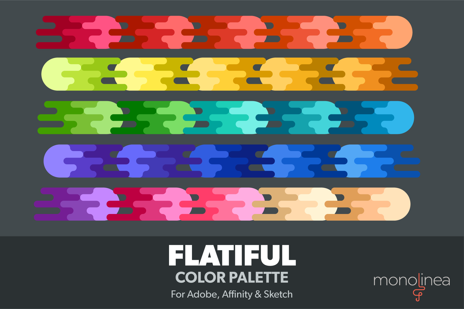
I wanted a base palette that I could use on my illustrations, with a range of shades, and highlights/shadows for each. So I made my own: It's a good starting point for illustrations, icons & UI work. There's more than 100 swatches, nicely organized. Comes in several formats, of course .afpalette included. Grab it over at CreativeMarket!

-
 Hi, I was just surfing youtube yesterday and I came across a video by Sean Tucker: At 7:50, Sean uses hue saturation and lumance sliders to edit inividual colours in his image. I was wondering if you can do this in affinity photo. I am interested in buying it soon so any answer will help me in making my decision. Thanks, Jayvin.
 -
 Hi When I take a photo from the develop persona into Nix Viveza2 the photo is mauve or pinkish in colour not the natural colours that it was in the developed persona. Why is this and how do I fix it? I have tried several photos with the same result. Thanks Mikep
 -
 I'm evaluating Affinity Photo in a work flow that uses DxO PhotoLab to apply lens as well as basic colour & exposure corrections. When I export from DxO into Affinity, photos look significantly different. Is there something I'm overlooking? Can someone please suggest how I can carry forward all of the work done in DxO before I begin more detailed work in Affinity Photo? Thanks.
 -
 Hey everyone, I am trying to figure out if there is a way to create a chord from multiple colors. I've got 3 colors that I really like and would like to find what colors are complimentary to them, to use in the same document. If anyone knows how to do this, even if it's some work-around fix, I'm all ears! Thanks! ps. the hex codes for those colors are #46D2FF, #A071FF, & #666666
 -
This morning's random posting. The devil is making work for some very idle hands at the moment. Still – back to the paid work on Monday.
-
 Hello, As soon as I do change a form with the perspective tool, I am no more able to modifiy its colour. Is there a way to change it ? Thank you for your support and best regards
 -
 Using the Colour Picker tool in the current beta (1.6.0.86) I do not have to click for the colour to be selected In the GIF I never click the mouse. While the mouse is moving the colour is not selected. If I stop, after about 1 second the colour is chosen, as if I had clicked the mouse. This doesn't happen in 1.5 I have tried unplugging my tablet, starting a new file, closing and relaunching AD.
 -
I often choose a colour from a palette then go and find its monochromatic or analogous colour variant. It would be great to have a built in tool to generate these variants automatically. For reference check out: https://color.adobe.com
-
 IU'm converting from Photoshop and struggling to understand something - In the colour panel, there are 2 colour circles which appear to correspond to a 'fill' colour, and a 'stroke' colour - whereas in Photoshop they relate to Foreground and Background colours. Does Affinity Photo have a concept of Foreground and Background colour or not? In Photoshop I can create a gradient from the foreground colour to the background colour - how do I do the equilavent in Affinity Photo? I used the colour dropper tool to select 2 colours in a photo, but as soon as I switch to the gradient tool I don't seem to be able to use the colours I picked, as a white gradient fills the entire layer and I cannot find an option to go from Fill to Stroke colour.
 -
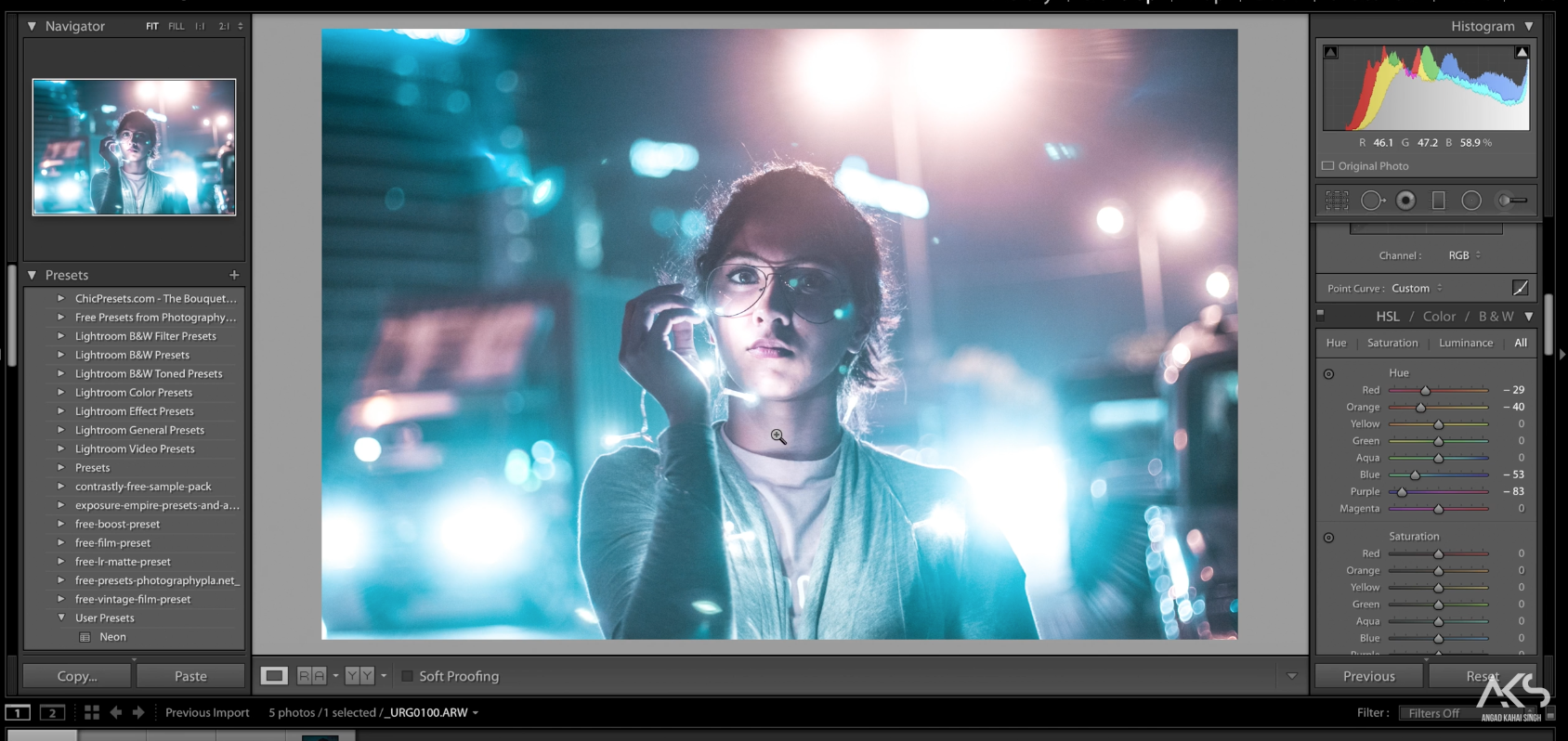
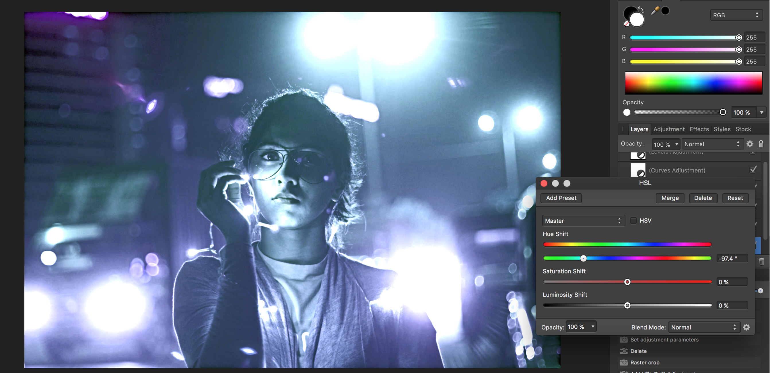
I am trying to stretch my Affinity skills a bit but following along with a Brandon Woelfel photo tutorial. The photo began looking different from the video right off the bat, with the Temperature adjustments. my main issue so far is that when the video changes the color channels to bring out a more teal color my whole photo just looks ugly and blue. it seems PS just has a much better and more specific HSL adjustment tool, is the true? Please help. I have attached the tutorials picture and mine in the same step making adjustments in HSL, Please help!! Here is the video. I just took a screen shot of the original to work along with the video.
-
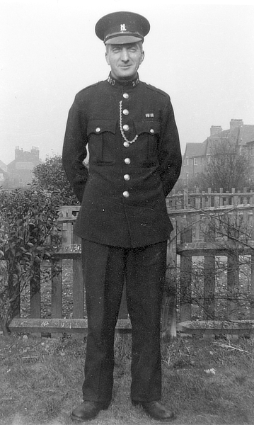
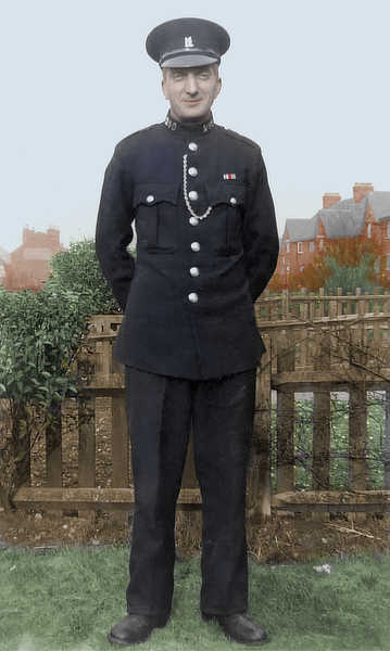
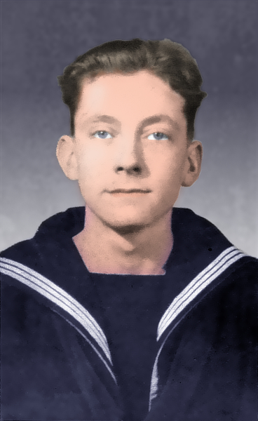
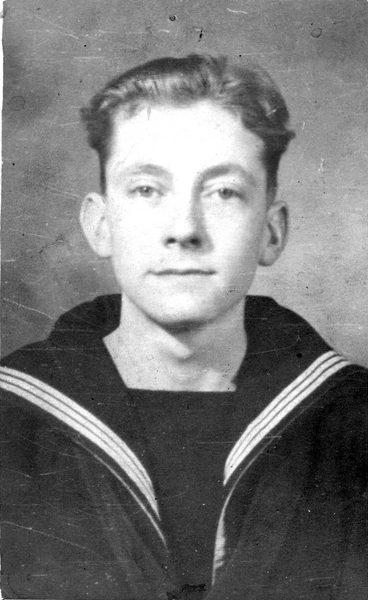
I've done some mono to colour in the past, but I've only recently begun to try it in AP. I scanned some old family photos a few years ago, and these two are of my grandfather and father (he's the younger one!) taken about 1949 or 1950, when Dad got his call-up. Granddad was a Special Police Constable, and they must have been showing off their uniforms. I'm pretty sure they were taken on Dad's camera. Anyway, to business -- I've reduced the images after recolouring, which cuts down the noise somewhat. The left-hand photo didn't look natural enough, so I tried Filters>Colors>Auto... (all four) and got the result on the right, which looks a bit more natural. Didn't work on Granddad though! I used a separate pixel layer for each colour, trying different combinations of blend mode and transparency till I was satisfied. Dad's eyes are a little stark, and there are some hard edges which need softening up ... but I'm still on the learning curve, and any constructive criticism will be welcome.
-
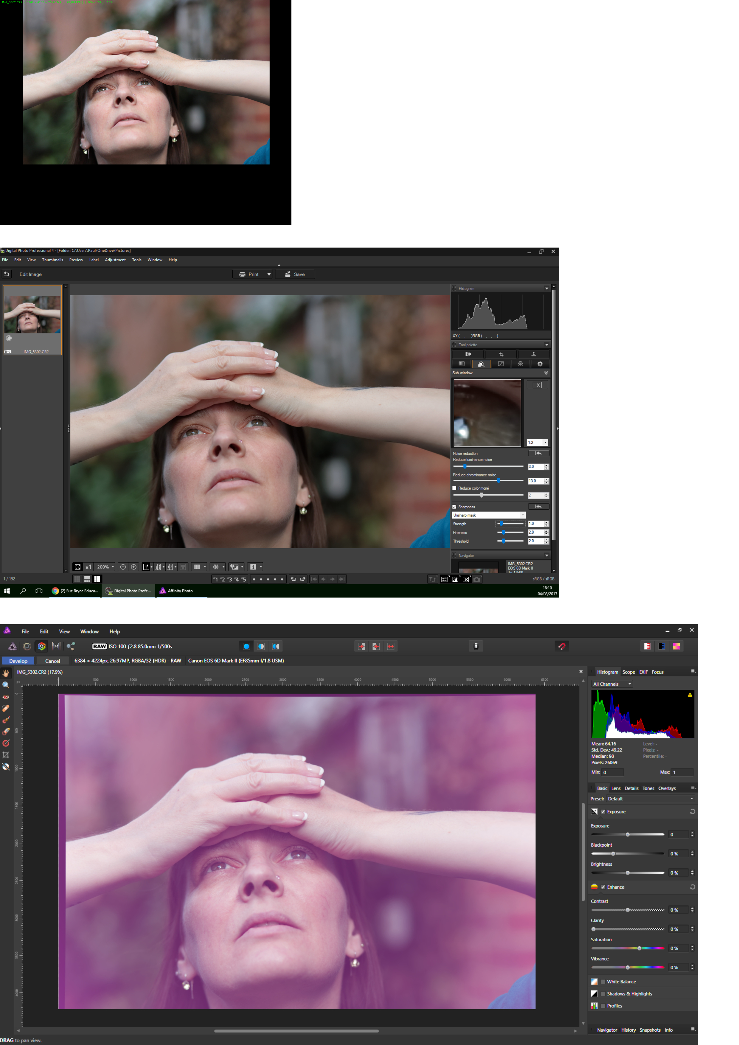
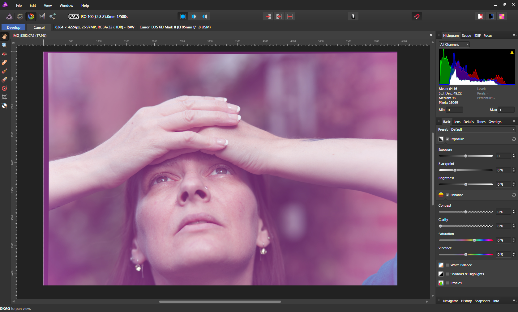
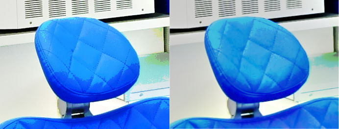
 Hi, I am having trouble with opening RAW files. It seems to have happened after the programme crashed last night (I didn't bother to restart it as it was past my bedtime) For some reason today, when I try to open a raw file, I am getting a weird purple hue. It seems to be taking a lot longer to open them too. I know it's not the files as they are opening ok in both Cannon DPP4 and Faststone. I have been using Affinity Photo for months now and this is the first issue I have had with it. Attaching a quick set of screen shots so you can see what I mean.
-
 Hello This is my first post here. I just bought Affinity Photo for iPad and the first thing I tried to do I can't seem to do. I want to use a brush and select a color from the photo. I have the brush tool and see the color picker but cannot see a way of getting the color from the photo. Also I have no idea what the little circular tools are next to the color picker. Is there a manual? Cheers. Martin
 -
 When I start a new document with a non transparent background the BG is shown in white ... when adding a pixel layer now BG is shown white but the thumbnail shows the BG in black (or similar). Is this a bug? From my understanding unless the BG is NOT transparent there needs to be some kind of BG colour (and consequently some kind of "layer" containing this colour). Even if only a textlayer is applied the BG is exported as shown (white). Is it some kind of imaginative BG that still is exported but can't be edited nor it is shown in the layers list and where I can't choose the colour of? This seems not easy to understand and somehow inconsistent to me. Maybe I did not fully understand the concept? Cheers, Timo (latest Beta)
 -
I launched AD beta build 1.6.0.74 (in Light UI mode) for the first time, drew a closed curve with the Pen Tool and clicked on the Colour Picker colour well in the Swatches panel. The colour displayed in the colour well was the default RGB red (#FF0000) but the fill applied to the shape was purple (#5C0EE4). Closing and relaunching the app has made no difference, nor has switching to Dark UI mode. If I go to the Colour panel and enter #5C0EE4 for the fill, the colour I actually get is #5097AB.
-
 Looking to upgrdade my graphics card, and seeking to establish which cards are compatible with Affinity that will offer a 10-bpp display. I know Photoshop has a real compatibility issue regards displaying in full colour 10-bits per pixel with anything other than Quadro or Firepro cards which are a tad expensive if you want one capable of running the odd game or two. I am looking at something like the RX580, or the GTX 1060 - both of which I understand offer full 10-bit displays. Neither of them will offer 10-bit in Photoshop. Question is, will they offer 10-bpp in Affinity? Does Affinity actually have a list of 'recommended / supported' cards? i5 4670 16GB Hyperx Fury (possibly looking to bump this up to 32 in the near future) GA-Z87 Motherboard XFX GA 7870 Graphics card 2GB [which will be replaced imminently!] Dell Ultrasharp UP2516D 2560x1440 [100% Adobe RGB, 100% sRGB] Thanks in advance,
 -
Hello, I'm very glad that we now have a glyphs browser, but I personally feel that its looks can be improved. Virtually all typefaces are made primarily for use on a light background, and to correctly evaluate a glyph I think the glyph browser should reflect this by having a white background with black glyphs. Right now the dark UI theme shows light glyphs on a dark background and the light UI theme shows grey type on a light background (which is better but lacks contrast). The font dropdown however does have black type on a white background in both themes, which I think is a good choice. Looking forward to your thoughts! Best, Bauke
- 5 replies
-
- 1
-

-
- colour
- glyphs browser
- (and 2 more)
-
Sort Swatches by Colour in the Swatches panel is good... But to be able to sort the swatches by Hue, Saturation or Lightness would be great and very useful. Is this possible? Please! :) :)
-
 Hi, finally the moment has come that I have to ask for your help. Untill now I have always managed not to take your time, but now I am simply stuck. I am trying to make an HDR using 3 perfectly aligned photos of different exposures... Ususally I have no problem in doing that but in this case the result is terribly "posterised". Below are the source photos, and two results - one with all merge options unchecked and one with all options checked (by options I mean "align" and "remove ghosts" etc.). Does anyone have any idea of what might be causing such behaviour?
-
 Is there a way to keep a swatch name when creating a palette from a document, All colours that are created have the document file name followed by a number, Not easy to identify when colours are similar to each other.
 -
 Will Affinity Photo and/or Affinity Designer be able to use the new color fonts that are starting to become available? So far they only work in Photoshop CC 2017. https://www.colorfonts.wtf