Search the Community
Showing results for tags 'colour'.
-
 I am wanting to move from Photoshop to affinity but all my existing psd files are printing out alot darker than they do from Photoshop. Is there a way to sort this as this will be the only reason i dont move to affinity
 -
 Following an AP tutorial I have created my own swatches. I use 5 colours palette that to my judgment correspond well to what i see in the original (template) image. If this is not a case, the 5 colour palette by AP is incorrect, I create a swatch again with a higher number of colors and make my selection to limit them to again 5. When color grading with 5 colours I add 5 colours from the swatch palette very carefully by ensuring that the Location value on color grading scale matches the Lightness (L) value of the color an indicated in a window for color picker. When I copy the colour palette from the swatch and apply it to my own image the result is different as regards tonality. Some additional adjustments are needed to match my image with the template. However, it is almost never the same. Is it what correct? Using swatches for color grading does not guarantee that the image that is edited will match the template and there might be differences?
 -
I have been learning to use the color grading technique by using swatches and LUT created on my now swatches. I have noticed that there are differences in color tones in my final images after the color grading is applied. I use 5 colour palette created from Image, saved on Location: Application. I have followed instructions from one PS tutorial and when adding colour from a palette to grade scale, I make sure that 2 colours, the two between black and midtown, midtown and white, are given values corresponding to L value showing up in the color picker window. Unfortunately, I cannot add the L value for the white and black point, as the Location box for these two in AP is inactive. The PS tutorial proposed also one step more: match the tones of colors by adding the tones values to the curve (see minute 8). I don't find this option in AP, when working with a swatch there is no way to adjust the curve. Any idea how I can match better the tones from th template in swatch palette? Please see the minute 8 in this tutorial. I do not know how to replicate this step in AP. Is it possible?
-
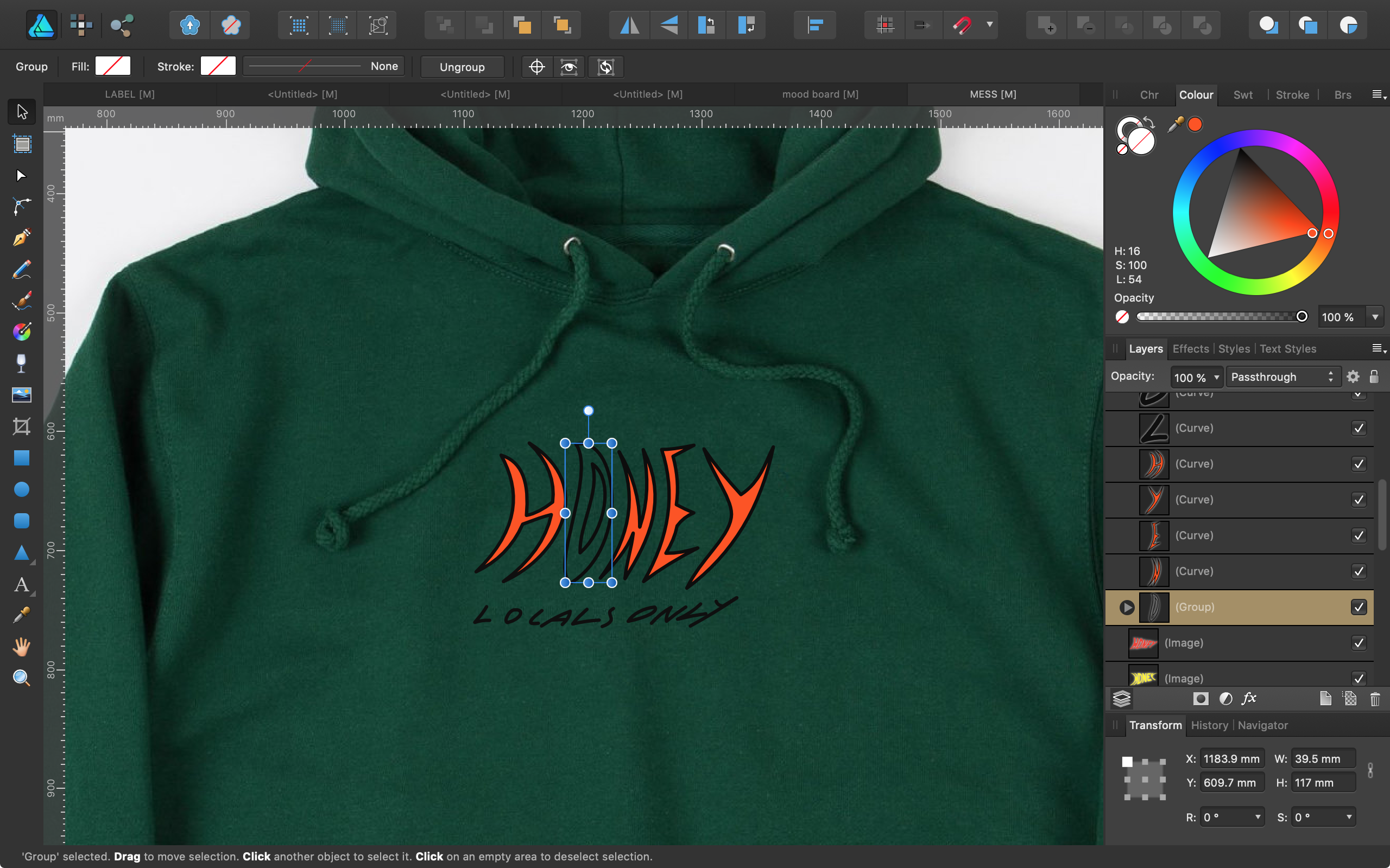
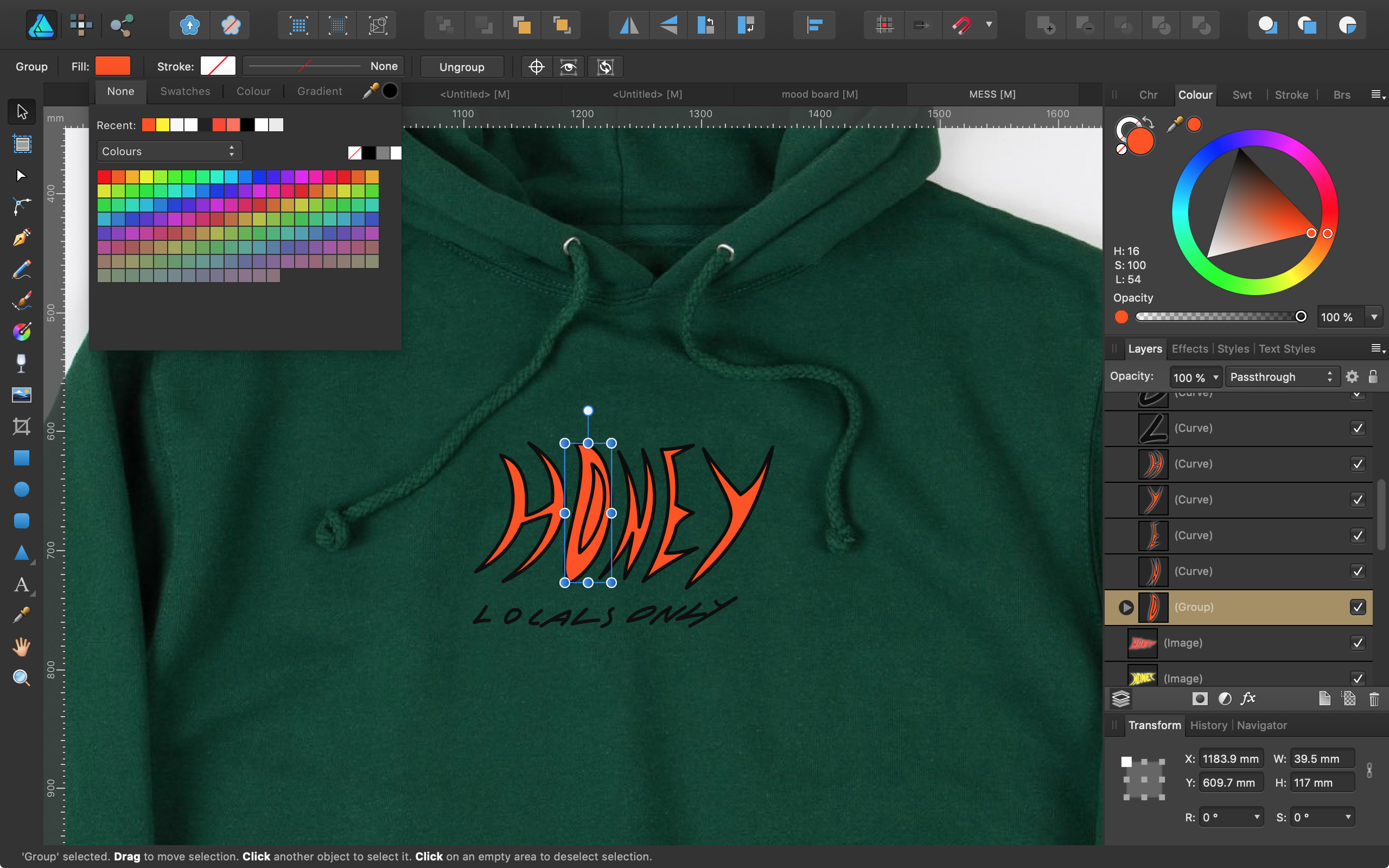
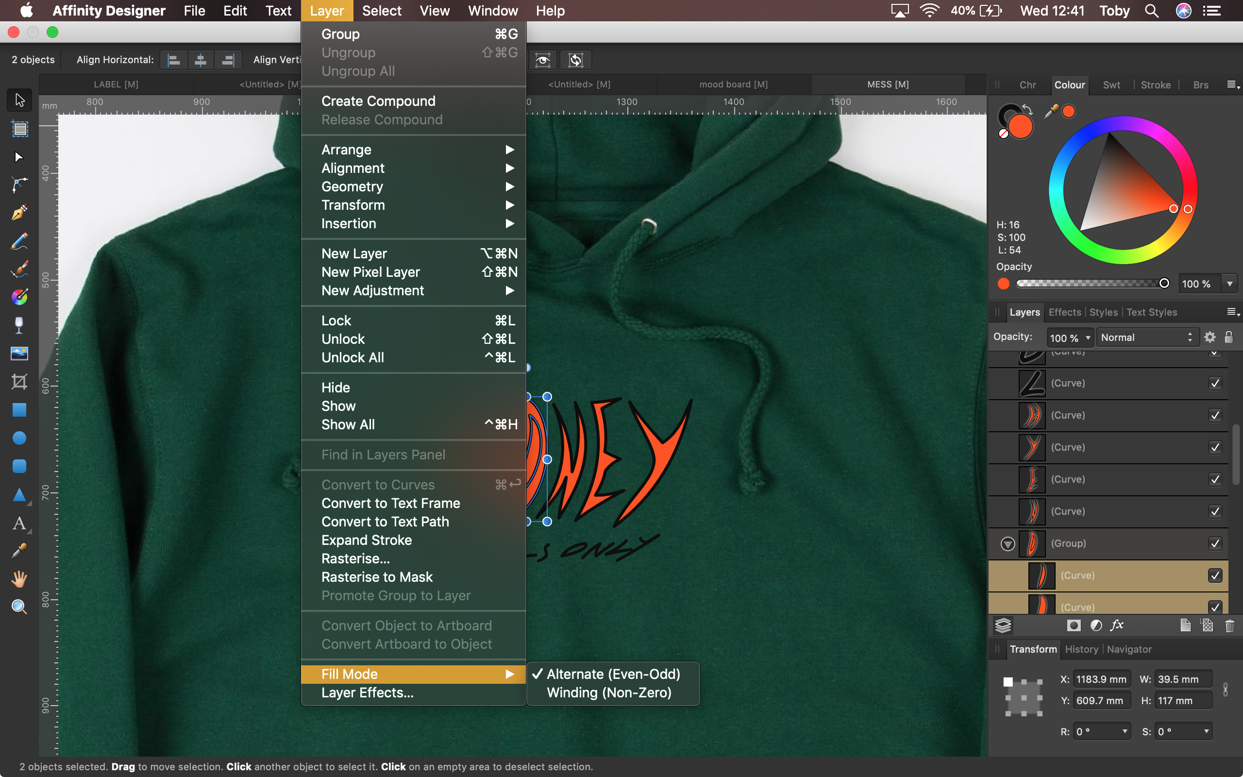
 Hi, I'm trying to fill a capital 'O' without filling in the middle of it. As seen in the attached screenshots. I found a post with the same issue, there they were told to select the individual curve layers rather than the group, and then change the fill mode in the layers menu to "Alternative (Even-Odd)". However, I tried this and it didn't seem to work. Is there something I'm doing wrong or something else that might work? Cheers
-
Windows 10 Home 1903, Publisher 1.7.1.404. I created a new document, changed the margins, added some row/column guides and created some global colours and I now find myself in a strange situation where the colour of the only layer in the document is different in the master page to how it shows in a ‘normal’ page. See attached GIF and AFPUB. I saved the document and re-opened and the problem is still there. I can also change the colour of the layer to any other colour and it stays the same colour on the ‘normal’ page. The Blend Mode of the layer is Normal. Also, when editing the master page linked I can change the colour of the layer on the normal page but it doesn’t change on the master page. I’ve reported this as a bug but am I just missing something incredibly basic here? Note: Please ignore the row/column guides going weird, that's just the GIF recording, they're fine on-screen. mis-matched-colour.afpub
-
Hi there.. I'm super new to designing and started using A.Publisher a few weeks ago. I've been designing a logo in RGB in Inkscape & using APUB to do all my file conversions especially for stuff I need in CMYK. I'm aware that CMYK colors will usually come out differently from RGB when it's sent to printers. Anway, I decided to just do a quick check on my colors and noticed that the CMYK values that's been generated by APUB don't match the RGB color's supposed CMYK color.. example. I have a color #134A84 which https://www.htmlcsscolor.com/hex/134A84 tells me should give me a CMYK value of 86/44/0/48 but in APUB, the CMYK value showing is 98/79/22/7 instead. When I plugged in the value of 86/44/0/48, I obviously got a different color and the RGB hex became #004B79. So I guess my question is, does APUB convert our RGB colors into CMYK to match what I actually see in RGB or is this a bug? This is a concern for me because I'm working on this for a client and want to make sure I deliver the right stuff. Thanks in advance!
-
Since I have updated Affinity Photo to the latest version, I am having a colour issue. When I pick a colour with the colour picker and start using that colour with a paint brush, the resulting colour is far off the colour I picked, eg. colour picker displays red, brush paints in yellow. Blend mode for the brush and layer are set to normal. Please see screenshot. Not sure how to fix this, I am running MAC OSX High Sierra.
-
I've had an enquiry for some A5 and try-fold leaflets set up in black and 1 spot colour so thought I'd run a few test in Publisher and just made a quick screen vid capturing Affinity's amazing flexibility - I remember having a go in Designer around two years ago and having to give up - just shows how things have improved - would still love to be able to use masks so as to get soft edges on some things (spots always seems to turn out CMYK with a mask in my tests) but I'm really chuffed that it all separates correctly Spot.mov
-
 This is a video of me talking about a couple of the problems with how Designer deals with color, and likely Affinity Photo as well. And this video should explain at least somewhat well why the gradients are too dark. If there are any Affinity devs active here, a response/acknowledgement of the problem/solution from them would be appreciated. Thanks! P.S. Shortly after I made this vid, I actually did go and buy AD. So I hope even more now that these problems get fixed. Like the point I tried to make in the video, would these issues really be that hard to program out? affinitydesignerproblem.mp4
 -
 I'm a bit confused with the behaviour of the "none" colour while brush painting in pixel persona. I can set the colour of foreground and background to "none", what is also indicated by the red diagonal line. This is fine until I choose the Paint Brush Tool and start to paint something. The colour of the foreground changes automatically to white indicated by the white circle, but the brush is painting nothing. Because before the sellection of it the colour was set to "none". But why is than the circle indicating white colour? Either it should stay indicating "none" (red diagonal) or it should paint with white colour. This would by logical, am I right?
 -
 I have been working on a print doc and using the same few colours. Is there any way to save a custom palette or list of the colours I use over and over again (apart from saving to the swatch dialogue)? And to give them custom names so I can reuse them, export them and import them? Tks.
 -
 I cant apply to a path any stroke width, nor change brush shape nor change stroke colour. I can only apply fill colour. Similar situation is when I try to change stoke width and colour to the artistic text or defined shapes like rectangles or ellipses. I found that this problem disappears when I apply no colour to a stroke, and then I can apply any stroke width, brush and colour.
 -
 Hi all, Probably a really obvious error on my part but the colours shown in Designer are not coming out the same when exported to PDF. I realise my system is not calibrated but I can't understand why there is a difference when viewing the working document and the exported document on the same screen? See attached which is a screen grab of the open PDF sitting in front of Designer's workspace. Any help appreciated.
-
The colour studio is fantastic. Just two things... Inputting colour values Because sampling colours for inspiration and/or use is a daily occurrence in iOS, I have fantastic colour pickers on iOS. If you can enable Affinity Photo/Designer to receive colour values manually, such as Hex and RGB values, life would be infinitely easier. This means would avoid... Working on an approximate colour in the colour wheel and sliders or... Importing an image of the colour source onto the canvas, and using the colour picker on the imported image (which often happens). Manual input of colour values will not only be easier and faster to work with daily, I will have the precise colour I am after. Exporting colour palettes If you can allow Exporting of colour palettes for future reference, would be fantastic rather than the only option to save them in the document. Remembering which document a colour palette is in can be tough, especially if the palette was created months ago. Having palettes at the application level is fantastic, so thanks for that. I usually have palettes at the document level as its the only way I know the palettes are backed up somewhere. Hope I’ve made sense and is something that can be put into both Affinity Photo and Designer on iOS.
-
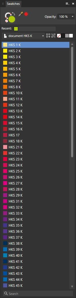
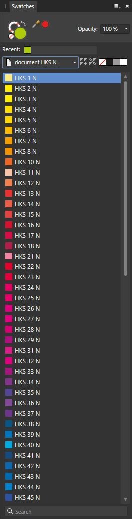
Hello my Friends, I hope that HKS will be included in future in Affinity software alongside Pantone. For time being, I've prepared CMYK versions of HKS colour systems for coated (K) and uncoated (N) papers (download attached *.afpalette files). HKS 98 & HKS 99 are gold and silver (same in both). Why? Lots of printers in Europe are using HKS, i.e. Saxoprint and others. :*) HKS N.afpalette HKS K.afpalette Post Scriptum Official Website: https://www.hks-farben.de On Wikipedia: https://en.wikipedia.org/wiki/HKS_(colour_system)
- 4 replies
-
- 5
-

-

-
- colour system
- hks
- (and 1 more)
-
 I’m struggling with pixel persona in Designer on iPad as I keep triggering a gesture shortcut that brings up the colour picker loop when using the brush tool. This means I regularly sample new colours by accident and then have to manually revert to the colour I was using before. I can’t quite work out what combination or sequence of gestures I am performing!! It seems to involve brief taps with 2 fingers, usually when I’m trying to rotate the canvas, but I can’t work out a consistent combo. help please!!
 -
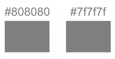
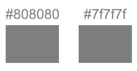
 Hey! I'm having problem with Hexa colour, when exporting it ! So when I try to export something with the #808080, it usually becomes #7f7f7f. On my test, the #7f7f7f can become something else To check, I'm using the colour picker inside Firefox. I tried with Gimp too, same crazy result ! The goal was to use it as an alpha channel... in Gimp, because it can export it to a game texture .dds DXT5. The only format that can be ok to export the #808080 was on my case .gif Gray. You will be able to find all my files in the .zip file attached, to check the colour exported, and the .afphoto to be sure ! If gray file, I can't make #808080, or a pure 50% black............. Do I need to understand something I don't know ? Thx for your help ! 808080.7z Here are different export from the same file, you can use the browser colour picker if you want
-
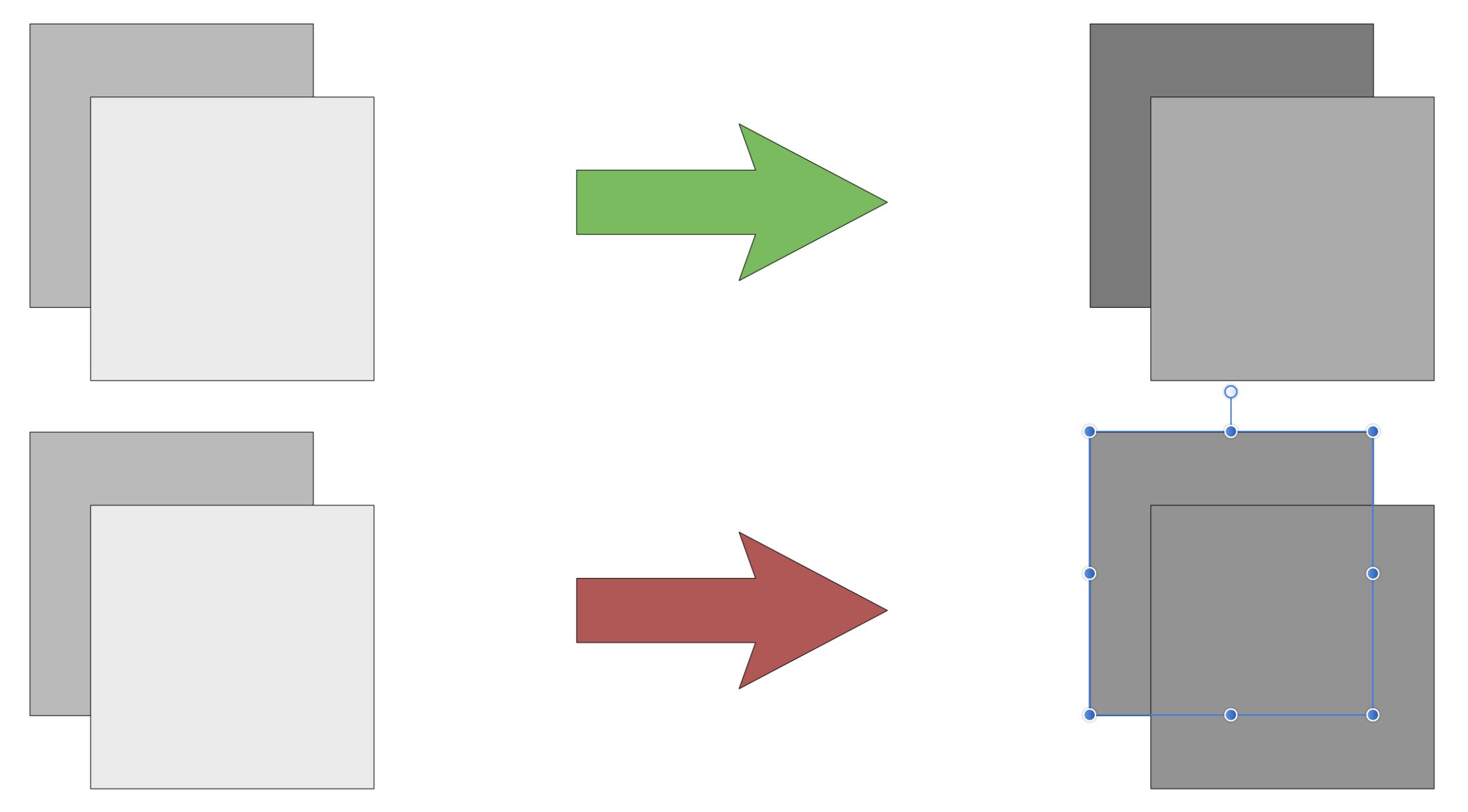
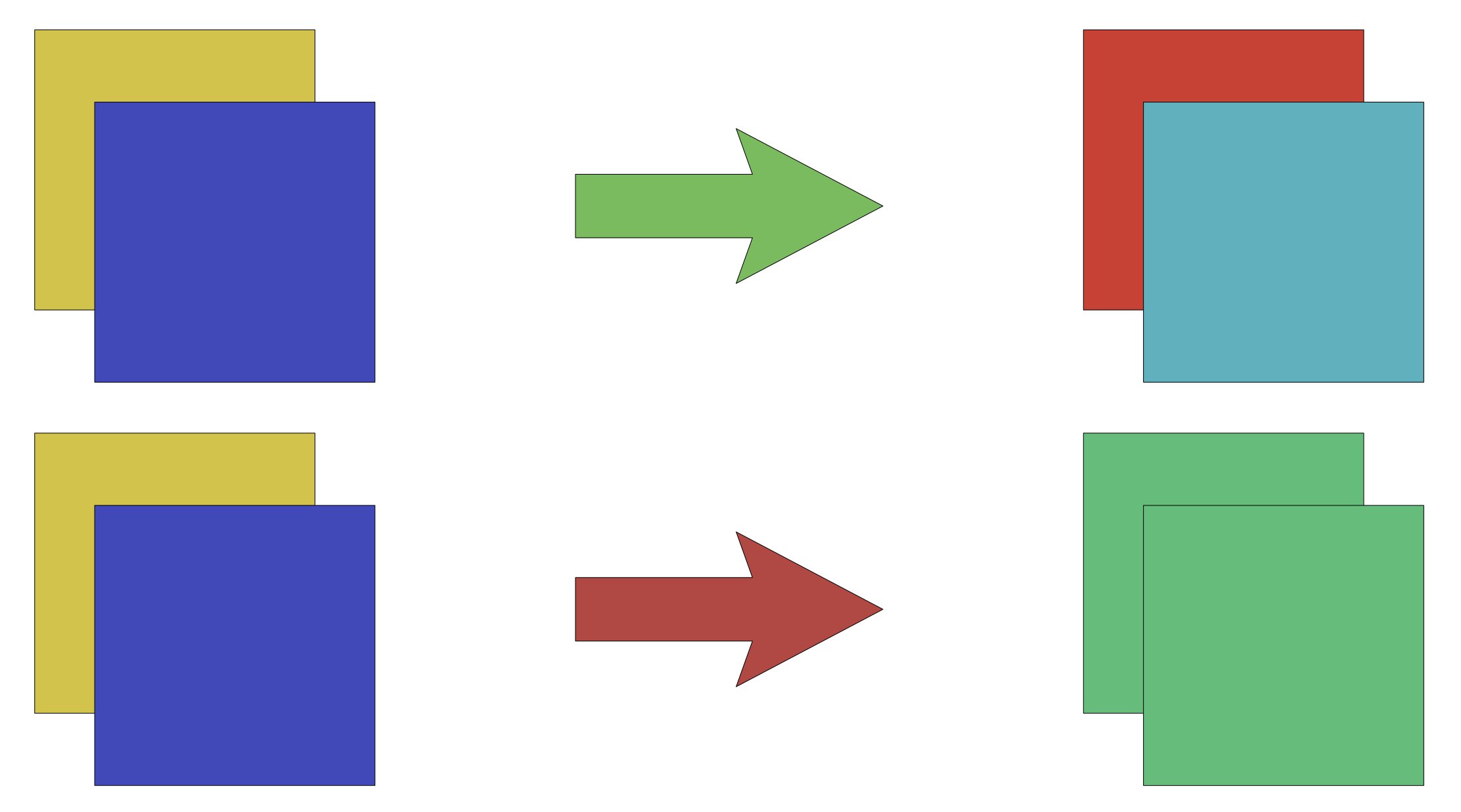
 Hi, I’m not sure what to call this. I want to adjust the colour and brightness in multiple objects but change them respectively so if you start with different colour you end with different colours. There are attached images to help explain what I mean. Thanks for any help
-
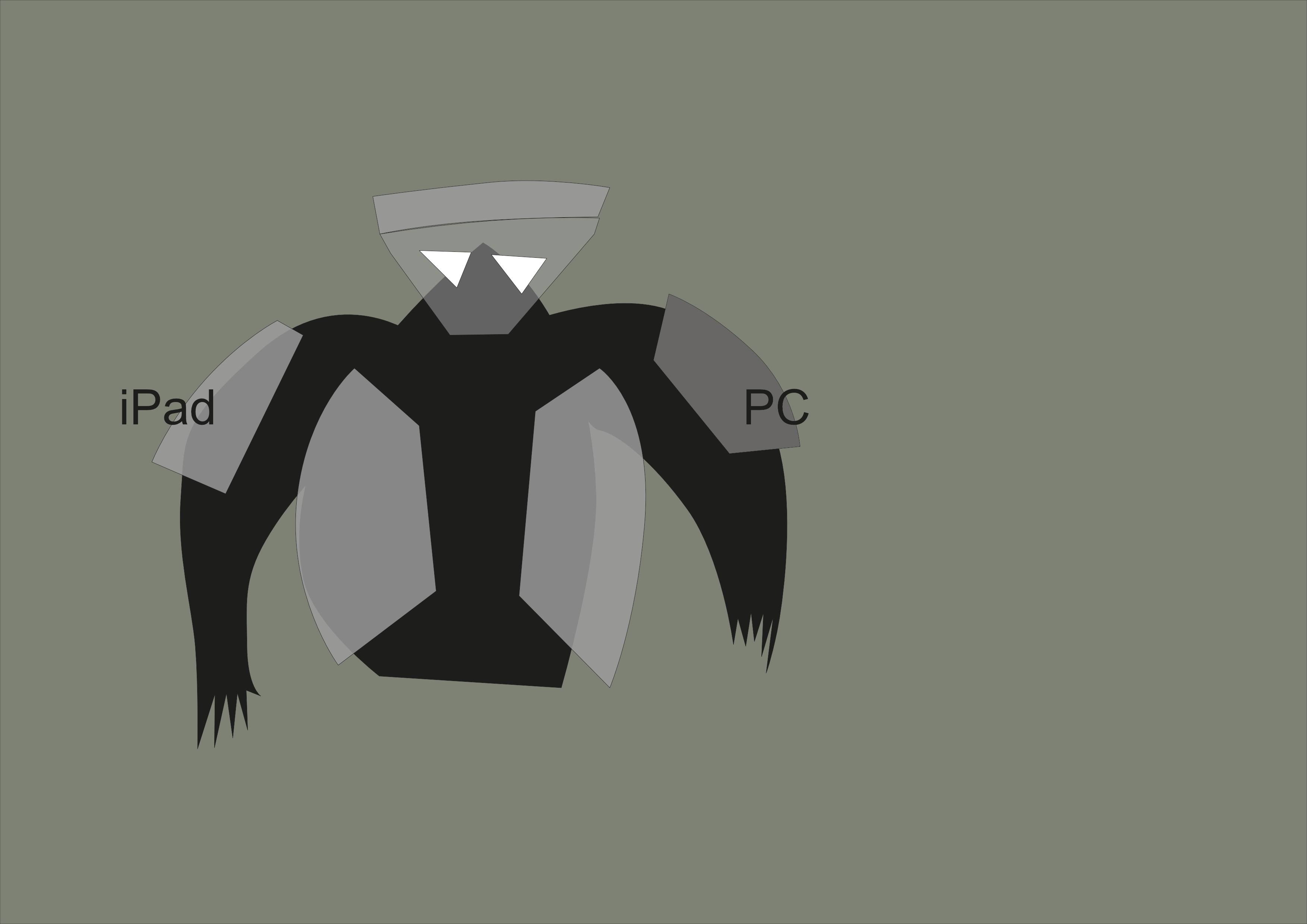
 I solved the problem below. For some reason, changing CMYK 0,0,0,100 to 0,0,0,50 changed opacity in HSL to 50%. Once I put it back to 100% it works OK. I think it may be a bug as it does with every newly created document on iPad, but works OK on desktop. — original question: Hi, I've got a document made in Affinity Designer on iPad Pro 2018. The document is in CMYK. I started to create shapes on different layers using black, and when I make grey fill CMYK 0,0,0,50 it seems to be transparent 50%. When I use exactly same colour from the same palette in the same document on PC, then it's opaque. How can I knock-out colours on iPad so they behave as they do on PC? I must have some settings wrong on iPad, but can't find what. I attach: 1. screenshot of how right arm cover is semi-transparent on iPad and left is opaque 2. screenshot of my colour settings on iPad Your help will be much appreciated! mr_1.afdesign
-
Hi, I’ve noticed that in Photo there’s Euroscale Coated v2, but there’s no Uncoated version of the colour profile. Designer doesn’t have any of them.
-
Hi, I’ve noticed that in Photo there’s Euroscale Coated v2, but there’s no Uncoated version of the colour profile. Designer doesn’t have any of them.
-
Hi, I have two HKS (K & N) colour systems as application palettes in A Photo on iPad. I can’ find the option to export them. If it’s not possible, what would be the easiest way to get them to desktop version? Can I transfer swatches from application palette to document palette in some easy way? I would open document on PC and then get the palletes. I hope, I don’t have to type in almost 170 colour values again. Thx.
-
The current colors are really ugly, and intrusive. The Bright colors are distracting from the main artwork... I recommend soft pastels instead of the current options (something that doesn't contrast too heavily from the UI interface too)
-
 Hello, How do you print a spread directly from Publisher? Can someone give me a good reference to printing, one that covers printing spread, doing imposition, how selecting specific attributes (like bleed or no bleed, trim marks etc.) affects the (seemingly) endless options on the Export to PDF drop down etc. I am having a very hard time printing my work. I did manage to print pages successfully but just can't manage to get good spreads when I have to go through creating a pdf first. (I do make use of soft-proofing, use an NEC PA271Q monitor (that I keep well-calibrated) a Canon PRO-100 printer, Red River Ultra Pro Satin 4.0 with the appropriate ICC profile.) The printing I need right now is for an Exhibition taking place in Scotland in April, so this is (for me) a very serious problem. Any help will be greatly appreciated. Sincerely, Robin
 -
 It took a while to make Tabs work in Affinity Designer. Perhaps it's a better way of doing it, but it's so different to what I am used to. It would be nice to have the option of setting all distances from the left-edge as well as what is the default of setting the distance of the current tab from the previous tab. I am mocking up an existing client's form so I can edit it as required for documentation purposes. The text needs to be black and the leader needs to be grey. The leader needs to be thinner than Affinity's default tab leader. How can I modify the line weight and colour of the Tab Stop Leaders?