Search the Community
Showing results for tags 'colors'.
-
 when I open a file it comes in with a strange color hue. Tried as a PNG and JPG. should be blue, but comes in brown. restarted AP, but still does it.
-
 This is actually still not happening. Thanks!
 -
 Hi there! I just made a quick test in Affinity Designer where i testet the "press ready" preset for pdf export. Previewing in different apps after exporting, the colors look all flat and greyish. Is it due to build-in softprooving of affinity pdf's or is there something wrong in my process? I put my example in the video below: export-test.mov
 -
 Hey Getting are really weird output on PNG slices. Something is a miss with the slice module. Never used to get these issues, including and still unanswered naming of slices and artboards. When I ouput the file to PNG, it saves in a odd format. Hard to explain, see pics below. They are even wrong when posted to INSTAGRAM and FACEBOOK. Any thoughts. I have now been outputting in JPG , no issues there. But something is miss in PNG. so the last image shows you how it is in DESIGNER, but how it shows when uploaded. Background is all dark, and top HD logo not show MULTIPLY layer style correctly. Gary
-
Hi! Strange thing is happening when I open one of the svg files. AD shows completely different colors compared to Chrome/Mac preview. What am I doing wrong?.. Svg file: https://www.dropbox.com/s/alo2vtoxcqkk6sg/image_10_12.svg?dl=0 As it's rendered by Chrome Opened in AD:
-
 I don't have a problem getting access to full range of colors when I upload image w color or create my own from scratch but when I try to add colors to a black and white tiff image it converts all my colors to gray scale. Even when I can get to the menu to give me the option of selecting a color once I select it as my fill option it instantly turns it to gray. Am I missing something? Please help.
-
Hi! I love Affinity Designer, BUT this problem is a HUGE headache to me I set a color that looks great in the workspace (within Affinity Designer) to my text, objects, etc. I export it and ALL THE COLORS are extremely OVERSATURATED, a moderate yellow looks like a highlighter yellow, Please fix this issue and help me QUICK! The image on the right is the one after export opened in windows photos, left is affinity designer
-
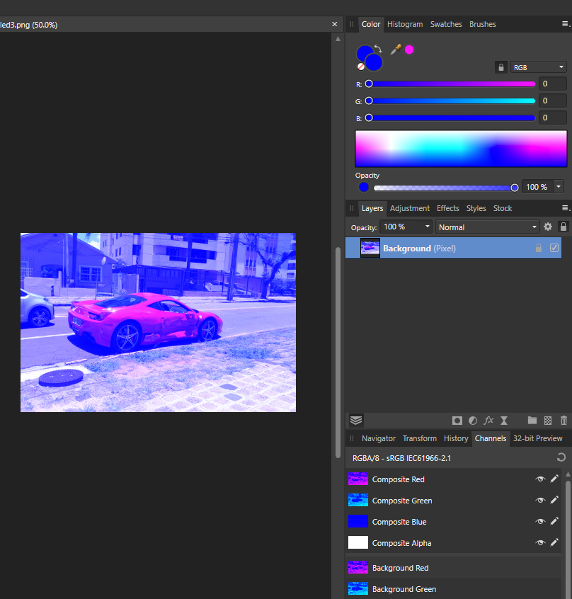
 I'm new to Affinity Photo|Designer and also new into the community, so Hiiii everyone! nice to meet you all! ahahahah My little problem is this: my color picker (in both designer and photo) only give-me Blue-ish colors to pick, the images attached shows how it look like. What I did so far: around 2 hours of google search, changed options, uninstalled both Designer and Photo and reinstalled them. Any photo I open stay in this blueish, my color palette only show tons of blue/pick. Guys, please help, I dunno what more I can do to fix this...
-
 Hi, i have installed affinity photo without changing the settings. when i open a .png the colors are different (darker) than on the original image attached a screen the left image is opened with affinity, the right image with another program all other image programs show the colour correctly as shown in the right picture, this does not happen with every image, but with many images and I cannot find the solution thanks for help Margoux
-
 Hello, I have the sony a6400 and for some reason affinity is displaying the colors way too dark. The Windows preview shows the image in the right colors and also of course the sony memories app. I attached a picture for it. I guess it has nothing to do with the camera settings since other apps can handle it. This problem is driving me crazy and i already resetted Affinity with the CRTL method. The upload is not taking png's and the error when uploading is -200 (Maybe change that?).. Not very helpful so i had to convert is to jpg for the upload.. Sry the interface is in german but i guess you know where it all is.
-
I have created a test file for spot color output. I cannot get the spot colors to output to spot only cmyk or rgb. I have tried PDFx4, PDFx3 and PDF1.7 in Affinity photo 1.7.3 and 1.8. Any guidance on this is appreciated. I am trying to use Affinity as an alternative to Adobe. See attached for file screenshot. Attached working file also. moontest.afphoto
-
 I switched from GIMP to Affinity and I miss the possibility to use colors across images. I try to explain it with an example: For re-coloring the eyes I need the colors #009100 and #2996FE. This color I can also create and use via RGB Hex. They are also shown as last used colors. Now I open another image file and there the last used colors are empty. So I have to define the colors again using the hex values. At GIMP I have the last 12 colors globally available for all files. Is there a way how I can get something like this under Affinity?
 -
 Hello guys, I learn how to work with Affinity Photo. I have got enclosed a file from this source https://discuss.pixls.us/t/out-of-the-box-raw-rendering-not-up-to-jpegs/6669/23 and I have tried to change the colors of the bridge. In another editor, I can change the colors quite well but in Affinity Photo is a problem for me. If somebody can help me with how to correct these colors I will be delighted. DSCF1110.RAF
 -
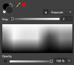
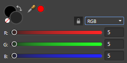
 I started making more images in affinity photo again and I've noticed that the colors are extremely off. The colors appear much whiter than they should be. Here is an example: The grayness scale RGB Color What the actual color is As you can see, the grayness is much higher than it should be. When I use a color picker, the image's rgb is 43,43,43, which is much higher than it should be. I can't make any accurate dark pictures on Affinity Photo because of this. Is there a way to fix this?
-
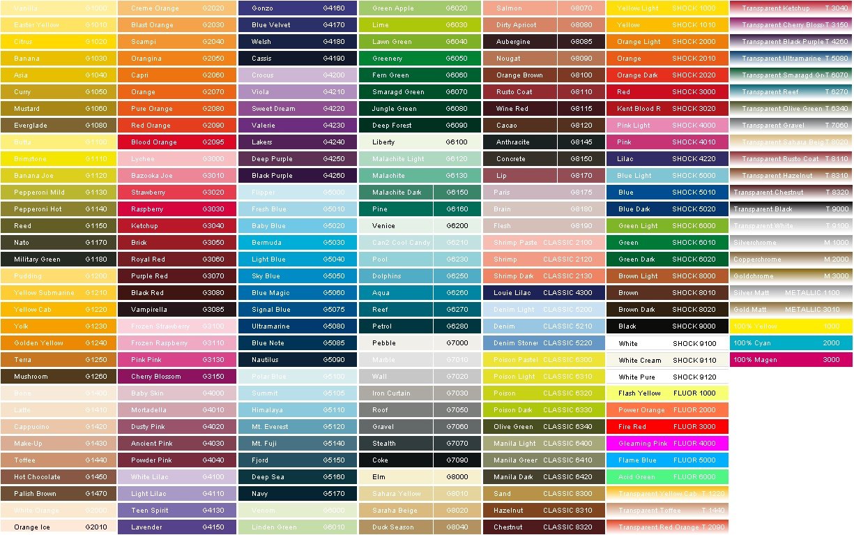
 Has anyone been able to import palettes to Designer on the iPad? I work with Montana brand spray paint and want to be able to import and/or their entire color palette. or do I have to use the eyedropper to import each color individually and name it individually? Also wondering if there is a way to rearrange the colors within the palette list view?
-
 Hello everyone, I'm new in using Affinity. Can anyone tell me, how can I set changing line colors in tables? In Indesign there's a possibility to set changing colors in table lines at a table format. Does this option exist in Affinity, too? Thanks in advance ;-)
 -
Link to Metallic Gradients Share Here are some fancy metallic gradients I put together.
- 22 replies
-
- 25
-

-

-
Hello, an somebody tell me why when I try to fill a shape it fills outside of the lines? (Like in the image)
-
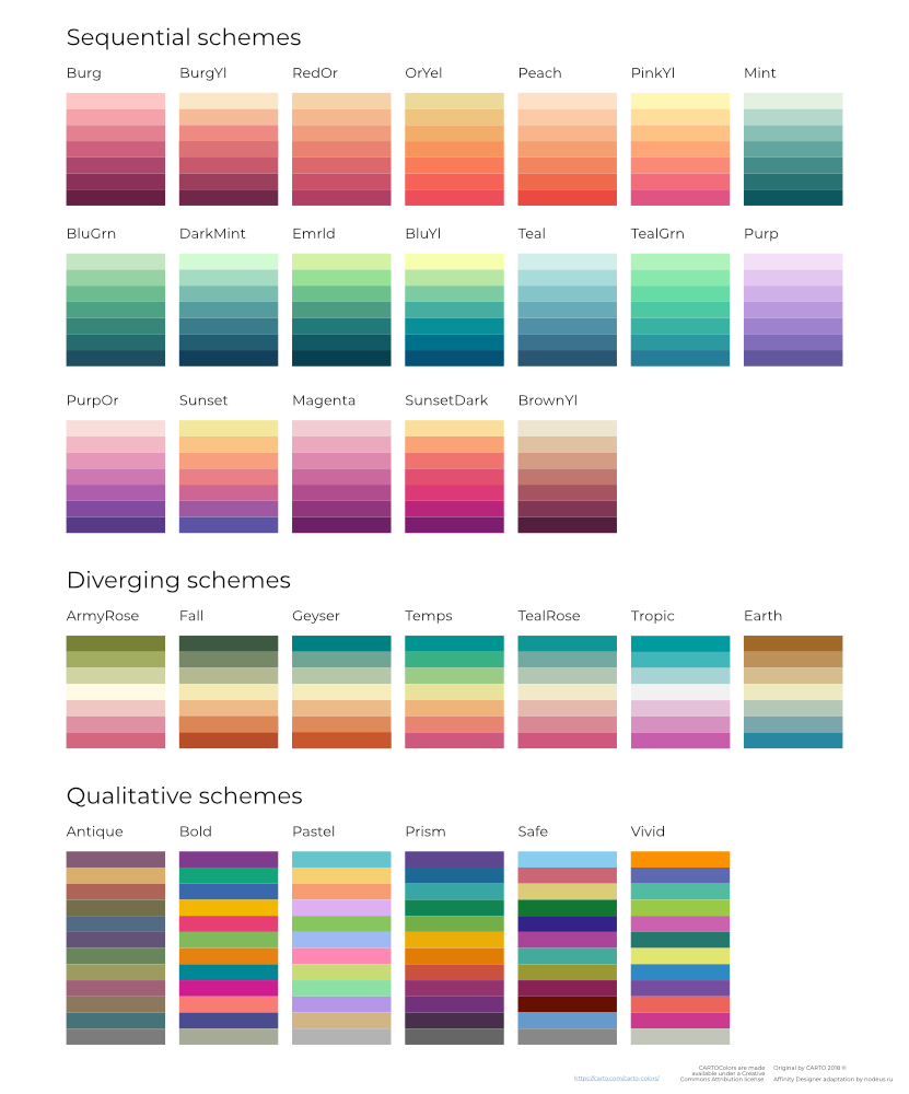
Material Design color palette Last update : September 7, 2019 Version : 1.0.0 About This afpalette file contain all the main colors and variants of the Material Design color palette extracted (manually) from the Material Design Color Tool Website. Getting started Open the swatches pannel (View > Studio > Swatches). Click Panel Preferences (top right of the swatches pannel window) and select a palette type from the Import Palette sub-menu. Locate the file Material_Design_Colors.afpalette and click Open. The newly imported palette will now be available to choose in the palette pop-up menu. Missing variants Some variants are missing : All colors 50 light variants are white (#FFFFFF). Red, Grey and blue grey 100 light variants are white (#FFFFFF). Grey 900 dark variant is black (#000000). Text color swatches For texts on a light color background : Black - Disabled (#000000 38%) Black - Medium (#000000 60%) Black - High (#000000 87%) For texts on a dark color background : White - Disabled (#FFFFFF 38%) White - Medium (#FFFFFF 60%) White - High (#FFFFFF 87%) Readability You can change the appearance of the swatches in the pannel for a better readability : Open the swatches pannel (View > Studio > Swatches). Click Panel Preferences and select Show as list from the Appearance sub-menu. Click Panel Preferences and select Alphabetical from the Sort sub-menu. Sources Material Design Color Tool Material_Design_Colors.afpalette
-
 This is a response to a question by user SunRiseMoon on July 02. 2019. A quick basic drawing lesson. As of this writing, shapes in Affinity designer have 2 attributes, the stroke and fill. Those are defined by vector curve(s). To be filled, those curves can be either open or closed, as long as they surround a 2D area. But if they are open, any "boolean" operation, such as add or divide, will close the curves between the end point of each. This often produces unusable shapes. In Affinity, shapes ar made frome a series of nodes, each one connecting to only those adjacent in the series. The nodes cannot connect to more than 2 other nodes. There is no branching of a curve object. In order to get filled areas of color, if the shape is to be made from the curves that are already there, the curves must be selected, and thru the node tool, joined, and then closed. Sometimes one may need to duplicate existing curves, and cut out sections w. the node tool. These can then be used to create an area that meets shapes that are already there. *** In the owl face example, various strokes were given varying thicknesses by manipulating the pressure curve. Those were "expanded," and added together to form ink like strokes. 3 of the original vector strokes were closed, and so those pen lines could have a fill assigned to them, and for smooth continuous areas of color. Other lines were unclosed shapes positioned either above of below the closed shapes. When the shapes were filled, most were below in the layer hierarchy, and so were hidded by the fill. I selected the "beak" line. See the copies go thru these steps. The line is closed. The closing line is extended upwards for a more natural appearance. A fill is assigned, and the stroke set to "none." the unclosed curve is then matched to the filled curves position, and given a varying line weight. At a reduced size, the beak group was placed over the face. OwlHeadStart.afdesign
 -
 Hi I did the update to the 1.7.0 version. When I export a CMYK .afdesign file to PNG, the 100% white background I made turn into a “yellowish/greyish” white after exporting. It also does it with every other colors. They become duller and not the same as in the .afdesign file I've created. In my Windows folder, it's the same thing. All the previews of my CMYK .afdesign files shows wrong colors. So i've chosen to reinstall the 1.6.5 But it do the same thing again ! I didn't had this issue before doing the update to the 1.7.0 version. And with RGB I don't have this problem. I'm on Windows 7, (64 bits) Can someone help me please? It's stressing me a lot. Colorimetry is already enough difficult when there is no problem...
 -
 Whenever I import a PNG file, colors are all off... at first I thought it had something to do with my color settings, but then I realized that if I imported the same image on JPG the colors were right.
-
 I disabled my right panel toolbars. I use XP and Serif X9.
 -
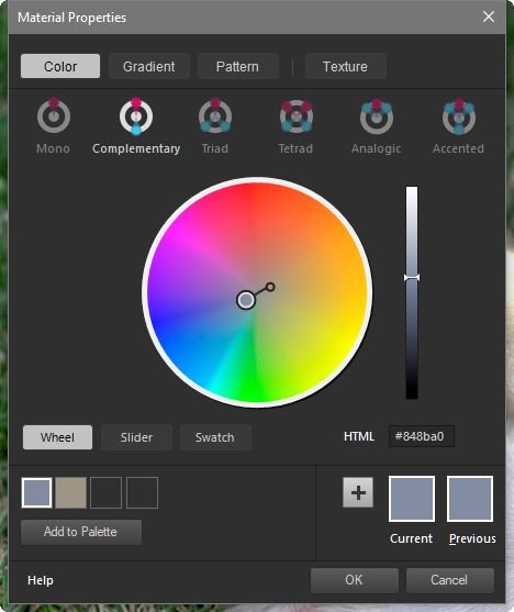
Corel PSP has had a Materials Propery Dialog that presents you with the various options of using Mono, Complementary, Triad, Tetrad, Analogic, Accented choices. I think Photoshop has something similar (where else would Corel get this idea) . I think it would make a very nice, and very useful feature to APhoto. Since there's always numerous requests to add features to APhoto that come from Photoshop, why not add something from PSP?


-15_49_57.jpg.c9becd8b8c8287216183151c2986c7e6.jpg)
-15_50_00.jpg.ad49b8796936c6d7d517cd9d4bdfad80.jpg)