Search the Community
Showing results for tags 'color'.
-
Hi, Please take a look at this video much better than I'll ever be able to explain : to keep it short : blending, as in photoshop, is badly implemented, making these weird dark in-between transitions. Thanks in advance.
-
 The last 1.8.2 update has broken the use of tab to navigate the values of the color panel. You can use the tab to go to next field, but as soon as you type a new value, tab stops working until you manually click into a field again. This worked fine in 1.8.0 and 1.8.1. It seems that tabbing after typing the value deselects the current field instead of selecting the next one. Setting cmyk values is now a slow tab-type-click process. Other tab-navigable panels work fine (for example, transform panels) By the way, this is a good chance to remind you we'd love to have tab-navigation in all panels, not only The Chosen Ones. 😉
 -
 Hi Folks, I'm trying to understand where I make a mistake: I create a CMYK doc with Fogra 39 profile, I place in the layout some RGB images, some texts, colored and 100K and a couple of boxes filled with other colors. When I export them I try to change the ICC to Fogra 29 or SWOP. I expect images to have different CMYK values... and it happens. However this changes also the vector boxes and text, so "Numbers" aren't preserved. Worst of all, also the 100%K comes on CMYK values. I tested some different setup, but when I change profile, numbers aren't preserved at all. Strange. Cannot find a way out of this. Someone could be so kind to explain me what I am doing wrong and how to fix it? Thanks a lot! G:
 -
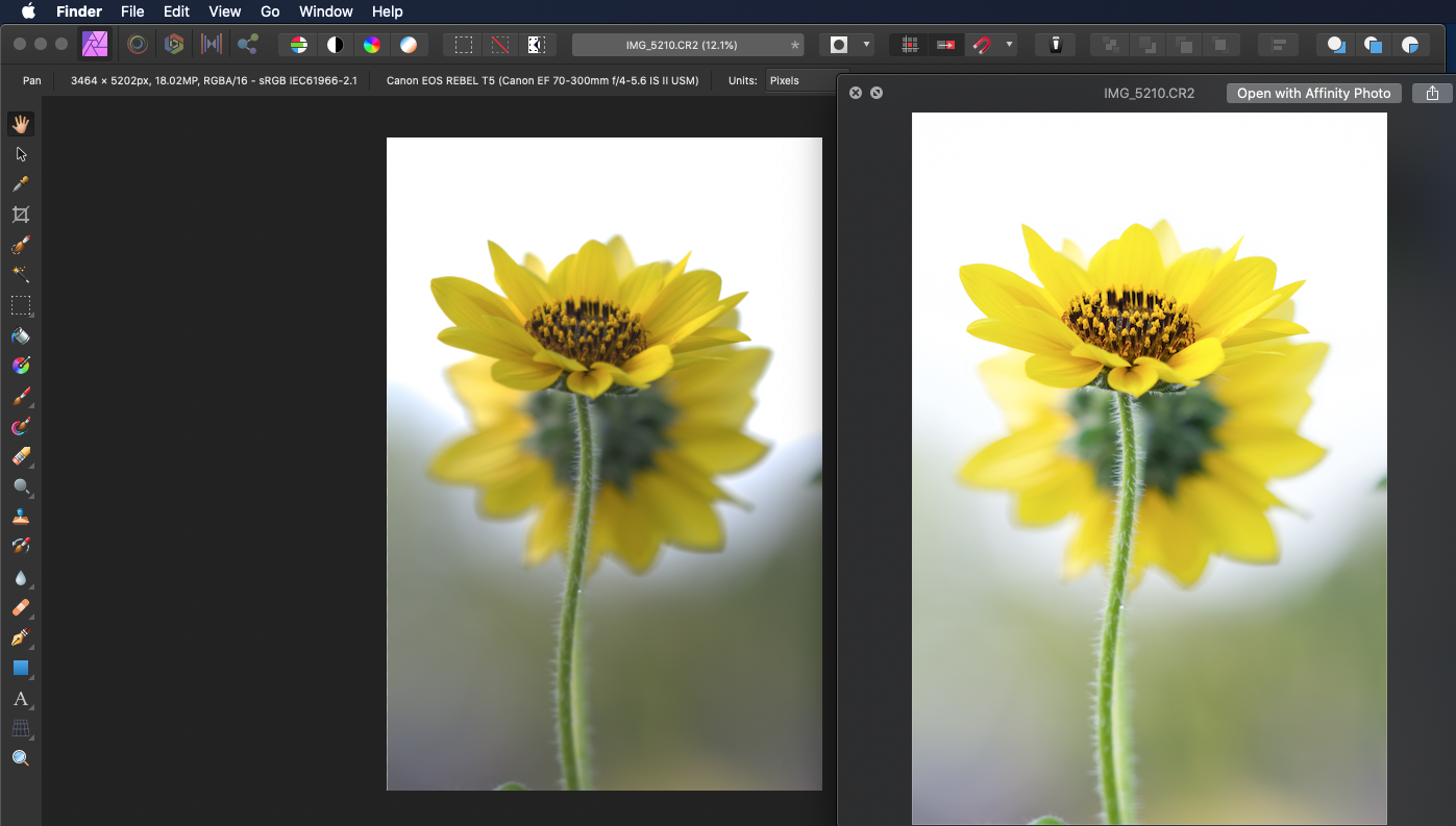
 I've been processing photos with Affinity for a few years now, I've never noticed this much of a difference in the color of a photo from when I'm previewing and then opened in Affinity. I'm not the most knowledgable person out there, but I know enough to know that RAW files are going to be a bit bland before processing, however, I don't ever recall it being this much of a difference. Forgive me if this is normal, if it's not, any tips and info on what's going on here would be appreciated.
-
 Hello! I recently upgraded to AP 1.8.2 (on a Mac Mini, OS 10.13.6). I find that the color selection panel is locked in the slider format. if I unlock it, I am able to change it to a color wheel (my preferred format) but only temporarily: when I leave the color panel and then return back to it, it reverts to locked sliders. Same thing happens every time I open a new document. This did not happen in 1.7.3 How can I permanently unlock the panel so I can move freely between formats or at least lock it as a wheel? I have found no help regarding this either in the forums or by searching in Google. Thanks, Mauricio
 -
 I'd like to see a tool that would allow the user to select all (shapes and/or layers) by color. This would be extremely time-saving when designing logos or making illustrations where you want to show several color variants. Thanks for your consideration.
 -
Help please! I am trying to understand the colour picker/dropper tool and hope someone can advise i have a rectangle, I colour it red ff0000. I create another rectangle, use the colour picker and hover over the first rectangle to choose the same red. the pixel square in the middle of the circle goes red, but it’s not selecting that colour, instead it Selects a grey. I found that moving the picker around the box at some point the outside circle goes red, but as the whole box is the same colour, why would it only be on certain points that it selects? this happens in various tests and means I cannot use the picker the way I’d like which is to select colours from images ive made a video of an image I’ve got. By enlarging, I can see the various pixel colours, but as the video shows, the picker isn’t picking up many of them. please advise, am I doing something wrong? thanks IMG_1217.MOV
-
I add a new photo AP. I go to Color, Swatches,, and Add Document Palette, nothing happens. Am I wrong to suggest the colors from the open photo would be added as swatches? If wrong, how can you obtain photo colors to add to swatches, other then color picker one by one.
-
 Hello! I have a very urgent request and hope somebody can help me I used Affinity Publisher to create an invitation that is going to be printed. The problem is - when I convert in into PDF the color of the image turns out different than the color of a vector that I placed in the same color and a rectangle I also placed in the same color (pipette). I later tried it with the print shop's used ICC profile, but it's nothing better. While the image is the same color as the original (background is greyish blue), the rectangle and the vector are very brown. I have no idea what might be the problem...
 -
 Can you modify the tint of a global colour? From what I've found you can edit the CMYK / RGB etc. values, but no tint. So if I need to globally change a colour from 95% to 85% tint I have to find every instance of that colour or am I missing something? I've tried so many different ways with opacity and tint, but can't figure it out. Many thanks!
 -
 When specifying a color using the color tool (using latest Affinity Designer 1.7.3 ), how can I specify (or obtain) an actual value for the opacity? There is a slider which works fine, however there isn't any numeric value associated with the slider that indicates what percentage of the alpha value you're currently using. Also, the recent colors list doesn't appear to retain the opacity either. How can I input a specific value for the alpha? Getting the RGBA value would be fine, too. So, I just noticed that this behavior with the opacity not showing a percentage value only appears when using the "FILL" or "STROKE" options in the "Curves" toolbar. The dockable tool window with "Color, Swatches, Stroke, and Brushes" tabs shows the opacity percentage, but no hex value. Thanks!
 -
 Hey! So for some reason both my Designer and Photo show whites as yellows. I cannot fix this and I definitely know it isn't a problem with my monitor since I can clearly see the photos I edit as normal before importing them into Photo. Also, in Designer, the empty background is white, but the white brush is not. Please help. Thanks! Examples:
-
 What’s the best way to create this effect (in designer, publisher or photo)? The face and background of each photo have different color overlays. Thanks in advance!
-
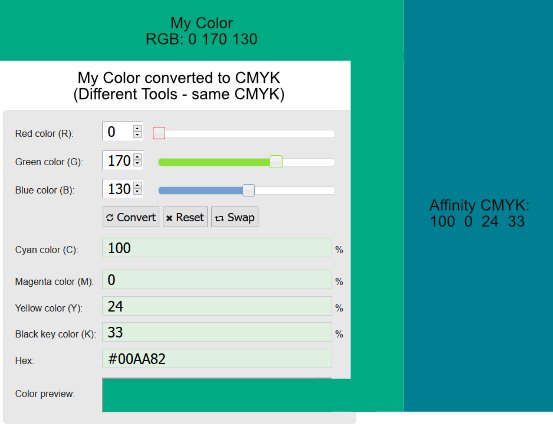
 Hello People, I might overlook something. But I really can't see what I am doing wrong. On the top left, you can see what Color i would like to work with. I was choosing the color in RGB. Because i wanna use this color also for something to print, i wanted to make my color for CMYK. I used for that multiple online RGB to CMYK converters to be sure it's the right one. On the left of the picture, you can see a screenshot from one converter. (The Document was set to CMYK). And now my problem. On the right is what color Affinity gives me when i use the CMYK color code. I also tried the CMYK colors in other programs, they all gave me the correct color which i want on the left. But not Affinity. Is there something I'm overlooking? Thanks in advance
-
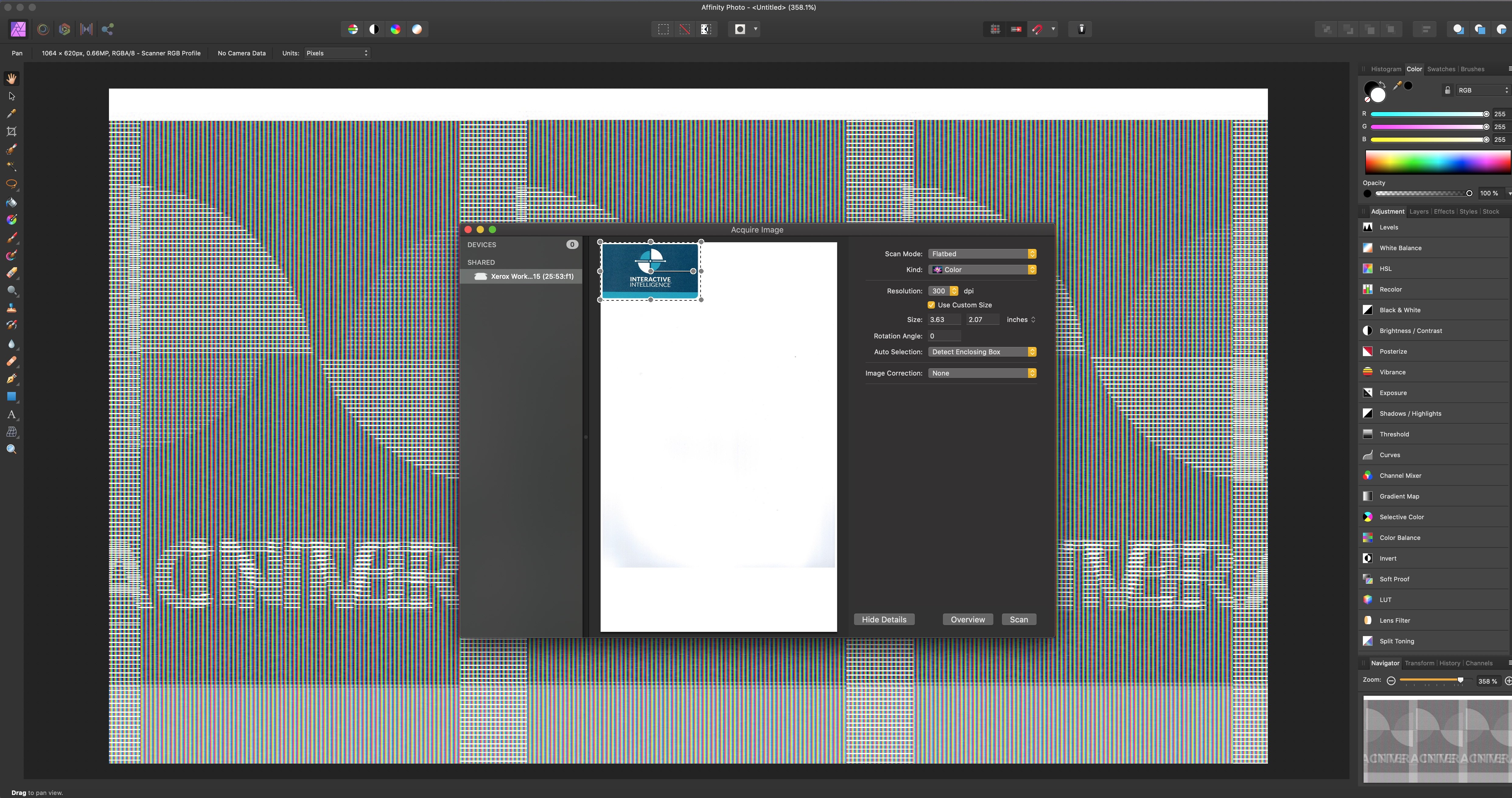
This is a bug report for scanning color documents into Affinity Photo on Mac. Moderator: I was registered on the legacy Serif forums, which did not automatically transfer to Affinity forums. I can reproduce when attempting color scans. (Note: Black & White, aka, gray-scale scans, however, import correctly.) Yes, this happens with a new document. Environment... OS & Version: Mac OS X Catalina (10.15.2) Expectation: Color scan will import / acquire from flatbed scanner correctly in Affinity Photo (attached: see color preview in 'Acquire Image' dialog) Actual Problem: Color scan is rendered in 'color bars' [sic] (attached: notice that the acquired Affinity Photo document renders in color bars) To Reproduce: Launch Affinity Photo on Mac, and access "Acquire Image..." from the "File" menu with a color sample loaded into the flatbed scanner; click the 'Scan' button (attached: screen capture with "Acquire Image" dialog showing the sample Screenshot attached. The scanner is Xerox WorkCentre 6515 with Mac OS drivers installed. Thank you, Ross B. --- Serif user since PagePlus X4 (in 2009), Ten Year Serif Anniversary Desktop Publisher since Mac OS 7.5.1 (1995)
-
 Is there a way I can do this globally? I decided that adding a colored background to my 20 artboards would make it easier to see. I just did a bunch of logo mock-ups and wanted to see if there was a faster way to handle this. I didn't really notice any way to easily change the BG on all the boards so I created a symbol and slowly duplicated and dragged it from board to board and had to redo all my layers to make sure it actually was at the bottom of the board on the correct board but if there is a faster way to handle this I'd be happy to hear it for the future.
 -
 I am transitioning from InDesign to Affinity Publisher. I have an InDesign document that has text with a black stroke and green fill. The letters really pop! (I'm attaching a sample.) Is there any way to achieve this effect in Publisher?
-
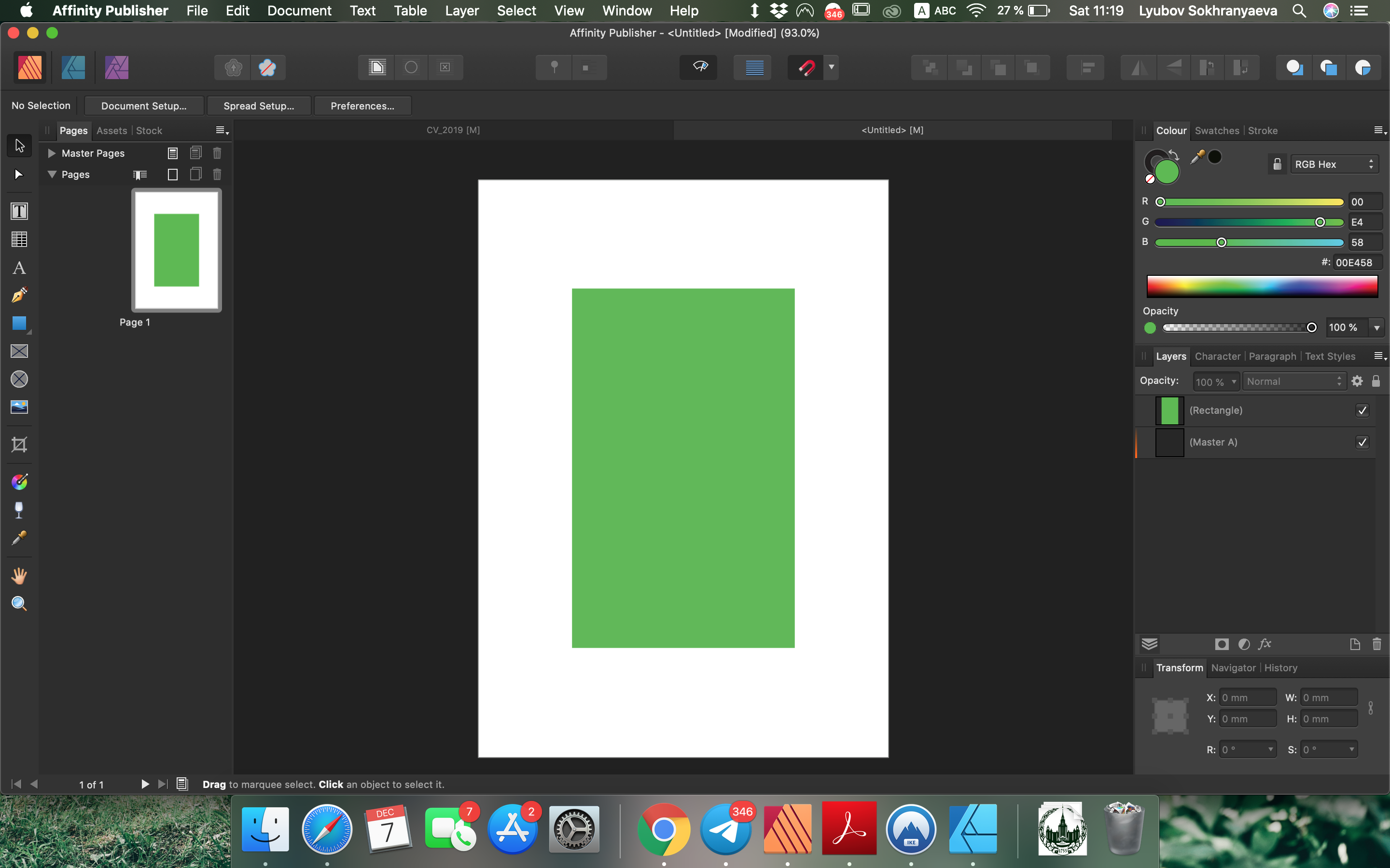
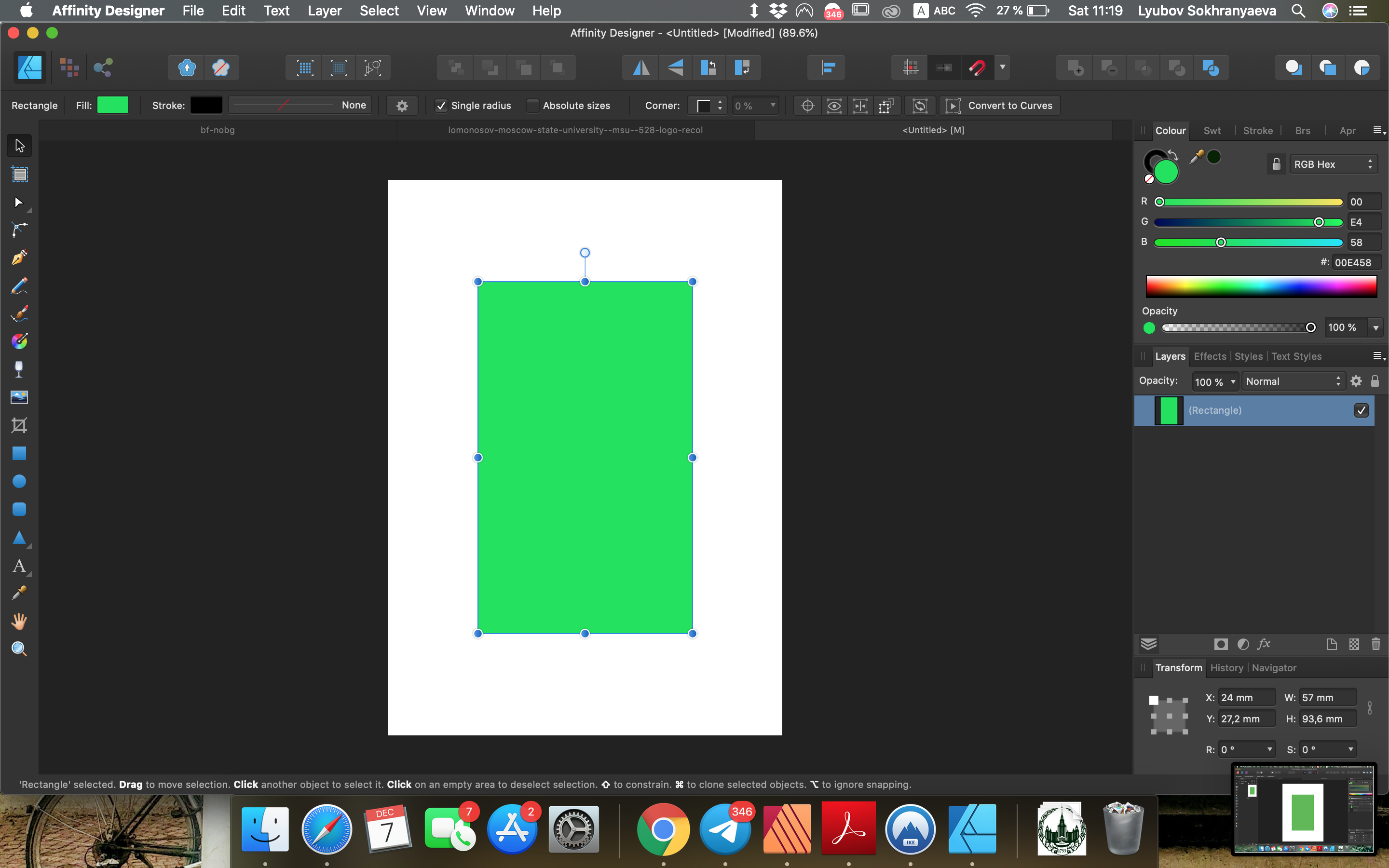
 Dear everyone I recently started using Affinity products and I'm having troubles figuring out why I have incompatible color palettes in Publisher and Designer. Maybe I've messed up some settings or something, but when I copy color number from Publisher and paste it in Designer I get a different color. It looks like the same color is brighter in Designer than in Publisher. You can see it on screenshots attached. This is very annoying and I don't know how to get rid of this problem. I would appreciate your help. Thank you very much!
-
 I am using Affinity Photo and I have exported an image, but the colors are all f'd up on some programs. Attached are some images showing the discrepancy. I have no clue why they won't display correctly on most programs, especially since some are displaying it correctly.
-
 Similar to this: The idea is to add a setting panel for colors that allow to edit the color of gradients, and objects in general, simultaneously or singular Adding other options for the settings, as saturation or brightness Most important for SVG format files
- 4 replies
-
- 4
-

-
- recolor
- transparency
- (and 6 more)
-
I want to edit the color of multiple objects at the same time, independently of their color, Gradients, stroke, transparency, etc Something like this: In illustrator there was two diferent ways to accomplish that, including other modifications available (As saturation and brightness for example), with its own settings panel Do Affinity Designer have a tool/feature that allow to modify the color of one or many objects to other colors?
-
As it is for color, it would be useful to have a quick live preview gradient settings in the studio
-
 Is there a way to click on an object within your artwork and have the swatches palette show you which color is actively selected? I want to build out a colors list and then know which color I’m working with when I select an object I’ve added to my artwork. I use a collection of Montana spray paints and need to know which colors to buy after I’ve designed the artwork.
-
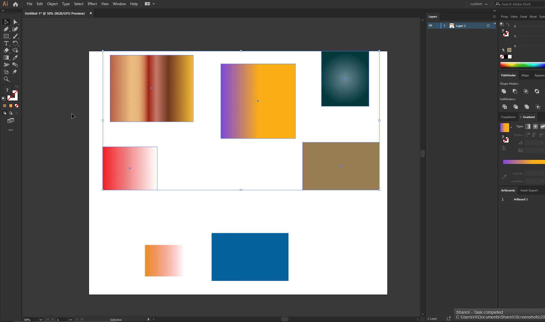
I am doing the graphic design of a game using SVG filesI was using Adobe Illustrator CC, but exporting SVG files in AI ruins the gradient, shapes, so I switched to affinity designerThe problem is that when I open any SVG file, the color of the vectors looks wrong, pale, without saturationI think it could be because the color settings, and display settingsWhen I export the file as SVG, the colors display correctly in other software, such as inkscape/illustrator (as should be) but not in affinity designer, so yeah, the problem is about displaying the colors in the software correctly. _______ These are two examples of the same file open in different softwares - (Affinity open the Affinity file.PNG - SVG screenshot) __ - (Adobe Illustrator or Inkscape or other software or browser open the SVG file.PNG - SVG screenshot)
-
I am doing the graphic design of a game using SVG files I was using Adobe Illustrator CC, but exporting SVG files in AI ruins the gradient, shapes, so I switched to affinity designer The problem is that when I open any SVG file, the color of the vectors looks wrong, pale, without saturation I think it could be because the color settings, and display settings When I export the file as SVG, the colors display correctly in other software, such as inkscape/illustrator (as should be) but not in affinity designer, so yeah, the problem is about displaying the colors in the software correctly _______ These are two examples of the same file open in different softwares - (Affinity open the Affinity file.PNG - SVG screenshot) __ - (Adobe Illustrator or Inkscape or other software or browser open the SVG file.PNG - SVG screenshot)