Search the Community
Showing results for tags 'color'.
-
 Hello , any one knows how can i do this color harmony ? I want to know how can i creat this , i saw a vedio on youtube but it was with photoshop , so anyone knows how to do this with affinity photo or designer ? Thanks Vedio link :
-
 Hi, I'm very sorry for asking this question but it's been driving me insane in the last 2 days. So I have this png file of a bunch of icons, they are all black and white. I want to colorize them to make them super pretty :D Looks like this So I then: 1) flattened the doc just to be sure. There's only one, unlocked PIXEL layer 2) set the color format to RGB16 3) converted the ICC profile to RGB generic 4) selected a part of the (only) layer using the square selection tool 5) pressed the adjustement panel/button and selected "HSL" .... nothing happens. This is odd because it works just fine using a color image (I regularly change eye colors and stuff like that without any issue) So something tells me that affinity doesn't consider black to be a color, but of course if i try to pain over the black it doens't take the aliasing into account and looks terrible. I tried 'filling' the black space with a different color and that doenst replace the black either, it just paints on top (and badly so). So in a nutshell what i want is replace the black and all its gradients of grey that forms the antialiasiang to say, red with gradients of red. I hope this makes sense, again, sorry for the n00b question!
 -
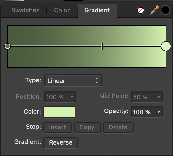
 Look like the gradient tool can't use document swatches for choose color and instead only use blended colors. Is there a way to use the document swatches? I did something wrong?
 -
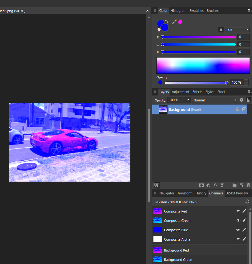
 I'm new to Affinity Photo|Designer and also new into the community, so Hiiii everyone! nice to meet you all! ahahahah My little problem is this: my color picker (in both designer and photo) only give-me Blue-ish colors to pick, the images attached shows how it look like. What I did so far: around 2 hours of google search, changed options, uninstalled both Designer and Photo and reinstalled them. Any photo I open stay in this blueish, my color palette only show tons of blue/pick. Guys, please help, I dunno what more I can do to fix this...
-
 Hi guys, I find the Selective Color Adjustment extremely useful with its possibility to adjust not only selected hues, but also tones. What seems weird in it though, is that regardless of the current document color mode, it operates in CMYK primaries. Surely, this works, but wouldn't it be more intuitive to have RGB sliders as an option? How about a more general selective color tool, that would allow hue range selection like in HSL Adjustment, but also with similar tone selection for shadows, midtones and highlights? It could offer a choice whether you want to adjust the selection in HSL, HSV, Lab, CMYK or RGB. Wouldn't such a tool be more straight forward than variety of different tools for the same purpose, that can only be applied one on top of another, distorting the input color for every next one? Think of it: HSL, Selective Color, Color Balance, Split Toning and Shadows / Highlights are all essentially selective color tools, but for some reason each of them lacks some functionality that others offer. I understand that they are important to make transition from Photoshop easier, but Photoshop is a very old software with legacy of limitations and concepts changing over time. Affinity Photo, being a new application designed from scratch, can be more streamlined and logical, while also supporting older Photoshop approaches for those who need them. Why can't we have one adjustment layer where all the tuning based on hue and luminance can be made in one place using same consistent logic? If you care about a possibility to separate adjustments into steps, you could just apply this tool several times, and each instance would adjust different things, but using same simple idea. P.S.: speaking of HSL, I think it should use Lightness slider instead of Luminosity, because Lightness is what L stands for in HSL.
-
 Hi, So my cat walked on my keyboard, and now I can only go for a black grey or white color. Can someone help me to get the colors back ? thank
-
 First i asked that question that question on facebook and it failed. Many didn´t understand that question correctly and told me about the basics about color-management and how that is a bad idea,...... that´s not the question. If i let´s say have a AdobeRGB Document and choose a color with the cmyk-sliders. They are clearly limited and don´t cover the whole AdobeRGB colorspace. The question is to what colorspace are they limited? I changed the default cmyk-colorprofile in the preferences but that didn´t affect the cmyk-sliders in rgb documents in any way, so it doesn´t seem to be based on that. So what are the cmyk-sliders based on?
 -
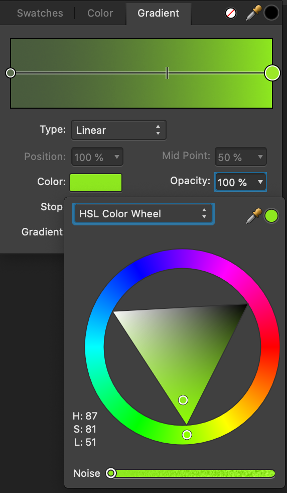
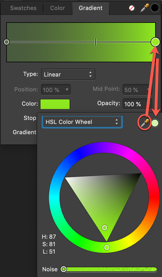
 When working with gradients you may wish to save one of the colors as a swatch but there are quite a few steps to do to make this happen, and doing so will affect the current gradient scheme ie. its object. I explain further below. My suggestion is to add the Swatch Add button to the Node of the gradient, which saves you all the steps explained further below. Now I will explain how taking the extra steps to add this color to a palette changes the current gradient scheme. 1. To best explain, I begin with showing the previous color in the gradient scheme so you can see the full workflow. 2. I will now alter the color. You will see that the color picker in the HSL popup is the previous color. To make the color picker the new color, I can either drag the color picker to the Node in the gradient scheme, OR I close and reopen the HSL popup (which is faster). 3. After closing and reopening the HSL popup, the color picker is now my desired color to save to a palette. Now that the color picker has been changed.... 4. The swatches panel shows the color picker has the new color, but the current gradient scheme will be changed as soon as I click the color picker. 5. I click the color picker, and the gradient has changed which allows me to proceed to saving the swatch, but the current object color is also changed. This workflow greatly reduces the ability to both experiment with colors in a gradient by impeding my ability to develop a set of preferred color in swatches palette. • It forces me to save a gradient prior to saving a node color. • It forces me to think whether I should finalize my gradient scheme so I'm not creating unwanted swatches in my color palette. • It abruptly changes the color of my object in the process of saving a desired color in the gradient scheme. • It stifles creative development as I may encounter other experimentation phases with other objects and not seek to go through all the steps to save a color node as a swatch. thank you
-
 I've accidentally closed the Color Tab and now I can't find where to go to open it back. D: (Affinity Photo)
 -
Someone says when "Color LCD" profile is set to the display on Mac, screenshot's color will be way off in Affinity. Color LCD is a built-in color profile often used as default. https://note.com/repunit_media/n/n02e94299f761
-
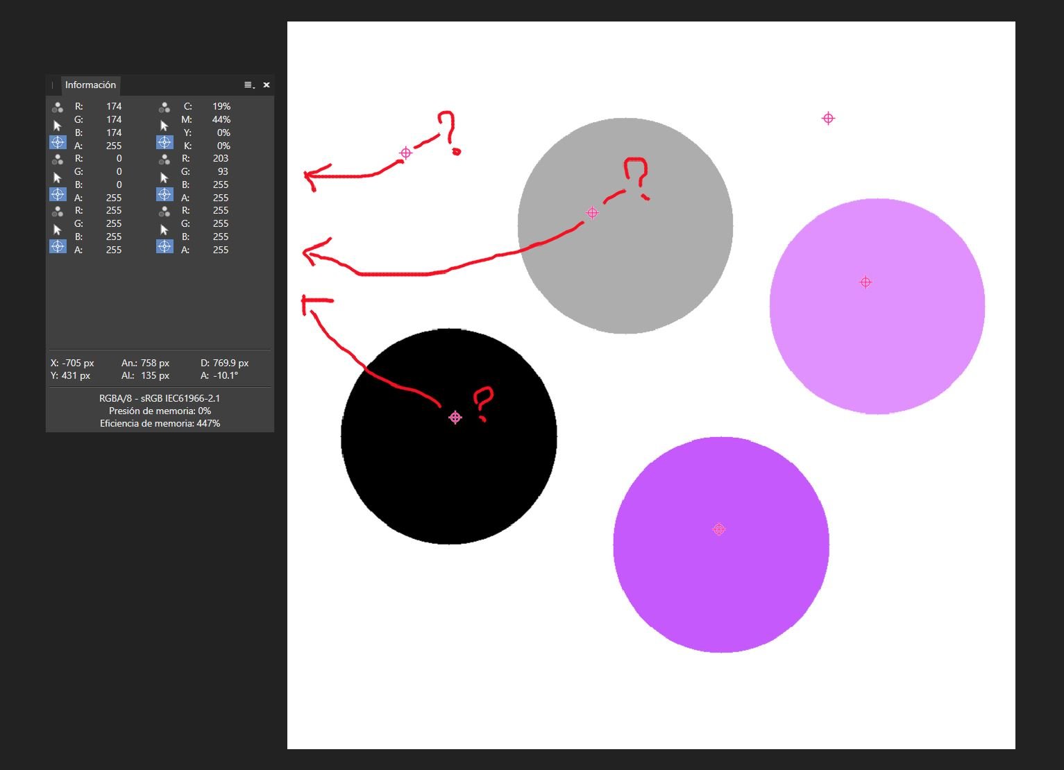
 295/5000 Hi, lately I've been using color sampling for my work, but whenever I use many color samples it becomes difficult to identify what values each swatch I put corresponds to, maybe they could have numbers or the option to put a special name to identify it. Thank you I attached a screenshot.
-
 The last 1.8.2 update has broken the use of tab to navigate the values of the color panel. You can use the tab to go to next field, but as soon as you type a new value, tab stops working until you manually click into a field again. This worked fine in 1.8.0 and 1.8.1. It seems that tabbing after typing the value deselects the current field instead of selecting the next one. Setting cmyk values is now a slow tab-type-click process. Other tab-navigable panels work fine (for example, transform panels) By the way, this is a good chance to remind you we'd love to have tab-navigation in all panels, not only The Chosen Ones. 😉
 -
 Hi all. Im on affinity publisher 1.8.1 on mac. When i try to export to pdf and select pdf/x-1a i get a color profile embedded by default. I'm not allowed to uncheck that option. Is there a workaround for this please? Why do i have embedded profiles in x1a
 -
 IU'm converting from Photoshop and struggling to understand something - In the colour panel, there are 2 colour circles which appear to correspond to a 'fill' colour, and a 'stroke' colour - whereas in Photoshop they relate to Foreground and Background colours. Does Affinity Photo have a concept of Foreground and Background colour or not? In Photoshop I can create a gradient from the foreground colour to the background colour - how do I do the equilavent in Affinity Photo? I used the colour dropper tool to select 2 colours in a photo, but as soon as I switch to the gradient tool I don't seem to be able to use the colours I picked, as a white gradient fills the entire layer and I cannot find an option to go from Fill to Stroke colour.
 -
 Hello, when trying to select a color with the color picker from the color palette it shows and gives me the wrong color. To reproduce just create an image. Fill it with 127 grey and save it. Open it with any program other than AP and try to pick the greyscale value from there. This gives me a value of 135. Opening the image and picking the color inside AP gives me the correct color. This bug prevents me from picking any color from outside AP since every color gets shifted in a for me random direction. This happens with all colors, not only greyscale. Other color values get picked as follows (255, 0, 0) gets picked as (247, 0, 0) (0, 255, 0) gets picked as (50, 255, 0) (0, 0, 255) gets picked as (38, 0, 255) Resetting the settings didn't change anything on my side. If this is my fault, please educate me on what I'm missing or doing wrong. Thank you! AP Version is 1.8.3.641
 -
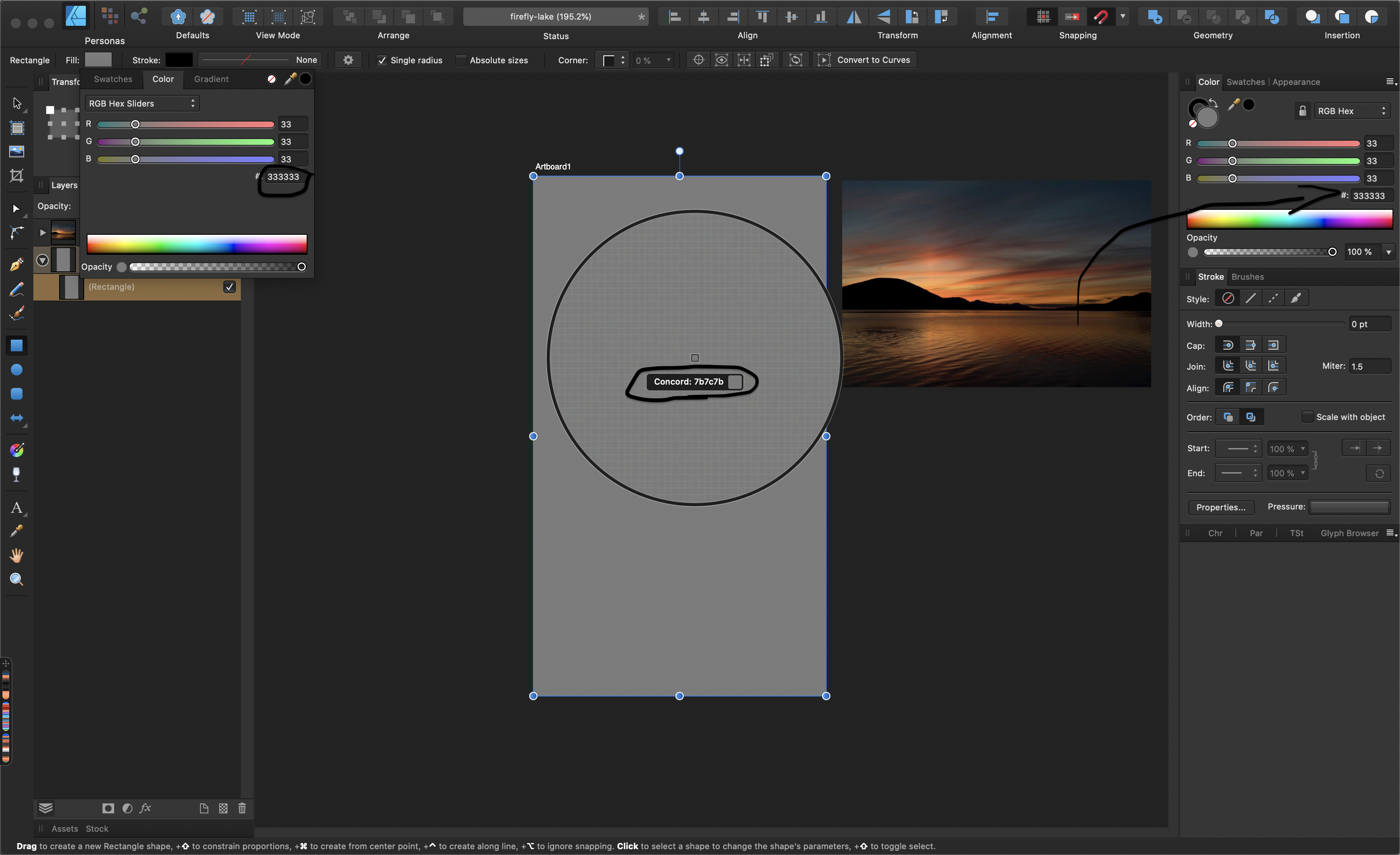
 All of a sudden colors are not properly being represented in Designer. Attached is a screenshot showing that the color #333333 is showing up as #7b7c7b. Does anyone have any idea why?
-
I just created a new project (newest Designer version), created a pixel layer and used the fill tool. Then the following happened: designer_bug.mp4
-
To speed up workflow, I'd like to request a color behavior change when selecting masks. When selecting a mask, please change foreground/background colors to Black and White. When selecting back onto a pixel or image layer, revert to selected colors. This is a Photoshop behavior I miss very much and I didn't realize how much I missed it as I've spent a LOT of time trying to figure out why my mask wasn't working only to realize I was painting on the mask with a color rather than black/grey/white. Also Thanks for your consideration
- 12 replies
-
- 2
-

-
- suggestion
- masking
- (and 2 more)
-
 I cant find anything similar with "color lookup" pre-defined color filter (As you can find in Photoshop) on Affinity Photo. Does anybody know if exists a similar feature here? If not, is it possible to create and save pre-defined automatic color adjustments? Many thanks!
 -
 Hi, I'm Stanley from Indonesia, really love this application. I just curious, is there any way in affinity designer to change color in a document with one-two clicks, rather than I have to change one by one color. Like recolor artwork in illustrator. Thank you
 -
Hi, Please take a look at this video much better than I'll ever be able to explain : to keep it short : blending, as in photoshop, is badly implemented, making these weird dark in-between transitions. Thanks in advance.
-
 Hi Folks, I'm trying to understand where I make a mistake: I create a CMYK doc with Fogra 39 profile, I place in the layout some RGB images, some texts, colored and 100K and a couple of boxes filled with other colors. When I export them I try to change the ICC to Fogra 29 or SWOP. I expect images to have different CMYK values... and it happens. However this changes also the vector boxes and text, so "Numbers" aren't preserved. Worst of all, also the 100%K comes on CMYK values. I tested some different setup, but when I change profile, numbers aren't preserved at all. Strange. Cannot find a way out of this. Someone could be so kind to explain me what I am doing wrong and how to fix it? Thanks a lot! G:
 -
 I'd like to see a tool that would allow the user to select all (shapes and/or layers) by color. This would be extremely time-saving when designing logos or making illustrations where you want to show several color variants. Thanks for your consideration.
 -
Help please! I am trying to understand the colour picker/dropper tool and hope someone can advise i have a rectangle, I colour it red ff0000. I create another rectangle, use the colour picker and hover over the first rectangle to choose the same red. the pixel square in the middle of the circle goes red, but it’s not selecting that colour, instead it Selects a grey. I found that moving the picker around the box at some point the outside circle goes red, but as the whole box is the same colour, why would it only be on certain points that it selects? this happens in various tests and means I cannot use the picker the way I’d like which is to select colours from images ive made a video of an image I’ve got. By enlarging, I can see the various pixel colours, but as the video shows, the picker isn’t picking up many of them. please advise, am I doing something wrong? thanks IMG_1217.MOV


.png.7df7b214f467cc89742d1225854137cf.png)