Search the Community
Showing results for tags 'color'.
-
So far I have not found this feature in any drawing program. But I think it could be done and it would make technical drawings easier. If I want to draw the wiring of a house I have in Germany a blue and brown line for the the actual electric power and a yellow/green for safety. The catch is, that is is not possible, to draw a line where green and yellow are alternating. I have done some improvisation in CorelDraw by designing a pattern = containing of 45degree lines (kind of hatching) or of concentric circles. Yet in both cases the drawing of powerlines does no longer look „dottet“ or alternating whenever you have a bend. This can lead to the point, that the 45 degree pattern becomes parallel with the powerline drawing. And ist is not possible, to do that, where both colors are drawn parallel. The only way to do this would be to group a yellow and a green line … very cumbersome. CAD-programs for the electric field avoid the problem, by have you just draw one (symbolic) line. But in cases where you need to be more specific, it would be much clearer to have such an option The attached PDF shows part of a drawing where the electric problem was that one had to use the blue and brown line from one source and the yellow/green line from another. So my challenge for the folks of Serif: 1 Offer a feature, that allows to draw lines with alternating color 2 The pattern should stay always at a right angle relative to the direction of the line - during the initial drawing process as well as, when manipiulating the line afterwards like for example rotation or stretching. 3 A not so good fallback position would be, to have a double-line drawn where both colors appear next to each other, because it could look as if that where 2 electric lines = a yellow and a green one.
-
Hello, I want to make a suggestion: When I load several files into the workspace, I get a number of TABS with the filenames. The active Tab has a grey color, that is difficult to differ from the rest of the Tabs, same with the X-Delete-Icon. Maybe some more contrast would help. Think about the older people, who sit before a retina desiplay. Sincerely Frank
-
 I must be missing something. 1. Open existing file. 2. File=>New then specify size. You will see a blank document. 3. Switch tab to opened existing document. 4. Select eyedropper tool. 5. Select color. 6. Return to new file. 7. Fill (Shift+F5) is greyed out?? 8. Select Flood Fill Tool. 9. Click on new document. 10. Right click on document. Nothing happens. Try a new intermediate step. 7A. Select rectangular marquee tool. 7B. Draw a rectangle around the entire document. Proceed with 8-10. Nothing happens. So, what is the secret to flood filling a document? This is pretty basic, but I must be missing something in Affinity Photo's workflow.
 -
 I just wonder what is it? and how it works? Thanks
-
 Is there an option for the color panel to auto-select the color of the stroke or fill, depending of which one is used so that I can change it with just one click (instead of clicking on the selection I need first)? This would be the case where a shape has only one of these two attributes. For example, I have a square which only has a fill color (no stroke). If I click on another shape, let's say a circle and I'm changing it's stroke color, when I click back on the square, I would like the color panel to auto-select the fill attribute (since it's the only attribute the square has) instead of keeping the stroke attribute selected (from the previous change). My logic is that I would want to change it's color rather than add a stroke to it. This way would eliminate an unnecessary extra click. Does anyone have an ideea if this is possible? In Adobe's software obviously it's not, but I'm keeping higher hopes for Affinity.
 -
 I create maps in QGIS (an open source GIS mapping program on PC and Mac). QGIS can export as PDF and SVG, but the best way is PDF. The problem with PDF's is that all the lines come in as individual layers (objects) while in SVG'sthey are at least grouped as sublayers. To get around this in Illustrator, I can use the Select>Same>Stroke Color and then move all the selected features to a new single layer group. Designer could use an expanded selection ability like Illustrator's. As far as selecting goes, there's a plugin for Illustrator called Select by rj-graffix.com which adds many selection abilities (but right now it doesn't appear that Designer supports plugins). Freehand used to have really robust selection abilities via a dialog box, and this included text attributes. Illustrator has never come close. Thanks.
 -
 Hi, I am new to Affinity Photo and amn having problems establishing a consistent work flow with assigning/changing font colors. The issue I'm having now is that outlines are appearing around letters even though outlined is NOT selected in fx. I can't get rid of them, have looked in the manual an done a search, but no joy. Can anyone explain why this is happening and how to stop it? Also, in the color picker, I don't get what the red line through a color means. Thanks!
 -
 Just curious if anyone can shed some light on why the same color look so different in Affinity vs other places such as our organization's website or in Microsoft Word. The color in Affinity has the exact same RGB value, but looks significantly different. Is there a way to make it look the same? Or at least close to similar? What's the best way to reconcile this? I created a logo earlier using the rgb color values from our website, but it looks so drastically different I am not able to use it yet. I've attached photos of the green color we are using. The first is from Affinity, the second is from our website and the third is from Microsoft Word. *****EDIT******* I think I figured it out. My color profile was set to "Created by Microsoft WCS..." I switched to sRGB and everything matches up correctly now. I still don't know what the created by Microsoft WCS options mean, so if someone want to explain that to me I would greatly appreciate it!
-
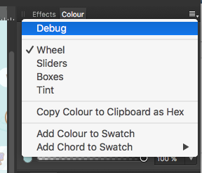
 Hey there, what I'm missing so far regarding the swatches panel: - Easy renaming workflow of swatches with F2 and Tab, and to go further: something like Renamy would be even more awesome - Select and delete/copy multiple swatches. At least it should be possible to click/select and delete via DEL-key to easliy clear up the swatches - "remove unused colors"-option to quickly clean up a palette - usecase would be mostly the the document-related palettes - Convert already added swatches to Global/Spot-Colors - Ability to easily set spot-color-name the same as swatch-name and vice versa (without copy-paste, perhaps with a checkbox in the settings of each swatch) - Missing a direct "Add current color to palette as Spot Color" very much! - The to "Add current color to palette [...]"-Icons are not very distinctive. I would've added at least a big triangle in the left bottom corner of the button regarding the "add as global color" option to suit the appearance of those color in the swatch-list/grid below - Setting/checkbox/action to add swatches via "create Palette from document/image" directly as Global/Spot-colors. - Indicator to see in which Colormode the color originally was created and then have the ability to quickly switch color from RGB to CMYK-Mode and vice versa (perhaps even be able to determine the rendering/conversion while doing so) Greetings, Johannes.
 -
 Hello there, I have copied various objects (with the desired color) from one file to another. There (on the screen) the colors fade, as if I had activated (at print) an extreme ink saving mode. In the original file I have a dark blue and in the destination file I have a pale blue (both with RGB 4/94/156). This fading effect goes over all objects in the file. I have already checked the color values and see the only difference, that in the destination file I work in "Artboards" in contrast to the first one. This was the order of the tutorial. I'm still using the trial version v1.5.4. Thank you for every help. oma-2017-rwg-01-04-flyer-print.afdesign
 -
Dan Margulis says that HSL adjustments are much easier to do LAB color. You already let us do Curves in LAB color space. How about HSL? Thanks!
-
Hi, I miss: 1: Editing and export 32bit grayscale 2: Color Chooser with full range for 16 and 32bit grayscale 3: Moving zeroes positions in rulers 4: Drawing basic pixel lines 5: Toolbar icons for Undo and Redo 6: Switch to previous tool, after color selected with ColorPickerTool
-
 Hello, I have my custom pallet in hexadecimals and I want to add them in a backgroun color for example on a rectangle How can I do it. Thanks in advance
 -
 After setting the color picker source to "Current Layer", it still picks using the "Global" setting when using the option-click shortcut for picking a color. Can there be a way to set the source and have it stay that way when using the option-click shortcut?
 -
 Hi all ! So glad i found this awesome software and i already love it ! :) So much stuff is handled much better than in PS so i am definitely switching over :) I do have one issue which is a bit annoying. At first my work area was a bit yellow, so i changed the profile and then it was all good. BUT, when i import a photo, it gets totally messed up and pick up a yellow hue. :/ Once i export the photo everything is good, but inside AD it looks like this: https://dl.dropboxusercontent.com/u/40227395/PREW/ss.jpg I am posting a screenshot so you can see how image looks normally (on the right) Also, i am using this color profile both in AD and in standard windows settings: Samsung - Natural Color Pro 1.0 ICM Tnx in advance ! I really hope to solve this issue !
 -
In Photoshop, you can set a simple preference for the eyedropper, to pick the color from the currently selected layer, or the resulting color from the displayed (flattened) set of all layers, or some other options: I regularly paint on a layer underneath other layers, and in PS I can select colors from the layer I'm painting on while I work. In Affinity, when I use the color picker while I'm painting, it picks the resulting color from all layers, which means that new color is dramatically wrong when I apply it to the "underpainting" layer. Is this an existing feature I haven't been able to find? Or is this simply not an option in Affinity?
-

[Aph] HSL tonal range slider with falloff
Alex_M posted a topic in Older Feedback & Suggestion Posts
In Photoshop I can pick a custom range of colors to manipulate and also set a falloff to that range. Will this be added in Photo?
-
Summary: Would love to see the ability to color code layers with a set of premade colors. This would affect the Layers UI, not the image itself. Usage: A great way of organizing layers. I can color code all my text layers Blue, all my painted layers Red, some special effects layers green. Then when I am trying to find those layers inside a 300 layer file, it's easier to find them then by name alone. Thanks! - Neil
-
 as described already in another thread here, i am encountering (strange?) problems with colors in both designer and photo, especially for cymk-colours. they kind of 'burn out' and are far too vibrant, so theres no way working with because they not nearly match whats expected. rgb seems quite right to me so far, but i have to use both affinitys mainly for cymk-workflows regarding print. so i have some questions that may be answered to get a grip on this and hopefully find a way towards a solution. 1. there are two options for rgb-profiles, one is called 'rgbu' - what do they exaclty refer to, and what is the difference between them regarding the use within affinity. more simple: why there are two? 2. is there any way, affinity works different regarding color-management than other applications like the adobe ones or corel does? the reason behind this is: the latter seems to do it right and (cymk-) colors are more or less close on screen - but not so in AF, although the profiles are set consistend and are the same thoughout all applications. 3. normally i would assume, all applications are using the screen-profiles that are defined in settings within OS - or win7 in this case. that means: every application uses this (in this case custom calibrated) profile as a basis to render according to the profiles set within the application itself... any other thing for affinity? so what is completely driving me nuts is the fact, that i cant get affinity to show only slightly correct colors for cymk... and i dont have any clue why. the awful thing is, that when emulating a srgb-space on my wide-gammut-monitors it seems to work far better, but i cant believe affinity wont be able to handle wide-gammut spaces... affinity (at least designer) is buildt to use for design & graphics of course. and while print is (still) some great part of that i believe that one should be able to work within cymk without that hassle and be able to get a correct color-preview on screen even for that. right? so the question to me is whats going wrong in that case??? is it affinity? is it me? is it another hard- or software? currently i am running out of ideas, but i have to solve this! any hints and thoughts highly appreciated and thanks in advance if more info is needed please be so kind and simply ask for it :-)
 -
It would be a welcome addition if we could make a swatch based on another swatch, not unlike Sass (https://robots.thoughtbot.com/controlling-color-with-sass-color-functions). In interfaces for example, I could create a green button with a darker green border. The darker green would be based on the original green and have the same hue and saturation, but the lightness would differ. That way, if I later change my mind and want to make all green buttons blue, the dark border would shift along. I'm looking forward to your thoughts!
-
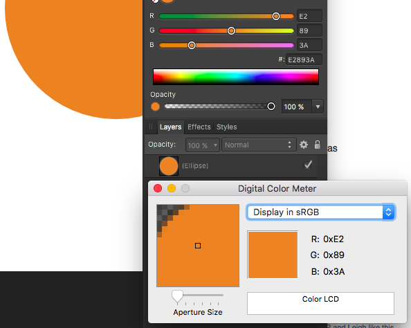
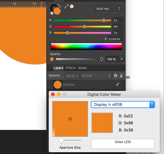
 Document: sRGB 16 Color Value: #E2893A Digital Color Meter (sRGB) on color pane: #E2893A Digital Color Meter (sRGB) on element: #E28939 colormismatch.afdesign colormismatch.afdesign
-
I spent a long time looking for this feature (or a similar one) and I was a little disappoint when I didn't find an alternative. I like the way the recolor artwork panel works in Illustrator, I use it mostly for complex multicolored work. I tend to work with more neutral colors or toned down shades that don't strain my eyes and change everything to the final colors when I'm finished. I think every designer and digital artist can benefit from a tool (or a mode of selection) that allows you to adjust color globally. Creating illustrations (both abstract minimal ones and more complex works) in AD is a really pleasant and seamless experience and a recolor panel would only further enhance. It'd be great if you added a similar feature. :)
-
 Steps to reproduce issue: 1. Select Pen or Shape (Rectangle, circle, etc) tool 2. Select stroke and fill colors 3. Create many shapes with it 4. Select them all 5. On the upper bar only align and distribute actions show up (Next to "N objects") Expected: 6. The upper bar should show fill and stroke colors for selected objects, just like it does when only one instance is selected
 -
 HI dear affinity dev team, very good job, i dont miss illustrator and sketch at all ;) but what keeps me from working late nite is the bright canvas background. would really love if i can change the white around my artboards to something darker. best, pascal
-
 Howdy folks, I'm trying to fill a a vector image that was created with the pen tool and I'm having some difficulty finding a way to color it in. I don't fully understand this pixel persona, but I've tried both rasterising and using pixel brushes and using the vector brushes, but am not getting a good result. Right now it's okay if it's just one color, though I'd like to figure out how to shade as well. Can anyone provide some guidance on this? Attached is the file I'm working with. Thanks in advance! drinking buddies v4.afdesign