Search the Community
Showing results for tags 'color profile management'.
Found 2 results
-
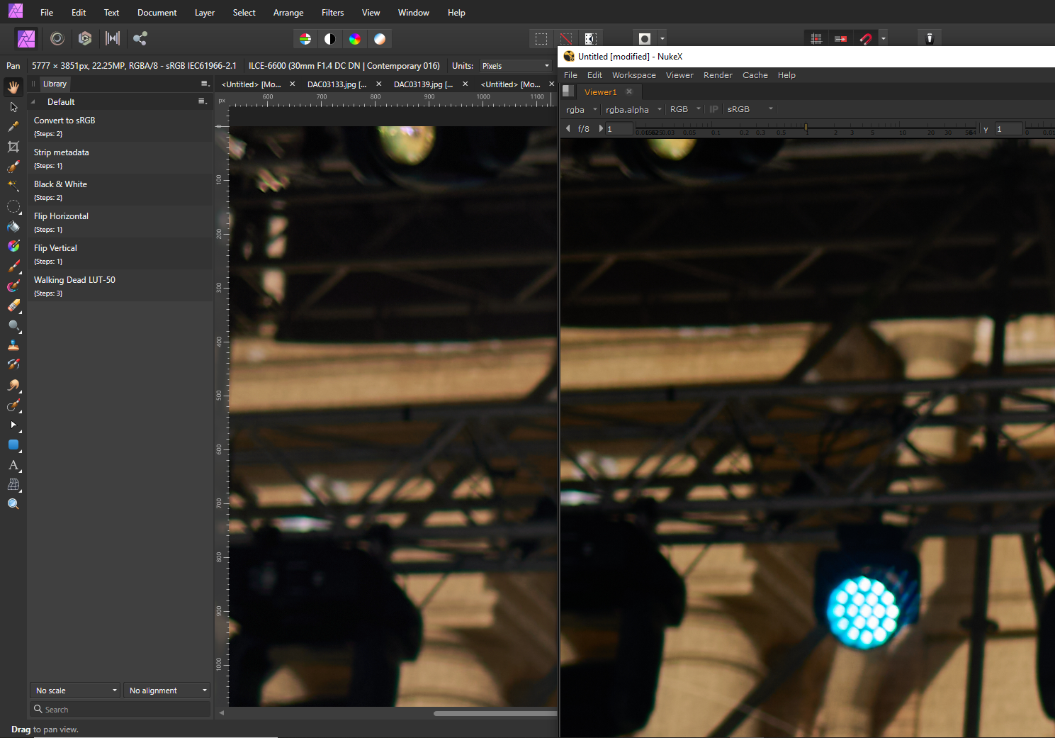
 Hi there, I am confused why just a straight plain jpg file with a default sRGB profile looks different in the shadows with a slight difference in colors too - whether you look at it in the Affinity Photo Viewport or any other app: I tried Windows Photo, Google Chrome, Foundry Nuke, Davinci Resolve. And it's not about a particular file, I see the difference in any file. The only app which also shows the same image as Affinity Photo is CaptureOne but their support couldn't explain that to me. Here is what I have: - Windows 10 PC with Nvidia GTX1060 3GB videocard and the latest drivers - two calibrated AOC 24B1W1 monitors with their respective .icm profiles set as defaults in the Windows Color Management Settings - standard JPG files with sRGB IEC61966-2.1 profile look brighter in Affinity Photo (and Capture One) than in many other professional apps. I originally took Sony RAW photos, developed them in CaptureOne and exported as JPGs with all defaults. The exported images look darker loosing shadow details when viewed anywhere else, except Affinity Photo which also shows the JPG as I see it in Capture One. - any random jpg from the internet also looks brighter in the shadows in Affiity Photo - I generally like what I see in Affintiy more but I must be sure which colors are true when I edit the photos to deliver them to a client Sometimes, I hear that app is not color managed, and that app IS color managed. So can anyone please explain to me in which case I see a true picture - in the viewport of Affinity Photo or in other apps? I can only add that if I go to Document -> Assign ICC Profile and chose the profile for my monitor than an image gets slightly darker, exactly like what I see in the Windows Photo Viewer, Google Chrome, Nuke or Davinci. Does it mean that in order to see a true image I need to do that operation, or what I see in Affinity Photo as is - is the true image and all other app lie to me, despite their being much more 'professional'? I've added a screenshot as an example of what I see on the same monitor in different apps, I hope you can see the difference too. It's subtle but quite noticable when you see the whole image which lacks details in the shadows when you look at the exported image.
-
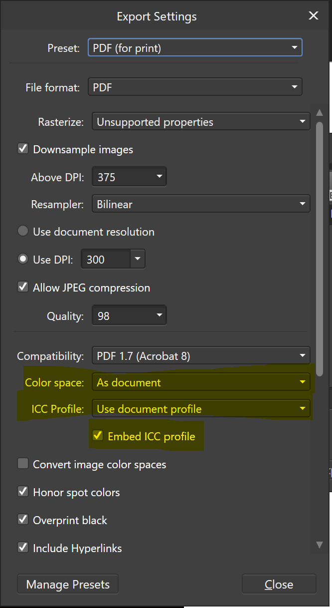
 I am layouting a portfolio in Publisher. I have setup the documents color space for Adobe RGB (set to convert in document setup) and all imported photos are Adobe RGB color space as well. I have a color calibrated monitor capable of showing almost 100% of Adobe RGB color space and photos are looking as they should in the Publisher Document. The issue arise when exporting the Publisher document to PDF using Shift+Ctrl+Alt+S command. When choosing either PDF for print or PDF for web I have tried all combinations of the color space and ICC settings in the menu option "more" and it always change the colors in the PDF compared to the colors in Publisher when I view the file in Adobe Reader. This does not happen when printing (CTRL+P) the publisher document to a PDF using either Microsofts PDF or Bullzip (software PDF printer). Can anyone tell me what I might have overlooked or doing worng?