Search the Community
Showing results for tags 'color management'.
-
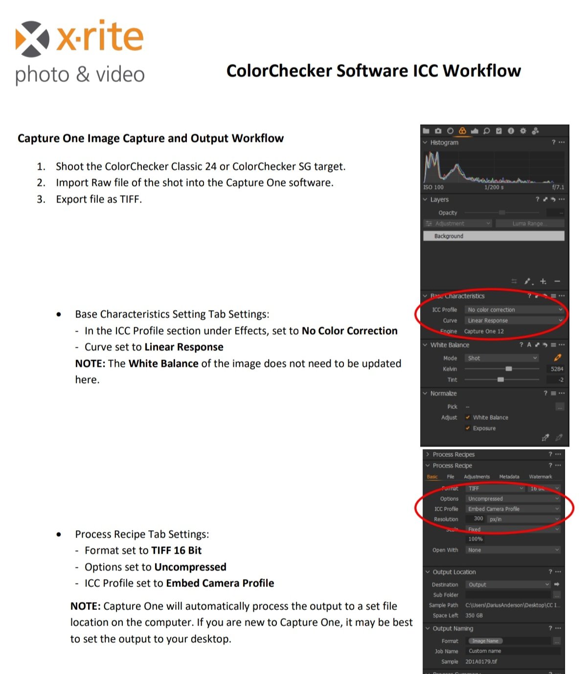
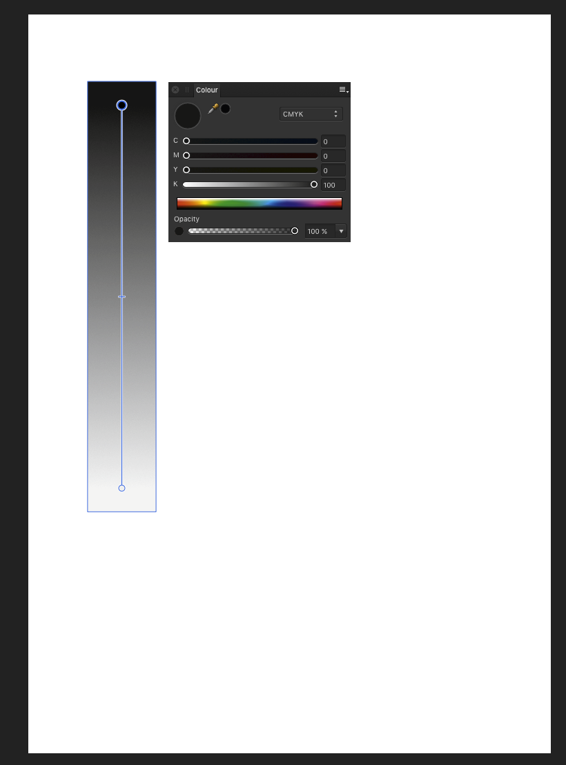
 It has been well established that Serif is highly unlikely to ever include integration with any calibration vendors' software in the Affinity products. Fortunately, many of these calibration tools will also generate an ICC profile which can be attached to an image file. The Calibrite/ X-Rite tool requires a TIFF file that has had no color correction whatsoever done to it. Unfortunately, they only provide instructions for exporting said TIFF file using Capture One, a very expensive program. I have included a screen shot of those instructions. Basically, they say to set the ICC profile to "no correction" and set the color curve to "linear response." Then export the TIFF as 16-bit, uncompressed, with the original camera profile that same "No Color Correction" profile embedded. So, the question is: Can Affinity Photo 2.1.1 export a similarly non-corrected TIFF file? If so, how? Conclusion: Affinity Photo can not export a non-corrected TIFF because it is impossible to get Affinity Photo to NOT apply any correction in the Develop Persona. It will always correct the image, both for viewing and for any exports. In addition, I have learned (thanks to @lepr that Affinity Photo would never be able to make use of any ICC Profile generated by the Calibrite software because, again, Affinity Photo does not let you change the ICC profile that it uses when in the Develop Persona. (If you ask me, they should change the name to something like "Let Us Force You to Do What We Want You To Do With Your RAW Files Persona. But anyway...) I have a tiny shred of doubt that this is true. But that doubt is based entirely on wishful thinking. So I'll see if I can prove @lepr wrong. But I doubt I will be able to. I have concluded that I will need to use the free and open source tools ImageMagick (suggested by @v_kyr) and RawTherapee, along with some scripts in my favorite DAM utility, IMatch, to get what I need done. It is a little disappointing to need to completely ignore the Develop Persona within Affinity Photo but oh well. And it will take more work. But I think I will be able to do it. After using those tools, I will then need to use a different script to export a color corrected TIFF file to be opened with Affinity Photo for any edits that need to be applied to only specific areas of the image.
-
 When I place AdobeRGB photos into sRGB document in current Publisher (v1), it displays as well as prints with wrong colors - ie. not converted to sRGB. Has this been fixed in the new Publisher, please?
 -
 I did a test, printing a gamut test image two ways from Publisher. For one, I had the App do the color management (and made sure that I switched off the color management in the printer) and for the other I did the color management in the printer. I am on Windows 10. I had used X-Rite i1 Studio to create an ICC profile and I used this profile in both cases. I used Perceptual rendering intent in both cases. The color Format in my document was RGB/16 and I selected Adobe RGB (1998) as the Color Profile and selected Convert. When having the printer do the color management, I had the choice of "Standard" or "Adobe RGB (1998) so I chose the Adobe RGB one. My printer is a Canon PRO-100 and I use the latest Canon XPS driver for this printer. I expected the two prints to be identical. They were not. While both were "good" - VERY close to what I saw on my monitor (A NEC SpectraView II monitor that had been recently calibrated) and both had very smooth shading with no banding, there was a difference in saturation. The print that had been produced having the App do the color management was more saturated. My feeling is that, since I used the same ICC profile and the same rendering intent in both cases, both printed from Publisher on the same printer and (obviously) the same paper, that the prints should have been identical. Can anyone tell me what I am missing? With thanks, Robin
 -
 Has anyone been able to import palettes to Designer on the iPad? I work with Montana brand spray paint and want to be able to import and/or their entire color palette. or do I have to use the eyedropper to import each color individually and name it individually? Also wondering if there is a way to rearrange the colors within the palette list view?
-
 Question: Is it possible to let AP show the colors of the color panel according to the color space of the document instead of the color space the monitor is in? Background of the question: I am using AP 1.10 on Windows with two monitors. Monitor 1 is calibrated to D65 sRGB color space but with 2.2 gamma (internal hardware calibration). Monitor 2 is calibrated to D65 native color space also 2.2 gamma (software calibration). If I put a view of the same image on monitor 1 and 2 each they look nearly identical. The document is in sRGB color space. So, even though monitor 2 is in native wide gamut, AP takes care that the document is shown in sRGB representation. This is fine for me. But, on monitor 2 the color panel does not respect this. There the colors are shown in the wide gamut color space. Reason why it is relevant for me. Monitor 2 is the pen display to draw on the images. But even though I see the image in the desired output color space (sRGB) I can't pick colors accordingly. This makes choosing a color more or less guesswork. Unfortunately I can't just set monitor 2 to sRGB color space because of limitations of how this is implented in the hardware.
-
 Dear Affinity Users and Developers We’re just in the process of evaluating Affinity Publisher (tested with 1.7.0.305 and 1.7.0.312) and we’ve come upon a problem with the PDF/X export: In our workflow our print PDF files are checked in Adobe Acrobat against the preflight profile PDFX-ready Sheetfed Offset Classic HQ V1.5. Among other things this profile checks the MD5 checksums of the used ICC profile against a pre-defined list of profiles known to be appropriate for offset printing. When exporting a PDF as PDF/X-1a with the ICC profile ISO Coated v2 300% (ECI) from Affinity Publisher the preflight returns this error: Looking at the preflight report in the section Output Intents I noticed a difference between a PDF exported from InDesign and Affinity Publisher: The Output Intent is stated as ISO Coated v2 300% (ECI) for the InDesign-PDF and as ISO Coated v2 300% (ECI) (Custom) for Affinity Publisher The Color Management Module had a value of HDM (InDesign) and lcms (Affinity Publisher). Primäre Zielplattform (in English probably: Primary Target Platform): empty (InDesign) and Apple Computer, Inc. (APPL) (Affinity Publisher) Profil erstellt mit (in English probably: Profile created with): Heidelberger Druckmaschinen AG (HDM ) (InDesign) and lcms (Affinity Publisher) The other fields were the same in both files. So I suspected this to be the reason for the different MD5 checksums. But not being an expert on the ins and outs of PDFs and colour management I turned to HilfDirSelbst.ch where we discussed this (in German) in this thread. Olaf Drümmer of callas concluded (my translation): So the question is Is Affinity Publisher correct in changing the meta-data of the profile when writing the PDF file? And if so: Would PDFX-ready need to append their list of MD5 checksums to include those of profiles created with lcms? Any insights and suggestions would be greatly appreciated! Best phph
- 14 replies
-
- 2
-

-
- color management
- icc-profile
- (and 3 more)
-
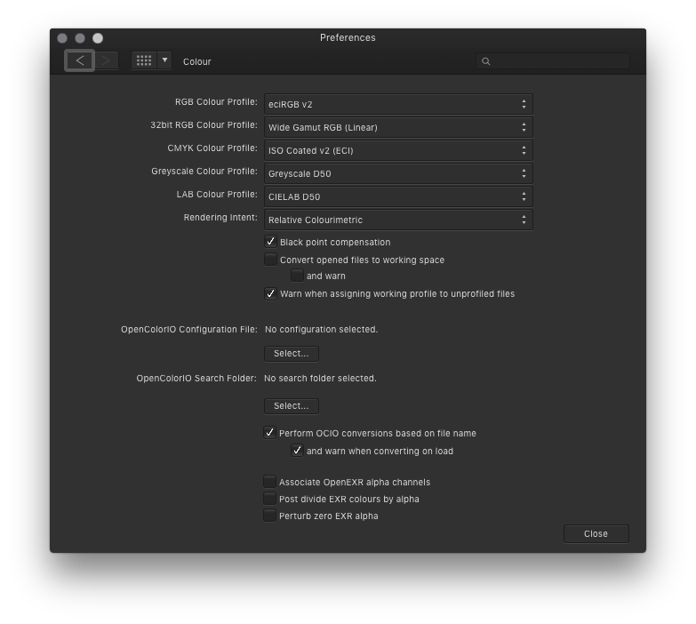
 Greyscale become multicoloured when printing from Affinity Designer. Obviously a conversion to/from color profiles happens inside Designer. How can I prevent this from happening? (This happens to all colours. It is just shown best with greyscale.) My printer expects data in the same colour profile as my AD files working profile. (ISO coated v2 (eci)) When exporting a PDF/X1a and printing with Adobe Acrobat everything is OK.
-
 The pdf passthrough is a very good feature but till now it is not perfect. I send you a publisher file with 3 placed pdfs. in the background two logos with black that is only 100% black. In the foreground one page of a publication. The main text again is 100% black. (only the monkey is not 100% black) When I export to pdf x4 one of the logos (the star) becomes 4 coloured black. The other yellow logo is set to overprint black and the whole page text is NOT overprinted black When exporting to ready for printstudio both logos blacks are 100% black, and the text is NOT overprinted black. The long text stays 100% black, but is not overprinted black. It makes no change if I choose transfer or interprete. When I open the whole-page-pdf in the foreground and replace with this the primarily placed pdf the text is overprinted black with pdf x4 and not overprinted black with printstudio ready. The logos do not change. this is a very odd behaviour of Publisher, Indesign here does not make any problems. afpubtransferproblems.zip
 -
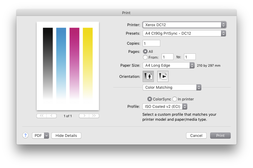
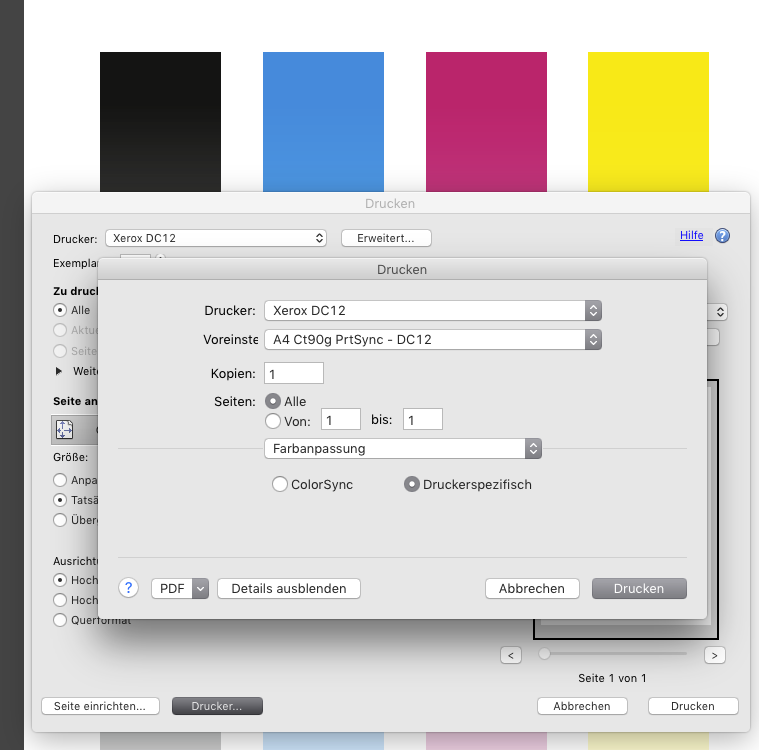
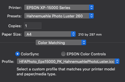
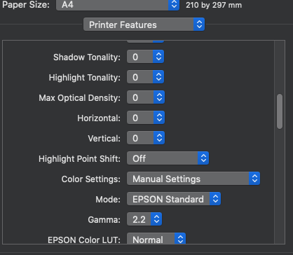
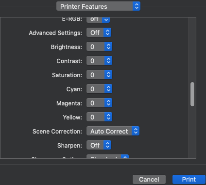
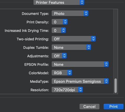
 Hello everyone, I bought an Epson XP-15000 and I'm trying to print from affinity photo on MacOs. I've done the soft proof correctly and now I'm in Print menu but I have some doubt. About color matching I set up this: But here in printer features there are a large number of parameters. How can I set them, please?
-
 I'm having a problem with affinity photo not transferring exr files rendered in blender with the color transform chosen inside blender. I remember this having worked in the past, so I don't know wether I accidentally changed anything. I rendered an image in blender with a filmic color transform and saved it as a 32 bit exr. Here is what it looks like in blender with the color management settings. And here is what it looks like upon opening the file in affinity photo. (Side-by-side closeup). The highlights are over-exposed and it looks like the srgb color transform in blender. So I tried using an opencolorio transform in affinity photo, however I am unable to select any color profiles and the transform option in the 32 bit preview window in greyed out, despite having selected a opencolorio configuration file in the settings.
 -
 I've been corresponding with MagCloud/Blurb tech support, trying to pin down what they think might be the right Publisher settings for PDFs submitted to them. It's uncharted territory. They don't have experience yet with Affinity Publisher — they have InDesign and QXP templates but none for Publisher — and Serif hasn't commented much about Magcloud/Blurb that I know of. I did a lot of book pagination in the past, but it was always someone else who did the final prepress work. Blurb has a page that could be useful for people like me who don't have much experience with setting up documents for CMYK processes. The most rudimentary color-management info on the page, I already know. It was the soft-proofing bit that caught my eye. https://www.blurb.com/blog/color-management-printing/ The web page contains a link to the company's own ICC profile, useful for soft proofing. Scroll down to the What is a Color Profile? subhead, then look in the second paragraph below it for The Blurb ICC Profile is based on the GRACoL2009 reference (etc.). The link to the ICC profile is in that sentence.
 -
 I am trying to print an 8 page booklet of photos in Affinity Publisher. The colors lose some saturation when i print it out on Matte paper as i would expect. I am used to soft proofing in Lightroom, which has a lot of control for specific papers. Within Affinity, i believe soft proofing is only available in Affinity Photo, so i am trying to create a workflow to boost the saturation for the paper type, but ultimately print it out of Affinity Publisher. When I opened an image in AP, I applied the ICC profile for Inkpress Print Plus Matte two sided paper on the soft proof layer. The color shift was dramatic, it desaturated the colors. Relative and perceptual rendering did not change the color, but saturation rendering did and brought it much closer to the desired output. If i try other paper profiles, the color shift is more subtle and more like what i would expect using matte papers. A couple of question to help me figure out how to do this workflow: 1. The Affinity Photo tutorials do not follow soft proofing through to the printing module. Do you turn off the soft proof layer then use the other layers adjustments to print.? 2. Since the color shift is unusually dramatic on the one ICC profile, could it be a problem with how AP using this particular third party profile (although i have not seen this issue in Lightroom or inDesign for that matter)? 3. How do you set Saturation rendering to in the print workflow - this is a clear setting in Photoshop and Lightroom? I don't see the rendering option in the workflow. 4. I really need to print this out in Publisher, so how do you carry through the soft proofing adjustments back to Publisher to get the adjustments that would help recover some of the saturation lost on matte paper? I am quite frustrated by the lack of a clear tutorial or manual on managing a print workflow to a photo printer (such as a Surecolor P600 or Canon Pro 1000). This is further complicated but the different print interfaces between Publisher and Photo. Affinity Photo is much better, Publisher has a mysterious printer feature tab that doesn't make much sense (i have a related, unanswered post on this). Please point me in the right direction to anything that would educate me. I have looked through the Affinity Photo Tutorials, the Affinity Publisher Tutorials (both on the website, and the extra tutorials i have purchased). I also bought the Affinity Photo Workbook. I am either a slow learner or the information is not there.
 -
 I don't know much about color management, so I always find photo colors are not accurate when processing them. My monitor is not wide-gamut. Colorspace of my camera RAW file can be set to sRGB or Adobe RGB. Which one should I choose? Photos are mainly used for web, but I occasionally pick some of them for printing. 1. When the raw file is sRGB, how should I set the default value of color option in Affinity Photo, and the exporting option when exporting a jpg for web, or exporting other format for printing? 2. When the raw file is Adobe RGB, then how should I set them? Thank you.
 -
 Color management is a major issue for many who post in these forums, yet I have not seen anything here about this problem in Windows 10 version 1903. Monitor calibration using a Spyder5Pro failed the other day under Windows 10 Pro x64 version 1903. The response from Datacolor is that Windows color management was broken with the release of version 1903. The problem affects all manufacturers of calibration equipment. Various solutions were suggested, none of which are sure to work. Those that might work can be expected to fail following another calibration or Windows update. An Internet search shows the problem has been known ever since version 1903 was first released several months ago. Windows cannot be expected to load a particular ICC profile or apply it even when it appears to be loaded. My system claims to have reverted to a monitor profile supplied by Dell, not my custom profile generated earlier by the Spyder. Does anyone at Serif have knowledge of this problem and when a fix from Microsoft might be expected. As an amateur, color management is way beyond my level of expertise, and it is not really an issue for me. I was perfectly happy with my photo prints before I bought the Spyder5 a year ago. But I understand this is a huge issue for professionals. Here are a couple of references about the problem from Datacolor that were just updated this morning. Perhaps the issue is fixed in Windows 10 Version 1909 that was announced on November 12. https://support.datacolor.com/index.php?/Knowledgebase/Article/View/1849/0/alert-bug-in-microsoft-windows-10-build-1903-causing-icc-profiling-issues https://support.datacolor.com/index.php?/Knowledgebase/Article/View/1847/0/windows-10-may-2019-update-windows-10-build-1903--unable-to-create-and--or-activate-an-icc-profile-in---spyderx-spyder5-and-spyder4 https://docs.microsoft.com/en-us/windows/whats-new/whats-new-windows-10-version-1909 https://blogs.windows.com/windowsexperience/2019/11/12/how-to-get-the-windows-10-november-2019-update/
 -
Would be nice to be able to export luts or total image adjustments as an ICC profile, this is something Photoshop has been able to do for ages.
-
I'm exporting my document as a PDF-X3 file. However the output pdf doesn't appear to have the correct profiles assigned for the contained images. Specifically, in the PDF all my images with AdobeRGB profile look flat as if they were incorrectly assigned an sRGB profile (assigned not converted). JPEG images with sRGB profiles look fine in the output PDF-X3. Embed profiles is ticked. I'm using the trial which is 1.7.2. Color format is CMYK/8 and profile is the Blurb ICC profile.
-
I noticed something quite unpleasant in all 3 apps checking out the final Publisher … Color management does not seem to work properly: While all Adobe apps display 100% cyan correctly on my hardware calibrated monitor (EIZO CG 277), this is clearly not the case with Affinity apps. Since we already have to pay attention to correct coloring in the layout phase, this would almost be a knock-out criterion for us if color (especially in the pre-press area of important boundary areas) could not be displayed correctly in the Affinity apps. I have of course checked the color settings in the Affinity Apps - everything quite the same like the Adobe Apps with cmyk ISOcoated v2 ... Please find attached a ZIP with a screenshot - InDesign and Publisher side by side (PNG incl. Monitor color profile - if the PNG is opened on a properly calibrated monitor, for example in Photoshop, the difference is clearly visible). Hopefully, I overlooked something ... AffinityColorNotCorrect.zip
-
 Hello, when I place a rgb-photo into a cmyk-document, is it correkt, that Affinity Photo converts automaticly the photo into the cmyk-modus? Greetings Frank
 -
 In an attempt to get my head around Publisher’s PDF export behavior (compared to Adobe’s which I’m rather familiar with), I stumbled upon this thread which only touches some of my problems: Some settings in the export process (under File > Export > PDF > More) don’t seem fully developed yet, so I hope to find some clarity here: PDF/X-1a: The standard only allows CMYK and spot colors, so the options “As document” and “Grayscale” don’t make much sense, right? PDF/X-4: The standard allows several color models, but if I want to output CMYK-only (despite enjoying other X-4 possibilities), then I’d expect the option “CMYK” to yield a CMYK-only PDF. This only happens as expected if I choose to “rasterize everything” which is never a true option with my kind of projects. In other words: Why can I choose between three options when according to standards there’s only one possible result (= X-1a), and why is there only one result when according to standards there would be at least three options (and Publisher lets me even choose) (= X-4)? What part of the story did I miss, or am I just too deep into Adobe thinking to realize that what’s going on here is perfectly reasonable? Or is it really? Is it like “take it or leave it” – if I want CMYK-only files, I have to deal with losing transparencies and all in X-1a, and if I want e.g. transparency maintained, I have to accept all other X-4 possibilities not as options but as obligations? I admit I’m very used to (and have grown very fond of) the Adobe approach of being able to throw anything into a layout regardless of resolution, color model, file format, and ICC profile – and only having to decide in the very last seconds what to get on the far end. Thanks a lot for any insight!
 -
 So, down the rabbit hole of color management for us! I'm on a Windows 10, 64-bit operating system with a run-of-the-mill Dell P2414H. I purchased a ColorMunki Display to calibrate my monitor. In the preferences of the program delivered with it, you have the choice of ICC profile version 2 or version 4. It defaults to version 4, but my Googling appears to suggest that version 4 may be problematic in numerous situations. However, I'm also having a hard time finding recent AND reliable info (ironically X-rite's own information is very dated). Of course, I'm most concerned about all this in Affinity Photo, so, first question: Do you advise ICC version 2 or 4? Can AP handle both of them (if that even comes into question), or is it better to use the older ICC version 2? And more largely (second question), is there anything specific that I need to do to make sure that AP is... correctly calling upon the monitor calibration information in the icm file? I'm asking because I also use RawTherapee for more "in-depth" raw development, and in that program, you have to indicate the monitor's color profile (point the program to the current monitor calibration icm file, so to speak). I don't see any such thing in Affinity Photo, although I do think Affinity Photo is completely "color managed"(?). So, I suppose there i a third implicite question: How does AP insert itself into the color management pipeline on any given computer? De excuse me if my terminology is off; I hope everything is understandable and thank you all in advance for your feedback!
 -
 I'm trying to touch-up my Drone photos, but they look horrible in Affinity Photo compared to Windows Preview or even Gimp Here, the original file has a very very smooth gradient coming from that lamp. But as soon as I open the file in Affinity Photo, the glow from the lamp turns in to blocky color bands.. It's almost like it tries to convert it to web-only colors or something because the quality is horrible. (below, you will probably see some banding in your web-browser, it's actually WORSE in Affinity Photo) Download this image and view it locally, to see it without banding. If you still see banding when you open it locally, sorry your monitor sucks
-
 I have to have good quality images for my YouTube channel and I have been reliably using Affinity for a while now. It's been producing some good stuff, but about a week ago it's been doing this: In the attached image - The far right is what I have in Affinity ready to be exported. When I export it, the center image is what I get no matter what type of export I do (PNG, JPG, etc.) It's all washed out and bright, I've used ImageGlass as well as Windows native photo viewing software in order to look at it and this is what turns up. Even stranger, if I open the center image in MS Paint, I get the image to the far left. Where everything's greenish and strange. So what's changed? It just started a little while ago for me and I'm unsure what to do. If it continues I'll have to ditch the program (Which, ironically, I was just recently praising to a friend who uses PS a few hours ago) and find something else.
-
 Hi, For some reason, starting about a week or two ago, Affinity Photo now imports my raw files with a dull pale greenish tint. If I import the same photo in Photoshop CS17, it looks fine. I have color management turned on in both programs, converting Sony RAW from Adobe RGB (98) to ProPhoto. I am in Windows 10. Where do I start? I don't think Win 10 is color managing.
 -
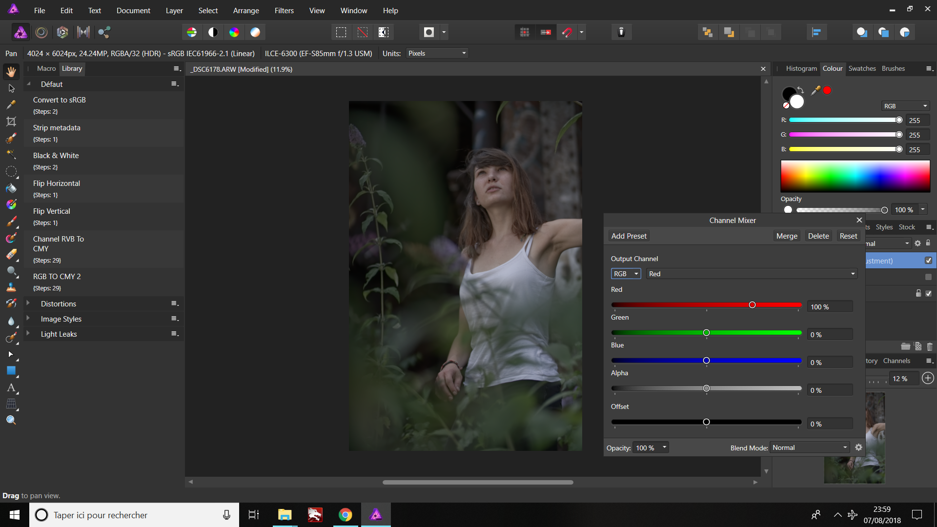
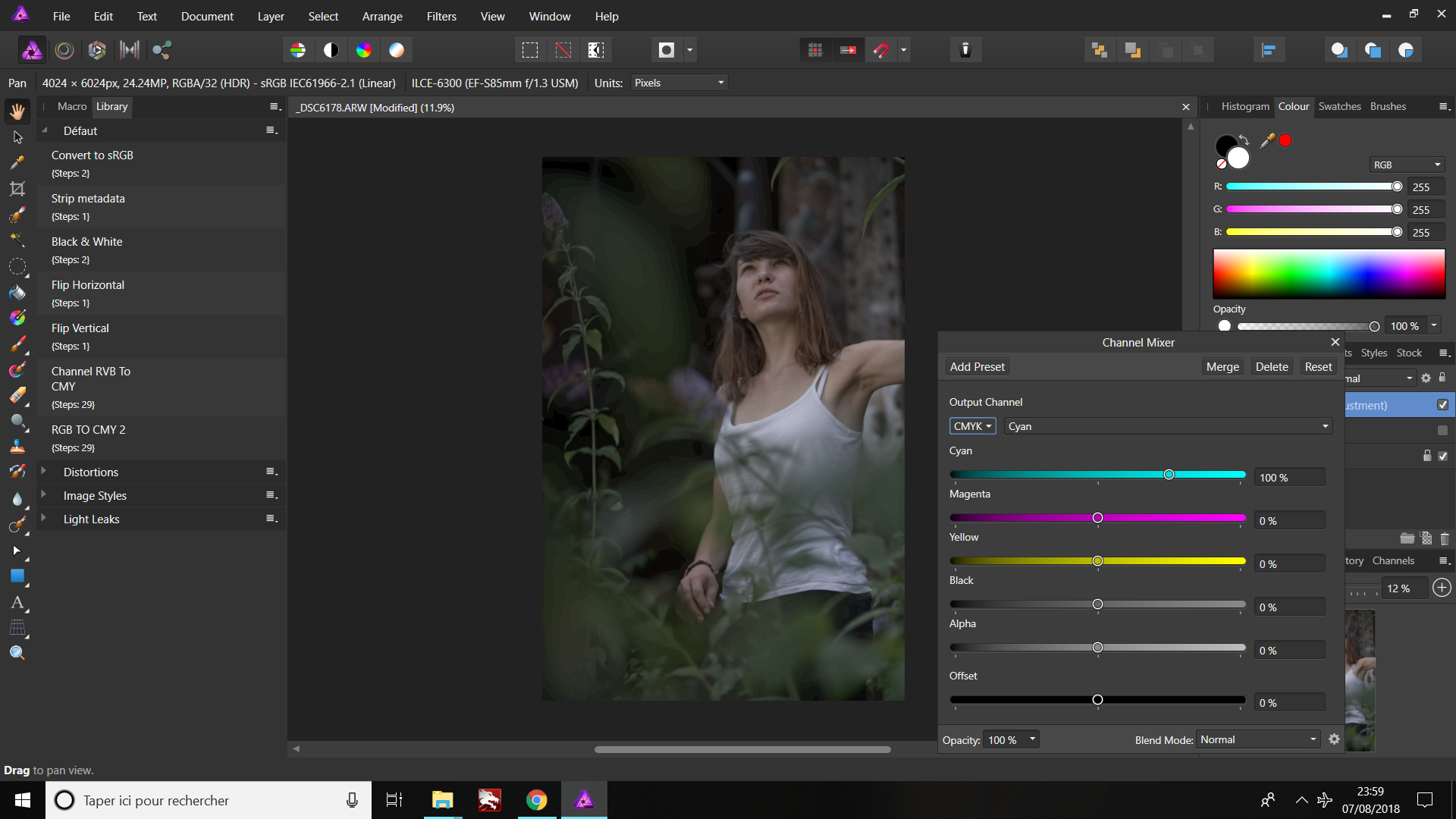
 Hello everybody ! First, LOVE to the Affinity team and the software because it's great ! The question that I have is about color editing in affinity photo "photo persona". I'm working a lot on color tweaking now to get some great emotional and powerfull results ! I really love using the channel mixer adjustment to change colors, and mostly toutching the CMYK, because you can change the colors on the picture kind of individually. On the other side, when you are tweaking colors using the mixer adjustment layer with RVB, all the colors of the picture are moving when you toutch to a color. You have more flexibility tweaking CMYK. But, problem ! I noticed that when I was tweaking the CMYK channel, the quality of the colors inside the image was quite bad compared to the same image tweaking the RVB channel... And some quite bad artifacts are appearing, in the shadows areas mostly. Is it normal ? Is there any way to tweak the CMYK channel without having this bad color artifacts ? Is the color format of the picture is changing from RVB 16 bits to CYMK 8 bits when I apply this layer ? What is the best way to do a really nice and creative color editing without loosing so much quality ? Thanks a lot, I really hope somebody is able to respond to this question. Ken.
-
 Using 1.6.4.104, Windows10, Epson SureColor P800, Xrite 1iDisplay calibrated 4k monitor I'm seeing very strange color shifts and a much lighter image printing using the app for color management. I'm choosing the correct Epson provided profile. When I let the printer control color it is fine. Is this a known issue? Any workarounds?


.png.7794cb65f79f12260f057a1bf6b3d8c3.png)