Search the Community
Showing results for tags 'color wheel'.
Found 15 results
-
 seq - create an objA with some color - create a clone objB and select it - switch color tab to tint and set any (be brave) - get back to wheel wheel is not revealing the tint color (even if the top left line/fill colors are properly updated this is IMO a bug as there is no info that this color is a tint and the tint is not dependant color
 -
 I would like the following improvements to the color cache in the color wheel panel. Yes, the swatch panel is there but I would like these new color cache last 10 colors to have more flexibility which will improve work flow. NOT because the suggestions may duplicate the swatch panel, it is to give flexibility in interface setup and individual work flow. In Designer the last 10 color cache colors really needs to have the ability to be erased or cleared AND have the ability to remove single colors. 1: To clear this completely, erasing the entire list of colors. If it is cluttered with mutliple copies of the same color or I want to change a color pallete I don't want to see the old colors. Sometimes I just want a clean start or interface when I begin working on the file. 2: Like in the Color Swatch panel have the ability to delete or remove a single color If I make a mistake or I don't want a specific color there as an option I should be able to remove it. Just Because. 3: If there is already an existing color in the cache that is the EXACT same color, do not add another one I do NOT need 5 of the exact same color in the last 10 colors used list this brings back to #1 and #2 above. 4: Option to turn this OFF to hide it from the panel. 5: Ability to set the number of colors to keep. It is currently hard coded to 10. What if I want 20 or 5 or 3? Ability to choose this number would be great. 6: Manual ordering of colors so I can drag colors in the order I prefer or like 7: Ability to save and load custom color options in this small color cache and have the ability to add them to the main swatch panel OR create a new swatch. I really like this smaller easily to access colors feature added in v2 but I would like these options for how it works. With this feature I would like the choice to FORCE a halt of new colors by locking this to a predefined color set or what is already there. Also: Option 1: Normal operation how it works currently Option 2: Lock current colors cache so no new colors are added or overwritten once I have my colors in this list Option 3: Load custom color swatch of X colors and lock them so they can't be overwritten by the last used color If the "locked" colors are less in number than the total available color slots. Say as it is now 10 available colors and I use 5 spaces that I do not want changed. The last 5 should operate as normal last used color que, cache or whatever it is called. If I have 3 "locked" then 7 are available or 8 locked then 2 available. I understand some will not understand why I would want this to work as suggested above, why not just use the color swatch panel. Because this new feature as is, looks to be so much simpler and with the above suggestions a quick work flow improvement with customization in how it can work. Leave it as it is now OR tick a box to remove it OR increase / decrease the color spaces from 10 to X. Have my most common colors used automatically populated to this color pallete OR if I have a nice color selection and then I choose a new color I lose what I had setup. When I screw up and chose the wrong color why do I have to be presented with this color every time I load that file. The main focus here is OPTIONS and making Affinity Apps work how we want them to work. Customization is AWESOME, please don't lock it down to just how the developers want the apps to work. As I think of new things I will update this post or thread.
 -
 Please add an option to disable the colour wheel from rotating when selecting a different colour. I want to have the orientation fixed, so I can more easily predict where I need to move the picker to.
 -
Hello, If you guys could add these contrast ratio feature in Affinity, it would be a really great tool. Here are some links that checks the contrast of background and foreground color. https://coolors.co/contrast-checker/112a46-acc8e5 https://colourcontrast.cc/ https://webaim.org/resources/contrastchecker/ I also attached a video explaining the feature request. Regards, Hossein Affinity-Feature-Request.mp4
- 7 replies
-
- 5
-

-
- color wheel
- contrast
- (and 5 more)
-
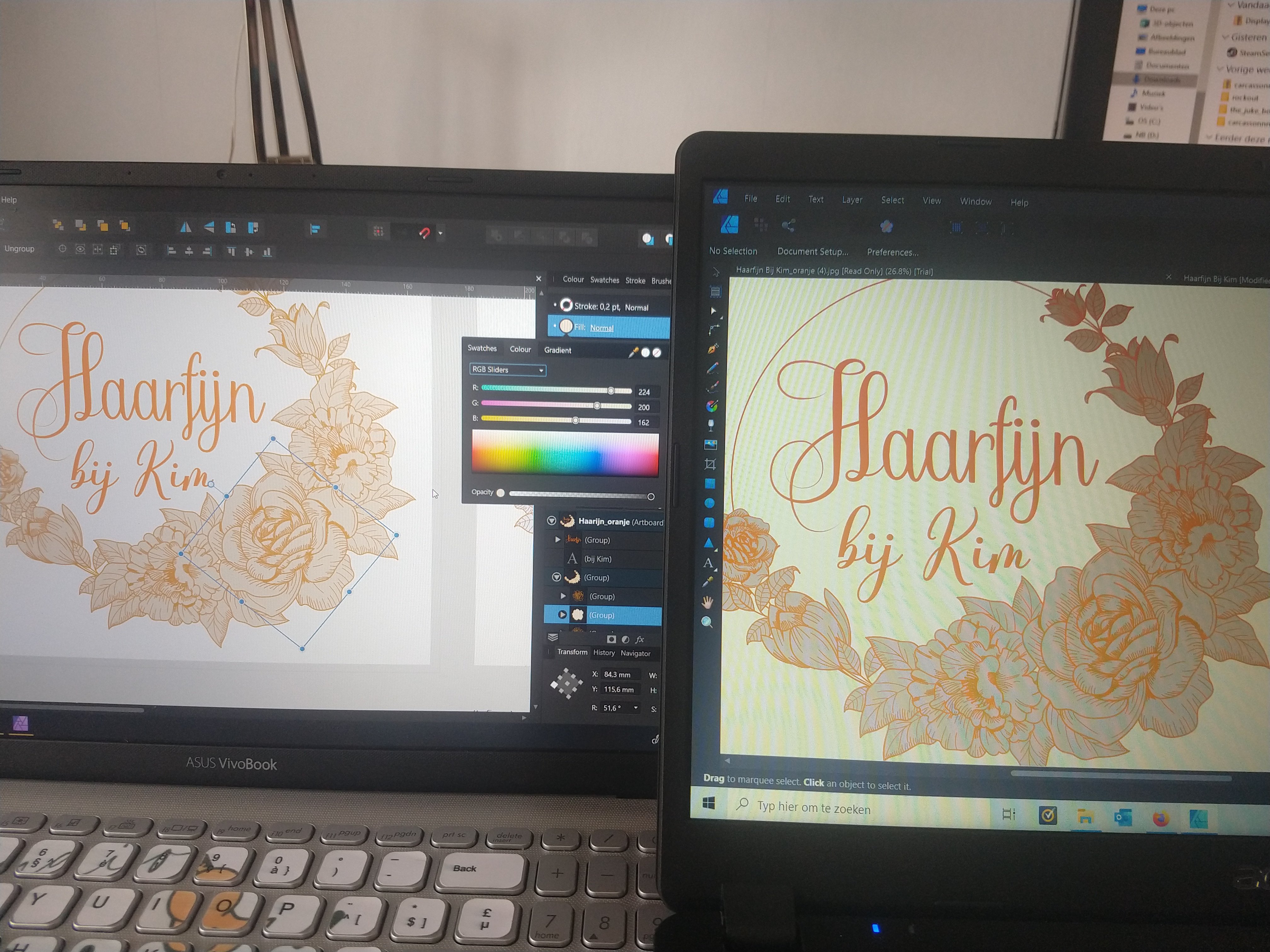
 Hi, When exporting a file the other day and sending it to someone else they saw different colors on the file. I took a picture of both my PC (left) and the other. I hope the difference is clear. The orange fill of the flowers is more blue. The letters don't have the same bright orange color. I noticed that the color wheels on both laptops look totally different. Can someone explain how this comes and what I can do about it? Thank you! Nils
-
 Hi, I'm really new to affinity designer and I have a problem where my color wheel only has grey, black and white colors, and I can't figure out how to switch back to being able to choose any colors. Does anyone know how to fix this?
 -
 Hi Affinity Forum. Question about Affinity Photo, please. Is there any way to pull up the color wheel on demand wherever the cursor happens to be at the time, even if the wheel already appears in the panels off to the side? Perhaps it could be a shortcut key combo. Or better yet, maybe it could be simply clicking the button on a Wacom stylus. I know this button does the trick in Photoshop, and it’s extremely helpful in digital painting. So far, I haven’t found this feature in Affinity Photo. If it exists, could someone please let me know where it is? Thanks!
 -
Would love it if the color wheel stopped rotating every time I changed the hue , if it could just be an option where the triangle would just be locked in place that would be fantastic! Really hope to have this on the iPad and the desktop version :)
-
Hi everyone, I'm using publisher with an external monitor, the main screen is a retina resolution, the external monitor is a full hd resolution. In the external monitor i used to have some panel detached form the main Publisher window, if i open the hsl color wheel panel from a fullhd monitor after giving some input on the retina monitor, the color wheel is drawed in retina sizes (@2x). Senza nome.mov
-
 Hello Affinity Photo development team, I'm a newbie to your program, but have worked as a digital illustrator for several years. Affinity Photo is a really nice program - a nice alternative to Photoshop. It could be a great program for digital illustrators and painters... But it is missing a critical option for higher speed efficiency: a fast color picker option by pressing "Ctrl" or "Alt" This is present in Photoshop, Corel Painter, Krita, OpenCanvas, PaintStorm Studio, etc. It is very important to painters to be able to access the color picker quickly. When you hold down "Ctrl" or "Alt" and click on the color - it color picks it. Then when you let go of the "Ctrl" or "Alt" key, it goes back to the tool you were using before. When you have to switch between brush and color picker, this wastes twice the amount of time. An extra second or fraction of a second may not seem like a lot - but it adds up. A painting that would take 2 hours, takes 4 hours. A piece that would take 1 day, takes 2 days. 1 week turns into 2 weeks, etc. This would be a great addition to Affinity Photo - for all artists. One last idea... Is allowing the user to "fix" the color wheel triangle in a fixed position - instead of having it rotate all around pointing at the chosen color. Why? Because having lightness point up, darkness point down, and saturation point right - is far easier for the brain to process than having the triangle flip all around the wheel... it makes picking specific shades across different colors inconsistent.. harder to match the same saturation position on different colors... because it has changed position. It's easier for the brain to map out the color triangle when it's fixed in one position. White up - black down - and saturation to the right.. Would be far easier to remember for artists - who need consistency, and speed in color picking. Thank you immensely for viewing and considering these ideas!!
- 48 replies
-
- 6
-
-

-
- color picker
- color wheel
- (and 8 more)
-
 Hi all - I'm new to Designer having used Illustrator for many years. I think the bottom-line question I have is: Can I assign a short-cut key to a Studio? I've looked through all the options on the short-cut keys and didn't find that option, but maybe its there and I just can't see it? Here is my problem: I have a dual monitor setup. Designer is open on my second monitor, and I've made a second view of my drawing and placed it on my Surface Pro so I can draw directly on the surface pro (close up) and see the overall image on the larger monitor. I have pulled the color wheel palette down to the Surface Pro in order to have quicker access to the color wheel while drawing. Each time I select a color and then start drawing, the color wheel palette disappears behind the art board on the surface pro. The only way to get the color wheel palette back is to reduce the size of the art board and drag the palette back up. OR short-cut CTRL+SHIFT+H to hide all the studios and then the same thing to call them all back which does put the color wheel palette back on top of my drawing. I thought perhaps it had something to do with the art board on the surface pro being a "second view" so I put that art board back on the large monitor and pulled the original art board down to the surface pro. Same problem. The color wheel palette stays put on the main monitor, but I still have to grab my mouse, select the color, let go of the mouse and then return to draw with my surface pen. I thought maybe "floating" the color wheel palette would help, but it didn't. Any ideas? Thanks in advance.
 -
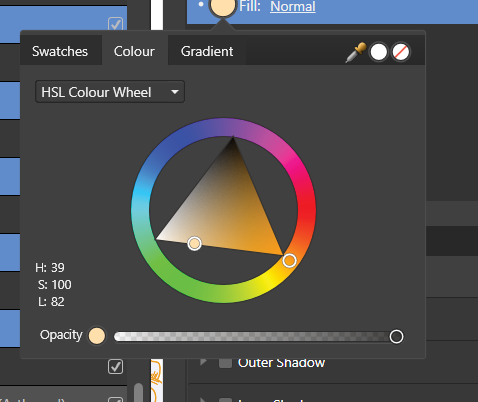
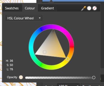
 I'm trying the fill tool of Affinity Designer and have trouble understanding which circle in the color wheel circle and triangle correspond to the circles in the fill tool. Also the circle inside the wheel won't move. Anybody knows?
 -
 Many time in graphic design we have question which color use. So I think very usefull will be add sugesting color feature. Working example of this is Adobe Kuler website. Why? It is a automatication process of choosing new color. Some people do it by intuition, by other by math. For beginner and I think many professional it can improve workflow create for example few version of web layout or for photographers what background choose to complete picture. More explenation (with great free ebook on using colors with curves) is on Wacom page Wacom Color Master here - ebook titled "Color Theory: Understanding and Mastering Curves" (I'm recommed this lecture) and in basic of colors in video Natalia Taffarel on YouTube. Simply this feature is help to choose colors well working together. What? Type of sugesting colors: Complementary Split Complementary Triad Tetrad (Double Complementary) Analog Accented Analog Custom Options change from sugested colors saturation and brightness to still get harmony of colors. How? 1. Choosing color It's simply choose color and get colors matching to type fx. Triad - that is as Adobe Kuler does on webpage. After that we can add colors as pallete to document / application with option setting global color to better changing them in te future. 2. Finding pallete Detecting pallete used in document. Based on that sugesting which color match to selected type (fx. complementary) or not. On photo is finding which colors you can use to background / text descibes etc. 3. Sets of color in pallete First you create pallete to use in document and make them as set color with global colors. After that you make new using option 1 or option 2 and after that you create new set. Then you can change set using in document. In Affinity Designer for example you can create duplicate project linking to base (when you choose source copy change too) on Artboard. Only difference is that you for Artboard 1 choose set 1, and for Artboard 2 you choose set 2 of colors. On Artboard 1 you have typical version on website layout and on Artboard 2 you have version for morning (news websites use this when some very important person died like president, pope etc.). In Affinity Photo it can be classic set of color for older people more toned and more dynamic for young people. For example photographer makes elegant frame for photo with two version of background fx. making avatars with photo. Sets color in my vision are variation of colors within document pallete. So we have all sets colors in document pallete, but by choosing set we choose which global color are used in document now. For example I create frame and set one set of global colors named "boy" and second set named "girl". By clicking which set I use I get variation using in label design now for boys (set "boys") or girls (set "girls"). Summary I don't know why many application is not doing this on the standard. Choosing right color is a base of graphics and photo editing. It is not look like a very complicated make color wheel and sugesting color on them. For me it could be very usefull option for many of users. If someone feel well choosing color how Affinity application do now then in can simply uncheck / select option "not sugesting". For others sugesting color is automatication color theory without getting a long lecture with math calculation for it.
 -
There is a photoshop plugin called Magic Picker ( http://anastasiy.com/magicpicker). One of its key features is Tone Locking. Basically, it let you change the tone without affecting the relative lighting, as showed in this video ( https://www.youtube.com/watch?v=3zAfu7xE-Jw ). Super useful in digital painting, photo editing, color palette creation and pretty much all kind of work that need a good color consistency.
-
 For some reason the colors on my color wheel changed and there all dark dull colors how do I get my color wheel to change back?