Search the Community
Showing results for tags 'color spaces'.
Found 5 results
-
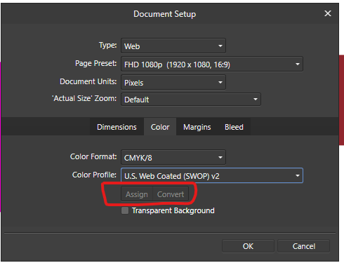
 Hi there everybody, thanks for tuning in. I've been working with a document created using a template for the web, whcih automatically assigns a sRGB color profile. Now, just for example, if I want to switch the color mode from sRGB to CMYK I see I have two options: one called "Assign" and the other, which is default by the way, called "Convert". I do understand the different gamuts between RGB and CMYK and that converting from the first to the last may produce dull shades to the colors. What I do NOT understand is what the difference is between ASSIGN and CONVERT in the Document Setup Menu under Color. One thing I've noticed is that Converting the colors do make a change to the color sliders, whereas assigning the color mode doesn't. Can someone explain how theese two features work in detail and preferably in a context for printing? Thank you so much for your help in advance! Dimitar Z.
-
 MagCloud, a division of Blurb, does not have templates for Affinity Publisher or instructions re: the desirable PDF export settings in Publisher. So for now there's some guesswork involved. The first .afpub made for the test had as its native color space CMYK, with the default CMYK profile selected. The second was an exact copy but with the native color space changed to RGB/16 and the garden-variety sRGB profile selected. Both PDFs passed MagCloud's preflight checks. In both cases I left the PDF export dialog's "convert images" check-box UN-checked. All of it will end up CMYK when MagCloud prints the books. But it will be interesting to see differences between the two. When I changed the native color space there was a noticeable change in contrast between white text on a black background. The characters' edges seemed to distinctly sharper in the RGB version. Could it have been only a screen artifact? Certain colors of the photographs had a bit of saturation boost in the RGB version as well — at least on-screen. I'd be interested to hear from people with a lot of pre-press experience: Given the differences in document color spaces and profiles used, would you expect significant differences in the printed pieces? (I won't be seeing them for a couple of weeks yet.) Something I didn't change in creating the documents: the Assign (versus Convert) setting found in Document Setup. This is one place where a "Lightroom style" UI does the user no favor: It's hard to tell which of those two buttons is "pushed" by default. For now I assume black means selected. The tool tips for these controls read "Assign color profile" and "Convert color profile." Does "Convert" apply to every possible object in the document, including photographs that were previously exported in RGB from their original raw format?
 -
By now I've learned enough about Affinity Publisher that I'm ready to create a small book of photographs to be printed by an online book service that uses a four-color process. I have just noticed something in creating a template, which I first set up in CMYK color space using the default color profile for CMYK: In Publisher's dialog shown via File > Document Setup, there an option to select "Assign" or "Convert." However, the option to select Assign, versus Convert, does not appear in the dialog displayed via File > New. Thus the option appears only after you've created the document. I assume these terms have the same meaning here as they do within a program like Photoshop—what should the program do color-space-wise when an image is opened or placed? Is this option's absence from File > New intentional? If so why would that be? Whichever option is selected—Assign versus Convert—what is the effect when placing images exported from a RAW editor in, say, sRGB or Adobe RGB once they are imported into the document? There doesn't seem to be any "leave in native color space" option—it's assign or convert. The purpose of selecting CMYK is that the book company requests that text be in CMYK color space. This is presumably to avoid "full" black which can cause problems on the press. But now I am wondering if this kind of document should be in an RGB color space throughout its creation, and then converted to CMYK on export to PDF—with Publisher instructed to leave images in their native color space at that time. Advice much appreciated.
-
My first goal in learning Affinity Publisher is to make a few small books of photographs—my own, and friends' photographs. After seeing a photographer's enthusiastic endorsements of a service called MagCloud (a division of Blurb) I decided to give that company a try. They have packages that enable you to make very short books at low cost—a good way to experiment. From what I've seen of the photographer's samples on the MagCloud site, they do a good job, including with black and white images. MagCloud doesn't offer a template in Publisher format, but creating probably wouldn't be difficult even for a newbie like me. My major point of confusion has to do with their color space requirements. My source images will be exported as 8- or 16-bit TIFF files from a raw converter (Capture One), likely converted to sRGB—I don't know if Adobe RGB would be overkill in this case. Friends' photographs will all be JPEGs—again, sRGB. MagCloud states that they expect RGB image files, but insist that all typography must be done "in CMYK color space" (their wording). I don't know why they insist on it. After all, they also say their process converts the entire PDF submitted to them to CMYK before they print the work. How to proceed here? If I start with a new Affinity Publisher document set to CMYK, what happens to RGB images placed within it? Does Publisher immediately convert them to CMYK? Or do they remain in the RGB color space? (I know already that Publisher has an option, when exporting to PDF, to convert to CMYK while still preserving the images' existing color spaces. Or would it be better to stick with RGB all the way through and simply blend colors using the CMYK sliders within Publisher*? MagCloud's own tech support people don't seem to be able to explain these things very well, so I haven't heard yet why they insist on CMYK for just the text within the source document. It might have to do with a need to specify something other than "hard" black for the typography. Apparently the four-color process doesn't like "hard" black. But the reasons for their requirement remain a bit murky. (They also say they don't support spot colors. This also makes me wonder what rendering intent I should choose, assuming Publisher has that option during exporting.) - - - - - - - * But surely setting color values that way isn't the same as converting a document to CMYK.
-
 Hi Everyone, In the need to understand the sometimes complex subject of Color Models, Color Spaces and Color Profiles better, I found it hard to find a nice to read and complete source on the matter. So after I did a deep dive into the subject I decided to share what I've learned about it by writing a tutorial blog about it with illustrations and interactives. Yesterday I published part one about Color Models and color basics, to pave the way to Color Spaces for the next and last part of the article. Although not directly Affinity related, I figured this could benefit other Affinity users too in understanding Color Spaces better and when to choose which in Designer and Photo. And making Color Spaces a little less confusing to understand. Of coarse all graphics-work for illustrations and interactives in the tutorial are made in Affinity Designer. The blog is available in both Dutch (https://www.wigglepixel.nl/blog/wat-zijn-color-models/) and translated in English (https://www.wigglepixel.nl/en/blog/what-are-color-models/). Hope you like it and if this makes others understand the subject better and as enthousiastic as I am now about it after this, I reached my goal! Maarten
- 27 replies
-
- 19
-

-

-
- rgb
- color model
- (and 6 more)