Search the Community
Showing results for tags 'color space'.
Found 23 results
-
 All the way in 2021 @yitzaklr asked for something similar as feedback to Affinity Designer 1. I just posted there not realizing it's an old thread so I'll copy that here. It depends on the Color Space model used to interpolate the gradient. Ideally we'd have an option to choose from multiple color spaces and newer Color Appearance Models (CAMs) such as OKLAB and CAM16, but even just CIELAB would be a great improvement over RGB. This should also be an option for transparency interpolation. Also Adobe has offered this functionality for a while.. The steps to compute this from an RGB base are roughly: Convert the gradient RGB colors into the new CAM space Linearly interpolate between the CAM colors to fill in the gradient Convert those new CAM colors back into RGB space Affinity already has HSL sliders so it should be easy to at least implement HSL gradient interpolation. Hope to hear back about this!
-
 I have some questions about the color samplers in the Info Panel of Affinity Photo. I use CMYK samplers a lot when doing critical color work, especially on skin tones. 1. What size is the sampler? (1 pixel, 3x3, 5x5, etc?) I am assuming it is a single pixel sample, but I am not sure. A single pixel can be misleading, so I'd like to use a larger average sample size. 2. Can you change the sample size? If so, how? Will the Info panel sample size be same as what you select using the EyeDropper Tool if you select something other than "point sample"? In other words, if I select a 5x5 sample size with the Eyedropper Tool, with the sampler in the Info panel also be a 5x5 average sample? 3. When selecting various color modes for the samplers (i.e., RGB, LAB, CMYK, HSV), what color space is used to report that data. For example, if I am working on an sRGB document, but wish to set a sampler to CMYK, which CMYK profile is used to report the numbers. A conversion is required from one color space to another to report accurate numbers. Does AP use the default color spaces and rendering intents to do this conversion, or is it some sort of generic table? Thanks.
 -
 Hi everyone, is it possible to import a color profile / color space into Affinity Designer iPad V1? I downloaded the .icc file from the printing service I want to use but did not understand this information in the help center: If you need to use a color space that is not available in Affinity Designer, it will have to be installed on your system. Devices can install color profiles for you. Consult your system's color management documentation for instructions. Can anyone alert me on how to go about this? I am using an iPad Pro 2015 with the iPadOS 16 installed. Any help would be greatly appreciated! Thank you!
 -
 is there any issue with inferring a LUT in a full ROMM RGB environment? It looked very off (just overall bad quality) when I did so, but when I converted everything to sRGB everything looked perfect. What are your experiences with this? is there a recommended color space or did I just do something wrong somewhere? (I had original files and AFP files so I knew how it's supposed to look)
 -
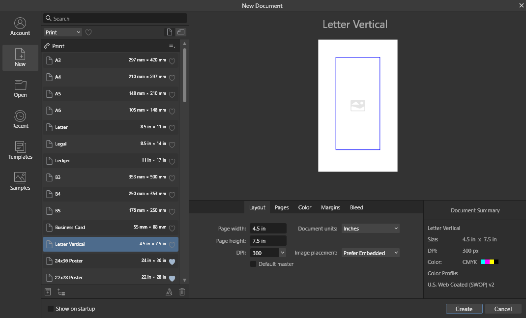
 I don't know if it's a question or feedback. For the past 5+ hours I've been trying to make sense of how to check how my work will look like when printed, and here's what I found. What I need I need a quick way to check whether my colors are within the printable gamut range and also to see the out-of-gamut colors. They keyword here is quick. What I get The Soft Proof layer works not like that. Suppose I am in the sRGB color space. It seems like it takes the RGB coordinates of current image of the sRGB space and simply applies them to the Proof Profile that I select (without conversion). But that's not what I want, this naturally gives the wrong results. What happens is that once I apply soft proof with the "U.S. Web Coated (SWOP) v2" profile I suddenly get a brighter image, as if it tells me that this is how it will be printed. And if I click the "Gamut Check" button most of image becomes grey. But it's not the case, it's not how it will be printed. In fact, all the original colors will be printed (in my particular case). The step that this Soft Proof feature misses is the conversion of Color Spaces for this "check". If instead of applying the Soft Proof layer I convert the color space (Document > Convert ICC Profile...) and select CMYK/8 + "U.S. Web Coated (SWOP) v2" then the image will remain exactly as is, it will not become brighter. Furthermore, if I now apply the Soft Proof layer and select "U.S. Web Coated (SWOP) v2" then the image will stay exactly the same, and if I click "Check Gamut" then no area will be grey. Because all colors are within the color space range. Bottom line It's very misleading what the Soft Proof shows if you don't convert your profile first. But if you have to convert your image profile to check the gamut then it makes the "Soft Proof" feature not helpful. I am attaching an image, just for reference, which I used to play around with this. Can you please help sort this out, why does it work like that and has that been done intentionally.
- 18 replies
-
- 1
-

-
- affinity photo
- soft proof
- (and 4 more)
-
 Hi, is it possible to set different colour spaces for each layer within Affinity apps? Or at least to see when opening a PDF with multi colour spaces the different colour spaces? Thanks!
 -
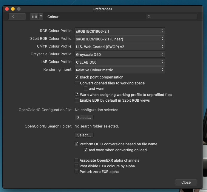
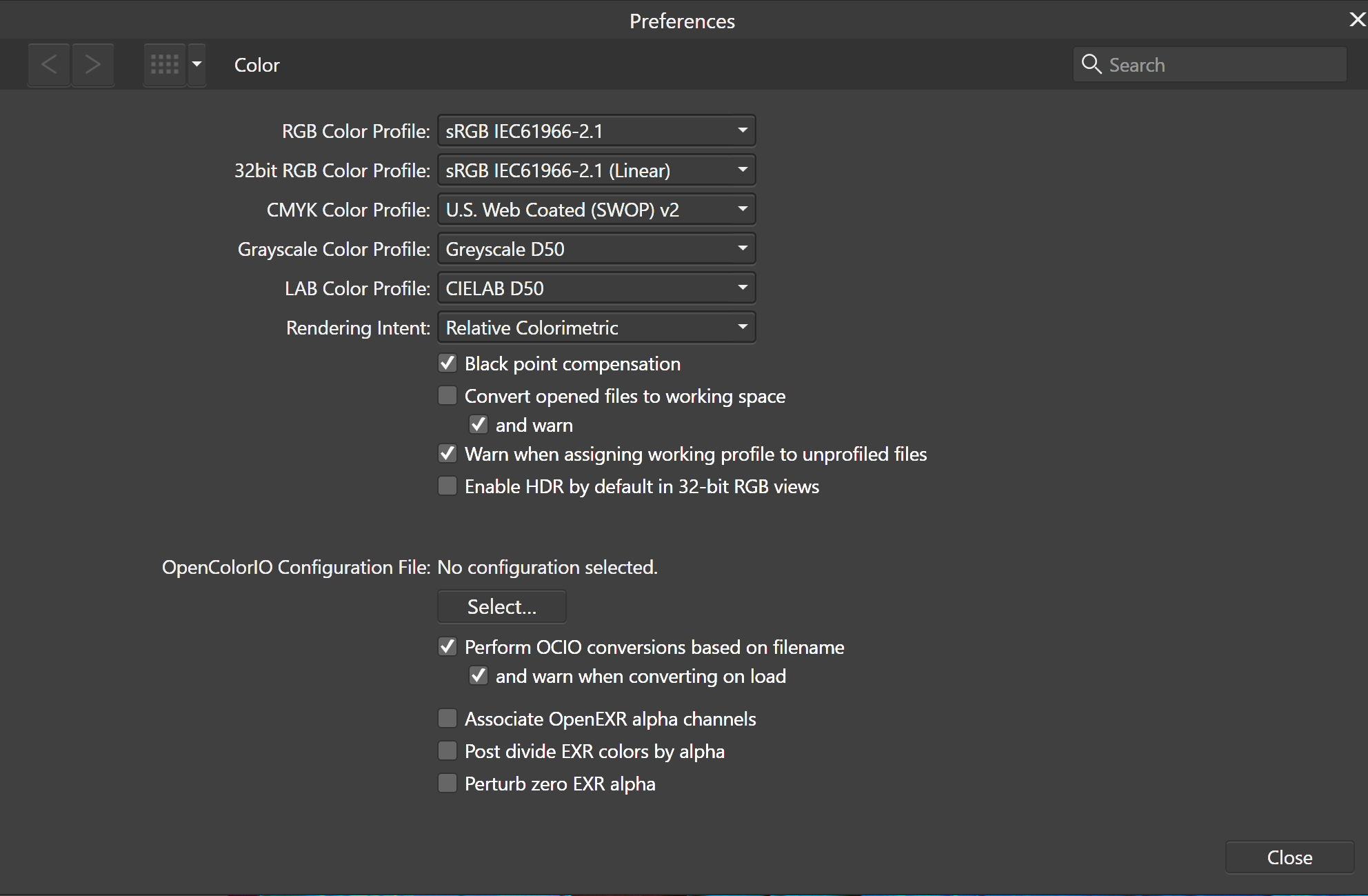
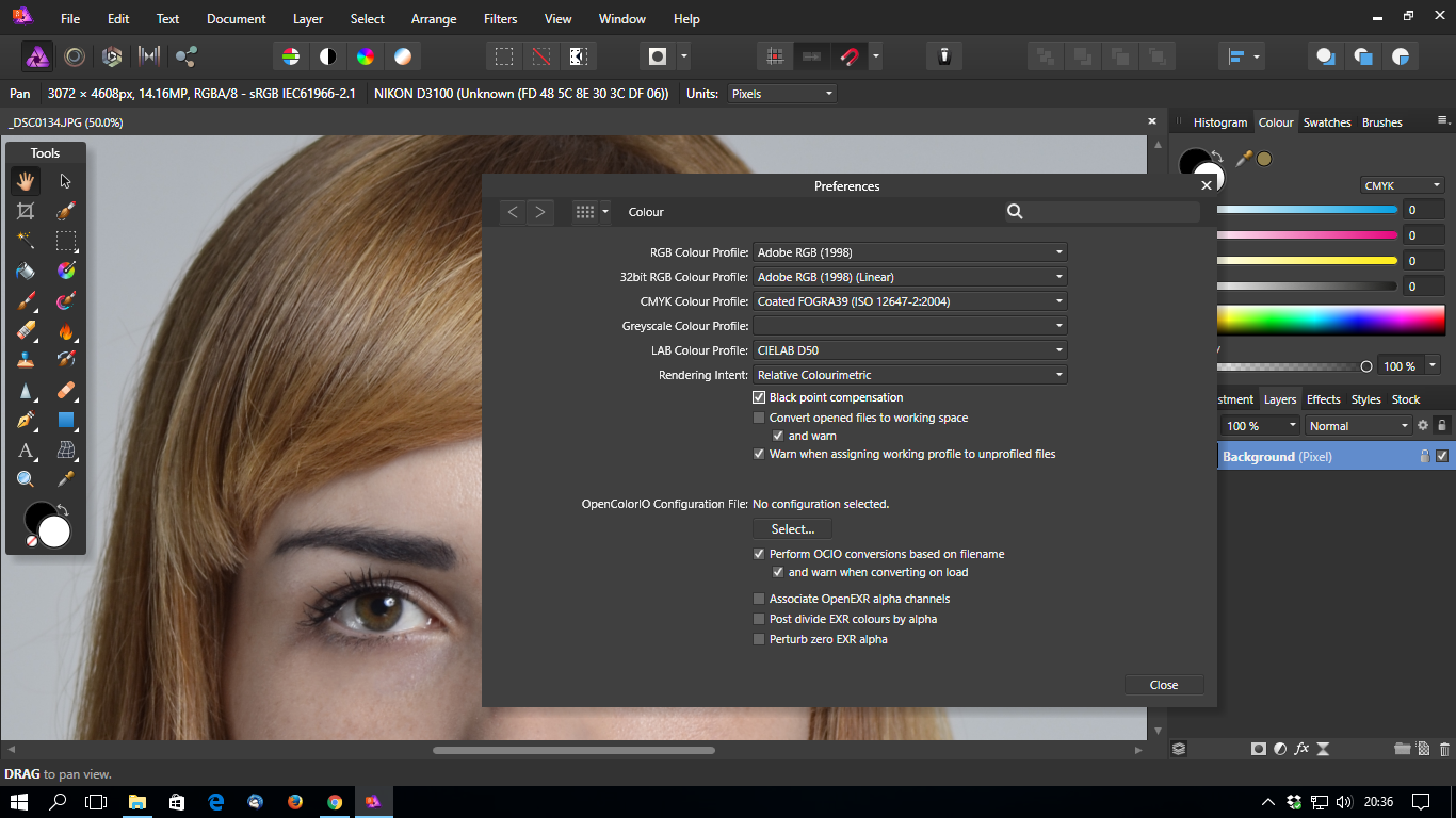
 Hi everybody, I got this color profile question . I have set it to Adobe RGB in my Fujifilm X E2. When I open the jpgs in Affinity Photo the photos have a different color, much punchier and more contrasty in a weird way. That's not what you want to experience. I checked the Affinity preferences and this is what it reads (see attachment) The term in Affinity is "color profile" which I assume is color space, right? However, it says color space in my camera. At the very top pull down menu I can choose Adobe RGB but it still renders my jpgs in the same different way I described above. It looks different in MacOS Finder Preview. Anyone knows what and how to tweak the settings in Affinity so it will match may camera's color space (Adobe RGB)?
-
 I am layouting a portfolio in Publisher. I have setup the documents color space for Adobe RGB (set to convert in document setup) and all imported photos are Adobe RGB color space as well. I have a color calibrated monitor capable of showing almost 100% of Adobe RGB color space and photos are looking as they should in the Publisher Document. The issue arise when exporting the Publisher document to PDF using Shift+Ctrl+Alt+S command. When choosing either PDF for print or PDF for web I have tried all combinations of the color space and ICC settings in the menu option "more" and it always change the colors in the PDF compared to the colors in Publisher when I view the file in Adobe Reader. This does not happen when printing (CTRL+P) the publisher document to a PDF using either Microsofts PDF or Bullzip (software PDF printer). Can anyone tell me what I might have overlooked or doing worng?
-
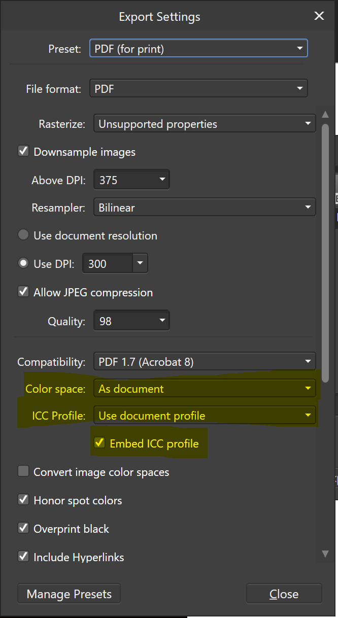
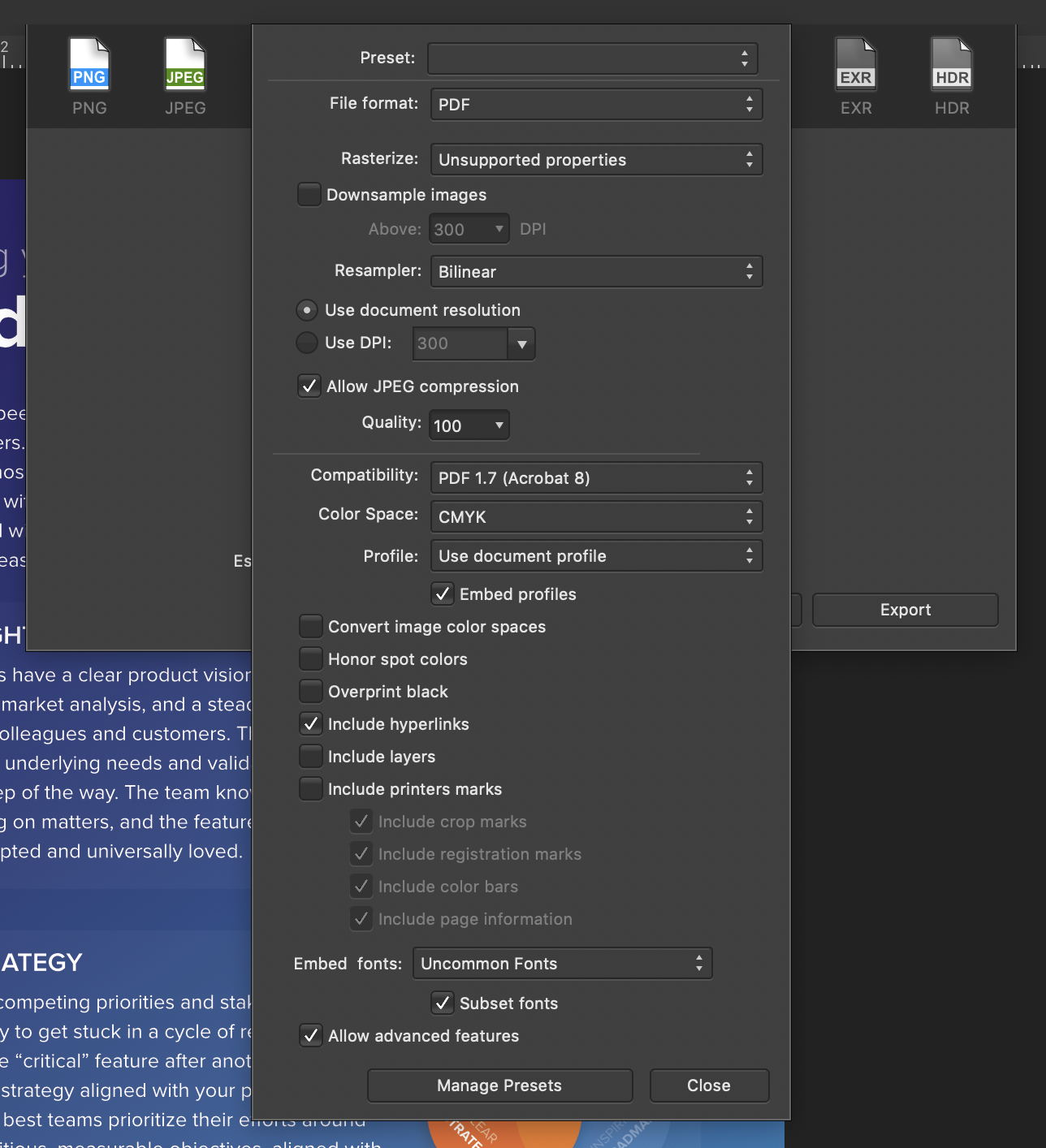
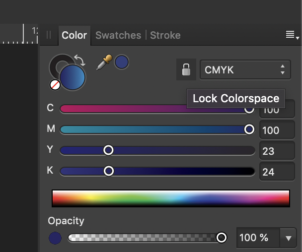
 CMYK colors appear dark & dull upon PDF export from Publisher (see Color-differences attached) I set up my document to be convert to CMYK US Web Coated Swap V2. In the color panel I locked colorspace to CMYK. I've tried virtually every combination of PDF export settings, including convert color profile unchecked and then checked. Why is there this discrepancy in colors? Product Excellence Flyer 2.afpub
-
Hi all, I recently updated to Affinity Photo 1.7.1.404 from 1.6.5.x through the Windows Store and now every image that I open, whether it's an *.afphoto, DNG, JPEG, PNG etc., opens way too dark. Documents created in previous versions are also rendered way too dark but are exported with the right colours and brightness, while new documents result in overly exposed images, more like as if the gamma went through the ceiling. The samples available in the Welcome screen also seem to not match the snapshots available on the Windows Store. From the same snapshots I also noticed that the icon for the Photo persona also seems darker. The "Color" panel also gets way too dark. My device: Windows Store snapshot: Software configurations: I tried running the trial version of Affinity Photo 1.6.5 (got it from the Downloads page) and the problem now seems to happen there as well My device is the Dell XPS 9570, running Windows 10 1903 with Intel UHD Graphics 630 (driver version 25.20.100). This issue also affects Affinity Designer but every other app on my system works just fine. Ideas?
-
 I recently noticed that the colors of my images are "off" by quite a bit after exporting. I checked my monitor to make sure it was set to "sRGB" and in AP it is also set to sRGB. How can I make the image colors look correct after exporting? I am using a windows 10 64 bit PC if that makes a difference. The monitor is a cheap walmart AOC but it's all I can afford. Nevertheless, it isn't a monitor problem because it's only after exporting that the pictures look "off".
 -
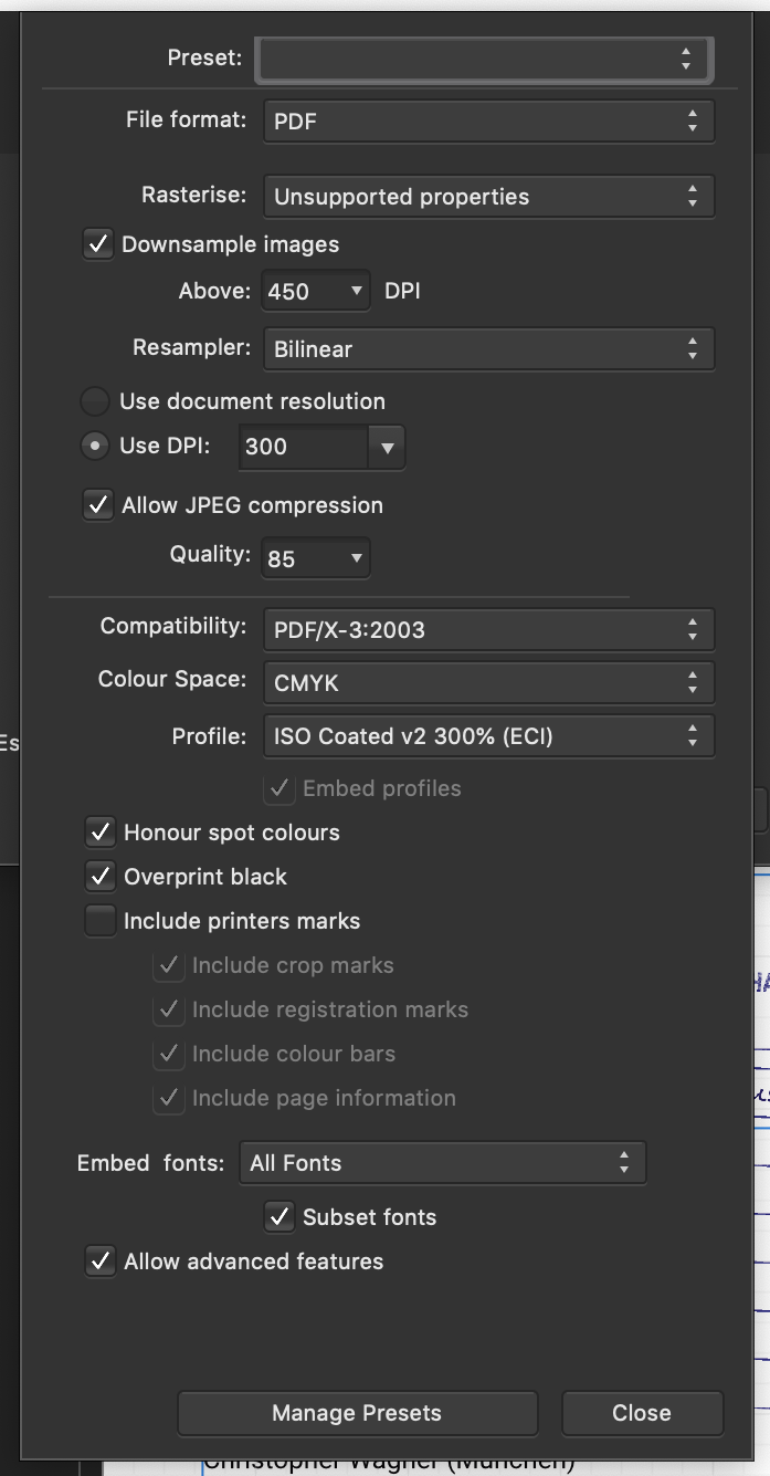
 Hi, I'm on macOS 10.14.2 and I'm using Publisher version 1.7.0.227. When exporting a PDF for print, I get several issues: PDF pages all have different sizes (I set up the page size in Spread Setup) I get the impression that for every page only the area of my content is being exported instead of the whole page. background is transparent (I unchecked this option in Document Setup) color space and profile are wrong (I set CMYK in Document Setup) See attached file for export settings.
-
 hello: is possible Display the color space in the top of the document in both programs (like photoshop)?
- 3 replies
-
- 1
-
-
- color space
- rgb
- (and 3 more)
-
 Hi Everyone, In the need to understand the sometimes complex subject of Color Models, Color Spaces and Color Profiles better, I found it hard to find a nice to read and complete source on the matter. So after I did a deep dive into the subject I decided to share what I've learned about it by writing a tutorial blog about it with illustrations and interactives. Yesterday I published part one about Color Models and color basics, to pave the way to Color Spaces for the next and last part of the article. Although not directly Affinity related, I figured this could benefit other Affinity users too in understanding Color Spaces better and when to choose which in Designer and Photo. And making Color Spaces a little less confusing to understand. Of coarse all graphics-work for illustrations and interactives in the tutorial are made in Affinity Designer. The blog is available in both Dutch (https://www.wigglepixel.nl/blog/wat-zijn-color-models/) and translated in English (https://www.wigglepixel.nl/en/blog/what-are-color-models/). Hope you like it and if this makes others understand the subject better and as enthousiastic as I am now about it after this, I reached my goal! Maarten
- 27 replies
-
- 19
-
-

-
- rgb
- color model
- (and 6 more)
-
 I understand how to use Affinity Photo to create 3D LUTs for use in my video editing software Premiere Pro CC 2018. But sInce I'm shooting video on a Panasonic GH5 in VLOG-L I should be creating the LUT adjustments in a LOG color space, at least that's what my research found. That option doesn't appear in Affinity Photo's "Color Format" drop-down menu. Is the LAB option an equivalent? Hoping you can help. Thanks, John.
 -
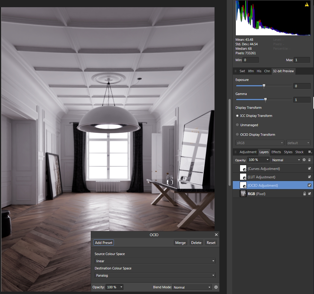
 I explain myself, After 2 days of trials, watching tutos, topics on the forum, I finally managed to have a fonctional 32bits linear workflow in place. I've tried tones of LUTs, OCIO layer and 32bits preview configs but, the better I had was a good viewing and a crap export. Finally I've found a way, perhaps not a good one, but a way. I've read @Frank Jonen talking about a gamma issue on a spécific question so I've tried the transfer fonction trail. It lead me to add an S curve shape on top of my layer stack and this time my LUT worked as expcted and the export too. But why do I need to do something approximative to have all working? Infos: -working with 32bits EXR float (full) linear render -OCIO layer to convert from linear to LOG -LUT layer to apply a creative Log base look -S curve shape on top -ICC or OCIO 32bit preview @troy_s welcome to the discussion
-
 when developing HDR images there is the danger that with RGB color mode you get color faults, because RGB represents color and luminance in the same value. If Affinity Photo would enable a LAB 32 bit HDR color mode that would solve the problem. Because color and luminance are now separated, the large dynamic range of HDR images are mainly reflected in luminance. This prevents color faults during HDR generation. By the way, I like the way Affinity Photo is adressing HDR development in the workflow. However, because I quite regularly get color faults during development, I can not use it in many situations (see attached image as an example for such a color fault in the sky). In this case I use my LAB 32 bit based HDR development programm (Oloneo), which produces nicer color without color faults.
- 1 reply
-
- 2
-
-
- hdr
- color space
- (and 2 more)
-
When opening an image file with embedded color space profile, you can either work in affinity photo with this embedded color space profile or affinity photo will apply color management to adjust the image to the default color space profile as set in the affinity photo color settings. For me it would be much more economic if the color settings would allow to inform if the embedded image ICC profile differs from the affinity photo default ICC profile (according settings) and asks whether to keep the embbeded profile or change it (comparable to photoshop handling).
-
 Hello first let me congratulate you for the amazing ipad app, just loving it...fantastic work...I am running the Beta I am running into an issue though with exporting my tiff files for printing. I export them as 16 bit tiffs in the adobe RGB space because there is no Prophoto option ( where is it?) and adobe RGB seems to be the next best choice ... correct? the export files opens perfect in AP desktop but wether I try to print the file from the IPAD or export in Prophoto from AP desktop they do not print properly but look like closups of very heavy noise artifacts.... I am printing from COLORBURST OVERDRIVE that reads the file and shows a normal preview. Never had a problem with COLORBURST and AP desktop files What do you reckon and suggest??. I think it could be interesting to put together a tutorial about preferences both for AP desktop and AP Ipad
 -
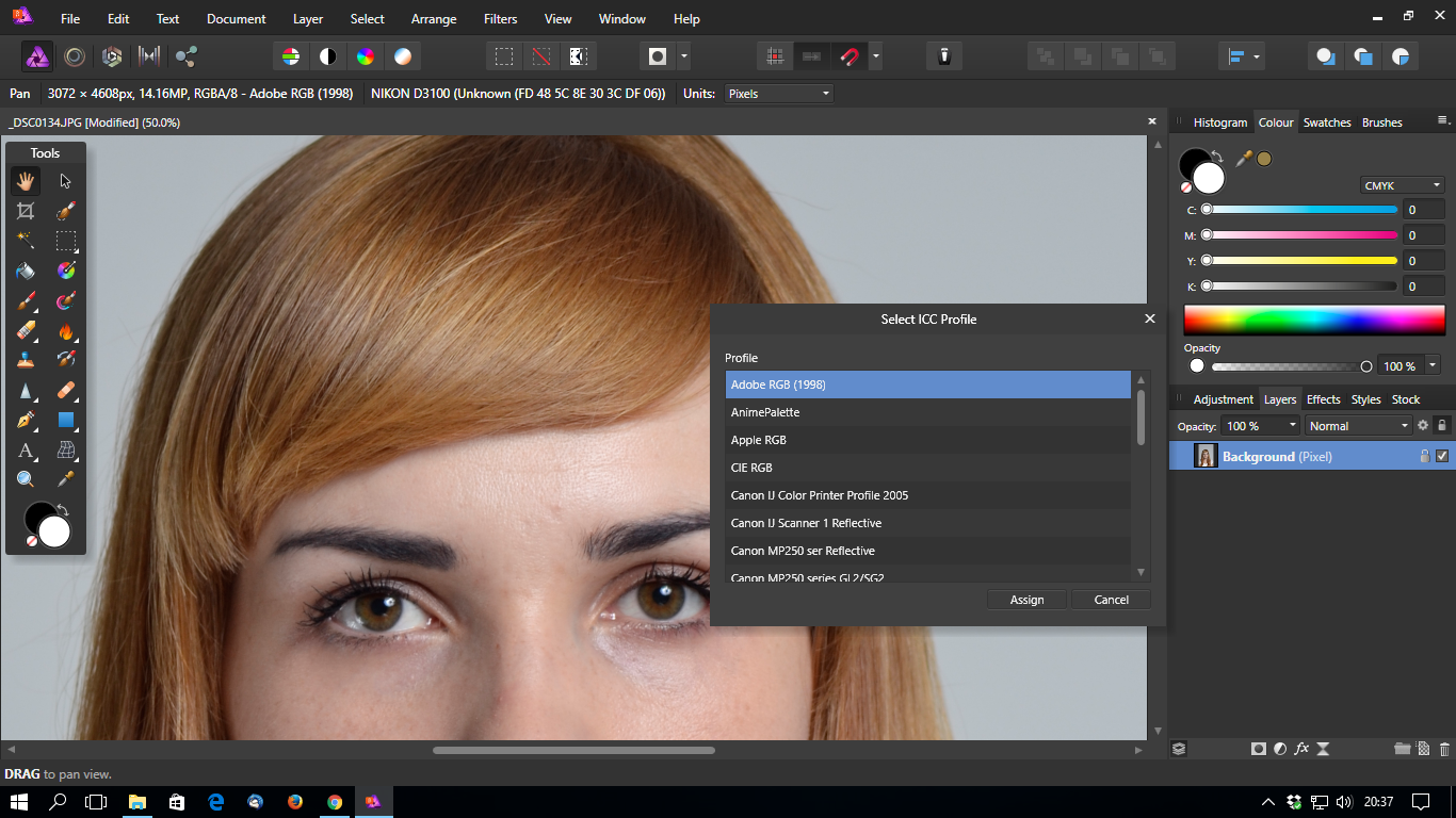
 AP Beta 1.5.0.43 still bad reads the color profiles in Nikon's JPG files. The picture was taken in Adobe RGB color space - AP indicates sRGB. I have to manually assign the correct profile. Sorry for my English :)
-
 When we develop and edit picture starting from RAW then very often we can lose fine color details during conversion to final color space. The typical remedy is to define working color space wide enough to accommodate wide camera gamut, but still, our final color space should be smaller so finally, a conversion is unavoidable. Leaving aside a discussion about what is real color, for sometimes complex reasons we can allow small color shifts and keep details visible. Often happens that color banding or unpleasant color areas emerge in final result even when you use 16 bits per channel and perfect profiles. To overcome this problem you can try to use wide gamut profile for working space, use the color proof layer on top and then export or convert picture to final color space. Below is the explanation (rationale) for this procedure. For example, let's imagine that there is pixel with R:G:B values of 116:51:32 with ProPhoto D65 profile. For simplicity, I will use here 8-bit encoding. Normally, with wide gamut profiles, at least 16 bits per channel should be used. Now, when we convert an image with this pixel to sRGB its value becomes 164:10:27, but color will not change. Why? Because this particular color is inside sRGB and ProPhoto gamut. When I will use color proof correction layer in ProPhoto profiled picture, then for this particular pixel value will not change, and still will be 116:51:32. Similarly, there will almost be no change in expected value after conversion to sRGB color space. Because of a rounding errors small shift to 163:11:26 can be observed. This particular pixel value is almost on the boundary of sRGB color space, so small changes are possible. The situation will change dramatically if we will try to do the same with a pixel which color is out of sRGB gamut. Let's take saturated red pixel in ProPhoto color space, where the value will be 163:0:0. Now, with proof layer applied, pixel value should change to 170:72:26, but when you directly export this picture to sRGB space then the value will be 241:0:0. Exporting picture with proof layer applied results in 241:8:5. Why there is such difference? The reason is simple: proof copy is still in ProPhoto space, so relative colorimetric routine adjusts not only saturation but also other parameters. When you directly export to small, sRGB space then conversion routine is in a completely different situation. Oversimplifying, zero is zero, so closest pixel value is for conversion routine 241:0:0 - a distance between a pixel value in different colorspaces is simply too large. This behavior leads to "fine tuned" color space conversion routine. This routine gives good results with highly saturated pictures and with RAW workflow, where there are many color details outside sRGB (aRGB) space. You have to remember, that modern cameras have really wide gamuts. Very often much wider than Adobe RGB in reds and blues. What do you think?
-
- 1
-
-
- wide gamut
- banding
- (and 2 more)
-

Change color format in export option
Hector Leon posted a topic in Older Feedback & Suggestion Posts
Hello! The possibility to change the color space/format at export without needs to change documents setup. Every time I'm working for impression(CMYK) when I need to send a preview to my clients, I have to change the document setup to RGB and then export to jpg or png and then go back to document setup and re-set the color format to CMYK......... Regards!
-
- 1
-
-
- colour space
- color space
- (and 3 more)
-
 Hi Affinity team I have two small feature requests that will make Affinity Photo and Designer fit really good into VFX, movie and TVC production. 1. My primary request is import and export in the Open EXR file format. Some of the key features of Open EXR is: High Dynamic range, up to 32 bit float. Multiple channel sets (layers / passes). Multiple compression types, both lossless and lossy. Open EXR is used all around in VFX, movie and TVC production. It is supported by, and the preferred image file format of many tools in VFX production (nuke, maya, modo, mari, fusion, scratch, daVinci resolve, etc. and even AE, but it's really bad implemented in PS). 2. The second request is support for motion picture and TV color spaces. Being able to handle Rec709, cineon (LOG), P3, Rec2020, ACES, etc. correctly in Affinity Photo and Designer would be a huge plus. I'm not a developer, but I think it could be done through the OpenColorIO color management solution, which is also widely adopted by VFX production tools. A still image editor is not the primary tool in the VFX, movie and TVC world. But it is always there as a secondary tool for doing quick fixes, converting images and vector files, developing raw files, etc. These requests I mention are weak points/not supported at all with most other image editors, and I think if Affinity Photo and Designer get's it right, it could be a huge plus, and with the very reasonable price tag I can't see reasons to not choose Affinity Photo and Designer. Cheers /johs