Search the Community
Showing results for tags 'color picker'.
-
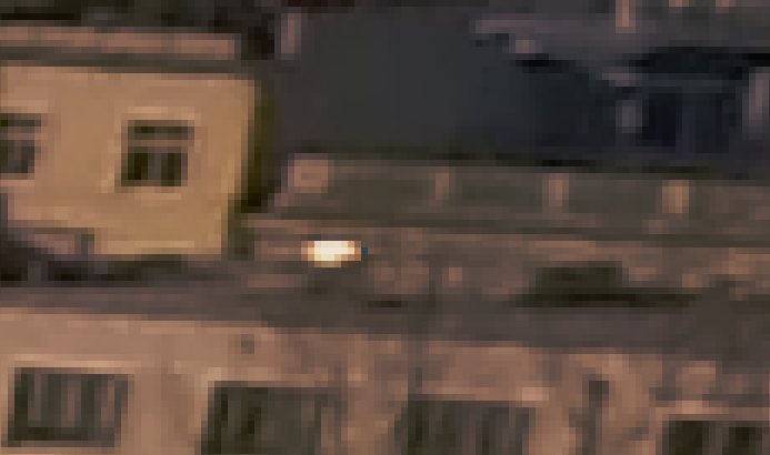
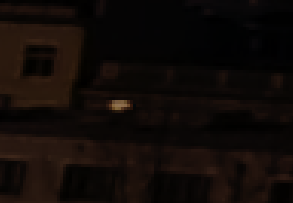
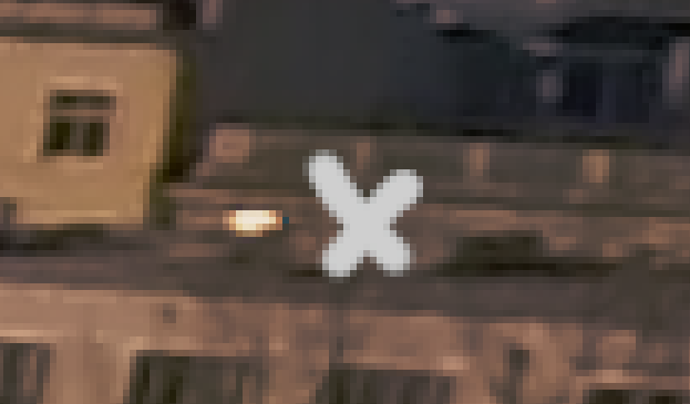
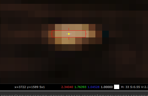
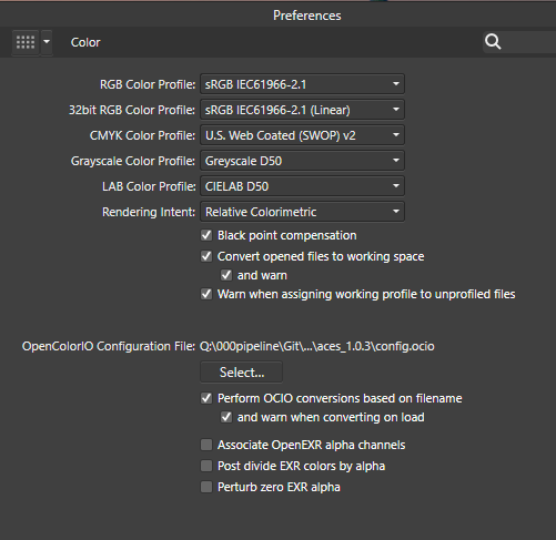
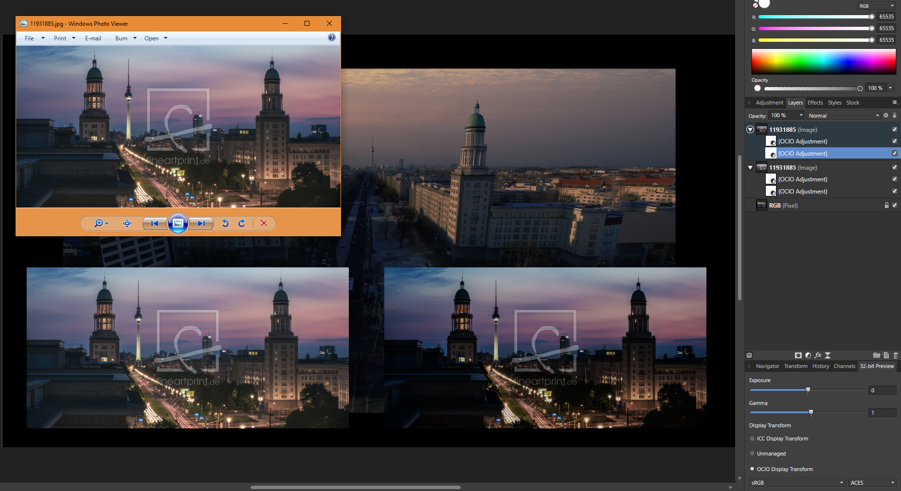
 Dear Serif Team and Affinity Photo users, I'm a VFX Compositor & Matte Painter and I'd like to move from PS to AP. I hope you can help me with some questions regarding the Implementation and proper use of ACES and 32-bit. My background plate is exported from Nuke as an ACES - ACES2065-1 16-bit EXR file. The import into AP (1.6.4.104) works fine - the file get's recognized as an ACES file and I get the same result using OCIO. But there are a few things I can't get my head around yet: How do I pick and paint high color values? Using the exposure slider in the 32-bit Preview I see that there are high values. If I pick and paint them back in, the result is way darker. (Changing the exposure doesn't effect the false picked color) picked in Nuke for comparison I moved from PS because there is a 16Bit limitation and I had to work with ACEScc files (log encoded) and use an ICC profile to check my work. I hoped to get around this using AP. Those threads are dealing with the same issue but the information is contradictory and I can't reproduce the method quoted first. https://forum.affinity.serif.com/index.php?/topic/49815-hdr-raw-pixel-values/ https://forum.affinity.serif.com/index.php?/topic/19787--/ What is the proper workflow of importing and edit JPGs in an ACES setup in AP? Unfortunately there's no way of assigning an IDT during import (as in Nuke) but I can reproduce Nukes behavior with OCIO Adjustment Layers, which seams pretty inconvenient. (Windows Photo Viewer as comparison) Bottom left: Two OCIO nodes in sequence [ACES2056-1 to Utility - Curve - sRGB] followed by [Output - sRGB to ACEScg]. Bottom right: Two OCIO nodes in sequence [ACES2056-1 to Utility - Curve - sRGB] followed by [Utility - sRGB - Texture to ACEScg]. This post deals with the question of the right IDT for JPGs in general. I guess going the Utility - sRGB - Texture way is better, isn't it? My color settings: If you need further information or I haven't made my questions clear enough please don't hesitate to ask. I'm glad about any help or further learning resources! Thanks a lot
-
Hi guys, It would be great if when using gradient colors, we could use the COLOR PICKER tool. For example, I have an object that has a gradient color. When I click on one of the handlers, to change one of the colors, if I use the color picker tool, the shape loses its gradient color and turns into the color chosen by the color picker, regardless of the fact that I first clicked on one of the gradient handlers. It would be great if when clicking on a gradient handler, and afterwards selecting the color picker tool and selecting a color, only the color of the gradient linked to the handler I clicked on, will be changed. I was actually surprised it doesn't work like this by default Thank you, Chris
- 10 replies
-
- 2
-

-
- gradient
- eye dropper
- (and 1 more)
-
 Hello, This suggestion is related to this one but also kinda different. I noticed the color picker tool, when configured as "Average (*x*)", will only return the average color when the cursor is inside the document/canvas. When outside, it will return the color of the pixel the mouse pointer is above, and not the actual average color of the zone. It would be nice if the tool could return the average color of the zone, no matter its location (inside/outside the document/canvas, inside/outside the program, whatever the monitor # the cursor is in, etc.). For example, when selecting the color picker tool in average mode and pointing to a 2nd monitor / another window / outside Affinity Designer/Photo, it should return the actual color average.
 -
 I’m using the Pencil tool in Vector persona, and trying to specify a Fill color with noise, I noticed there is no Noise slider. That’s only available in the color picker on the right side of the screen with the other studio panels. Also, why use up UI space to add a lesser functioning color picker? Might as well get rid of the color picker options for the tool and use the main color picker with access to Quick Colors, Swatches etc. This might help with getting more options on the tool’s pop up menu along the bottom and having less scrolling thru all the tool options... Thanks for all you do!
 -
 I want to paint the lighting fixture shown in the attached Affinity Photo file. I want to use the color shown in the "Color Picker Color.png" file. I followed a tutorial on the webs to learn how to select the brushed nickel frame of the light fixture (and saw the marching ants). To get the color I want into Affinity Photo I pasted the square into the picture (it is very small in the picture) am moved it up to the corner then clicked the color picker (eyedropper) icon and clicked on the square of color. The color does appear in the upper right at the top of the "Color" tab but I can't get that color to color in the selection. I CAN get all sorts of strange colors in the selection if I choose Hue or Recolor or HSL but I cannot seem to get the color of my sample to color in the selection. Please help, Don Change_color_of_lighting_fixture.afphoto
-
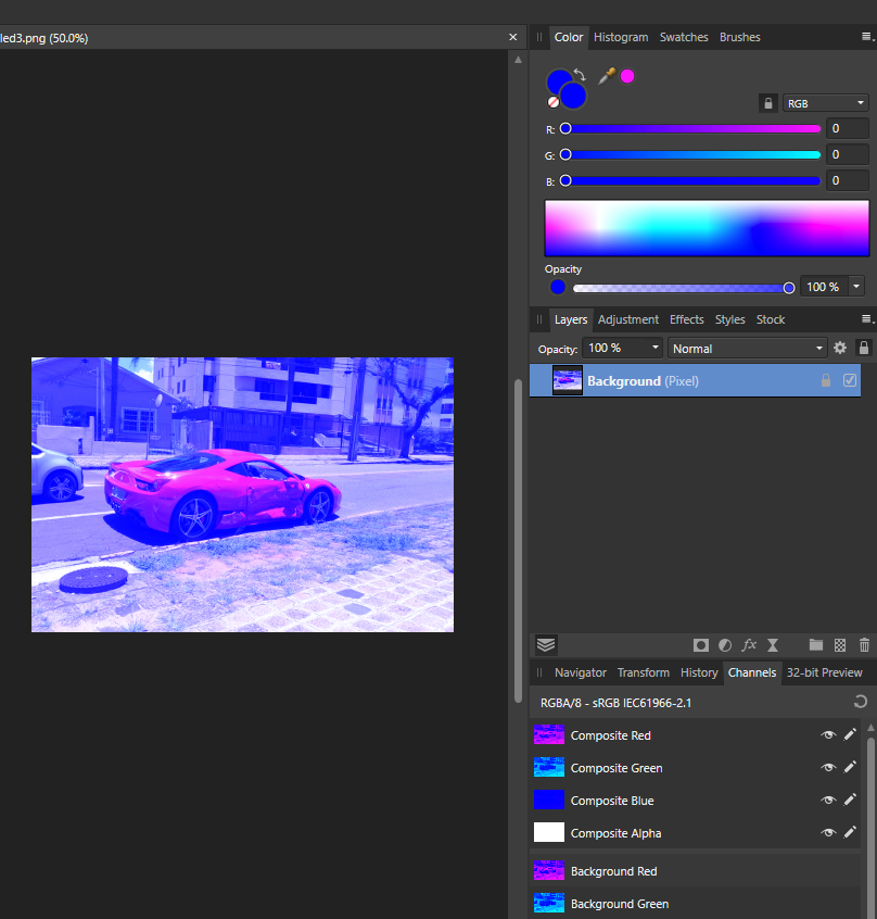
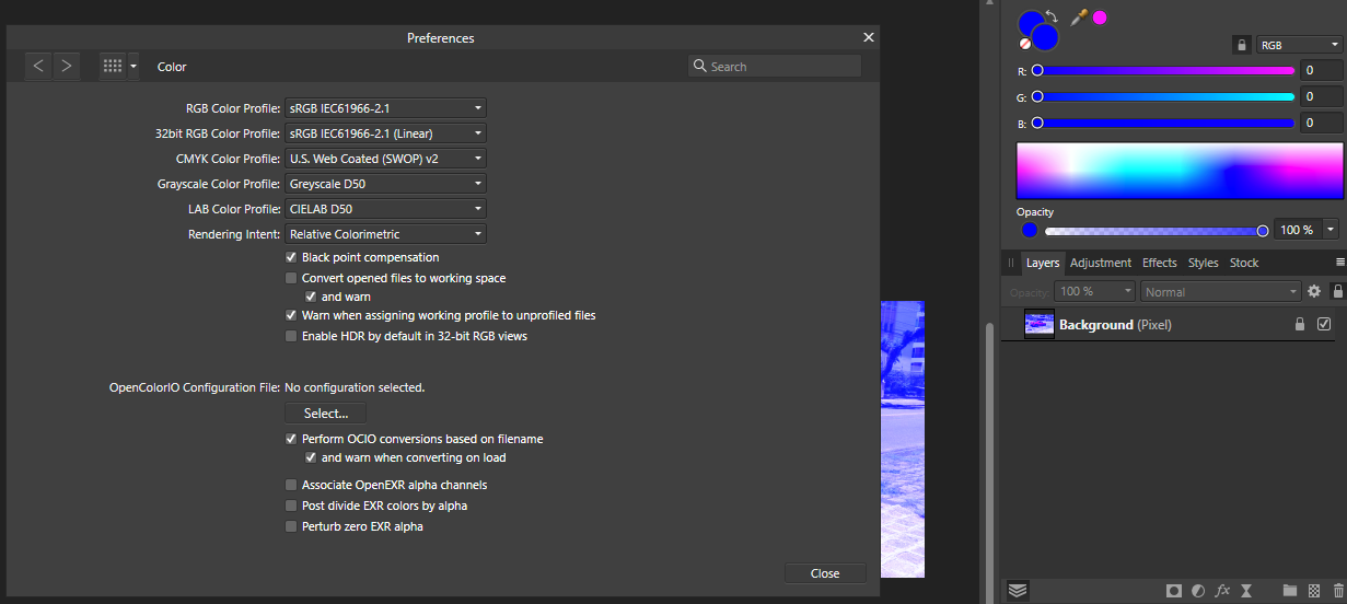
 I'm new to Affinity Photo|Designer and also new into the community, so Hiiii everyone! nice to meet you all! ahahahah My little problem is this: my color picker (in both designer and photo) only give-me Blue-ish colors to pick, the images attached shows how it look like. What I did so far: around 2 hours of google search, changed options, uninstalled both Designer and Photo and reinstalled them. Any photo I open stay in this blueish, my color palette only show tons of blue/pick. Guys, please help, I dunno what more I can do to fix this...
-

Digital Drawing in Affinity Photo
petr0m posted a topic in Feedback for Affinity Photo V1 on Desktop
First off I mostly enjoy drawing in affinity photo. I would want to supply a small list of features which is holding my work speed back tremendously and which I find would be great additions to the affinity apps: Hover Option for the eye dropper color pick: It would be great to have an option to enable a hover color pick without clicking on the canvas after pressing alt for picking up a color. It just needs to much timing and coordinating when painting fast to press alt (assigned to stylus keys) and then click the canvas. Sometime the canvas is hit first ending up to redo one step to try to choose the color again. I would want an option to always pick up a color as soon as alt is pressed and that click and dragging then opens up the more precise view for picking colors. Color wheel of the box version: It would be great to have an additional rectangular color wheel option. Quick solution to rotate workspace: button and drag to show a compass/indicator and rotate the workspace Straight lines for brush tool by dragging a line preview: option to draw straight lines with the brush tool at the actual recorded pressure level. The line should be previewed so that the drawing angle can be adjusted until the additional button for drawing these straight lines is released, would be immensly helpful for fine lineart, as the resulting line can be previewed and adjusted. Would be a great addition to the current draw from dab to dab. Direct slider option for width, opacity, flow and hardness in the brush toolbar: Option display the sliders without the need of clicking the drop down option to display the sliders Scale slider for the UI: Something I have noticed on the work with high dpi-monitors, is that the UI is appearing pretty small. That would be very helpful also if these apps are used on high dpi smaller monitors like a surface pro. Re-sizeable dockers: More flexibility to set up your workspace Brush performance improvements Photoshop Plugin Compatibility for photoshop panels
- 7 replies
-
- 2
-
-
- ui
- color picker
- (and 1 more)
-
 Hello, when trying to select a color with the color picker from the color palette it shows and gives me the wrong color. To reproduce just create an image. Fill it with 127 grey and save it. Open it with any program other than AP and try to pick the greyscale value from there. This gives me a value of 135. Opening the image and picking the color inside AP gives me the correct color. This bug prevents me from picking any color from outside AP since every color gets shifted in a for me random direction. This happens with all colors, not only greyscale. Other color values get picked as follows (255, 0, 0) gets picked as (247, 0, 0) (0, 255, 0) gets picked as (50, 255, 0) (0, 0, 255) gets picked as (38, 0, 255) Resetting the settings didn't change anything on my side. If this is my fault, please educate me on what I'm missing or doing wrong. Thank you! AP Version is 1.8.3.641
 -
 In Affinity Photo you can use the alt key with the brush tool to temporarily bring up the color picker. There needs to be a similar hotkey that can bring up the color picker while using the flood fill tool. I’m a professional cartoonists, and laying flat colors underneath a layer of black line art is a crucial part of my job. The way that the Flood Fill tool and the Freehand selection tool preform will have a direct impact on weather comic artists buy your program or not. Please consider sitting down with some comic artists and hearing their needs. We want to buy this program.
 -
This actually applies to all three programs in the Suite. The color picker in CMYK when used in click-and-drag mode, runs into a problem with its local readout when the first two elements (C,M,) are both 100. When that happens, the field length for the readout does not expand far enough, and the K value is truncated at one or two digits, depending on the number of digits in the Y value. When that happens, the only way to get the accurate K reading is to let go of the mouse, so the full set of readings appears in the palette on the side. But this is quite a nuisance when it happens. I've made the attached screen capture video to demonstrate. This is in Windows 8.1, using a 1920 x 1200 monitor. The video is in .MOV format. If it doesn't run properly, I'll upload another one in a different format. Let me know if it's necessary. AFPhoto.mov
- 3 replies
-
- 1
-

-
- color picker
- cmyk
- (and 1 more)
-
 When I used the color picker today I go a popup asking for permission to record my screen. I refused the permission since I didn't understand what it was for. But no I understand that it was needed to be able to pick colors outside the app and I wish to change the permission and I can't find how to do it. It's for Affinity Designer on mac.
 -
I am having trouble with the color that I have picked with the color picker remaining the picked color when I switch to the brush tool. No matter what I do the color of the brush tool always switches to the previously used color.
-
 The color picker found in the Add Global Color dialog dialog only picks colours in RGB, independently of the document color space. Steps to reproduce: Create a new CMYK document Create a new object on the page, for example a rectangle with C:0 M:0 Y:0 K:20 Open the Swatches panel From the Swatches panel flyout menu, chose Add Global Color Use the color picker found next to the drop down menu to pick the color from the rectangle Notice the color value is expressed in RGB rather than CMYK Thanks!
 -
 Solved. See Walts reply and my reply to his for even more. Pulling this out of the slow death in the archives - into the light. I am madly missing a colour picker functionality like described by @chris.bannudirectly from the gradient editor. It is essential when you draw (recreate the image with vectors) on top of photos and need to add gradient points with exact colours from the image just below. Why is it not possible? All workarounds slows the work flow down to a crawl.
 -
 I need to create similar objects with same color/attributes/styles, but different shape The current only way is inefficient (Create a style) Eyedropper tool would facilitate this task Color picker could be upgraded (Would need to rename the tool), adding options (with check boxes) for Copy effects - Copy color (Also gradient attributes) - Copy Stroke style - Etc. Like this: ro That or add a brand new eyedropper tool for the software _____________________________________________________________________________________________________________ In addition, I suggest a miscellaneous shortcut for "Add Style from Selection"
-
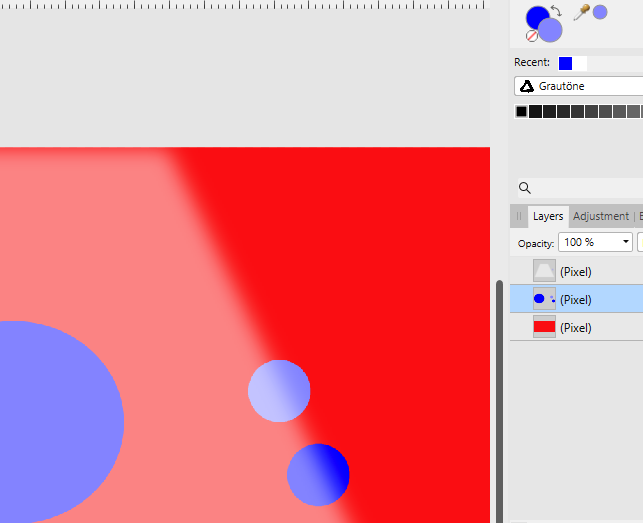
 When sampling a color with the paint brush tool by pressing the ALT key, always the global color as it can be seen on the screen is sampled. If there are brightening or darkening layers above the current layer, the sampled color is brightened or darkened once more, which ends up in a completely wrong color. The actual color picker tool has a source setting "Current layer" which samples the correct color. So either the paint brush tool should consider the color picker tool's source setting when sampling a color or it needs an own setting for sampling colors. There is a dark blue circle on the middle layer used as sampling source. The top layer has a brightening effect. The color for the lower dot on the right was sampled with the actual color picker tool with source set to "Current layer", the color is correct. The color for the upper dot was sampled with the paint brush tool's inbuilt color picker by pressing ALT: the color chosen is already brighter than it actually is and is then brightened once more. AP 1.6.1.93, Windows 8.1
-
It would be great to add this to current functionality: Drag color swatch horizontally decreases saturation all the way to 0% back to original value (with a snap along the way) with the option to increase sat to 100% all the way back at color swatch in UI. Thanks for your consideration and all you do!
-
 I used the color picker to sample a small patch (17 x 17) of grass, then did a Select Sampled Color..., then clicked Cancel. Here are the crash reports. Affinity Photo_2019-08-08-125016_RRL-MacBookPro15.crash Affinity Photo_2019-08-08-125120_RRL-MacBookPro15.crash Affinity Photo_2019-08-08-125933_RRL-MacBookPro15.crash I canceled because the selected stuff was not the color I had sampled.
 -
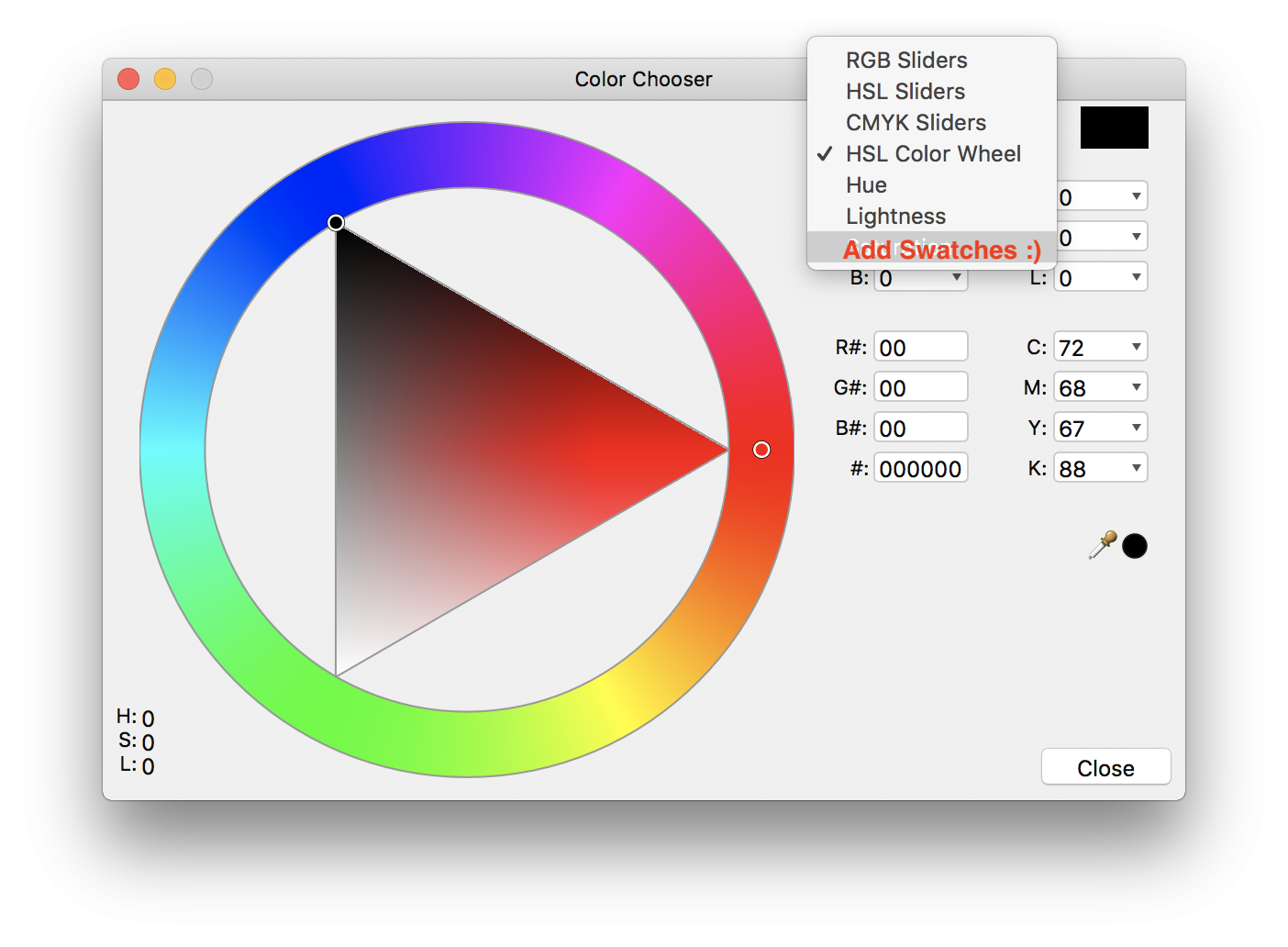
 Hello Affinity Photo development team, I'm a newbie to your program, but have worked as a digital illustrator for several years. Affinity Photo is a really nice program - a nice alternative to Photoshop. It could be a great program for digital illustrators and painters... But it is missing a critical option for higher speed efficiency: a fast color picker option by pressing "Ctrl" or "Alt" This is present in Photoshop, Corel Painter, Krita, OpenCanvas, PaintStorm Studio, etc. It is very important to painters to be able to access the color picker quickly. When you hold down "Ctrl" or "Alt" and click on the color - it color picks it. Then when you let go of the "Ctrl" or "Alt" key, it goes back to the tool you were using before. When you have to switch between brush and color picker, this wastes twice the amount of time. An extra second or fraction of a second may not seem like a lot - but it adds up. A painting that would take 2 hours, takes 4 hours. A piece that would take 1 day, takes 2 days. 1 week turns into 2 weeks, etc. This would be a great addition to Affinity Photo - for all artists. One last idea... Is allowing the user to "fix" the color wheel triangle in a fixed position - instead of having it rotate all around pointing at the chosen color. Why? Because having lightness point up, darkness point down, and saturation point right - is far easier for the brain to process than having the triangle flip all around the wheel... it makes picking specific shades across different colors inconsistent.. harder to match the same saturation position on different colors... because it has changed position. It's easier for the brain to map out the color triangle when it's fixed in one position. White up - black down - and saturation to the right.. Would be far easier to remember for artists - who need consistency, and speed in color picking. Thank you immensely for viewing and considering these ideas!!
- 48 replies
-
- 6
-
-
-
- color picker
- color wheel
- (and 8 more)
-
 All of a sudden...until today never had a problem, designer keeps crashing. Every time I use color picker the whole program crashes. Does anyone have any advice? Thank you in advance for help/advice you may have! B
 -
 Hi all, If I paint in a 32-bit document with a brush using color intensity higher than 1, the Color Picker clips the value to 1. Cheers, Juan
 -
It would be great to add a minimized version of the Color Chooser's stroke, fill and none icon to the one column Tool Palette layout, as is available in the 2 column layout, which is not as space efficient on small screens as the 1 column layout. Additionally, after double clicking on the color chooser, it would be great to have Swatches as an option in the color mode / source pop-up menu... Attached are screengrabs to better illustrate. Thanks for all you do!
-
Hi all, I noticed that in the Color Tab there is no 32-bit option, is this intended or just a missing feature?. Furthermore, the picker does not pick the Intensity set in the brush. Cheers, Juan
-
 Masks are a huge part of my image editing workflows. One of the only things still keeping me partially tethered to Photoshop is how that program manages masks with other tools --- particularly its brush blending modes, color picker, and history brush. Brush Blending modes and Masks -- Blending modes like Lighten and Darken are invaluable when doing meticulous mask editing, or when painting with a mask. Lighten would allow you to paint in slightly less opaque portions of the mask without altering already existing opaque portions, while the Darken blending mode would provide the opposite functionality. The Color Picker and Masks -- When you have a mask selected, the color picker could choose a gray/black/white directly from the mask for you to paint/fill/etc with, which makes intuitive sense and is extremely useful for being precise with edits, even with a gradient of grays in the mask. The Undo Brush and Masks -- Another great way to increase the options for editing Masks would be to allow the Undo Brush to work with them. Currently (as of Beta 1.7) nothing happens when you attempt to use the Undo brush on a mask.
- 6 replies
-
- 2
-
-
- masks
- undo brush
- (and 1 more)
-
 I apologize if this is something already brought up or if I'm not following something properly but I'm a new user to this program and the first thing I've noticed is an issue with calibration with the color picker tool which is odd seeing how the brush tool and eraser seem to be working normally. I've had an issue similar before with Clip Paint not being calibrated right but that was in every aspect not just a certain tool. I'm using a Wacom Cintiq 13HD Touch (touch is off), I'm running Windows 8.1 and Wacom driver are up to date so not sure how to fix this problem. Any suggestions advice would be helpful. If you need further information just ask and I'll see what I can provide. Kinda at a loss here.