Search the Community
Showing results for tags 'color management'.
-
 Hello, I am considering changing my workflow based on Adobe “Bridge + Camera Raw + Photoshop” on Windows to another product and I was pointed to Affinity Photo. Before trying I would like to check if this makes sense at. So if possible I would like to profit from your experience to help me make a start on some questions to see if this a road worth pursuing for me. I use Bridge for photo selection, Camera Raw for work on photos and Photoshop for refined work and printing (with color management). Can I do these with Affinity? Can Affinity support non-destructive workflow? Does Affinity support colors management and preview with other color profiles? How does it manage printing? Can I print letting Affinity manage color profiles as I do in Photoshop? Can Affinity read and use my existing CR2 files with the companion XMP file generated by Adobe Camera Raw (these XMP files contain not only the IPTC data, but also the work on the photo I did with Camera Raw) Can Affinity read the Photoshop PSD files? I use layers layer masks and have Smart Objects embedded. Many thanks for your patience and help. Regards
 -
 When I open a document in Adobe RGB, which uses a white point of D65, and allow Affinity to convert it to my working space, which is Colormatch RGB (D50 white point), and have the rendering intent set to Absolute Colorimetric, I don't see the expected blue-ish tint in the whites. Absolute Colorimetric should NOT maintain the white point, and thus, a white in a D65 based color space should shift slightly towards blue when mapped to a D50 based color space. (and this is the behaviour I have observed in the past, using Photoshop) Is the rendering intent setting even used when opening a document and converting to the working space? If it's NOT used here, when is it used?
 -
 Hello everyone, I currently own a monitor which is used for color management, but unfortunately I am still very confused on how everything works. I read so many articles, etc., and I still don't feel that things are clear to me, mainly because when I try to experiment with these things I get mixed results. My monitor is capable of 99% adobeRGB and I set it in windows to always use adobeRGB. My concern is that the colours I see in Affinity photo differ quite a lot to those I see in lightroom (I use a standalone version of lightroom to do cataloging and some pre-editing). I read that lightroom used ProPhoto RGB as its main icc profile for the develop module. Well, I set the "RGB color profile" in the AP's color profiles as the same (I downloaded it from the icc website). Nonetheless the colors are still different. Is this somehow a conversion from the higher gamut ProPhoto RGB to adobe RGB (screen's icc profile) that uses different engines and therefore the colours are different? What are the steps between the photo's RGB values->screen when in AP? I need guidance or someone to really dumb down the information and feed it to me, because I am very confused with this ordeal. Thanks for anyone's time, all the best, -JA
 -
 I cannot find an answer to this in the documentation. I have been using Affinity Photo as a replacement for Photoshop and am pleased with the performance. I have a question about printing and whether I can print profile targets with no color management. Photoshop CS6 does not allow this (there is a 'null transform' work around) and Adobe suggests using the Adobe Color Print Utility (ACPU) for this purpose. Unfortunately with WindowsOS, patch sizes are reduced by 4% using ACPU. Adobe is aware of this issue but shows no signs of wanting to fix it. I would like to be able to use Affinity photo to print ArgyllCMS generated profile targets with no color management if possible so that target size is retained.
 -
 I have an issue with color management printing from AD where the printed color is not what I would expect: The document is set to AdobeRGB, there are some red shapes (RGB 255;0;0) and a small image - printing to an HP CLJ M452. Color management is turned off in the printer driver. In the print dialog under color management, I´ve chosen "Color Handling: Performed by App" and my ICC profile for the paper type in question. The resulting print is shifted to orange instead of the pure red defined in the document. When I print the document by letting the printer driver manage color (and selecting AdobeRGB in the print driver), the result is as expected. I would have do some more tests but from what I see with this document, there seems to be something fishy about the color management handling in AD. The ICC profile is OK - I use it successfully in various other apps (Indesign, Lightroom, Photoshop). Any ideas?
 -
I appreciate the profile settings in the preferences for the different color modes (RGB, CMYK, Greyscale, Lab), but i'm at odds with how color magement is implemented. When choosing sRGB, images with ProPhoto profile are rendered with wrong, oversaturated colors whereas sRGB profile images are displayed correctly and vice versa ( undersaturated colors for sRGB images) when choosing ProPhoto as default profile. So color management doesn't seems to work as it should !
-
 I just found out that I made a serious error by purchasing AP. It does not support color management! When converting or assigning to a different profile one has to be able to preview what happens and also one has to be able to choose the rendering intent (the usual 4 intents + Blackpoint compensation BPC). This is not offered at the moment when doing a conversion. It is possible to chose the intent in the default options, but this is not enough. This only makes sense for "standard conversions", but often one has to decide on an individual basis if which rendering intent is best for a given photo. I must say I am very disappointed now. Of course I tried the demo and checked different features. Everything was fine. I also have seen that ICC conversion is offerered, so I did not try that out. I know how that works. It never came to my mind that an ICC conversion could be offered without a preview and without an individual choice for the rendering intent. No real professional will be able to use AP alone for that reason. Of course I know there are thousands of "half-professionals" who do not care or know enough about color management. But the ones preparing photos for high-quality, predictable output, be it on screen or in print, will not be able to use AP in a meaningful way on it's own. See also a post like this, which says the same: https://forum.affinity.serif.com/index.php?/topic/17884-icc-profile-conversion/ This feature must be included as soon as possible in the 1.x version IMO. AP is announced and discussed as a Photoshop alternative. This is totally not the case when this simple, but basic and important feature is missing. BTW, it should be clear somewhere how to the default color rendering to the screen is done. In some programs you can choose that on your own. In Photoshop the default rendering is fixed to: relative + BPC.
 -
 //EDIT: formerly known as 'the big disappointment'// -------------------------------------------------------------------------------------------------------------------------------------- dont know if i am in the right place for my complaints, admins just might feel free to change the category. ust tried the designer/photo-combo. although theres actually no trial available, the current offer made me weak. so bought both and the book, installed and ... just got quite disappointed! having a approved win7pro 64bit-system with two calibrated nec spectraview reference monitors, calibrated epson 3880 printer and soft-rip for cmyk proofing. this setup is reliable, well maintained and flawlessly working with adobe illustrator, photoshop, indesign and lightroom as well as corel draw for dtp and photo editing same as web development. every application is giving consistent results under the given color management enviroment. thus said before describing the affinity-experiences to indicate this might be not a newbies issue ... so to af designer and photo: first serious issue i am encountering is a quite incorrect color presentation when using cymk-incorpotated files. colors here are far to vibrant and quite "over the top". looks like viewing a rgb-pic under wrong conditions as wide-gammut with no correction. profiles set throughout all applications are eciRGB or srgb/adobe rgb respective iso coated/uncoated v2. as long as in rgb, affinity follows the other applications - completely going nuts in cymk. every application does this great too, exept for the affinitys. theres 'flashing' colors that neighter represent the correct appearance nor theire useable in any way. as the color management setup showed absolutely no problems so far, i assume the problem is up to affinity. having hardware calibrated monitors with 16bit lut, and experiencing affinity isnt able to handle existing 16bit cymk tifs too, there might be something that affinity cant handle regarding the monitor-assigned profiles? btw: when i am applying a srgb-emulation to one of the monitors (as i am doing when developing for web) the colors in affinity are getting better for cymk... but that cant be the solution, as this is not useable for all other applications which can handle the monitor profiles the right way. switching my monitor profiles to native srgb as suggested in some other threads, changes nothing at all. apart from that it cant be managed that way through windows due to hardware-calibration. so what does affinity wrong? affinity is praysed for being used by professionals, but how would they, experiencing such issues?? maybe its me whos doing something wrong with affinity, but why does it work well with all other programs??? any hint for maybe overlooked things highly appreciated. theres some other things too, i've experienced already within the first few hours: - no support for 16bit cymk tif-files (big downpoint, as there are many) - no color control/preview when exporting bitmaps /.png/.jpg (which is quite sad too when theres no consistent color-conversion as it seems) - no recognition of postscript-printer (soft-rip) and available deactivation of printer profile (because colors are handled by rip - adobe does this as well as corel...) - no option for printing without profile overall - quite important for printing calibration targets for profiling (as well as targeting the rip) ... - no color inspection tool without clicking (like info-panel in adobe, or maybe havent just found yet) - using exported corel-files as .ai does not work in affinity, have to save them in ai again. great clincher as well. - the dark ui has far to harsh contrasts, especially within menus - startup-time is worse 30-40 sec plus on a real fast engine (plenty of ram plus ssd - adobe and corel only takes a fraction of it) - ...? having just made simple setup and some research, maybe ill find other issues, maybe experiencing some change to the better, but so far there isnt much hope i am able to replace my print workflow with affinity at all. if this problems (at least the color-thing) wont be solved soon, theres no way using affinity for (my) cymk-workflow. and if this persists until the upcoming publisher is revealed, it will be unuseable for this too! really would be glad being able to dismiss adobe and corel (the sooner the better), but obviously theres completely no way for that up till now ... so at the moment regarding the buy as kind of support for affinity and ongoing development to the better... and: hoping for production-useable versions within version 1. sad. and just as a remark: its quite a pity one cant order designer, photo and book within one single subscription - maybe i am too dumb for, but it required three individual oders to get all of them... and - it may be some good idea for the future to offer bundles (once they work correctly of course!).
 -
 I have been doing some testing of color printing using Affinity Photo. I am using an IMac, OS El Capitan and an Epson 2400 printer. I am not getting colors that are completely accurate. I just used the Mac's calibration program to calibrate my monitor. I printed all the images on plain copy paper. For 2 below, I had set the RGB Color Profile, in the Preferences settings, to sRGB 61966-2.1. For the other 3 tests, I changed it to Adobe RGB (1998) after doing some reading on color management. In this example, the color profile of the image I was trying to print was sRGB 61966-2.1 I believe this profile came from the camera from which the picture was taken. When I printed the image I tried a few different settings: 1.Color Sync (which lets Affinity manage the printing), using the Adobe RGB (1998) color profile, with the Plain Paper setting. I disabled the settings in the printer dialog box so that Affinity Photo, not the printer was controlling the settings. This gave me the best print, although the skin tones in the photo were too orangey red compared to how the picture looked on the monitor. 2. Color Sync using the same color profile on the printer, sRGB 6 1966-2.1, as was used in the document. Again, I used the plain paper setting and disabled the printer controlling the settings. This print was worse than the first, with the skin tones even more orangey and the blue objects in the image tending toward turquoise rather than deep blue. 3. Color Sync as in #2 except that I chose the Enhanced Matte setting. This gave me the worst colors, in terms of both the skin tones and the blues. 4. Epson controls the colors. This defaulted to a printer profile of SP2200 Standard PK, with plain paper settings, something I was not able to change. The colors I got were similar to the colors in #2 and not as bad as in #3. Based on this experiment, I'm wondering if there is anything else that I should change either in my preferences or other settings. #1 is acceptable but not great. I don't want to use up all my expensive ink trying every combination of preference settings and color profile settings so I'm wondering if there is some rule of thumb that I should be following.
 -
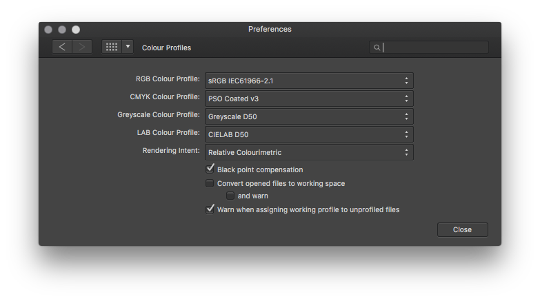
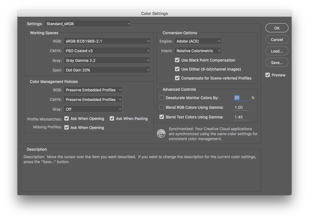
 There seems to be a problem in Affinity Photo with viewing files that are in a different color space than the working color space set in Preferences. Example: I have a simple file with a grey gradient (16Bit TIFF, ProPhoto RGB). When I open this in Affinity Photo there is a slight orange color cast in some of the dark greys and a slight blue color cast in some of the not so dark greys. See attached file "AP-vs-PS.png" (screenshot of the same file open in AP (left) and Photoshop CC (right)). The file is not changed by AP. I can work on it - ignoring the color casts - , safe it again and open it in Photoshop and there is still no color cast in Photoshop. The problem is just the viewing of the file in AP. In this example I use a file with an embedded ProPhoto RGB profile. But I have the same problems when using a file with an embedded eciRGB or AdobeRGB profile. Color settings in AP: RGB color profile: sRGB; convert open files to working space unchecked (see screenshot "AP-color-settings.png") Color settings in PS: Working space RGB: sRGB; Profile Mismatches: Ask when opening checked (and when opening, I choose "use the embedded profile (instead of the working space)") (see screenshot "PS-color-settings.png") As a workaround I can set the working space in AP to the same as the embedded profile of the file I open. But this is not how color management should work! Others have asked similar questions but I don't think they were ever answered.
-
There is a problem with my setup — the preview in the lower right hand corner looks fine, but the picture in the main window is displayed with incorrect colours, corresponding to the primary monitor's profile, even though AP is running on the secondary display. Reconfiguring the display arrangements to make the secondary(calibrated, IPS, wide gamut) monitor primary fixes the problem, leading me to believe that the application only applies the single profile for the primary. The seemingly accurate colour in the afore-mentioned preview contradicts this explanation somewhat, so I am at a loss. Setting the secondary display as primary each time I run AP, just for AP, is terribly inconvenient. I should think that this is a serious shortcoming for such an application. Or am I doing something wrong?
-
I am a bit unsettled by the way soft proofing is implemented. It is currently a layer. It is not document wide, this is confusing: I could make a mistake and have two soft proofing layers,, or export a photo with the soft proofing active, or print the soft proofed version... A document wide soft proofing it definitely necessary IMHO. And I am also completely unsettled by the print dialog. There is no print dialog: I jump directly to the winter dialog: I miss a dialog like in aperture (my favorite tool tool) or photoshop (all east like my aging CS3) : the dialog allows to adjust margin, select the paper/printer profile, proofing options (perceptual etc) by put affinity photo in direct control of the color management (i.e., disable apple print dialog volt management). These two options a (for me) absolutely pessary for a complete print workflow. My tools : iMac + OS X 10.11 with calibrated screen (with probe), epson R2400, access to epson 4800, Aperture, Adobe CS3 (serious glitches win photoshop, crashes in illustrator and indesign not working anymore). PS: I would love a DAM from Affinity, and almost buy it blindfolded, these above functions are essentials for it too.
-
I’m a bit confused about the fact that the Soft Proof functionality is implemented as “Adjustment”. I don’t feel I “adjust” an image when I soft-proof it; rather it’s some kind of filter I’m using for a moment. Specifically, I will switch on and off Soft Proof frequently, whereas in the current implementation, I’ll have to *undo* the Soft Proof each time (if I’m not mistaken), which is kind of strange.
-
 I’m using the Apple Color Picker a lot, especially as I have created a lot of Color Palettes. I encountered three issues with this on Affinity Photo: 1. The shortcut for the Apple Color Picker is universally Shift-Command-C in any well behaved Cocoa app on OS X. It’s not in Affinity Photo, which is confusing. 2. Open an image in sRGB in Affinity Photo. Choose the Colour pane in the upper right of Affinity Photo. Choose the Color Sliders pane in the Apple Color Picker. Choose RGB Sliders from the Color Model pop-up. By clicking on the tiny Color Space pull-down menu left of the Color Model pop-up, make sure Generic RGB is the color space selected. With the sliders in the Apple Color Picker, select some arbitrary RGB values. Note that the RGB values in the Colour pane in the upper right of Affinity Photo are identical. However, the Apple Color Picker values are in Generic RGB, those in Affinity Photo are (should be) in sRGB (since that’s the image’s color space), so identical values are wrong. 3. I see that you try to integrate the user-wide OS X color palettes of the Apple Color Picker into your own GUI (which I applaud). However, the point about the color palettes in the Apple Color Picker is that these are *named* colors (the names indicating their usage), whereas you only display the color swatches, which is kind of useless for a palette of colors. This is especially an issue because points 1 and 2 prevent easy usage of the Apple Color Picker instead.