Search the Community
Showing results for tags 'cmyk'.
-
 Hi and thanks (very much) in advance. I am making a book cover for a paperback book -- I am using Affinity Publisher, and I also have Affinity photo (and Designer, too). There is a photo (from Unsplash, free to use) that I want to use on the cover (the photo is attached). It is a blue sky with a cloud -- and the blue is so bright and wonderful. It's a jpg file, but the problem is, when I convert to CMYK (which is required by the printing company) -- the blue sky fades, and loses all its magic. Is this what always happens when JPG goes to CMYK ? ... Or is there something that I don't know about Affinity Publisher (or Affinity Photo) -- is there some trick or technique to keep the CMYK blue looking bright like the jpg blue sky ? Thanks again ... from Zorba
-
 Hi there. Well, I found an annoying trouble, I think, in reference to color spaces. I did a design using a rgb document. Well, I have the rgb reference of the color of one element but when I change to cmyk in the right side dock (or in the document itself) the referece doesn't match with other conversors like https://www.calculadoraconversor.com/cmyk-a-rgb/ or https://www.rapidtables.com/convert/color/cmyk-to-rgb.html I think the conversion is wrong. In example: #00146B in RGB >>>> Designer gives CMYK 100, 97, 24, 25 while both conversors above writed and other softwares give CMYK 100 81 0 58 It´s imposible to have a secure work if the conversion is not real. Where is the problem? Thank you in advance.
 -
 I am new to Affinity Publisher. I have it on my MacBook Pro, v1.8.6. Today I was going through a tutorial for it on lynda.com and was doing a very simple letter-size doc. I ran into a very weird (to me) issue when I was specifying a CMYK color. When I initially spec’d it, all seemed normal. A bit later, I looked back at the percentages (in the context sensitive-area at the top) and the settings had turned into four digits! When I put the correct CMYK percentages in, the color was entirely different. I restarted the program (twice), no difference. I tried to add that color to the swatch palette and another color added instead. it just got weirder and weirder (and frustrating). I’ve been dealing with print graphics for 30 years and there are *no* four-digit percentages (LOL). Is this a bug or something? I have been wanting to try Publisher out to see if it could replace InDesign our our workflow. Not at this rate... Screen shot attached. The other thing is performance-related. I select some text and change the size in the palette, and the type doesn’t change size immediately. I am so used to the way InDesign behaves ... Any thoughts on what is going on? Thanks!
-
 I'm not sure if I'm not understanding the gradient colour selection dialog boxes. I have two artboards of the same poster side by side, one is my CMYK version and the other is RGB. I'm switching between them and trying to ensure that each one has the correct colours set. How ever, when I edit one, say RGB, then go to the other CMYK one the dialog box isn't switching to CMYK, so I tell it I want these colours to be CMYK. Then back over to RGB artboard and select the same item, but now the dialog box is saying each step is CMYK. I'm confused to say the least. Isn't it meant to show me the colour of the step selected and not the last colour used? Put two boxes next to each other, fill one with RGB and the second with CMYK (can be a solid or gradient), now go back to the first box and it's suddenly a CMYK. I'm losing the battle here (and my sanity slightly). Is it that a single document can't have CMYK's and RGB's? Thanks for any direction on this as I'm trying to get things out for clients and this is making my already late project later.
 -
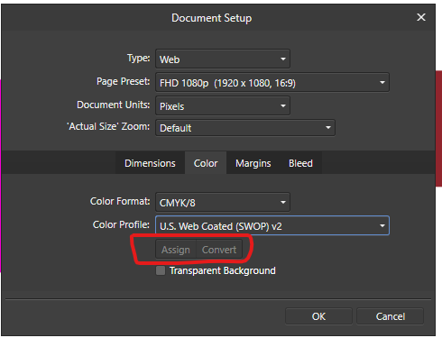
 Hi there everybody, thanks for tuning in. I've been working with a document created using a template for the web, whcih automatically assigns a sRGB color profile. Now, just for example, if I want to switch the color mode from sRGB to CMYK I see I have two options: one called "Assign" and the other, which is default by the way, called "Convert". I do understand the different gamuts between RGB and CMYK and that converting from the first to the last may produce dull shades to the colors. What I do NOT understand is what the difference is between ASSIGN and CONVERT in the Document Setup Menu under Color. One thing I've noticed is that Converting the colors do make a change to the color sliders, whereas assigning the color mode doesn't. Can someone explain how theese two features work in detail and preferably in a context for printing? Thank you so much for your help in advance! Dimitar Z.
-
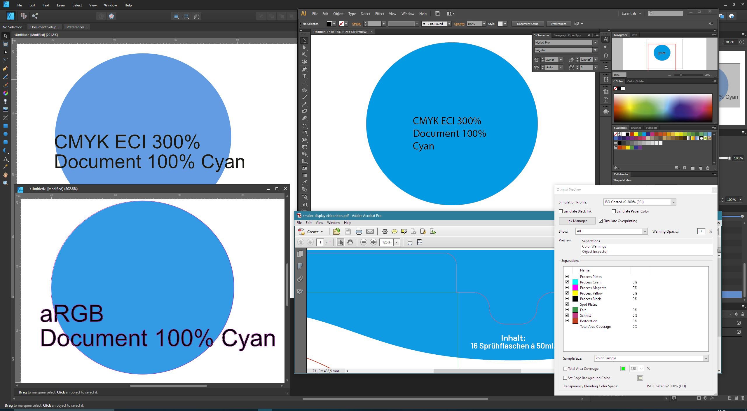
 Hello, im having issues with the cmyk color reproduction in affinity suite while adobe software (photoshop, illustrator, acrobat) shows quite accurate cmyk colors. of course its not the "real thing" as cmyk is cmyk, but you can quite easily pinpoint 100% cyan as such in adobe, and not even close in affinity. output colors (values) via pdf export are correct, but are apparently truncated down to srgb(?) for display output on my wide color gamut monitor (100% argb color space) which greatly shifts blue and green colors from the "real" cmyk colors that should and can be somewhat displayed in wide gamut, and adobe software does just that. in an affinity cmyk document 100% cyan looks like desaturated sky / baby blue, but if i create an argb instead of a cmyk document in affinity cyan begins popping, just like in acrobat, illustrator and photoshop, but these do it even within a cmyk document. at this point i dont know what exactly is going on and im trying to make sense of it. are there some hidden settings for affinity to control display color space? did something break? did i screw up the monitor setup? i have cross checked srgb vs srgb content with an old calibrated 8bit srgb monitor vs my wide gamut one and photos and web in itself looks very close in a color managed environment. i just never stumbled over this drastic difference in color rendition between affinity and adobe. thats my setup: win 10 1903 acer predator xb323U (10 bit, 100% argb) calibrated and profiled for srgb gamma response via displaycal + spyder5, but the monitor is not a professional display with hardware calibration support. Adobe CS6 newest affinity suite the files below are jpgs in argb, but maybe the upload to the board broke them - im also new to the wide gamut thing. anyway, the differences should be clearly visible in srgb, too! the screenshots show how different apps display 100% cyan. top left is affinity designer in an ECI 300% CMYK document and it looks awful - the color is just miles off. bottom left is affinity designer in an argb document with 100% cyan and it looks ok. top right is adobe illustrator in ECI 300% CMYK with 100% cyan and it looks good. bottom right is adobe acrobat showing actual print files in ECI 300% CMYK with 100% cyan (file created in affinity) and color proofing shows something close to illustrator - in wide gamut its very close visually. the 2nd screenshot shows the exact same, except for adobe acrobat having simulation profile switched from ECI 300% to srgb, and its the exact same color affinity designer shows. in an srgb document with srgb color values illustrator and designer show the same colors. i also included the first screenshot as pdf in argb in case the board dismissed the color profile or whatever. if you set the simulation profile to a wide gamut rgb (photo rgb, argb, you name it) on a wide gamut display you should see what i see. is there a way to make affinity display what adobe displays? or has someone an idea what went wrong on my end, if that is not to be expected behavior? thanks, looking forward to your input! affinity cmyk1.pdf
-
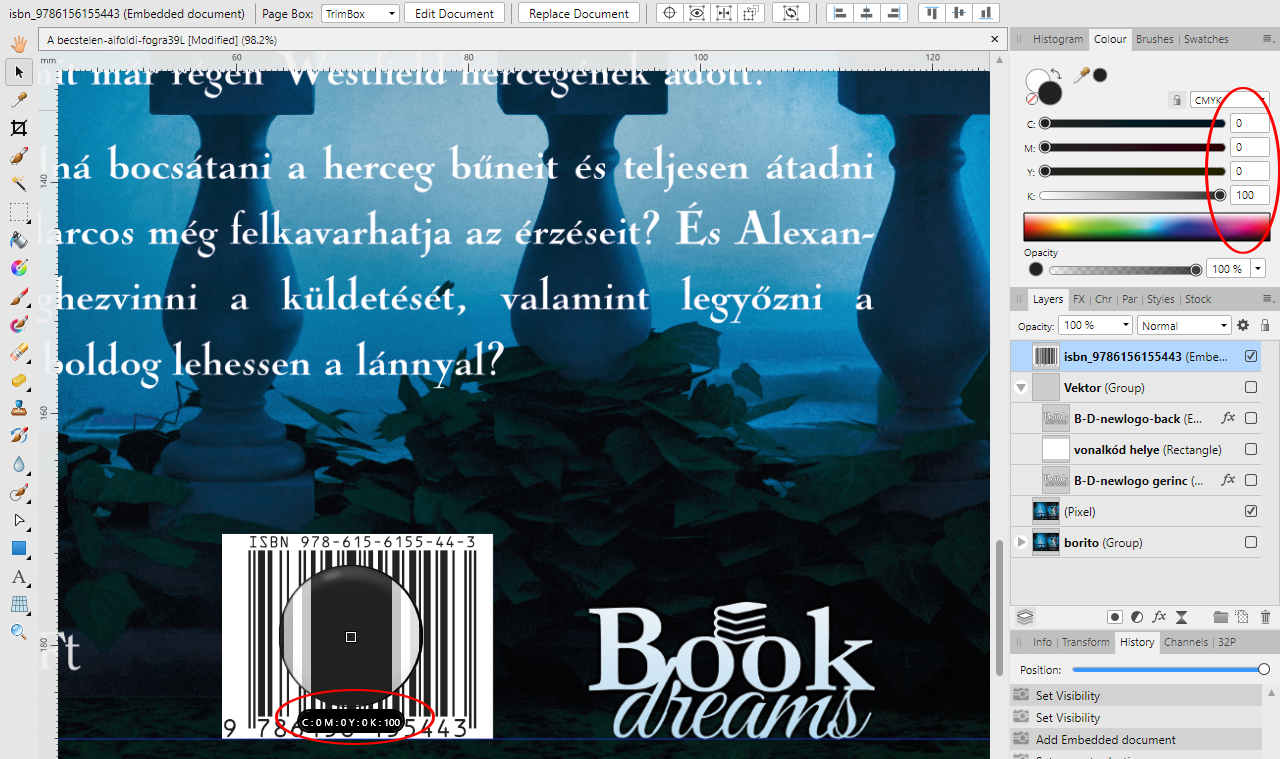
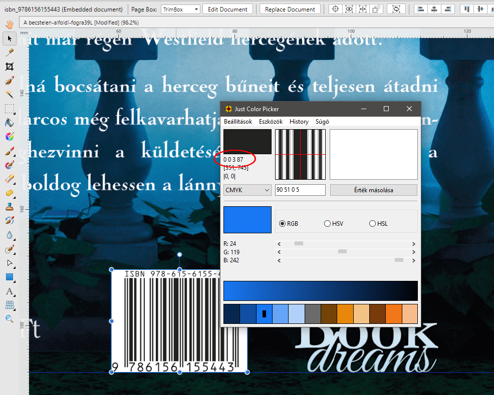
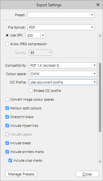
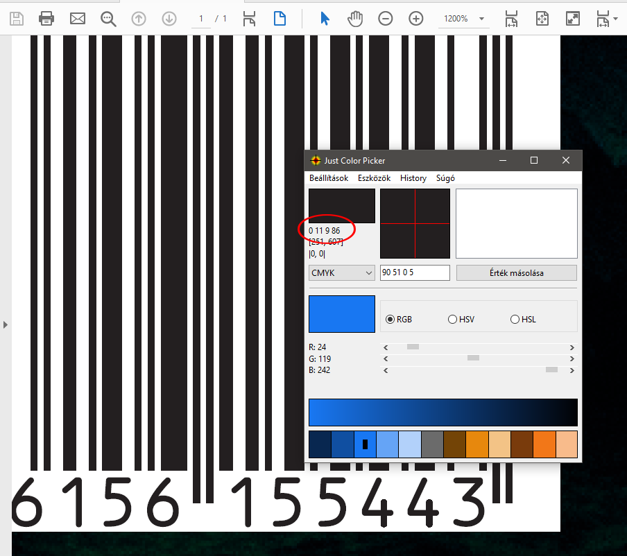
 Hi all, I have a problem with color profile, and need a tip for printing. I have a project with ISO Coated v2 ECI 300 or Coated_Fogra39L_VIGC_300 color profile and a CMYK barcode in EPS format. This is a book cover and for printing need barcode in 0,0,0,255 black, and without embed ICC profile. When I insert barcode to project, automatically converted lower black, but these profiles include full K support. If I open barcode with double click, and assign (not convert) to correct ICC profile, then I get correct values (with strokes?). I tested this value with Just Color Picker in CMYK pick, but I get different value: And after PDF export get a new value again: Here is my PDF export settings, and I tried "Convert image color spaces" option turned on or off, but no helped. How can I set PDF export for leave barcode in original 0,0,0,100 format? If open my PDF in Affinity Photo, then Affinity picker see 0,0,0,100 in barcode... Is this correct? (I haven't Adobe Acrobat Pro for checking.)
-
 I purchased Designer and Photo years ago but I just couldn't replace Illustrator & Photoshop because of a few missing features that are just workflow basics. I've moved to the Windows platform and just downloaded new trial versions of them to give them another chance, and these problems persist. Most of them relate to features that prevent the user from making critical, unprofessional mistakes like inconsistent color use across multiple documents. If you are deigning a flyer, a business card and a name badge, you can't have variations between them. These are a few [very] minor omissions that I am missing that risks me making amateurish mistakes: - Global swatches don't carry to another document when copy-n-pasting a logo from one document to another (same as in Publisher) - Swatches not carrying over to the new document also means that overprint setting are lost because overprint is defined in the swatch, not in the object. - I can't tell what color mode I'm working in. If my mode is RGB for a flyer, I need something to shout out at me, or at least give me a clue that my print job is going to be disaster. A simple RGB/CMYK icon would suffice. Even Photo displays its color mode in the document's header, but Designer [where it's more important] doesn't. - The colour picker only picks up RGB/CMYK values, not a global swatch. Even if I've pasted a logo into a new document and it's displaying a global color, the eyedropper doesn't read it as a global color so I can't even reliably copy colors from my source logo. - To duplicate an object by dragging it, I have to press the Alt key before I select the object, not during the drag. Most of the time, I need to be certain I have selected the correct object before I duplicate it, however, now I have to duplicate something and then find out if I selected correctly. I don't know how many times I have moved items I want to duplicate and duplicated items I didn't want to duplicate because of this. An application is not fast to work in if I'm constantly undoing my actions. - Changing the colors of margins & guides. If I design a blue brochure, my margins and guides disappear. I need to make them red or yellow or anything. I don't expect to be able to mix my own colors, but a dozen pre-mixed swatches to choose from would solve this problem. (apart from working in wireframe mode) - Connecting the selected transform corner in the transform palette to the free transform with the move tool. It's very strange that I can select a corner in the transform palette, but then I always rotate around the center. I have to manually type rotation values in degrees to get the rotation around a corner. Why the disconnect? This disconnect is similar to the disconnect I experience between the swatches, color mixer and eye dropper. - Previewing at export. Even in Photo, I can't see the effect of the level of JPEG compression being applied to my exported files (neither in Designer nor Photo). I have to export a file half a dozen times until I hit upon that sweet spot of small file size to barely noticable quality loss. Even the open source GIMP does this with a live preview at export. I can do awesome professional work, and then break it all with a poor export... and not even realise it. - Proofing colors. I really need to be able to see how my colors will separate before I save my PDF. If I've accidentally worked in RGB, this will reveal my mistake as I go to repro. Overprinting and knockout will also be a disaster if not picked up in time. (Who here hasn't experienced the dreaded white text set to overprint and wondered where all your text went?). This feature alone forces me to keep a professional, licensed copy of Adobe Acrobat around to preview color separations. In my final repro file, I have to know if my spot colors are still spots and if I'm printing fine black text as 100% black, or a full color breakdown that will turn my single color print job into a full color one. Previewing the separations (or channels in your photo editor) points out my potential errors. - Overprinting settings. The previous point leads straight into this one. Why is over printing set in the swatch and not the object? If I want some small paragraph text to over print, but large display text to knockout, I have to make 2 identical black swatches to do this. Why can't I specify this on an object-by-object basis? I guess "Multiply" does the same thing and works as a work-around, but you're targeting print designers, and use the term overprint yourselves so why the strange and risky implementation. - Snapping to "round" values. When manually selecting a color in CMYK, we are inevitably creating a color using round number values from a color chart. It's slow and frustrating trying to select exactly 50% in a slider as it hops from 49 to 51 and back again while we search for that perfect pixel placement. How about snapping to increments of 5% by holding down the shift key? Your snapping features are awesomely powerful, but only in the document. Why not extend this into the sliders and the rest of the application? (Admittedly, I don't know any other application that does this, but it makes sense and would be welcome.) Basic features that are even in open source software seem to be missing. We waited for years to get arrow heads. You claimed it was because you wanted to get it awesome, but they are no more powerful/different to anything else out there on the market. I suspect we only got them when Publisher was released. Did we have to wait for a whole new app to be leased to get arrow heads? Now we sit with other missing basic, common features like: - Blend/Interpolate - Stroke drawing tools like a grid tool and a straight line tool. These are enormous time savers. - Tabs. (I understand you want to protect Publisher by keeping high end text features like hyphenation, drop-caps and text wrap out of Designer, but this feels like a very basic feature compared to your range of kerning, alignment and Opentype features already here from day one) I understand that everyone's needs are different and you can't satisfy everyone, but you are targeting print designers as well and illustrators and web designers, and these are all features every professional expects and is surprising that they're not here. You give us features that most professionals just leave on the defaults because few of us even understand them (like color profiles and LUTs), but then drop the ball by not pasting a global swatch from one document to another. It's confusing and just doesn't make me feel confident in the files I send to print. Please can you look at these issues before adding new features. I understand that new features are needed to sell products, but a lot of us early adopters are just wondering where the small tweaks and refinements are. It seems that your development team needs to consult with an old school designer or printer to get these fundamentals right. It feels like you've only got young designers who have grown up with an RGB workflow and have never had to bang out 6 flyers in an afternoon and send them to print with the job being rejected.
- 32 replies
-
- 34
-

-

-

-
- separations
- proofing
- (and 8 more)
-
 Hi there! I just made a quick test in Affinity Designer where i testet the "press ready" preset for pdf export. Previewing in different apps after exporting, the colors look all flat and greyish. Is it due to build-in softprooving of affinity pdf's or is there something wrong in my process? I put my example in the video below: export-test.mov
 -
 Hi I am using Designer to create digital artwork to sell online. If this sounds impressive, don't be misled, I am a complete novice! In the last month I have moved from Gimp - Inkspace - Krita to here, and am learning as I go. I have done a lot of research into how to maintain colour integrity in my work, but am still struggling to make a final decision on my workflow. I could really use some advice. I understand RGB & CMYK, at least enough to know RGB=device and CMYK=print. At least traditionally, although nowadays most print companies should accept RGB... My customer base is generalised as a bunch of people who know very little about digital files - might even struggle to unzip something - so they really don't want to be bothered with decisions regarding file type or colour profiles. For this reason, most of the other sellers just design in RGB (to get the best colours I guess) and embed the profile in the finished files. Most designs are supplied in a variety of file types (usually JPG, PDF, PNG) and a variety of sizes (so the customer can just pick the size format they need). The customer might print the artwork at home on their 20 year old printer or (hopefully!) they will send it to some kind of professional to print. This is more likely to be a Whitewall/Jessops/Staples kinda place than a high end bespoke printing service. So I have no way of knowing how or where it will be printed. What I need to avoid is any significant change in colour from when the customer viewed the image on their device (where it is shown as a jpg) to when they print it. For this reason I think (happy to be persuaded otherwise!) that I have decided to do end to end CMYK. I'd rather limit the scope of my artwork and set good exceptions. BUT, I am not sure how to actually achieve this in AD. I have set my colour profiles as shown. My questions are: 1. Do I need to limit my selection of colours when I am designing? I think I am OK to use the colour wheel, because the colours available change to only offer me CMYK values when I select the CMYK profile at creation. What about the Swatches - should I only select from the CMYK (pantone) palettes? What about Styles, are they 'safe'? 2. What ICC profile should I use to export. Doc? sRGB? One of the CMYK ones...my customers might be anywhere in the world, so hard to pick one. 3. Do I have to be careful about black? I keep reading about the dangers of picking the wrong black, but am not sure how to achieve/avoid that. I'm grateful for your time in reading my blurb and would really like to hear your advice. Thanks so much! K
-
I have no problem with Publisher defaulting CMYK documents to "rich black” (a mix of CMYK colors) for text. Sure I like to see a default option to use 100 % K for all text, but in the meantime I'll just define all my Text Styles as 100 % K, and problem solved - right? Wrong! Changing a documents CMYK color profile (which I had to do at the end of a large job because my client changed printers) modified all the text blocks in my document back to "rich black". Even though every text style was defined as 100 % K, and nothing else. I had to manually click on each text block, apply the original Style with no overrides (option-click) – or in cases where I had to use overrides, manually chance the color of the text back to 100 % K. Now I pray that no CMYK text element slips through, as these sorts of "mishaps" cause unnecessary and costly delays at the printers, apart from making me look like a fool. (A CMYK separations view mode would also be nice to have). I understand that a new program – even a professional app – has some kinks to iron out (remember Indesign 1, anyone?) But I really hope this gets really, really high up on someones list of critical corrections/improvements. (I Hope this is not something that will ”never be fixed” because of some underlying RGB thing with the whole suite of apps.) ps. Why am I called a "Newbie" here? I've been doing computer aided layout since PageMaker 2, back in 1987.
-
 I've been corresponding with MagCloud/Blurb tech support, trying to pin down what they think might be the right Publisher settings for PDFs submitted to them. It's uncharted territory. They don't have experience yet with Affinity Publisher — they have InDesign and QXP templates but none for Publisher — and Serif hasn't commented much about Magcloud/Blurb that I know of. I did a lot of book pagination in the past, but it was always someone else who did the final prepress work. Blurb has a page that could be useful for people like me who don't have much experience with setting up documents for CMYK processes. The most rudimentary color-management info on the page, I already know. It was the soft-proofing bit that caught my eye. https://www.blurb.com/blog/color-management-printing/ The web page contains a link to the company's own ICC profile, useful for soft proofing. Scroll down to the What is a Color Profile? subhead, then look in the second paragraph below it for The Blurb ICC Profile is based on the GRACoL2009 reference (etc.). The link to the ICC profile is in that sentence.
 -
This is to follow up earlier questions about using Affinity Publisher documents for books printed via MagCloud. Making the template hasn't been difficult. The unknown information (so far) has to do with the PDF settings. MagCloud has instructions for InDesign but none for Affinity Publisher. I see from other threads that there are people here with experience producing books on MagCloud. I would be much obliged for feedback about this if your time permits. The rest of the post concerns MagCloud's recommendations for InDesign's PDF export settings. The comment I'll add below it contains my guesses about PDF export from Publisher. Settings here are in order of their appearance in the MagCloud instructions. InDesign options for which there don't seem to be equivalents in Affinity Publisher are marked "**" below. (I'm using v. 1.8.2 for Windows.) Pages: All Spreads option: Disabled ** Created tagged PDF: Disabled [But so far PDFs I've exported from Publisher don't seem to be tagged] Export Layers: "Visible and Printable Layers" Hyperlinks: Include [optional] ** Include interactive elements: Disabled For both color and greyscale images: Bicubic downsampling to 300 ppi for images above 300 ppi Compression: JPEG Image quality: High [presumably meaning 80+] For monochrome images: ** Bicubic downsampling to 1200 ppi for images above 1800 ppi ** Compression: CCITT Group 4 The instructions draw particular attention to these next two options, which don't appear in the Publisher export dialog: ** Compress text and line art: Enabled ** Crop image data to frames: Enabled Compatibility: Acrobat 5 (PDF 1.4) Bleed: Include Color conversion: None Profile Inclusion Policy: "Include RGB and all tagged S..." [The screen shot does not display the full setting.] Fonts: Subset fonts when percentage of characters used is less than: 0% All security features appear to be disabled.
-
By now I've learned enough about Affinity Publisher that I'm ready to create a small book of photographs to be printed by an online book service that uses a four-color process. I have just noticed something in creating a template, which I first set up in CMYK color space using the default color profile for CMYK: In Publisher's dialog shown via File > Document Setup, there an option to select "Assign" or "Convert." However, the option to select Assign, versus Convert, does not appear in the dialog displayed via File > New. Thus the option appears only after you've created the document. I assume these terms have the same meaning here as they do within a program like Photoshop—what should the program do color-space-wise when an image is opened or placed? Is this option's absence from File > New intentional? If so why would that be? Whichever option is selected—Assign versus Convert—what is the effect when placing images exported from a RAW editor in, say, sRGB or Adobe RGB once they are imported into the document? There doesn't seem to be any "leave in native color space" option—it's assign or convert. The purpose of selecting CMYK is that the book company requests that text be in CMYK color space. This is presumably to avoid "full" black which can cause problems on the press. But now I am wondering if this kind of document should be in an RGB color space throughout its creation, and then converted to CMYK on export to PDF—with Publisher instructed to leave images in their native color space at that time. Advice much appreciated.
-
My first goal in learning Affinity Publisher is to make a few small books of photographs—my own, and friends' photographs. After seeing a photographer's enthusiastic endorsements of a service called MagCloud (a division of Blurb) I decided to give that company a try. They have packages that enable you to make very short books at low cost—a good way to experiment. From what I've seen of the photographer's samples on the MagCloud site, they do a good job, including with black and white images. MagCloud doesn't offer a template in Publisher format, but creating probably wouldn't be difficult even for a newbie like me. My major point of confusion has to do with their color space requirements. My source images will be exported as 8- or 16-bit TIFF files from a raw converter (Capture One), likely converted to sRGB—I don't know if Adobe RGB would be overkill in this case. Friends' photographs will all be JPEGs—again, sRGB. MagCloud states that they expect RGB image files, but insist that all typography must be done "in CMYK color space" (their wording). I don't know why they insist on it. After all, they also say their process converts the entire PDF submitted to them to CMYK before they print the work. How to proceed here? If I start with a new Affinity Publisher document set to CMYK, what happens to RGB images placed within it? Does Publisher immediately convert them to CMYK? Or do they remain in the RGB color space? (I know already that Publisher has an option, when exporting to PDF, to convert to CMYK while still preserving the images' existing color spaces. Or would it be better to stick with RGB all the way through and simply blend colors using the CMYK sliders within Publisher*? MagCloud's own tech support people don't seem to be able to explain these things very well, so I haven't heard yet why they insist on CMYK for just the text within the source document. It might have to do with a need to specify something other than "hard" black for the typography. Apparently the four-color process doesn't like "hard" black. But the reasons for their requirement remain a bit murky. (They also say they don't support spot colors. This also makes me wonder what rendering intent I should choose, assuming Publisher has that option during exporting.) - - - - - - - * But surely setting color values that way isn't the same as converting a document to CMYK.
-
 Hey! I am really happy with the new 1.8 versions! Thank you so much, guys! Till now I have only found this odd thing (in all three apps the same). I guess the color format should update accordingly to the preset (print with CMYK and the rest with RGB) - at least at the start up until I change it manually: Just wanted to tell you - nothing bad I think. All the best Chris
-
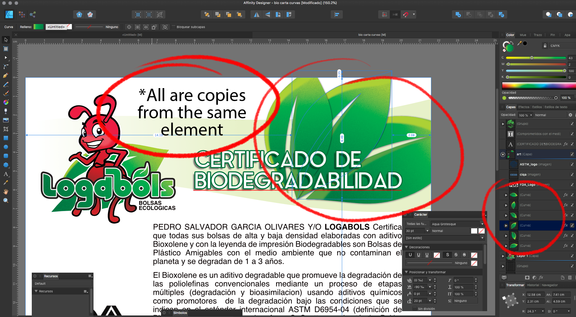
 Hi, i make some gradients in cmyk, but, when i export to pdf to print, some copys of the same image are converted in grayscale, before: https://www.dropbox.com/s/1wh3wkikko2xw3u/before.png after: https://www.dropbox.com/s/o6gwcvg5u859hep/after.png ¿Some idea to fixed this? (i use affinity designer 1.8 in mac) The leafs, all are copies from the same element. https://www.dropbox.com/s/zv595zrs9x54f1l/see.png 😰
-
 Hello forum, I hope, someone can help me out with setting up a Publisher document: The colours used are black (from cmyk) and one spot colour. By writing the PDF for printing, all texts (set to 100% black in Publisher) are being transformed to "rich black" containing cmyk colours. (Nooooo!) How can I prevent 100%-black-elements from being converted to some cmyk colour? I've found a suggestion to create a solid colour for 100% black. That solution is not working for me: I am using greyscale photos as well. So now the created PDF contains three colours. The first spot colour, the black from the greyscale photos and the spot colour I created to prevent texts converting to cmyk. That is very annoying, I need the PDF to be used only the black from cmyk and the one solid colour. Is there a soloution for this? Thank you guys for suggestions / help. Cheers
 -
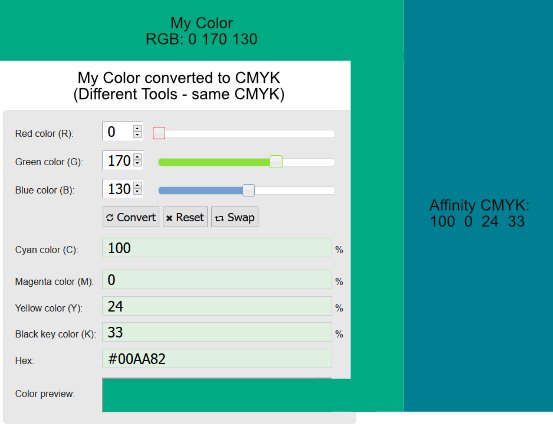
 Hello People, I might overlook something. But I really can't see what I am doing wrong. On the top left, you can see what Color i would like to work with. I was choosing the color in RGB. Because i wanna use this color also for something to print, i wanted to make my color for CMYK. I used for that multiple online RGB to CMYK converters to be sure it's the right one. On the left of the picture, you can see a screenshot from one converter. (The Document was set to CMYK). And now my problem. On the right is what color Affinity gives me when i use the CMYK color code. I also tried the CMYK colors in other programs, they all gave me the correct color which i want on the left. But not Affinity. Is there something I'm overlooking? Thanks in advance
-
 Attached is a macro set for splitting RGB image into separate layers for a number of colour models. RGB: Basic separation RGBW: New model! Like CMYK but Red, Green, Blue and White RGB-W: Like RGBW but only two layers for separate colour/tone editing CMY: Effective inverse of RGB CMYK: Standard internal model CMY-K: Like CMYK, but with only two layers for separate colour/tone editing HSL: New model! Hue, Saturation and Luminosity on separate layers! HSL-RGB: Same as HSL, but with Hue broken down into separate RGB layers Principles used in doing these: Start with 'Merge Visible' to create flat layer for base (saves tripping over adjustments) End with single layer group (so you can delete it in one go if you don't like it Named layers, so you know which is which Keep it simple (just the layers, no 'edit ready' adjustments such as curves, sharpening) Fast as possible (so RGB done with channels, CMYK with curves, etc), though new ones need Apply Image which can be very slow! Any bugs, etc. please let me know. Do be patient with Apply Image adjustments and don't try to 'Esc' out as this can leave you in limbo. Enjoy! Dave's Colour Models V1.afmacros
- 12 replies
-
- 15
-
-
-
- colour model
- layer separation
- (and 5 more)
-
This actually applies to all three programs in the Suite. The color picker in CMYK when used in click-and-drag mode, runs into a problem with its local readout when the first two elements (C,M,) are both 100. When that happens, the field length for the readout does not expand far enough, and the K value is truncated at one or two digits, depending on the number of digits in the Y value. When that happens, the only way to get the accurate K reading is to let go of the mouse, so the full set of readings appears in the palette on the side. But this is quite a nuisance when it happens. I've made the attached screen capture video to demonstrate. This is in Windows 8.1, using a 1920 x 1200 monitor. The video is in .MOV format. If it doesn't run properly, I'll upload another one in a different format. Let me know if it's necessary. AFPhoto.mov
- 3 replies
-
- 1
-
-
- color picker
- cmyk
- (and 1 more)
-
 I have what I hope can be a yes / no answer type question. I've created an ICC profile (sRGB) after monitor calibration, great. I want to send photos to an external printing house (as a photo book) which uses a CMYK (FOGRA39) profile. Can I simply export the photos using the ICC CMYK profile they use or is there more to it? Is soft proofing necessary? (I'm not really sure what it is but have seen some tutorials on it). What about document -> assign an ICC profile? I'm using AF v1.8.0.486 Beta. thanks so much Julie.
 -
Hi folks, I'm trying to create CMYK colors with correct colors number (0% to 100%). Unfortunately the color picker give me only RGB values (0 to 255) on CMYK tab. Could I can fix this problem? Because its very difficult create color documents unknowing the color results. Its happen with any document that I create with CMYK color space, using the old ICC for Fogra 39 (coated paper). My Affinity Designer is 1.7.3.481. Affinity_Designer_2019-10-25_10-22-44.mp4
-
 Hi, there is significant colour inconsistency by conversion from RGB to CMYK via the adjustment layer and document setup. The soft proof adjustment layer produces different colours than the same rendering intent through document setup dialog box. See my video. Colours in video are shifted a bit, but the issue is visible. Am I doing something wrong or is there some different renderig on background when using document setup conversion? I'm not sure if the adjustment layer has smaller gamut or the luminosity differs, but CMYK colours after document colour conversion looks for me a bit better. RGB to CMYK.mov
 -
 In Affinity starting with an RGB value of (100,100,100) translates to a CMYK value of (60,52,52,21). -> Why so much cyan ? -> Why is it different than this ? (here or here) -> If I plug the CMYK (60,52,52,21) in reverse here I get rgb(80,95,95) with a cyan tint, but affinity says rgb (102,100,100). Why ? In the attached file the color format is set to CMYK with profile (US Web coated SWOP v2). -> Exporting the file to PNG gives me correct result (exactly as shown on screen) -> Exporting to JPEG with color profile included gives me a cyan tint. Why ? (it doesn't include the profile after all ?) ColorTest.afdesign