Search the Community
Showing results for tags 'character spacing'.
Found 1 result
-
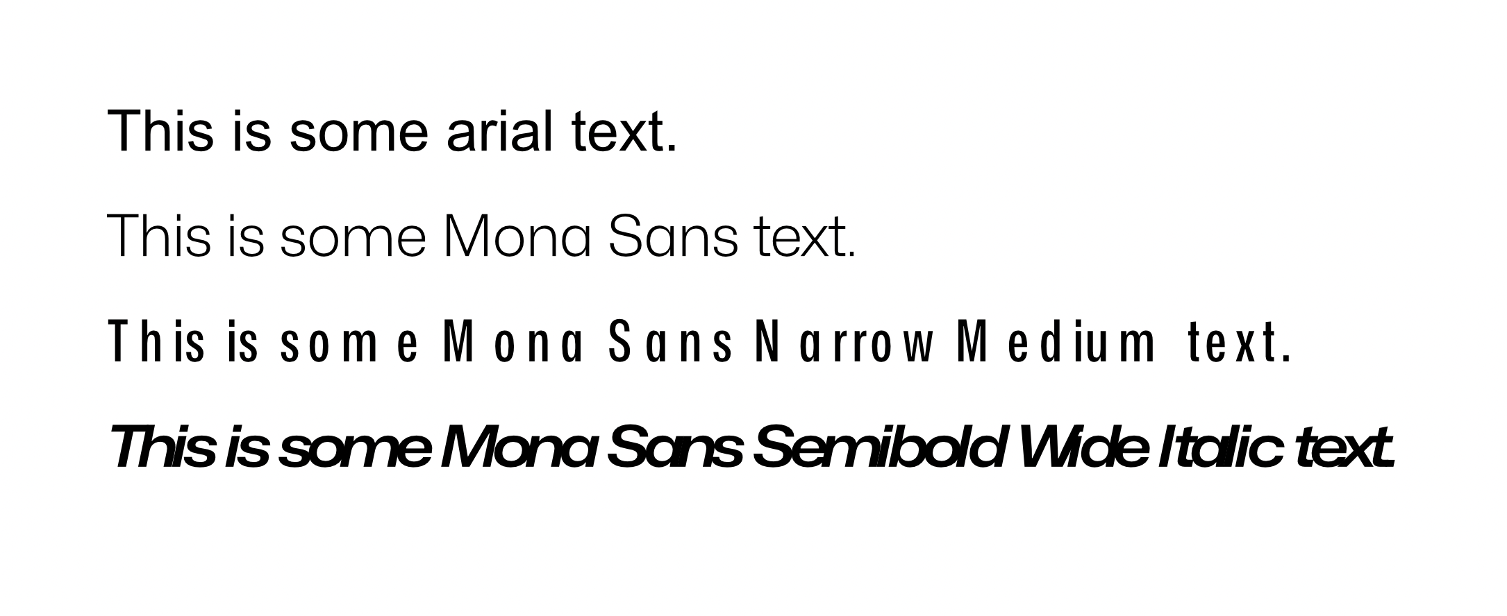
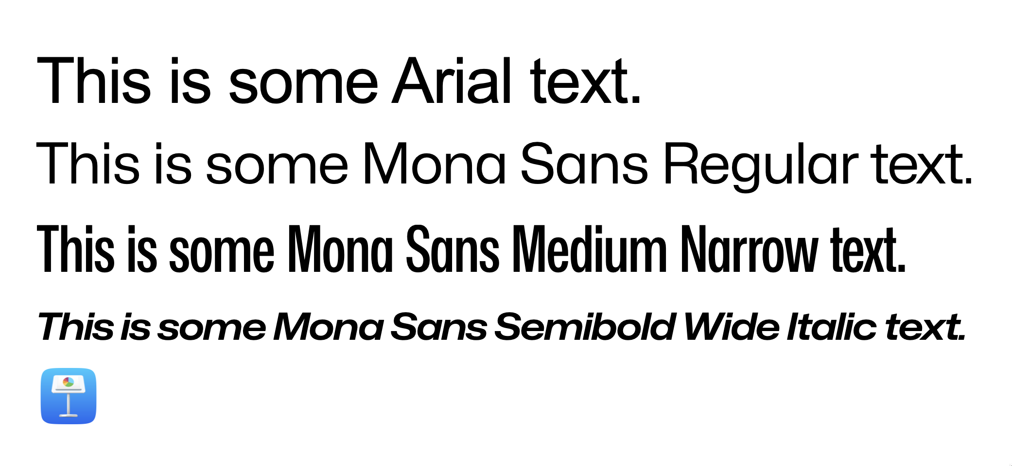
 Hi, everyone. Thanks beforehand for your time. So, basically my problem has to do with character spacing, no matter tracking, kerning, both or none. Affinity displays it completely wrong. Refer to the screenshots for more context. This first screenshot comes from a fresh new affinity document. I just wrote the text and set the font face. This is how Mona Sans looks against Arial, just to name an example. You can clearly see that the spacing for the Narrow Version and the Wide Italic version has been absolutely butchered. I can't tell if Arial and the Regular version for Mona have the same problem. To me, they look fine, but I don't really know what to expect after seeing how it reacts to very wide and narrow fonts. Second screenshot is how Keynote, just another app that deals with text, looks like. Font Book looks identically, as so does every other text app I have. Essentially, that's the spacing that the original designers had in mind. I am very aware of the ⌘ + opt + → command for setting this up manually. But, in this specific case, I am just writing a bunch of text. I expect the result to be like the second picture with no additional tweaking. Essentially, that's how the typeface was designed and I want to keep those proportions. For reference, I accessed the Character window and tweaked everything to be as default, or close to default as possible. That means, 0% everywhere. I went character by character, checking that the kerning for each pair was set to 0%. Question is: am I missing something? Am I doing something wrong? Or, on the other hand, is it a problem with Designer? Hope you can help me out. Lemme know if any other piece of info is needed. Specs: - OS: MacOS Ventura 13.0. This occurred in both an Intel machine and an Apple Silicon Machine. - Affinity Version is 1.10.6 Again, thanks much for your time beforehand.