Search the Community
Showing results for tags 'calligraphy'.
Found 9 results
-
 I'm trying to look for an angled/tilted brush for hand writing with my pen tablet. I know it sounds extremely simple – it's one of the default brushes on Adobe Illustrator – but I can't seem to find it on Affinity Designer. Everything is rounded... Some taper off a the ends. But none are actually angled. Please help!
- 61 replies
-
- 3
-

-
- brushes
- affinity designer
- (and 1 more)
-
 Look up for vector flat tip brush for calligraphy and font creation.
 -
 I don't know if the Calligraphic Art Brush exists in Affinity Designer sice I'm a beginner but if it doesn't exist I think that you would need to add it to Affinity Designer because it helps a lot in vector inking. I hope that you will take this into consideration. Thank you
 -
 I am a newbie using Publisher to prepare practice grids for practicing Chinese characters, but I am having trouble aligning the characters within each box. Chinese character fonts are uniformly monospaced (no kerning option). Columns 1 and 2 are too far to the right, and column 3 is just right (3D needs a very slight nudge to the right). Columns 4 and 5 are also very slightly off (4D and 5C need to be slightly nudged to the left). When designing the grid, I left a small horizontal space (1.2 mm) between boxes. I set my text size to 110 pts, which seems just right (at least for column 3). Anything above or below 110 pts causes more problems. I hope I can avoid making microadjustments to every single box. The character menu doesn't seem to have any useful options, and neither does the paragraph menu. "Spacing" seems like the obvious place for making adjustments, but that doesn't work either: leading doesn't work; left indent and right indent move everything over. Maybe I should just jam all the boxes together? Advice would be very much appreciated.
-
Chinese Character Practice Grid: My Very First Creation with Affinity Publisher Disclaimer: I’m a total newbie. I couldn’t find any tutorials relevant to the task, so I decided to just “wing” it. However, I am quite pleased with the results, simple as they are. (1) I don’t know if it’s possible to draw different types of lines in Affinity Publisher, so I designed the grid itself in Microsoft Word, a variation on the traditional jeougongger 九宮格 “nine square grid” approach. (2) I imported a smaller grid into Affinity Publisher, copied it once using Ctrl-C, then pasted multiple copies into place using Ctrl-V to create an A4 sheet (keyboard shortcuts I have been using in Microsoft Word for over 20 years). The individual squares did not quite line up, so I had to fiddle with the positions for quite a while (less than ideal). (3) I then used the Slender Gold font (based on the calligraphic style of the last emperor of the Song Dynasty) to type in the three characters of a Chinese name I chose for a foreign friend. I was quite pleased to discover that Affinity Publisher automatically snaps the characters exactly into the center of each box. I typed in an English title using GR Tonal Spelling, AKA Gwoyeu Romatzyh 國語羅馬字 (guan is 1st tone, guann is 4th tone). (4) I exported the resulting file as a PNG file. The menu item was exactly where I expected it to be. (5) Finally, I cropped the first three boxes using Photoscape. Maybe Affinity Publisher has cropping tools built in? *** Initial verdict: I was very pleased that a total newbie like myself could create a usable. I created an attractive design without even reading the instructions (the tutorials I found were not helpful). I still have a lot to learn, but so far I feel that my money was well spent. Problem: Although I bought the software directly from Serif, it cost me about US $65 (not sure why it costs more in Taiwan: my income is very limited). I hope I can pick up the Affinity Photo and Affinity Designer at Black Friday discounts.
- 2 replies
-
- 4
-
-
- chinese art
- grid lines
- (and 2 more)
-
 Hi everyone! I'm a calligrapher, and I've just opened my calligraphy business - clearly the first thing to do.... create my logo! I did the calligraphy with a Wacom tablet and then edited the lines a bit etc to make it neater / thicker where needed. Simple but fun... and now onto the rest of the tutorial videos
-
 could we please request better vector handwriting support? chinese or japanese characters require much more visual feedback and stroke fidelity than alphabetic characters the vector pencil tool would work if we had an option to hide the nodes until (re)selected, i.e. option to hide automatic node display, as the nodes obscure visual feedback for handwriting the vector brush tool has too much auto smoothing/lag even with no stabiliser enabled, distortion in alphabetic/english handwriting is ‘relatively’ minor (for non-calligraphers) but completely distorts handwritten kanji of normal proficiency (i realise the team might not include a native-speed kanji writer so this might not be an obvious deficiency) hope i am just missing an existing option somewhere… warmest wishes, maki
 -
Last December me and two colleagues were featured in a newspaper article about calligraphers, type designers and letterers in our town (Florianópolis, Brazil). The editor also invited us to create the cover for the art supplement. Each of us took a word of the title and did it according to our speciality. Then, I've assembled the three contributions in Affinity Photo. Here's a machine translation of my blog post detailing the process: https://translate.google.com/translate?sl=auto&tl=en&u=http%3A//www.ivanjeronimo.com.br/essays/2017/01/com-capa-coletiva-jornal-destaca-mercado-das-letras-em-florianopolis/
-
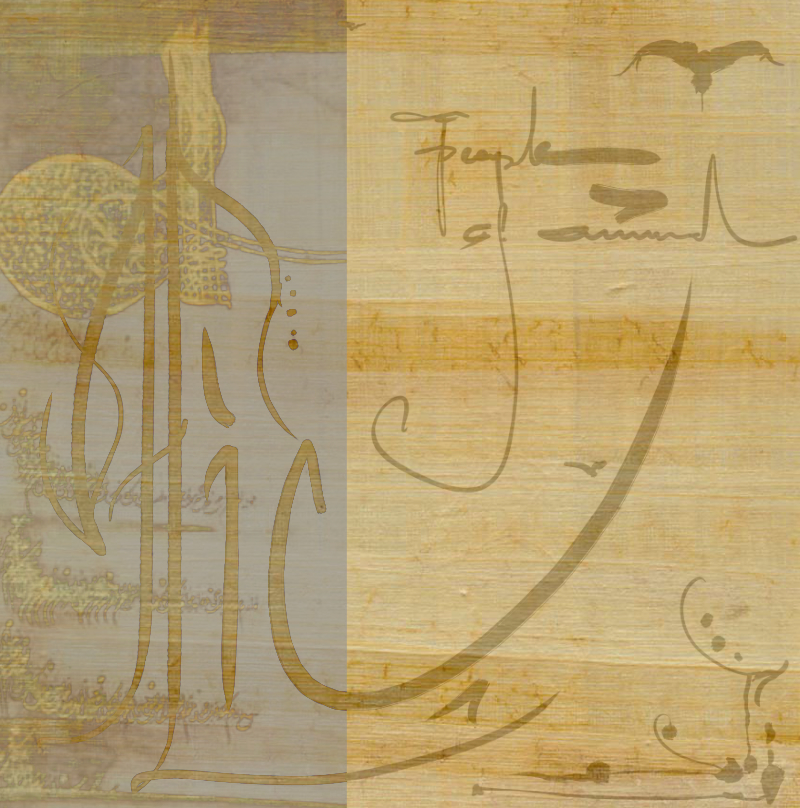
writing -hiç- mean nothing..Sufi word.
.png.51ccf1004592a9a802629bbd8dd9d5ab.png)
.png.08be0786db0ca44ee054f07c4a60e351.png)
.png.487158ecd8e3c7f83919cd1caad2a9d0.png)
.png.44fcc6bcb7a6f1b93bd40d20bb35f186.png)
.png.d9fb52476ed91254e34acc391db7ff40.png)