Search the Community
Showing results for tags 'calibration'.
Found 7 results
-
 I'm not sure what happened, but when I bought the software after having the trial I opened it and white in the program is replaced by light pink. I've looked up the issue and couldn't find anything like this problem. I did see that it could have something to do with monitor color calibration, however I have a three monitor set up and all three show the issue. I tried exporting a quick drawing with white squares and the exported png is perfectly normal, whites were white! I don't know if it's a simple fix or not, but I'd really like to be able to use the software, I really enjoy it. Please, if someone can help me I'd really appreciate it! Thank you!
-
 Hi, I'd like to scan my coins collection (Canon MX925). In order to get the most correct grey level, I include 4 standards during my scan. There in a significant drift when I check my standards vs the one created with Affinity Would someone know how to perform coins colour calibration based on my 4 standards? Thanks NB: Attached my initial scan Fab Planche_100_a_123A_originale_tiff_niveau_de_gris.tif Planche_100_a_123A.afphoto
 -
 Hi all! Im new to higher end printing at home and was so excited to get my new Canon Pro 100 printer. But... What I see on the screen and what is printing are 2 different things ! My image is dull and missing the saturation of colour that should be there. And its not a hardware issue. Ive become overloaded on canon and youtube tutorials about calibration for monitor and printers and all that jazz. I have no idea where to start and need a basic 1-2-3 [if thats ;possible] to get things more in sync. I know this printer is capable of greatness and so is Affinity, so very grateful for your suggestions!
 -
 I apologize if this is something already brought up or if I'm not following something properly but I'm a new user to this program and the first thing I've noticed is an issue with calibration with the color picker tool which is odd seeing how the brush tool and eraser seem to be working normally. I've had an issue similar before with Clip Paint not being calibrated right but that was in every aspect not just a certain tool. I'm using a Wacom Cintiq 13HD Touch (touch is off), I'm running Windows 8.1 and Wacom driver are up to date so not sure how to fix this problem. Any suggestions advice would be helpful. If you need further information just ask and I'll see what I can provide. Kinda at a loss here.
 -
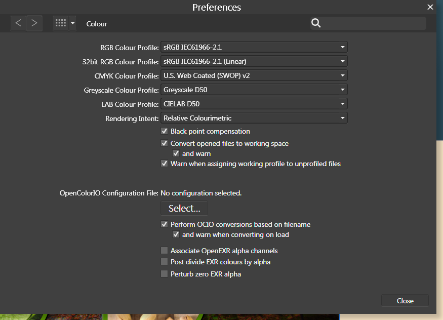
 For some reason, the AFD interface is scaling to beige where it should be scaling to white. This doesn't affect any final renders, but while it substitutes white for beige in the interface, I can't make any accurate design judgements involving colour. So this is happening on my new computer. I booted up my old computer with Designer and it doesn't have the same issue. Whites are white. I open up the same files on my new computer and whites are now beige (see attachment). Note in the toolbar where fill and stroke should be a red line in a white box, its a red line in a beige box. I tried changing the renderer from my GPU (nvidia) to WARP but this has had no effect. I am running Windows 7 on both computers and I have attached my Nvidia information file for more details. I have not noticed this problem in any other applications running on my system. It is not a monitor calibration issue. I have no idea what colour profiles I should be selecting in preferences. I have attached a screenshot of my colour settings. NVIDIA System Information 01-05-2017 09-51-49.txt
-
 as described already in another thread here, i am encountering (strange?) problems with colors in both designer and photo, especially for cymk-colours. they kind of 'burn out' and are far too vibrant, so theres no way working with because they not nearly match whats expected. rgb seems quite right to me so far, but i have to use both affinitys mainly for cymk-workflows regarding print. so i have some questions that may be answered to get a grip on this and hopefully find a way towards a solution. 1. there are two options for rgb-profiles, one is called 'rgbu' - what do they exaclty refer to, and what is the difference between them regarding the use within affinity. more simple: why there are two? 2. is there any way, affinity works different regarding color-management than other applications like the adobe ones or corel does? the reason behind this is: the latter seems to do it right and (cymk-) colors are more or less close on screen - but not so in AF, although the profiles are set consistend and are the same thoughout all applications. 3. normally i would assume, all applications are using the screen-profiles that are defined in settings within OS - or win7 in this case. that means: every application uses this (in this case custom calibrated) profile as a basis to render according to the profiles set within the application itself... any other thing for affinity? so what is completely driving me nuts is the fact, that i cant get affinity to show only slightly correct colors for cymk... and i dont have any clue why. the awful thing is, that when emulating a srgb-space on my wide-gammut-monitors it seems to work far better, but i cant believe affinity wont be able to handle wide-gammut spaces... affinity (at least designer) is buildt to use for design & graphics of course. and while print is (still) some great part of that i believe that one should be able to work within cymk without that hassle and be able to get a correct color-preview on screen even for that. right? so the question to me is whats going wrong in that case??? is it affinity? is it me? is it another hard- or software? currently i am running out of ideas, but i have to solve this! any hints and thoughts highly appreciated and thanks in advance if more info is needed please be so kind and simply ask for it :-)
 -
 Hi all :-) I've got a question I hope is not to far off. My screen is calibrated to a white point of 5500. The result of that is that when my photos are shown on others screens they tend to be to cold or blue/greenish. Is there a way to fix this quickly in Affinity? Adjusting several photos at once? If I do have to adjust each photo adjusting the white balance (which is what I have to do?), does the scale compare to the difference between D-55 and D-65? I hope I have expressed myself somewhat clearly... Cheers Peter C-)