Search the Community
Showing results for tags 'banding'.
Found 12 results
-
 Hello, I created a background with a gradient in Affinity Photo. In the doc and when exported, I and someone on a separate computer I shared the image to can also see the banding on the image. I tried: exporting as a JPEG, PNG, PNG-8, and converting the file format to RGB/16 and RGB/32 (HDR). RGB/16 seemed to smooth the image more but there were still bands in the image. I also tried remaking the background in RGB/32 but the background did not turn out. The image is 1920 x 1080 300 DPI How can I remove the bands or export the image without the bands?
-
 Attached a picture. Its caused by wrong settings with high speed sync flash. wonder if there is anyway to counteract it by subtracting lines? Like generating a series of black and white lines of certain frequency and softness? (How?) filter frequency? Im not sure
 -
 Getting pronounced banding when using Affinity Photo 1.8.1 (trial) to view a gray scale 10 bit test ramp image. Same image displays smooth gradation, no banding, when viewed with OS X El Capitan's Preview app, which supports 10 bit depth. Using OS X 10.11.6 on Mac Pro (Late 2013) with AMD FirePro D300 cards and a Dell UP2718Q monitor. Wondering if Affinity Photo lacks 10 bit support for this platform or if it's just a configuration problem that prevents a smooth display of the image. 10_bit_test_ramp.psd
 -
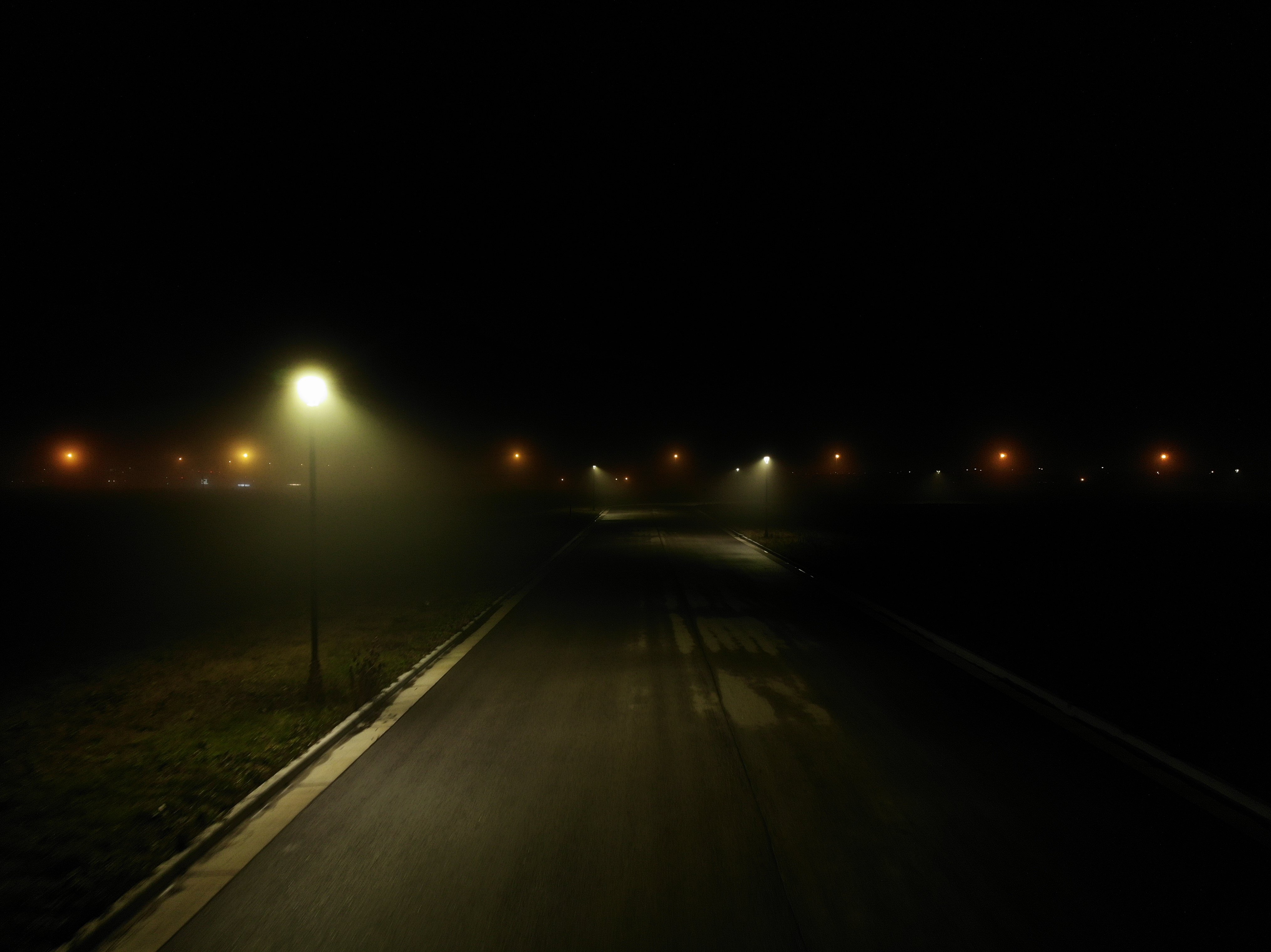
 I'm trying to touch-up my Drone photos, but they look horrible in Affinity Photo compared to Windows Preview or even Gimp Here, the original file has a very very smooth gradient coming from that lamp. But as soon as I open the file in Affinity Photo, the glow from the lamp turns in to blocky color bands.. It's almost like it tries to convert it to web-only colors or something because the quality is horrible. (below, you will probably see some banding in your web-browser, it's actually WORSE in Affinity Photo) Download this image and view it locally, to see it without banding. If you still see banding when you open it locally, sorry your monitor sucks
-
One of the main reasons I prefer Designer over Illustrator is because of the dithered gradients... My quality of work has increased DRASTICALLY because of it and I no longer need to rely on a 2nd software like photoshop for high quality gradients. The thing is though that its only supported in gradient fill... Gradient Overlays & other effects like shadows, glows, etc. - Nope! So my request is kinda plain and simple... Why not bring dithering for effects too...?! I've faced multiple banding issues here and there... Please acknowledge if doable... (P.S. I've attached a sample of my work... So you see what I mean...)
-
 New Photo user. I shot a panorama using my iPhone 8 the other day, brought the JPG into Photo to enhance and notice thin vertical lines in areas of consistent color - such as sky. Perhaps due to the phone stitching many images? Is there any way to eliminate these? How? Thanks for a great editor. The more I use it and view the tutorials the more I am impressed by its capabilities.
 -
 Hello guys! I'm looking for a way to create gradients that are made of solid bands (show banding), as opposed to have them dithered. I understand that the dither is to make them look smoother. But for a particular project I am working on, I need them with banding. I can accomplish this in Photoshop. Its gradient tool bar has a Dither tick box. So you have the option. I thought I found something similar in Affinity Photo/Designer. In Preferences/Performance>"Dither Gradients". But this tick box doesn't seem to affect the Gradient tool in Photo or the Fill Tool in Designer. Maybe it refers to something else? Any ideas how could I produce such gradients? Many thanks!
 -
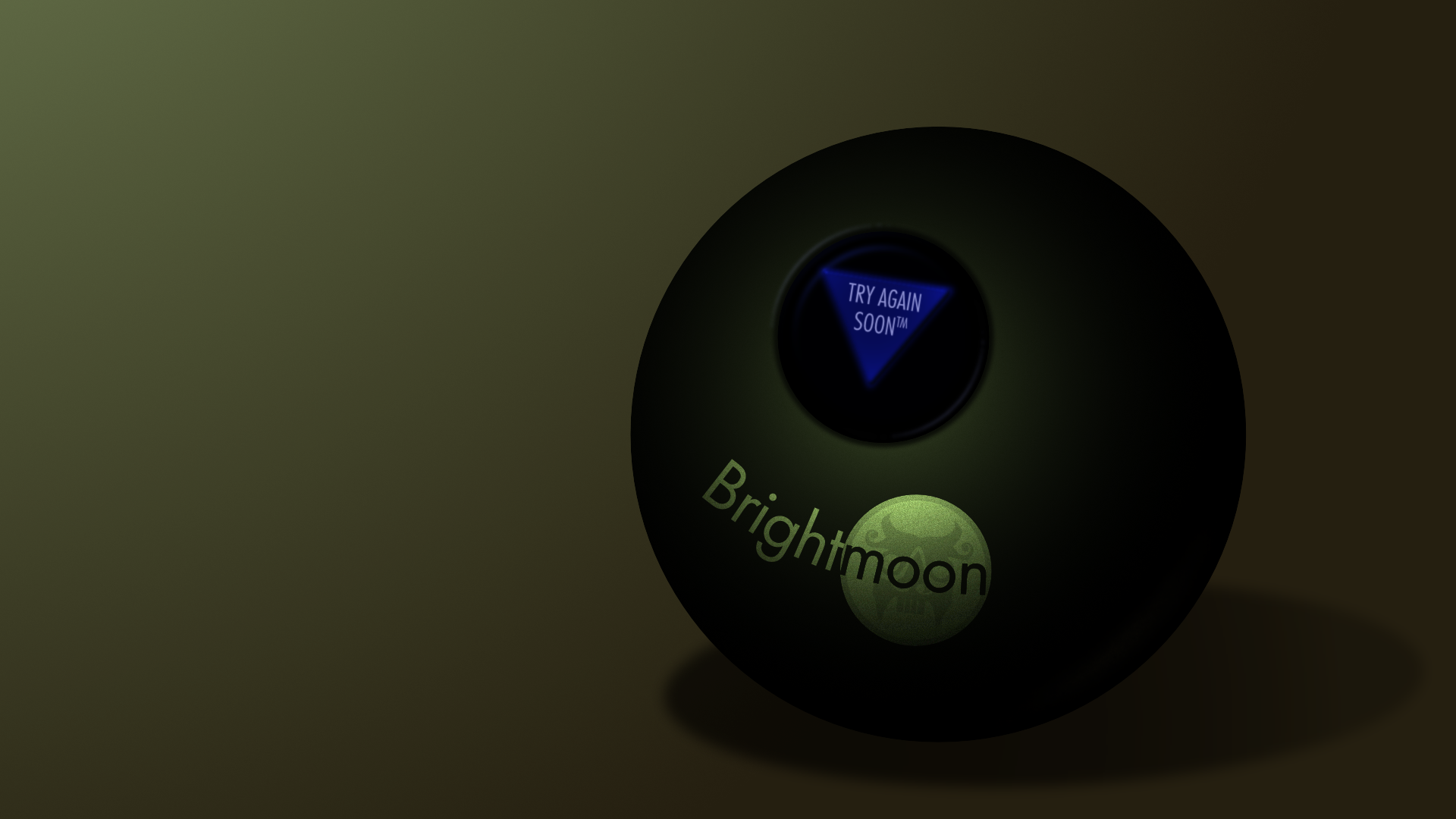
 Twice now I've run into an issue where trying to export a png with Affinity Designer results in a posterized reduction of colors, and I cannot find a setting to avoid this. In my current piece, it resulted in obvious banding of the gradients, and the reflected light being lost entirely. However, if I save the file as psd, then open that in Clip Studio Paint and save as png there, I get accurate colors and no banding. The first file is the png as saved from AD, the second is the png from CSP, and the third is the original afd so you can check and see if there's anything weird about it. Brightmoon 8-ball.afdesign Is there something I'm missing on export to prevent this issue, or is it a bug? Also, I've tried copy-pasting layer styles a few times, but it's prone to changing the values on paste--generally about double or half (i.e., 7px gaussian blur becomes 13.8px). Is there a way to prevent that, as well?
-
When I add a 100% gaussian blur effect to an object I can see what I can only describe as some kind halo or banding. In checking with the last release (1.4.2), it's there too. Is this normal?
-
 I am getting banding when creating a vignette with a stacked image. I am unclear what to do based on what I have been able to find in help or online.
-
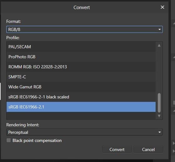
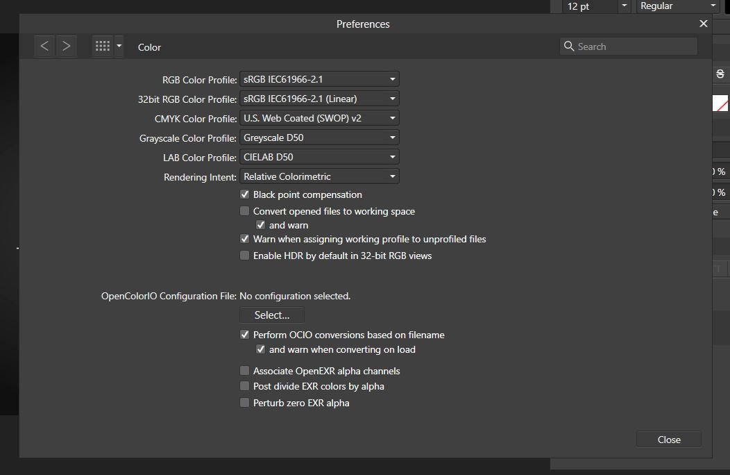
 When we develop and edit picture starting from RAW then very often we can lose fine color details during conversion to final color space. The typical remedy is to define working color space wide enough to accommodate wide camera gamut, but still, our final color space should be smaller so finally, a conversion is unavoidable. Leaving aside a discussion about what is real color, for sometimes complex reasons we can allow small color shifts and keep details visible. Often happens that color banding or unpleasant color areas emerge in final result even when you use 16 bits per channel and perfect profiles. To overcome this problem you can try to use wide gamut profile for working space, use the color proof layer on top and then export or convert picture to final color space. Below is the explanation (rationale) for this procedure. For example, let's imagine that there is pixel with R:G:B values of 116:51:32 with ProPhoto D65 profile. For simplicity, I will use here 8-bit encoding. Normally, with wide gamut profiles, at least 16 bits per channel should be used. Now, when we convert an image with this pixel to sRGB its value becomes 164:10:27, but color will not change. Why? Because this particular color is inside sRGB and ProPhoto gamut. When I will use color proof correction layer in ProPhoto profiled picture, then for this particular pixel value will not change, and still will be 116:51:32. Similarly, there will almost be no change in expected value after conversion to sRGB color space. Because of a rounding errors small shift to 163:11:26 can be observed. This particular pixel value is almost on the boundary of sRGB color space, so small changes are possible. The situation will change dramatically if we will try to do the same with a pixel which color is out of sRGB gamut. Let's take saturated red pixel in ProPhoto color space, where the value will be 163:0:0. Now, with proof layer applied, pixel value should change to 170:72:26, but when you directly export this picture to sRGB space then the value will be 241:0:0. Exporting picture with proof layer applied results in 241:8:5. Why there is such difference? The reason is simple: proof copy is still in ProPhoto space, so relative colorimetric routine adjusts not only saturation but also other parameters. When you directly export to small, sRGB space then conversion routine is in a completely different situation. Oversimplifying, zero is zero, so closest pixel value is for conversion routine 241:0:0 - a distance between a pixel value in different colorspaces is simply too large. This behavior leads to "fine tuned" color space conversion routine. This routine gives good results with highly saturated pictures and with RAW workflow, where there are many color details outside sRGB (aRGB) space. You have to remember, that modern cameras have really wide gamuts. Very often much wider than Adobe RGB in reds and blues. What do you think?
-
- 1
-

-
- wide gamut
- banding
- (and 2 more)
-
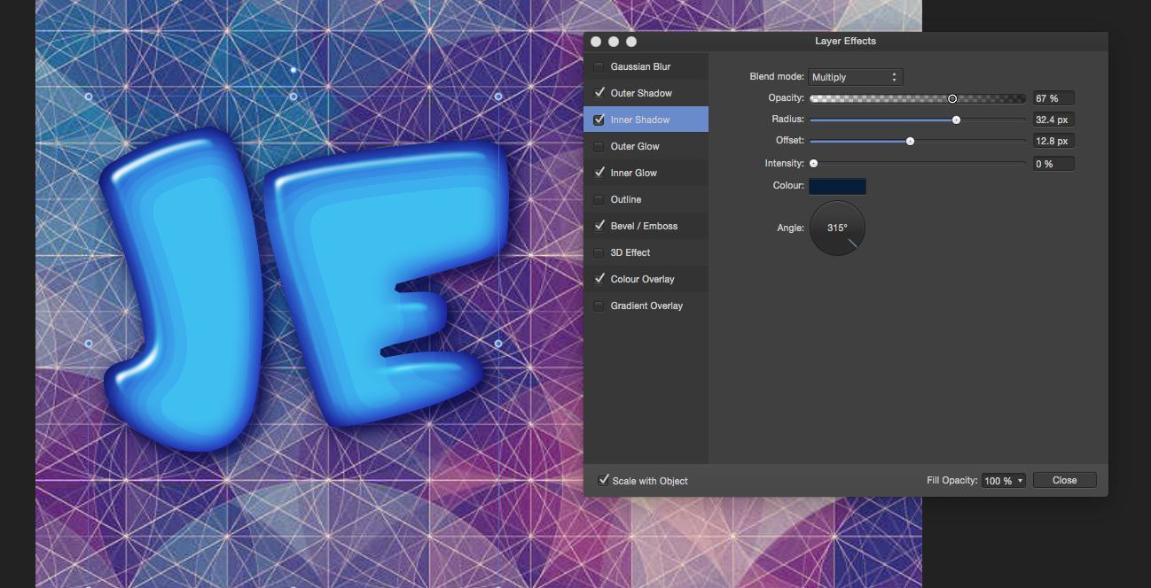
 For some reason I am getting this weird banding in the layer style I am doing. Any ideas? See attached.