Search the Community
Showing results for tags 'affinity v1'.
Found 8 results
-
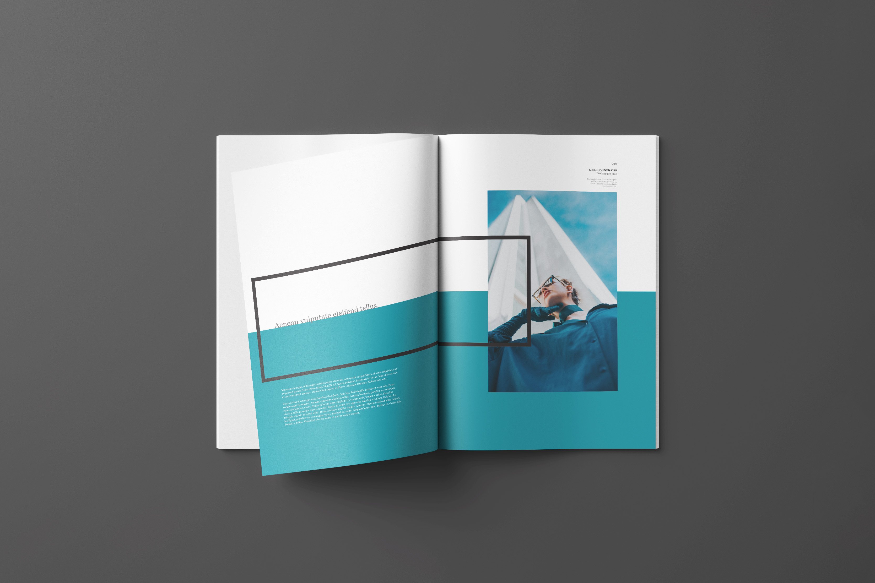
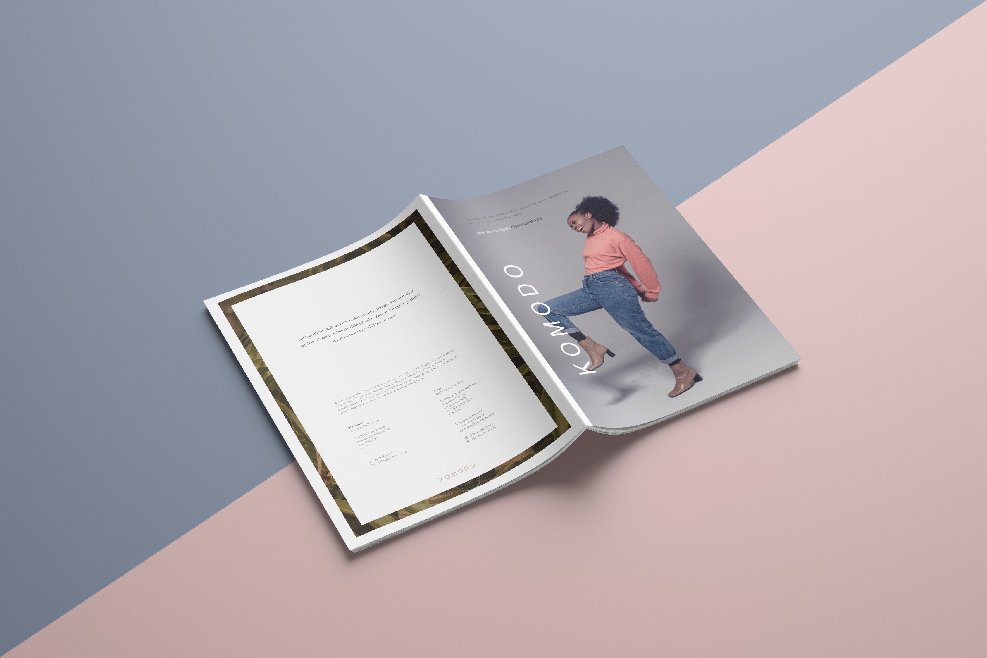
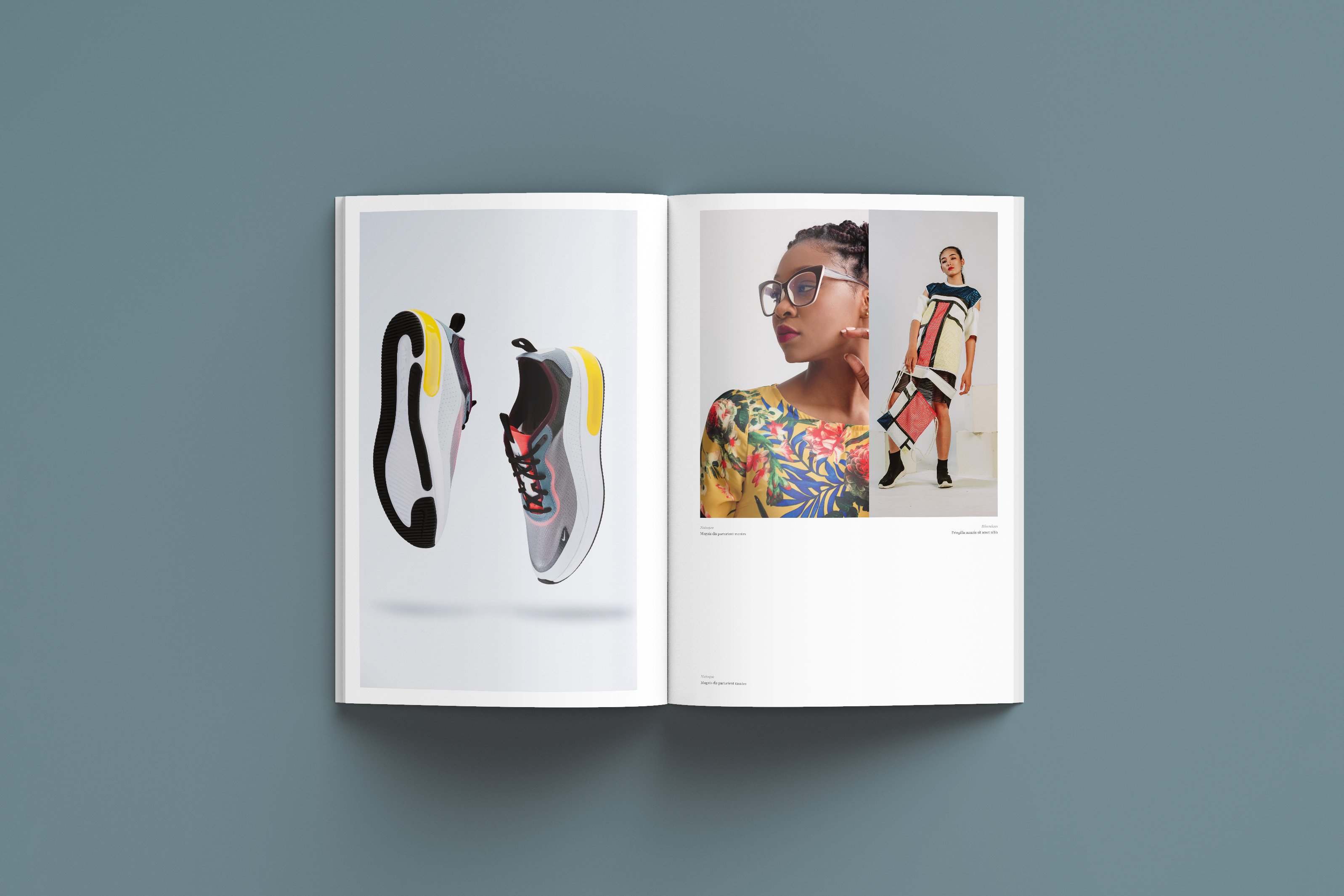
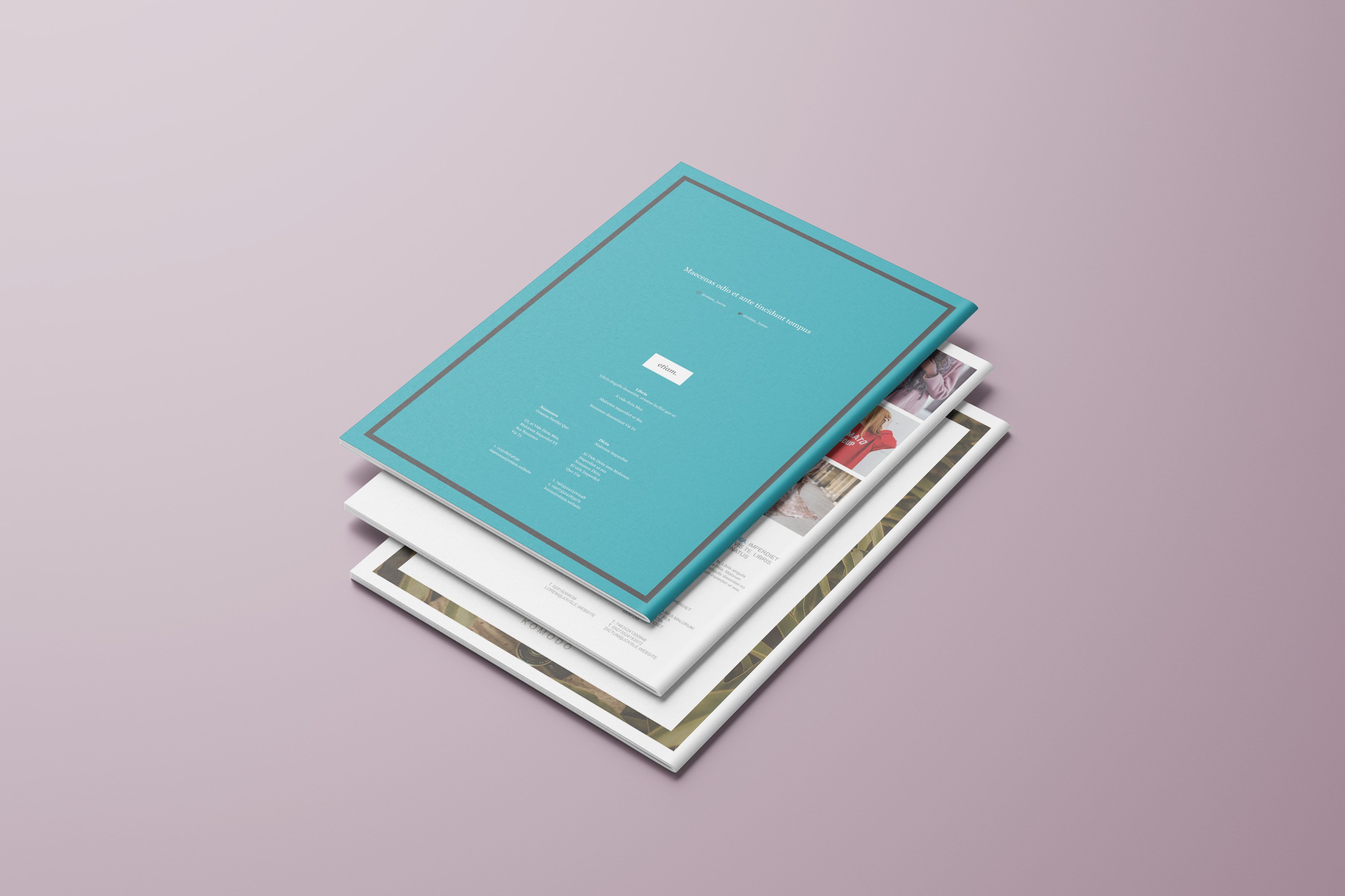
These are some projects done in Affinity Publisher, but took it just a step further to see what they'd look like placed into mockups. The three projects are "Aurelie", "Jovan" and "Komodo". Affinity's built-in stock images feature really helped, especially with the amount of iterations I had to make. "Aurelie" "Jovan" "Komodo" "Komodo" View 2 All the books together

- 2 replies
-
- 5
-

-

-
- affinity suite
- affinity v1
- (and 6 more)
-
This isometric illustration project was probably one of the most difficult I've ever worked on but absolutely worth all the effort in the end. Big shout out to Kevin House for taking the time to provide the walk-through and resources to get it completed 💪
-
- 10
-
-
- affinity suite
- illustration
- (and 6 more)
-
Here are my two attempts at the "Reflected Skyline" illustration project from the Affinity Designer Workbook. Hope you guys enjoy! Any feedback is much appreciated V1: V2:
- 8 replies
-
- 7
-
-
- affinity v1
- affinity v2
- (and 7 more)
-
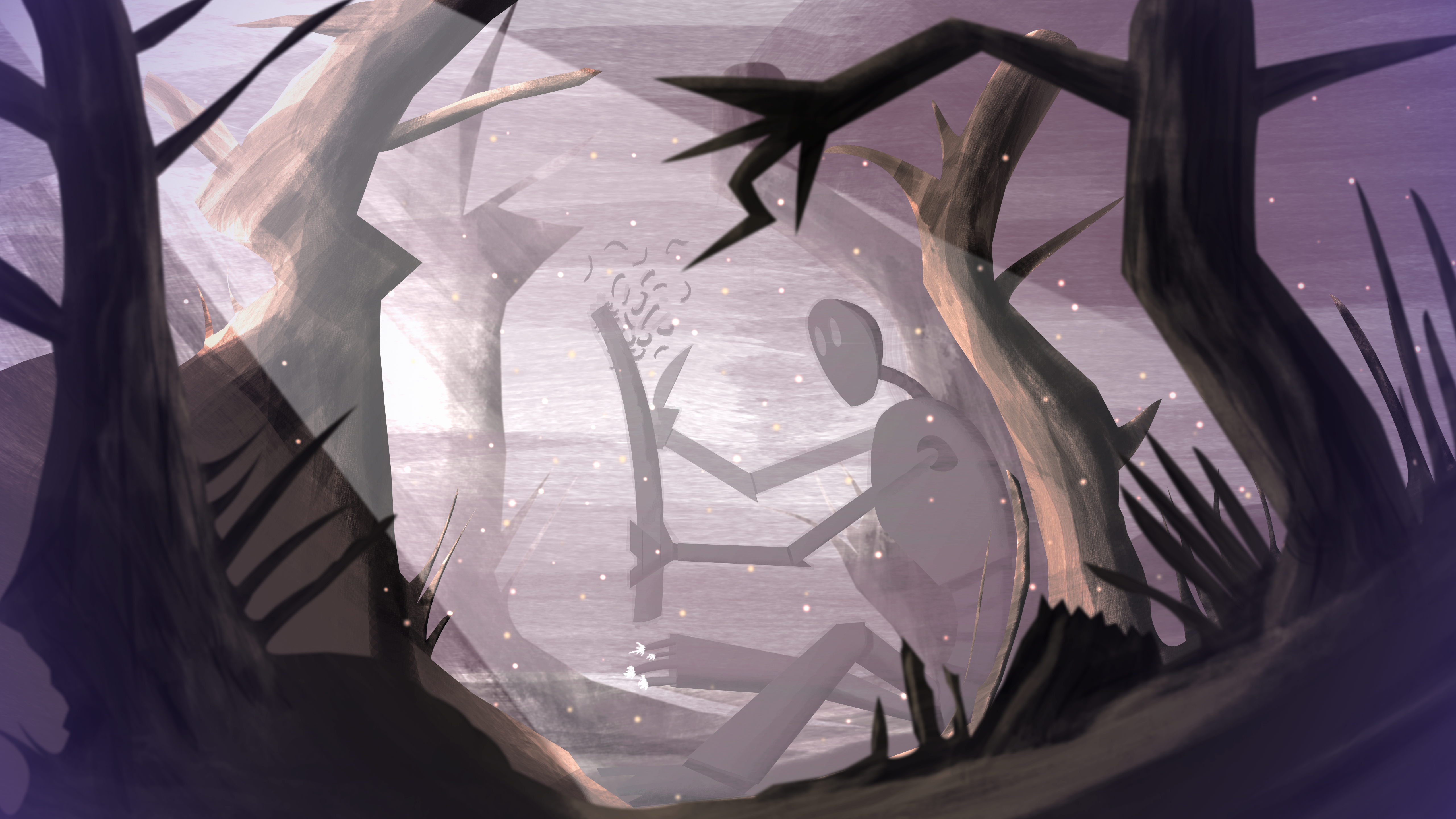
Here are my two attempts at "The Whittler" illustration project from the Affinity Designer Workbook. I forgot to mention in my "Reflected Skyline" post is that every upload that contains two images from the workbooks are years apart. The V1s were done on a low-budget laptop I had since college which still works to this day! The V2s were completed on a much better system. I must admit that I could've put a bit more effort into V2, especially with the robot's neck but hopefully that'll be done if I ever decide to tackle it again V1: V2:
-
- 6
-
-
- affinity v1
- affinity designer workbook
- (and 7 more)
-
 Hello I just wanted to make a clean thread asking for backward compatible files between v2 and v1 of programs. I didn't had any reason to need it till now but now I do notice what a big problem it is. First of all now that the summer time that I have most of my workload I did noticed problems with designer v2 performance and I wished to move back on v1 till it is fixed, but nope. I can't open v2 files, I need to do workarounds with sketchy imports. Second, I wanted to work on my macbook from home so I tried to get the designer v2 trial there to see what's up, but nope OS not supported so it can only use v1. But I use v2 on workstation and this is another roadblock. So yeah dear Serif, please we need backward compatibility. It is understandable that there is tools that are simple not available on v1 but this can be bypassed by automatically converting to curves whatever is not gonna work and display a warning of losing the editability of some objects if the file is saved with the older program version. Thanks
- 27 replies
-
- 7
-
-
-
- backward compatibility
- affinity v1
- (and 6 more)
-
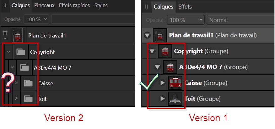
In version Affinity design 1, the grouping of shapes was drawn in the group icon. Now in version Affinity design 2, we see that a folder as an image is not practical, unless you change the name of the group each time. Do you think it will come back as in version 1? You can see the difference in the files t attach. Thank you for your reply.
-
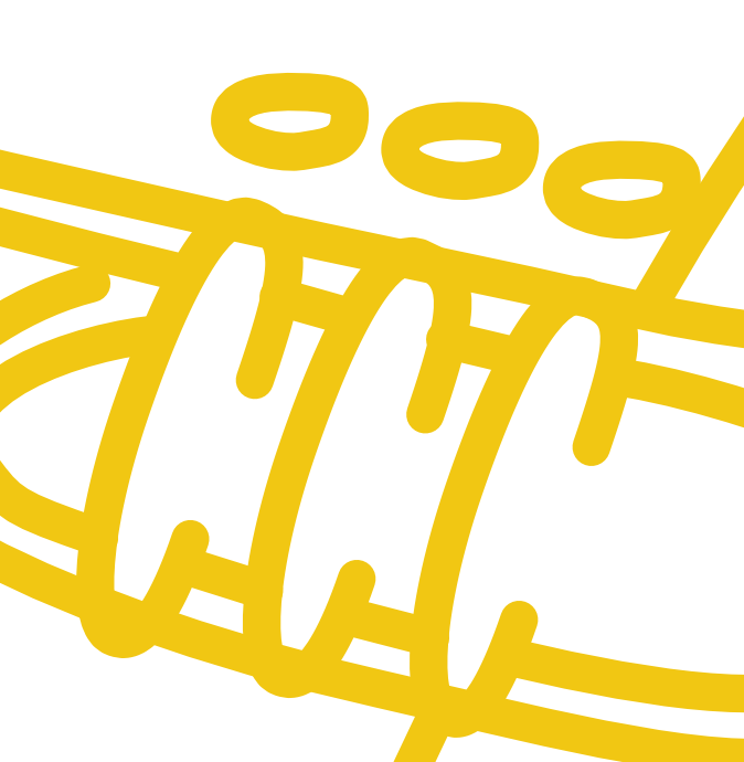
 Hello community, I think may this isn't the right forum for my issue but the others are also not suiteable. I have the following problem: I have a favicon that has some circle-like curves. As you can see in the attatched curve-affinity.png those curves are rounded on their ends but are of one with inside. When exporting the curves as SVG for export (but also as SVG good quality-digital) in the browser (I've tested it with Brave, Firefox and Edge) I get the result shown in curve-browserview.png Do you know how to fix this problem? Is there any setting in Affinity to fix it or is it a browser-view problem? Thanks for any suggestions.
-
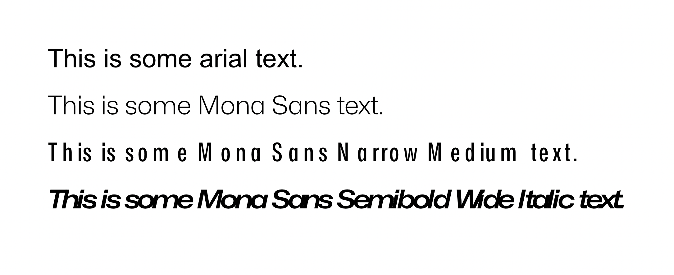
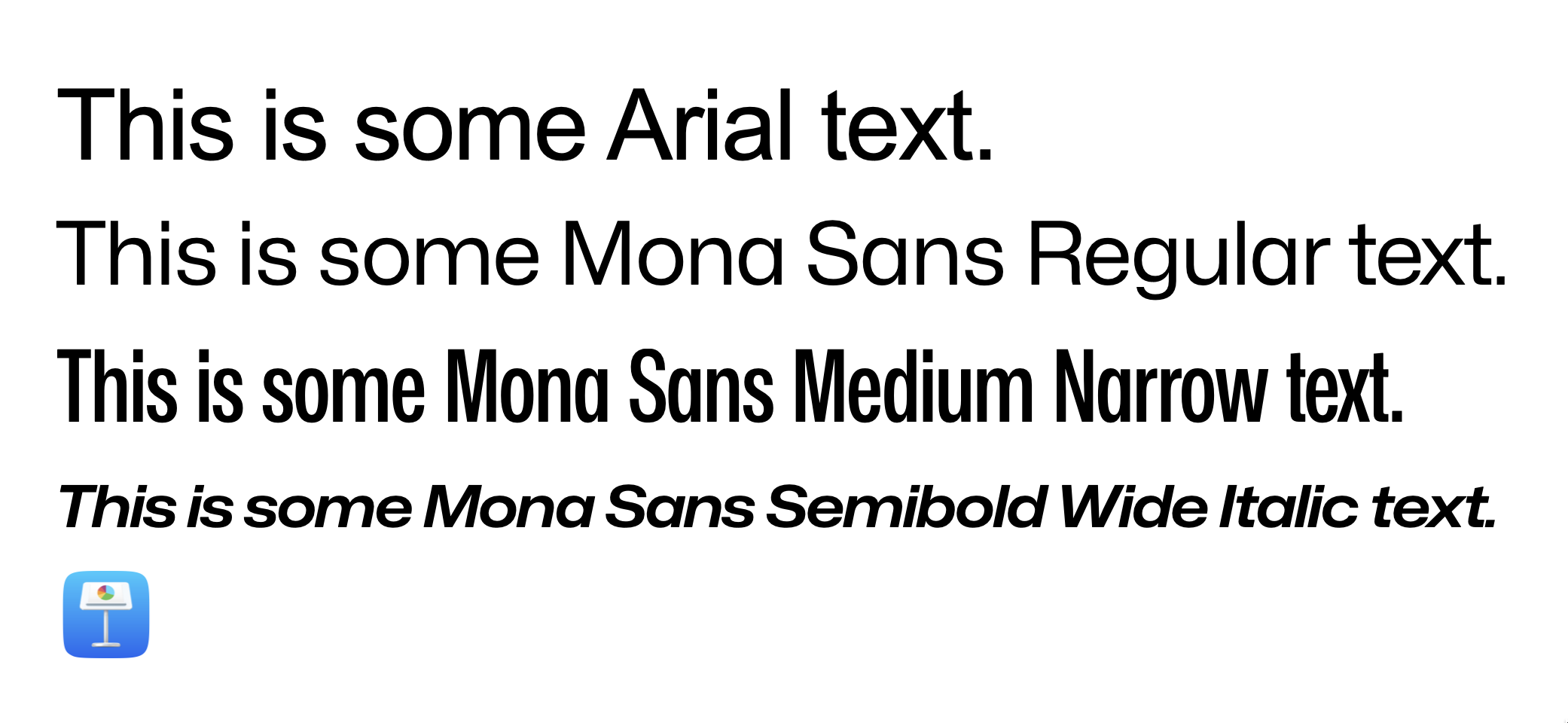
 Hi, everyone. Thanks beforehand for your time. So, basically my problem has to do with character spacing, no matter tracking, kerning, both or none. Affinity displays it completely wrong. Refer to the screenshots for more context. This first screenshot comes from a fresh new affinity document. I just wrote the text and set the font face. This is how Mona Sans looks against Arial, just to name an example. You can clearly see that the spacing for the Narrow Version and the Wide Italic version has been absolutely butchered. I can't tell if Arial and the Regular version for Mona have the same problem. To me, they look fine, but I don't really know what to expect after seeing how it reacts to very wide and narrow fonts. Second screenshot is how Keynote, just another app that deals with text, looks like. Font Book looks identically, as so does every other text app I have. Essentially, that's the spacing that the original designers had in mind. I am very aware of the ⌘ + opt + → command for setting this up manually. But, in this specific case, I am just writing a bunch of text. I expect the result to be like the second picture with no additional tweaking. Essentially, that's how the typeface was designed and I want to keep those proportions. For reference, I accessed the Character window and tweaked everything to be as default, or close to default as possible. That means, 0% everywhere. I went character by character, checking that the kerning for each pair was set to 0%. Question is: am I missing something? Am I doing something wrong? Or, on the other hand, is it a problem with Designer? Hope you can help me out. Lemme know if any other piece of info is needed. Specs: - OS: MacOS Ventura 13.0. This occurred in both an Intel machine and an Apple Silicon Machine. - Affinity Version is 1.10.6 Again, thanks much for your time beforehand.