Search the Community
Showing results for tags 'affinity publisher' or 'affinity suite' in content posted in Share your work.
-
Latest A5 mock-up. Hardest thing was getting the bleed alerts right on the PDF check

-

multi Oh crap...I need an 'album' cover stat, you got 3 days.
Junkbox posted a topic in Share your work
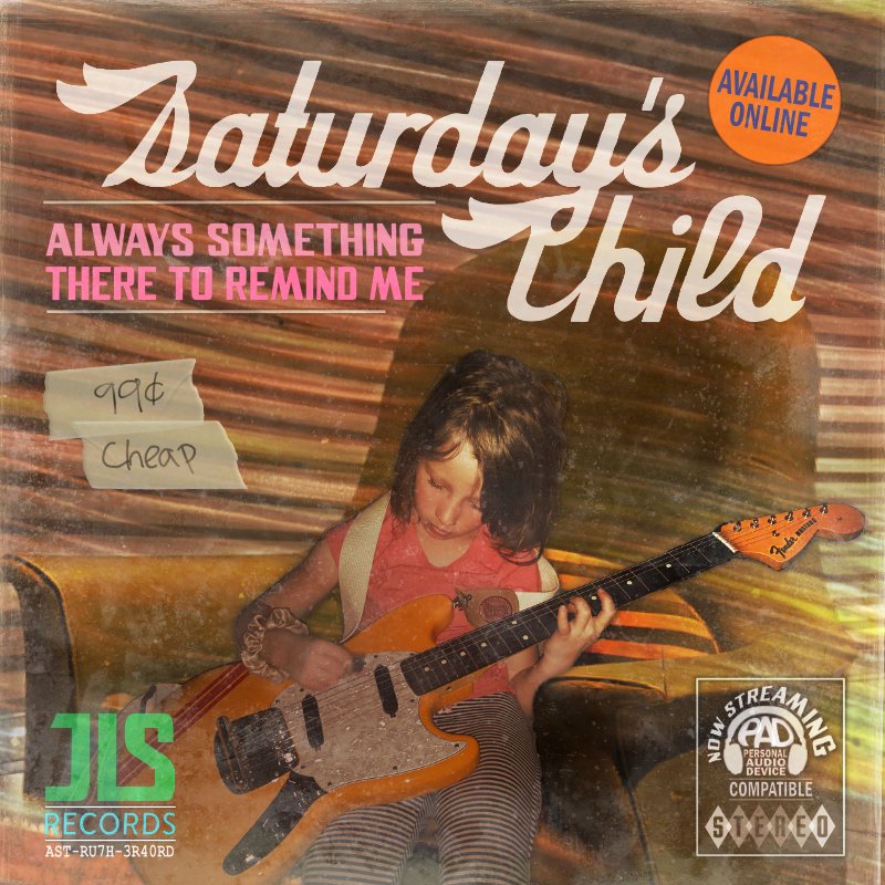
So my good buddy calls me says I need a CD/album cover in like a few days. Apparently, as we artists are the last to learn there's been all sorts of contemplations that the designer is only privy to after significant procrastination. Then come to find out that a late night decision the release is to be under their newly independent label. This has no effect on my process. I've done many graphics for the band, and even played in a side band or two with em. So yes, of course I'm in. The title track is a Burt Bacharach cover, so the idea was to make the 'album' cover appear as a dusted out 70's LP, replete with the 'I've been sitting in Mom's basement' look. Here's the final. This is the first time I've used Affinity Suite exclusively for a project like this. Just wanted to share. The suite works well, glad to do a full project with it. Thanks.
- 5 replies
-
- 12
-

-
- affinity designer
- affinity photo
- (and 2 more)
-
Hi, I took all the pictures, edited them (not with Affinity Photo) and created a super simple catalog (with Affinity Publisher V1+2), which also got printed (for private purpose only, with additional pages like imprint, foreword, introduction etc). It was easy and a joy to use Publisher. Thank you, people from Serif. Online version: https://mount-sushi.com/netsuke/gallery/index.html PS: I'm not a professional photographer, and these sculptures are really small ...
-
 My French Adventure is her site where folks can purchase the pdf eBook. Publisher worked well except for the paragraph spacing. Under the Paragraph tab spacing and leading do not change the spacing unles you make huge jumps in the leading. I may be doing something wrong, but I had hoped for much more control of my text. Let's hope they continue to make strides in the function of this program! Other than that, Publisher works very well😊 Ned
 -
Just upgraded to the new Affinity Suite after using it daily for 4-5 years. Not sure it justifies the jump to a major release. There are as far as I can see only slight improvements. The versions suffers from the same lack of features many mentioned for years. One thing for sure didn't improve are the app icons. I created a little pack for myself and maybe some of you might enjoy it as well. Peace Y. Affinity YS App Icons.afdesign
-
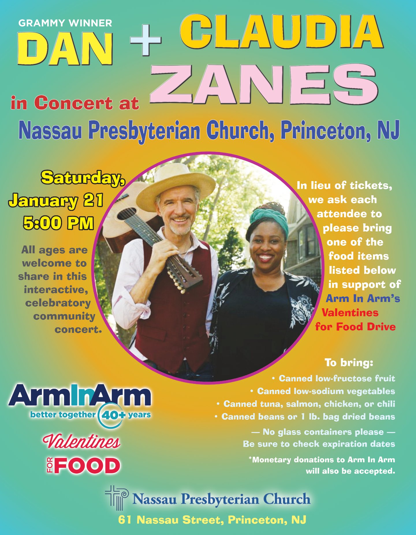
Just a simple flyer for local promotion. I took visual cues from their website as I was only provided with a photo and sponsor logos.
-
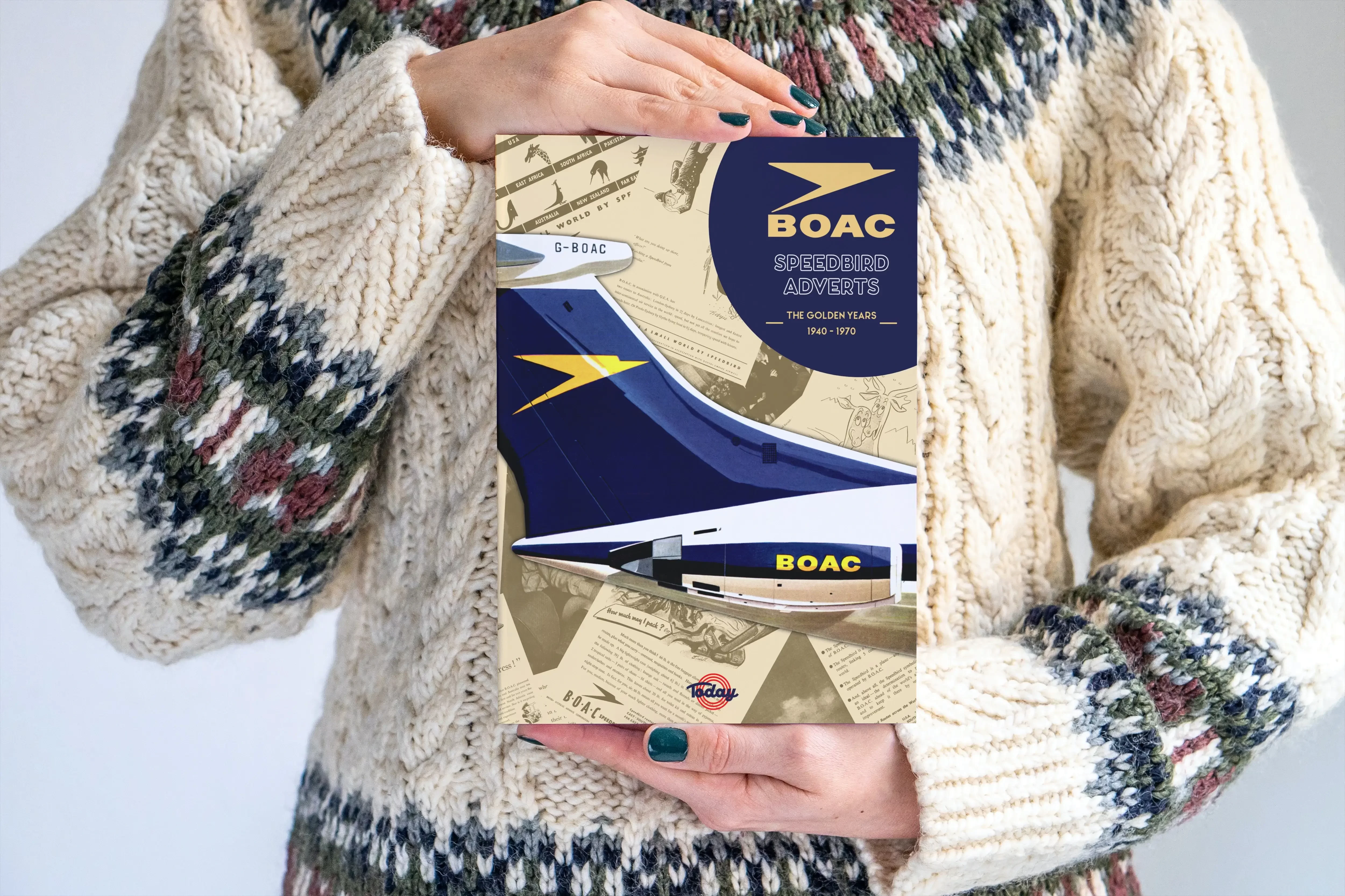
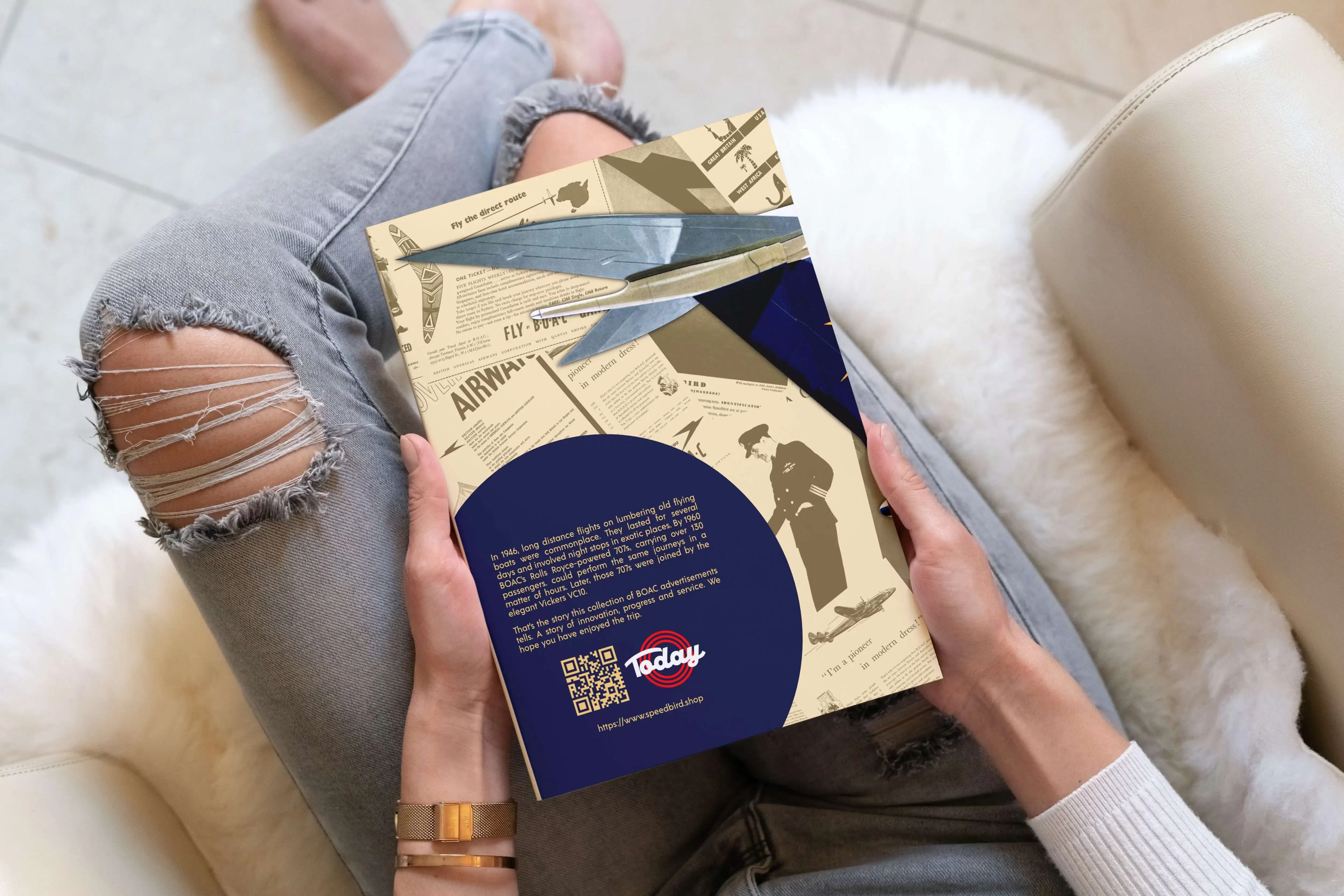
This is one my side projects for 2022. I run a FaceBook group on the BOAC Speedbird aircraft and "The BOAC Speedbird Adverts" book which contains 133 rare adverts (B&W and colour) from 1940-1970. The adverts were cleaned up using Affinity Photo and the cover was put together with Affinity Designer and of course the book was put together using the Affinity Publisher. For more info visit https://speedbird.shop
-
- 5
-
-
- affinity designer
- affinity photo
- (and 1 more)
-
I’ve been trying out V2 on the iPad. I traditionally draw single frame cartoons, now I'm shifting to single-frame stories. Getting use to the interface change has been a bit time consuming, but overall it's been a positive experience. I'm looking forward to seeing how the iPad platform evolves. Working while sitting on the couch instead of an office desk is a major bonus. I hope you enjoy my submission.
-
Hello all. Just giving v2 a quick spin. Faced with a blank page, this what I ended up with! I’m really enjoying the new warp tool for shapes and text.
-
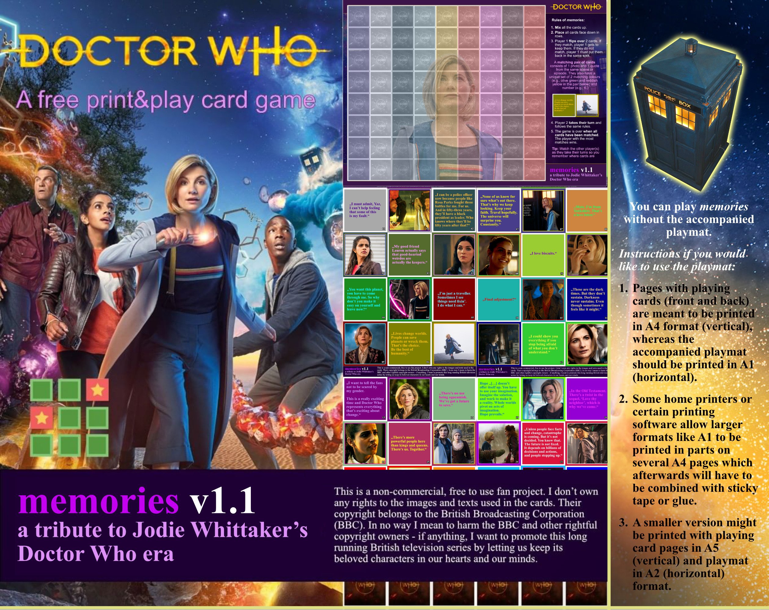
 memories (memory game) is a fan-project I made dedicated to Jodie Whittaker's Doctor Who era. I used Affinity's "Studio Link" power with Affinity Publisher as base and Affinity Photo to edit colours and images. The card game (PDF file) is published on: https://kplasa.itch.io/memories/
-
- 2
-
-
- cardgame
- printandplay
- (and 3 more)
-
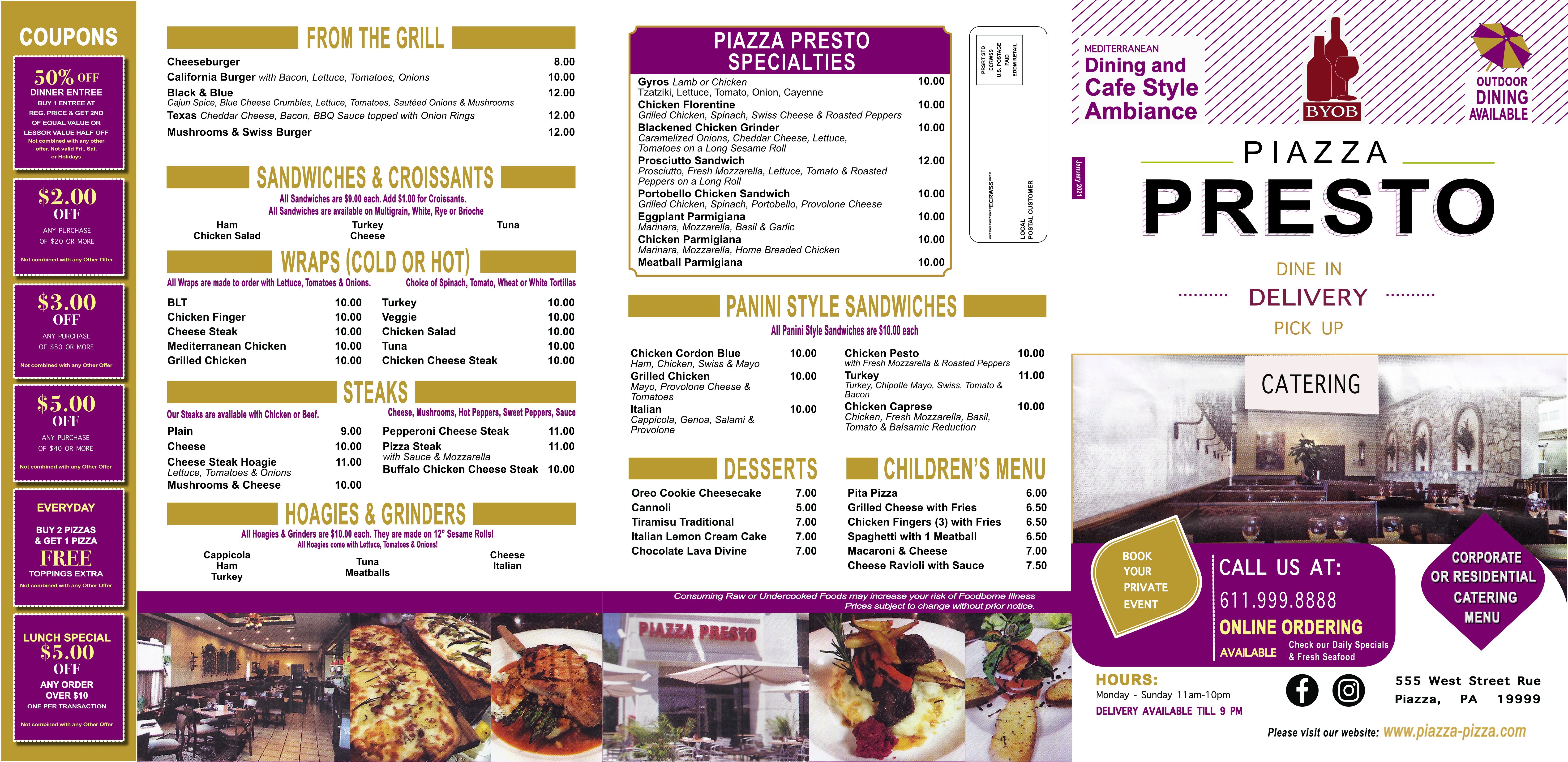
 I created a menu for an Italian Pizza restaurant. I changed the phone and address as I didn’t want to post the real ones. I used Affinity Photo for the photos and Designer for creating the icons and shapes. Lots of text, tables to work with. These are jpg and don’t look as sharp as in Publisher or as the final PDFs used to print the menus.
-
-
Hello Affinity fam! I would like to start using these forums more often and share with you the pieces I'm creating. Here is my latest completed piece. I leave you the information of the piece below. Greetings and thank you so much! https://i.imgur.com/d52WZnm.jpg
-
Here is my latest comedy poem laid out in Affinity Publisher. It is a comedy observation about a cat that drools when excited or relaxed. This was written to reclaim the word "pussy" to mean "domestic cat". I hope you find it funny. The background image was created using stable diffusion ai and then using digital auto painter and affinity photo to complete the creation. The document was laid out in Affinity Publisher. Moderator, please could you move this to Share Your Work. Thanking you in advance.
-
 The attached PDF is a progress print - and not the final - as I am still trying to deal with a minor issue of getting the marginal grid text to appear on the last 3 maps, and there will be an 8.5"x11" formatted sized narrative and technical report dealing with the overall surveying project. When its been written and assembled in Affinity Publisher, I'll update this thread. This portion of the project is that which passes through the Town of Sullivan, Hancock County, Maine. All of the spatial components of this PDF were produced using Global Mapper Pro, v24.0 and assembled in Affinity Publisher v1.10.5.1342. The PDF includes a few anchors and internal hyperlinks for navigation and one external URL linked with the survey control station used for this portion of the project. Sullivan Val Sheets on 2020 Orthos (20221004).pdf
-
 I know, Publisher is not meant for real work yet. But I couldn't wait. So I made a lot of backups inbetween so I could transfer texts and stuff to another App if needed. But almost everything went well. Sometimes Publisher just closed after an action but it saved the work so no loss there. My new book is about storytelling. It is the aftermath of a social media campaign from last fall in which I published 30 blog articles about essential storytelling questions. As a teaser I produced 30 dioramas of famous stories and took photos of them. Affinity Photo was a real life saver then. After the campaign I decided to publish this book with the campaigns content. I used Affinity Designer for most of the graphics and Affinity Photo for my Diorama Photos again. Publisher showed to be reliable enough to produce the whole book with 168 pages and a content worth of 1.2 GB. I made a video with a short flip through: When Affinity Publisher will finally be published I will definitely buy a license. :-) Kainote
- 15 replies
-
- 10
-
-
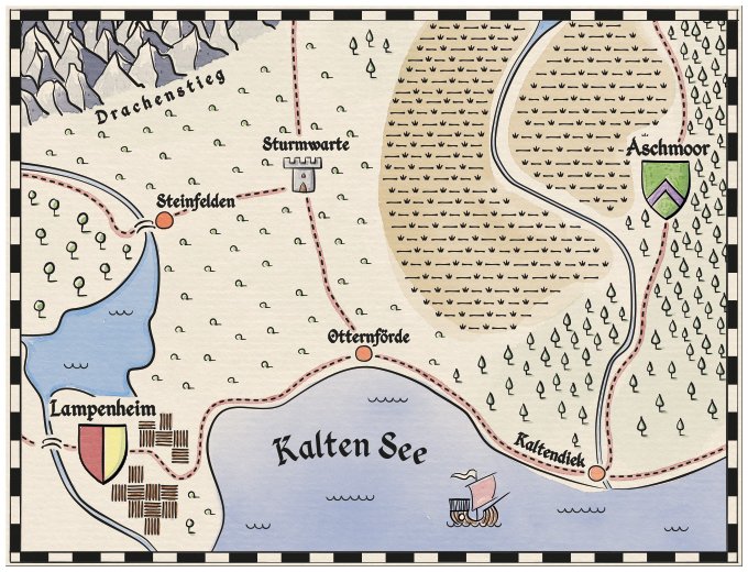
Hi, I have created a #Zine for #Zinequest - #Kickstarter. This is my first campaign. I used Affinity Designer for all of the illustrations (including the maps) - no special brushes, just the basic pen-tool. All of the textures were created or edited with Affinity Photo and the layout is in Affinity Publisher. The watercolour painting is not done with Affinity - I have yet to understand the brushes and such - especially how they work in the world of offset printing. I hope you will take a look at my campaign on Kickstarter -
-
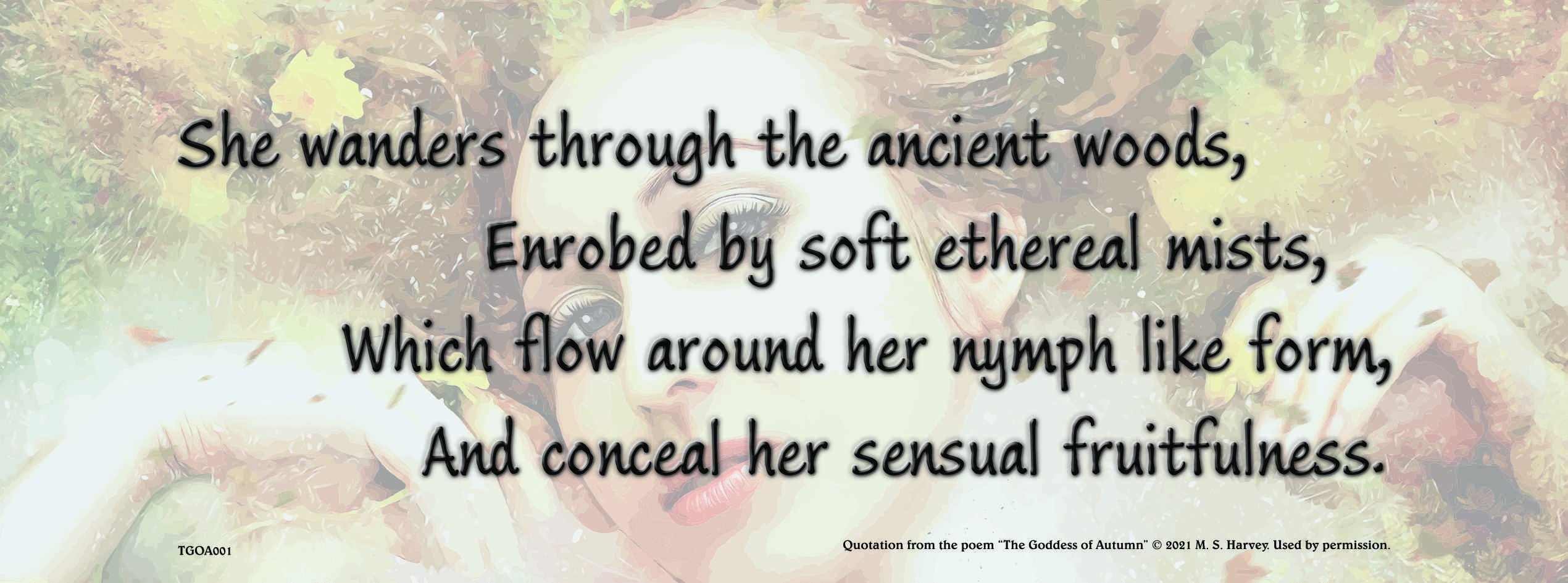
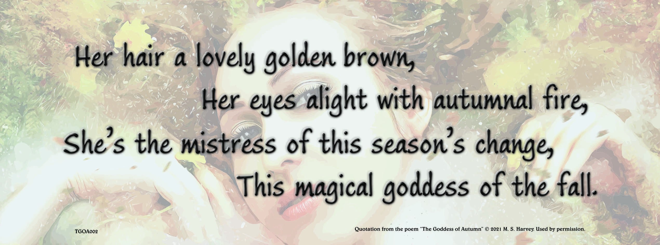
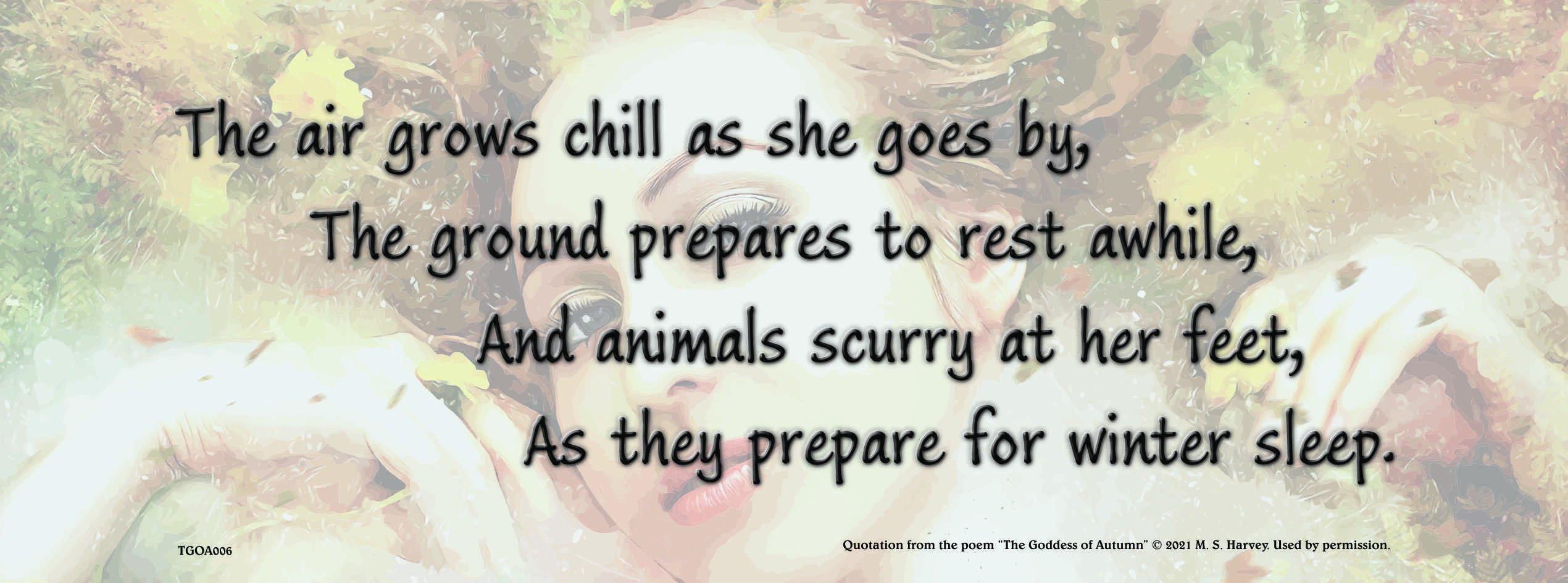
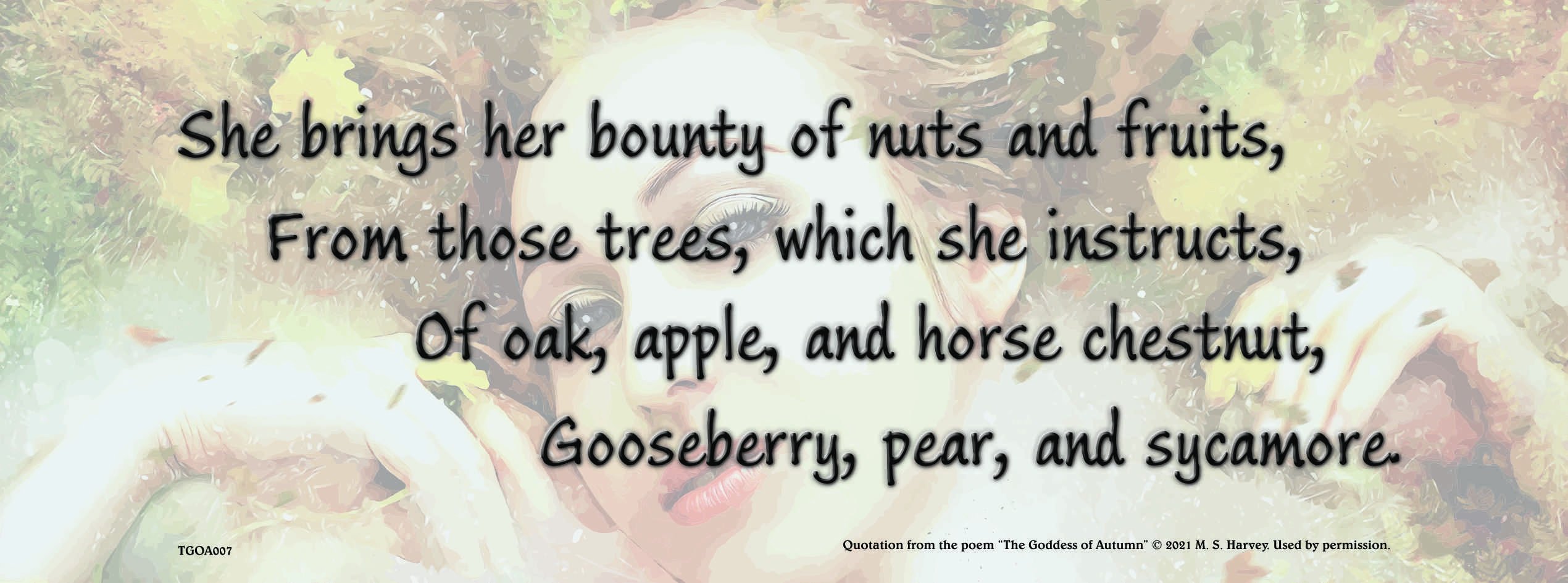
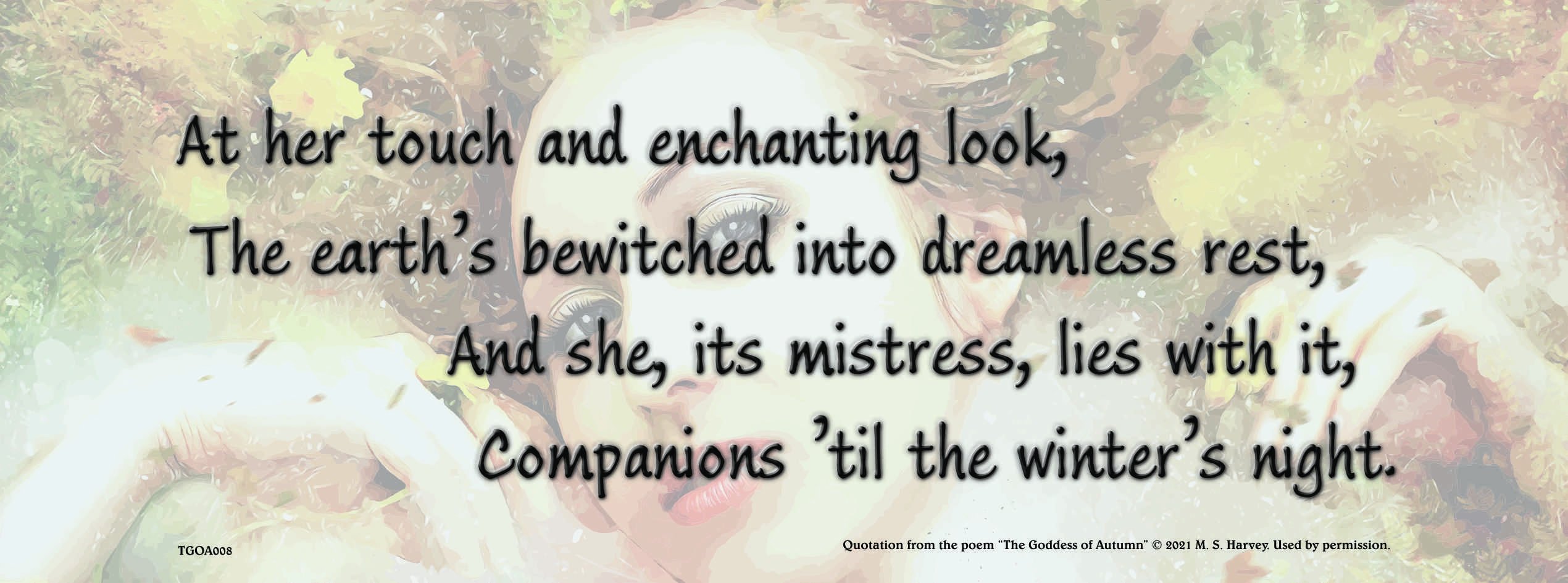
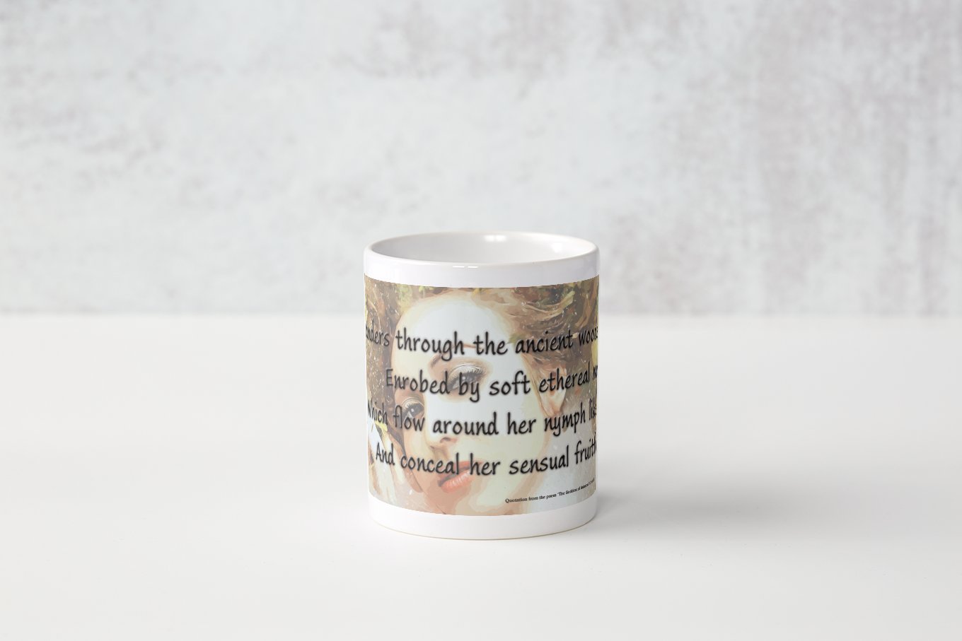
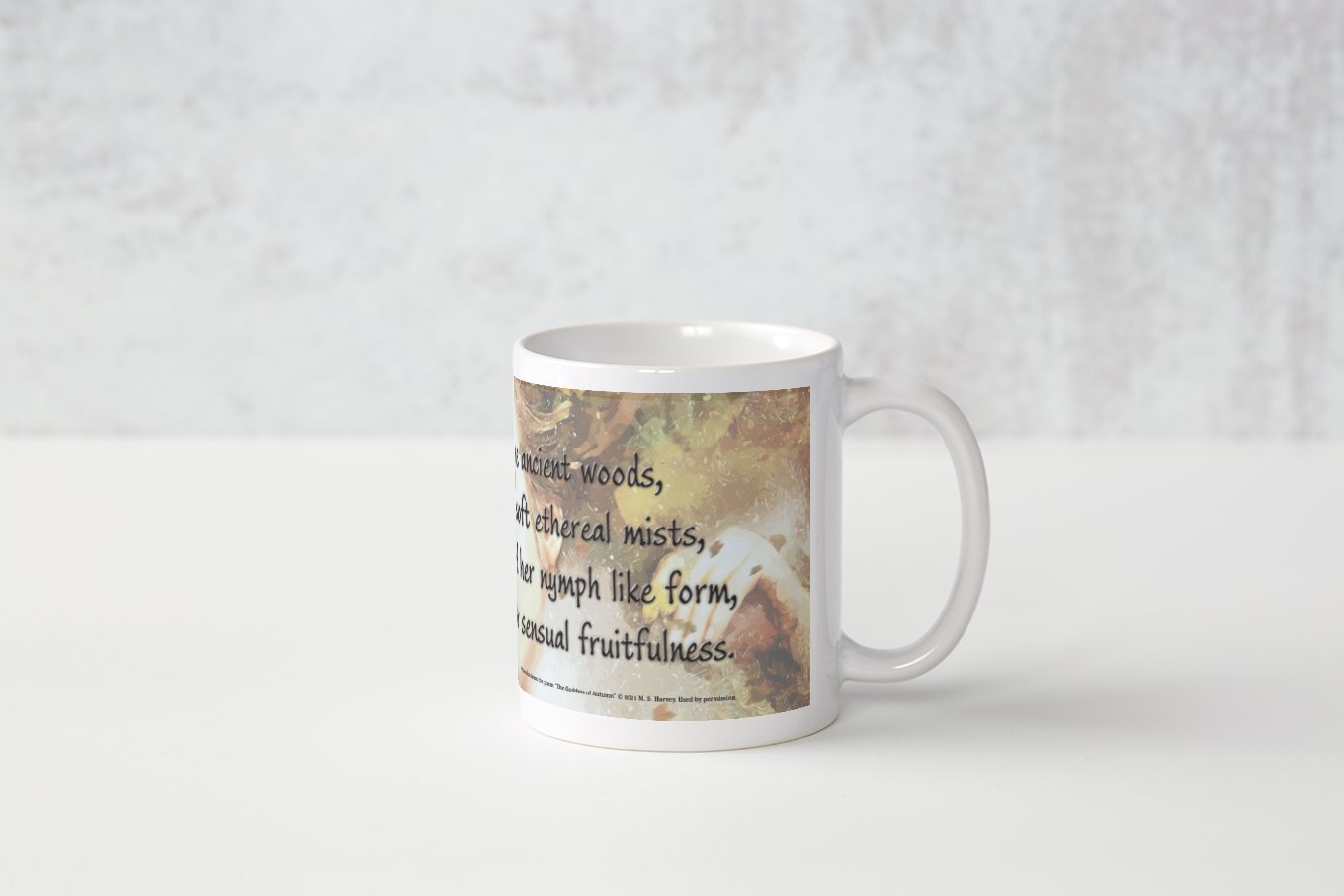
 As an experiment in getting poetry onto every day items, I thought a set of mugs might be interesting. This was an interesting trial. I chose The Goddess of Autumn as it is the most classical style of poem I have written. The font used is Ink Journal and the image is a vector traced version of an excellent image from Pixabay. I used Artistic Text and Alignment Tools to create the staggered line layout. The emboss effect was used to add a little interest to the main text design. Here are eight JPG files of medium quality to showcase the designs.
-
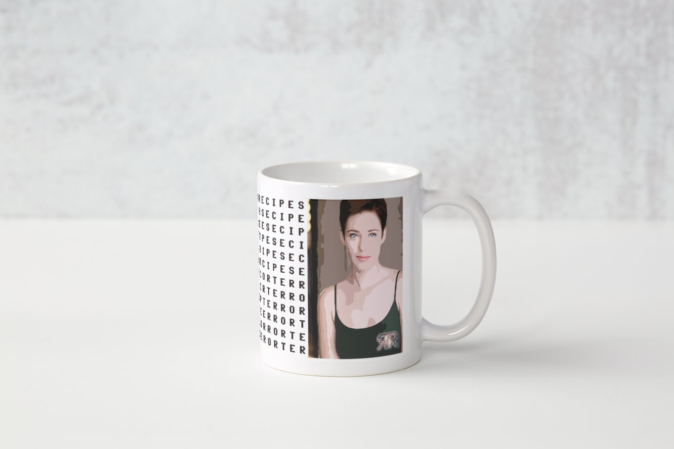
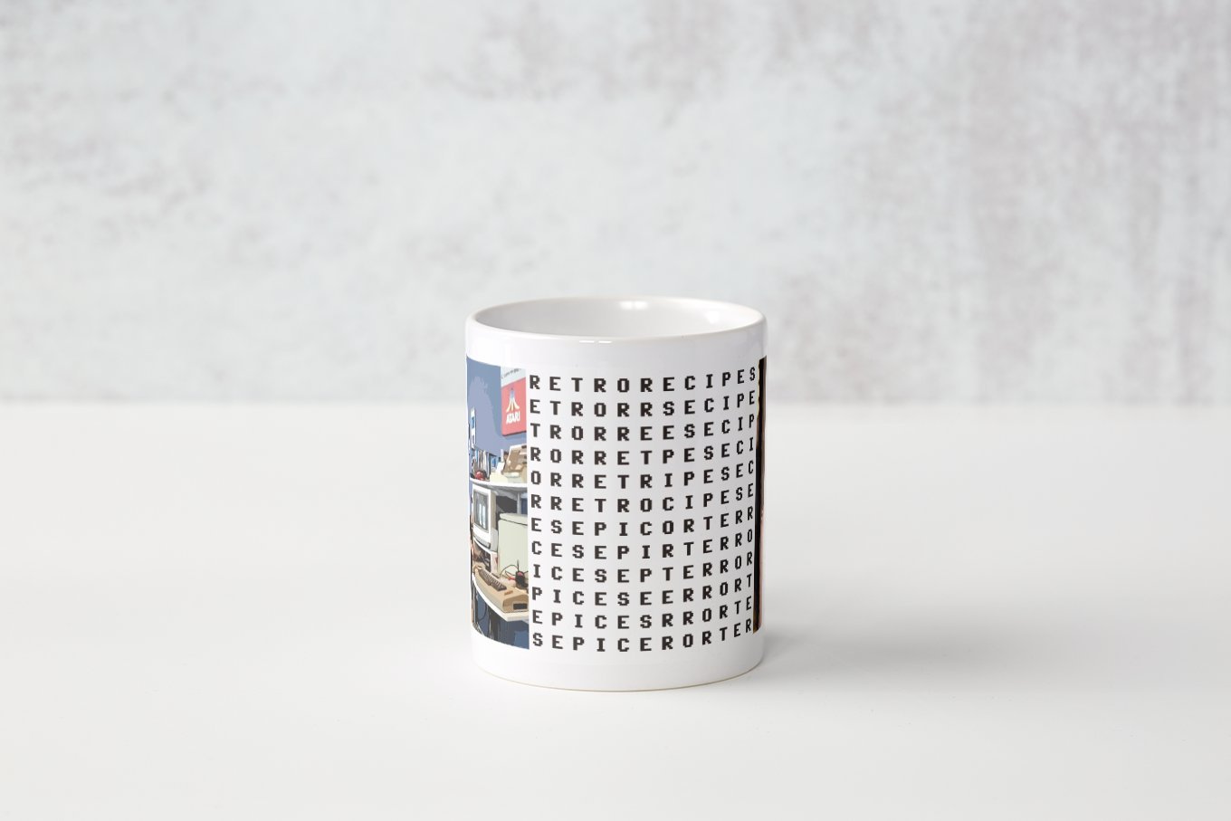
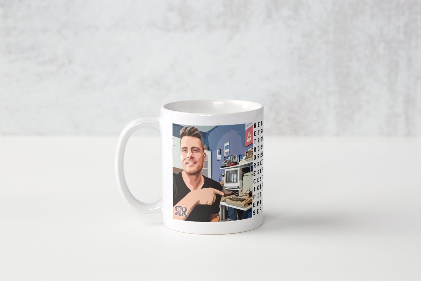
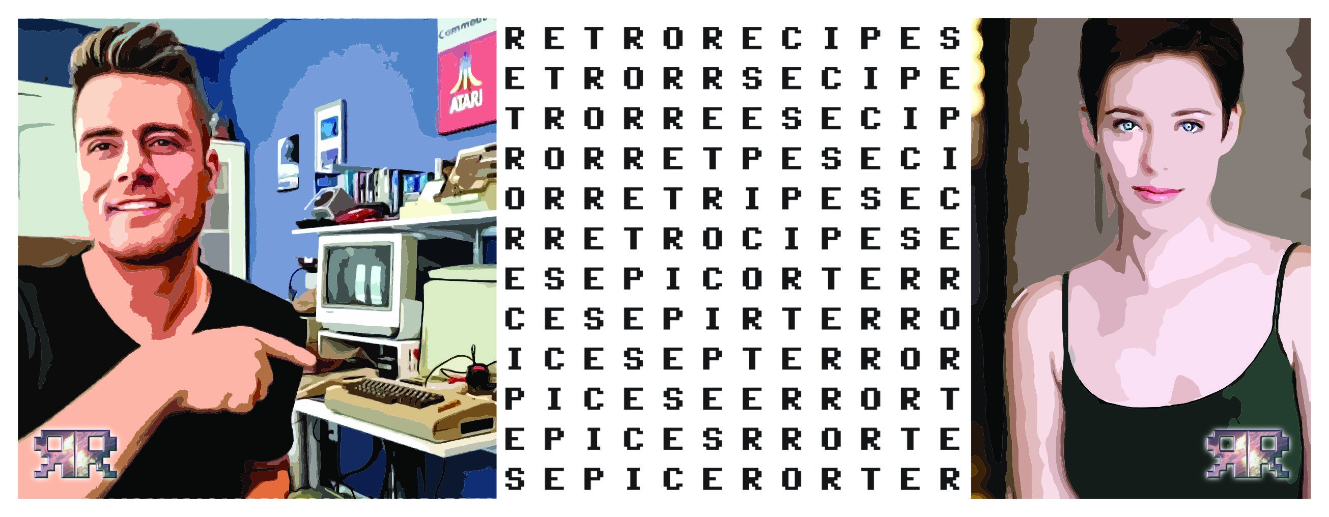
One of my favourite YouTube channels is Retro Recipes. A nostalgia fuelled look at the technologies and culture that shaped our childhoods' formative years. I decided I'd like a mug with that channel's identification on, and so designed my own. I have relinquished the design to the owner of the channel to avoid breaching his intellectual property rights, but I thought I'd share the creation of the project with you. Whether, he uses the design or not is up to him. This is probably just fan art. Check out his channel ... https://www.youtube.com/c/Perifractic
-
- 1
-
-
- retro recipes
- perifractic
- (and 2 more)
-
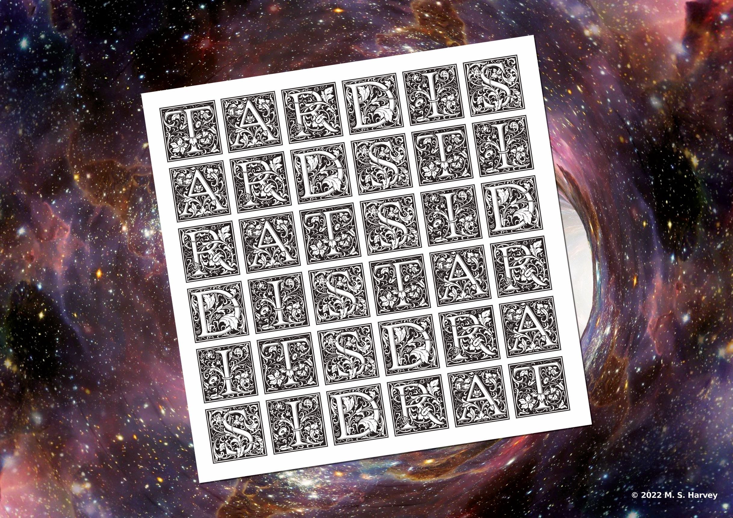
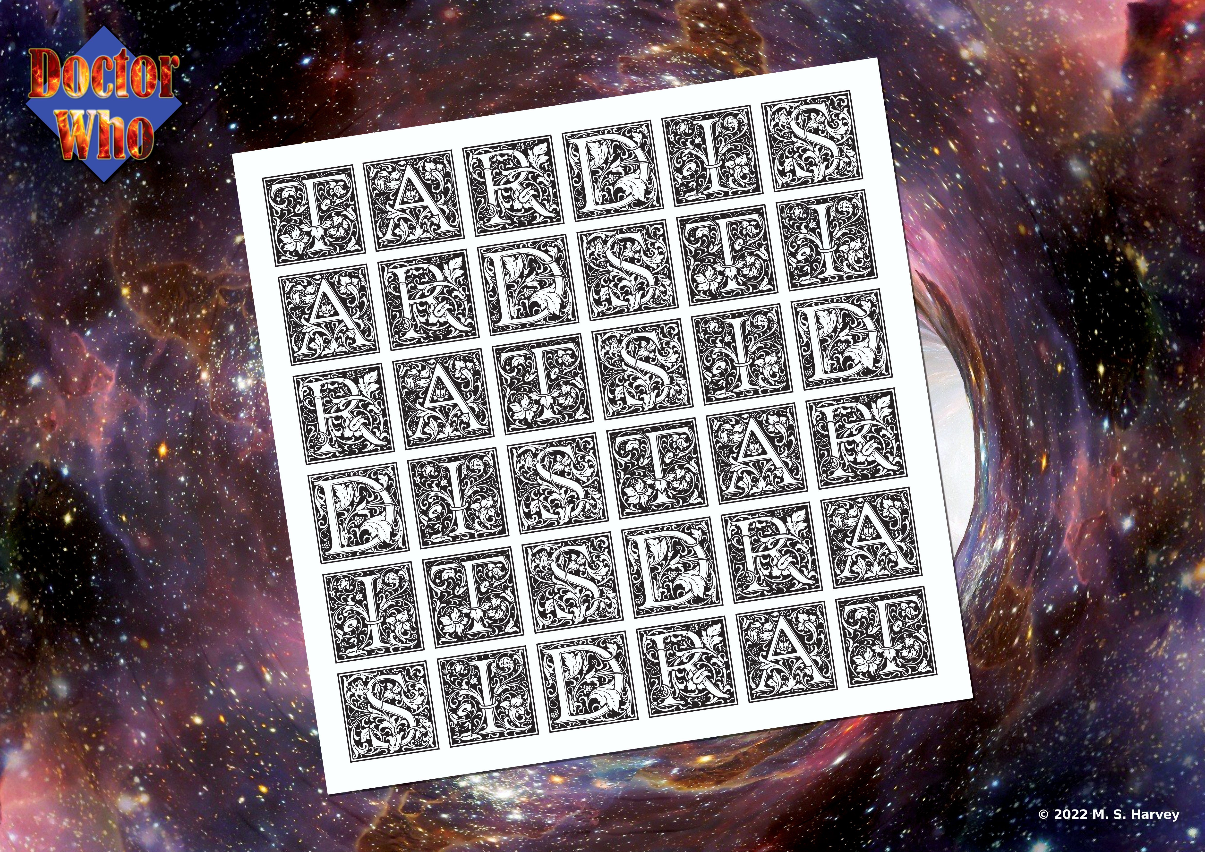
After playing with the TARDIS acronym, I developed a magic square style layout with the word TARDIS written bidirectionally on the outside of the square. Then using Affinity Publisher I created a table with eh letters written into each cell. I chose an illustrated caps font and saved the finished product as an SVG. This I later imported into Publisher and using an upscaled image of a wormhole from Pixabay as a background, I placed the word square with a white square behind it onto the page. I added a shadow to the white square and ran the auto levels on the background in studio link Photo persona. This was done on an A0 size document. Rotating the square slightly in an anticlockwise fashion seemed to give it a subtle artistic flair. Then using the rescale option in Publisher I created subsequently smaller versions A1, A2 and A3. The resultant landscape poster is shown in JPG form. This is A3 size. This reduced viewed version created in Photo. I would definitely have this on my wall. I have ordered the A2 poster version from Vistaprint. Looking forward to seeing the final product. This has a new logo to avoid breaching any BBC logo creation rules.
- 22 replies
-
- 6
-
-
- affinity publisher
- poster
- (and 7 more)
-
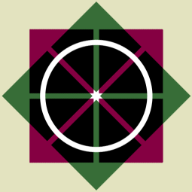
To avoid contravening the BBC's Doctor Who Fan Art rules, I designed a Doctor Who logo for my own use. Retrospectively, it harks back to the diamond logo buy with bolder lettering more reminiscent of the Pertwee and McGann days (but not the same font). I decided to try and incorporate the regeneration effect into the lettering by the use of fire imagery and adding an outer glow. This was all done using Publisher and Designer. I will use this final version for the final poster design.
-
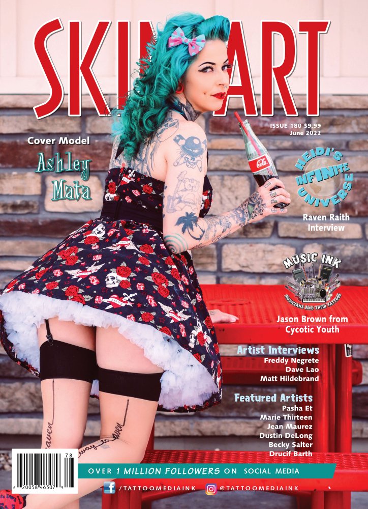
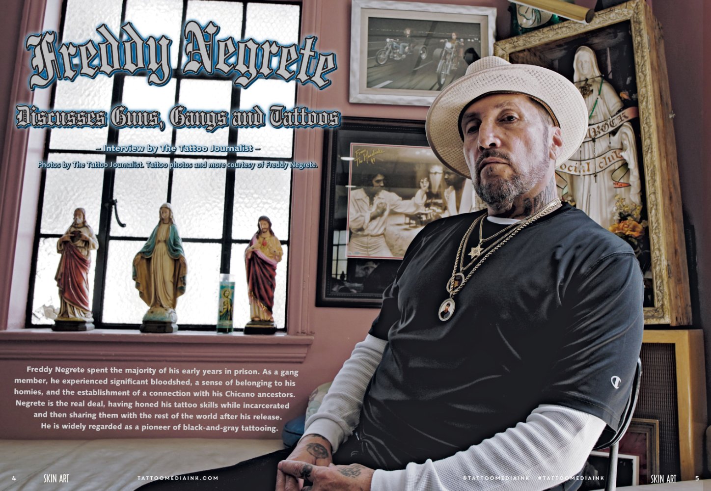
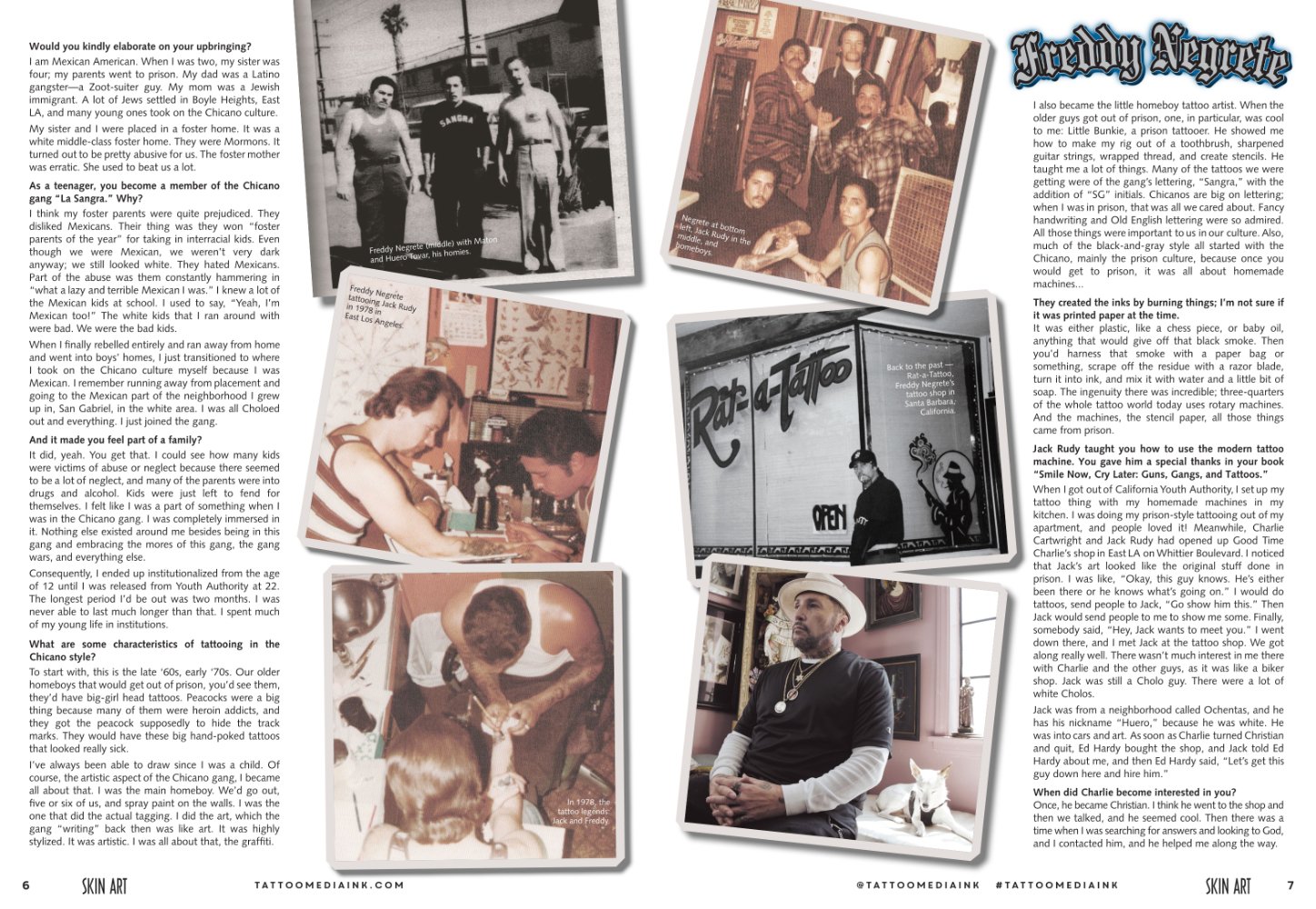
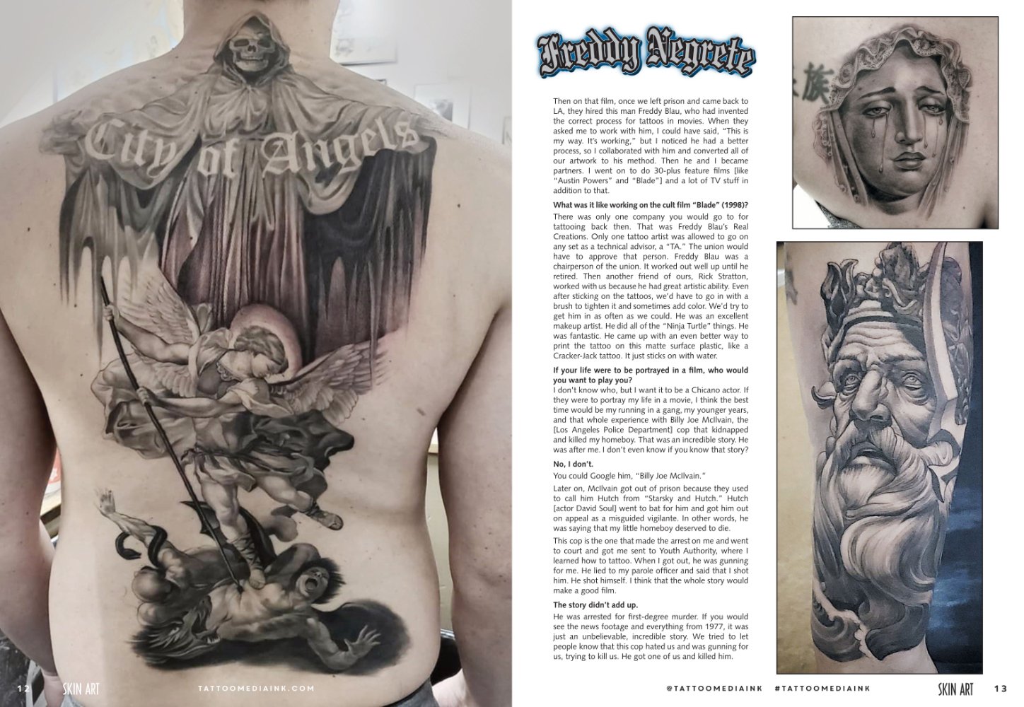
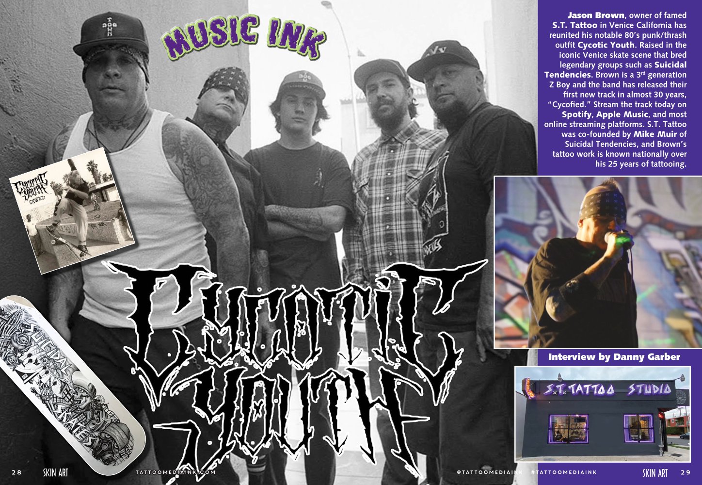
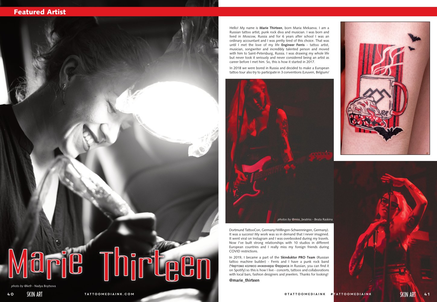
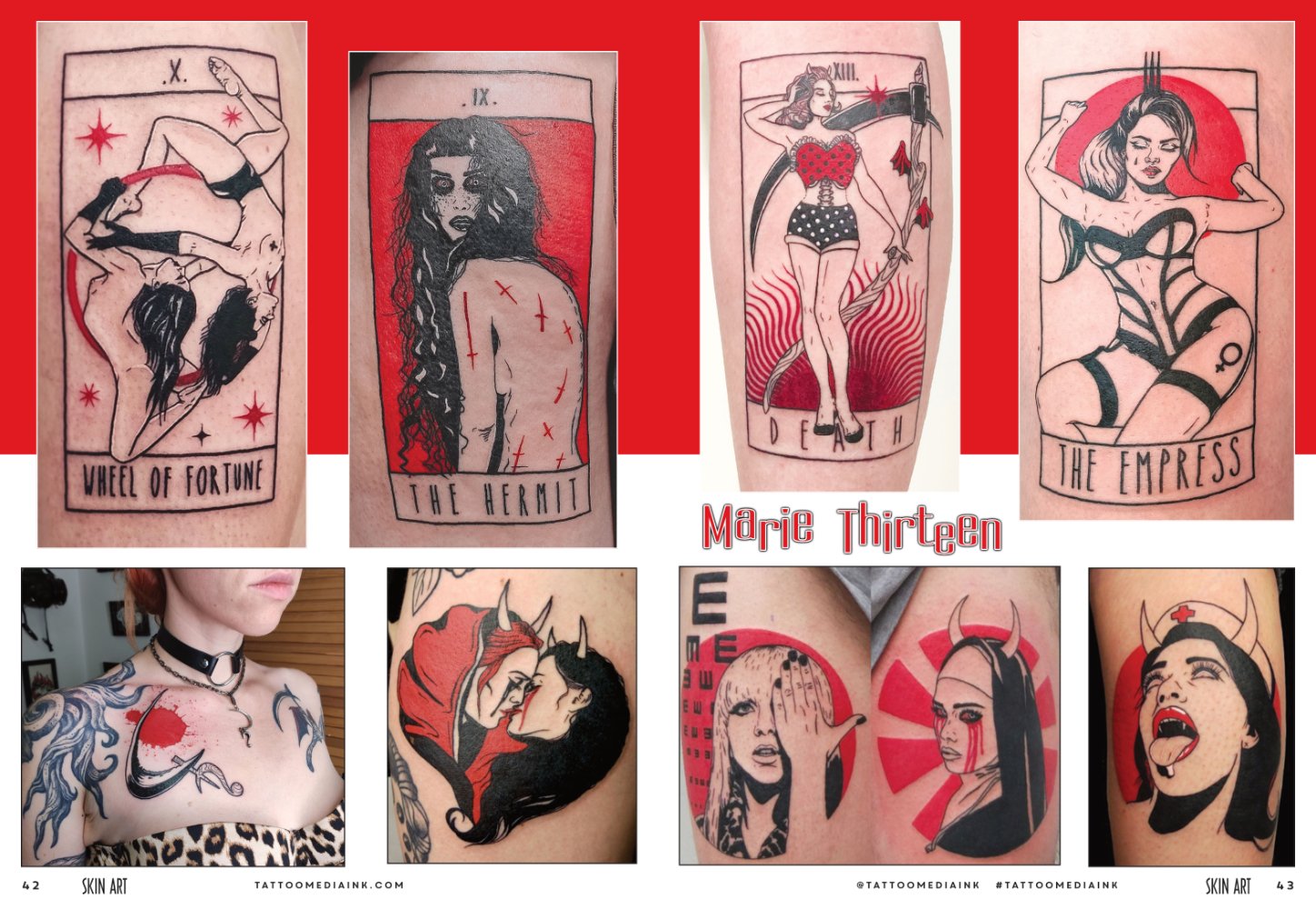
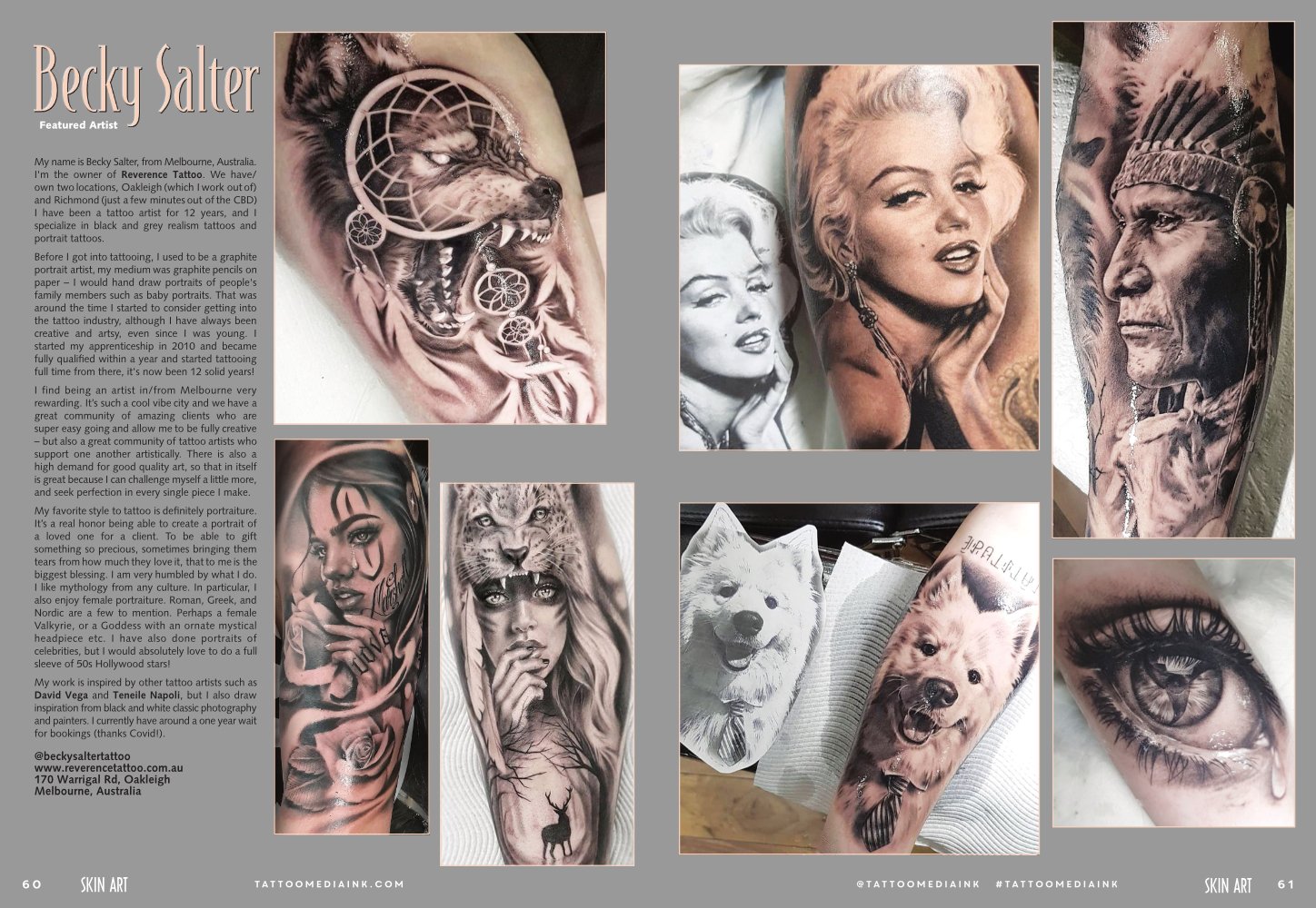
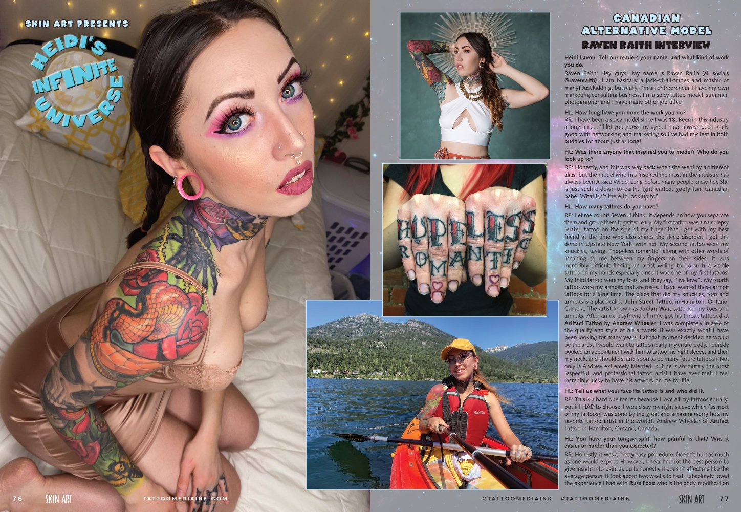
 A few more issues per year going forward as the parent company folded other magazines into Skin Art and Tattoo Revue. Here's the latest issue. Never at a loss for interesting stories and amazing artwork by these super talented tattoo artists.
-
Sharing work created in Publisher.
-
Jerry Wickam Post IL-1148 newsletter. Post 1148 Newsletter 2022 Spring.pdf


.jpg.c72c80f1e559e510341ff21a700515a3.jpg)